- A curiousity timeline
- Some COVID-19 information
- A little R and some visualisations
- Some modelling and estimation
March 7, 2020
Overview
Timeline
- 22nd Jan: Whatsapp
- Confirmed cases: 555
- 25th Jan: Whatsapp
- Confirmed cases: 1,434
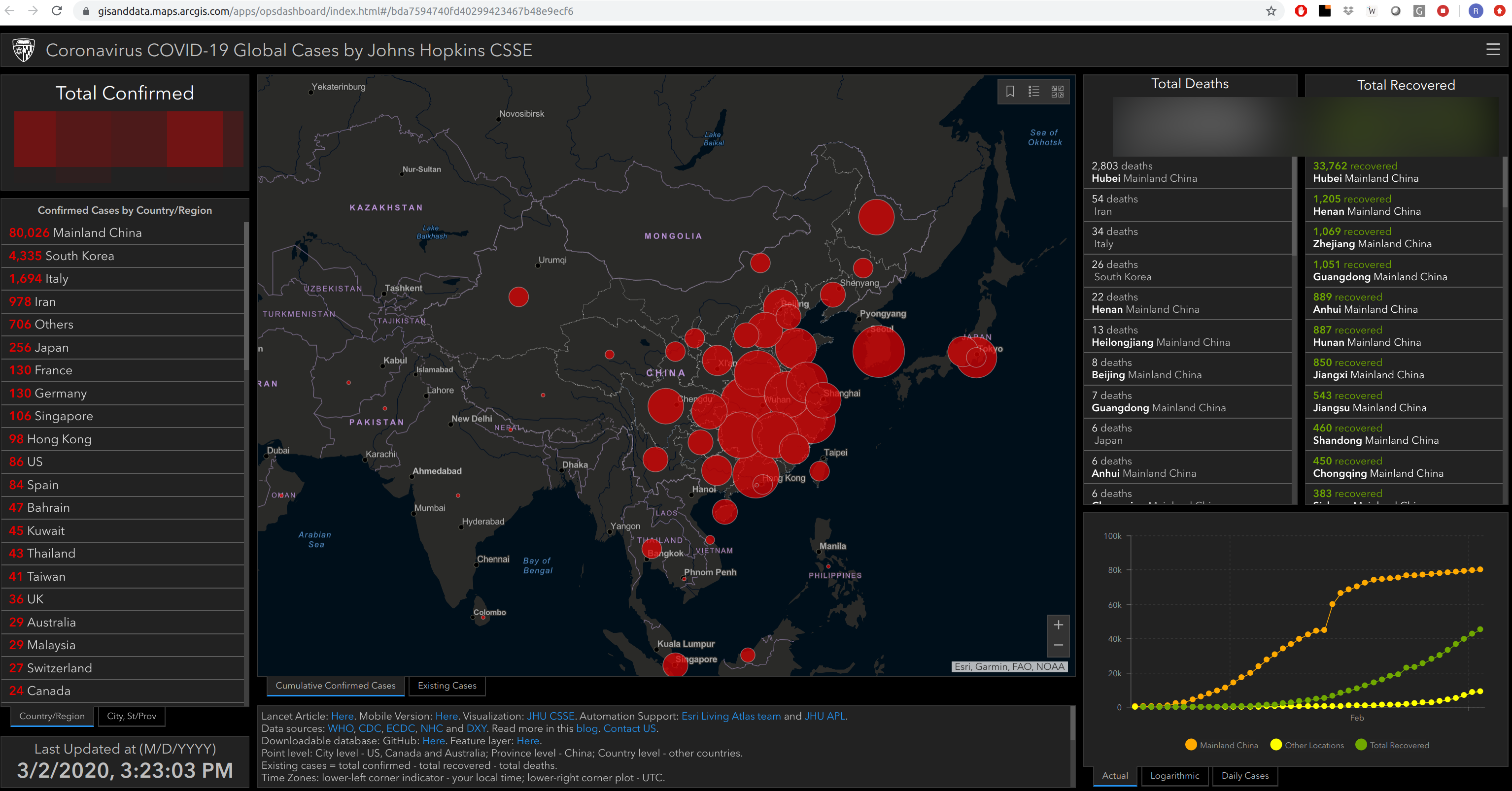
John Hopkins Live Tracker Dashboard
Timeline
- 22nd Jan: Whatsapp
- Confirmed cases: 555
- 25th Jan: Whatsapp
- Confirmed cases: 1,434
- 10th Feb: SatRday talk submission
- Confirmed cases: 42,000
Timeline
- 22nd Jan: Whatsapp
- Confirmed cases: 555
- 25th Jan: Whatsapp
- Confirmed cases: 1,434
- 10th Feb: SatRday talk submission
- Confirmed cases: 42,000
- 13th Feb: Prof. Vardas @NRF
- Confirmed cases: 60,429
COVID-19
\(R_0\): The number of people, on average, that one sick person will infect. cboettig gist
COVID-19
COVID-19 Origins

COVID-19 Clinical Assessment (T8 -> T11)


Coronaviruses
6 already known to infect humans:
- hCoV-OC63
- hCoV-NL63
- hCoV-HKU1
hCoV-229E
- SARS-CoV 2002/2003 Guangdong, China
MERS-CoV 2012 Middle East (ongoing)
SARS
Easy numbers to remember:
- Outbreak lasted 8 months
- Confirmed cases: 8,000
- Total deaths: 800
COVID-19
library(scales)
scale_y_continuous(label = comma)
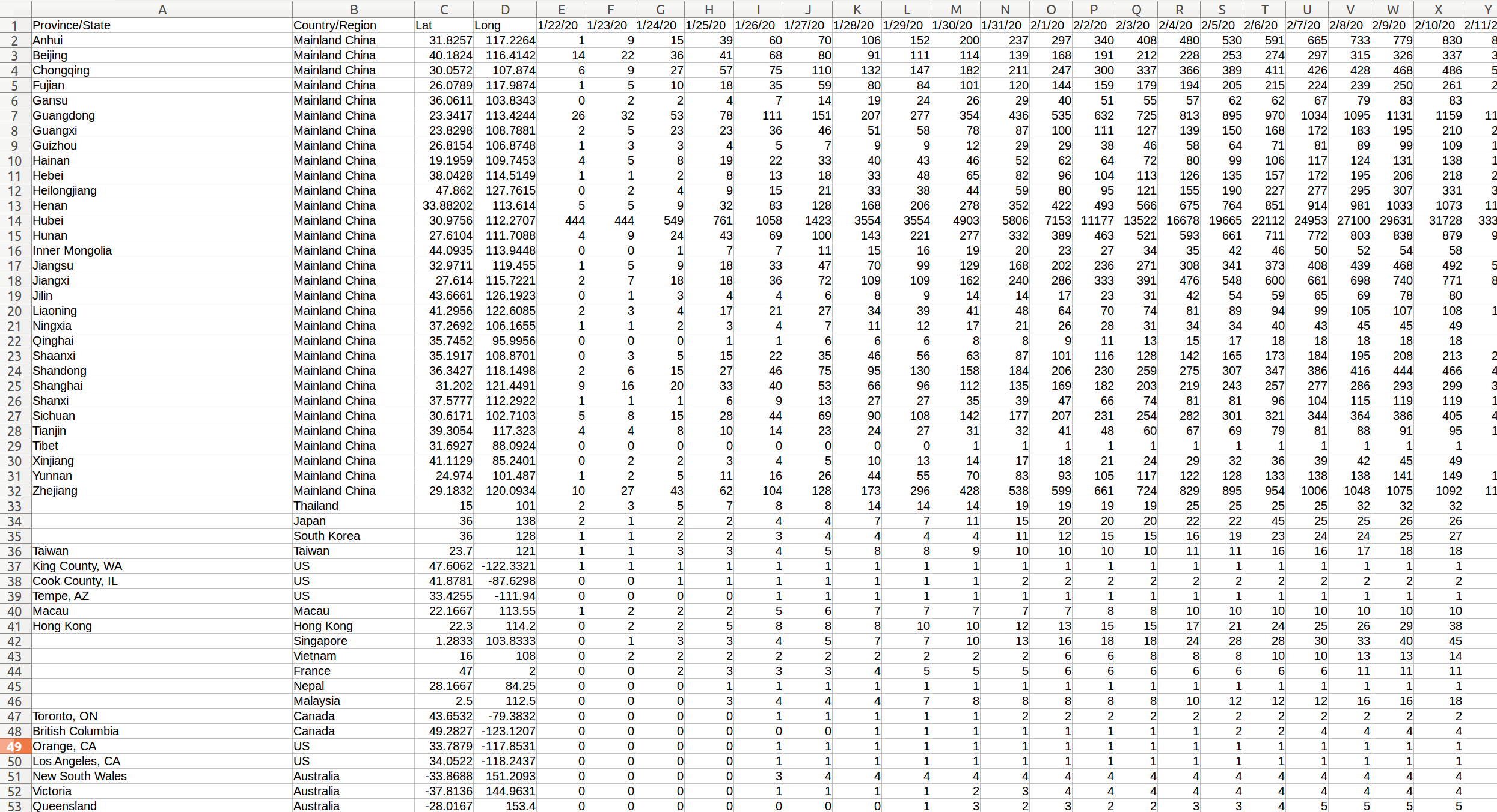
COVID-19 Data
github.com/CSSEGISandData/COVID-19
Tidy-tears
COVID-19 Latest
COVID-19 Latest (Mortality Rates)
Mortality Rates (China & !China)
ggplot() + scale_y_log10()
Corrected Mortality Rates (smooth infections)
smooth.spline(data$date, data$confirmed, spar = .5)
Corrected Mortality Rates (smooth deaths)
Corrected Mortality Rates
ggplot() + stat_smooth(method = 'lm')
Corrected Mortality Rates
Lag : 5 days from confirmed -> deceased
Mortality rate: 3.7%
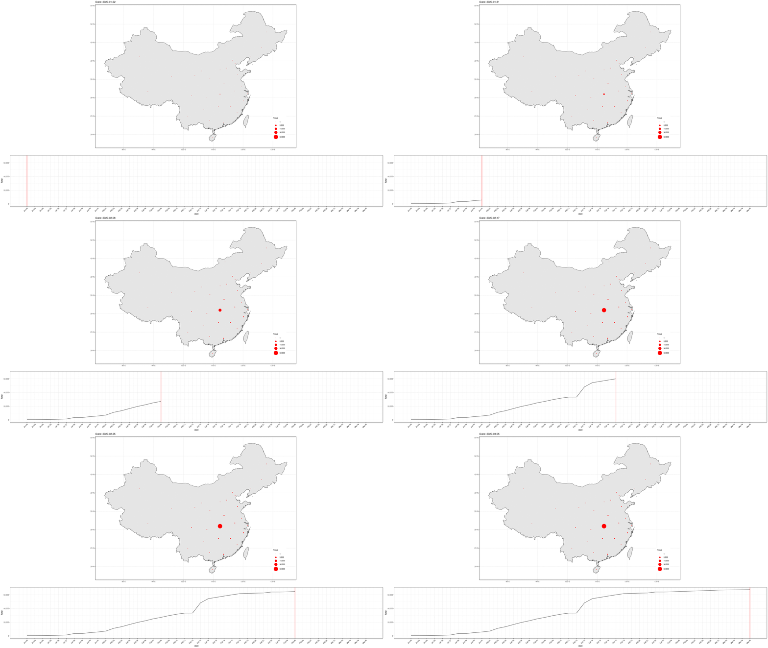
COVID-19 In Mainland China
library(sf)
geom_sf(data = china_provinces)
Can we do better?
Express the totals on an axis.
Drop the geography. Rather split on countries.
Focus on Top-n elements.
Perhaps scale the totals?
Elsewhere
Outbreak status by local gradient (ggplot)
Outbreak status by local gradient (d3)
Shifting the x-axis to match the outbreak stage
Build a “typical” growth line.
Shift each trajectory by country to “best-fit” existing trends.
Modelling the typical growth (0:12)
Modelling the typical growth (0:24)
Putting it together
- Mortality Rates
- Quarantine Policies
- Economic
R packages
- ioslides : for markdown-based presentations
- tidyr : for data preparation
- dplyr : to target an output format
- ggplot2 : for visualisation
- r2d3 : for better visualisation
