Updated Heatmaps and Dendrograms
Last updated: 2021-02-11
Checks: 6 1
Knit directory: esoph-micro-cancer-workflow/
This reproducible R Markdown analysis was created with workflowr (version 1.6.2). The Checks tab describes the reproducibility checks that were applied when the results were created. The Past versions tab lists the development history.
The R Markdown is untracked by Git. To know which version of the R Markdown file created these results, you’ll want to first commit it to the Git repo. If you’re still working on the analysis, you can ignore this warning. When you’re finished, you can run wflow_publish to commit the R Markdown file and build the HTML.
Great job! The global environment was empty. Objects defined in the global environment can affect the analysis in your R Markdown file in unknown ways. For reproduciblity it’s best to always run the code in an empty environment.
The command set.seed(20200916) was run prior to running the code in the R Markdown file. Setting a seed ensures that any results that rely on randomness, e.g. subsampling or permutations, are reproducible.
Great job! Recording the operating system, R version, and package versions is critical for reproducibility.
Nice! There were no cached chunks for this analysis, so you can be confident that you successfully produced the results during this run.
Great job! Using relative paths to the files within your workflowr project makes it easier to run your code on other machines.
Great! You are using Git for version control. Tracking code development and connecting the code version to the results is critical for reproducibility.
The results in this page were generated with repository version 285a2fb. See the Past versions tab to see a history of the changes made to the R Markdown and HTML files.
Note that you need to be careful to ensure that all relevant files for the analysis have been committed to Git prior to generating the results (you can use wflow_publish or wflow_git_commit). workflowr only checks the R Markdown file, but you know if there are other scripts or data files that it depends on. Below is the status of the Git repository when the results were generated:
Ignored files:
    Ignored:    .Rhistory
    Ignored:    .Rproj.user/
    Ignored:    data/

Untracked files:
    Untracked:  analysis/heatmaps-dendrograms-species-level.Rmd
    Untracked:  output/nci-species-lvl-heatmap-01-2021-02-11.pdf
    Untracked:  output/nci-species-lvl-heatmap-01-2021-02-11.png
    Untracked:  output/nci-species-lvl-heatmap-05-2021-02-11.pdf
    Untracked:  output/nci-species-lvl-heatmap-05-2021-02-11.png
    Untracked:  output/nci-specific-otus-heatmap-2021-02-11.pdf
    Untracked:  output/nci-specific-otus-heatmap-2021-02-11.png
    Untracked:  output/tcga-rna-species-lvl-heatmap-001-2021-02-11.pdf
    Untracked:  output/tcga-rna-species-lvl-heatmap-001-2021-02-11.png
    Untracked:  output/tcga-rna-species-lvl-heatmap-01-2021-02-11.pdf
    Untracked:  output/tcga-rna-species-lvl-heatmap-01-2021-02-11.png
    Untracked:  output/tcga-rna-species-lvl-heatmap-05-2021-02-11.pdf
    Untracked:  output/tcga-rna-species-lvl-heatmap-05-2021-02-11.png
    Untracked:  output/tcga-rna-specific-otus-heatmap-2021-02-11.pdf
    Untracked:  output/tcga-rna-specific-otus-heatmap-2021-02-11.png
    Untracked:  output/tcga-wgs-species-lvl-heatmap-001-2021-02-11.pdf
    Untracked:  output/tcga-wgs-species-lvl-heatmap-001-2021-02-11.png
    Untracked:  output/tcga-wgs-species-lvl-heatmap-01-2021-02-11.pdf
    Untracked:  output/tcga-wgs-species-lvl-heatmap-01-2021-02-11.png
    Untracked:  output/tcga-wgs-species-lvl-heatmap-05-2021-02-11.pdf
    Untracked:  output/tcga-wgs-species-lvl-heatmap-05-2021-02-11.png
    Untracked:  output/tcga-wgs-specific-otus-heatmap-2021-02-11.pdf
    Untracked:  output/tcga-wgs-specific-otus-heatmap-2021-02-11.png

Unstaged changes:
    Modified:   analysis/index.Rmd
Note that any generated files, e.g. HTML, png, CSS, etc., are not included in this status report because it is ok for generated content to have uncommitted changes.
There are no past versions. Publish this analysis with wflow_publish() to start tracking its development.
Intro
This page contains the updated code for generating the joint figures of heatmaps with the dendrogram. The update was needed to fix how the OTUs were subset based on average relative abundance. Prior to each heatmap will be a table of the OTUs that meet the given criteria.
I figured out that I originally subset based on the OTU relative abundance for each individual and sample, meaning that I subset according the just the raw Abundance irrespective of any OTU average abundance. This mistake is corrected in this document.
Heatmaps and Dendrograms
Species Level - NCI 16S Data
Relative Abudance Cutoff: 0.05
analysis.dat <- dat.16s # insert dataset to be used in analysis
avgRelAbundCutoff <- 0.05 # minimum average relative abundance for OTUs


otu.dat <- analysis.dat %>% filter(sample_type != "0") %>%
  dplyr::group_by(OTU) %>%
  dplyr::summarise(AverageRelativeAbundance=mean(Abundance))%>%
  dplyr::filter(AverageRelativeAbundance>=avgRelAbundCutoff) %>%
  dplyr::arrange(desc(AverageRelativeAbundance))

kable(otu.dat[,c(2,1)], format="html", digits=3) %>%
  kable_styling(full_width = T)%>%
scroll_box(width="100%", height="100%")| AverageRelativeAbundance | OTU |
|---|---|
| 0.250 | Streptococcus_dentisani:Streptococcus_infantis:Streptococcus_mitis:Streptococcus_oligofermentans:Streptococcus_oralis:Streptococcus_pneumoniae:Streptococcus_pseudopneumoniae:Streptococcus_sanguinis |
| 0.076 | Pseudomonas_rhodesiae |
| 0.058 | Prevotella_melaninogenica |
plot.dat <- analysis.dat %>% filter(sample_type != "0") %>%
  dplyr::group_by(OTU) %>%
  dplyr::mutate(aveAbund=mean(Abundance)) %>%
  dplyr::ungroup() %>%
  dplyr::filter(aveAbund>=avgRelAbundCutoff) %>%
  dplyr::mutate(ID = as.factor(accession.number)) %>%
  dplyr::select(sample_type, OTU, ID, Abundance, aveAbund)

plot.dat$OTU[plot.dat$OTU == "Streptococcus_dentisani:Streptococcus_infantis:Streptococcus_mitis:Streptococcus_oligofermentans:Streptococcus_oralis:Streptococcus_pneumoniae:Streptococcus_pseudopneumoniae:Streptococcus_sanguinis"] <- "Streptoccus spp.*"

# widen plot.dat for dendro
dat.wide <- plot.dat %>%
  dplyr::mutate(
    ID = paste0(ID, "_",sample_type)
  ) %>%
  dplyr::select(ID, OTU, Abundance) %>%
  dplyr::group_by(ID, OTU) %>%
  dplyr::summarise(
    Abundance = mean(Abundance)
  ) %>%
  tidyr::pivot_wider(
    id_cols = OTU,
    names_from = ID,
    values_from = Abundance,
    values_fill = 0
  )
rn <- dat.wide$OTU
mat <- as.matrix(dat.wide[,-1])
rownames(mat) <- rn

sample_names <- colnames(mat)

# Obtain the dendrogram
dend <- as.dendrogram(hclust(dist(mat)))
dend_data <- dendro_data(dend)

# Setup the data, so that the layout is inverted (this is more
# "clear" than simply using coord_flip())
segment_data <- with(
  segment(dend_data),
  data.frame(x = y, y = x, xend = yend, yend = xend))
# Use the dendrogram label data to position the gene labels
gene_pos_table <- with(
  dend_data$labels,
  data.frame(y_center = x, gene = as.character(label), height = 1))

# Table to position the samples
sample_pos_table <- data.frame(sample = sample_names) %>%
  dplyr::mutate(x_center = (1:n()),
         width = 1)

# Neglecting the gap parameters
heatmap_data <- mat %>%
  reshape2::melt(value.name = "expr", varnames = c("gene", "sample")) %>%
  left_join(gene_pos_table) %>%
  left_join(sample_pos_table)

# extract and rejoin sample IDs and sample_type names for plotting
# first for the heatmap data.frame
A <- str_split(heatmap_data$sample, "_")
heatmap_data$ID <- heatmap_data$sample_type <- "0"
for(i in 1:nrow(heatmap_data)){
  heatmap_data$ID[i] <- A[[i]][1]
  heatmap_data$sample_type[i] <- A[[i]][2]
}
# second for the sample position dataframe (dendo)
A <- str_split(sample_pos_table$sample, "_")
sample_pos_table$ID <- sample_pos_table$sample_type <- "0"
for(i in 1:nrow(sample_pos_table)){
  sample_pos_table$ID[i] <- A[[i]][1]
  sample_pos_table$sample_type[i] <- A[[i]][2]
}

# Limits for the vertical axes
gene_axis_limits <- with(
  gene_pos_table,
  c(min(y_center - 0.5 * height), max(y_center + 0.5 * height))
) +
  0.1 * c(-1, 1) # extra spacing: 0.1

## Build Heatmap Pieces
# by parts
hmd <- filter(heatmap_data, sample_type == "Barretts Only")
hmd$x_center <- as.numeric(as.factor(hmd$x_center))
spd <- filter(sample_pos_table, sample_type == "Barretts Only")
spd$x_center <- as.numeric(as.factor(spd$x_center))

plt_hmap1 <- ggplot(hmd,
                   aes(x = x_center, y = y_center, fill = expr,
                       height = height, width = width)) +
  geom_tile() +
  #facet_wrap(.~sample_type)+
  scale_fill_gradient2("Abundance",trans="sqrt", high = "darkred", low = "darkblue", breaks=c(0, 0.10, 0.30, 0.50, 0.80)) +
  scale_x_continuous(breaks = spd$x_center,
                     labels = spd$ID,
                     expand = c(0, 0)) +
  # For the y axis, alternatively set the labels as: gene_position_table$gene
  scale_y_continuous(breaks = gene_pos_table[, "y_center"],
                     labels = rep("", nrow(gene_pos_table)),
                     limits = gene_axis_limits,
                     expand = c(0, 0)) +
  labs(x = "BO", y = NULL) +
  theme_classic() +
  theme(axis.text.x = element_text(size = rel(1), hjust = 0.5,vjust=0.5, angle = 90),
        # margin: top, right, bottom, and left
        #axis.ticks.y = element_blank(),
        plot.margin = unit(c(1, 0.01, 0.01, -0.7), "cm"),
        panel.grid = element_blank(),
        legend.position = "none")

# Part 2: "EAC-adjacent tissue w/ Barretts History"
hmd <- filter(heatmap_data, sample_type == "EAC-adjacent tissue w/ Barretts History")
hmd$x_center <- as.numeric(as.factor(hmd$x_center))
spd <- filter(sample_pos_table, sample_type == "EAC-adjacent tissue w/ Barretts History")
spd$x_center <- as.numeric(as.factor(spd$x_center))

plt_hmap2 <- ggplot(hmd,
                    aes(x = x_center, y = y_center, fill = expr,
                        height = height, width = width)) +
  geom_tile() +
  #facet_wrap(.~sample_type)+
  scale_fill_gradient2("expr",trans="sqrt", high = "darkred", low = "darkblue", breaks=c(0, 0.1, 0.10, 0.30, 0.50, 0.80)) +
  scale_x_continuous(breaks = spd$x_center,
                     labels = spd$ID,
                     expand = c(0, 0)) +
  # For the y axis, alternatively set the labels as: gene_position_table$gene
  scale_y_continuous(breaks = gene_pos_table[, "y_center"],
                     labels = rep("", nrow(gene_pos_table)),
                     limits = gene_axis_limits,
                     expand = c(0, 0)) +
  labs(x = "EAC-adj. w/ Barretts", y = NULL) +
  theme_classic() +
  theme(axis.text.x = element_text(size = rel(1), hjust = 0.5,vjust=0.5, angle = 90),
        axis.ticks.y = element_blank(),
        # margin: top, right, bottom, and left
        plot.margin = unit(c(1, 0.01, 0.01, -0.7), "cm"),
        panel.grid.minor = element_blank(),
        legend.position = "none")

# Part 3: "EAC tissues w/ Barretts History"
hmd <- filter(heatmap_data, sample_type == "EAC tissues w/ Barretts History")
hmd$x_center <- as.numeric(as.factor(hmd$x_center))
spd <- filter(sample_pos_table, sample_type == "EAC tissues w/ Barretts History")
spd$x_center <- as.numeric(as.factor(spd$x_center))

plt_hmap3 <- ggplot(hmd,
                    aes(x = x_center, y = y_center, fill = expr,
                        height = height, width = width)) +
  geom_tile() +
  #facet_wrap(.~sample_type)+
  scale_fill_gradient2("Abundance",trans="sqrt", high = "darkred", low = "darkblue", breaks=c(0, 0.10, 0.30, 0.50, 0.80)) +
  scale_x_continuous(breaks = spd$x_center,
                     labels = spd$ID,
                     expand = c(0, 0)) +
  # For the y axis, alternatively set the labels as: gene_position_table$gene
  scale_y_continuous(breaks = gene_pos_table[, "y_center"],
                     labels = rep("", nrow(gene_pos_table)),
                     limits = gene_axis_limits,
                     expand = c(0, 0)) +
  labs(x = "EAC w/ Barretts", y = NULL) +
  theme_classic() +
  theme(axis.text.x = element_text(size = rel(1), hjust = 0.75, vjust=0.5, angle = 90),
        axis.ticks.y = element_blank(),
        # margin: top, right, bottom, and left
        plot.margin = unit(c(1, 0.01, 0.01, -0.7), "cm"),
        panel.grid.minor = element_blank())


# Dendrogram plot
plt_dendr <- ggplot(segment_data) +
  geom_segment(aes(x = x, y = y, xend = xend, yend = yend)) +
  scale_x_reverse(expand = c(0, 0.5)) +
  scale_y_continuous(breaks = gene_pos_table$y_center,
                     labels = gene_pos_table$gene,
                     limits = gene_axis_limits,
                     expand = c(0, 0)) +
  labs(x = "", y = "", colour = "", size = "") +
  theme_classic() +
  theme(panel.grid = element_blank(),
        axis.text.x = element_blank(),
        axis.ticks.x = element_blank(),
        plot.margin = unit(c(1, 0.01, 0.01, -0.7), "cm"))

prntRelAbund <- avgRelAbundCutoff*100
p <- plt_dendr+plt_hmap1+plt_hmap2+plt_hmap3+
plot_layout(
nrow=1, widths = c(0.2, 0.2, 1, 1),
guides="collect"
) +
plot_annotation(
title="NCI-16s Data showing average relative abundance of species level by individual",
subtitle=paste0("Subset to OTU average relative abundance > ",prntRelAbund,"%; *S. dentisani, S. infantis, S. mitis, S. oligofermentans, S. oralis, S. pneumoniae, S. pseudopneumoniae, S. sanguinis")
)
p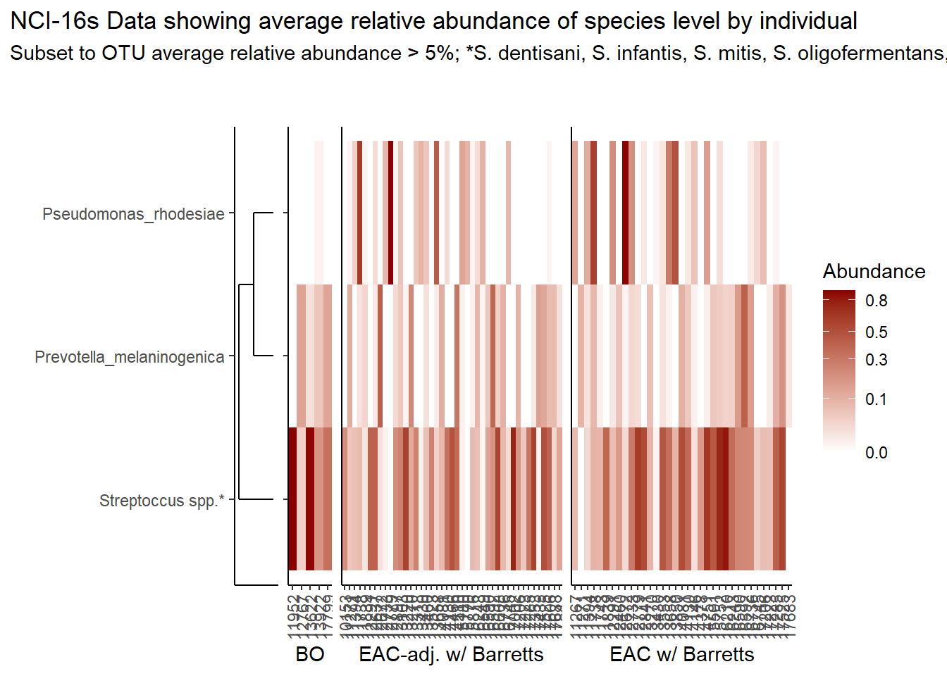
if(save.plots == T){
  ggsave(paste0("output/nci-species-lvl-heatmap-05-",save.Date,".pdf"), plot=p, units="in", width=20, height=5)
  ggsave(paste0("output/nci-species-lvl-heatmap-05-",save.Date,".png"), plot=p, units="in", width=20, height=5)
}
Relative Abudance Cutoff: 0.01
analysis.dat <- dat.16s # insert dataset to be used in analysis
avgRelAbundCutoff <- 0.01 # minimum average relative abundance for OTUs


otu.dat <- analysis.dat %>% filter(sample_type != "0") %>%
  dplyr::group_by(OTU) %>%
  dplyr::summarise(AverageRelativeAbundance=mean(Abundance))%>%
  dplyr::filter(AverageRelativeAbundance>=avgRelAbundCutoff) %>%
  dplyr::arrange(desc(AverageRelativeAbundance))

kable(otu.dat[,c(2,1)], format="html", digits=3) %>%
  kable_styling(full_width = T)%>%
scroll_box(width="100%", height="400px")| AverageRelativeAbundance | OTU |
|---|---|
| 0.250 | Streptococcus_dentisani:Streptococcus_infantis:Streptococcus_mitis:Streptococcus_oligofermentans:Streptococcus_oralis:Streptococcus_pneumoniae:Streptococcus_pseudopneumoniae:Streptococcus_sanguinis |
| 0.076 | Pseudomonas_rhodesiae |
| 0.058 | Prevotella_melaninogenica |
| 0.046 | Stenotrophomonas_maltophilia |
| 0.042 | Lactobacillus_gasseri:Lactobacillus_johnsonii |
| 0.041 | Veillonella_dispar |
| 0.034 | Acinetobacter_guillouiae |
| 0.031 | Fusobacterium_nucleatum |
| 0.025 | Rothia_mucilaginosa |
| 0.024 | Staphylococcus_epidermidis:Staphylococcus_hominis |
| 0.022 | Gemella_haemolysans |
| 0.018 | Selenomonas_sputigena |
| 0.017 | Granulicatella_adiacens:Granulicatella_paraadiacens |
| 0.017 | Haemophilus_parainfluenzae |
| 0.016 | otu19913:Actinobacillus_minor:Actinobacillus_porcinus:Actinobacillus_rossii:Haemophilus_paraphrohaemolyticus |
| 0.012 | otu16698:Tannerella_forsythia |
| 0.011 | Actinomyces_odontolyticus |
| 0.010 | Clostridium_perfringens:Clostridium_thermophilus |
plot.dat <- analysis.dat %>% filter(sample_type != "0") %>%
  dplyr::group_by(OTU) %>%
  dplyr::mutate(aveAbund=mean(Abundance)) %>%
  dplyr::ungroup() %>%
  dplyr::filter(aveAbund>=avgRelAbundCutoff) %>%
  dplyr::mutate(ID = as.factor(accession.number)) %>%
  dplyr::select(sample_type, OTU, ID, Abundance, aveAbund)

plot.dat$OTU[plot.dat$OTU == "Streptococcus_dentisani:Streptococcus_infantis:Streptococcus_mitis:Streptococcus_oligofermentans:Streptococcus_oralis:Streptococcus_pneumoniae:Streptococcus_pseudopneumoniae:Streptococcus_sanguinis"] <- "Streptoccus spp.*"

# widen plot.dat for dendro
dat.wide <- plot.dat %>%
  dplyr::mutate(
    ID = paste0(ID, "_",sample_type)
  ) %>%
  dplyr::select(ID, OTU, Abundance) %>%
  dplyr::group_by(ID, OTU) %>%
  dplyr::summarise(
    Abundance = mean(Abundance)
  ) %>%
  tidyr::pivot_wider(
    id_cols = OTU,
    names_from = ID,
    values_from = Abundance,
    values_fill = 0
  )
rn <- dat.wide$OTU
mat <- as.matrix(dat.wide[,-1])
rownames(mat) <- rn

sample_names <- colnames(mat)

# Obtain the dendrogram
dend <- as.dendrogram(hclust(dist(mat)))
dend_data <- dendro_data(dend)

# Setup the data, so that the layout is inverted (this is more
# "clear" than simply using coord_flip())
segment_data <- with(
  segment(dend_data),
  data.frame(x = y, y = x, xend = yend, yend = xend))
# Use the dendrogram label data to position the gene labels
gene_pos_table <- with(
  dend_data$labels,
  data.frame(y_center = x, gene = as.character(label), height = 1))

# Table to position the samples
sample_pos_table <- data.frame(sample = sample_names) %>%
  dplyr::mutate(x_center = (1:n()),
         width = 1)

# Neglecting the gap parameters
heatmap_data <- mat %>%
  reshape2::melt(value.name = "expr", varnames = c("gene", "sample")) %>%
  left_join(gene_pos_table) %>%
  left_join(sample_pos_table)

# extract and rejoin sample IDs and sample_type names for plotting
# first for the heatmap data.frame
A <- str_split(heatmap_data$sample, "_")
heatmap_data$ID <- heatmap_data$sample_type <- "0"
for(i in 1:nrow(heatmap_data)){
  heatmap_data$ID[i] <- A[[i]][1]
  heatmap_data$sample_type[i] <- A[[i]][2]
}
# second for the sample position dataframe (dendo)
A <- str_split(sample_pos_table$sample, "_")
sample_pos_table$ID <- sample_pos_table$sample_type <- "0"
for(i in 1:nrow(sample_pos_table)){
  sample_pos_table$ID[i] <- A[[i]][1]
  sample_pos_table$sample_type[i] <- A[[i]][2]
}

# Limits for the vertical axes
gene_axis_limits <- with(
  gene_pos_table,
  c(min(y_center - 0.5 * height), max(y_center + 0.5 * height))
) +
  0.1 * c(-1, 1) # extra spacing: 0.1

## Build Heatmap Pieces
# by parts
hmd <- filter(heatmap_data, sample_type == "Barretts Only")
hmd$x_center <- as.numeric(as.factor(hmd$x_center))
spd <- filter(sample_pos_table, sample_type == "Barretts Only")
spd$x_center <- as.numeric(as.factor(spd$x_center))

plt_hmap1 <- ggplot(hmd,
                   aes(x = x_center, y = y_center, fill = expr,
                       height = height, width = width)) +
  geom_tile() +
  #facet_wrap(.~sample_type)+
  scale_fill_gradient2("Abundance",trans="sqrt", high = "darkred", low = "darkblue", breaks=c(0, 0.10, 0.30, 0.50, 0.80)) +
  scale_x_continuous(breaks = spd$x_center,
                     labels = spd$ID,
                     expand = c(0, 0)) +
  # For the y axis, alternatively set the labels as: gene_position_table$gene
  scale_y_continuous(breaks = gene_pos_table[, "y_center"],
                     labels = rep("", nrow(gene_pos_table)),
                     limits = gene_axis_limits,
                     expand = c(0, 0)) +
  labs(x = "BO", y = NULL) +
  theme_classic() +
  theme(axis.text.x = element_text(size = rel(1), hjust = 0.5,vjust=0.5, angle = 90),
        # margin: top, right, bottom, and left
        #axis.ticks.y = element_blank(),
        plot.margin = unit(c(1, 0.01, 0.01, -0.7), "cm"),
        panel.grid = element_blank(),
        legend.position = "none")

# Part 2: "EAC-adjacent tissue w/ Barretts History"
hmd <- filter(heatmap_data, sample_type == "EAC-adjacent tissue w/ Barretts History")
hmd$x_center <- as.numeric(as.factor(hmd$x_center))
spd <- filter(sample_pos_table, sample_type == "EAC-adjacent tissue w/ Barretts History")
spd$x_center <- as.numeric(as.factor(spd$x_center))

plt_hmap2 <- ggplot(hmd,
                    aes(x = x_center, y = y_center, fill = expr,
                        height = height, width = width)) +
  geom_tile() +
  #facet_wrap(.~sample_type)+
  scale_fill_gradient2("expr",trans="sqrt", high = "darkred", low = "darkblue", breaks=c(0, 0.1, 0.10, 0.30, 0.50, 0.80)) +
  scale_x_continuous(breaks = spd$x_center,
                     labels = spd$ID,
                     expand = c(0, 0)) +
  # For the y axis, alternatively set the labels as: gene_position_table$gene
  scale_y_continuous(breaks = gene_pos_table[, "y_center"],
                     labels = rep("", nrow(gene_pos_table)),
                     limits = gene_axis_limits,
                     expand = c(0, 0)) +
  labs(x = "EAC-adj. w/ Barretts", y = NULL) +
  theme_classic() +
  theme(axis.text.x = element_text(size = rel(1), hjust = 0.5,vjust=0.5, angle = 90),
        axis.ticks.y = element_blank(),
        # margin: top, right, bottom, and left
        plot.margin = unit(c(1, 0.01, 0.01, -0.7), "cm"),
        panel.grid.minor = element_blank(),
        legend.position = "none")

# Part 3: "EAC tissues w/ Barretts History"
hmd <- filter(heatmap_data, sample_type == "EAC tissues w/ Barretts History")
hmd$x_center <- as.numeric(as.factor(hmd$x_center))
spd <- filter(sample_pos_table, sample_type == "EAC tissues w/ Barretts History")
spd$x_center <- as.numeric(as.factor(spd$x_center))

plt_hmap3 <- ggplot(hmd,
                    aes(x = x_center, y = y_center, fill = expr,
                        height = height, width = width)) +
  geom_tile() +
  #facet_wrap(.~sample_type)+
  scale_fill_gradient2("Abundance",trans="sqrt", high = "darkred", low = "darkblue", breaks=c(0, 0.10, 0.30, 0.50, 0.80)) +
  scale_x_continuous(breaks = spd$x_center,
                     labels = spd$ID,
                     expand = c(0, 0)) +
  # For the y axis, alternatively set the labels as: gene_position_table$gene
  scale_y_continuous(breaks = gene_pos_table[, "y_center"],
                     labels = rep("", nrow(gene_pos_table)),
                     limits = gene_axis_limits,
                     expand = c(0, 0)) +
  labs(x = "EAC w/ Barretts", y = NULL) +
  theme_classic() +
  theme(axis.text.x = element_text(size = rel(1), hjust = 0.75, vjust=0.5, angle = 90),
        axis.ticks.y = element_blank(),
        # margin: top, right, bottom, and left
        plot.margin = unit(c(1, 0.01, 0.01, -0.7), "cm"),
        panel.grid.minor = element_blank())


# Dendrogram plot
plt_dendr <- ggplot(segment_data) +
  geom_segment(aes(x = x, y = y, xend = xend, yend = yend)) +
  scale_x_reverse(expand = c(0, 0.5)) +
  scale_y_continuous(breaks = gene_pos_table$y_center,
                     labels = gene_pos_table$gene,
                     limits = gene_axis_limits,
                     expand = c(0, 0)) +
  labs(x = "", y = "", colour = "", size = "") +
  theme_classic() +
  theme(panel.grid = element_blank(),
        axis.text.x = element_blank(),
        axis.ticks.x = element_blank(),
        plot.margin = unit(c(1, 0.01, 0.01, -0.7), "cm"))

prntRelAbund <- avgRelAbundCutoff*100
p <- plt_dendr+plt_hmap1+plt_hmap2+plt_hmap3+
plot_layout(
nrow=1, widths = c(0.5, 0.2, 1, 1),
guides="collect"
) +
plot_annotation(
title="NCI-16s Data showing average relative abundance of genera by individual",
subtitle=paste0("Subset to OTU average relative abundance > ",prntRelAbund,"%")
)
p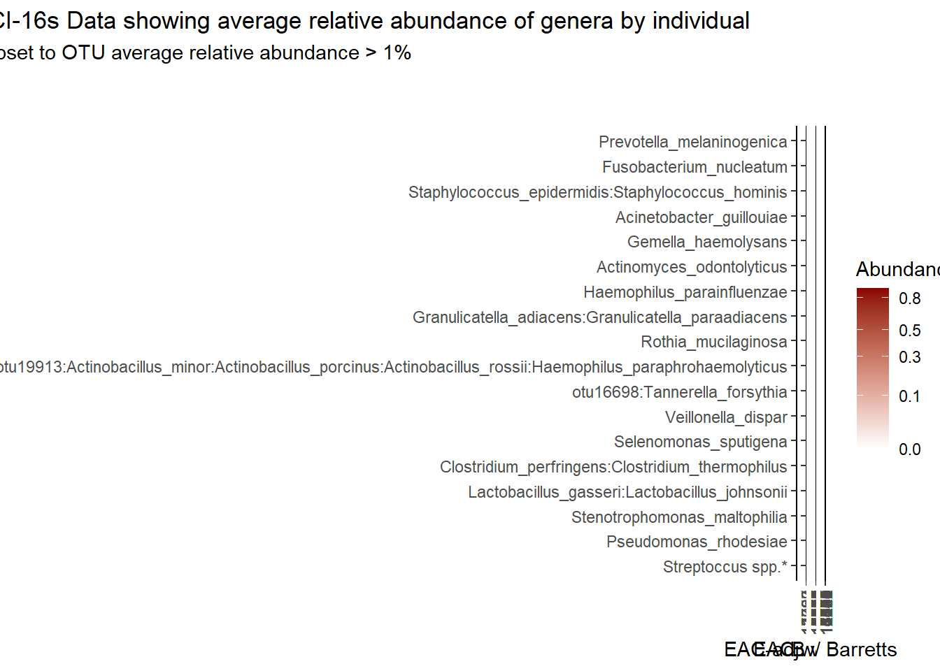
if(save.plots == T){
  ggsave(paste0("output/nci-species-lvl-heatmap-01-",save.Date,".pdf"), plot=p, units="in", width=25, height=7)
  ggsave(paste0("output/nci-species-lvl-heatmap-01-",save.Date,".png"), plot=p, units="in", width=25, height=7)
}
Specific OTUs
p <- plt_dendr+plt_hmap1+plt_hmap2+plt_hmap3+ plt_hmap4+
  plot_layout(
    nrow=1, widths = c(0.2, 0.2, 1, 1, 1),
    guides="collect"
  ) +
  plot_annotation(
    title="NCI-16s Data showing average relative abundance of specific OTUs by individual"
  )
p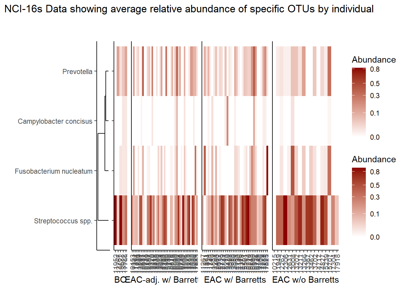
if(save.plots == T){
  ggsave(paste0("output/nci-specific-otus-heatmap-",save.Date,".pdf"), plot=p, units="in", width=25, height=5)
  ggsave(paste0("output/nci-specific-otus-heatmap-",save.Date,".png"), plot=p, units="in", width=25, height=5)
}
Species Level - TCGA RNAseq Data
The heatmaps for slide 6 focus on the TCGA RNAseq data.
Relative Abudance Cutoff: 0.05
analysis.dat <- dat.rna %>%
  dplyr::mutate(OTU = otu2) # insert dataset to be used in analysis
avgRelAbundCutoff <- 0.05 # minimum average relative abundance for OTUs


otu.dat <- analysis.dat %>% filter(sample_type != "0") %>%
  dplyr::group_by(OTU) %>%
  dplyr::summarise(AverageRelativeAbundance=mean(Abundance, na.rm=T))%>%
  dplyr::filter(AverageRelativeAbundance>=avgRelAbundCutoff) %>%
  dplyr::arrange(desc(AverageRelativeAbundance))

kable(otu.dat[,c(2,1)], format="html", digits=3) %>%
  kable_styling(full_width = T)%>%
scroll_box(width="100%", height="100%")| AverageRelativeAbundance | OTU |
|---|---|
| 0.426 | Pseudomonas fluorescens group |
| 0.320 | Pseudomonas sp. UW4 |
| 0.075 | Arthrobacter phenanthrenivorans |
plot.dat <- analysis.dat %>% filter(sample_type != "0") %>%
  dplyr::group_by(OTU) %>%
  dplyr::mutate(aveAbund=mean(Abundance, na.rm=T)) %>%
  dplyr::ungroup() %>%
  dplyr::filter(aveAbund>=avgRelAbundCutoff) %>%
  dplyr::mutate(ID = as.factor(Patient_ID),
                Abundance = ifelse(is.na(Abundance), 0, Abundance)) %>%
  dplyr::select(sample_type, OTU, ID, Abundance, aveAbund)


# widen plot.dat for dendro
dat.wide <- plot.dat %>%
  dplyr::mutate(
    ID = paste0(ID, "_",sample_type)
  ) %>%
  dplyr::select(ID, OTU, Abundance) %>%
  dplyr::group_by(ID, OTU) %>%
  dplyr::summarise(
    Abundance = mean(Abundance)
  ) %>%
  tidyr::pivot_wider(
    id_cols = OTU,
    names_from = ID,
    values_from = Abundance,
    values_fill = 0
  )
rn <- dat.wide$OTU
mat <- as.matrix(dat.wide[,-1])
rownames(mat) <- rn

sample_names <- colnames(mat)

# Obtain the dendrogram
dend <- as.dendrogram(hclust(dist(mat)))
dend_data <- dendro_data(dend)

# Setup the data, so that the layout is inverted (this is more
# "clear" than simply using coord_flip())
segment_data <- with(
  segment(dend_data),
  data.frame(x = y, y = x, xend = yend, yend = xend))
# Use the dendrogram label data to position the gene labels
gene_pos_table <- with(
  dend_data$labels,
  data.frame(y_center = x, gene = as.character(label), height = 1))

# Table to position the samples
sample_pos_table <- data.frame(sample = sample_names) %>%
  dplyr::mutate(x_center = (1:n()),
         width = 1)

# Neglecting the gap parameters
heatmap_data <- mat %>%
  reshape2::melt(value.name = "expr", varnames = c("gene", "sample")) %>%
  left_join(gene_pos_table) %>%
  left_join(sample_pos_table)

# extract and rejoin sample IDs and sample_type names for plotting
# first for the heatmap data.frame
A <- str_split(heatmap_data$sample, "_")
heatmap_data$ID <- heatmap_data$sample_type <- "0"
for(i in 1:nrow(heatmap_data)){
  heatmap_data$ID[i] <- A[[i]][1]
  heatmap_data$sample_type[i] <- A[[i]][2]
}
# second for the sample position dataframe (dendo)
A <- str_split(sample_pos_table$sample, "_")
sample_pos_table$ID <- sample_pos_table$sample_type <- "0"
for(i in 1:nrow(sample_pos_table)){
  sample_pos_table$ID[i] <- A[[i]][1]
  sample_pos_table$sample_type[i] <- A[[i]][2]
}

# Limits for the vertical axes
gene_axis_limits <- with(
  gene_pos_table,
  c(min(y_center - 0.5 * height), max(y_center + 0.5 * height))
) +
  0.1 * c(-1, 1) # extra spacing: 0.1

## Build Heatmap Pieces
# EAC w/ Barrets
hmd <- filter(heatmap_data, sample_type == "EAC tissues w/ Barretts History")
hmd$x_center <- as.numeric(as.factor(hmd$x_center))
spd <- filter(sample_pos_table, sample_type == "EAC tissues w/ Barretts History")
spd$x_center <- as.numeric(as.factor(spd$x_center))

plt_hmap1 <- ggplot(hmd,
                   aes(x = x_center, y = y_center, fill = expr,
                       height = height, width = width)) +
  geom_tile() +
  #facet_wrap(.~sample_type)+
  scale_fill_gradient2("Abundance",trans="sqrt", high = "darkred", low = "darkblue", breaks=c(0, 0.10, 0.30, 0.50, 0.80)) +
  scale_x_continuous(breaks = spd$x_center,
                     labels = spd$ID,
                     expand = c(0, 0)) +
  # For the y axis, alternatively set the labels as: gene_position_table$gene
  scale_y_continuous(breaks = gene_pos_table[, "y_center"],
                     labels = rep("", nrow(gene_pos_table)),
                     limits = gene_axis_limits,
                     expand = c(0, 0)) +
  labs(x = "EAC w/ Barretts", y = NULL) +
  theme_classic() +
  theme(axis.text.x = element_text(size = rel(1), hjust = 0.5,vjust=0.5, angle = 90),
        # margin: top, right, bottom, and left
        #axis.ticks.y = element_blank(),
        plot.margin = unit(c(1, 0.01, 0.01, -0.7), "cm"),
        panel.grid = element_blank(),
        legend.position = "none")

# Part 2: "EAC-adjacent tissue w/ Barretts History"
hmd <- filter(heatmap_data, sample_type == "EAC-adjacent tissue w/ Barretts History")
hmd$x_center <- as.numeric(as.factor(hmd$x_center))
spd <- filter(sample_pos_table, sample_type == "EAC-adjacent tissue w/ Barretts History")
spd$x_center <- as.numeric(as.factor(spd$x_center))

plt_hmap2 <- ggplot(hmd,
                    aes(x = x_center, y = y_center, fill = expr,
                        height = height, width = width)) +
  geom_tile() +
  #facet_wrap(.~sample_type)+
  scale_fill_gradient2("expr",trans="sqrt", high = "darkred", low = "darkblue", breaks=c(0, 0.1, 0.10, 0.30, 0.50, 0.80)) +
  scale_x_continuous(breaks = spd$x_center,
                     labels = spd$ID,
                     expand = c(0, 0)) +
  # For the y axis, alternatively set the labels as: gene_position_table$gene
  scale_y_continuous(breaks = gene_pos_table[, "y_center"],
                     labels = rep("", nrow(gene_pos_table)),
                     limits = gene_axis_limits,
                     expand = c(0, 0)) +
  labs(x = "EAC-adj. w/ Barretts", y = NULL) +
  theme_classic() +
  theme(axis.text.x = element_text(size = rel(1), hjust = 0.5,vjust=0.5, angle = 90),
        axis.ticks.y = element_blank(),
        # margin: top, right, bottom, and left
        plot.margin = unit(c(1, 0.01, 0.01, -0.7), "cm"),
        panel.grid.minor = element_blank(),
        legend.position = "none")

# Part 3: "EAC tissues w/o Barretts History"
hmd <- filter(heatmap_data, sample_type == "EAC tissues w/o Barretts History")
hmd$x_center <- as.numeric(as.factor(hmd$x_center))
spd <- filter(sample_pos_table, sample_type == "EAC tissues w/o Barretts History")
spd$x_center <- as.numeric(as.factor(spd$x_center))

plt_hmap3 <- ggplot(hmd,
                    aes(x = x_center, y = y_center, fill = expr,
                        height = height, width = width)) +
  geom_tile() +
  #facet_wrap(.~sample_type)+
  scale_fill_gradient2("Abundance",trans="sqrt", high = "darkred", low = "darkblue", breaks=c(0, 0.10, 0.30, 0.50, 0.80)) +
  scale_x_continuous(breaks = spd$x_center,
                     labels = spd$ID,
                     expand = c(0, 0)) +
  # For the y axis, alternatively set the labels as: gene_position_table$gene
  scale_y_continuous(breaks = gene_pos_table[, "y_center"],
                     labels = rep("", nrow(gene_pos_table)),
                     limits = gene_axis_limits,
                     expand = c(0, 0)) +
  labs(x = "EAC w/o Barretts", y = NULL) +
  theme_classic() +
  theme(axis.text.x = element_text(size = rel(1), hjust = 0.75, vjust=0.5, angle = 90),
        axis.ticks.y = element_blank(),
        # margin: top, right, bottom, and left
        plot.margin = unit(c(1, 0.01, 0.01, -0.7), "cm"),
        panel.grid.minor = element_blank())


# Dendrogram plot
plt_dendr <- ggplot(segment_data) +
  geom_segment(aes(x = x, y = y, xend = xend, yend = yend)) +
  scale_x_reverse(expand = c(0, 0.5)) +
  scale_y_continuous(breaks = gene_pos_table$y_center,
                     labels = gene_pos_table$gene,
                     limits = gene_axis_limits,
                     expand = c(0, 0)) +
  labs(x = "", y = "", colour = "", size = "") +
  theme_classic() +
  theme(panel.grid = element_blank(),
        axis.text.x = element_blank(),
        axis.ticks.x = element_blank(),
        plot.margin = unit(c(1, 0.01, 0.01, -0.7), "cm"))

prntRelAbund <- avgRelAbundCutoff*100
p <- plt_dendr+plt_hmap1+plt_hmap2+plt_hmap3+
plot_layout(
nrow=1, widths = c(0.2, 0.4, 0.15, 1),
guides="collect"
) +
plot_annotation(
title="TCGA RNAseq Data showing average relative abundance of species by individual",
subtitle=paste0("Subset to OTU average relative abundance > ",prntRelAbund,"%")
)
p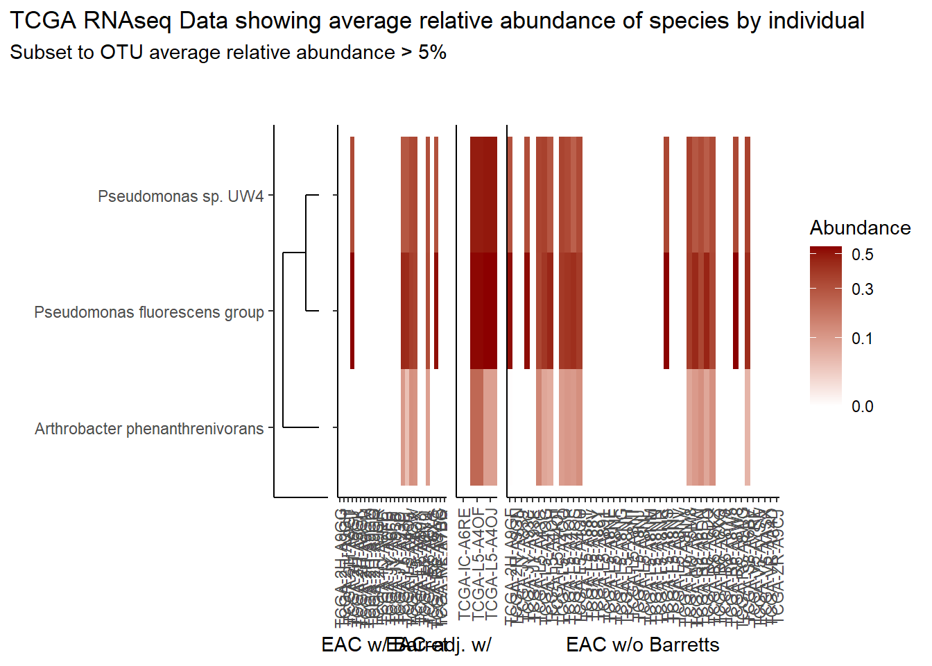
if(save.plots == T){
  ggsave(paste0("output/tcga-rna-species-lvl-heatmap-05-",save.Date,".pdf"), plot=p, units="in", width=25, height=5)
  ggsave(paste0("output/tcga-rna-species-lvl-heatmap-05-",save.Date,".png"), plot=p, units="in", width=25, height=5)
}
Relative Abudance Cutoff: 0.01
analysis.dat <- dat.rna %>%
  dplyr::mutate(OTU = otu2) # insert dataset to be used in analysis
avgRelAbundCutoff <- 0.01 # minimum average relative abundance for OTUs


otu.dat <- analysis.dat %>% filter(sample_type != "0") %>%
  dplyr::group_by(OTU) %>%
  dplyr::summarise(AverageRelativeAbundance=mean(Abundance, na.rm=T))%>%
  dplyr::filter(AverageRelativeAbundance>=avgRelAbundCutoff) %>%
  dplyr::arrange(desc(AverageRelativeAbundance))

kable(otu.dat[,c(2,1)], format="html", digits=3) %>%
  kable_styling(full_width = T)%>%
scroll_box(width="100%", height="100%")| AverageRelativeAbundance | OTU |
|---|---|
| 0.426 | Pseudomonas fluorescens group |
| 0.320 | Pseudomonas sp. UW4 |
| 0.075 | Arthrobacter phenanthrenivorans |
| 0.041 | Pseudomonas sp. UK4 |
| 0.029 | Bradyrhizobium sp. BTAi1 |
| 0.027 | Pseudomonas putida group |
| 0.011 | Bacillus cereus group |
plot.dat <- analysis.dat %>% filter(sample_type != "0") %>%
  dplyr::group_by(OTU) %>%
  dplyr::mutate(aveAbund=mean(Abundance, na.rm=T)) %>%
  dplyr::ungroup() %>%
  dplyr::filter(aveAbund>=avgRelAbundCutoff) %>%
  dplyr::mutate(ID = as.factor(Patient_ID),
                Abundance = ifelse(is.na(Abundance), 0, Abundance)) %>%
  dplyr::select(sample_type, OTU, ID, Abundance, aveAbund)


# widen plot.dat for dendro
dat.wide <- plot.dat %>%
  dplyr::mutate(
    ID = paste0(ID, "_",sample_type)
  ) %>%
  dplyr::select(ID, OTU, Abundance) %>%
  dplyr::group_by(ID, OTU) %>%
  dplyr::summarise(
    Abundance = mean(Abundance)
  ) %>%
  tidyr::pivot_wider(
    id_cols = OTU,
    names_from = ID,
    values_from = Abundance,
    values_fill = 0
  )
rn <- dat.wide$OTU
mat <- as.matrix(dat.wide[,-1])
rownames(mat) <- rn

sample_names <- colnames(mat)

# Obtain the dendrogram
dend <- as.dendrogram(hclust(dist(mat)))
dend_data <- dendro_data(dend)

# Setup the data, so that the layout is inverted (this is more
# "clear" than simply using coord_flip())
segment_data <- with(
  segment(dend_data),
  data.frame(x = y, y = x, xend = yend, yend = xend))
# Use the dendrogram label data to position the gene labels
gene_pos_table <- with(
  dend_data$labels,
  data.frame(y_center = x, gene = as.character(label), height = 1))

# Table to position the samples
sample_pos_table <- data.frame(sample = sample_names) %>%
  dplyr::mutate(x_center = (1:n()),
         width = 1)

# Neglecting the gap parameters
heatmap_data <- mat %>%
  reshape2::melt(value.name = "expr", varnames = c("gene", "sample")) %>%
  left_join(gene_pos_table) %>%
  left_join(sample_pos_table)

# extract and rejoin sample IDs and sample_type names for plotting
# first for the heatmap data.frame
A <- str_split(heatmap_data$sample, "_")
heatmap_data$ID <- heatmap_data$sample_type <- "0"
for(i in 1:nrow(heatmap_data)){
  heatmap_data$ID[i] <- A[[i]][1]
  heatmap_data$sample_type[i] <- A[[i]][2]
}
# second for the sample position dataframe (dendo)
A <- str_split(sample_pos_table$sample, "_")
sample_pos_table$ID <- sample_pos_table$sample_type <- "0"
for(i in 1:nrow(sample_pos_table)){
  sample_pos_table$ID[i] <- A[[i]][1]
  sample_pos_table$sample_type[i] <- A[[i]][2]
}

# Limits for the vertical axes
gene_axis_limits <- with(
  gene_pos_table,
  c(min(y_center - 0.5 * height), max(y_center + 0.5 * height))
) +
  0.1 * c(-1, 1) # extra spacing: 0.1

## Build Heatmap Pieces
# EAC w/ Barrets
hmd <- filter(heatmap_data, sample_type == "EAC tissues w/ Barretts History")
hmd$x_center <- as.numeric(as.factor(hmd$x_center))
spd <- filter(sample_pos_table, sample_type == "EAC tissues w/ Barretts History")
spd$x_center <- as.numeric(as.factor(spd$x_center))

plt_hmap1 <- ggplot(hmd,
                   aes(x = x_center, y = y_center, fill = expr,
                       height = height, width = width)) +
  geom_tile() +
  #facet_wrap(.~sample_type)+
  scale_fill_gradient2("Abundance",trans="sqrt", high = "darkred", low = "darkblue", breaks=c(0, 0.10, 0.30, 0.50, 0.80)) +
  scale_x_continuous(breaks = spd$x_center,
                     labels = spd$ID,
                     expand = c(0, 0)) +
  # For the y axis, alternatively set the labels as: gene_position_table$gene
  scale_y_continuous(breaks = gene_pos_table[, "y_center"],
                     labels = rep("", nrow(gene_pos_table)),
                     limits = gene_axis_limits,
                     expand = c(0, 0)) +
  labs(x = "EAC w/ Barretts", y = NULL) +
  theme_classic() +
  theme(axis.text.x = element_text(size = rel(1), hjust = 0.5,vjust=0.5, angle = 90),
        # margin: top, right, bottom, and left
        #axis.ticks.y = element_blank(),
        plot.margin = unit(c(1, 0.01, 0.01, -0.7), "cm"),
        panel.grid = element_blank(),
        legend.position = "none")

# Part 2: "EAC-adjacent tissue w/ Barretts History"
hmd <- filter(heatmap_data, sample_type == "EAC-adjacent tissue w/ Barretts History")
hmd$x_center <- as.numeric(as.factor(hmd$x_center))
spd <- filter(sample_pos_table, sample_type == "EAC-adjacent tissue w/ Barretts History")
spd$x_center <- as.numeric(as.factor(spd$x_center))

plt_hmap2 <- ggplot(hmd,
                    aes(x = x_center, y = y_center, fill = expr,
                        height = height, width = width)) +
  geom_tile() +
  #facet_wrap(.~sample_type)+
  scale_fill_gradient2("expr",trans="sqrt", high = "darkred", low = "darkblue", breaks=c(0, 0.1, 0.10, 0.30, 0.50, 0.80)) +
  scale_x_continuous(breaks = spd$x_center,
                     labels = spd$ID,
                     expand = c(0, 0)) +
  # For the y axis, alternatively set the labels as: gene_position_table$gene
  scale_y_continuous(breaks = gene_pos_table[, "y_center"],
                     labels = rep("", nrow(gene_pos_table)),
                     limits = gene_axis_limits,
                     expand = c(0, 0)) +
  labs(x = "EAC-adj. w/ Barretts", y = NULL) +
  theme_classic() +
  theme(axis.text.x = element_text(size = rel(1), hjust = 0.5,vjust=0.5, angle = 90),
        axis.ticks.y = element_blank(),
        # margin: top, right, bottom, and left
        plot.margin = unit(c(1, 0.01, 0.01, -0.7), "cm"),
        panel.grid.minor = element_blank(),
        legend.position = "none")

# Part 3: "EAC tissues w/o Barretts History"
hmd <- filter(heatmap_data, sample_type == "EAC tissues w/o Barretts History")
hmd$x_center <- as.numeric(as.factor(hmd$x_center))
spd <- filter(sample_pos_table, sample_type == "EAC tissues w/o Barretts History")
spd$x_center <- as.numeric(as.factor(spd$x_center))

plt_hmap3 <- ggplot(hmd,
                    aes(x = x_center, y = y_center, fill = expr,
                        height = height, width = width)) +
  geom_tile() +
  #facet_wrap(.~sample_type)+
  scale_fill_gradient2("Abundance",trans="sqrt", high = "darkred", low = "darkblue", breaks=c(0, 0.10, 0.30, 0.50, 0.80)) +
  scale_x_continuous(breaks = spd$x_center,
                     labels = spd$ID,
                     expand = c(0, 0)) +
  # For the y axis, alternatively set the labels as: gene_position_table$gene
  scale_y_continuous(breaks = gene_pos_table[, "y_center"],
                     labels = rep("", nrow(gene_pos_table)),
                     limits = gene_axis_limits,
                     expand = c(0, 0)) +
  labs(x = "EAC w/o Barretts", y = NULL) +
  theme_classic() +
  theme(axis.text.x = element_text(size = rel(1), hjust = 0.75, vjust=0.5, angle = 90),
        axis.ticks.y = element_blank(),
        # margin: top, right, bottom, and left
        plot.margin = unit(c(1, 0.01, 0.01, -0.7), "cm"),
        panel.grid.minor = element_blank())


# Dendrogram plot
plt_dendr <- ggplot(segment_data) +
  geom_segment(aes(x = x, y = y, xend = xend, yend = yend)) +
  scale_x_reverse(expand = c(0, 0.5)) +
  scale_y_continuous(breaks = gene_pos_table$y_center,
                     labels = gene_pos_table$gene,
                     limits = gene_axis_limits,
                     expand = c(0, 0)) +
  labs(x = "", y = "", colour = "", size = "") +
  theme_classic() +
  theme(panel.grid = element_blank(),
        axis.text.x = element_blank(),
        axis.ticks.x = element_blank(),
        plot.margin = unit(c(1, 0.01, 0.01, -0.7), "cm"))

prntRelAbund <- avgRelAbundCutoff*100
p <- plt_dendr+plt_hmap1+plt_hmap2+plt_hmap3+
plot_layout(
nrow=1, widths = c(0.2, 0.4, 0.15, 1),
guides="collect"
) +
plot_annotation(
title="TCGA RNAseq Data showing average relative abundance of species by individual",
subtitle=paste0("Subset to OTU average relative abundance > ",prntRelAbund,"%")
)
p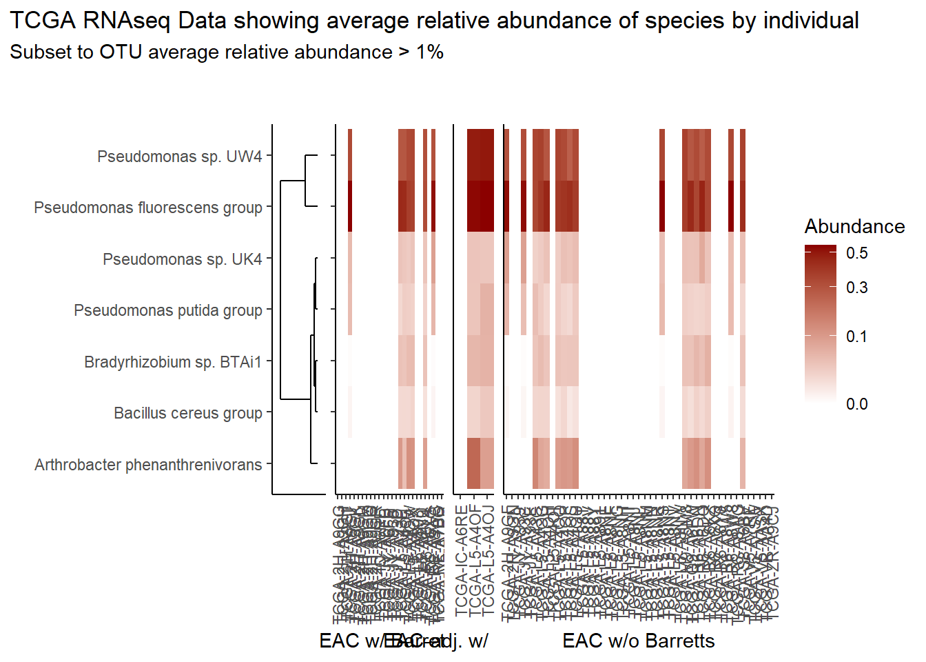
if(save.plots == T){
  ggsave(paste0("output/tcga-rna-species-lvl-heatmap-01-",save.Date,".pdf"), plot=p, units="in", width=25, height=5)
  ggsave(paste0("output/tcga-rna-species-lvl-heatmap-01-",save.Date,".png"), plot=p, units="in", width=25, height=5)
}
Relative Abudance Cutoff: 0.001
analysis.dat <- dat.rna %>%
  dplyr::mutate(OTU = otu2) # insert dataset to be used in analysis
avgRelAbundCutoff <- 0.001 # minimum average relative abundance for OTUs


otu.dat <- analysis.dat %>% filter(sample_type != "0") %>%
  dplyr::group_by(OTU) %>%
  dplyr::summarise(AverageRelativeAbundance=mean(Abundance, na.rm=T))%>%
  dplyr::filter(AverageRelativeAbundance>=avgRelAbundCutoff) %>%
  dplyr::arrange(desc(AverageRelativeAbundance))

kable(otu.dat[,c(2,1)], format="html", digits=3) %>%
  kable_styling(full_width = T)%>%
scroll_box(width="100%", height="100%")| AverageRelativeAbundance | OTU |
|---|---|
| 0.426 | Pseudomonas fluorescens group |
| 0.320 | Pseudomonas sp. UW4 |
| 0.075 | Arthrobacter phenanthrenivorans |
| 0.041 | Pseudomonas sp. UK4 |
| 0.029 | Bradyrhizobium sp. BTAi1 |
| 0.027 | Pseudomonas putida group |
| 0.011 | Bacillus cereus group |
| 0.009 | Propionibacterium acnes |
| 0.006 | Escherichia coli |
| 0.004 | Arthrobacter sp. FB24 |
| 0.004 | Bacillus megaterium |
| 0.003 | Haemophilus influenzae |
| 0.003 | Pseudomonas aeruginosa group |
| 0.003 | Pseudomonas brassicacearum |
| 0.002 | Enterobacter cloacae complex |
| 0.001 | Psychrobacter sp. PRwf-1 |
| 0.001 | Enterococcus faecalis |
| 0.001 | Arthrobacter chlorophenolicus |
plot.dat <- analysis.dat %>% filter(sample_type != "0") %>%
  dplyr::group_by(OTU) %>%
  dplyr::mutate(aveAbund=mean(Abundance, na.rm=T)) %>%
  dplyr::ungroup() %>%
  dplyr::filter(aveAbund>=avgRelAbundCutoff) %>%
  dplyr::mutate(ID = as.factor(Patient_ID),
                Abundance = ifelse(is.na(Abundance), 0, Abundance)) %>%
  dplyr::select(sample_type, OTU, ID, Abundance, aveAbund)


# widen plot.dat for dendro
dat.wide <- plot.dat %>%
  dplyr::mutate(
    ID = paste0(ID, "_",sample_type)
  ) %>%
  dplyr::select(ID, OTU, Abundance) %>%
  dplyr::group_by(ID, OTU) %>%
  dplyr::summarise(
    Abundance = mean(Abundance)
  ) %>%
  tidyr::pivot_wider(
    id_cols = OTU,
    names_from = ID,
    values_from = Abundance,
    values_fill = 0
  )
rn <- dat.wide$OTU
mat <- as.matrix(dat.wide[,-1])
rownames(mat) <- rn

sample_names <- colnames(mat)

# Obtain the dendrogram
dend <- as.dendrogram(hclust(dist(mat)))
dend_data <- dendro_data(dend)

# Setup the data, so that the layout is inverted (this is more
# "clear" than simply using coord_flip())
segment_data <- with(
  segment(dend_data),
  data.frame(x = y, y = x, xend = yend, yend = xend))
# Use the dendrogram label data to position the gene labels
gene_pos_table <- with(
  dend_data$labels,
  data.frame(y_center = x, gene = as.character(label), height = 1))

# Table to position the samples
sample_pos_table <- data.frame(sample = sample_names) %>%
  dplyr::mutate(x_center = (1:n()),
         width = 1)

# Neglecting the gap parameters
heatmap_data <- mat %>%
  reshape2::melt(value.name = "expr", varnames = c("gene", "sample")) %>%
  left_join(gene_pos_table) %>%
  left_join(sample_pos_table)

# extract and rejoin sample IDs and sample_type names for plotting
# first for the heatmap data.frame
A <- str_split(heatmap_data$sample, "_")
heatmap_data$ID <- heatmap_data$sample_type <- "0"
for(i in 1:nrow(heatmap_data)){
  heatmap_data$ID[i] <- A[[i]][1]
  heatmap_data$sample_type[i] <- A[[i]][2]
}
# second for the sample position dataframe (dendo)
A <- str_split(sample_pos_table$sample, "_")
sample_pos_table$ID <- sample_pos_table$sample_type <- "0"
for(i in 1:nrow(sample_pos_table)){
  sample_pos_table$ID[i] <- A[[i]][1]
  sample_pos_table$sample_type[i] <- A[[i]][2]
}

# Limits for the vertical axes
gene_axis_limits <- with(
  gene_pos_table,
  c(min(y_center - 0.5 * height), max(y_center + 0.5 * height))
) +
  0.1 * c(-1, 1) # extra spacing: 0.1

## Build Heatmap Pieces
# EAC w/ Barrets
hmd <- filter(heatmap_data, sample_type == "EAC tissues w/ Barretts History")
hmd$x_center <- as.numeric(as.factor(hmd$x_center))
spd <- filter(sample_pos_table, sample_type == "EAC tissues w/ Barretts History")
spd$x_center <- as.numeric(as.factor(spd$x_center))

plt_hmap1 <- ggplot(hmd,
                   aes(x = x_center, y = y_center, fill = expr,
                       height = height, width = width)) +
  geom_tile() +
  #facet_wrap(.~sample_type)+
  scale_fill_gradient2("Abundance",trans="sqrt", high = "darkred", low = "darkblue", breaks=c(0, 0.10, 0.30, 0.50, 0.80)) +
  scale_x_continuous(breaks = spd$x_center,
                     labels = spd$ID,
                     expand = c(0, 0)) +
  # For the y axis, alternatively set the labels as: gene_position_table$gene
  scale_y_continuous(breaks = gene_pos_table[, "y_center"],
                     labels = rep("", nrow(gene_pos_table)),
                     limits = gene_axis_limits,
                     expand = c(0, 0)) +
  labs(x = "EAC w/ Barretts", y = NULL) +
  theme_classic() +
  theme(axis.text.x = element_text(size = rel(1), hjust = 0.5,vjust=0.5, angle = 90),
        # margin: top, right, bottom, and left
        #axis.ticks.y = element_blank(),
        plot.margin = unit(c(1, 0.01, 0.01, -0.7), "cm"),
        panel.grid = element_blank(),
        legend.position = "none")

# Part 2: "EAC-adjacent tissue w/ Barretts History"
hmd <- filter(heatmap_data, sample_type == "EAC-adjacent tissue w/ Barretts History")
hmd$x_center <- as.numeric(as.factor(hmd$x_center))
spd <- filter(sample_pos_table, sample_type == "EAC-adjacent tissue w/ Barretts History")
spd$x_center <- as.numeric(as.factor(spd$x_center))

plt_hmap2 <- ggplot(hmd,
                    aes(x = x_center, y = y_center, fill = expr,
                        height = height, width = width)) +
  geom_tile() +
  #facet_wrap(.~sample_type)+
  scale_fill_gradient2("expr",trans="sqrt", high = "darkred", low = "darkblue", breaks=c(0, 0.1, 0.10, 0.30, 0.50, 0.80)) +
  scale_x_continuous(breaks = spd$x_center,
                     labels = spd$ID,
                     expand = c(0, 0)) +
  # For the y axis, alternatively set the labels as: gene_position_table$gene
  scale_y_continuous(breaks = gene_pos_table[, "y_center"],
                     labels = rep("", nrow(gene_pos_table)),
                     limits = gene_axis_limits,
                     expand = c(0, 0)) +
  labs(x = "EAC-adj. w/ Barretts", y = NULL) +
  theme_classic() +
  theme(axis.text.x = element_text(size = rel(1), hjust = 0.5,vjust=0.5, angle = 90),
        axis.ticks.y = element_blank(),
        # margin: top, right, bottom, and left
        plot.margin = unit(c(1, 0.01, 0.01, -0.7), "cm"),
        panel.grid.minor = element_blank(),
        legend.position = "none")

# Part 3: "EAC tissues w/o Barretts History"
hmd <- filter(heatmap_data, sample_type == "EAC tissues w/o Barretts History")
hmd$x_center <- as.numeric(as.factor(hmd$x_center))
spd <- filter(sample_pos_table, sample_type == "EAC tissues w/o Barretts History")
spd$x_center <- as.numeric(as.factor(spd$x_center))

plt_hmap3 <- ggplot(hmd,
                    aes(x = x_center, y = y_center, fill = expr,
                        height = height, width = width)) +
  geom_tile() +
  #facet_wrap(.~sample_type)+
  scale_fill_gradient2("Abundance",trans="sqrt", high = "darkred", low = "darkblue", breaks=c(0, 0.10, 0.30, 0.50, 0.80)) +
  scale_x_continuous(breaks = spd$x_center,
                     labels = spd$ID,
                     expand = c(0, 0)) +
  # For the y axis, alternatively set the labels as: gene_position_table$gene
  scale_y_continuous(breaks = gene_pos_table[, "y_center"],
                     labels = rep("", nrow(gene_pos_table)),
                     limits = gene_axis_limits,
                     expand = c(0, 0)) +
  labs(x = "EAC w/o Barretts", y = NULL) +
  theme_classic() +
  theme(axis.text.x = element_text(size = rel(1), hjust = 0.75, vjust=0.5, angle = 90),
        axis.ticks.y = element_blank(),
        # margin: top, right, bottom, and left
        plot.margin = unit(c(1, 0.01, 0.01, -0.7), "cm"),
        panel.grid.minor = element_blank())


# Dendrogram plot
plt_dendr <- ggplot(segment_data) +
  geom_segment(aes(x = x, y = y, xend = xend, yend = yend)) +
  scale_x_reverse(expand = c(0, 0.5)) +
  scale_y_continuous(breaks = gene_pos_table$y_center,
                     labels = gene_pos_table$gene,
                     limits = gene_axis_limits,
                     expand = c(0, 0)) +
  labs(x = "", y = "", colour = "", size = "") +
  theme_classic() +
  theme(panel.grid = element_blank(),
        axis.text.x = element_blank(),
        axis.ticks.x = element_blank(),
        plot.margin = unit(c(1, 0.01, 0.01, -0.7), "cm"))

prntRelAbund <- avgRelAbundCutoff*100
p <- plt_dendr+plt_hmap1+plt_hmap2+plt_hmap3+
plot_layout(
nrow=1, widths = c(0.5, 0.4, 0.15, 1),
guides="collect"
) +
plot_annotation(
title="TCGA RNAseq Data showing average relative abundance of species by individual",
subtitle=paste0("Subset to OTU average relative abundance > ",prntRelAbund,"%")
)
p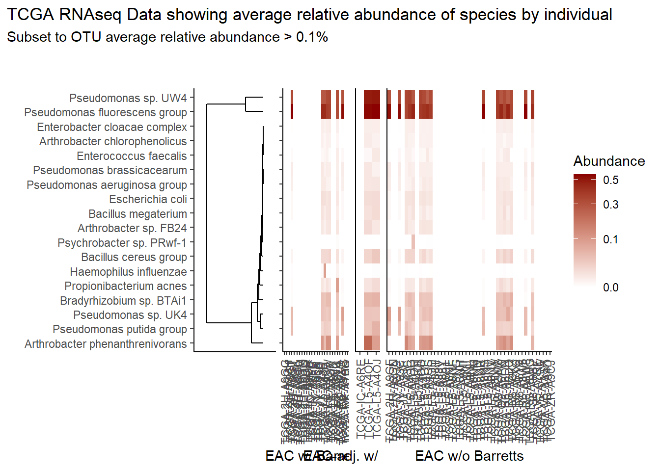
if(save.plots == T){
  ggsave(paste0("output/tcga-rna-species-lvl-heatmap-001-",save.Date,".pdf"), plot=p, units="in", width=25, height=5)
  ggsave(paste0("output/tcga-rna-species-lvl-heatmap-001-",save.Date,".png"), plot=p, units="in", width=25, height=5)
}
Specific OTUs
The heatmaps for slide 9 focus on the TCGA RNAseq data. The difference here is we focus on 4 OTUs.
p <- plt_dendr+plt_hmap1+plt_hmap2+plt_hmap3+
  plot_layout(
    nrow=1, widths = c(0.2, 0.4, 0.15, 1),
    guides="collect"
  ) +
  plot_annotation(
    title="TCGA RNAseq Data showing average relative abundance of specific OTUs by individual"
  )
p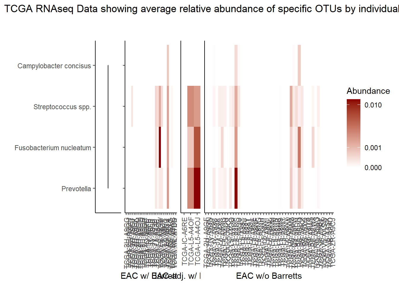
if(save.plots == T){
  ggsave(paste0("output/tcga-rna-specific-otus-heatmap-",save.Date,".pdf"), plot=p, units="in", width=25, height=5)
  ggsave(paste0("output/tcga-rna-specific-otus-heatmap-",save.Date,".png"), plot=p, units="in", width=25, height=5)
}
Sepcies Level - TCGA WGS Data
The heatmaps for slide7 focus on the TCGA WGS data.
Relative Abudance Cutoff: 0.05
analysis.dat <- dat.wgs %>%
  dplyr::mutate(OTU = otu2) # insert dataset to be used in analysis
avgRelAbundCutoff <- 0.05 # minimum average relative abundance for OTUs


otu.dat <- analysis.dat %>% filter(sample_type != "0") %>%
  dplyr::group_by(OTU) %>%
  dplyr::summarise(AverageRelativeAbundance=mean(Abundance, na.rm=T))%>%
  dplyr::filter(AverageRelativeAbundance>=avgRelAbundCutoff) %>%
  dplyr::arrange(desc(AverageRelativeAbundance))

kable(otu.dat[,c(2,1)], format="html", digits=3) %>%
  kable_styling(full_width = T)%>%
scroll_box(width="100%", height="100%")| AverageRelativeAbundance | OTU |
|---|---|
| 0.465 | Coprobacillus sp. D7 |
| 0.106 | Propionibacterium acnes |
| 0.074 | Haemophilus influenzae |
| 0.057 | Prevotella melaninogenica |
plot.dat <- analysis.dat %>% filter(sample_type != "0") %>%
  dplyr::group_by(OTU) %>%
  dplyr::mutate(aveAbund=mean(Abundance, na.rm=T)) %>%
  dplyr::ungroup() %>%
  dplyr::filter(aveAbund>=avgRelAbundCutoff) %>%
  dplyr::mutate(ID = as.factor(Patient_ID),
                Abundance = ifelse(is.na(Abundance), 0, Abundance)) %>%
  dplyr::select(sample_type, OTU, ID, Abundance, aveAbund)


# widen plot.dat for dendro
dat.wide <- plot.dat %>%
  dplyr::mutate(
    ID = paste0(ID, "_",sample_type)
  ) %>%
  dplyr::select(ID, OTU, Abundance) %>%
  dplyr::group_by(ID, OTU) %>%
  dplyr::summarise(
    Abundance = mean(Abundance)
  ) %>%
  tidyr::pivot_wider(
    id_cols = OTU,
    names_from = ID,
    values_from = Abundance,
    values_fill = 0
  )
rn <- dat.wide$OTU
mat <- as.matrix(dat.wide[,-1])
rownames(mat) <- rn

sample_names <- colnames(mat)

# Obtain the dendrogram
dend <- as.dendrogram(hclust(dist(mat)))
dend_data <- dendro_data(dend)

# Setup the data, so that the layout is inverted (this is more
# "clear" than simply using coord_flip())
segment_data <- with(
  segment(dend_data),
  data.frame(x = y, y = x, xend = yend, yend = xend))
# Use the dendrogram label data to position the gene labels
gene_pos_table <- with(
  dend_data$labels,
  data.frame(y_center = x, gene = as.character(label), height = 1))

# Table to position the samples
sample_pos_table <- data.frame(sample = sample_names) %>%
  dplyr::mutate(x_center = (1:n()),
         width = 1)

# Neglecting the gap parameters
heatmap_data <- mat %>%
  reshape2::melt(value.name = "expr", varnames = c("gene", "sample")) %>%
  left_join(gene_pos_table) %>%
  left_join(sample_pos_table)

# extract and rejoin sample IDs and sample_type names for plotting
# first for the heatmap data.frame
A <- str_split(heatmap_data$sample, "_")
heatmap_data$ID <- heatmap_data$sample_type <- "0"
for(i in 1:nrow(heatmap_data)){
  heatmap_data$ID[i] <- A[[i]][1]
  heatmap_data$sample_type[i] <- A[[i]][2]
}
# second for the sample position dataframe (dendo)
A <- str_split(sample_pos_table$sample, "_")
sample_pos_table$ID <- sample_pos_table$sample_type <- "0"
for(i in 1:nrow(sample_pos_table)){
  sample_pos_table$ID[i] <- A[[i]][1]
  sample_pos_table$sample_type[i] <- A[[i]][2]
}

# Limits for the vertical axes
gene_axis_limits <- with(
  gene_pos_table,
  c(min(y_center - 0.5 * height), max(y_center + 0.5 * height))
) +
  0.1 * c(-1, 1) # extra spacing: 0.1

## Build Heatmap Pieces
# EAC w/ Barrets
hmd <- filter(heatmap_data, sample_type == "EAC tissues w/ Barretts History")
hmd$x_center <- as.numeric(as.factor(hmd$x_center))
spd <- filter(sample_pos_table, sample_type == "EAC tissues w/ Barretts History")
spd$x_center <- as.numeric(as.factor(spd$x_center))

plt_hmap1 <- ggplot(hmd,
                   aes(x = x_center, y = y_center, fill = expr,
                       height = height, width = width)) +
  geom_tile() +
  #facet_wrap(.~sample_type)+
  scale_fill_gradient2("Abundance",trans="sqrt", high = "darkred", low = "darkblue", breaks=c(0, 0.10, 0.30, 0.50, 0.80)) +
  scale_x_continuous(breaks = spd$x_center,
                     labels = spd$ID,
                     expand = c(0, 0)) +
  # For the y axis, alternatively set the labels as: gene_position_table$gene
  scale_y_continuous(breaks = gene_pos_table[, "y_center"],
                     labels = rep("", nrow(gene_pos_table)),
                     limits = gene_axis_limits,
                     expand = c(0, 0)) +
  labs(x = "EAC w/ Barretts", y = NULL) +
  theme_classic() +
  theme(axis.text.x = element_text(size = rel(1), hjust = 0.5,vjust=0.5, angle = 90),
        # margin: top, right, bottom, and left
        #axis.ticks.y = element_blank(),
        plot.margin = unit(c(1, 0.01, 0.01, -0.7), "cm"),
        panel.grid = element_blank(),
        legend.position = "none")

# Part 2: "EAC-adjacent tissue w/ Barretts History"
hmd <- filter(heatmap_data, sample_type == "EAC-adjacent tissue w/ Barretts History")
hmd$x_center <- as.numeric(as.factor(hmd$x_center))
spd <- filter(sample_pos_table, sample_type == "EAC-adjacent tissue w/ Barretts History")
spd$x_center <- as.numeric(as.factor(spd$x_center))

plt_hmap2 <- ggplot(hmd,
                    aes(x = x_center, y = y_center, fill = expr,
                        height = height, width = width)) +
  geom_tile() +
  #facet_wrap(.~sample_type)+
  scale_fill_gradient2("expr",trans="sqrt", high = "darkred", low = "darkblue", breaks=c(0, 0.1, 0.10, 0.30, 0.50, 0.80)) +
  scale_x_continuous(breaks = spd$x_center,
                     labels = spd$ID,
                     expand = c(0, 0)) +
  # For the y axis, alternatively set the labels as: gene_position_table$gene
  scale_y_continuous(breaks = gene_pos_table[, "y_center"],
                     labels = rep("", nrow(gene_pos_table)),
                     limits = gene_axis_limits,
                     expand = c(0, 0)) +
  labs(x = "EAC-adj. w/ Barretts", y = NULL) +
  theme_classic() +
  theme(axis.text.x = element_text(size = rel(1), hjust = 0.5,vjust=0.5, angle = 90),
        axis.ticks.y = element_blank(),
        # margin: top, right, bottom, and left
        plot.margin = unit(c(1, 0.01, 0.01, -0.7), "cm"),
        panel.grid.minor = element_blank(),
        legend.position = "none")

# Part 3: "EAC tissues w/o Barretts History"
hmd <- filter(heatmap_data, sample_type == "EAC tissues w/o Barretts History")
hmd$x_center <- as.numeric(as.factor(hmd$x_center))
spd <- filter(sample_pos_table, sample_type == "EAC tissues w/o Barretts History")
spd$x_center <- as.numeric(as.factor(spd$x_center))

plt_hmap3 <- ggplot(hmd,
                    aes(x = x_center, y = y_center, fill = expr,
                        height = height, width = width)) +
  geom_tile() +
  #facet_wrap(.~sample_type)+
  scale_fill_gradient2("Abundance",trans="sqrt", high = "darkred", low = "darkblue", breaks=c(0, 0.10, 0.30, 0.50, 0.80)) +
  scale_x_continuous(breaks = spd$x_center,
                     labels = spd$ID,
                     expand = c(0, 0)) +
  # For the y axis, alternatively set the labels as: gene_position_table$gene
  scale_y_continuous(breaks = gene_pos_table[, "y_center"],
                     labels = rep("", nrow(gene_pos_table)),
                     limits = gene_axis_limits,
                     expand = c(0, 0)) +
  labs(x = "EAC w/o Barretts", y = NULL) +
  theme_classic() +
  theme(axis.text.x = element_text(size = rel(1), hjust = 0.75, vjust=0.5, angle = 90),
        axis.ticks.y = element_blank(),
        # margin: top, right, bottom, and left
        plot.margin = unit(c(1, 0.01, 0.01, -0.7), "cm"),
        panel.grid.minor = element_blank())


# Dendrogram plot
plt_dendr <- ggplot(segment_data) +
  geom_segment(aes(x = x, y = y, xend = xend, yend = yend)) +
  scale_x_reverse(expand = c(0, 0.5)) +
  scale_y_continuous(breaks = gene_pos_table$y_center,
                     labels = gene_pos_table$gene,
                     limits = gene_axis_limits,
                     expand = c(0, 0)) +
  labs(x = "", y = "", colour = "", size = "") +
  theme_classic() +
  theme(panel.grid = element_blank(),
        axis.text.x = element_blank(),
        axis.ticks.x = element_blank(),
        plot.margin = unit(c(1, 0.01, 0.01, -0.7), "cm"))

prntRelAbund <- avgRelAbundCutoff*100
p <- plt_dendr+plt_hmap1+plt_hmap2+plt_hmap3+
plot_layout(
nrow=1, widths = c(0.3, 0.4, 0.15, 1),
guides="collect"
) +
plot_annotation(
title="TCGA WGS Data showing average relative abundance of species by individual",
subtitle=paste0("Subset to OTU average relative abundance > ",prntRelAbund,"%")
)
p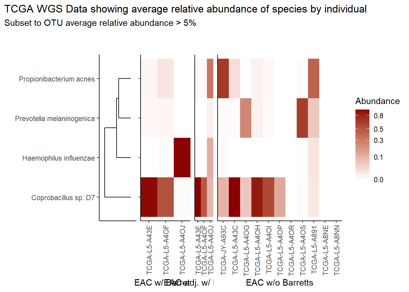
if(save.plots == T){
  ggsave(paste0("output/tcga-wgs-species-lvl-heatmap-05-",save.Date,".pdf"), plot=p, units="in", width=20, height=5)
  ggsave(paste0("output/tcga-wgs-species-lvl-heatmap-05-",save.Date,".png"), plot=p, units="in", width=20, height=5)
}
Relative Abudance Cutoff: 0.01
analysis.dat <- dat.wgs %>%
  dplyr::mutate(OTU = otu2) # insert dataset to be used in analysis
avgRelAbundCutoff <- 0.01 # minimum average relative abundance for OTUs


otu.dat <- analysis.dat %>% filter(sample_type != "0") %>%
  dplyr::group_by(OTU) %>%
  dplyr::summarise(AverageRelativeAbundance=mean(Abundance, na.rm=T))%>%
  dplyr::filter(AverageRelativeAbundance>=avgRelAbundCutoff) %>%
  dplyr::arrange(desc(AverageRelativeAbundance))

kable(otu.dat[,c(2,1)], format="html", digits=3) %>%
  kable_styling(full_width = T)%>%
scroll_box(width="100%", height="100%")| AverageRelativeAbundance | OTU |
|---|---|
| 0.465 | Coprobacillus sp. D7 |
| 0.106 | Propionibacterium acnes |
| 0.074 | Haemophilus influenzae |
| 0.057 | Prevotella melaninogenica |
| 0.028 | Cyanothece sp. CCY0110 |
| 0.027 | Fusobacterium nucleatum |
| 0.022 | Campylobacter concisus |
| 0.019 | Bradyrhizobium sp. BTAi1 |
| 0.016 | Bradyrhizobium diazoefficiens |
| 0.014 | Streptococcus pneumoniae |
| 0.012 | Bradyrhizobium japonicum |
plot.dat <- analysis.dat %>% filter(sample_type != "0") %>%
  dplyr::group_by(OTU) %>%
  dplyr::mutate(aveAbund=mean(Abundance, na.rm=T)) %>%
  dplyr::ungroup() %>%
  dplyr::filter(aveAbund>=avgRelAbundCutoff) %>%
  dplyr::mutate(ID = as.factor(Patient_ID),
                Abundance = ifelse(is.na(Abundance), 0, Abundance)) %>%
  dplyr::select(sample_type, OTU, ID, Abundance, aveAbund)


# widen plot.dat for dendro
dat.wide <- plot.dat %>%
  dplyr::mutate(
    ID = paste0(ID, "_",sample_type)
  ) %>%
  dplyr::select(ID, OTU, Abundance) %>%
  dplyr::group_by(ID, OTU) %>%
  dplyr::summarise(
    Abundance = mean(Abundance)
  ) %>%
  tidyr::pivot_wider(
    id_cols = OTU,
    names_from = ID,
    values_from = Abundance,
    values_fill = 0
  )
rn <- dat.wide$OTU
mat <- as.matrix(dat.wide[,-1])
rownames(mat) <- rn

sample_names <- colnames(mat)

# Obtain the dendrogram
dend <- as.dendrogram(hclust(dist(mat)))
dend_data <- dendro_data(dend)

# Setup the data, so that the layout is inverted (this is more
# "clear" than simply using coord_flip())
segment_data <- with(
  segment(dend_data),
  data.frame(x = y, y = x, xend = yend, yend = xend))
# Use the dendrogram label data to position the gene labels
gene_pos_table <- with(
  dend_data$labels,
  data.frame(y_center = x, gene = as.character(label), height = 1))

# Table to position the samples
sample_pos_table <- data.frame(sample = sample_names) %>%
  dplyr::mutate(x_center = (1:n()),
         width = 1)

# Neglecting the gap parameters
heatmap_data <- mat %>%
  reshape2::melt(value.name = "expr", varnames = c("gene", "sample")) %>%
  left_join(gene_pos_table) %>%
  left_join(sample_pos_table)

# extract and rejoin sample IDs and sample_type names for plotting
# first for the heatmap data.frame
A <- str_split(heatmap_data$sample, "_")
heatmap_data$ID <- heatmap_data$sample_type <- "0"
for(i in 1:nrow(heatmap_data)){
  heatmap_data$ID[i] <- A[[i]][1]
  heatmap_data$sample_type[i] <- A[[i]][2]
}
# second for the sample position dataframe (dendo)
A <- str_split(sample_pos_table$sample, "_")
sample_pos_table$ID <- sample_pos_table$sample_type <- "0"
for(i in 1:nrow(sample_pos_table)){
  sample_pos_table$ID[i] <- A[[i]][1]
  sample_pos_table$sample_type[i] <- A[[i]][2]
}

# Limits for the vertical axes
gene_axis_limits <- with(
  gene_pos_table,
  c(min(y_center - 0.5 * height), max(y_center + 0.5 * height))
) +
  0.1 * c(-1, 1) # extra spacing: 0.1

## Build Heatmap Pieces
# EAC w/ Barrets
hmd <- filter(heatmap_data, sample_type == "EAC tissues w/ Barretts History")
hmd$x_center <- as.numeric(as.factor(hmd$x_center))
spd <- filter(sample_pos_table, sample_type == "EAC tissues w/ Barretts History")
spd$x_center <- as.numeric(as.factor(spd$x_center))

plt_hmap1 <- ggplot(hmd,
                   aes(x = x_center, y = y_center, fill = expr,
                       height = height, width = width)) +
  geom_tile() +
  #facet_wrap(.~sample_type)+
  scale_fill_gradient2("Abundance",trans="sqrt", high = "darkred", low = "darkblue", breaks=c(0, 0.10, 0.30, 0.50, 0.80)) +
  scale_x_continuous(breaks = spd$x_center,
                     labels = spd$ID,
                     expand = c(0, 0)) +
  # For the y axis, alternatively set the labels as: gene_position_table$gene
  scale_y_continuous(breaks = gene_pos_table[, "y_center"],
                     labels = rep("", nrow(gene_pos_table)),
                     limits = gene_axis_limits,
                     expand = c(0, 0)) +
  labs(x = "EAC w/ Barretts", y = NULL) +
  theme_classic() +
  theme(axis.text.x = element_text(size = rel(1), hjust = 0.5,vjust=0.5, angle = 90),
        # margin: top, right, bottom, and left
        #axis.ticks.y = element_blank(),
        plot.margin = unit(c(1, 0.01, 0.01, -0.7), "cm"),
        panel.grid = element_blank(),
        legend.position = "none")

# Part 2: "EAC-adjacent tissue w/ Barretts History"
hmd <- filter(heatmap_data, sample_type == "EAC-adjacent tissue w/ Barretts History")
hmd$x_center <- as.numeric(as.factor(hmd$x_center))
spd <- filter(sample_pos_table, sample_type == "EAC-adjacent tissue w/ Barretts History")
spd$x_center <- as.numeric(as.factor(spd$x_center))

plt_hmap2 <- ggplot(hmd,
                    aes(x = x_center, y = y_center, fill = expr,
                        height = height, width = width)) +
  geom_tile() +
  #facet_wrap(.~sample_type)+
  scale_fill_gradient2("expr",trans="sqrt", high = "darkred", low = "darkblue", breaks=c(0, 0.1, 0.10, 0.30, 0.50, 0.80)) +
  scale_x_continuous(breaks = spd$x_center,
                     labels = spd$ID,
                     expand = c(0, 0)) +
  # For the y axis, alternatively set the labels as: gene_position_table$gene
  scale_y_continuous(breaks = gene_pos_table[, "y_center"],
                     labels = rep("", nrow(gene_pos_table)),
                     limits = gene_axis_limits,
                     expand = c(0, 0)) +
  labs(x = "EAC-adj. w/ Barretts", y = NULL) +
  theme_classic() +
  theme(axis.text.x = element_text(size = rel(1), hjust = 0.5,vjust=0.5, angle = 90),
        axis.ticks.y = element_blank(),
        # margin: top, right, bottom, and left
        plot.margin = unit(c(1, 0.01, 0.01, -0.7), "cm"),
        panel.grid.minor = element_blank(),
        legend.position = "none")

# Part 3: "EAC tissues w/o Barretts History"
hmd <- filter(heatmap_data, sample_type == "EAC tissues w/o Barretts History")
hmd$x_center <- as.numeric(as.factor(hmd$x_center))
spd <- filter(sample_pos_table, sample_type == "EAC tissues w/o Barretts History")
spd$x_center <- as.numeric(as.factor(spd$x_center))

plt_hmap3 <- ggplot(hmd,
                    aes(x = x_center, y = y_center, fill = expr,
                        height = height, width = width)) +
  geom_tile() +
  #facet_wrap(.~sample_type)+
  scale_fill_gradient2("Abundance",trans="sqrt", high = "darkred", low = "darkblue", breaks=c(0, 0.10, 0.30, 0.50, 0.80)) +
  scale_x_continuous(breaks = spd$x_center,
                     labels = spd$ID,
                     expand = c(0, 0)) +
  # For the y axis, alternatively set the labels as: gene_position_table$gene
  scale_y_continuous(breaks = gene_pos_table[, "y_center"],
                     labels = rep("", nrow(gene_pos_table)),
                     limits = gene_axis_limits,
                     expand = c(0, 0)) +
  labs(x = "EAC w/o Barretts", y = NULL) +
  theme_classic() +
  theme(axis.text.x = element_text(size = rel(1), hjust = 0.75, vjust=0.5, angle = 90),
        axis.ticks.y = element_blank(),
        # margin: top, right, bottom, and left
        plot.margin = unit(c(1, 0.01, 0.01, -0.7), "cm"),
        panel.grid.minor = element_blank())


# Dendrogram plot
plt_dendr <- ggplot(segment_data) +
  geom_segment(aes(x = x, y = y, xend = xend, yend = yend)) +
  scale_x_reverse(expand = c(0, 0.5)) +
  scale_y_continuous(breaks = gene_pos_table$y_center,
                     labels = gene_pos_table$gene,
                     limits = gene_axis_limits,
                     expand = c(0, 0)) +
  labs(x = "", y = "", colour = "", size = "") +
  theme_classic() +
  theme(panel.grid = element_blank(),
        axis.text.x = element_blank(),
        axis.ticks.x = element_blank(),
        plot.margin = unit(c(1, 0.01, 0.01, -0.7), "cm"))

prntRelAbund <- avgRelAbundCutoff*100
p <- plt_dendr+plt_hmap1+plt_hmap2+plt_hmap3+
plot_layout(
nrow=1, widths = c(0.3, 0.4, 0.15, 1),
guides="collect"
) +
plot_annotation(
title="TCGA WGS Data showing average relative abundance of species by individual",
subtitle=paste0("Subset to OTU average relative abundance > ",prntRelAbund,"%")
)
p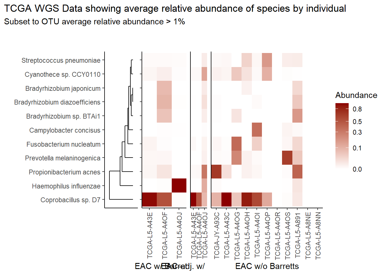
if(save.plots == T){
  ggsave(paste0("output/tcga-wgs-species-lvl-heatmap-01-",save.Date,".pdf"), plot=p, units="in", width=20, height=5)
  ggsave(paste0("output/tcga-wgs-species-lvl-heatmap-01-",save.Date,".png"), plot=p, units="in", width=20, height=5)
}
Relative Abudance Cutoff: 0.001
analysis.dat <- dat.wgs %>%
  dplyr::mutate(OTU = otu2) # insert dataset to be used in analysis
avgRelAbundCutoff <- 0.001 # minimum average relative abundance for OTUs


otu.dat <- analysis.dat %>% filter(sample_type != "0") %>%
  dplyr::group_by(OTU) %>%
  dplyr::summarise(AverageRelativeAbundance=mean(Abundance, na.rm=T))%>%
  dplyr::filter(AverageRelativeAbundance>=avgRelAbundCutoff) %>%
  dplyr::arrange(desc(AverageRelativeAbundance))

kable(otu.dat[,c(2,1)], format="html", digits=3) %>%
  kable_styling(full_width = T)%>%
scroll_box(width="100%", height="100%")| AverageRelativeAbundance | OTU |
|---|---|
| 0.465 | Coprobacillus sp. D7 |
| 0.106 | Propionibacterium acnes |
| 0.074 | Haemophilus influenzae |
| 0.057 | Prevotella melaninogenica |
| 0.028 | Cyanothece sp. CCY0110 |
| 0.027 | Fusobacterium nucleatum |
| 0.022 | Campylobacter concisus |
| 0.019 | Bradyrhizobium sp. BTAi1 |
| 0.016 | Bradyrhizobium diazoefficiens |
| 0.014 | Streptococcus pneumoniae |
| 0.012 | Bradyrhizobium japonicum |
| 0.010 | Bradyrhizobium sp. S23321 |
| 0.008 | candidate division TM7 single-cell isolate TM7a |
| 0.008 | Veillonella parvula |
| 0.008 | Streptococcus parasanguinis |
| 0.007 | Rhodopseudomonas palustris |
| 0.006 | Pseudomonas fluorescens group |
| 0.006 | Bradyrhizobium sp. ORS 278 |
| 0.006 | Streptococcus mitis |
| 0.005 | Beggiatoa sp. PS |
| 0.004 | Staphylococcus epidermidis |
| 0.004 | Corynebacterium tuberculostearicum |
| 0.004 | Streptococcus suis |
| 0.003 | Haemophilus parainfluenzae |
| 0.003 | Streptococcus pseudopneumoniae |
| 0.003 | Delftia sp. Cs1-4 |
| 0.003 | Lactobacillus gasseri |
| 0.003 | [Eubacterium] hallii |
| 0.002 | Delftia acidovorans |
| 0.002 | Streptococcus oralis |
| 0.002 | Pseudomonas putida group |
| 0.002 | Streptococcus thermophilus |
| 0.002 | Pseudomonas aeruginosa group |
| 0.002 | Atopobium rimae |
| 0.002 | Prevotella intermedia |
| 0.001 | candidate division TM7 single-cell isolate TM7c |
| 0.001 | Acidovorax delafieldii |
| 0.001 | Staphylococcus capitis |
| 0.001 | Escherichia coli |
| 0.001 | Oligotropha carboxidovorans |
| 0.001 | Acinetobacter junii |
| 0.001 | Acidovorax ebreus |
| 0.001 | Lactococcus garvieae |
| 0.001 | Gemmata obscuriglobus |
| 0.001 | Lactobacillus crispatus |
| 0.001 | Streptococcus gordonii |
| 0.001 | Xanthomonas campestris |
| 0.001 | Bacteroides sp. 3_1_33FAA |
plot.dat <- analysis.dat %>% filter(sample_type != "0") %>%
  dplyr::group_by(OTU) %>%
  dplyr::mutate(aveAbund=mean(Abundance, na.rm=T)) %>%
  dplyr::ungroup() %>%
  dplyr::filter(aveAbund>=avgRelAbundCutoff) %>%
  dplyr::mutate(ID = as.factor(Patient_ID),
                Abundance = ifelse(is.na(Abundance), 0, Abundance)) %>%
  dplyr::select(sample_type, OTU, ID, Abundance, aveAbund)


# widen plot.dat for dendro
dat.wide <- plot.dat %>%
  dplyr::mutate(
    ID = paste0(ID, "_",sample_type)
  ) %>%
  dplyr::select(ID, OTU, Abundance) %>%
  dplyr::group_by(ID, OTU) %>%
  dplyr::summarise(
    Abundance = mean(Abundance)
  ) %>%
  tidyr::pivot_wider(
    id_cols = OTU,
    names_from = ID,
    values_from = Abundance,
    values_fill = 0
  )
rn <- dat.wide$OTU
mat <- as.matrix(dat.wide[,-1])
rownames(mat) <- rn

sample_names <- colnames(mat)

# Obtain the dendrogram
dend <- as.dendrogram(hclust(dist(mat)))
dend_data <- dendro_data(dend)

# Setup the data, so that the layout is inverted (this is more
# "clear" than simply using coord_flip())
segment_data <- with(
  segment(dend_data),
  data.frame(x = y, y = x, xend = yend, yend = xend))
# Use the dendrogram label data to position the gene labels
gene_pos_table <- with(
  dend_data$labels,
  data.frame(y_center = x, gene = as.character(label), height = 1))

# Table to position the samples
sample_pos_table <- data.frame(sample = sample_names) %>%
  dplyr::mutate(x_center = (1:n()),
         width = 1)

# Neglecting the gap parameters
heatmap_data <- mat %>%
  reshape2::melt(value.name = "expr", varnames = c("gene", "sample")) %>%
  left_join(gene_pos_table) %>%
  left_join(sample_pos_table)

# extract and rejoin sample IDs and sample_type names for plotting
# first for the heatmap data.frame
A <- str_split(heatmap_data$sample, "_")
heatmap_data$ID <- heatmap_data$sample_type <- "0"
for(i in 1:nrow(heatmap_data)){
  heatmap_data$ID[i] <- A[[i]][1]
  heatmap_data$sample_type[i] <- A[[i]][2]
}
# second for the sample position dataframe (dendo)
A <- str_split(sample_pos_table$sample, "_")
sample_pos_table$ID <- sample_pos_table$sample_type <- "0"
for(i in 1:nrow(sample_pos_table)){
  sample_pos_table$ID[i] <- A[[i]][1]
  sample_pos_table$sample_type[i] <- A[[i]][2]
}

# Limits for the vertical axes
gene_axis_limits <- with(
  gene_pos_table,
  c(min(y_center - 0.5 * height), max(y_center + 0.5 * height))
) +
  0.1 * c(-1, 1) # extra spacing: 0.1

## Build Heatmap Pieces
# EAC w/ Barrets
hmd <- filter(heatmap_data, sample_type == "EAC tissues w/ Barretts History")
hmd$x_center <- as.numeric(as.factor(hmd$x_center))
spd <- filter(sample_pos_table, sample_type == "EAC tissues w/ Barretts History")
spd$x_center <- as.numeric(as.factor(spd$x_center))

plt_hmap1 <- ggplot(hmd,
                   aes(x = x_center, y = y_center, fill = expr,
                       height = height, width = width)) +
  geom_tile() +
  #facet_wrap(.~sample_type)+
  scale_fill_gradient2("Abundance",trans="sqrt", high = "darkred", low = "darkblue", breaks=c(0, 0.10, 0.30, 0.50, 0.80)) +
  scale_x_continuous(breaks = spd$x_center,
                     labels = spd$ID,
                     expand = c(0, 0)) +
  # For the y axis, alternatively set the labels as: gene_position_table$gene
  scale_y_continuous(breaks = gene_pos_table[, "y_center"],
                     labels = rep("", nrow(gene_pos_table)),
                     limits = gene_axis_limits,
                     expand = c(0, 0)) +
  labs(x = "EAC w/ Barretts", y = NULL) +
  theme_classic() +
  theme(axis.text.x = element_text(size = rel(1), hjust = 0.5,vjust=0.5, angle = 90),
        # margin: top, right, bottom, and left
        #axis.ticks.y = element_blank(),
        plot.margin = unit(c(1, 0.01, 0.01, -0.7), "cm"),
        panel.grid = element_blank(),
        legend.position = "none")

# Part 2: "EAC-adjacent tissue w/ Barretts History"
hmd <- filter(heatmap_data, sample_type == "EAC-adjacent tissue w/ Barretts History")
hmd$x_center <- as.numeric(as.factor(hmd$x_center))
spd <- filter(sample_pos_table, sample_type == "EAC-adjacent tissue w/ Barretts History")
spd$x_center <- as.numeric(as.factor(spd$x_center))

plt_hmap2 <- ggplot(hmd,
                    aes(x = x_center, y = y_center, fill = expr,
                        height = height, width = width)) +
  geom_tile() +
  #facet_wrap(.~sample_type)+
  scale_fill_gradient2("expr",trans="sqrt", high = "darkred", low = "darkblue", breaks=c(0, 0.1, 0.10, 0.30, 0.50, 0.80)) +
  scale_x_continuous(breaks = spd$x_center,
                     labels = spd$ID,
                     expand = c(0, 0)) +
  # For the y axis, alternatively set the labels as: gene_position_table$gene
  scale_y_continuous(breaks = gene_pos_table[, "y_center"],
                     labels = rep("", nrow(gene_pos_table)),
                     limits = gene_axis_limits,
                     expand = c(0, 0)) +
  labs(x = "EAC-adj. w/ Barretts", y = NULL) +
  theme_classic() +
  theme(axis.text.x = element_text(size = rel(1), hjust = 0.5,vjust=0.5, angle = 90),
        axis.ticks.y = element_blank(),
        # margin: top, right, bottom, and left
        plot.margin = unit(c(1, 0.01, 0.01, -0.7), "cm"),
        panel.grid.minor = element_blank(),
        legend.position = "none")

# Part 3: "EAC tissues w/o Barretts History"
hmd <- filter(heatmap_data, sample_type == "EAC tissues w/o Barretts History")
hmd$x_center <- as.numeric(as.factor(hmd$x_center))
spd <- filter(sample_pos_table, sample_type == "EAC tissues w/o Barretts History")
spd$x_center <- as.numeric(as.factor(spd$x_center))

plt_hmap3 <- ggplot(hmd,
                    aes(x = x_center, y = y_center, fill = expr,
                        height = height, width = width)) +
  geom_tile() +
  #facet_wrap(.~sample_type)+
  scale_fill_gradient2("Abundance",trans="sqrt", high = "darkred", low = "darkblue", breaks=c(0, 0.10, 0.30, 0.50, 0.80)) +
  scale_x_continuous(breaks = spd$x_center,
                     labels = spd$ID,
                     expand = c(0, 0)) +
  # For the y axis, alternatively set the labels as: gene_position_table$gene
  scale_y_continuous(breaks = gene_pos_table[, "y_center"],
                     labels = rep("", nrow(gene_pos_table)),
                     limits = gene_axis_limits,
                     expand = c(0, 0)) +
  labs(x = "EAC w/o Barretts", y = NULL) +
  theme_classic() +
  theme(axis.text.x = element_text(size = rel(1), hjust = 0.75, vjust=0.5, angle = 90),
        axis.ticks.y = element_blank(),
        # margin: top, right, bottom, and left
        plot.margin = unit(c(1, 0.01, 0.01, -0.7), "cm"),
        panel.grid.minor = element_blank())


# Dendrogram plot
plt_dendr <- ggplot(segment_data) +
  geom_segment(aes(x = x, y = y, xend = xend, yend = yend)) +
  scale_x_reverse(expand = c(0, 0.5)) +
  scale_y_continuous(breaks = gene_pos_table$y_center,
                     labels = gene_pos_table$gene,
                     limits = gene_axis_limits,
                     expand = c(0, 0)) +
  labs(x = "", y = "", colour = "", size = "") +
  theme_classic() +
  theme(panel.grid = element_blank(),
        axis.text.x = element_blank(),
        axis.ticks.x = element_blank(),
        plot.margin = unit(c(1, 0.01, 0.01, -0.7), "cm"))

prntRelAbund <- avgRelAbundCutoff*100
p <- plt_dendr+plt_hmap1+plt_hmap2+plt_hmap3+
plot_layout(
nrow=1, widths = c(0.3, 0.4, 0.15, 1),
guides="collect"
) +
plot_annotation(
title="TCGA WGS Data showing average relative abundance of species by individual",
subtitle=paste0("Subset to OTU average relative abundance > ",prntRelAbund,"%")
)
p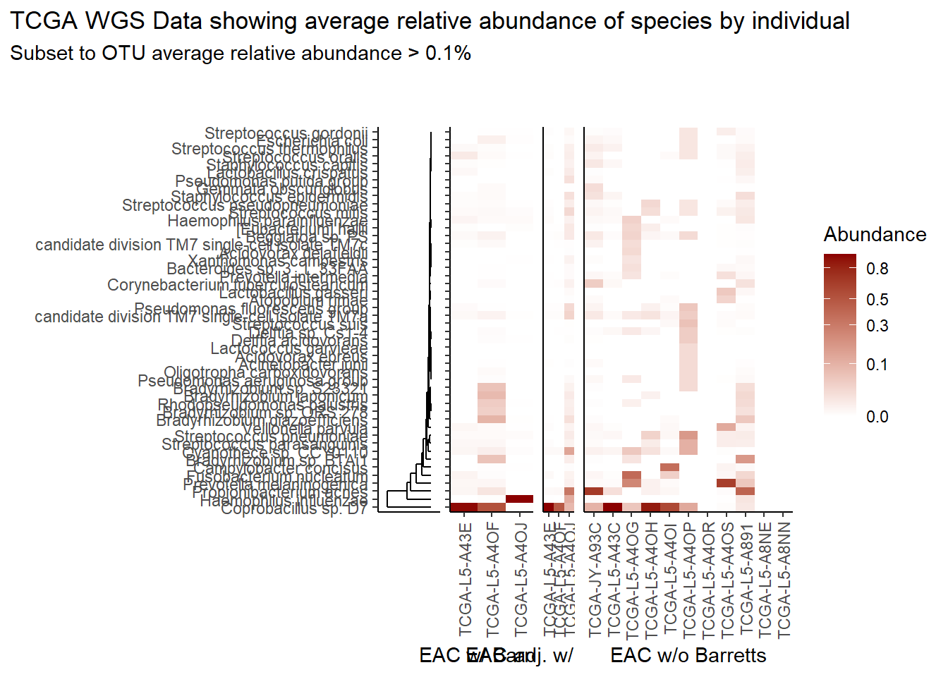
if(save.plots == T){
  ggsave(paste0("output/tcga-wgs-species-lvl-heatmap-001-",save.Date,".pdf"), plot=p, units="in", width=20, height=10)
  ggsave(paste0("output/tcga-wgs-species-lvl-heatmap-001-",save.Date,".png"), plot=p, units="in", width=20, height=10)
}
Specific OTUs
The heatmaps for slide76 focus on the TCGA WGS data.
analysis.dat <- dat.wgs.s # insert dataset to be used in analysis


otu.dat <- analysis.dat %>% filter(sample_type != "0") %>%
  dplyr::group_by(OTU) %>%
  dplyr::summarise(AverageRelativeAbundance=mean(Abundance, na.rm=T))

kable(otu.dat[,c(2,1)], format="html", digits=3) %>%
  kable_styling(full_width = T)%>%
scroll_box(width="100%", height="100%")| AverageRelativeAbundance | OTU |
|---|---|
| 0.027 | Fusobacterium nucleatum |
| 0.005 | Streptococcus spp. |
| 0.022 | Campylobacter concisus |
| 0.057 | Prevotella |
plot.dat <- analysis.dat %>% filter(sample_type != "0") %>%
  dplyr::group_by(OTU) %>%
  dplyr::mutate(aveAbund=mean(Abundance, na.rm=T)) %>%
  dplyr::ungroup() %>%
  dplyr::mutate(ID = as.factor(Patient_ID),
                Abundance = ifelse(is.na(Abundance), 0, Abundance)) %>%
  dplyr::select(sample_type, OTU, ID, Abundance, aveAbund)


# widen plot.dat for dendro
dat.wide <- plot.dat %>%
  dplyr::mutate(
    ID = paste0(ID, "_",sample_type)
  ) %>%
  dplyr::select(ID, OTU, Abundance) %>%
  dplyr::group_by(ID, OTU) %>%
  dplyr::summarise(
    Abundance = mean(Abundance)
  ) %>%
  tidyr::pivot_wider(
    id_cols = OTU,
    names_from = ID,
    values_from = Abundance,
    values_fill = 0
  )
rn <- dat.wide$OTU
mat <- as.matrix(dat.wide[,-1])
rownames(mat) <- rn

sample_names <- colnames(mat)

# Obtain the dendrogram
dend <- as.dendrogram(hclust(dist(mat)))
dend_data <- dendro_data(dend)

# Setup the data, so that the layout is inverted (this is more
# "clear" than simply using coord_flip())
segment_data <- with(
  segment(dend_data),
  data.frame(x = y, y = x, xend = yend, yend = xend))
# Use the dendrogram label data to position the gene labels
gene_pos_table <- with(
  dend_data$labels,
  data.frame(y_center = x, gene = as.character(label), height = 1))

# Table to position the samples
sample_pos_table <- data.frame(sample = sample_names) %>%
  dplyr::mutate(x_center = (1:n()),
         width = 1)

# Neglecting the gap parameters
heatmap_data <- mat %>%
  reshape2::melt(value.name = "expr", varnames = c("gene", "sample")) %>%
  left_join(gene_pos_table) %>%
  left_join(sample_pos_table)

# extract and rejoin sample IDs and sample_type names for plotting
# first for the heatmap data.frame
A <- str_split(heatmap_data$sample, "_")
heatmap_data$ID <- heatmap_data$sample_type <- "0"
for(i in 1:nrow(heatmap_data)){
  heatmap_data$ID[i] <- A[[i]][1]
  heatmap_data$sample_type[i] <- A[[i]][2]
}
# second for the sample position dataframe (dendo)
A <- str_split(sample_pos_table$sample, "_")
sample_pos_table$ID <- sample_pos_table$sample_type <- "0"
for(i in 1:nrow(sample_pos_table)){
  sample_pos_table$ID[i] <- A[[i]][1]
  sample_pos_table$sample_type[i] <- A[[i]][2]
}

# Limits for the vertical axes
gene_axis_limits <- with(
  gene_pos_table,
  c(min(y_center - 0.5 * height), max(y_center + 0.5 * height))
) +
  0.1 * c(-1, 1) # extra spacing: 0.1

## Build Heatmap Pieces
# EAC w/ Barrets
hmd <- filter(heatmap_data, sample_type == "EAC tissues w/ Barretts History")
hmd$x_center <- as.numeric(as.factor(hmd$x_center))
spd <- filter(sample_pos_table, sample_type == "EAC tissues w/ Barretts History")
spd$x_center <- as.numeric(as.factor(spd$x_center))

plt_hmap1 <- ggplot(hmd,
                   aes(x = x_center, y = y_center, fill = expr,
                       height = height, width = width)) +
  geom_tile() +
  #facet_wrap(.~sample_type)+
  scale_fill_gradient2("Abundance",trans="sqrt", high = "darkred", low = "darkblue", breaks=c(0, 0.10, 0.30, 0.50, 0.80)) +
  scale_x_continuous(breaks = spd$x_center,
                     labels = spd$ID,
                     expand = c(0, 0)) +
  # For the y axis, alternatively set the labels as: gene_position_table$gene
  scale_y_continuous(breaks = gene_pos_table[, "y_center"],
                     labels = rep("", nrow(gene_pos_table)),
                     limits = gene_axis_limits,
                     expand = c(0, 0)) +
  labs(x = "EAC w/ Barretts", y = NULL) +
  theme_classic() +
  theme(axis.text.x = element_text(size = rel(1), hjust = 0.5,vjust=0.5, angle = 90),
        # margin: top, right, bottom, and left
        #axis.ticks.y = element_blank(),
        plot.margin = unit(c(1, 0.01, 0.01, -0.7), "cm"),
        panel.grid = element_blank(),
        legend.position = "none")

# Part 2: "EAC-adjacent tissue w/ Barretts History"
hmd <- filter(heatmap_data, sample_type == "EAC-adjacent tissue w/ Barretts History")
hmd$x_center <- as.numeric(as.factor(hmd$x_center))
spd <- filter(sample_pos_table, sample_type == "EAC-adjacent tissue w/ Barretts History")
spd$x_center <- as.numeric(as.factor(spd$x_center))

plt_hmap2 <- ggplot(hmd,
                    aes(x = x_center, y = y_center, fill = expr,
                        height = height, width = width)) +
  geom_tile() +
  #facet_wrap(.~sample_type)+
  scale_fill_gradient2("expr",trans="sqrt", high = "darkred", low = "darkblue", breaks=c(0, 0.1, 0.10, 0.30, 0.50, 0.80)) +
  scale_x_continuous(breaks = spd$x_center,
                     labels = spd$ID,
                     expand = c(0, 0)) +
  # For the y axis, alternatively set the labels as: gene_position_table$gene
  scale_y_continuous(breaks = gene_pos_table[, "y_center"],
                     labels = rep("", nrow(gene_pos_table)),
                     limits = gene_axis_limits,
                     expand = c(0, 0)) +
  labs(x = "EAC-adj. w/ Barretts", y = NULL) +
  theme_classic() +
  theme(axis.text.x = element_text(size = rel(1), hjust = 0.5,vjust=0.5, angle = 90),
        axis.ticks.y = element_blank(),
        # margin: top, right, bottom, and left
        plot.margin = unit(c(1, 0.01, 0.01, -0.7), "cm"),
        panel.grid.minor = element_blank(),
        legend.position = "none")

# Part 3: "EAC tissues w/o Barretts History"
hmd <- filter(heatmap_data, sample_type == "EAC tissues w/o Barretts History")
hmd$x_center <- as.numeric(as.factor(hmd$x_center))
spd <- filter(sample_pos_table, sample_type == "EAC tissues w/o Barretts History")
spd$x_center <- as.numeric(as.factor(spd$x_center))

plt_hmap3 <- ggplot(hmd,
                    aes(x = x_center, y = y_center, fill = expr,
                        height = height, width = width)) +
  geom_tile() +
  #facet_wrap(.~sample_type)+
  scale_fill_gradient2("Abundance",trans="sqrt", high = "darkred", low = "darkblue", breaks=c(0, 0.10, 0.30, 0.50, 0.80)) +
  scale_x_continuous(breaks = spd$x_center,
                     labels = spd$ID,
                     expand = c(0, 0)) +
  # For the y axis, alternatively set the labels as: gene_position_table$gene
  scale_y_continuous(breaks = gene_pos_table[, "y_center"],
                     labels = rep("", nrow(gene_pos_table)),
                     limits = gene_axis_limits,
                     expand = c(0, 0)) +
  labs(x = "EAC w/o Barretts", y = NULL) +
  theme_classic() +
  theme(axis.text.x = element_text(size = rel(1), hjust = 0.75, vjust=0.5, angle = 90),
        axis.ticks.y = element_blank(),
        # margin: top, right, bottom, and left
        plot.margin = unit(c(1, 0.01, 0.01, -0.7), "cm"),
        panel.grid.minor = element_blank())


# Dendrogram plot
plt_dendr <- ggplot(segment_data) +
  geom_segment(aes(x = x, y = y, xend = xend, yend = yend)) +
  scale_x_reverse(expand = c(0, 0.5)) +
  scale_y_continuous(breaks = gene_pos_table$y_center,
                     labels = gene_pos_table$gene,
                     limits = gene_axis_limits,
                     expand = c(0, 0)) +
  labs(x = "", y = "", colour = "", size = "") +
  theme_classic() +
  theme(panel.grid = element_blank(),
        axis.text.x = element_blank(),
        axis.ticks.x = element_blank(),
        plot.margin = unit(c(1, 0.01, 0.01, -0.7), "cm"))

prntRelAbund <- avgRelAbundCutoff*100
p <- plt_dendr+plt_hmap1+plt_hmap2+plt_hmap3+
plot_layout(
nrow=1, widths = c(0.5, 0.4, 0.15, 1),
guides="collect"
) +
plot_annotation(
title="TCGA WGS Data showing average relative abundance of specific OTUs by individual"
)
p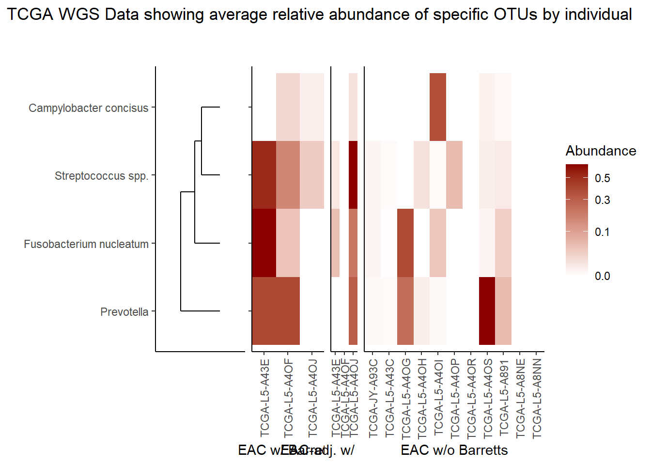
if(save.plots == T){
  ggsave(paste0("output/tcga-wgs-specific-otus-heatmap-",save.Date,".pdf"), plot=p, units="in", width=25, height=5)
  ggsave(paste0("output/tcga-wgs-specific-otus-heatmap-",save.Date,".png"), plot=p, units="in", width=25, height=5)
}
sessionInfo()R version 4.0.3 (2020-10-10)
Platform: x86_64-w64-mingw32/x64 (64-bit)
Running under: Windows 10 x64 (build 19042)
Matrix products: default
locale:
[1] LC_COLLATE=English_United States.1252
[2] LC_CTYPE=English_United States.1252
[3] LC_MONETARY=English_United States.1252
[4] LC_NUMERIC=C
[5] LC_TIME=English_United States.1252
attached base packages:
[1] stats graphics grDevices utils datasets methods base
other attached packages:
[1] cowplot_1.1.1 dendextend_1.14.0 ggdendro_0.1.22 reshape2_1.4.4
[5] car_3.0-10 carData_3.0-4 gvlma_1.0.0.3 patchwork_1.1.1
[9] viridis_0.5.1 viridisLite_0.3.0 gridExtra_2.3 xtable_1.8-4
[13] kableExtra_1.3.1 data.table_1.13.6 readxl_1.3.1 forcats_0.5.1
[17] stringr_1.4.0 dplyr_1.0.3 purrr_0.3.4 readr_1.4.0
[21] tidyr_1.1.2 tibble_3.0.6 ggplot2_3.3.3 tidyverse_1.3.0
[25] lmerTest_3.1-3 lme4_1.1-26 Matrix_1.2-18 vegan_2.5-7
[29] lattice_0.20-41 permute_0.9-5 phyloseq_1.34.0 workflowr_1.6.2
loaded via a namespace (and not attached):
[1] minqa_1.2.4 colorspace_2.0-0 rio_0.5.16
[4] ellipsis_0.3.1 rprojroot_2.0.2 XVector_0.30.0
[7] fs_1.5.0 rstudioapi_0.13 farver_2.0.3
[10] lubridate_1.7.9.2 xml2_1.3.2 codetools_0.2-16
[13] splines_4.0.3 knitr_1.31 ade4_1.7-16
[16] jsonlite_1.7.2 nloptr_1.2.2.2 broom_0.7.4
[19] cluster_2.1.0 dbplyr_2.1.0 BiocManager_1.30.10
[22] compiler_4.0.3 httr_1.4.2 backports_1.2.1
[25] assertthat_0.2.1 cli_2.3.0 later_1.1.0.1
[28] htmltools_0.5.1.1 prettyunits_1.1.1 tools_4.0.3
[31] igraph_1.2.6 gtable_0.3.0 glue_1.4.2
[34] Rcpp_1.0.6 Biobase_2.50.0 cellranger_1.1.0
[37] vctrs_0.3.6 Biostrings_2.58.0 rhdf5filters_1.2.0
[40] multtest_2.46.0 ape_5.4-1 nlme_3.1-149
[43] iterators_1.0.13 xfun_0.20 ps_1.5.0
[46] openxlsx_4.2.3 rvest_0.3.6 lifecycle_0.2.0
[49] statmod_1.4.35 zlibbioc_1.36.0 MASS_7.3-53
[52] scales_1.1.1 hms_1.0.0 promises_1.1.1
[55] parallel_4.0.3 biomformat_1.18.0 rhdf5_2.34.0
[58] curl_4.3 yaml_2.2.1 stringi_1.5.3
[61] highr_0.8 S4Vectors_0.28.1 foreach_1.5.1
[64] BiocGenerics_0.36.0 zip_2.1.1 boot_1.3-25
[67] rlang_0.4.10 pkgconfig_2.0.3 evaluate_0.14
[70] Rhdf5lib_1.12.1 labeling_0.4.2 tidyselect_1.1.0
[73] plyr_1.8.6 magrittr_2.0.1 R6_2.5.0
[76] IRanges_2.24.1 generics_0.1.0 DBI_1.1.1
[79] foreign_0.8-80 pillar_1.4.7 haven_2.3.1
[82] withr_2.4.1 mgcv_1.8-33 abind_1.4-5
[85] survival_3.2-7 modelr_0.1.8 crayon_1.4.1
[88] rmarkdown_2.6 progress_1.2.2 grid_4.0.3
[91] git2r_0.28.0 reprex_1.0.0 digest_0.6.27
[94] webshot_0.5.2 httpuv_1.5.5 numDeriv_2016.8-1.1
[97] stats4_4.0.3 munsell_0.5.0