library(sqldf)
con <- dbConnect(SQLite(), dbname="chicagocrime.db")Making a Hotspot Map
Note: If you have skipped ahead and run the code in Lesson #8: SQL Part 2, then some of the queries involving PrimaryType in this set of notes will not work. You will need to modify those queries to left join with the iucr table.
1 Introduction
In the previous section, you built a SQLite database to store and manage the large Chicago crime data. In this section, you will query the database to extract the latitude and longitude of crime incidents and create a hotspot map with a large dataset. The concept of determining the geographic locations where crime is most intense, a crime hotspot, is very important to criminological theory as well as to the very practical question of where to focus public safety efforts.
Here we will make hotspot maps with our Chicago crime data (which requires use of SQL). Of course, if you have acquired a dataset with latitude and longitude not in a SQL database, you could use these same methods to make a hotspot map using only R.
2 Setting up the data
Let’s first load up the sqldf library and reconnect to our Chicago crime database.
Let’s run a SQL query to extract the two columns, Latitude and Longitude, from our crime database, creating a data frame with one row for each crime incident.
dataAllcrime <- dbGetQuery(con, "
   SELECT Latitude, Longitude
   FROM crime
   WHERE Latitude  IS NOT NULL AND
         Longitude IS NOT NULL")
nrow(dataAllcrime)
[1] 8284414How would your query differ if you wanted to do a hotspot map of only assaults?
dataAssaults <- dbGetQuery(con, "
   SELECT Latitude, Longitude
   FROM crime
   WHERE PrimaryType='ASSAULT' AND
         Latitude  IS NOT NULL AND
         Longitude IS NOT NULL")
nrow(dataAssaults)
[1] 557660Always do a quick check to make sure the data looks the way you expect it to look.
dataAssaults |> head() Latitude Longitude
1 41.91944 -87.77556
2 41.96846 -87.70761
3 41.74878 -87.60517
4 41.76889 -87.61413
5 41.87296 -87.75366
6 41.88448 -87.631313 Creating leaflet maps
We will be using leaflet to make our maps, so be sure you have it installed. We will also use the sf package for some of our spatial calculations. Here we avoid saying too much about the sf package since we go into great detail about it in later parts of the course.
library(dplyr)
library(leaflet)
library(sf)
Let’s start small by creating a leaflet map just showing assaults in Ward 22.
dataWard22Assaults <- dbGetQuery(con, "
   SELECT Latitude,Longitude
   FROM crime
   WHERE PrimaryType='ASSAULT' AND
         Latitude  IS NOT NULL AND
         Longitude IS NOT NULL AND
         Ward=22")

leaflet(dataWard22Assaults) |>
  setView(lng=-87.73, lat=41.83, # selected map's center
          zoom=13) |>            # zoom in to "neighborhood" level
  addTiles() |> # add the base street layer
  addCircleMarkers(~Longitude, ~Latitude,
                   radius=3,
                   stroke=FALSE,
                   fillOpacity = 1)
Leaflet has placed dots all over the map for ward 22. With so many dots, it is rather difficult to determine where exactly there is a higher crime density. It seems that crime is simply everywhere in ward 22. Instead of showing all the dots, we are going to make a new map layer that colors different areas depending on the number of crime incidents per square kilometer, the crime density.
3.1 Hexagonal tiling
One strategy is to chop up the Chicago map into a bunch of smaller tiles. For this we are going to overlay our leaflet map with hexagonal tiles. Then we will count how many dots land within each hexagonal tile and color the tile according to that count. Hexagonal bins are convenient because they produce smoother, more visually appealing density maps, especially when compared with square tiles. Each hexagon has a consistent distance to its neighbors and their geometry better approximates a circle, reducing distortion in how densities appear. This uniformity makes patterns in the underlying data easier to interpret, especially when mapping phenomena like crime incidents, where you want to highlight true spatial concentrations rather than artifacts of the grid shape.
This time we will make a hotspot map of all assaults in Chicago. First, we need to communicate to R that latitude and longitude are special geographic coordinates. We will use a special coordinate system, the Universal Transverse Mercator coordinate system, for the part of globe sharing Chicago’s longitude area (CRS 26916 = UTM zone 16N) to avoid distortion (because we are projecting points on a round earth to a two dimensional screen). The problem with using latitude and longitude coordinates is that differences in coordinates are measured in degrees rather than meters. At the equator 0.01° longitude is about 1 kilometer, but 0.01° degree gets shorter and shorter as you move toward the earth’s poles. Therefore, all of our tiling and counting will be done in the UTM Zone 16N coordinate system that has distances measured in meters. After we have done all of our calculations, we will convert back to latitude and longitude to overlay our results on top of leaflet.
# convert to an sf object
#   tells R that Longitude and Latitude are special columns
dataAssaults <- dataAssaults |>
   st_as_sf(coords = c("Longitude", "Latitude"),
            crs = 4326,        # lat/long coordinate system (WGS 84)
            remove = FALSE) |> # don't remove the lat/long columns
   st_transform(crs = 26916)   # project to UTM 16N, Chicago
Next, we will create the set of hexagonal tiles that covers the assault locations. We need to set the size of the hexagons, specifically the distance between opposite edges of each hexagon. First check what units of distance R will use with these data.
# check the distance units dataAssaults is in
st_crs(dataAssaults)$units
[1] "m"Confirming that the distance measurements are in meters, let’s set the hexagon size to 0.5 km or 500 meters. After that, we can use st_make_grid() to make an R object (an sf object) that creates the hexagons and stores them in a convenient format.
# set distance (meters) between opposite sides of each hexagon
sizeHex <- 500
# create hexagonal tiles
gridHex <- st_make_grid(dataAssaults,
                        cellsize = sizeHex,
                        square = FALSE) |> # prefer hexagons
   st_as_sf() |> # convert to sf object
   rename(geometry = x)
gridHex
Simple feature collection with 6762 features and 0 fields
Geometry type: POLYGON
Dimension: XY
Bounding box: xmin: 422095.9 ymin: 4610178 xmax: 456845.9 ymax: 4652757
Projected CRS: NAD83 / UTM zone 16N
First 10 features:
geometry
1 POLYGON ((422345.9 4610611,...
2 POLYGON ((422345.9 4611477,...
3 POLYGON ((422345.9 4612343,...
4 POLYGON ((422345.9 4613209,...
5 POLYGON ((422345.9 4614075,...
6 POLYGON ((422345.9 4614941,...
7 POLYGON ((422345.9 4615807,...
8 POLYGON ((422345.9 4616673,...
9 POLYGON ((422345.9 4617539,...
10 POLYGON ((422345.9 4618405,...gridHex is like a regular data frame with one column containing polygon objects as each row’s data element. There is also a header that gives some summary information like how many hexagons there are in gridHex (6,762) and its coordinate system (NAD83 / UTM zone 16N).
Let’s check our work so far by displaying the hexagons over a leaflet map of Chicago.
leaflet() |>
   addTiles() |>
   # zoom=11 -> tight city level view
   setView(lng = -87.8, lat = 41.85, zoom = 11) |>
   addPolygons(
      # convert coordinates back to lat/long (CRS 4326)
      data = gridHex |> st_transform(crs=4326),
      fillOpacity = 0,    # don't color in the hexagons
      color = "darkgray", # border of hexagons
      weight = 2,         # border thickness
      opacity = 1)        # border transparency
We are making progress. We have covered the map of Chicago with 6,762 hexagons. Some of our hexagons are tiling parts of Lake Michigan. We will end up dropping those by filtering our hexagons with 0 crime counts.
Now we need to count how many of the assaults land in each of these hexagonal tiles. st_intersects() will figure out which points in dataAssaults land inside each hexagon and lengths() will count their number. We will also compute the crime density (incidents per square kilometer per year), eliminate any hexagons with 0 assaults (like all those in Lake Michigan), and project coordinates back to latitude/longitude, which leaflet requires.
We will need to know the number of years of data we have so we can normalize results to a “per year” rate.
a <- dbGetQuery(con, "SELECT Date FROM crime") |>
   mutate(Date = lubridate::mdy_hms(Date)) |>
   summarize(firstDate = min(Date),
             lastDate  = max(Date))
nYears <- as.numeric(difftime(a$lastDate, a$firstDate, units = "days") / 365.25)
nYears
[1] 24.59138st_intersects(), when used with polygon shapes (gridHex) and points (dataAssaults), returns for each polygon a list of the indices of points that the polygon intersects. Here is what the results of st_intersects() look like for 10 hexagons plucked from the middle of Chicago. For some hexagons, the list is empty signalling that no assaults landed in that hexagon. For other hexagons we see lists of points. These are the row numbers from dataAssaults of points that landed in that specific hexagonal tile.
gridHex |>
   slice(3480:3489) |>
   st_intersects(dataAssaults)
Sparse geometry binary predicate list of length 10, where the predicate
was `intersects'
1: (empty)
2: (empty)
3: (empty)
4: (empty)
5: (empty)
6: 12, 3388, 6990, 7234, 7427, 7487, 18670, 19382, 20377, 27893, ...
7: 9391, 14771, 18938, 19218, 25833, 30536, 31292, 31427, 33952, 43080, ...
8: 29548, 30511, 37116, 49594, 54512, 58866, 95299, 121602, 127701, 169652, ...
9: 7158, 11117, 17344, 20963, 42193, 92508, 99246, 134087, 141568, 142694, ...
10: 146006, 150503, 378307If we apply lengths() to this list it will return the number of points in each of these lists.
gridHex |>
   slice(3480:3489) |>
   st_intersects(dataAssaults) |>
   lengths()
[1] 0 0 0 0 0 94 98 34 38 3Now for all of our hexagons covering Chicago let’s compute the number of assaults per km2 per year.
gridHex <- gridHex |>
   # find which dots each hex intersects...
   mutate(nAssaults = geometry |>
             st_intersects(dataAssaults) |>
             lengths(), # ...and count them
          # get area in square kilometers
          areakm2 = as.numeric(st_area(geometry)) / 10^6,
          # compute incidents per km2 per year
          density = nAssaults / areakm2 / nYears) |>
   filter(nAssaults > 0) |> # drop those that are empty
   st_transform(crs=4326) # transform back to lat/long for leaflet

gridHex
Simple feature collection with 2667 features and 3 fields
Geometry type: POLYGON
Dimension: XY
Bounding box: xmin: -87.94064 ymin: 41.64168 xmax: -87.51863 ymax: 42.02491
Geodetic CRS: WGS 84
First 10 features:
geometry nAssaults areakm2 density
1 POLYGON ((-87.93757 41.9944... 1 0.2165064 0.1878220
2 POLYGON ((-87.93472 42.0061... 1 0.2165064 0.1878220
3 POLYGON ((-87.93153 41.9944... 1 0.2165064 0.1878220
4 POLYGON ((-87.92789 41.9516... 1 0.2165064 0.1878220
5 POLYGON ((-87.928 41.9594, ... 1 0.2165064 0.1878220
6 POLYGON ((-87.92846 41.9905... 1 0.2165064 0.1878220
7 POLYGON ((-87.92538 41.9867... 4 0.2165064 0.7512881
8 POLYGON ((-87.92561 42.0023... 3 0.2165064 0.5634661
9 POLYGON ((-87.92186 41.9516... 1 0.2165064 0.1878220
10 POLYGON ((-87.92197 41.9594... 1 0.2165064 0.1878220Now gridHex has three new columns associating to each hexagon an assault count, the area of the hexagon (all should be identical), and the assault density. We want to break up that density into bins and assign a color to each bin. This way we can color-code each hexagon based on the assault density. colorBin() creates a function that will take a density value and return a color. The combination of bins = 10 and pretty = TRUE will create some nice intervals for the different colors. Viridis is a family of color palettes that has been engineered to be perceptually uniform (equal steps in data values look like equal steps in color), colorblind-friendly, printer-friendly (maintains contrast in grayscale), and is readable on screens and projectors.
pal <- colorBin("viridis",
                domain = gridHex$density,
                bins = 10,
                pretty = TRUE) # choose "nice" breakpoints
So what is this pal() function? If we give pal() a number it will produce a color code.
pal(125)[1] "#3B528B"pal(125) produces the color code #3B528B, which gives the hexadecimal code for mixing the primary source colors red (3B), green (52), and blue (8B). That mix is like a deep indigo blue. When creating the hexagon overlay, each hexagon’s density will be run through pal() which will determine how to color the hexagon.
What breakpoints did pal() decide on?
pal |> attr("colorArgs")$bins
[1] 0 50 100 150 200 250 300 350 400 450
$na.color
[1] "#808080"The bins value shows that pal() will assign one color to 0-50, another color to 50-100, and so on up to the last bin 400-450. It also shows that if there happens to be any hexagons with missing values for density (there are in fact none), those hexagons will get colored with #808080, which is gray.
Let’s make our leaflet map!
leaflet() |>
  addTiles() |>
  setView(lng = -87.8, lat = 41.85, zoom = 10) |>
  addPolygons(
    data = gridHex,
    fillColor = ~pal(density),
    fillOpacity = 0.5,
    color = "darkgray", # border of hexagons
    weight = 0.5,       # border thickness
    opacity = 0.8,      # border transparency
    # make popup box when hovering
    label = ~paste("Count:",
                   format(nAssaults, big.mark=","),
                   "<br>Density: ",
                   format(round(density,1), nsmall=1),
                   "/ km² / year") |>
       lapply(htmltools::HTML), # signal HTML so <br> is linebreak
    highlightOptions = highlightOptions(color = "red", # hover highlight
                                        weight = 2,
                                        bringToFront = FALSE)) |>
  addLegend(position = "bottomright",
            pal = pal,
            values = gridHex$density,
            title = "Incidents / km² / year",
            opacity = 0.7,
            labFormat = labelFormat()) # use pal() to figure out format
You can zoom in on specific neighborhoods or specific hexagons. You can also hover your mouse over a hexagon to see the assault density.
You can try to make your own color palettes, like
palGreg <- colorNumeric(
  palette = c("springgreen", "hotpink"),
  domain  = c(0, 450))

leaflet() |>
  addTiles() |>
  setView(lng = -87.8, lat = 41.85, zoom = 10) |>
  addPolygons(
    data = gridHex,
    fillColor = ~palGreg(density),
    fillOpacity = 0.5,
    color = "darkgray",
    weight = 0.5,
    opacity = 0.8,
    label = ~paste("Count:",
                   format(nAssaults, big.mark=","),
                   "<br>Density: ",
                   format(round(density,1), nsmall=1),
                   "/ km² / year") |>
       lapply(htmltools::HTML),
    highlightOptions = highlightOptions(color = "red",
                                        weight = 2,
                                        bringToFront = FALSE)) |>
  addLegend(position = "bottomright",
            pal = palGreg,
            values = gridHex$density,
            title = "Incidents / km² / year",
            opacity = 0.7,
            labFormat = labelFormat())
Yikes! I have made awful color choices here. The gradation of the palette is not sufficiently varied for us to see where the hotspots are, except for the few hexagons colored hot pink. I find it best to rely on the built in color palettes that have been more thoughtfully constructed.
3.2 Contour map
You can also create a map that shows the high crime areas in a way that is akin to elevation on a topographical map. The more concentrated the concentric areas, the higher the crime (or, in the case of a topographical map, the higher the terrain).
3.2.1 Kernel density estimation
We are going to use a two-dimensional kernel density estimate. Two-dimensional kernel density estimation (2D KDE) is a smoothing technique that transforms a set of crime incident points into a smooth looking surface, highlighting areas where events are more concentrated. Instead of plotting individual dots, KDE places a smooth “bump” (the kernel) over each point and sums them up, producing a measure of how many incidents are expected per unit area. When used for crime hotspot mapping, this method makes clusters of incidents visually stand out, reduces noise from random scatter, and allows analysts to interpret patterns of concentration at a chosen spatial scale (controlled by a bandwidth parameter).
To give the general idea how this works, let’s look at a one-dimensional version. Imagine we have single street that is 6 kilometers long and we know the crime locations of 8 crimes along this street. I have marked those 8 crime locations on the horizontal axis.
# Small set of points (e.g., crime locations on a 1D street axis)
x <- c(1.0, 1.8, 2.0, 2.7, 3.1, 3.9, 4.2, 5.0)
plot(0, 0, type = "n",
     xlim=c(0, 6),
     ylim = c(0, 1.8),
     xlab = "x", ylab = "",
     axes = FALSE)
axis(1)
rug(x, lwd = 2)
points(x, rep(0, length(x)), pch = 19)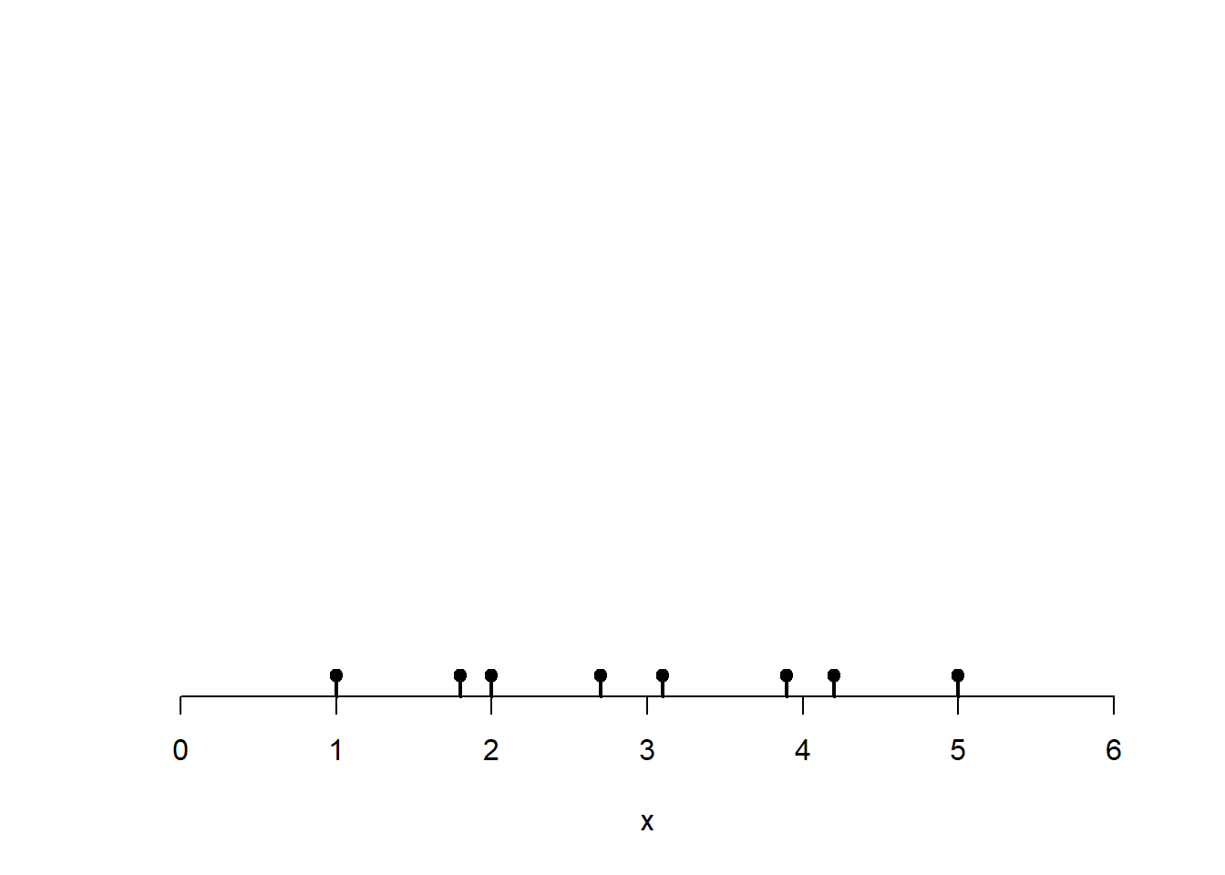
Centered on each point place a bell-shaped curve. I have used the normal distribution here, but other choices are possible. The parameter bandwidth controls how wide these bell curves are around each point. The total area under these bell curves adds up to 8, the total number of incidents. Rather than treat the incident as occurring at one specific point, the kernels kind of smudge the incident so that the weight of any one incident is spread over nearby areas.
plot(0, 0, type = "n",
     xlim=c(0, 6),
     ylim = c(0, 1.8),
     xlab = "x", ylab = "Incidents")
rug(x, lwd = 2)
points(x, rep(0, length(x)), pch = 19)

# Bandwidth (controls smoothness)
h <- 0.35

# Grid to evaluate densities
g <- seq(min(x) - 3*h, max(x) + 3*h, length.out = 1000)

# compute kernels
kernels <- sapply(x, function(xi) dnorm((g - xi)/h) / h)

# Overlay individual kernels (light lines)
apply(kernels, 2,
      function(y) lines(g, y,
                        col = rgb(0.2, 0.2, 0.2, 0.35),
                        lwd = 1.5))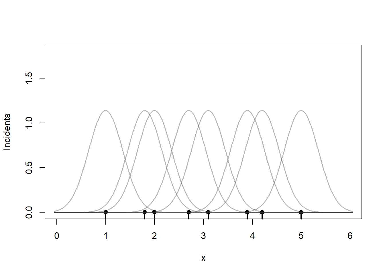
To estimate the number of incidents we can sum those kernel values at any point \(x\). So if you want to compute the KDE of the incidents at 2.5.
plot(0, 0, type = "n",
     xlim=c(0, 6), ylim = c(0, 1.8),
     xlab = "x", ylab = "Incidents")
rug(x, lwd = 2)
points(x, rep(0, length(x)), pch = 19)
apply(kernels, 2,
      function(y) lines(g, y,
                        col = rgb(0.2, 0.2, 0.2, 0.35),
                        lwd = 1.5))

# find the kernel heights near 2.5
i <- abs(g-2.5) |> which.min()
points(rep(2.5, 8), c(kernels[i,1:8]), col=rgb(1,0,0,0.35), pch=19)
points(2.5, sum(kernels[i,1:8]), col="red", pch=19)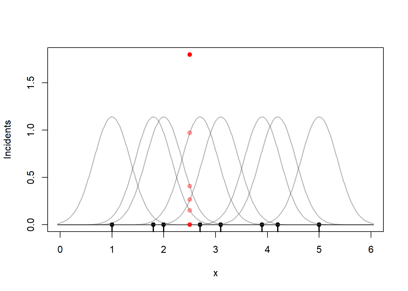
That sum is 1.8. A more useful measure is an incident rate per kilometer. Since we have a 6-kilometer street segment, the crime incident rate at the 2.5 km marker divides that sum by 6, 0.30 incidents per kilometer. I will divide the KDE by 6 through the rest of this section so that the vertical axis is incidents / km.
Repeat this process for a range of values of \(x\). Note that I am summing up the kernel values and then dividing by 6 (the length of the road) to get an incident per kilometer rate.
plot(0, 0, type = "n",
     xlim=c(0, 6), ylim = c(0, 1.2),
     xlab = "x", ylab = "Incidents / km")
rug(x, lwd = 2)
points(x, rep(0, length(x)), pch = 19)
apply(kernels, 2,
      function(y) lines(g, y,
                        col = rgb(0.2, 0.2, 0.2, 0.35),
                        lwd = 1.5))

# KDE = sum of kernels
kde <- rowSums(kernels) / 6 # divide by number of kms -> incidents/km
lines(g, kde, col = "#2C7BB6", lwd = 3)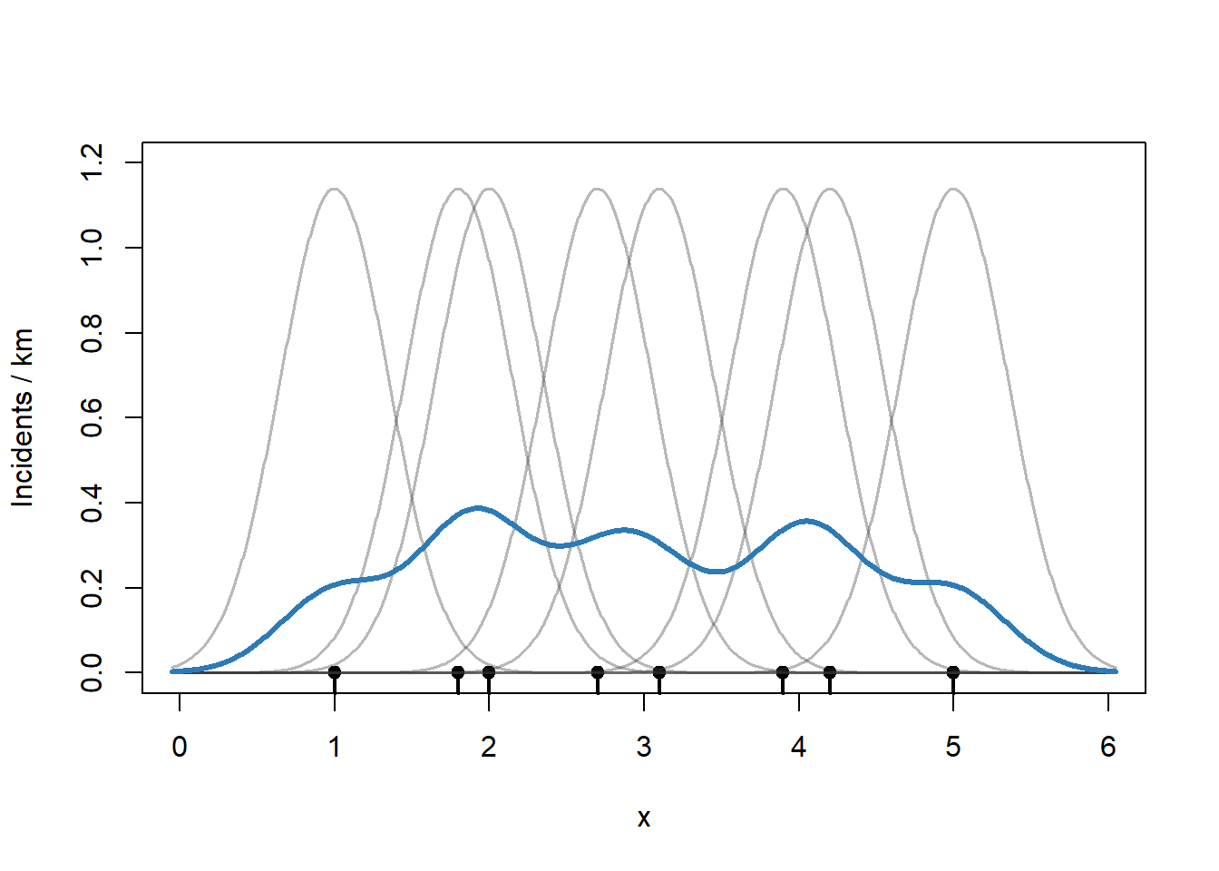
Selecting a bandwidth can be a little tricky. A bandwidth that is too small gives a KDE that is unstable and too jagged. A bandwidth that is too large smooths away interesting features and fails to highlight hotspots. The R MASS package has useful tools for choosing reasonable bandwidth parameters that we will use on our Chicago data.
plot(0, 0, type = "n",
     xlim=c(0, 6), ylim = c(0, 1.2),
     xlab = "x", ylab = "Incidents / km")
rug(x, lwd = 2)
points(x, rep(0, length(x)), pch = 19)

# too small
h <- 0.1
kernels <- sapply(x, function(xi) dnorm((g - xi)/h) / h)
lines(g, rowSums(kernels) / 6, col = "#E66101", lwd = 3)

# too big
h <- 1.0
kernels <- sapply(x, function(xi) dnorm((g - xi)/h) / h)
lines(g, rowSums(kernels) / 6, col = "#4DAF4A", lwd = 3)

# original h=0.35
h <- 0.35
kernels <- sapply(x, function(xi) dnorm((g - xi)/h) / h)
lines(g, kde, col = "#2C7BB6", lwd = 3)

legend("topright",
       legend = c("h=0.10", "h=0.35", "h=1.00"),
       fill   = c("#E66101","#2C7BB6","#4DAF4A"),
       border = NA,
       bty    = "n",
       title  = "Bandwidth")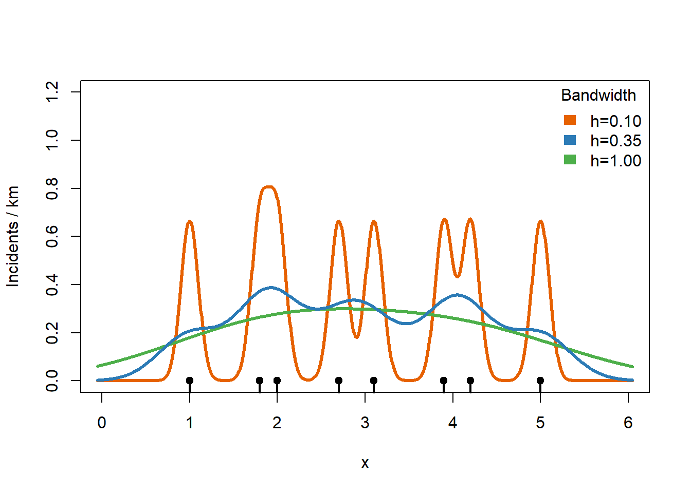
The color that we would apply to any stretch of the road depends on how high the crime density is at a particular point. I have shaded the regions showing the relationship between the KDE estimate and what color we would shade the road segment.
plot(0, 0, type = "n",
     xlim=c(0, 6), ylim = c(0, 1.2),
     xlab = "x", ylab = "")

pal1dKDE <- colorBin("viridis",
                     domain = kde,
                     bins = 4,
                     pretty = TRUE)
rect(par()$usr[1], 0.3, par()$usr[2], par()$usr[4],
     col=pal1dKDE(0.35) |> adjustcolor(alpha.f = 0.5))
rect(par()$usr[1], 0.2, par()$usr[2], 0.3,
     col=pal1dKDE(0.25) |> adjustcolor(alpha.f = 0.5))
rect(par()$usr[1], 0.1, par()$usr[2], 0.2,
     col=pal1dKDE(0.15) |> adjustcolor(alpha.f = 0.5))
rect(par()$usr[1], 0.0, par()$usr[2], 0.1,
     col=pal1dKDE(0.05) |> adjustcolor(alpha.f = 0.5))

rug(x, lwd = 2)
points(x, rep(0, length(x)), pch = 19)
lines(g, kde, col = "#2C7BB6", lwd = 3)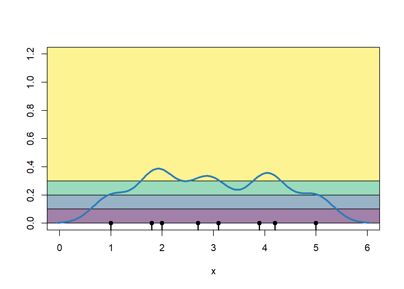
To simplify, we draw the road colored by crime incident rate.
plot(g, rep(0,1000), ylim = c(0, 1.2),
     xlab = "x", ylab = "",
     col=pal1dKDE(kde))
rug(x, lwd = 2)
points(x, rep(0, length(x)), pch = 19)
bins <- attr(pal1dKDE, "colorArgs")$bins
mid  <- (bins[-1] + bins[-length(bins)]) / 2
bins <- bins |> format(nsmall=1)
labs <- paste0("(", bins[-length(bins)], ", ", bins[-1], ")")
legend("topright",
       legend = labs,
       fill   = pal1dKDE(mid),
       border = NA,
       bty    = "n",
       title  = "Incidents / km")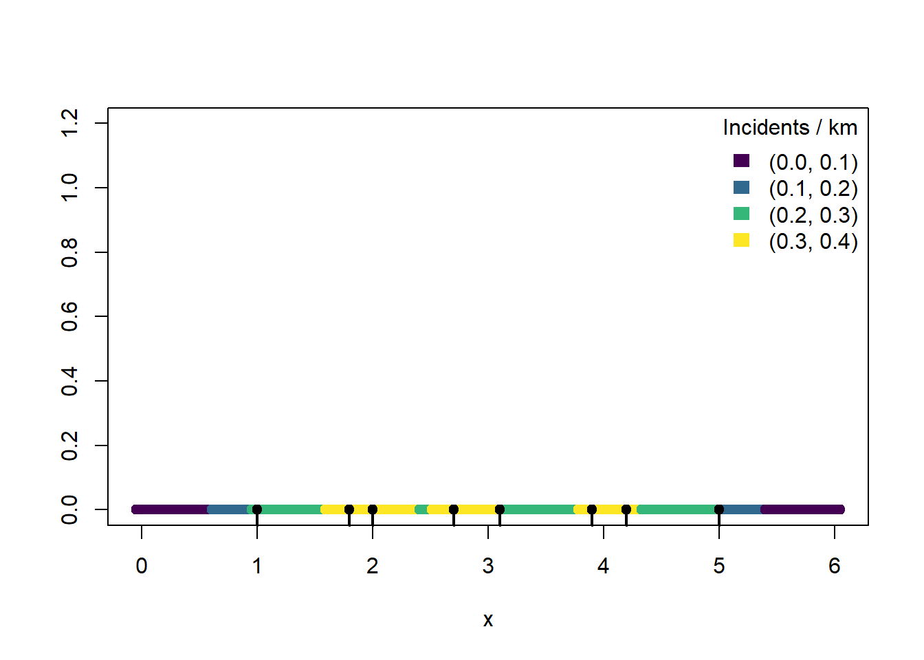
The process of computing a KDE for a two-dimensional collection of points is similar. We use a two-dimensional version of the normal distribution kernel and create a two-dimensional grid of values at which we will compute the incident rate per square kilometer.
3.2.2 Contour map with two-dimensional kernel density estimation
The MASS package provides a two-dimensional KDE function kde2d(). However, the MASS package also has a select() function that clashes with dplyr’s select() function. This makes it either easy to cause bugs or confusing why an apparently simple line of code does not work. So we will not run library(MASS) and just prefix any calls to MASS functions with MASS:: to avoid problems completely.
We will also use the isoband package. Isobands are the filled regions between pairs of contour lines representing areas where the incident rate values fall within a given range.
# for computing 2-dimensional kernel density estimates
#   prefer not to load it, MASS::select() clash with dplyr::select()
# library(MASS)
# for creating polygons from contours
library(isoband)
Here we use MASS::bandwidth.nrd() to select bandwidths, one for the x direction and one for the y direction. kde2d() will compute the KDE on a 200 x 200 grid of points.
# extract the (x,y) coordinates
xy <- dataAssaults |>
   st_coordinates() |>
   data.frame()
# simple bandwidth guess for how much smoothing
h <- c(MASS::bandwidth.nrd(xy$X),
       MASS::bandwidth.nrd(xy$Y))
kdeAssaults <- MASS::kde2d(
   xy$X, xy$Y, # coordinates
   n = 200,    # a 200 x 200 grid
   h = h)      # bandwidth
Stored in kdeAssaults is a component z that contains the crime density estimate. As we requested, MASS::kde2d() chopped the map of Chicago into a 200 x 200 grid of dimension and z contains the estimated crime density at those grid points. Those points are centered in a box with width and height equal to:
# width in meters
diff(kdeAssaults$x[1:2])
[1] 169.6576# height in meters
diff(kdeAssaults$y[1:2])[1] 211.274z is scaled so that z times the width times the height equals the fraction of expected crime incidents in that box. So z is like the fraction of crime incidents per square meter. If we multiply each value of z by the width and height of the boxes (which all have the same size) and add them up, we should get a number close to 1.
sum(kdeAssaults$z * diff(kdeAssaults$x[1:2]) * diff(kdeAssaults$y[1:2]))[1] 0.9973903If we multiply all the values of z by the total number of crime incidents, then rather than describing the fraction of incidents per square meter (a hard to understand quantity), we estimate the expected number of incidents per square meter. Multiply that by 106 to convert square meters to square kilometers and divide by the number of years of data that we have so that we get an estimated number of crime incidents per km2 per year, a measurement that describes the pace of incidents over space and time.
# scale so that the units are incidents/km2/year
kdeAssaults$zKM2Year <- kdeAssaults$z * nrow(dataAssaults) * 10^6 / nYears
hist(kdeAssaults$zKM2Year,
     xlab = "Crime rate",
     ylab = "Number of points",
     main = "")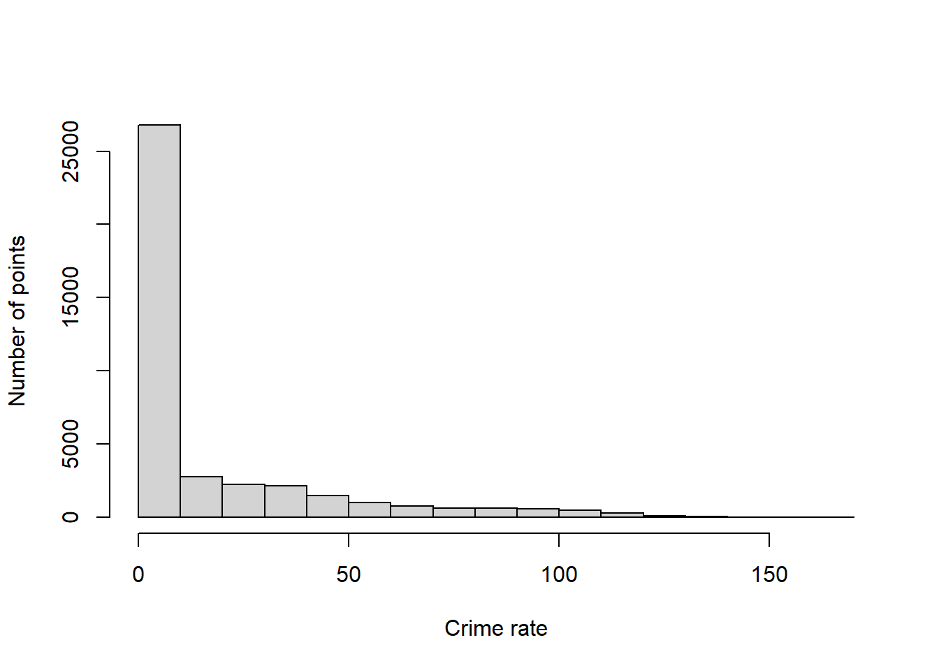
The histogram shows that a large number of areas have very low crime rates, but this histogram has a long right tail, meaning some parts of Chicago have high crime rates. Let’s determine some nice breakpoints for our map.
breaks <- kdeAssaults$zKM2Year |>
   range() |>
   pretty(n=10)
breaks
[1] 0 20 40 60 80 100 120 140 160 180Now we ask isobands() to find level sets for each value of breaks. That is, isobands() will find curves through x and y where the value of zKM2Year is close to each value of breaks.
contourAssaults <-
   isobands(kdeAssaults$x,
            kdeAssaults$y,
            kdeAssaults$zKM2Year,
            levels_low  = breaks[-length(breaks)],
            levels_high = breaks[-1]) |>
   iso_to_sfg() |>        # convert to sf geometry object
   st_sfc(crs = 26916) |> # convert to sf data column
   st_sf(levels_low  = breaks[-length(breaks)], # convert to sf object
         levels_high = breaks[-1],
         geometry = _) |>
   st_transform(4326)

# show the result so far
contourAssaults |>
   slice(-1) |> # drop the outer edge
   st_geometry() |>
   plot()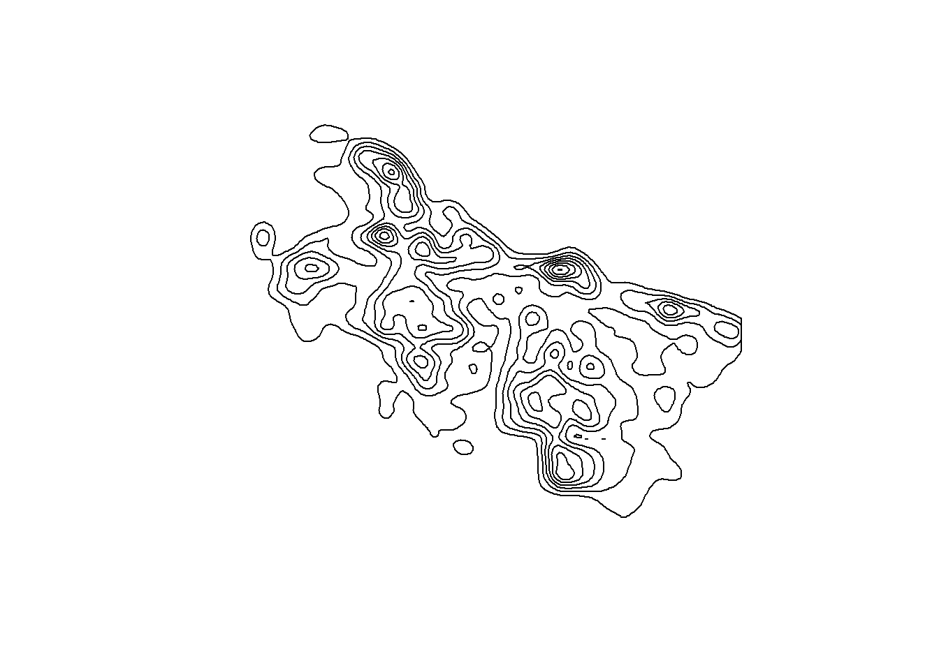
Let’s create a viridis color palette to shade the areas between these contour lines.
pal <- colorBin("viridis",
                domain = (contourAssaults$levels_low +
                             contourAssaults$levels_high)/2,
                bins = breaks,
                pretty = FALSE)
Now we are ready to overlay a colored contour map on top of our Chicago leaflet map.
leaflet() |>
  addTiles() |>
  setView(lng = -87.8, lat = 41.85, zoom = 10) |>
  addPolygons(
    data = contourAssaults,
    fillColor = ~pal((levels_low + levels_high)/2),
    fillOpacity = 0.4,
    color = "#808080",  # contour band edges
    weight = 0.5,
    opacity = 0.5,
    label = ~paste0("Density: ",
                    format(levels_low,  scientific=FALSE), "-",
                    format(levels_high, scientific=FALSE)) |>
       lapply(htmltools::HTML),
    highlightOptions =
       highlightOptions(weight = 2, bringToFront = TRUE)) |>
  addLegend(
    position = "bottomright",
    pal = pal,
    values = (contourAssaults$levels_low +
                 contourAssaults$levels_high)/2,
    title = "Incidents / km² / year",
    opacity = 0.7)
Chicago assault hot spots
The contours have been created over the Chicago bounding box, which ends up looking a little strange, with areas highlighted in Lake Michigan. We are going to intersect the contours with the data points’ concave hull, a tight-fitting polygon that wraps a point set while allowing some inward dents. The ratio parameter sets how tight the fit is, roughly the fraction of the convex hull’s area to keep. This leaflet map shows the convex hull (the smallest polygon that contains all the data points with no inward dents) in gray and the concave hull with ratio set to 0.2 in purple. We could use either one to trim the KDE contour map to places where assaults actually occur.
leaflet() |>
   addTiles() |>
   setView(lng = -87.8, lat = 41.85, zoom = 10) |>
   addPolygons(
      data = dataAssaults |>
         st_geometry() |>
         st_combine() |>
         st_convex_hull() |>
         st_buffer(200) |> # add a little extra at the edges
         st_transform(crs = 4326),
      color = "#808080",
      weight = 0.5,
      opacity = 0.9)  |>
   addPolygons(
      data = dataAssaults |>
         st_geometry() |>
         st_combine() |>
         st_concave_hull(ratio=0.2) |>
         st_buffer(200) |> # add a little extra at the edges
         st_transform(crs = 4326),
      color = "purple",
      weight = 0.5,
      opacity = 0.9,
    highlightOptions =
       highlightOptions(weight = 2, bringToFront = TRUE))
Also, let’s make the hotspot map only highlight the hottest spots, those with a crime rate exceeding 80 incidents per km2 per year. Zoom in on some of the brightest areas to see what is in these high assault rate areas.
legendMid <- (contourAssaults$levels_low +
                 contourAssaults$levels_high)/2
legendMid <- legendMid[legendMid > 80]
legendCol <- pal(legendMid)
legendLabs <- paste0(contourAssaults$levels_low, "-",
                     contourAssaults$levels_high)
legendLabs <- legendLabs[contourAssaults$levels_low >= 80]

leaflet() |>
   addTiles() |>
   setView(lng = -87.8, lat = 41.85, zoom = 10) |>
   addPolygons(
      data = contourAssaults |>
         st_intersection(dataAssaults |>
                            st_geometry() |>
                            st_combine() |>
                            st_concave_hull(ratio=0.2) |>
                            st_buffer(200) |> # add a little extra at the edges
                            st_transform(crs = 4326)) |>
         filter(levels_low >= 80), # highlight just the hottest spots
      fillColor = ~pal((levels_low + levels_high)/2),
      fillOpacity = 0.4,
      color = "#808080",
      weight = 0.5,
      opacity = 0.5,
      label = ~paste0("Density: ",
                      format(levels_low,  scientific=FALSE), "-",
                      format(levels_high, scientific=FALSE)),
      highlightOptions =
         highlightOptions(weight = 2, bringToFront = TRUE)) |>
   addLegend(
      position = "bottomright",
      colors = legendCol,
      labels = legendLabs,
      title = "Incidents / km² / year",
      opacity = 0.7)
Chicago assault hot spots
4 Visualizing changes in hotspots over time
Let’s create hotspot maps with just motor vehicle theft, making a separate map for each year between 2018 and 2024. Take a look at the Date column in our initial dataset.
dbGetQuery(con, "SELECT Date
                 FROM crime
                 LIMIT 5")
Date
1 07/29/2022 03:39:00 AM
2 01/03/2023 04:44:00 PM
3 08/10/2020 09:45:00 AM
4 08/26/2017 10:00:00 AM
5 09/06/2023 05:00:00 PMWe want only the year part of these dates. The year starts with the 7th character and has a length of 4 characters. So to extract just the year we can use the built-in SQL function SUBSTR().
dataCarTheft <- dbGetQuery(con, "
   SELECT Latitude,
          Longitude,
          SUBSTR(Date, 7, 4) AS year
   FROM crime
   WHERE PrimaryType='MOTOR VEHICLE THEFT' AND
         Latitude  IS NOT NULL AND
         Longitude IS NOT NULL AND
         year >= 2018 AND year <= 2024")
dataCarTheft |> head()
Latitude Longitude year
1 41.76935 -87.61501 2022
2 41.80890 -87.61814 2023
3 41.76170 -87.71864 2023
4 41.90969 -87.79601 2023
5 41.76342 -87.70524 2023
6 41.98896 -87.78277 2023In the WHERE clause, note the use of the alias year that was defined in the SELECT clause. Most standard SQL implementations do not allows using aliases in the WHERE clause, but SQLite does. If you are working with a SQL database that does not allow aliases to be used like this, then you need to replace year with SUBSTR(Date, 7, 4) every time it is used outside of the SELECT clause. Or you can create all the aliases in a Common Table Expression (CTE), which we will discuss in later lessons.
Now that we have the car theft data pulled out of our SQL database, convert to a spatial data frame with st_as_sf() and make a color palette for the range of car theft rates.
dataCarTheft <- dataCarTheft |>
   st_as_sf(coords = c("Longitude", "Latitude"),
            crs = 4326, # lat/long coordinate system
            remove = FALSE) |>
   st_transform(crs = 26916)

breaks <- seq(0, 140, by=20)

pal <- colorBin("viridis",
                domain = (breaks[-length(breaks)]+breaks[-1])/2,
                bins = breaks,
                pretty = FALSE)
We then loop through the years 2018 to 2024, subsetting the data to one of those years at a time, and generate a hotspot map.
maps <- lapply(2018:2024,
function(year0)
{
   message(paste("Mapping", year0))

   xy <- dataCarTheft |>
      filter(year == year0) |> # for just one year
      st_coordinates() |>
      data.frame()
   h <- c(MASS::bandwidth.nrd(xy$X),
          MASS::bandwidth.nrd(xy$Y))
   kdeCarTheft <- MASS::kde2d(xy$X, xy$Y, n = 200, h = h)

   # no need to divide by year here... only one year of data
   kdeCarTheft$zKM2Year <- kdeCarTheft$z * nrow(xy) * 10^6

   contourCarTheft <-
      isobands(kdeCarTheft$x,
               kdeCarTheft$y,
               kdeCarTheft$zKM2Year,
               levels_low  = breaks[-length(breaks)],
               levels_high = breaks[-1]) |>
      iso_to_sfg() |>
      st_sfc(crs = 26916) |>
      st_sf(levels_low  = breaks[-length(breaks)],
            levels_high = breaks[-1],
            geometry = _) |>
      st_transform(4326) # back to lat/long

   mapYear <- leaflet() |>
      addTiles() |>
      setView(lng = -87.8, lat = 41.85, zoom = 10) |>
      addPolygons(
         data = contourCarTheft |>
            st_intersection(dataCarTheft |>
                               st_geometry() |>
                               st_combine() |>
                               st_concave_hull(ratio=0.7) |>
                               st_buffer(200) |>
                               st_transform(crs = 4326)) |>
            filter(levels_low >= 25), # highlight just the hottest spots
         fillColor = ~pal((levels_low + levels_high)/2),
         fillOpacity = 0.4,
         color = "#808080",
         weight = 0.5,
         opacity = 0.5,
         label = ~paste0("Density: ",
                         format(levels_low,  scientific=FALSE), "-",
                         format(levels_high, scientific=FALSE)) |>
            lapply(htmltools::HTML),
         highlightOptions =
            highlightOptions(weight = 2, bringToFront = TRUE)) |>
      addLegend(
         position = "bottomright",
         pal = pal,
         values = (contourCarTheft$levels_low +
                      contourCarTheft$levels_high)/2,
         title = paste(year0, "Incidents / km² / year"),
         opacity = 0.7)

   # add a little space after each map
   htmltools::div(style = "margin-bottom: 12px;", mapYear)
})
# generate HTML code for all the maps
htmltools::tagList(maps)
Car thefts spiked in between 2022 and 2024.
dataCarTheft |>
   count(year) |>
   plot(n~year, data=_,
        xlab = "Year",
        ylab = "Number of car thefts")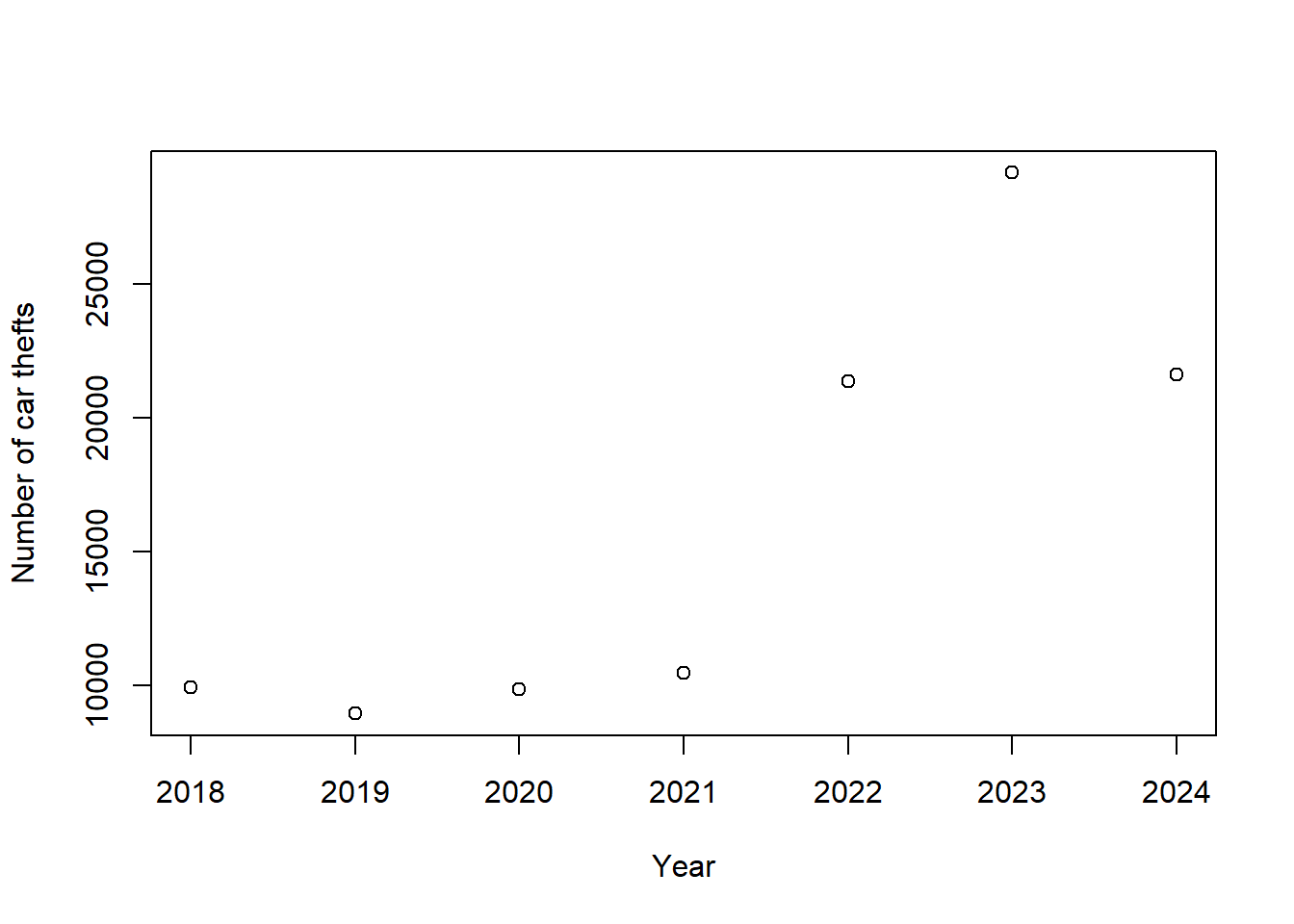
That spike was fueled by thefts of Kia and Hyundai vehicles, which lacked passive immobilizer antitheft devices as standard equipment and lead to a social media trend describing how to steal Kia and Hyundai vehicles.
Many cities other than Chicago have accessible incident-level data. You can easily modify the code here to make a hotspot map for Philadelphia, Los Angeles, Seattle, San Francisco, Baltimore, or Washington, DC.
5 Disconnect
Remember to disconnect from the database when you are done.
dbDisconnect(con)