Exploratory data analysis
John Blischak
2019-09-27
Last updated: 2019-09-27
Checks: 7 0
Knit directory: wflow-r4ds/
This reproducible R Markdown analysis was created with workflowr (version 1.4.0). The Checks tab describes the reproducibility checks that were applied when the results were created. The Past versions tab lists the development history.
Great! Since the R Markdown file has been committed to the Git repository, you know the exact version of the code that produced these results.
Great job! The global environment was empty. Objects defined in the global environment can affect the analysis in your R Markdown file in unknown ways. For reproduciblity it’s best to always run the code in an empty environment.
The command set.seed(20190925) was run prior to running the code in the R Markdown file. Setting a seed ensures that any results that rely on randomness, e.g. subsampling or permutations, are reproducible.
Great job! Recording the operating system, R version, and package versions is critical for reproducibility.
Nice! There were no cached chunks for this analysis, so you can be confident that you successfully produced the results during this run.
Great job! Using relative paths to the files within your workflowr project makes it easier to run your code on other machines.
Great! You are using Git for version control. Tracking code development and connecting the code version to the results is critical for reproducibility. The version displayed above was the version of the Git repository at the time these results were generated.
Note that you need to be careful to ensure that all relevant files for the analysis have been committed to Git prior to generating the results (you can use wflow_publish or wflow_git_commit). workflowr only checks the R Markdown file, but you know if there are other scripts or data files that it depends on. Below is the status of the Git repository when the results were generated:
Ignored files:
    Ignored:    .Rhistory
    Ignored:    .Rproj.user/
Note that any generated files, e.g. HTML, png, CSS, etc., are not included in this status report because it is ok for generated content to have uncommitted changes.
These are the previous versions of the R Markdown and HTML files. If you’ve configured a remote Git repository (see ?wflow_git_remote), click on the hyperlinks in the table below to view them.
| File | Version | Author | Date | Message |
|---|---|---|---|---|
| Rmd | 874ad3b | John Blischak | 2019-09-27 | chp 5 exploratory data analysis |
Setup
library(nycflights13)
library(tidyverse)
data(diamonds)
library(ggstance)
library(lvplot)
library(ggbeeswarm)
Variation
p. 90
- Explore the distribution of each of the
x,y, andzvariables indiamonds. What do you learn? Think about a diamond and how you might decide which dimension is the length, width, and depth.
ggplot(data = diamonds, mapping = aes(x = x)) +
  geom_histogram()
`stat_bin()` using `bins = 30`. Pick better value with `binwidth`.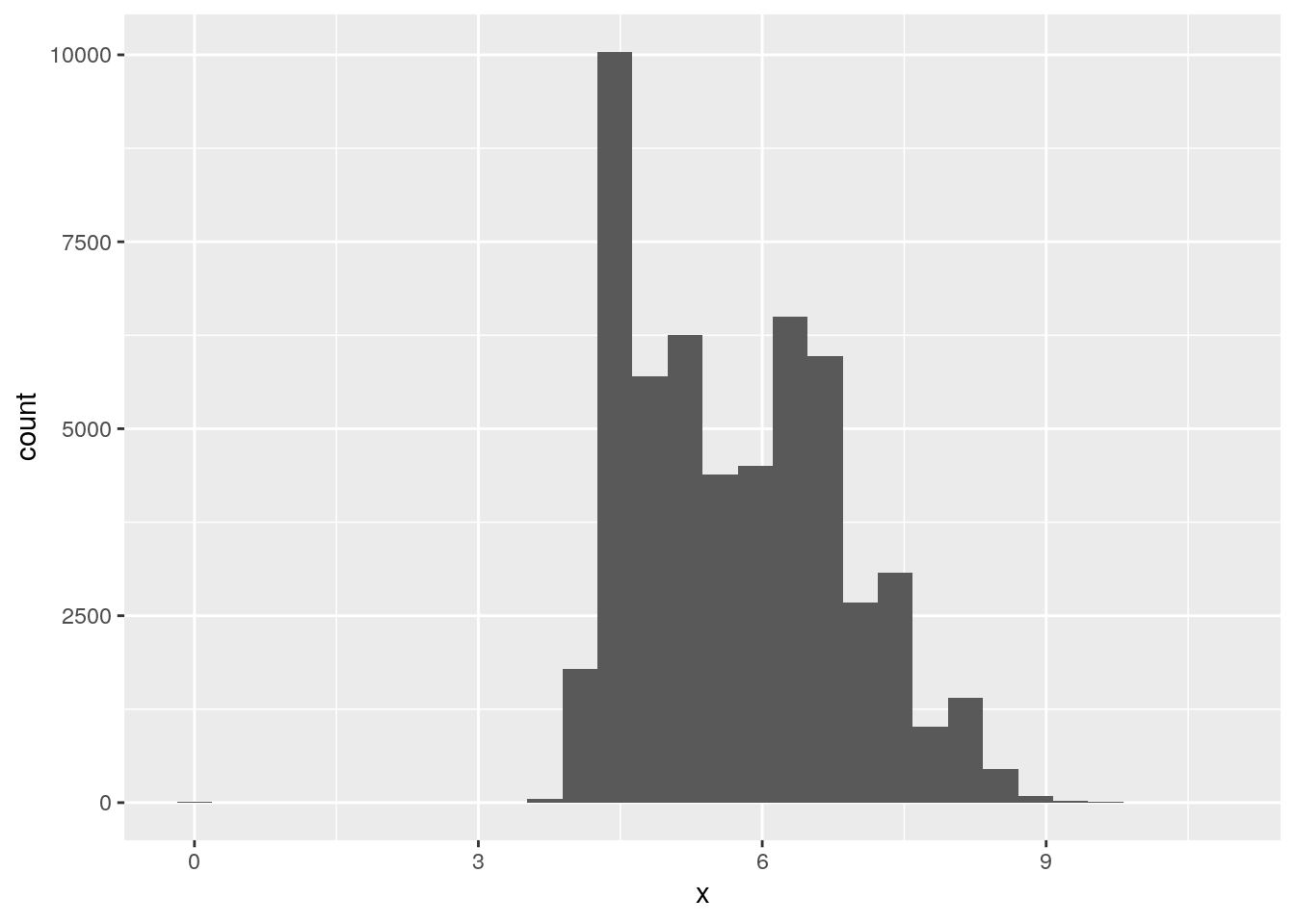
ggplot(data = diamonds, mapping = aes(x = y)) +
  geom_histogram()
`stat_bin()` using `bins = 30`. Pick better value with `binwidth`.
ggplot(data = diamonds, mapping = aes(x = z)) +
  geom_histogram()
`stat_bin()` using `bins = 30`. Pick better value with `binwidth`.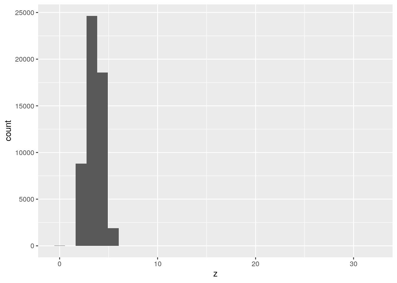
- Explore the distribution of
price. Do you discover anything unusual or surprising? (Hint: Carefully think about thebinwidthand make sure you try a wide range of values.)
ggplot(data = diamonds, mapping = aes(x = price)) +
  geom_histogram(binwidth = 10)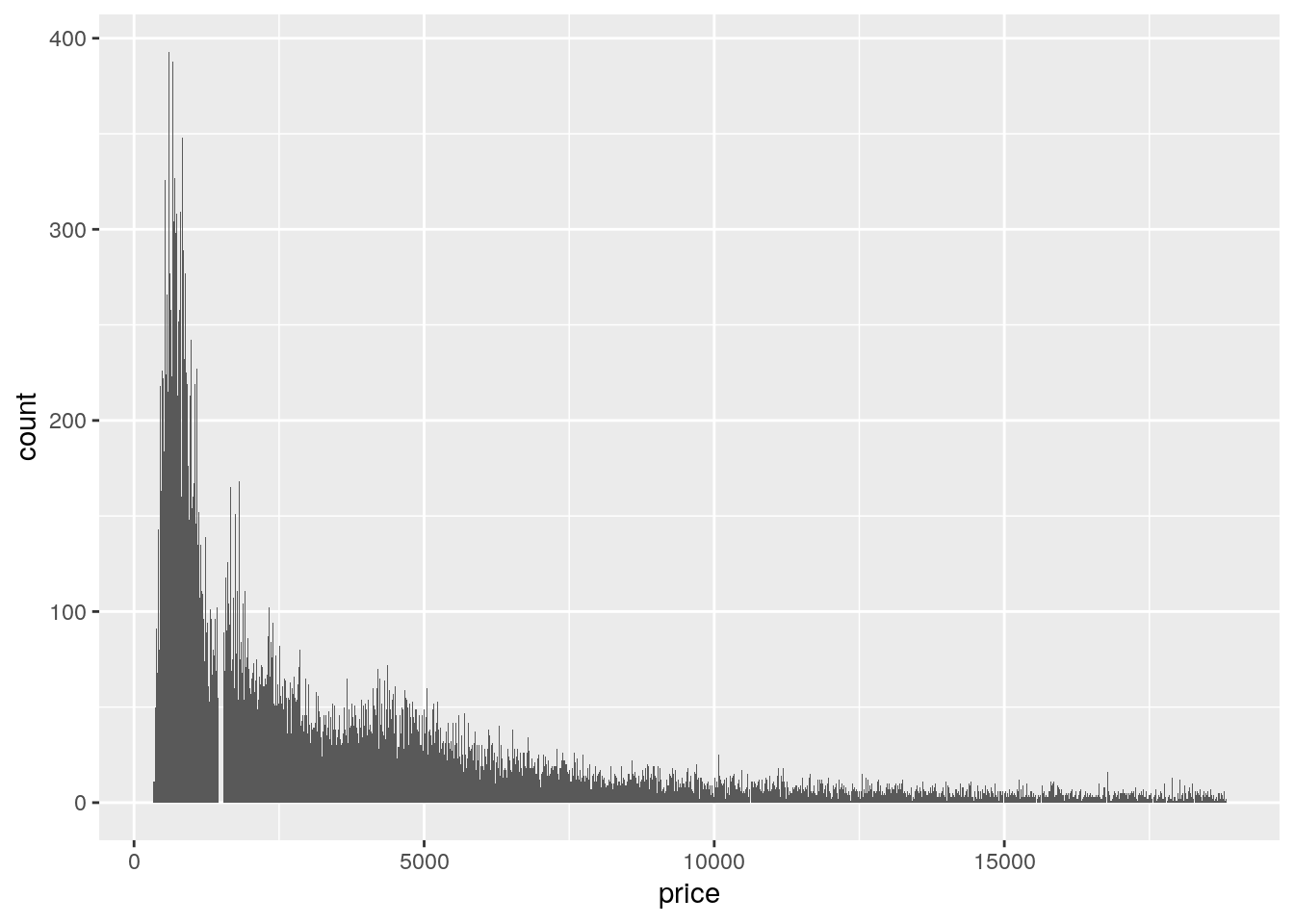
ggplot(data = diamonds, mapping = aes(x = price)) +
  geom_histogram(binwidth = 100)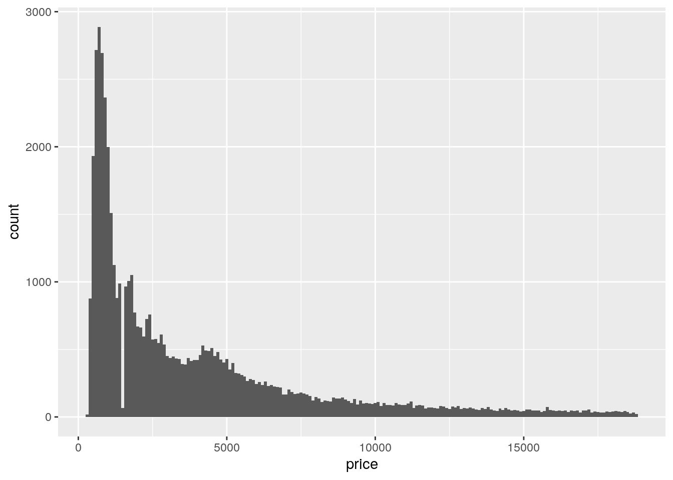
ggplot(data = diamonds, mapping = aes(x = price)) +
  geom_histogram(binwidth = 1000)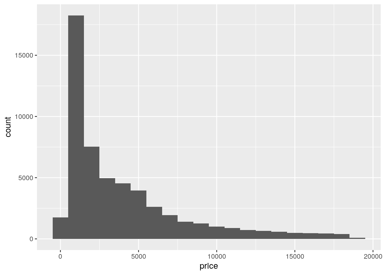
- How many diamonds are 0.99 carat? How many are 1 carat? What do you think is the cause of the difference?
diamonds %>%
  filter(between(carat, 0.99, 1)) %>%
  count(carat)
# A tibble: 2 x 2
carat n
<dbl> <int>
1 0.99 23
2 1 1558- Compare and contrast
coord_cartesian()vsxlim()orylim()when zooming in on a histogram. What happens if you leavebinwidthunset? What happens if you try and zoom so only half a bar shows?
Using coord_cartesian() zooms into the existing plot. Thus the bin width does not change. Using xlim() changes the binwidth because it changes the number of observations. Using ylim() removes data because the bars that go above 1000 are removed from the final plot.
ggplot(data = diamonds, mapping = aes(x = y)) +
  geom_histogram()
`stat_bin()` using `bins = 30`. Pick better value with `binwidth`.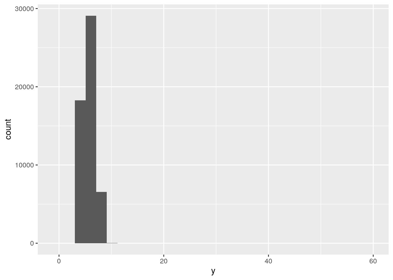
ggplot(data = diamonds, mapping = aes(x = y)) +
  geom_histogram() +
  xlim(5, 10)
`stat_bin()` using `bins = 30`. Pick better value with `binwidth`.Warning: Removed 17576 rows containing non-finite values (stat_bin).Warning: Removed 2 rows containing missing values (geom_bar).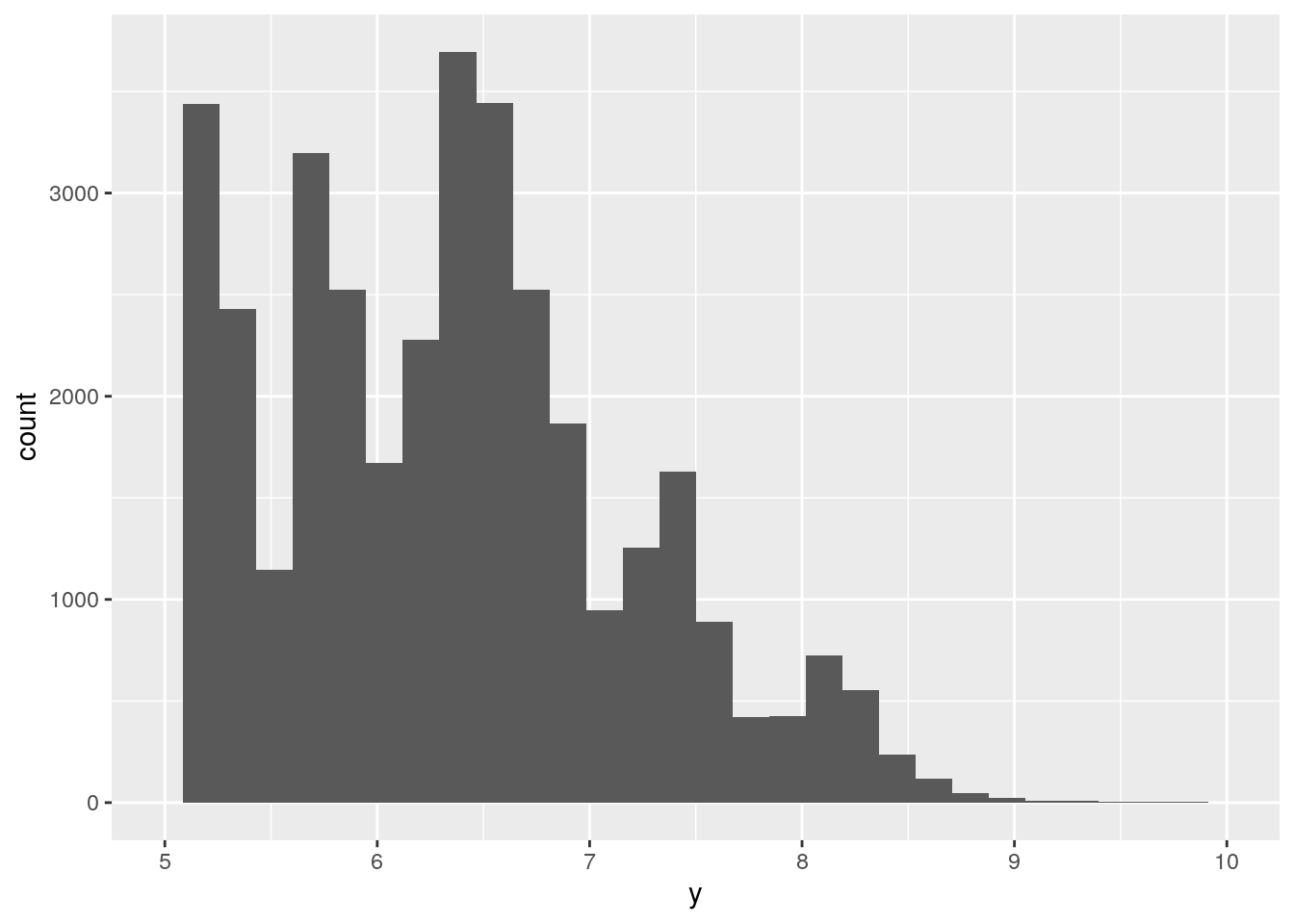
ggplot(data = diamonds, mapping = aes(x = y)) +
  geom_histogram() +
  ylim(0, 1000)
`stat_bin()` using `bins = 30`. Pick better value with `binwidth`.Warning: Removed 3 rows containing missing values (geom_bar).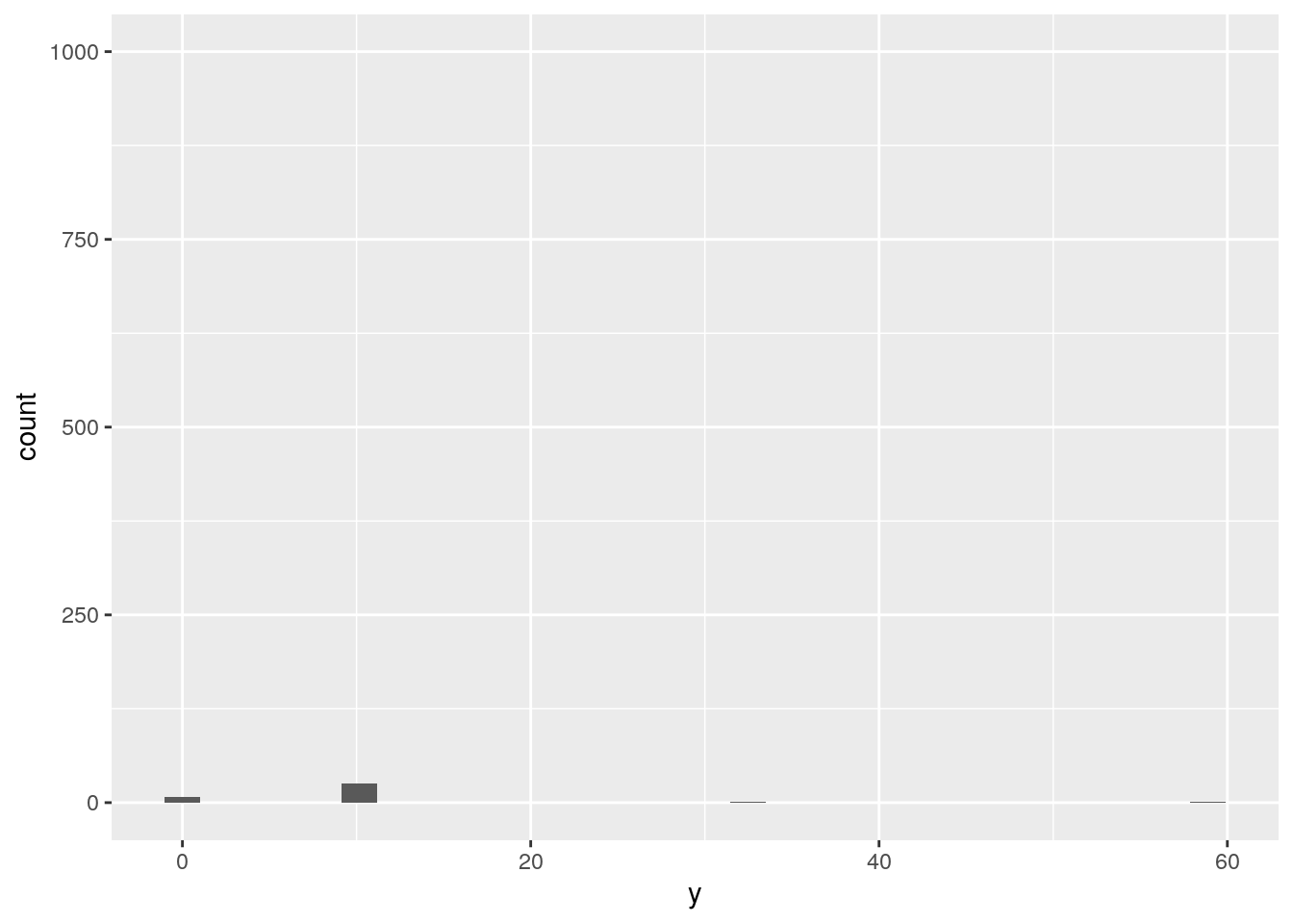
ggplot(data = diamonds, mapping = aes(x = y)) +
  geom_histogram() +
  coord_cartesian(xlim = c(5, 10))
`stat_bin()` using `bins = 30`. Pick better value with `binwidth`.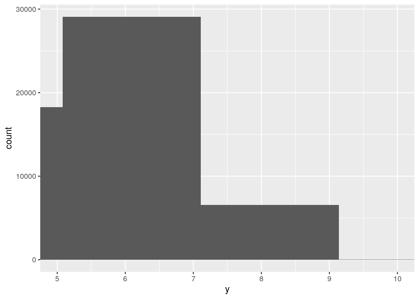
ggplot(data = diamonds, mapping = aes(x = y)) +
  geom_histogram() +
  coord_cartesian(ylim = c(0, 1000))
`stat_bin()` using `bins = 30`. Pick better value with `binwidth`.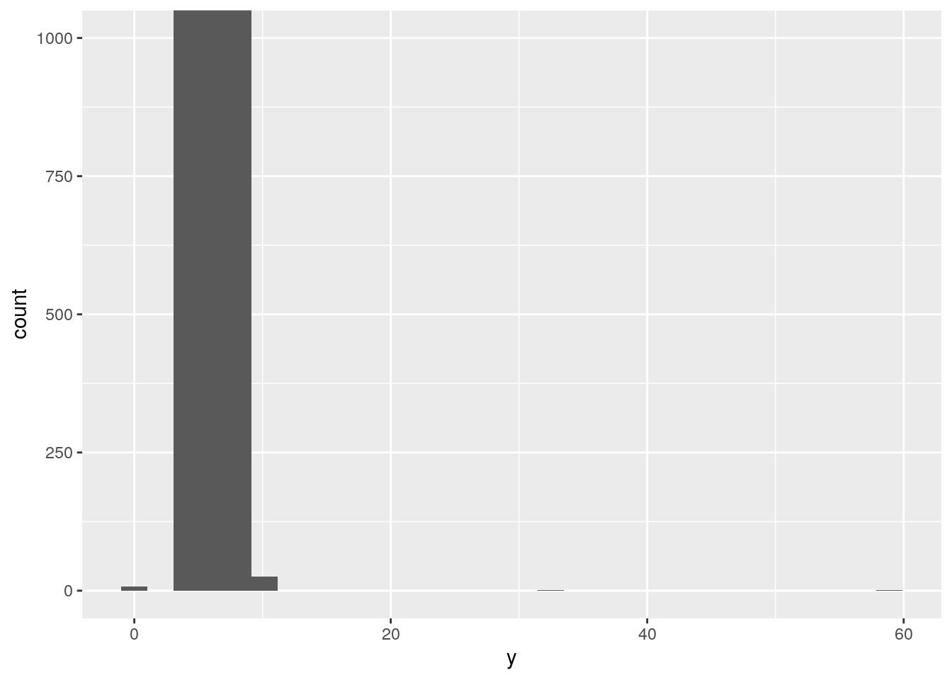
Missing values
p. 93
- What happens to missing values in a histogram? What happens to missing values in a bar chart? Why is there a difference?
geom_histogram() removes missing values numeric variables:
d <- data.frame(x = c(1, 1, 2, 2, NA, 3))
ggplot(data = d, mapping = aes(x = x)) +
  geom_histogram()
`stat_bin()` using `bins = 30`. Pick better value with `binwidth`.Warning: Removed 1 rows containing non-finite values (stat_bin).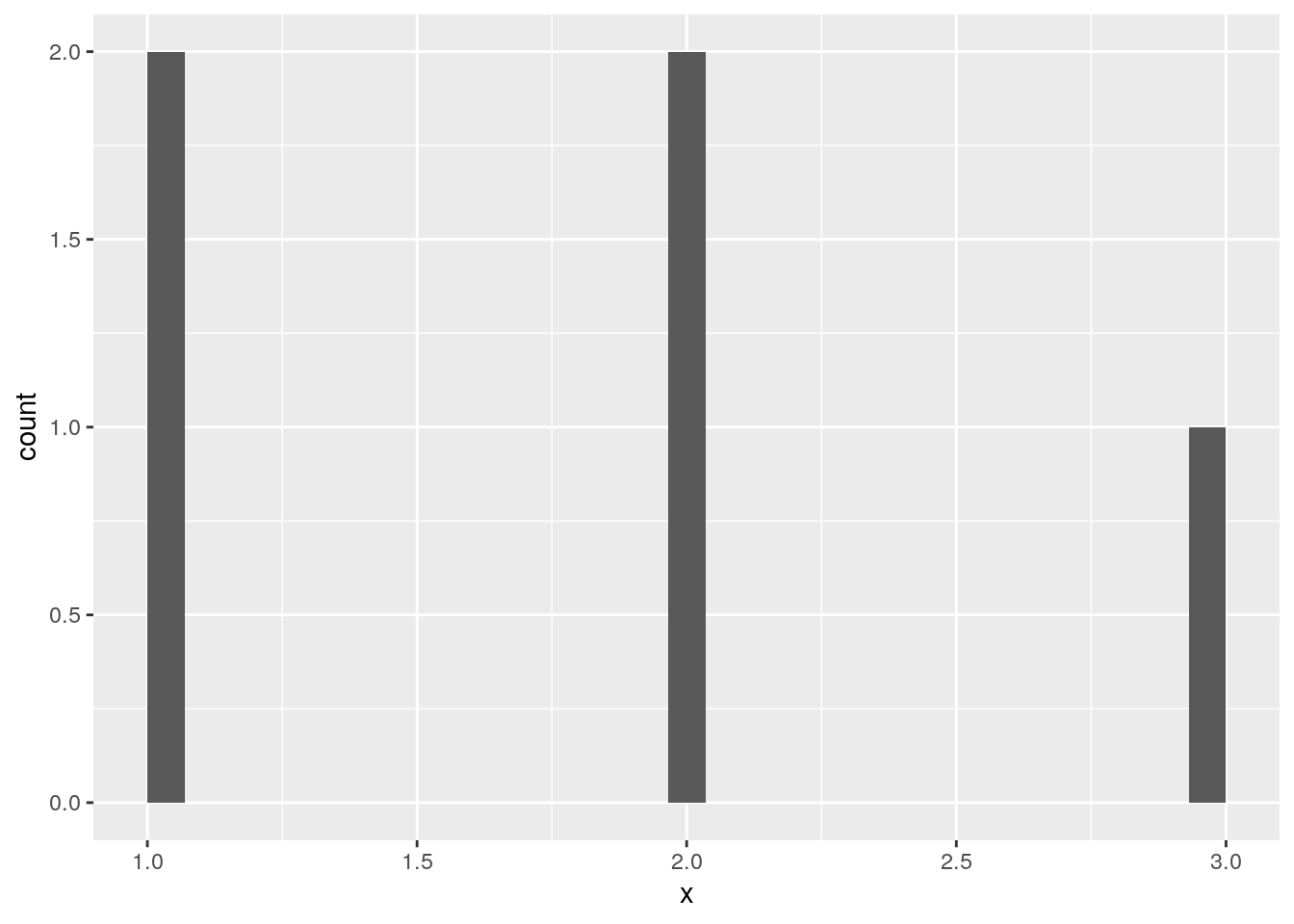
geom_bar() keeps missing values for non-numeric variables:
d <- data.frame(x = c("a", "a", "b", "b", NA, "c"))
ggplot(data = d, mapping = aes(x = x)) +
  geom_bar()
An edge case is integers. They are treated as numeric and have missing values removed. To treat them as discrete, they need to be converted to a factor:
d <- data.frame(x = c(1, 1, 2, 2, NA, 3))
ggplot(data = d, mapping = aes(x = x)) +
  geom_bar()
Warning: Removed 1 rows containing non-finite values (stat_count).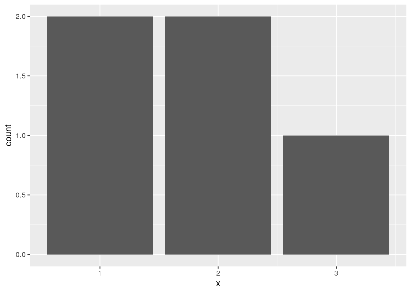
d$x <- factor(d$x)
ggplot(data = d, mapping = aes(x = x)) +
  geom_bar()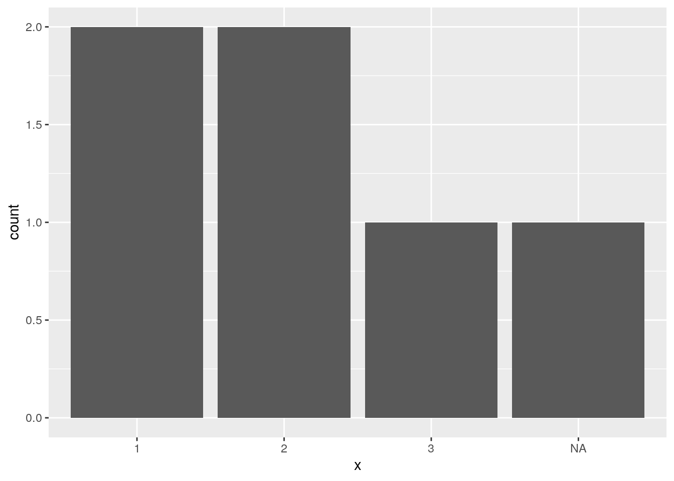
- What does
na.rm = TRUEdo inmean()andsum()?
Missing values are removed prior to performing the calculation.
Covariation - A categorical and continuous variable
p. 99
- Use what you’ve learned to improve the visualisation of the departure times of cancelled vs. non-cancelled flights.
Plot the density values:
nycflights13::flights %>%
  mutate(
    cancelled = is.na(dep_time),
    sched_hour = sched_dep_time %/% 100,
    sched_min = sched_dep_time %% 100,
    sched_dep_time = sched_hour + sched_min / 60
  ) %>%
  ggplot(mapping = aes(sched_dep_time)) +
    geom_freqpoly(mapping = aes(y = ..density.., colour = cancelled), binwidth = 1/4)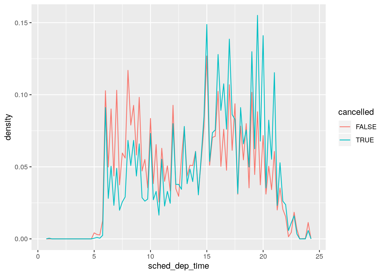
I prefer the version with geom_density():
nycflights13::flights %>%
  mutate(
    cancelled = is.na(dep_time),
    sched_hour = sched_dep_time %/% 100,
    sched_min = sched_dep_time %% 100,
    sched_dep_time = sched_hour + sched_min / 60
  ) %>%
  ggplot(mapping = aes(sched_dep_time)) +
    geom_density(mapping = aes(colour = cancelled), bw = 1/4)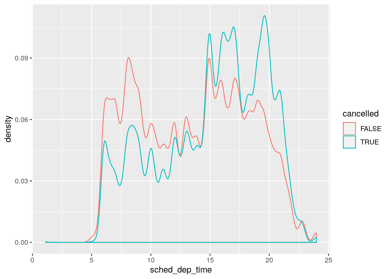
- What variable in the diamonds dataset is most important for predicting the price of a diamond? How is that variable correlated with cut? Why does the combination of those two relationships lead to lower quality diamonds being more expensive?
carat is the most important for predicting price.
summary(lm(price ~ ., data = diamonds))
Call:
lm(formula = price ~ ., data = diamonds)

Residuals:
     Min       1Q   Median       3Q      Max
-21376.0   -592.4   -183.5    376.4  10694.2

Coefficients:
             Estimate Std. Error  t value Pr(>|t|)
(Intercept)  5753.762    396.630   14.507  < 2e-16 ***
carat       11256.978     48.628  231.494  < 2e-16 ***
cut.L         584.457     22.478   26.001  < 2e-16 ***
cut.Q        -301.908     17.994  -16.778  < 2e-16 ***
cut.C         148.035     15.483    9.561  < 2e-16 ***
cut^4         -20.794     12.377   -1.680  0.09294 .
color.L     -1952.160     17.342 -112.570  < 2e-16 ***
color.Q      -672.054     15.777  -42.597  < 2e-16 ***
color.C      -165.283     14.725  -11.225  < 2e-16 ***
color^4        38.195     13.527    2.824  0.00475 **
color^5       -95.793     12.776   -7.498 6.59e-14 ***
color^6       -48.466     11.614   -4.173 3.01e-05 ***
clarity.L    4097.431     30.259  135.414  < 2e-16 ***
clarity.Q   -1925.004     28.227  -68.197  < 2e-16 ***
clarity.C     982.205     24.152   40.668  < 2e-16 ***
clarity^4    -364.918     19.285  -18.922  < 2e-16 ***
clarity^5     233.563     15.752   14.828  < 2e-16 ***
clarity^6       6.883     13.715    0.502  0.61575
clarity^7      90.640     12.103    7.489 7.06e-14 ***
depth         -63.806      4.535  -14.071  < 2e-16 ***
table         -26.474      2.912   -9.092  < 2e-16 ***
x           -1008.261     32.898  -30.648  < 2e-16 ***
y               9.609     19.333    0.497  0.61918
z             -50.119     33.486   -1.497  0.13448
---
Signif. codes:  0 '***' 0.001 '**' 0.01 '*' 0.05 '.' 0.1 ' ' 1

Residual standard error: 1130 on 53916 degrees of freedom
Multiple R-squared:  0.9198,    Adjusted R-squared:  0.9198
F-statistic: 2.688e+04 on 23 and 53916 DF,  p-value: < 2.2e-16
Lower quality cuts have higher carat values.
ggplot(data = diamonds, mapping = aes(x = cut, y = carat)) +
  geom_boxplot()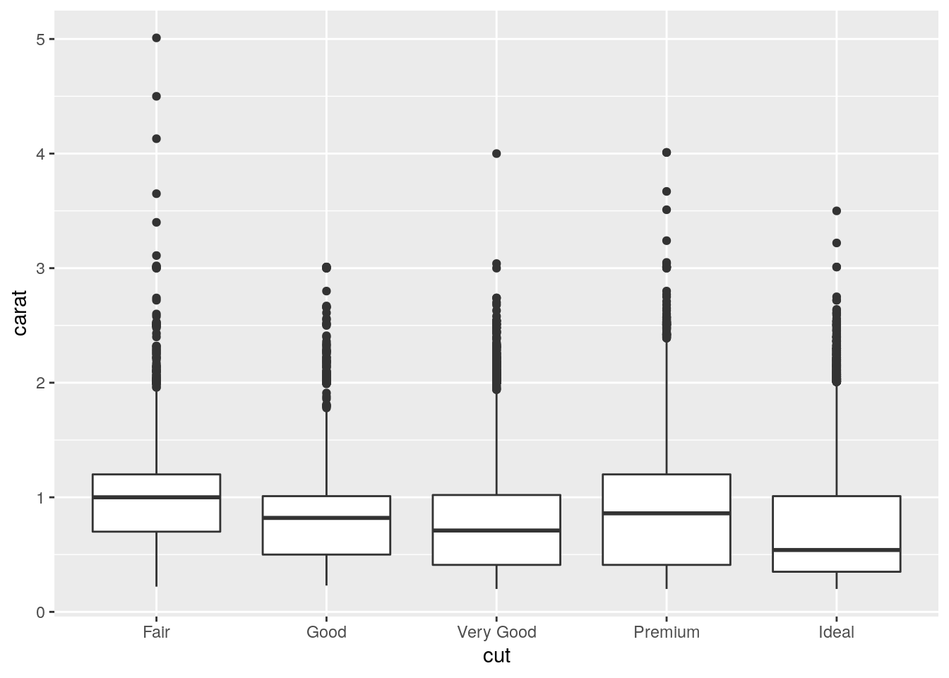
And since a higher carat gets a higher price, lower cuts tend to be more expensive on average.
ggplot(data = diamonds, mapping = aes(x = carat, y = price)) +
  geom_point(alpha = 0.5) +
  facet_wrap(~ cut)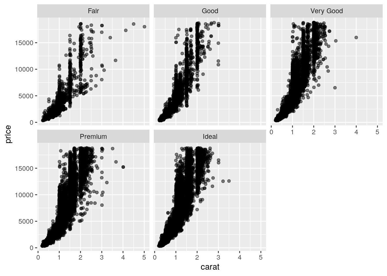
- Install the ggstance package, and create a horizontal boxplot. How does this compare to using
coord_flip()?
Have to switch x and y aesthetics:
ggplot(data = diamonds, mapping = aes(x = cut, y = carat)) +
  geom_boxplot() +
  coord_flip()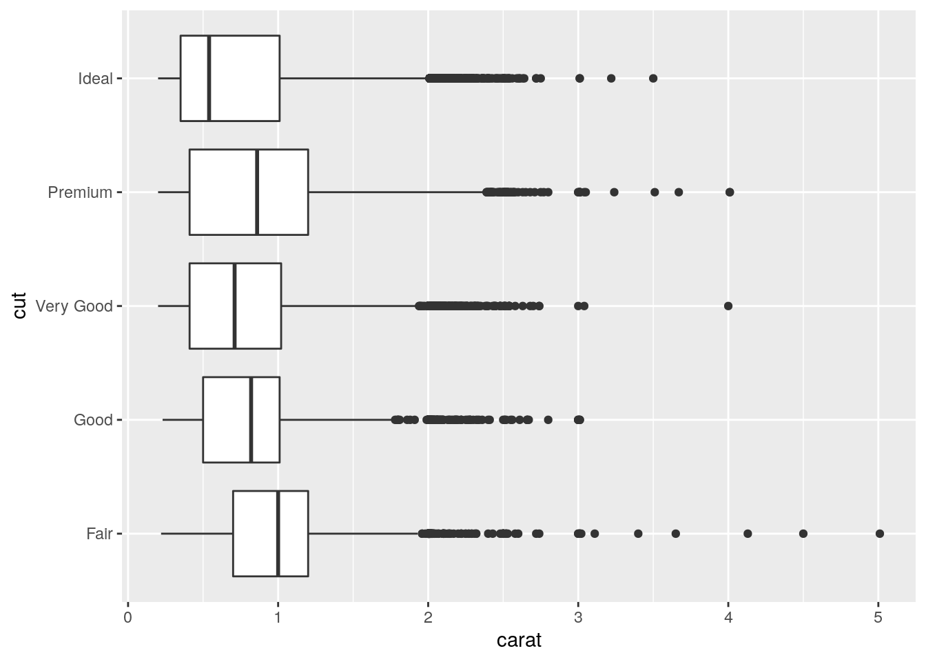
ggplot(data = diamonds, mapping = aes(x = carat, y = cut)) +
  ggstance::geom_boxploth()
- One problem with boxplots is that they were developed in an era of much smaller datasets and tend to display a prohibitively large number of “outlying values”. One approach to remedy this problem is the letter value plot. Install the lvplot package, and try using
geom_lv()to display the distribution of price vs cut. What do you learn? How do you interpret the plots?
ggplot(data = diamonds, mapping = aes(x = cut, y = price)) +
  lvplot::geom_lv()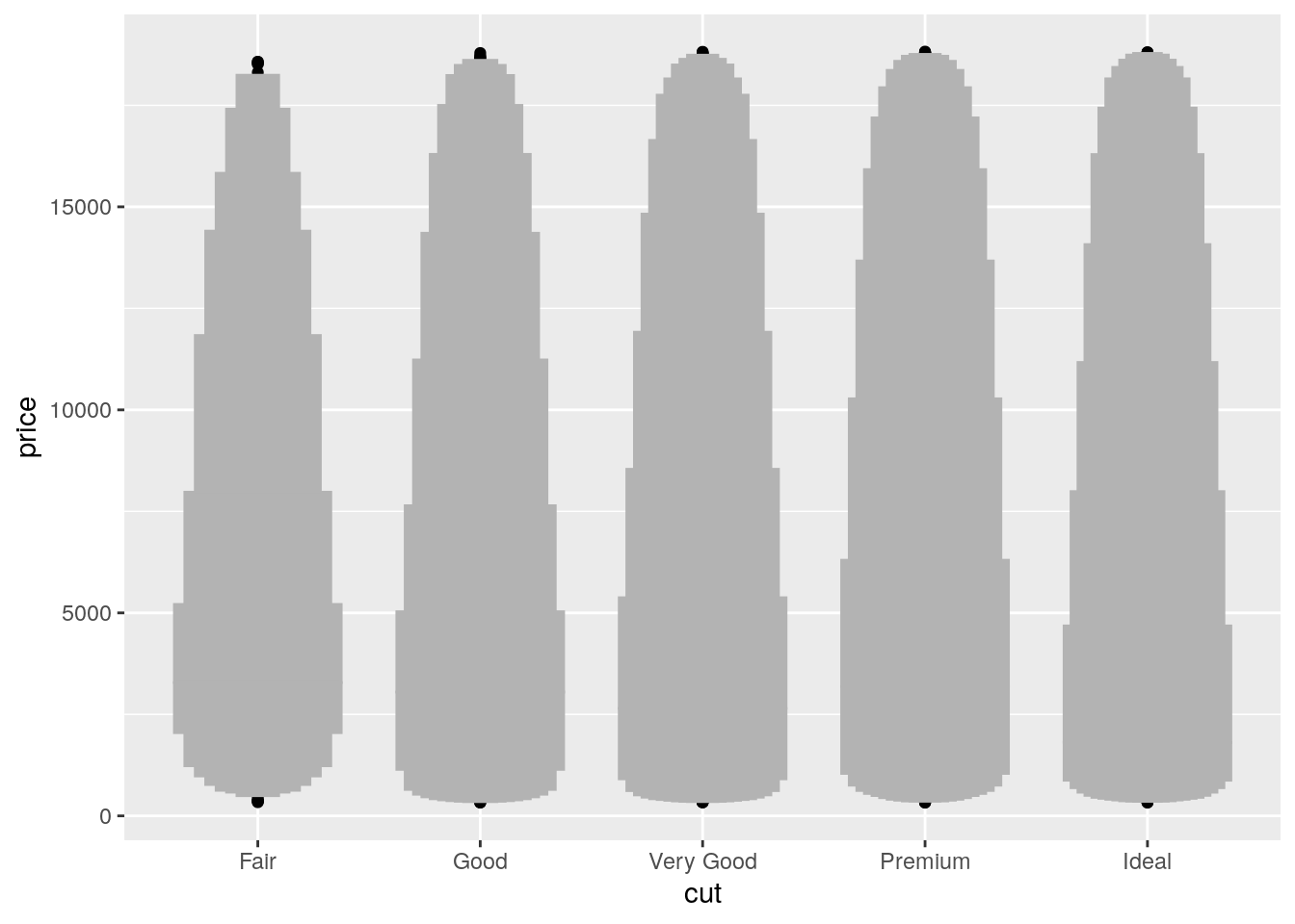
- Compare and contrast
geom_violin()with a facettedgeom_histogram(), or a colouredgeom_freqpoly(). What are the pros and cons of each method?
ggplot(data = diamonds, mapping = aes(x = cut, y = price)) +
  geom_violin()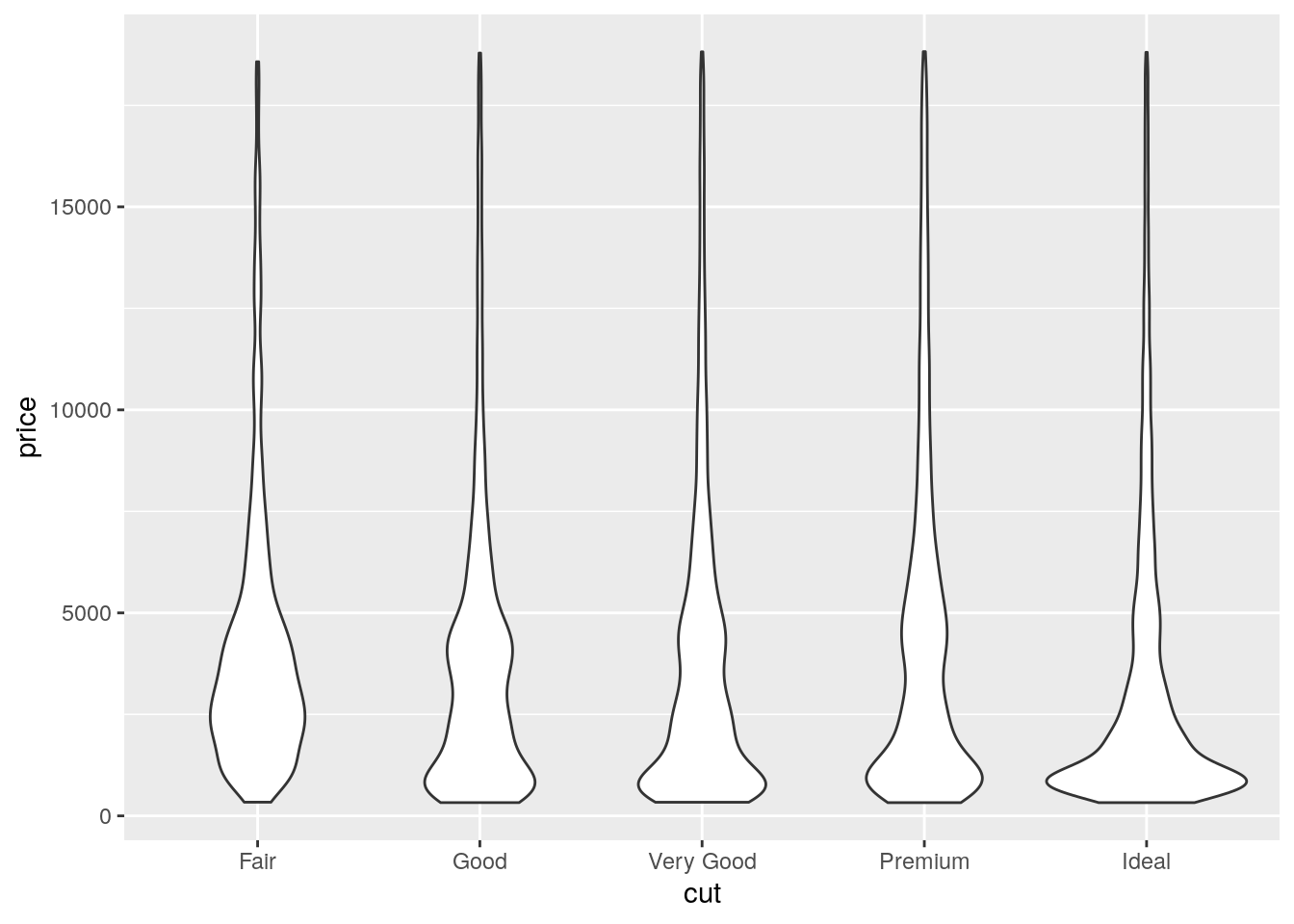
ggplot(data = diamonds, mapping = aes(x = price)) +
  geom_histogram() +
  facet_wrap(~ cut)
`stat_bin()` using `bins = 30`. Pick better value with `binwidth`.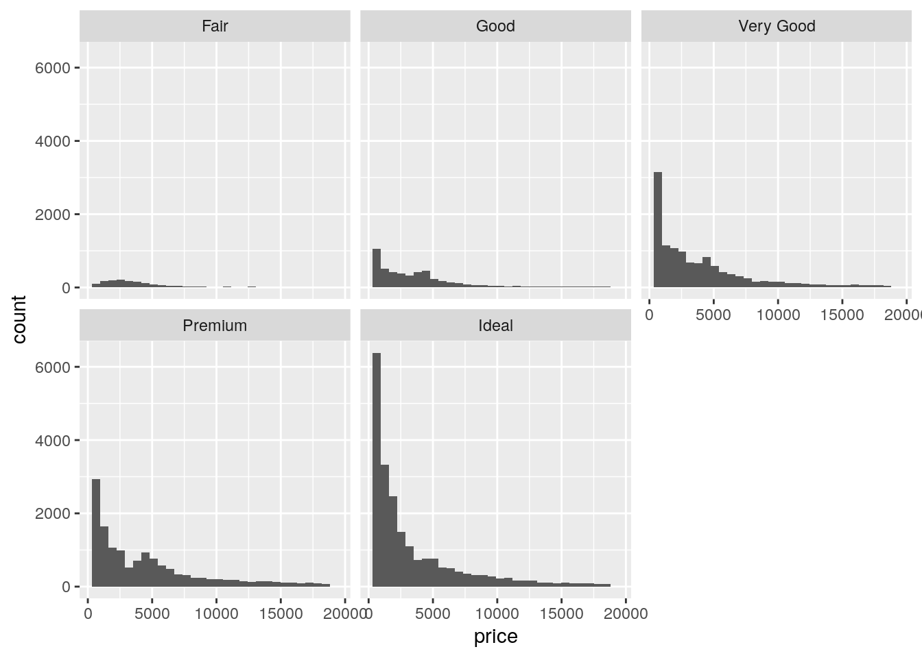
ggplot(data = diamonds, mapping = aes(x = price)) +
  geom_freqpoly(mapping = aes(color = cut))
`stat_bin()` using `bins = 30`. Pick better value with `binwidth`.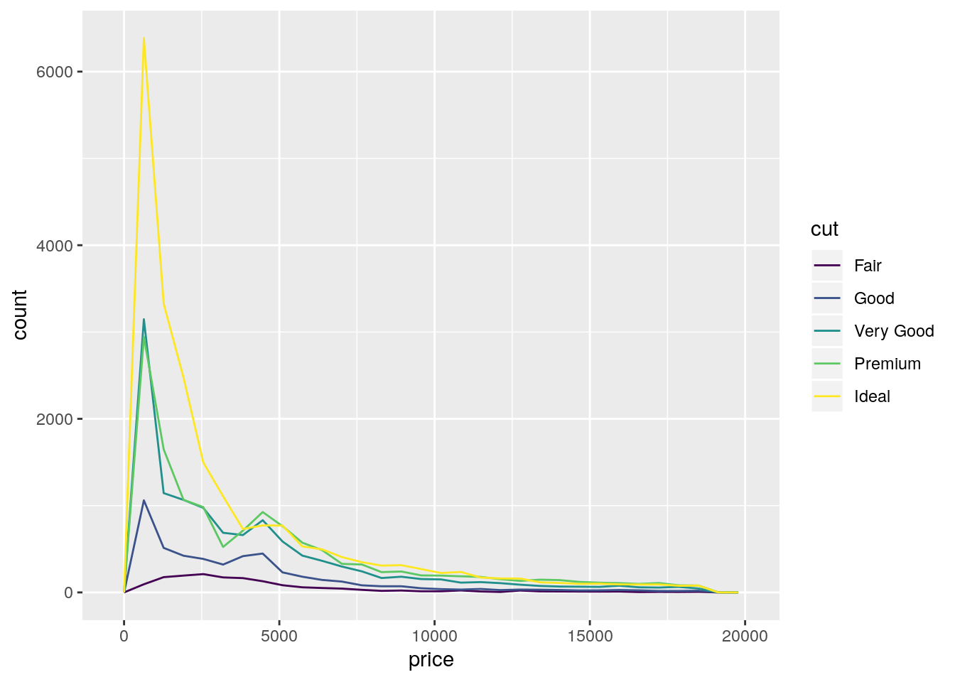
- If you have a small dataset, it’s sometimes useful to use
geom_jitter()to see the relationship between a continuous and categorical variable. The ggbeeswarm package provides a number of methods similar togeom_jitter(). List them and briefly describe what each one does.
ggplot(data = diamonds[sample(seq_len(nrow(diamonds)), 1000), ],
       mapping = aes(x = cut, y = price)) +
  ggbeeswarm::geom_beeswarm()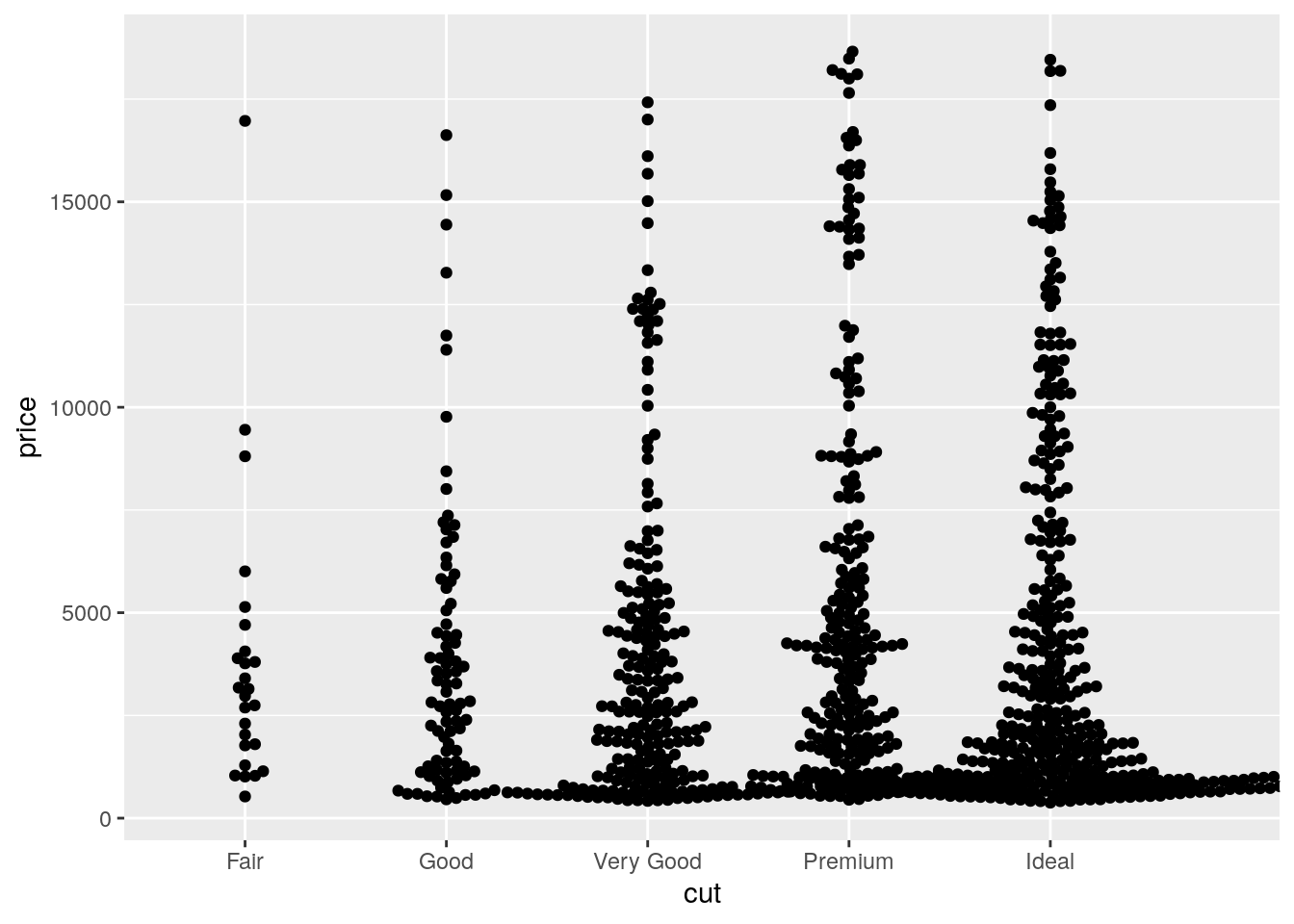
Covariation - Two categorical variables
p. 101
- How could you rescale the count dataset above to more clearly show the distribution of cut within colour, or colour within cut?
Use a grouped mutate to calculate proportion of each cut within each color.
diamonds %>%
  count(color, cut) %>%
  group_by(color) %>%
  mutate(prop = n / sum(n)) %>%
  ggplot(mapping = aes(x = color, y = cut)) +
    geom_tile(mapping = aes(fill = prop))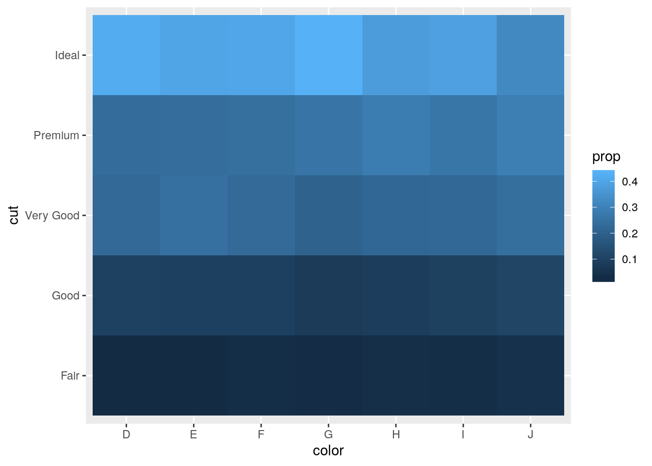
- Use
geom_tile()together with dplyr to explore how average flight delays vary by destination and month of year. What makes the plot difficult to read? How could you improve it?
Only including non-cancelled flights with delayed arrivals.
flights %>%
  filter(!is.na(dep_delay), !is.na(arr_delay), arr_delay > 0) %>%
  select(dest, month, arr_delay) %>%
  group_by(dest, month) %>%
  summarize(delay = mean(arr_delay)) %>%
  ggplot(mapping = aes(x = as.factor(month), y = dest)) +
  geom_tile(mapping = aes(fill = delay))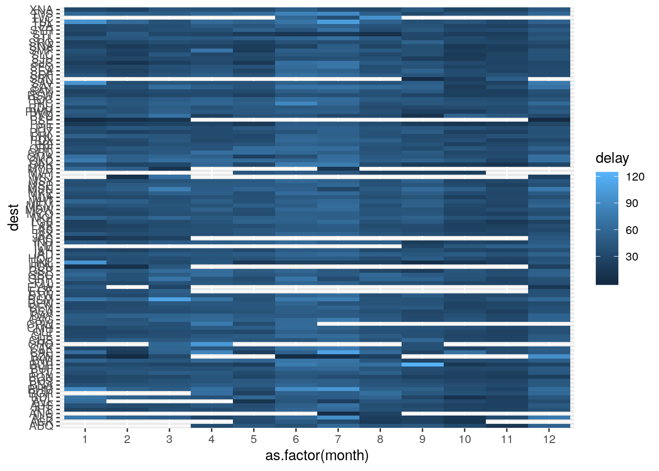
- Why is it slightly better to use
aes(x = color, y = cut)rather thanaes(x = cut, y = color)in the example above?
Putting longer variable values on y-axis ensure that the axis labels don’t overlap.
diamonds %>%
  count(color, cut) %>%
  ggplot(mapping = aes(x = color, y = cut)) +
    geom_tile(mapping = aes(fill = n))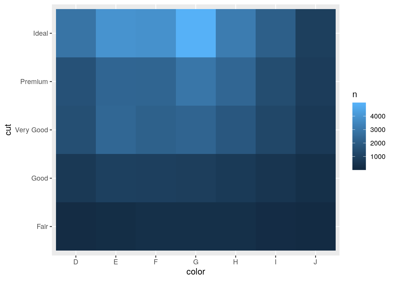
diamonds %>%
  count(color, cut) %>%
  ggplot(mapping = aes(x = cut, y = color)) +
    geom_tile(mapping = aes(fill = n))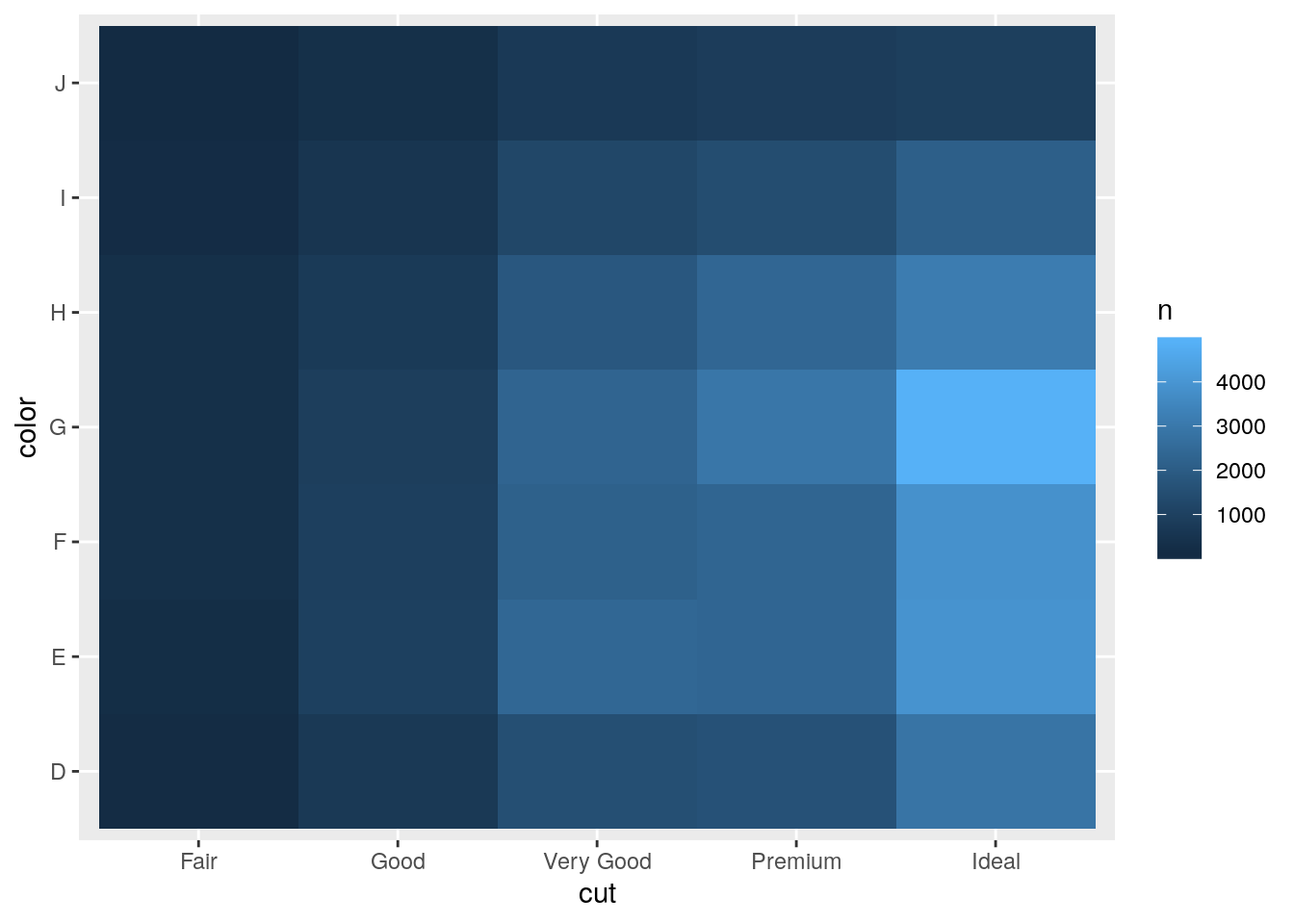
Covariation - Two continuous variables
smaller <- diamonds %>%
  filter(carat < 3)
ggplot(data = smaller, mapping = aes(x = carat, y = price)) +
  geom_boxplot(mapping = aes(group = cut_width(carat, 0.1)), varwidth = TRUE)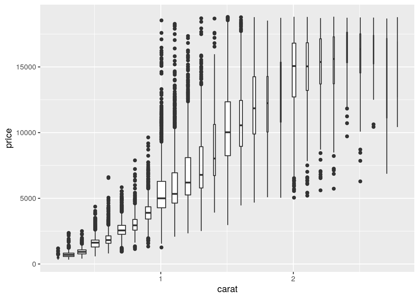
ggplot(data = smaller, mapping = aes(x = carat, y = price)) +
  geom_boxplot(mapping = aes(group = cut_number(carat, 20)))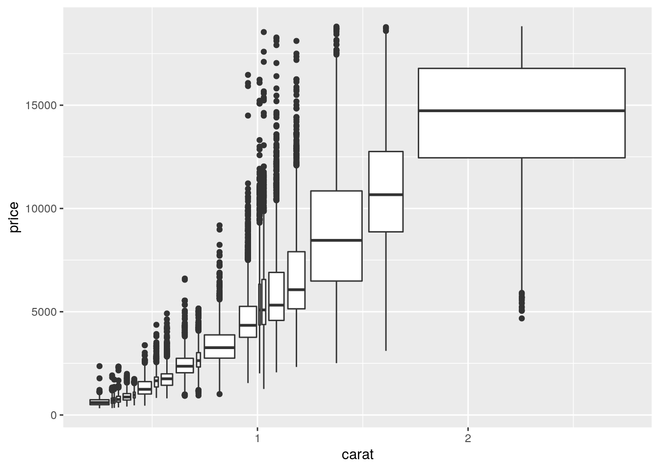
I think the above plot is confusing. The use of cut_number() puts a fairly equal number of observations in each bin. However, because carat is mapped to x, the width of the bin corresponds to the width on the x-axis, not the number of observations (as is done with varwidth = TRUE).
table(cut_number(diamonds$carat, 20))
  [0.2,0.3]  (0.3,0.31] (0.31,0.32] (0.32,0.35]  (0.35,0.4]  (0.4,0.42]
       4203        2249        1840        2766        3333        2088
 (0.42,0.5]  (0.5,0.53]  (0.53,0.6]   (0.6,0.7]  (0.7,0.73]  (0.73,0.9]
       2453        2653        2863        2714        2550        3890
    (0.9,1]    (1,1.01] (1.01,1.04] (1.04,1.13] (1.13,1.24] (1.24,1.51]
       2836        2242        1881        2692        2820        3232
 (1.51,1.7]  (1.7,5.01]
       1950        2685
p. 105
- Instead of summarising the conditional distribution with a boxplot, you could use a frequency polygon. What do you need to consider when using
cut_width()vscut_number()? How does that impact a visualisation of the 2d distribution ofcaratandprice?
With cut_width(), the number of observations in each bin may vary substantially; whereas, with cut_number(), each bin will have a similar number of observations.
# cut_interval makes n groups with equal range
table(cut_interval(diamonds$price, n = 10))
     [326,2.18e+03] (2.18e+03,4.03e+03] (4.03e+03,5.88e+03]
              25335                9328                7393
(5.88e+03,7.72e+03] (7.72e+03,9.57e+03] (9.57e+03,1.14e+04]
               3878                2364                1745
(1.14e+04,1.33e+04] (1.33e+04,1.51e+04]  (1.51e+04,1.7e+04]
               1306                1002                 863
 (1.7e+04,1.88e+04]
                726
# cut_number makes n groups with (approximately) equal numbers of observations
table(cut_number(diamonds$price, n = 10))
          [326,646]           (646,837]      (837,1.09e+03]
               5411                5385                5396
 (1.09e+03,1.7e+03]   (1.7e+03,2.4e+03]  (2.4e+03,3.46e+03]
               5388                5405                5384
(3.46e+03,4.66e+03]  (4.66e+03,6.3e+03]  (6.3e+03,9.82e+03]
               5394                5389                5395
(9.82e+03,1.88e+04]
               5393
# cut_width makes groups of width width.
table(cut_width(diamonds$price, width = 1000))
         [-500,500]       (500,1.5e+03]   (1.5e+03,2.5e+03]
               1749               18261                7532
  (2.5e+03,3.5e+03]   (3.5e+03,4.5e+03]   (4.5e+03,5.5e+03]
               4958                4535                3950
  (5.5e+03,6.5e+03]   (6.5e+03,7.5e+03]   (7.5e+03,8.5e+03]
               2627                1946                1395
  (8.5e+03,9.5e+03]  (9.5e+03,1.05e+04] (1.05e+04,1.15e+04]
               1253                1000                 899
(1.15e+04,1.25e+04] (1.25e+04,1.35e+04] (1.35e+04,1.45e+04]
                721                 655                 576
(1.45e+04,1.55e+04] (1.55e+04,1.65e+04] (1.65e+04,1.75e+04]
                482                 471                 437
(1.75e+04,1.85e+04] (1.85e+04,1.95e+04]
                391                 102
ggplot(data = diamonds, mapping = aes(x = carat)) +
geom_freqpoly(mapping = aes(color = cut_width(price, width = 1000)))`stat_bin()` using `bins = 30`. Pick better value with `binwidth`.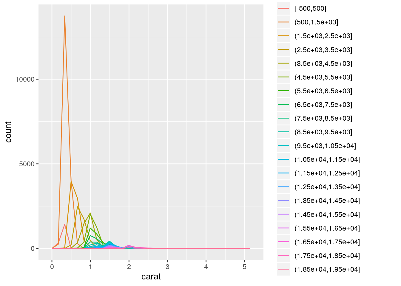
ggplot(data = diamonds, mapping = aes(x = carat)) +
  geom_freqpoly(mapping = aes(color = cut_number(price, n = 10)))
`stat_bin()` using `bins = 30`. Pick better value with `binwidth`.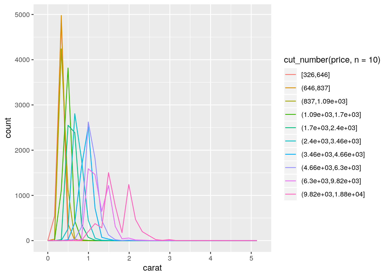
- Visualise the distribution of carat, partitioned by price.
ggplot(data = diamonds, mapping = aes(x = price, y = carat)) +
  geom_boxplot(mapping = aes(group = cut_width(price, 1000)))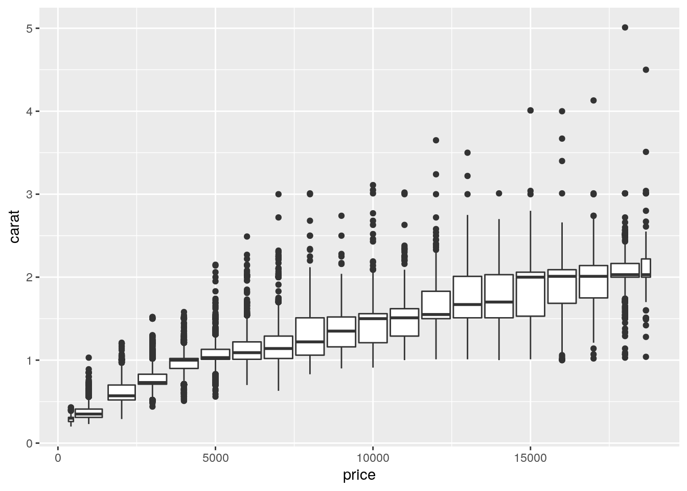
- How does the price distribution of very large diamonds compare to small diamonds? Is it as you expect, or does it surprise you?
diamonds %>%
  mutate(volume = x * y * z, # naive, but not clear what they want
         size = ifelse(volume > quantile(volume, 0.75), "large",  "small")) %>%
  ggplot(mapping = aes(x = price)) +
  geom_density(mapping = aes(color = size))
- Combine two of the techniques you’ve learned to visualise the combined distribution of cut, carat, and price.
ggplot(data = diamonds, mapping = aes(x = carat, y = price)) +
  geom_point(mapping = aes(color = cut), alpha = 0.5)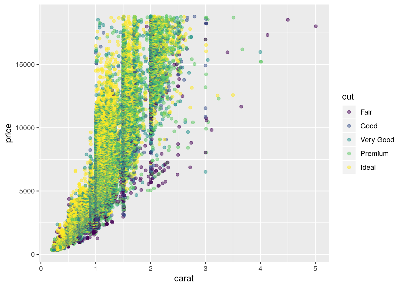
- Two dimensional plots reveal outliers that are not visible in one dimensional plots. For example, some points in the plot below have an unusual combination of
xandyvalues, which makes the points outliers even though theirxandyvalues appear normal when examined separately.
ggplot(data = diamonds) +
  geom_point(mapping = aes(x = x, y = y)) +
  coord_cartesian(xlim = c(4, 11), ylim = c(4, 11))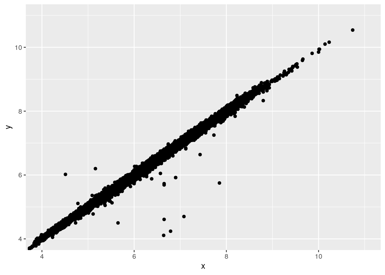
Why is a scatterplot a better display than a binned plot for this case?
Because you want to highlight outliers. A binned plot would focus on the most densely overplotted areas.
sessionInfo()R version 3.6.1 (2019-07-05)
Platform: x86_64-pc-linux-gnu (64-bit)
Running under: Ubuntu 18.04.3 LTS
Matrix products: default
BLAS: /usr/lib/x86_64-linux-gnu/atlas/libblas.so.3.10.3
LAPACK: /usr/lib/x86_64-linux-gnu/atlas/liblapack.so.3.10.3
locale:
[1] LC_CTYPE=en_US.UTF-8 LC_NUMERIC=C
[3] LC_TIME=en_US.UTF-8 LC_COLLATE=en_US.UTF-8
[5] LC_MONETARY=en_US.UTF-8 LC_MESSAGES=en_US.UTF-8
[7] LC_PAPER=en_US.UTF-8 LC_NAME=C
[9] LC_ADDRESS=C LC_TELEPHONE=C
[11] LC_MEASUREMENT=en_US.UTF-8 LC_IDENTIFICATION=C
attached base packages:
[1] stats graphics grDevices utils datasets methods base
other attached packages:
[1] ggbeeswarm_0.6.0 lvplot_0.2.0 ggstance_0.3.3
[4] forcats_0.4.0 stringr_1.4.0 dplyr_0.8.3
[7] purrr_0.3.2 readr_1.3.1 tidyr_1.0.0
[10] tibble_2.1.3 ggplot2_3.2.1 tidyverse_1.2.1
[13] nycflights13_1.0.1
loaded via a namespace (and not attached):
[1] beeswarm_0.2.3 tidyselect_0.2.5 xfun_0.9
[4] haven_2.1.1 lattice_0.20-38 colorspace_1.4-1
[7] vctrs_0.2.0 generics_0.0.2 viridisLite_0.3.0
[10] htmltools_0.3.6 yaml_2.2.0 utf8_1.1.4
[13] rlang_0.4.0 pillar_1.4.2 glue_1.3.1
[16] withr_2.1.2 modelr_0.1.5 readxl_1.3.1
[19] lifecycle_0.1.0 munsell_0.5.0 gtable_0.3.0
[22] workflowr_1.4.0 cellranger_1.1.0 rvest_0.3.4
[25] evaluate_0.14 labeling_0.3 knitr_1.25
[28] vipor_0.4.5 fansi_0.4.0 broom_0.5.2
[31] Rcpp_1.0.2 backports_1.1.4 scales_1.0.0
[34] jsonlite_1.6 fs_1.3.1 hms_0.5.1
[37] digest_0.6.21 stringi_1.4.3 grid_3.6.1
[40] rprojroot_1.2 cli_1.1.0 tools_3.6.1
[43] magrittr_1.5 lazyeval_0.2.2 crayon_1.3.4
[46] whisker_0.4 pkgconfig_2.0.2 zeallot_0.1.0
[49] xml2_1.2.2 lubridate_1.7.4 assertthat_0.2.1
[52] rmarkdown_1.15 httr_1.4.1 rstudioapi_0.10
[55] R6_2.4.0 nlme_3.1-141 git2r_0.26.1.9000
[58] compiler_3.6.1