Data visualization with ggplot2
John Blischak
2019-09-25
Last updated: 2019-09-25
Checks: 6 1
Knit directory: wflow-r4ds/
This reproducible R Markdown analysis was created with workflowr (version 1.4.0). The Checks tab describes the reproducibility checks that were applied when the results were created. The Past versions tab lists the development history.
Great! Since the R Markdown file has been committed to the Git repository, you know the exact version of the code that produced these results.
The global environment had objects present when the code in the R Markdown file was run. These objects can affect the analysis in your R Markdown file in unknown ways. For reproduciblity it’s best to always run the code in an empty environment. Use wflow_publish or wflow_build to ensure that the code is always run in an empty environment.
The following objects were defined in the global environment when these results were created:
| Name | Class | Size |
|---|---|---|
| data | environment | 56 bytes |
| env | environment | 56 bytes |
The command set.seed(20190925) was run prior to running the code in the R Markdown file. Setting a seed ensures that any results that rely on randomness, e.g. subsampling or permutations, are reproducible.
Great job! Recording the operating system, R version, and package versions is critical for reproducibility.
Nice! There were no cached chunks for this analysis, so you can be confident that you successfully produced the results during this run.
Great job! Using relative paths to the files within your workflowr project makes it easier to run your code on other machines.
Great! You are using Git for version control. Tracking code development and connecting the code version to the results is critical for reproducibility. The version displayed above was the version of the Git repository at the time these results were generated.
Note that you need to be careful to ensure that all relevant files for the analysis have been committed to Git prior to generating the results (you can use wflow_publish or wflow_git_commit). workflowr only checks the R Markdown file, but you know if there are other scripts or data files that it depends on. Below is the status of the Git repository when the results were generated:
Ignored files:
    Ignored:    .Rproj.user/
    Ignored:    docs/figure/
Note that any generated files, e.g. HTML, png, CSS, etc., are not included in this status report because it is ok for generated content to have uncommitted changes.
These are the previous versions of the R Markdown and HTML files. If you’ve configured a remote Git repository (see ?wflow_git_remote), click on the hyperlinks in the table below to view them.
| File | Version | Author | Date | Message |
|---|---|---|---|---|
| Rmd | 25ccd00 | John Blischak | 2019-09-25 | Start chapter 1 exercises on ggplot2 |
Setup
library(ggplot2)
data(mpg)
head(mpg)
# A tibble: 6 x 11
manufacturer model displ year cyl trans drv cty hwy fl class
<chr> <chr> <dbl> <int> <int> <chr> <chr> <int> <int> <chr> <chr>
1 audi a4 1.8 1999 4 auto(… f 18 29 p comp…
2 audi a4 1.8 1999 4 manua… f 21 29 p comp…
3 audi a4 2 2008 4 manua… f 20 31 p comp…
4 audi a4 2 2008 4 auto(… f 21 30 p comp…
5 audi a4 2.8 1999 6 auto(… f 16 26 p comp…
6 audi a4 2.8 1999 6 manua… f 18 26 p comp…First steps
p. 6
Run
ggplot(data = mpg). What do you see?
A blank plot
ggplot(data = mpg)
How many rows are in
mpg? How many columns?
nrow(mpg)[1] 234ncol(mpg)[1] 11What does the
drvvariable describe? Read the help for?mpgto find out.
?mpgdrv: f = front-wheel drive, r = rear wheel drive, 4 = 4wd
Make a scatterplot of
hwyvscyl.
ggplot(data = mpg) +
  geom_point(aes(x = cyl, y = hwy))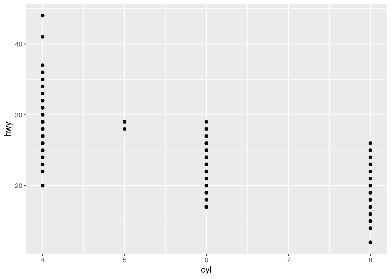
What happens if you make a scatterplot of
classvsdrv? Why is the plot not useful?
ggplot(data = mpg) +
  geom_point(aes(x = class, y = drv))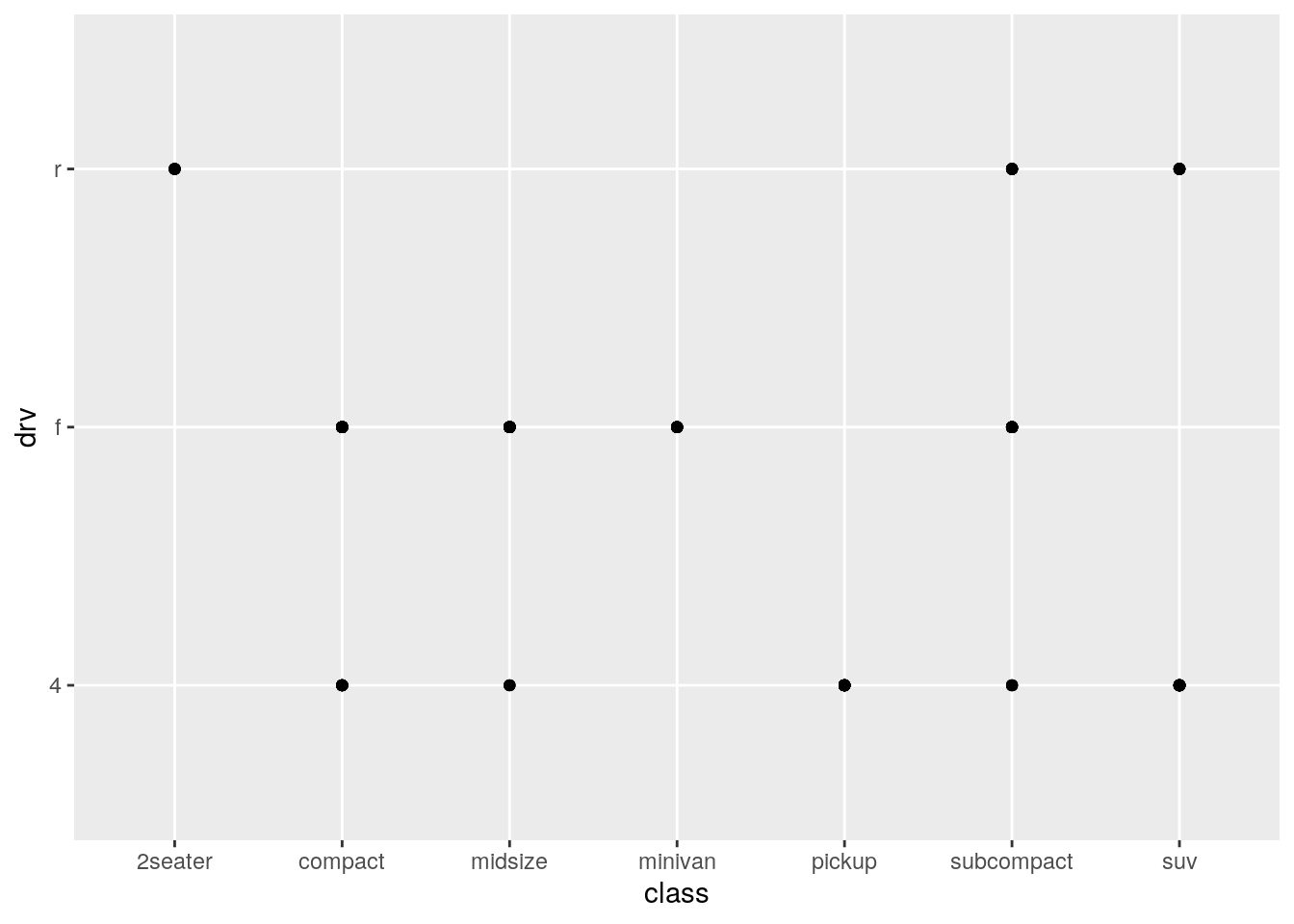
Because the points are overplotted, it doesn’t provide any information on the number of cars with each combination.
table(mpg$class, mpg$drv)
              4  f  r
  2seater     0  0  5
  compact    12 35  0
  midsize     3 38  0
  minivan     0 11  0
  pickup     33  0  0
  subcompact  4 22  9
  suv        51  0 11
Aesthetic mappings
p. 12
What’s gone wrong with this code? Why are the points not blue?
ggplot(data = mpg) +
  geom_point(mapping = aes(x = displ, y = hwy, color = "blue"))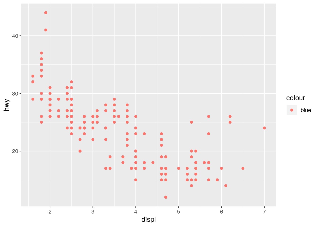
Defining color inside of aes() maps the color variable to the character vector c("blue"). Since it only has one unique value, there is only one entry in the legend. Furthermore it is defined the first default color (more on this below).
To turn all the points uniformly to blue, define color outside of aes().
ggplot(data = mpg) +
  geom_point(mapping = aes(x = displ, y = hwy), color = "blue")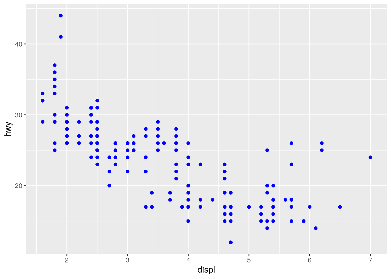
The default colors are determined by running scale_color_hue():
scales::show_col(scale_color_hue()$palette(1))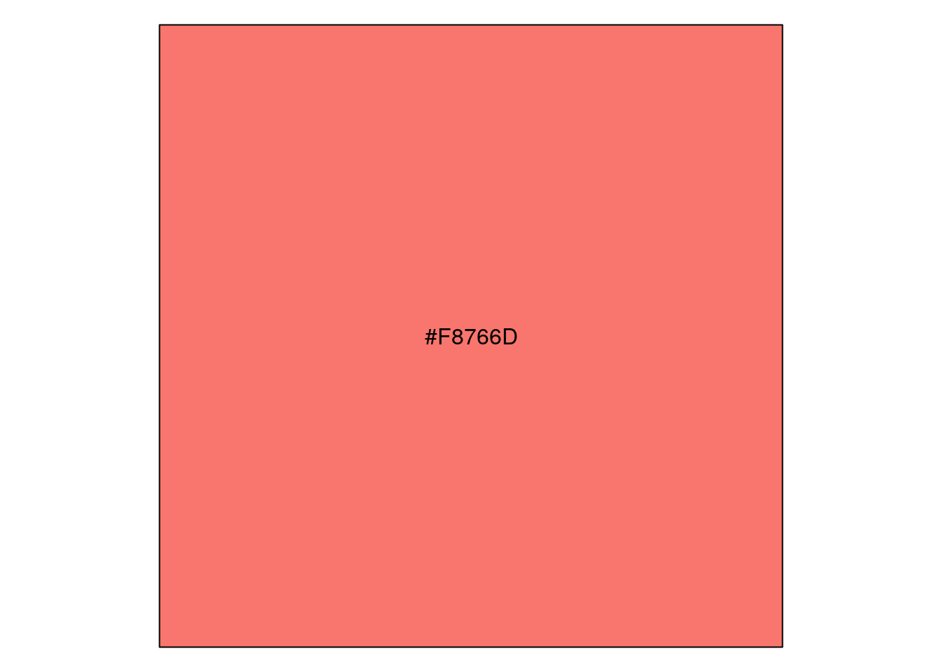
p <- ggplot(data = mpg) +
  geom_point(mapping = aes(x = displ, y = hwy, color = "blue"))
unique(ggplot_build(p)$data[[1]]$colour)
[1] "#F8766D"https://stackoverflow.com/a/8197706 https://stackoverflow.com/a/25211125
Which variables in
mpgare categorical? Which variables are continuous? (Hint: type?mpgto read the documentation for the dataset). How can you see this information when you runmpg?
str(mpg)Classes 'tbl_df', 'tbl' and 'data.frame': 234 obs. of 11 variables:
$ manufacturer: chr "audi" "audi" "audi" "audi" ...
$ model : chr "a4" "a4" "a4" "a4" ...
$ displ : num 1.8 1.8 2 2 2.8 2.8 3.1 1.8 1.8 2 ...
$ year : int 1999 1999 2008 2008 1999 1999 2008 1999 1999 2008 ...
$ cyl : int 4 4 4 4 6 6 6 4 4 4 ...
$ trans : chr "auto(l5)" "manual(m5)" "manual(m6)" "auto(av)" ...
$ drv : chr "f" "f" "f" "f" ...
$ cty : int 18 21 20 21 16 18 18 18 16 20 ...
$ hwy : int 29 29 31 30 26 26 27 26 25 28 ...
$ fl : chr "p" "p" "p" "p" ...
$ class : chr "compact" "compact" "compact" "compact" ...Map a continuous variable to
color,size, andshape. How do these aesthetics behave differently for categorical vs. continuous variables?
p <- ggplot(data = mpg, mapping = aes(x = displ, y = hwy))
p + geom_point(aes(color = class))
p + geom_point(aes(color = cty))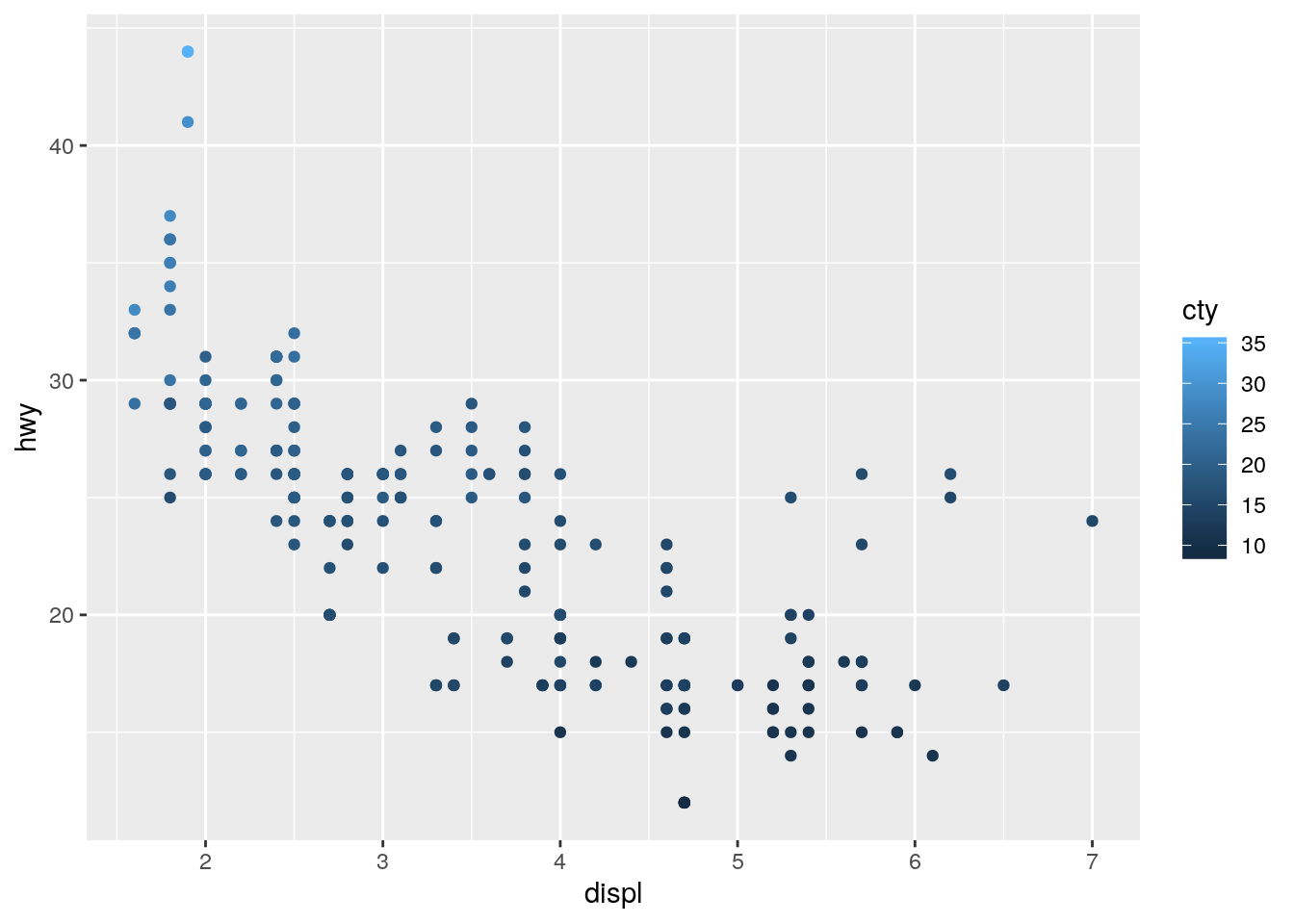
p + geom_point(aes(size = class))Warning: Using size for a discrete variable is not advised.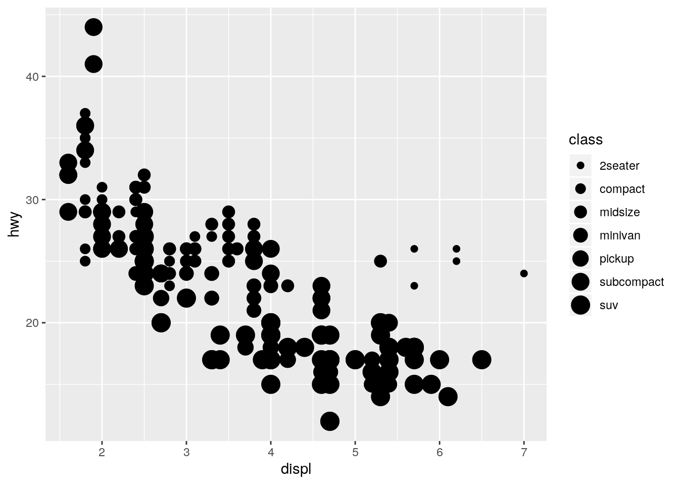
p + geom_point(aes(size = cty))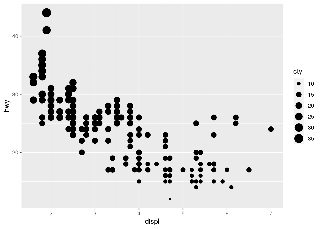
p + geom_point(aes(shape = class))Warning: The shape palette can deal with a maximum of 6 discrete values
because more than 6 becomes difficult to discriminate; you have 7.
Consider specifying shapes manually if you must have them.Warning: Removed 62 rows containing missing values (geom_point).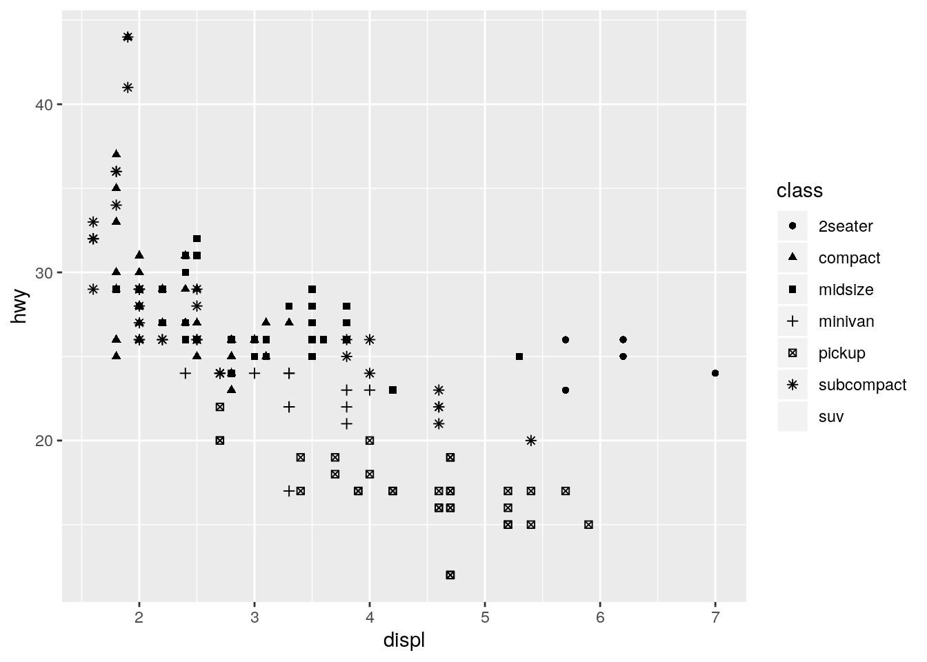
tools::assertError(print(p + geom_point(aes(shape = cty))), verbose = TRUE)Asserted error: A continuous variable can not be mapped to shape
Note: Have to use print() to catch error because the error is generated by print.ggplot().
https://stackoverflow.com/a/11782043
What happens if you map the same variable to multiple aesthetics?
ggplot(data = mpg) +
  geom_point(mapping = aes(x = displ, y = hwy, color = class, size = class))
Warning: Using size for a discrete variable is not advised.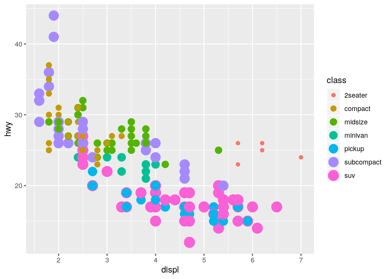
Both aesthetics are applied.
What does the
strokeaesthetic do? What shapes does it work with? (Hint: use?geom_point)
?geom_pointstroke controls the width of the border (for shapes that have a border).
ggplot(data = mpg) +
  geom_point(mapping = aes(x = displ, y = hwy),
             shape = 21, fill = "white", color = "red", stroke = 3)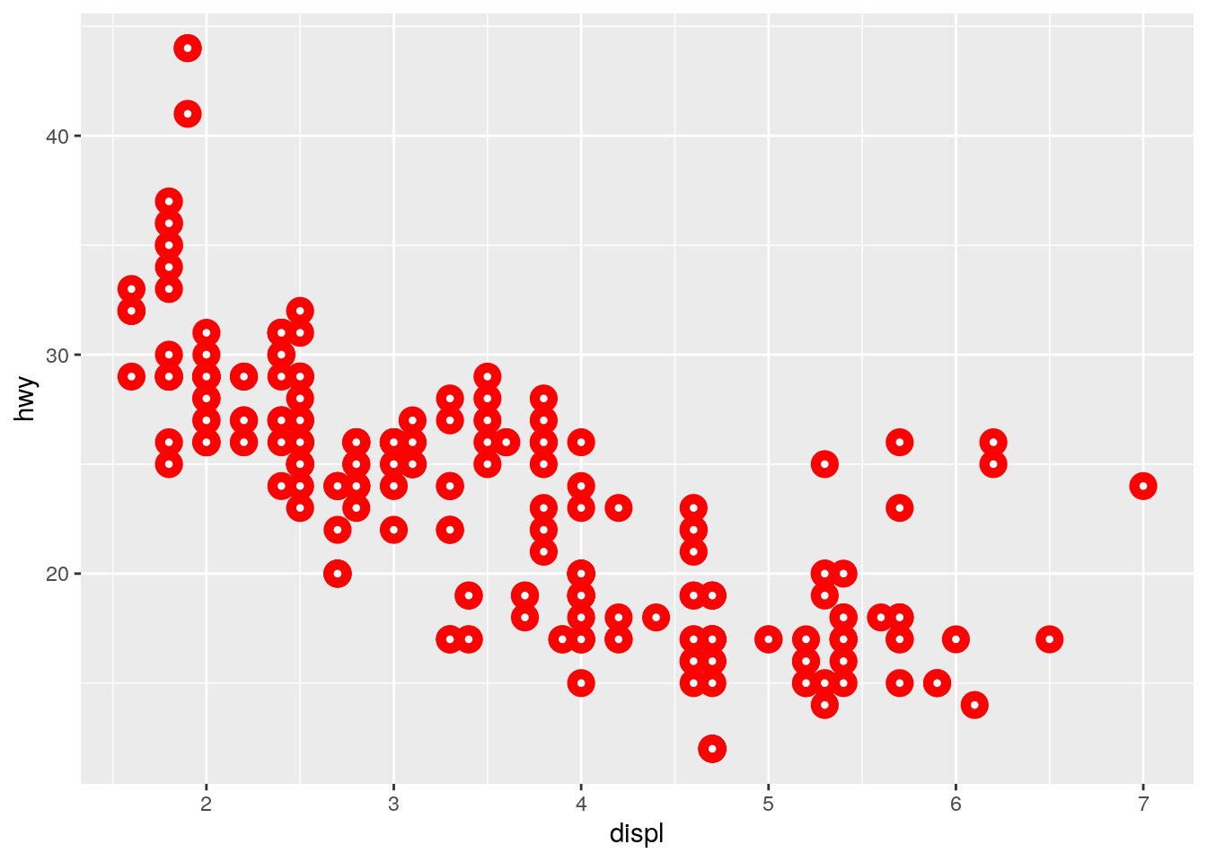
What happens if you map an aesthetic to something other than a variable name, like
aes(colour = displ < 5)? Note, you’ll also need to specify x and y.
ggplot(data = mpg) +
  geom_point(mapping = aes(x = displ, y = hwy, colour = displ < 5))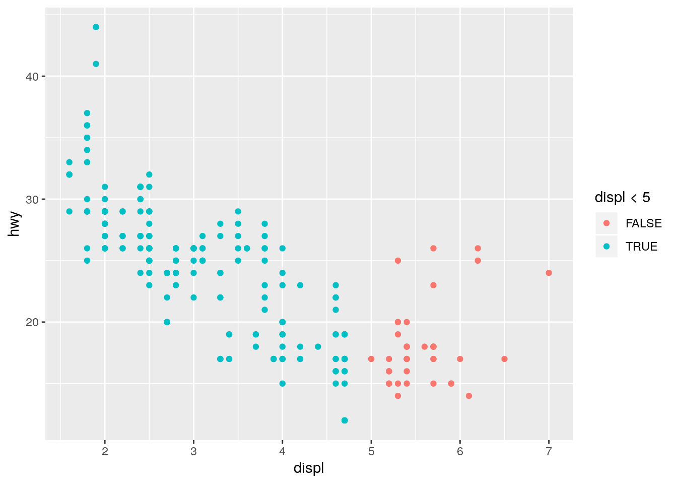
This is analogous to the color = "blue" question above. Since a logical vector has two unique values, TRUE and FALSE, the points are colored using the first two default colors. Note that since the x-axis is also displ, the color is providing redundant information in this plot.
Facets
p. 15
What happens if you facet on a continuous variable?
It creates a separate facet for each unique value of the continuous variable:
ggplot(data = mpg) +
  geom_point(mapping = aes(x = displ, y = hwy)) +
  facet_wrap(~ cty)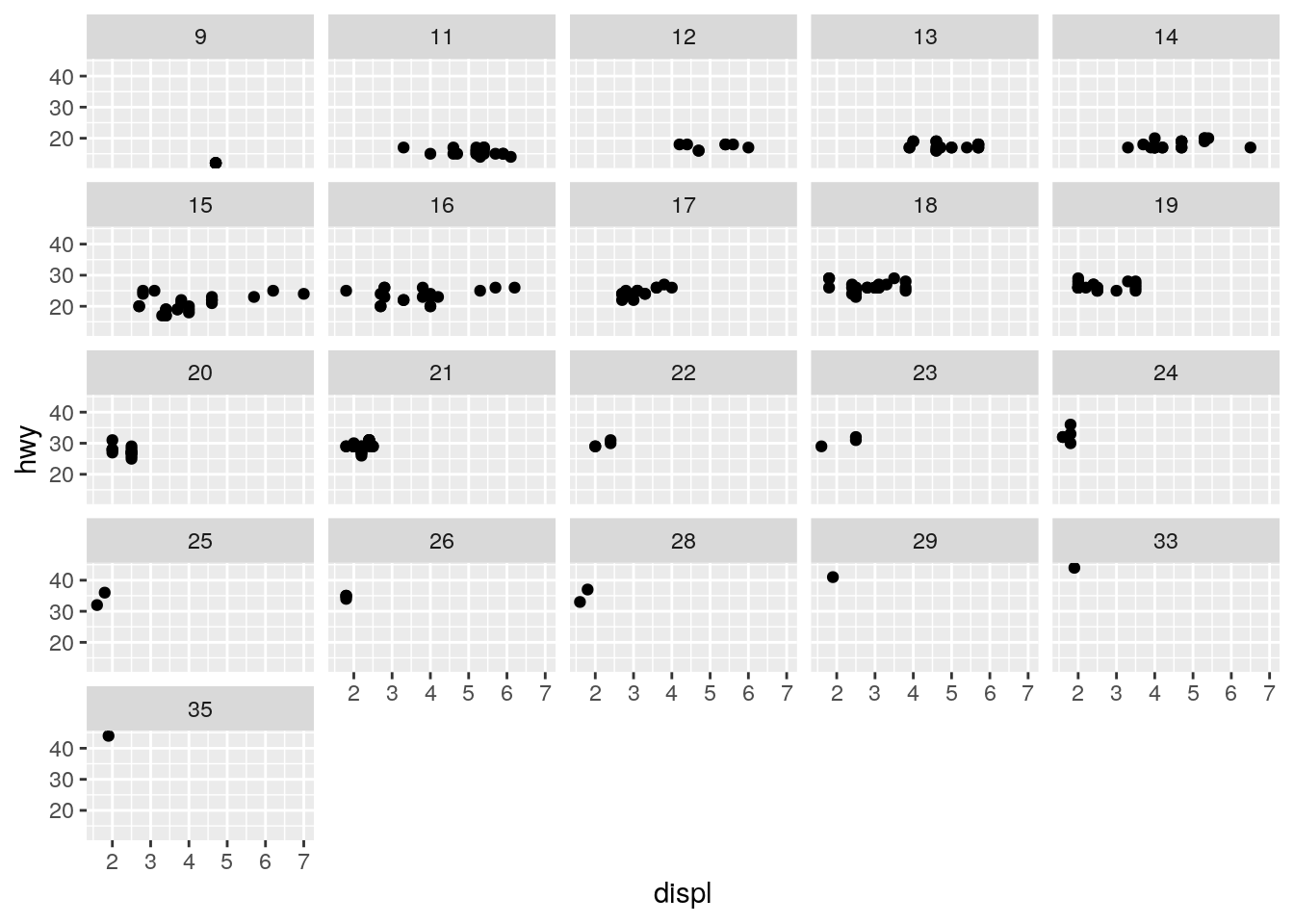
ggplot(data = mpg) +
  geom_point(mapping = aes(x = displ, y = hwy)) +
  facet_wrap(~ displ)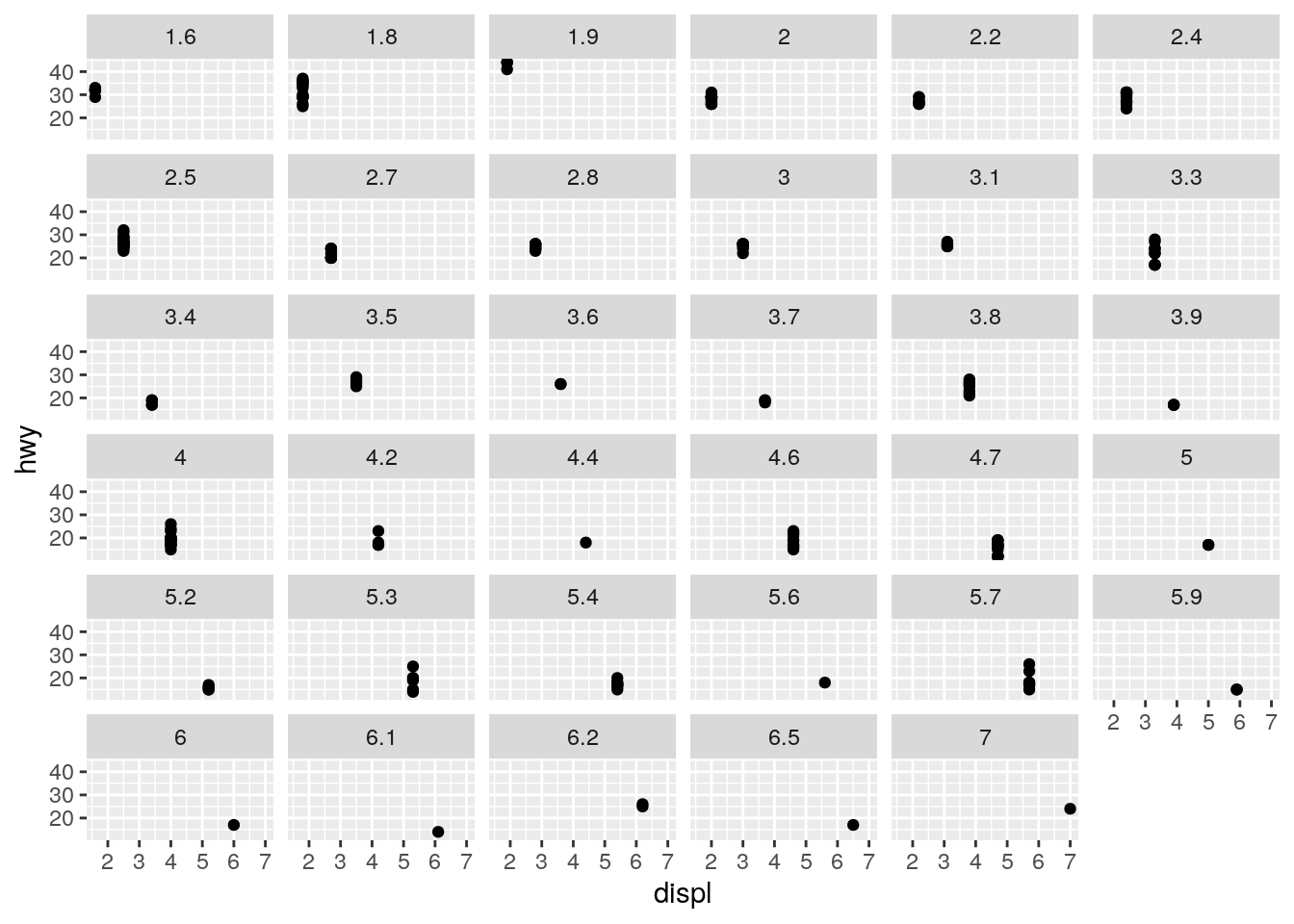
What do the empty cells in plot with
facet_grid(drv ~ cyl)mean? How do they relate to this plot?
ggplot(data = mpg) +
  geom_point(mapping = aes(x = drv, y = cyl))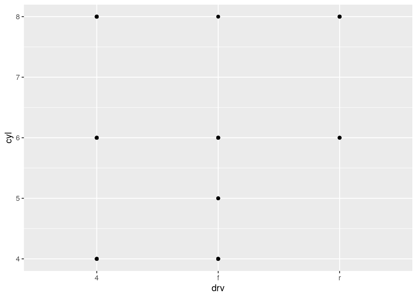
The data set does not include any cars with rear wheel drive and 4 or 5 cylinders.
What plots does the following code make? What does
.do?
ggplot(data = mpg) +
  geom_point(mapping = aes(x = displ, y = hwy)) +
  facet_grid(drv ~ .)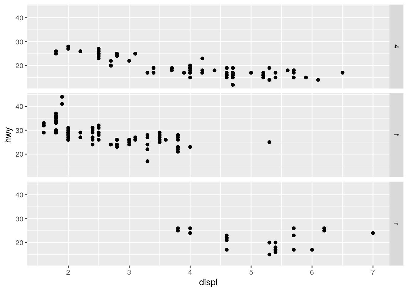
ggplot(data = mpg) +
  geom_point(mapping = aes(x = displ, y = hwy)) +
  facet_grid(. ~ cyl)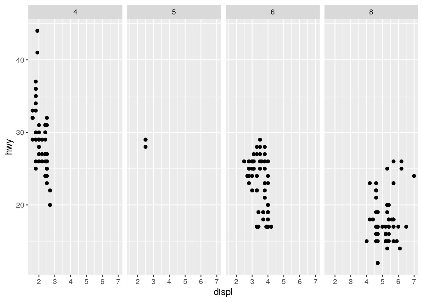
The . is a place holder for the rows or columns.
Take the first faceted plot in this section:
ggplot(data = mpg) +
  geom_point(mapping = aes(x = displ, y = hwy)) +
  facet_wrap(~ class, nrow = 2)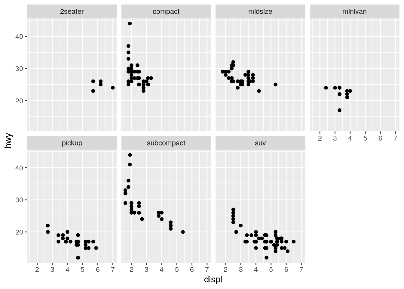
What are the advantages to using faceting instead of the colour aesthetic? What are the disadvantages? How might the balance change if you had a larger dataset?
ggplot(data = mpg) +
  geom_point(mapping = aes(x = displ, y = hwy, color = class))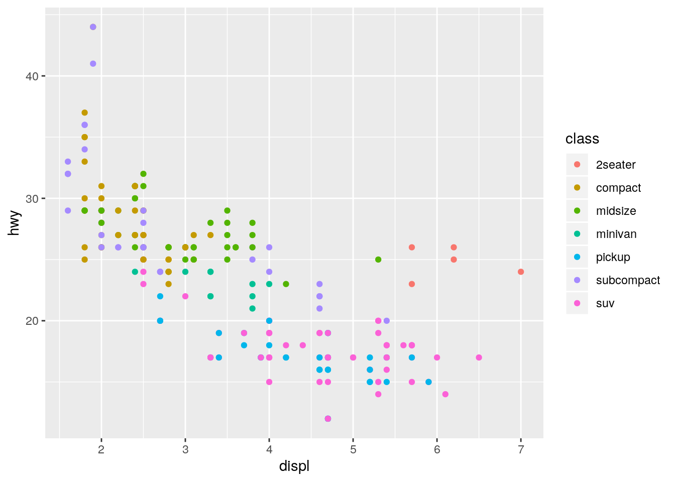
The facets make it easier to see the full shape of the distribution for each class. The disadvantage is that it makes it more difficult to directly compare across each class. With more cars, there would be an increased possibility of overplotting, makeing the faceting more advantageous.
Read
?facet_wrap. What doesnrowdo? What doesncoldo? What other options control the layout of the individual panels? Why doesn’tfacet_grid()havenrowandncolarguments?
?facet_wrapnrow controls the number of rows and ncol controls the number of columns. as.table determines the order of the facets. drop removes empty facets. dir controls horizontal or vertical ordering.
The number of rows and columns for facet_grid() are determined by the number of unique levels in the variables used for facetting.
When using
facet_grid()you should usually put the variable with more unique levels in the columns. Why?
I don’t feel that this is an obvious question. This answer states it is because screens tend to be wider than longer. But that makes a lot of assumptions. First, what if the variable has so many unique levels that it doesn’t fit well horizontally at a readable size on a smaller laptop screen. I personally find it easier to scroll vertically rather than horizontally. Also, I feel like this should be informed by the importance of the x versus y axis. Having more columns means it will be easier to compare the y-axis values. And having more rows means it will be easier to compare the x-axis values.
sessionInfo()R version 3.6.1 (2019-07-05)
Platform: x86_64-pc-linux-gnu (64-bit)
Running under: Ubuntu 18.04.3 LTS
Matrix products: default
BLAS: /usr/lib/x86_64-linux-gnu/atlas/libblas.so.3.10.3
LAPACK: /usr/lib/x86_64-linux-gnu/atlas/liblapack.so.3.10.3
locale:
[1] LC_CTYPE=en_US.UTF-8 LC_NUMERIC=C
[3] LC_TIME=en_US.UTF-8 LC_COLLATE=en_US.UTF-8
[5] LC_MONETARY=en_US.UTF-8 LC_MESSAGES=en_US.UTF-8
[7] LC_PAPER=en_US.UTF-8 LC_NAME=C
[9] LC_ADDRESS=C LC_TELEPHONE=C
[11] LC_MEASUREMENT=en_US.UTF-8 LC_IDENTIFICATION=C
attached base packages:
[1] stats graphics grDevices utils datasets methods base
other attached packages:
[1] ggplot2_3.2.1
loaded via a namespace (and not attached):
[1] Rcpp_1.0.2 plyr_1.8.4 compiler_3.6.1 pillar_1.4.2
[5] git2r_0.26.1 highr_0.8 workflowr_1.4.0 tools_3.6.1
[9] zeallot_0.1.0 digest_0.6.21 evaluate_0.14 tibble_2.1.3
[13] gtable_0.3.0 pkgconfig_2.0.2 rlang_0.4.0 cli_1.1.0
[17] yaml_2.2.0 xfun_0.9 withr_2.1.2 stringr_1.4.0
[21] dplyr_0.8.3 knitr_1.25 fs_1.3.1 vctrs_0.2.0
[25] rprojroot_1.2 grid_3.6.1 tidyselect_0.2.5 glue_1.3.1
[29] R6_2.4.0 fansi_0.4.0 rmarkdown_1.15 reshape2_1.4.3
[33] purrr_0.3.2 magrittr_1.5 whisker_0.4 backports_1.1.4
[37] scales_1.0.0 htmltools_0.3.6 assertthat_0.2.1 colorspace_1.4-1
[41] labeling_0.3 utf8_1.1.4 stringi_1.4.3 lazyeval_0.2.2
[45] munsell_0.5.0 crayon_1.3.4