Chapter 5 - Exploratory Data Analysis (EDA)
Vebash Naidoo
16/10/2020
Last updated: 2020-10-16
Checks: 7 0
Knit directory: r4ds_book/
This reproducible R Markdown analysis was created with workflowr (version 1.6.2). The Checks tab describes the reproducibility checks that were applied when the results were created. The Past versions tab lists the development history.
Great! Since the R Markdown file has been committed to the Git repository, you know the exact version of the code that produced these results.
Great job! The global environment was empty. Objects defined in the global environment can affect the analysis in your R Markdown file in unknown ways. For reproduciblity it’s best to always run the code in an empty environment.
The command set.seed(20200814) was run prior to running the code in the R Markdown file. Setting a seed ensures that any results that rely on randomness, e.g. subsampling or permutations, are reproducible.
Great job! Recording the operating system, R version, and package versions is critical for reproducibility.
Nice! There were no cached chunks for this analysis, so you can be confident that you successfully produced the results during this run.
Great job! Using relative paths to the files within your workflowr project makes it easier to run your code on other machines.
Great! You are using Git for version control. Tracking code development and connecting the code version to the results is critical for reproducibility.
The results in this page were generated with repository version 50bf4b7. See the Past versions tab to see a history of the changes made to the R Markdown and HTML files.
Note that you need to be careful to ensure that all relevant files for the analysis have been committed to Git prior to generating the results (you can use wflow_publish or wflow_git_commit). workflowr only checks the R Markdown file, but you know if there are other scripts or data files that it depends on. Below is the status of the Git repository when the results were generated:
Ignored files:
    Ignored:    .Rproj.user/

Untracked files:
    Untracked:  VideoDecodeStats/
    Untracked:  analysis/images/
    Untracked:  code_snipp.txt
Note that any generated files, e.g. HTML, png, CSS, etc., are not included in this status report because it is ok for generated content to have uncommitted changes.
These are the previous versions of the repository in which changes were made to the R Markdown (analysis/ch5_eda.Rmd) and HTML (docs/ch5_eda.html) files. If you’ve configured a remote Git repository (see ?wflow_git_remote), click on the hyperlinks in the table below to view the files as they were in that past version.
| File | Version | Author | Date | Message |
|---|---|---|---|---|
| Rmd | 50bf4b7 | sciencificity | 2020-10-16 | added new chapters |
library(tidyverse)
library(flair)
library(nycflights13)
library(palmerpenguins)
library(gt)
library(skimr)
library(emo)
library(tidyquant)
library(lubridate)
library(magrittr)
theme_set(theme_tq())
Patterns
Variation: Best way to understand the pattern in a variable is to visualise the distribution of the variables values.
Categorical: Bar chart
Continuous: Histogram
In both:
- tall bars == common values of the variable
- short bars == less common values of the variable
- no bars == absense of that value in your data
Investigate Categories
ggplot(data = penguins) +
  geom_bar(aes(x = species))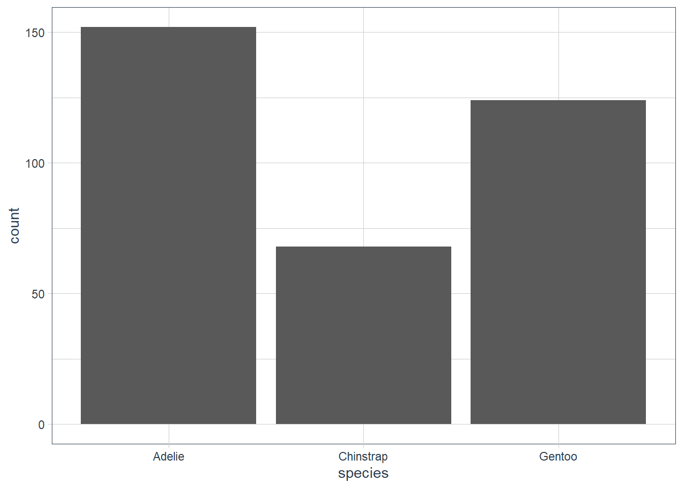
ggplot(data = penguins) +
  geom_bar(aes(x = sex))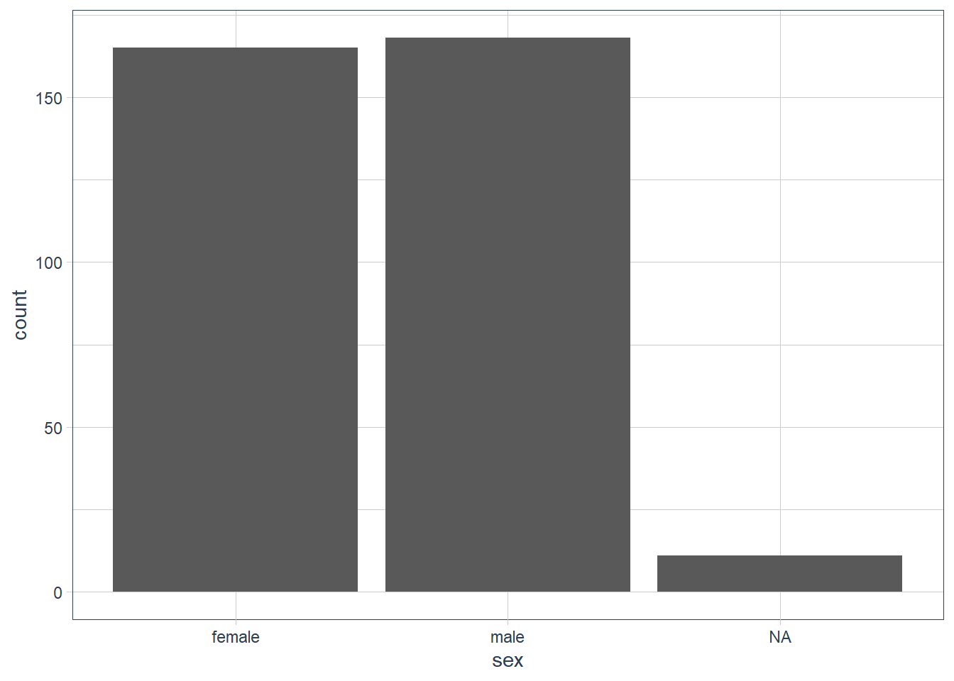
ggplot(data = penguins) +
  geom_bar(aes(x = island))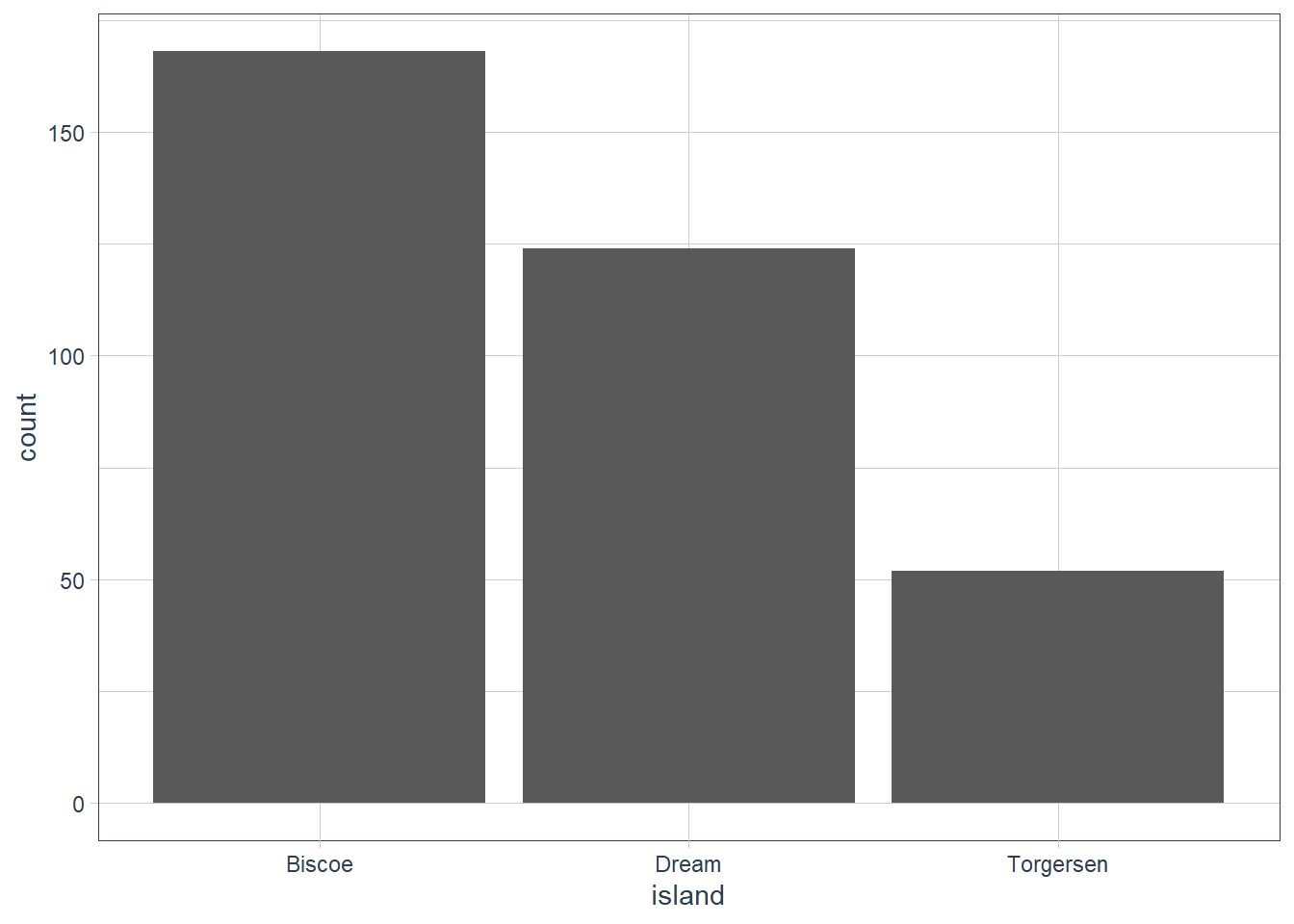
Investigate Continuous Data
ggplot(data = penguins) +
  geom_histogram(aes(x = bill_length_mm),
                 binwidth = 0.6)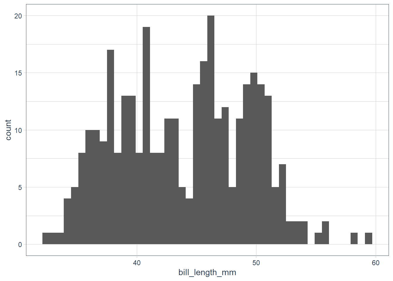
penguins %>%
  count(cut_width(bill_length_mm, 0.6))
# A tibble: 42 x 2
   `cut_width(bill_length_mm, 0.6)`     n
   <fct>                            <int>
 1 [32.1,32.7]                          1
 2 (32.7,33.3]                          1
 3 (33.3,33.9]                          1
 4 (33.9,34.5]                          3
 5 (34.5,35.1]                          5
 6 (35.1,35.7]                          6
 7 (35.7,36.3]                         13
 8 (36.3,36.9]                          9
 9 (36.9,37.5]                          8
10 (37.5,38.1]                         15
# ... with 32 more rows
The data looks bimodal - i.e. there are 2 bumps in the distribution. If we recall we have 3 species, so let’s fill in the bars based on the species.
ggplot(data = penguins) +
  geom_histogram(aes(x = bill_length_mm, fill = species),
                 alpha = 0.5,
                 binwidth = 0.6) +
  scale_fill_tq()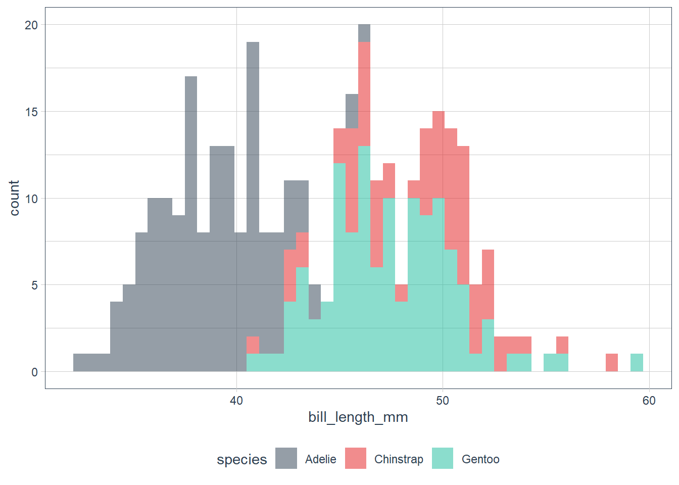
penguins %>%
  group_by(species) %>%
  count(cut_width(bill_length_mm, 0.6))
# A tibble: 71 x 3
# Groups:   species [3]
   species `cut_width(bill_length_mm, 0.6)`     n
   <fct>   <fct>                            <int>
 1 Adelie  [32.1,32.7]                          1
 2 Adelie  (32.7,33.3]                          1
 3 Adelie  (33.3,33.9]                          1
 4 Adelie  (33.9,34.5]                          3
 5 Adelie  (34.5,35.1]                          5
 6 Adelie  (35.1,35.7]                          6
 7 Adelie  (35.7,36.3]                         13
 8 Adelie  (36.3,36.9]                          9
 9 Adelie  (36.9,37.5]                          8
10 Adelie  (37.5,38.1]                         15
# ... with 61 more rows
When we have overlapping histograms, the suggestion is to use geom_freqpoly() which uses lines instead of bars.
ggplot(data = penguins) +
  geom_freqpoly(aes(x = bill_length_mm, colour = species),
                binwidth = 0.6) +
  scale_fill_tq()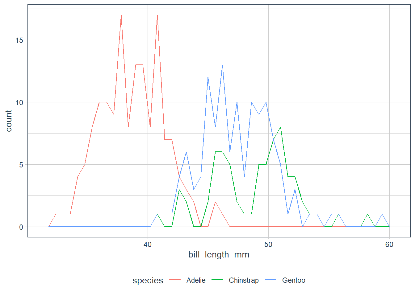
Looking at the plots ask some questions of your data:
Which values are the most common? Why?
Which values are rare? Why? Does that match your expectations?
Can you see any unusual patterns? What might explain them?
Clusters of similar values suggest that subgroups exist in your data. To understand the subgroups, ask:
How are the observations within each cluster similar to each other?
How are the observations in separate clusters different from each other?
How can you explain or describe the clusters?
Why might the appearance of clusters be misleading?
Investigate Unusual Values
Outliers are observations that don’t seem to gel nicely with the rest of the data.
Here the long y-axis indicates some outliers.
ggplot(data = diamonds) +
  # y is a var in the dataset! it measures one of the
  # dimensions of the diamond
  geom_histogram(aes(x = y),
                 binwidth = 0.5)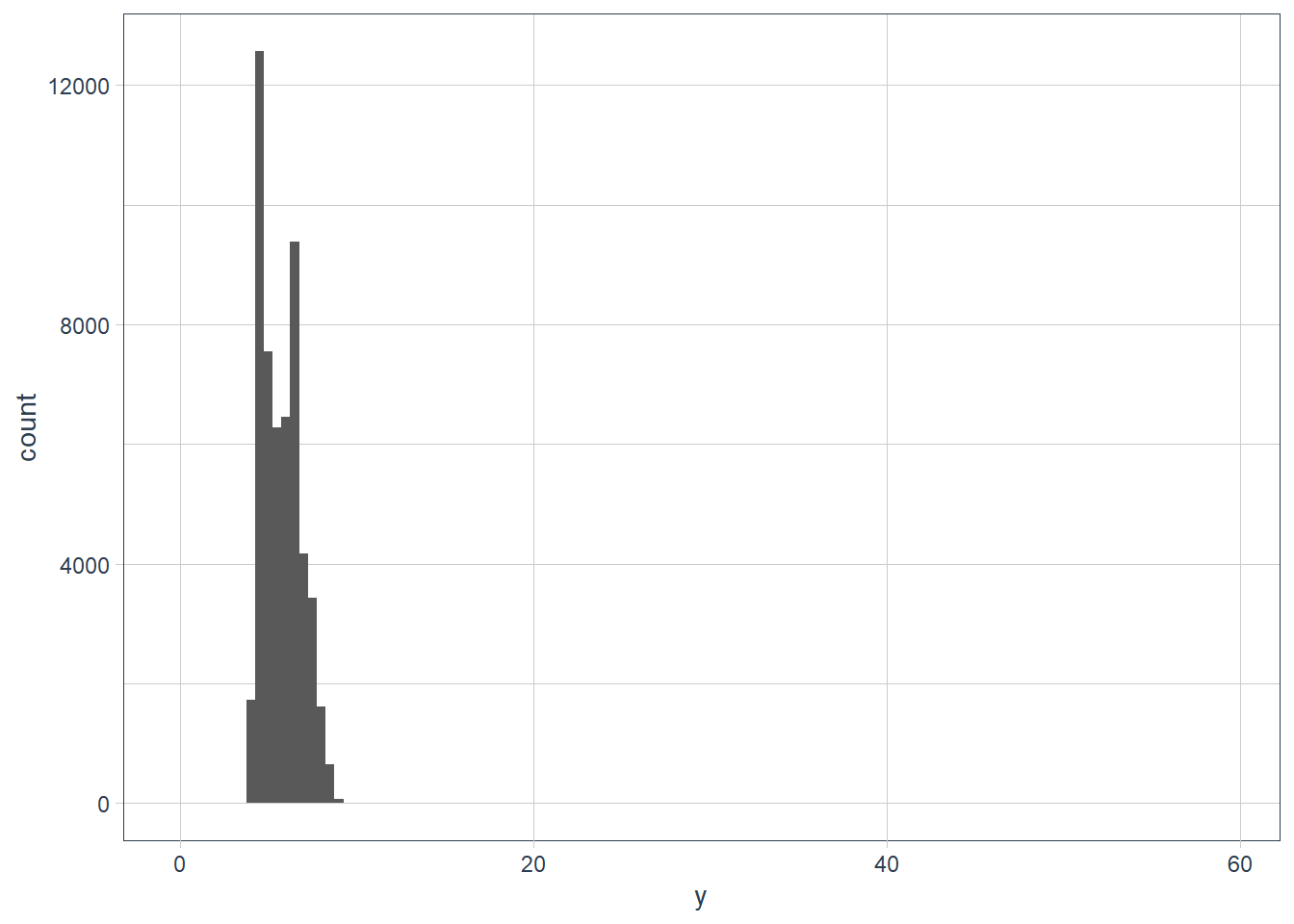
To zoom in lets use coord_cartesian() with the ylim variable.
The coord_cartesian() also has an xlim to zoom into the x-axis.
ggplot(data = diamonds) +
  geom_histogram(mapping = aes(x = y), binwidth = 0.5) +
  # limit the y-axis to btw 0-50! Note to self: DON'T CONFUSE with the x-axis
  # which is named `y`!!
  coord_cartesian(ylim = c(0,50)) +
  labs(x = "The variable y in the diamonds dataset")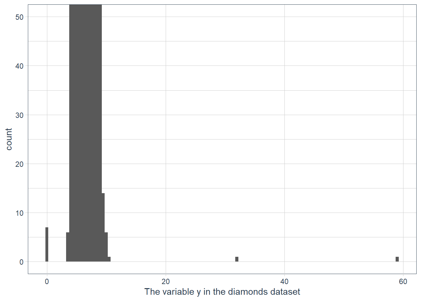
# zoom into the unusual values
(unusual <- diamonds %>%
    filter(y < 3 | y > 20) %>%
    arrange(y)) %>%
  print(width = Inf) # print the whole dataset so we can see all cols
# A tibble: 9 x 10
carat cut color clarity depth table price x y z
<dbl> <ord> <ord> <ord> <dbl> <dbl> <int> <dbl> <dbl> <dbl>
1 1 Very Good H VS2 63.3 53 5139 0 0 0
2 1.14 Fair G VS1 57.5 67 6381 0 0 0
3 1.56 Ideal G VS2 62.2 54 12800 0 0 0
4 1.2 Premium D VVS1 62.1 59 15686 0 0 0
5 2.25 Premium H SI2 62.8 59 18034 0 0 0
6 0.71 Good F SI2 64.1 60 2130 0 0 0
7 0.71 Good F SI2 64.1 60 2130 0 0 0
8 0.51 Ideal E VS1 61.8 55 2075 5.15 31.8 5.12
9 2 Premium H SI2 58.9 57 12210 8.09 58.9 8.06The y feature in the diamonds dataset measures a dimension (width, height, depth) in millimeters. A dimension of 0 mm is incorrect, and a dimension of ~32mm or ~59mm is also incorrect. Those diamonds will cost an 💪 and a 🦵!
In practice it is best to do analysis with and without your outliers.
- No difference with or without, probably safe to remove them
- Big difference with vs without, need to investigate why they are there before any action.
- In both cases, disclose the action taken in your analysis.
Exercises
Explore the distribution of each of the
x,y, andzvariables indiamonds. What do you learn? Think about a diamond and how you might decide which dimension is the length, width, and depth.ggplot(data = diamonds) + geom_histogram(aes(x=x), binwidth = 0.5)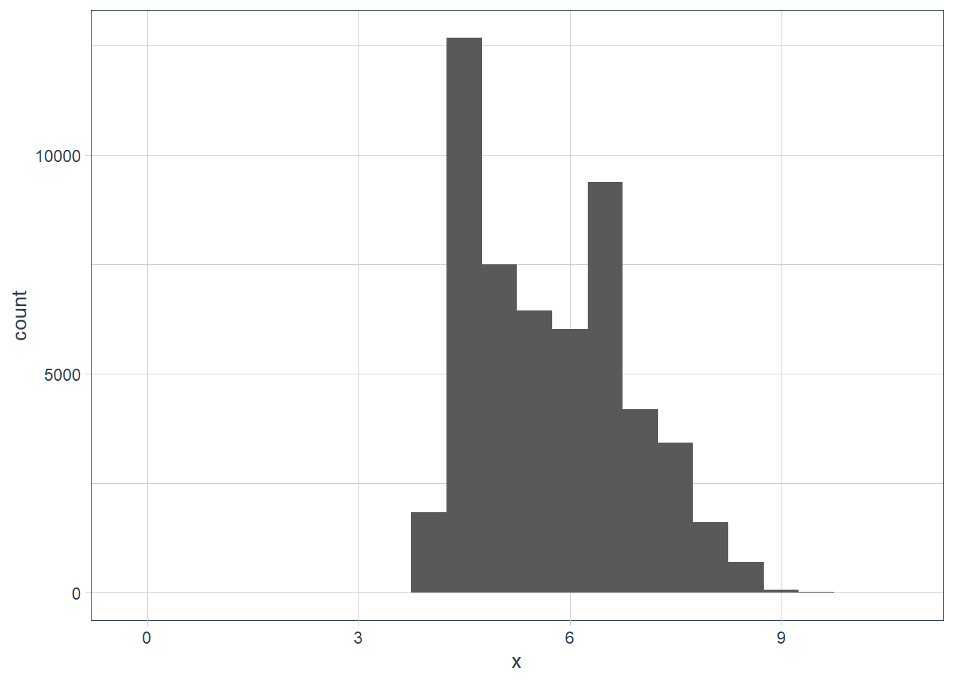
filter(diamonds, x == max(x)) %>%
  print(width = Inf)
# A tibble: 1 x 10 carat cut color clarity depth table price x y z <dbl> <ord> <ord> <ord> <dbl> <dbl> <int> <dbl> <dbl> <dbl> 1 5.01 Fair J I1 65.5 59 18018 10.7 10.5 6.98filter(diamonds, x == min(x)) %>% print(width = Inf)# A tibble: 8 x 10 carat cut color clarity depth table price x y z <dbl> <ord> <ord> <ord> <dbl> <dbl> <int> <dbl> <dbl> <dbl> 1 1.07 Ideal F SI2 61.6 56 4954 0 6.62 0 2 1 Very Good H VS2 63.3 53 5139 0 0 0 3 1.14 Fair G VS1 57.5 67 6381 0 0 0 4 1.56 Ideal G VS2 62.2 54 12800 0 0 0 5 1.2 Premium D VVS1 62.1 59 15686 0 0 0 6 2.25 Premium H SI2 62.8 59 18034 0 0 0 7 0.71 Good F SI2 64.1 60 2130 0 0 0 8 0.71 Good F SI2 64.1 60 2130 0 0 0diamonds %>% filter(x != 0) %>% filter(x == min(x)) %>% print(width = Inf)# A tibble: 2 x 10 carat cut color clarity depth table price x y z <dbl> <ord> <ord> <ord> <dbl> <dbl> <int> <dbl> <dbl> <dbl> 1 0.2 Premium F VS2 62.6 59 367 3.73 3.71 2.33 2 0.2 Premium D VS2 62.3 60 367 3.73 3.68 2.31ggplot(data = diamonds) + geom_histogram(aes(x = x), binwidth = 0.5) + coord_cartesian(xlim = c(0, 1), ylim = c(0, 10))
ggplot(data = diamonds) +
  geom_histogram(aes(x = y),
                 binwidth = 0.5)
filter(diamonds, y == max(y)) %>%
  print(width = Inf)
# A tibble: 1 x 10 carat cut color clarity depth table price x y z <dbl> <ord> <ord> <ord> <dbl> <dbl> <int> <dbl> <dbl> <dbl> 1 2 Premium H SI2 58.9 57 12210 8.09 58.9 8.06filter(diamonds, y == min(y)) %>% print(width = Inf)# A tibble: 7 x 10 carat cut color clarity depth table price x y z <dbl> <ord> <ord> <ord> <dbl> <dbl> <int> <dbl> <dbl> <dbl> 1 1 Very Good H VS2 63.3 53 5139 0 0 0 2 1.14 Fair G VS1 57.5 67 6381 0 0 0 3 1.56 Ideal G VS2 62.2 54 12800 0 0 0 4 1.2 Premium D VVS1 62.1 59 15686 0 0 0 5 2.25 Premium H SI2 62.8 59 18034 0 0 0 6 0.71 Good F SI2 64.1 60 2130 0 0 0 7 0.71 Good F SI2 64.1 60 2130 0 0 0diamonds %>% filter(y != 0) %>% filter(y == min(y)) %>% print(width = Inf)# A tibble: 1 x 10 carat cut color clarity depth table price x y z <dbl> <ord> <ord> <ord> <dbl> <dbl> <int> <dbl> <dbl> <dbl> 1 0.2 Premium D VS2 62.3 60 367 3.73 3.68 2.31diamonds %>% filter(y < 10) %>% filter(y == max(y)) %>% print(width = Inf)# A tibble: 2 x 10 carat cut color clarity depth table price x y z <dbl> <ord> <ord> <ord> <dbl> <dbl> <int> <dbl> <dbl> <dbl> 1 4.01 Premium J I1 62.5 62 15223 10.0 9.94 6.24 2 4 Very Good I I1 63.3 58 15984 10.0 9.94 6.31ggplot(data = diamonds) + geom_histogram(aes(x = z), binwidth = 0.5)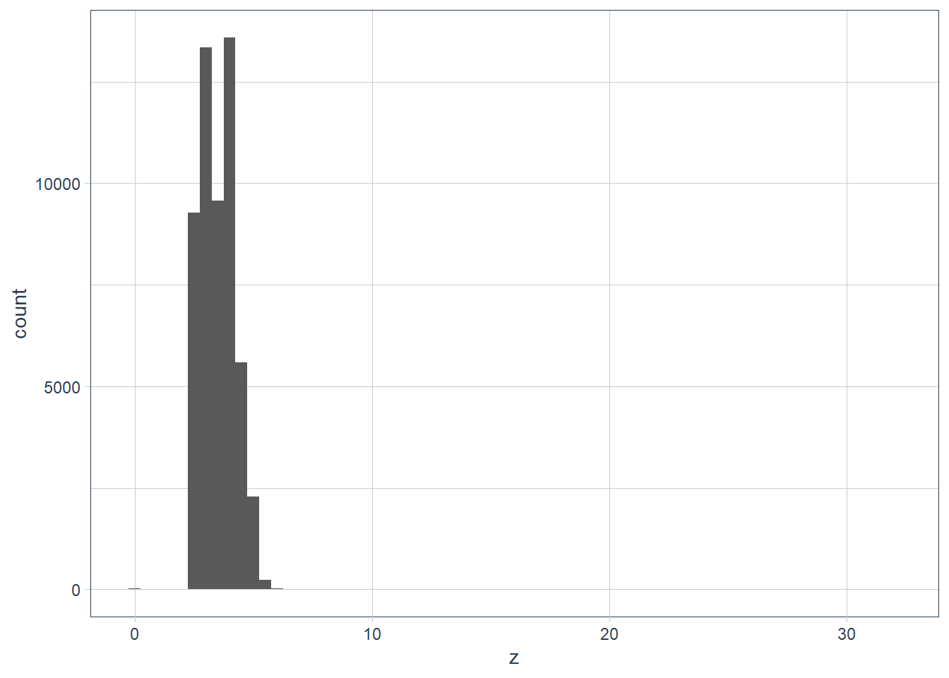
filter(diamonds, z == max(z)) %>%
  print(width = Inf)
# A tibble: 1 x 10 carat cut color clarity depth table price x y z <dbl> <ord> <ord> <ord> <dbl> <dbl> <int> <dbl> <dbl> <dbl> 1 0.51 Very Good E VS1 61.8 54.7 1970 5.12 5.15 31.8filter(diamonds, z == min(z)) %>% print(width = Inf)# A tibble: 20 x 10 carat cut color clarity depth table price x y z <dbl> <ord> <ord> <ord> <dbl> <dbl> <int> <dbl> <dbl> <dbl> 1 1 Premium G SI2 59.1 59 3142 6.55 6.48 0 2 1.01 Premium H I1 58.1 59 3167 6.66 6.6 0 3 1.1 Premium G SI2 63 59 3696 6.5 6.47 0 4 1.01 Premium F SI2 59.2 58 3837 6.5 6.47 0 5 1.5 Good G I1 64 61 4731 7.15 7.04 0 6 1.07 Ideal F SI2 61.6 56 4954 0 6.62 0 7 1 Very Good H VS2 63.3 53 5139 0 0 0 8 1.15 Ideal G VS2 59.2 56 5564 6.88 6.83 0 9 1.14 Fair G VS1 57.5 67 6381 0 0 0 10 2.18 Premium H SI2 59.4 61 12631 8.49 8.45 0 11 1.56 Ideal G VS2 62.2 54 12800 0 0 0 12 2.25 Premium I SI1 61.3 58 15397 8.52 8.42 0 13 1.2 Premium D VVS1 62.1 59 15686 0 0 0 14 2.2 Premium H SI1 61.2 59 17265 8.42 8.37 0 15 2.25 Premium H SI2 62.8 59 18034 0 0 0 16 2.02 Premium H VS2 62.7 53 18207 8.02 7.95 0 17 2.8 Good G SI2 63.8 58 18788 8.9 8.85 0 18 0.71 Good F SI2 64.1 60 2130 0 0 0 19 0.71 Good F SI2 64.1 60 2130 0 0 0 20 1.12 Premium G I1 60.4 59 2383 6.71 6.67 0unusual_z <- diamonds %>% filter(z < 2 | z > 10) ggplot(data = unusual_z) + geom_histogram(aes(x = z), binwidth = 0.5) + coord_cartesian(xlim = c(0, 35), ylim = c(0, 25))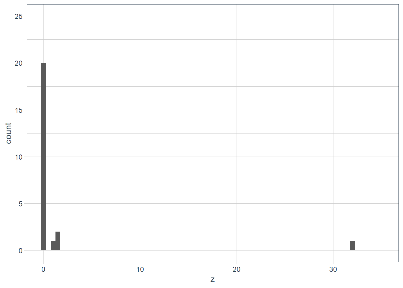
diamonds %>%
  select(x, y, z) %>%
  filter(x != 0,
         y != 0,
         z != 0) %>%
  skim()
Data summary Name Piped data Number of rows 53920 Number of columns 3 _______________________ Column type frequency: numeric 3 ________________________ Group variables None Variable type: numeric
skim_variable n_missing complete_rate mean sd p0 p25 p50 p75 p100 hist x 0 1 5.73 1.12 3.73 4.71 5.70 6.54 10.74 ▇▇▅▁▁ y 0 1 5.73 1.14 3.68 4.72 5.71 6.54 58.90 ▇▁▁▁▁ z 0 1 3.54 0.70 1.07 2.91 3.53 4.04 31.80 ▇▁▁▁▁ So it turns out a diamond has a table, width and depth.
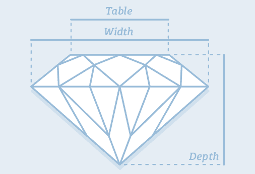
Credit: https://www.diamonds.pro/
x and y could be depth or width - there’s not much difference between the 2 values. The z is likely to be the
tablesince it is smaller.But looking at the
?diamondshelp page x = length, y = width and z = depth, and there is actually a table variable that is a relative measure 🤷, so there goes my “theory” 🤦.Explore the distribution of
price. Do you discover anything unusual or surprising? (Hint: Carefully think about thebinwidthand make sure you try a wide range of values.)ggplot(data = diamonds) + geom_histogram(aes(x = price), bins = 20)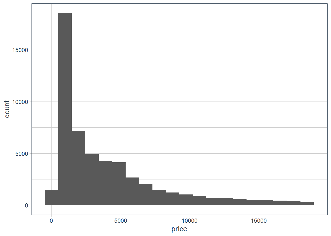
ggplot(data = diamonds) +
  geom_histogram(aes(x = price), binwidth = 1000)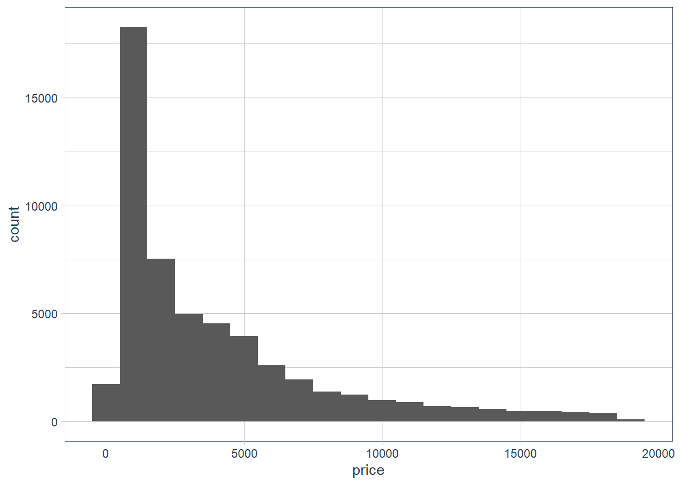
ggplot(data = diamonds) +
  geom_histogram(aes(x = price), binwidth = 200)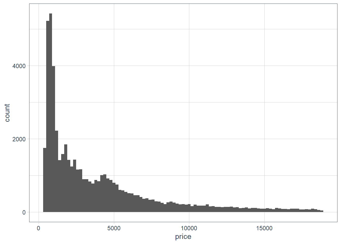
ggplot(data = diamonds) +
  geom_histogram(aes(x = price), binwidth = 500)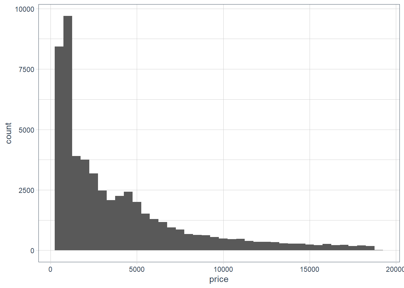
diamonds %>%
  select(price) %>%
  skim()
Data summary Name Piped data Number of rows 53940 Number of columns 1 _______________________ Column type frequency: numeric 1 ________________________ Group variables None Variable type: numeric
skim_variable n_missing complete_rate mean sd p0 p25 p50 p75 p100 hist price 0 1 3932.8 3989.44 326 950 2401 5324.25 18823 ▇▂▁▁▁ diamonds %>% filter(price == 326 | price == 18823) %>% gt()carat cut color clarity depth table price x y z 0.23 Ideal E SI2 61.5 55 326 3.95 3.98 2.43 0.21 Premium E SI1 59.8 61 326 3.89 3.84 2.31 2.29 Premium I VS2 60.8 60 18823 8.50 8.47 5.16 diamonds %>% arrange(-carat) %>% head(10) %>% gt()carat cut color clarity depth table price x y z 5.01 Fair J I1 65.5 59 18018 10.74 10.54 6.98 4.50 Fair J I1 65.8 58 18531 10.23 10.16 6.72 4.13 Fair H I1 64.8 61 17329 10.00 9.85 6.43 4.01 Premium I I1 61.0 61 15223 10.14 10.10 6.17 4.01 Premium J I1 62.5 62 15223 10.02 9.94 6.24 4.00 Very Good I I1 63.3 58 15984 10.01 9.94 6.31 3.67 Premium I I1 62.4 56 16193 9.86 9.81 6.13 3.65 Fair H I1 67.1 53 11668 9.53 9.48 6.38 3.51 Premium J VS2 62.5 59 18701 9.66 9.63 6.03 3.50 Ideal H I1 62.8 57 12587 9.65 9.59 6.03 The prices range from $326 to $18823. The carat of the high priced $18823 diamond is 2.29. There are other diamonds where the carat is bigger, and the cut is also Premium yet the price is lower. So it seems diamond pricing considers many factors, and could also be determined on who is doing the selling.
How many diamonds are 0.99 carat? How many are 1 carat? What do you think is the cause of the difference?
diamonds %>%
  filter(
         carat == 1 |
         carat == 0.99
        ) %>%
  count(carat, sort = TRUE)
# A tibble: 2 x 2 carat n <dbl> <int> 1 1 1558 2 0.99 23sample_test <- diamonds %>% filter(carat == 1 | carat == 0.99) %>% group_by(carat) %>% arrange(carat, price) sample_test %>% sample_n(20) %>% gt()cut color clarity depth table price x y z 0.99 Good F SI2 63.3 54 4052 6.36 6.43 4.05 Premium F VS2 62.6 55 5893 6.50 6.35 4.02 Very Good F SI2 61.2 56 4852 6.40 6.45 3.93 Fair I SI1 60.7 66 3337 6.42 6.34 3.87 Very Good D SI1 62.6 57 5671 6.34 6.37 3.98 Ideal F SI1 62.8 57 5728 6.30 6.38 3.98 Ideal H SI1 61.1 56 5287 6.44 6.47 3.94 Ideal F VS1 61.0 55 5947 6.46 6.52 3.96 Very Good F SI1 62.5 58 5112 6.36 6.38 3.98 Very Good G SI1 62.8 56 4863 6.34 6.36 3.99 Ideal F SI1 62.1 58 6038 6.33 6.40 3.95 Fair I SI2 68.1 56 2811 6.21 6.06 4.18 Fair H VS2 71.6 57 3593 5.94 5.80 4.20 Very Good J SI1 60.3 57 4002 6.44 6.49 3.90 Very Good F VS2 61.8 57 6094 6.37 6.39 3.94 Ideal I SI1 61.8 57 4763 6.40 6.42 3.96 Very Good E SI2 61.8 59 4780 6.30 6.33 3.90 Premium F SI2 60.6 61 4075 6.45 6.38 3.89 Very Good D SI2 62.5 57 4993 6.30 6.34 3.95 Fair J I1 73.6 60 1789 6.01 5.80 4.35 1 Very Good H SI1 62.1 58 5247 6.44 6.45 4.00 Very Good D SI1 60.1 60 4697 6.47 6.55 3.91 Premium H SI1 62.7 60 4469 6.30 6.24 3.93 Ideal E SI1 61.9 56 5458 6.37 6.45 3.97 Premium E VS2 63.0 58 7168 6.25 6.22 3.93 Good H VS1 61.8 61 5219 6.40 6.31 3.93 Very Good D IF 63.3 59 16073 6.37 6.33 4.02 Good D SI2 64.0 54 3304 6.29 6.24 4.01 Premium H VS2 61.5 61 5000 6.45 6.40 3.95 Fair F SI1 64.8 59 5292 6.29 6.24 4.06 Ideal E SI2 62.0 57 4623 6.37 6.41 3.96 Premium D SI1 61.5 60 5488 6.38 6.34 3.91 Premium G VS1 60.6 59 6115 6.48 6.42 3.91 Very Good I SI1 58.5 61 4649 6.51 6.55 3.82 Premium D SI2 61.6 58 4626 6.45 6.37 3.95 Premium H VS2 62.6 59 5320 6.37 6.31 3.97 Premium H SI2 62.8 60 3080 6.46 6.34 4.02 Ideal D SI1 63.0 56 4592 6.33 6.28 3.97 Premium F SI1 59.7 60 4939 6.51 6.48 3.88 Ideal G VS2 58.9 60 6235 6.53 6.58 3.86 sample_test %>% select(cut, price) %>% skim()Data summary Name Piped data Number of rows 1581 Number of columns 3 _______________________ Column type frequency: factor 1 numeric 1 ________________________ Group variables carat Variable type: factor
skim_variable carat n_missing complete_rate ordered n_unique top_counts cut 0.99 0 1 TRUE 5 Ver: 8, Fai: 7, Ide: 5, Pre: 2 cut 1.00 0 1 TRUE 5 Pre: 462, Ver: 389, Goo: 333, Ide: 208 Variable type: numeric
skim_variable carat n_missing complete_rate mean sd p0 p25 p50 p75 p100 hist price 0.99 0 1 4406.17 1318.99 1789 3465 4780 5479 6094 ▂▅▅▇▇ price 1.00 0 1 5241.59 1603.94 1681 4155 4864 6073 16469 ▇▇▁▁▁ The one carat diamonds are gigher in price and hugely so in the upper range.
Compare and contrast
coord_cartesian()vsxlim()orylim()when zooming in on a histogram. What happens if you leavebinwidthunset? What happens if you try and zoom so only half a bar shows?ggplot(data = diamonds) + geom_histogram(mapping = aes(x = y), binwidth = 0.5) + # limit the y-axis to btw 0-50! # Note to self: DON'T CONFUSE with the x-axis # which is named `y`!! coord_cartesian(ylim = c(0,50)) + labs(x = "The variable y in the diamonds dataset")
ggplot(data = diamonds) +
  geom_histogram(mapping = aes(x = y), binwidth = 0.5) +
  ylim(c(0,50)) +
  labs(x = "The variable y in the diamonds dataset")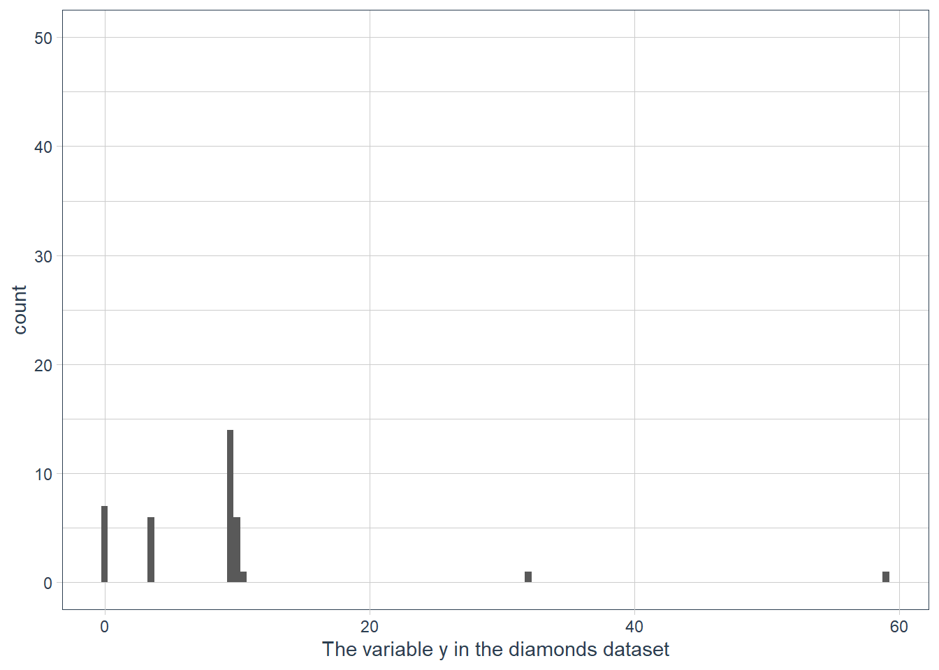
ggplot(data = diamonds) +
  geom_histogram(mapping = aes(x = y)) +
  ylim(c(0,50)) +
  labs(x = "The variable y in the diamonds dataset")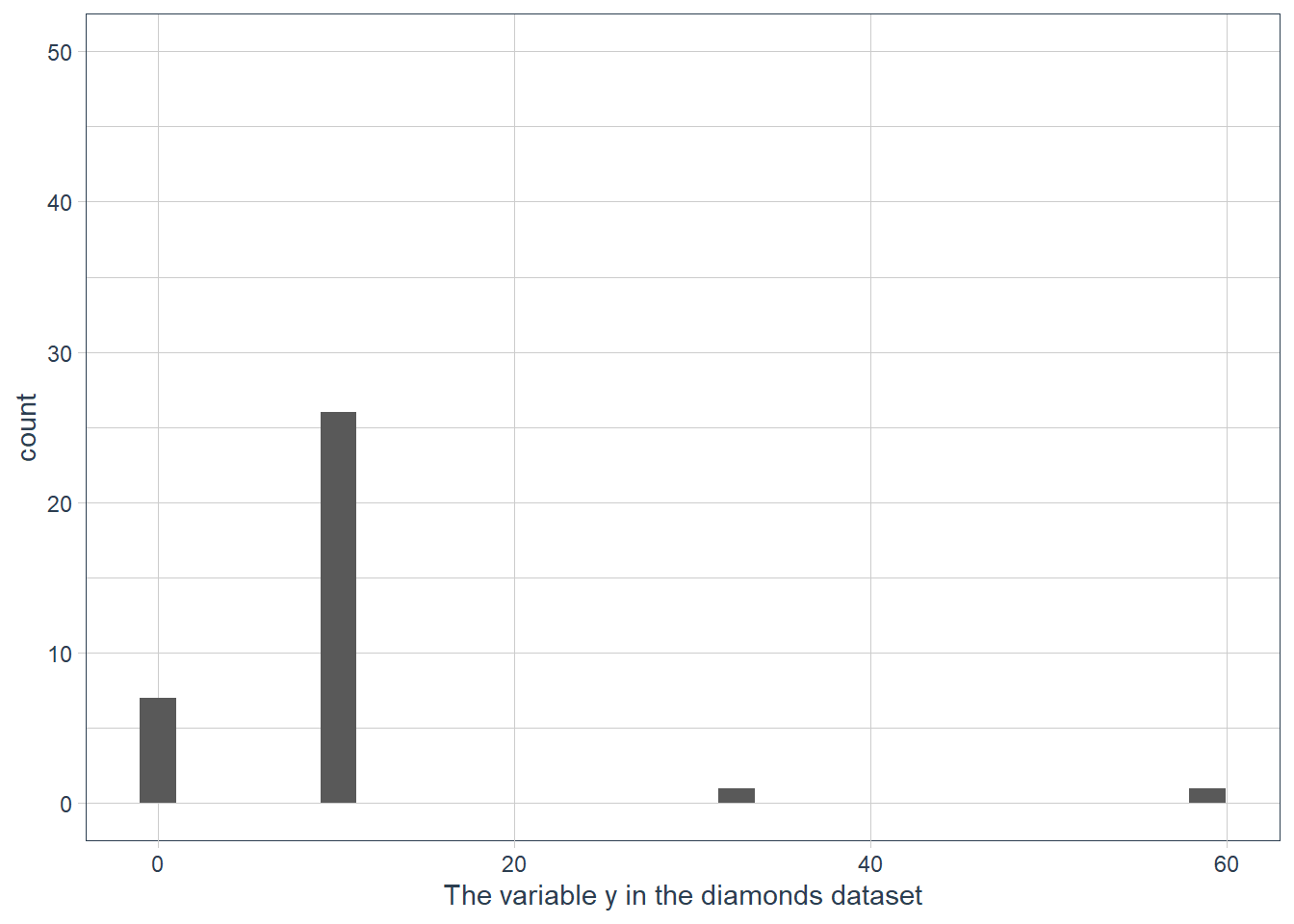
Documentation reads: “This is a shortcut for supplying the limits argument to the individual scales. Note that, by default, any values outside the limits will be replaced with NA.” So
ylim()andxlim()replace values outside the limit with NULL values resulting in the histogram being quite different to what we have when we usecoord_cartesian().If we don’t supply a binwidth ggplot defaults the number of bins to display to 30, and hence implicitly picks a binwidth for us.
Leveraging Missing Values
When you have weird values for variables, e.g. the ~59 mm for y, you may be tempted to drop these values and carry on. Often though a dataset is not nice and neat with all it’s weird values in a few observations! Usually the weird values are spread over multiple observations!
diamonds %>%
  mutate(row_num = row_number()) %>%
  filter(x==0 | y==0 | z==0) %>%
gt()| carat | cut | color | clarity | depth | table | price | x | y | z | row_num |
|---|---|---|---|---|---|---|---|---|---|---|
| 1.00 | Premium | G | SI2 | 59.1 | 59 | 3142 | 6.55 | 6.48 | 0 | 2208 |
| 1.01 | Premium | H | I1 | 58.1 | 59 | 3167 | 6.66 | 6.60 | 0 | 2315 |
| 1.10 | Premium | G | SI2 | 63.0 | 59 | 3696 | 6.50 | 6.47 | 0 | 4792 |
| 1.01 | Premium | F | SI2 | 59.2 | 58 | 3837 | 6.50 | 6.47 | 0 | 5472 |
| 1.50 | Good | G | I1 | 64.0 | 61 | 4731 | 7.15 | 7.04 | 0 | 10168 |
| 1.07 | Ideal | F | SI2 | 61.6 | 56 | 4954 | 0.00 | 6.62 | 0 | 11183 |
| 1.00 | Very Good | H | VS2 | 63.3 | 53 | 5139 | 0.00 | 0.00 | 0 | 11964 |
| 1.15 | Ideal | G | VS2 | 59.2 | 56 | 5564 | 6.88 | 6.83 | 0 | 13602 |
| 1.14 | Fair | G | VS1 | 57.5 | 67 | 6381 | 0.00 | 0.00 | 0 | 15952 |
| 2.18 | Premium | H | SI2 | 59.4 | 61 | 12631 | 8.49 | 8.45 | 0 | 24395 |
| 1.56 | Ideal | G | VS2 | 62.2 | 54 | 12800 | 0.00 | 0.00 | 0 | 24521 |
| 2.25 | Premium | I | SI1 | 61.3 | 58 | 15397 | 8.52 | 8.42 | 0 | 26124 |
| 1.20 | Premium | D | VVS1 | 62.1 | 59 | 15686 | 0.00 | 0.00 | 0 | 26244 |
| 2.20 | Premium | H | SI1 | 61.2 | 59 | 17265 | 8.42 | 8.37 | 0 | 27113 |
| 2.25 | Premium | H | SI2 | 62.8 | 59 | 18034 | 0.00 | 0.00 | 0 | 27430 |
| 2.02 | Premium | H | VS2 | 62.7 | 53 | 18207 | 8.02 | 7.95 | 0 | 27504 |
| 2.80 | Good | G | SI2 | 63.8 | 58 | 18788 | 8.90 | 8.85 | 0 | 27740 |
| 0.71 | Good | F | SI2 | 64.1 | 60 | 2130 | 0.00 | 0.00 | 0 | 49557 |
| 0.71 | Good | F | SI2 | 64.1 | 60 | 2130 | 0.00 | 0.00 | 0 | 49558 |
| 1.12 | Premium | G | I1 | 60.4 | 59 | 2383 | 6.71 | 6.67 | 0 | 51507 |
Throwing away all observations where a variable has weird values can result in a serious shrinking of your dataset.
The authors suggest that instead of throwing away the observations with weird values, rather replace them with missing values. This may sound strange since many of us have probably heard that missing values shouldn’t be used in data science! It’s usually a problem to be fixed!
But in EDA it may provide insight to either force weird values to be NA, or to investigate how missing values differ from non-missing values.
Exercises
What happens to missing values in a histogram? What happens to missing values in a bar chart? Why is there a difference?
Missing values in bar charts are plotted as a category. Missing values in a histogram are dropped.
I guess that it is easy to create one category for missing and lump all the missing variable observations into that count.
For a continuous variable where data is binned however how do you show that on a graph? The limits are continuous values e.g. from 0 - 100, -100 - 100 etc. Where should the count of NAs go on the x-axis, and y-axis given that the range that NA could represent is any number in the range of the continuous values we have for a variable.
What does
na.rm = TRUEdo inmean()andsum()?The NAs are removed and then the mean() or sum() is computed on the remaining non-NA values.
c(1,2,NA,3,4,NA,5) %>%
  mean(na.rm=TRUE)
[1] 3# (1+2+3+4+5) / 5 = 15 / 5 = 3 c(1,2,NA,3,4,NA,5) %>% sum(na.rm=TRUE)[1] 15# (1+2+3+4+5)
Covariation
sessionInfo()R version 3.6.3 (2020-02-29)
Platform: x86_64-w64-mingw32/x64 (64-bit)
Running under: Windows 10 x64 (build 18363)
Matrix products: default
locale:
[1] LC_COLLATE=English_South Africa.1252 LC_CTYPE=English_South Africa.1252
[3] LC_MONETARY=English_South Africa.1252 LC_NUMERIC=C
[5] LC_TIME=English_South Africa.1252
attached base packages:
[1] stats graphics grDevices utils datasets methods base
other attached packages:
[1] magrittr_1.5 tidyquant_1.0.0
[3] quantmod_0.4.17 TTR_0.23-6
[5] PerformanceAnalytics_2.0.4 xts_0.12-0
[7] zoo_1.8-7 lubridate_1.7.8
[9] emo_0.0.0.9000 skimr_2.1.1
[11] gt_0.2.2 palmerpenguins_0.1.0
[13] nycflights13_1.0.1 flair_0.0.2
[15] forcats_0.5.0 stringr_1.4.0
[17] dplyr_1.0.0 purrr_0.3.4
[19] readr_1.3.1 tidyr_1.1.0
[21] tibble_3.0.3 ggplot2_3.3.0
[23] tidyverse_1.3.0 workflowr_1.6.2
loaded via a namespace (and not attached):
[1] httr_1.4.2 sass_0.2.0 jsonlite_1.7.0 modelr_0.1.6
[5] assertthat_0.2.1 highr_0.8 cellranger_1.1.0 yaml_2.2.1
[9] pillar_1.4.6 backports_1.1.6 lattice_0.20-38 glue_1.4.1
[13] quadprog_1.5-8 digest_0.6.25 checkmate_2.0.0 promises_1.1.0
[17] rvest_0.3.5 colorspace_1.4-1 htmltools_0.5.0 httpuv_1.5.2
[21] pkgconfig_2.0.3 broom_0.5.6 haven_2.2.0 scales_1.1.0
[25] whisker_0.4 later_1.0.0 git2r_0.26.1 farver_2.0.3
[29] generics_0.0.2 ellipsis_0.3.1 withr_2.2.0 repr_1.1.0
[33] cli_2.0.2 crayon_1.3.4 readxl_1.3.1 evaluate_0.14
[37] fs_1.4.1 fansi_0.4.1 nlme_3.1-144 xml2_1.3.2
[41] tools_3.6.3 hms_0.5.3 lifecycle_0.2.0 munsell_0.5.0
[45] reprex_0.3.0 compiler_3.6.3 rlang_0.4.7 grid_3.6.3
[49] rstudioapi_0.11 base64enc_0.1-3 labeling_0.3 rmarkdown_2.4
[53] gtable_0.3.0 DBI_1.1.0 curl_4.3 R6_2.4.1
[57] knitr_1.28 utf8_1.1.4 rprojroot_1.3-2 Quandl_2.10.0
[61] stringi_1.4.6 Rcpp_1.0.4.6 vctrs_0.3.2 dbplyr_1.4.3
[65] tidyselect_1.1.0 xfun_0.13