Divvy usage over the year
Peter Carbonetto
Last updated: 2018-01-23
Code version: 96c320f
In this last analysis, I use the Divvy trip data to examine biking trends in Chicago over the course of one year.
I begin by loading a few packages, as well as some additional functions I wrote for this project.
library(data.table)
library(ggplot2)
source("../code/functions.R")
Read the data
First, I read in the Divvy trip and station data from the CSV files.
divvy <- read.divvy.data()
# Reading station data from ../data/Divvy_Stations_2016_Q4.csv.
# Reading trip data from ../data/Divvy_Trips_2016_Q1.csv.
# Reading trip data from ../data/Divvy_Trips_2016_04.csv.
# Reading trip data from ../data/Divvy_Trips_2016_05.csv.
# Reading trip data from ../data/Divvy_Trips_2016_06.csv.
# Reading trip data from ../data/Divvy_Trips_2016_Q3.csv.
# Reading trip data from ../data/Divvy_Trips_2016_Q4.csv.
# Preparing Divvy data for analysis in R.
# Converting dates and times.
I would like to analyze city-wide departures for each day of the year, so I create a new “day of year” column.
divvy$trips <-
  transform(divvy$trips,
    start.dayofyear = factor(as.numeric(format(divvy$trips$starttime,"%j")),
                             1:366))
I also convert the “start week” column to a factor to make it easier to compile trip statistics for each week in the year.
divvy$trips <- transform(divvy$trips,start.week = factor(start.week,0:52))Plot departures per day and per week
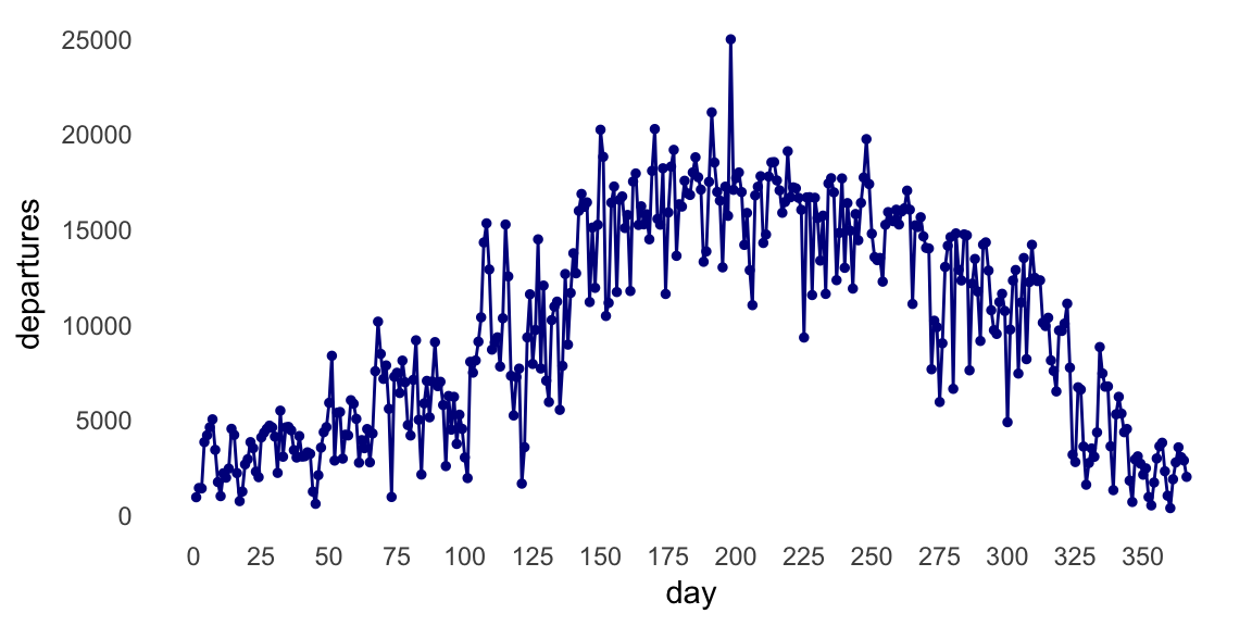
Here, I create a new vector containing the number of trips taken in each day of the year, and then I plot these numbers.
counts.day <- as.vector(table(divvy$trips$start.dayofyear))
ggplot(data.frame(day = 1:366,departures = counts.day),
       aes(x = day,y = departures)) +
  geom_point(color = "darkblue",shape = 19,size = 1) +
  geom_line(color = "darkblue") +
  scale_x_continuous(breaks = seq(0,350,25)) +
  theme_minimal() +
  theme(panel.grid.major = element_blank(),
        panel.grid.minor = element_blank())
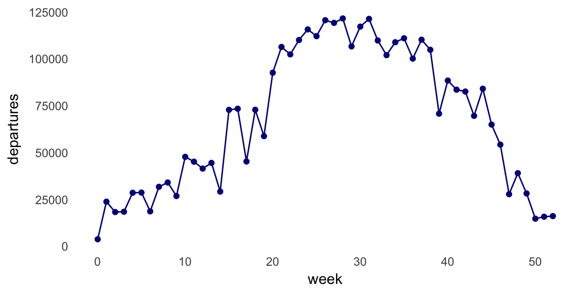
This plot shows a sizeable increase in bike trips during summer days, but since the number of trips varies widely from one day to the next, I think the plot will look nicer if instead we count the number of trips per week.
counts.week <- as.vector(table(divvy$trips$start.week))
ggplot(data.frame(week = 0:52,departures = counts.week),
       aes(x = week,y = departures)) +
  geom_point(color = "darkblue",shape = 19,size = 1.5) +
  geom_line(color = "darkblue") +
  theme_minimal() +
  theme(panel.grid.major = element_blank(),
        panel.grid.minor = element_blank())
Indeed, the seasonal trends are less noisy in this plot; the majority of Divvy bike trips in Chicago are taken when the weather is warmer (weeks 20–40), and very few people are using the Divvy bikes in the cold winter months.
Seasonal trends at the University of Chicago
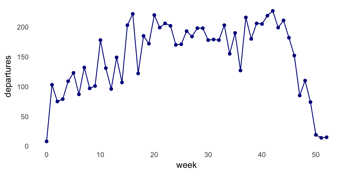
When we analyze trips taken at the University of Chicago bike station, the “bump” during warmer months flattens out. This is probably because a large fraction of University of Chicago students leave during the summer.
dat <- subset(divvy$trips,from_station_name == "University Ave & 57th St")
counts.week.uchicago <- as.vector(table(dat$start.week))
ggplot(data.frame(week = 0:52,departures = counts.week.uchicago),
       aes(x = week,y = departures)) +
  geom_point(color = "darkblue",shape = 19,size = 1.5) +
  geom_line(color = "darkblue") +
  theme_minimal() +
  theme(panel.grid.major = element_blank(),
        panel.grid.minor = element_blank())
Session information
This is the version of R and the packages that were used to generate these results.
sessionInfo()
# R version 3.4.3 (2017-11-30)
# Platform: x86_64-apple-darwin15.6.0 (64-bit)
# Running under: macOS High Sierra 10.13.2
#
# Matrix products: default
# BLAS: /Library/Frameworks/R.framework/Versions/3.4/Resources/lib/libRblas.0.dylib
# LAPACK: /Library/Frameworks/R.framework/Versions/3.4/Resources/lib/libRlapack.dylib
#
# locale:
# [1] en_US.UTF-8/en_US.UTF-8/en_US.UTF-8/C/en_US.UTF-8/en_US.UTF-8
#
# attached base packages:
# [1] stats     graphics  grDevices utils     datasets  methods   base
#
# other attached packages:
# [1] ggplot2_2.2.1       data.table_1.10.4-3
#
# loaded via a namespace (and not attached):
#  [1] Rcpp_0.12.15     knitr_1.18       magrittr_1.5     munsell_0.4.3
#  [5] colorspace_1.3-2 rlang_0.1.6      stringr_1.2.0    plyr_1.8.4
#  [9] tools_3.4.3      grid_3.4.3       gtable_0.2.0     git2r_0.21.0
# [13] htmltools_0.3.6  yaml_2.1.16      lazyeval_0.2.1   rprojroot_1.3-2
# [17] digest_0.6.13    tibble_1.3.4     evaluate_0.10.1  rmarkdown_1.8
# [21] labeling_0.3     stringi_1.1.6    compiler_3.4.3   scales_0.5.0
# [25] backports_1.1.2
This R Markdown site was created with workflowr 0.10.1.