Estimating Differences in the Distribution of First-degree Relatives
Manqing Lin, Tina Lasisi
2024-09-22 21:41:22
Last updated: 2024-09-22
Checks: 6 1
Knit directory: PODFRIDGE/
This reproducible R Markdown analysis was created with workflowr (version 1.7.1). The Checks tab describes the reproducibility checks that were applied when the results were created. The Past versions tab lists the development history.
The R Markdown file has unstaged changes. To know which version of
the R Markdown file created these results, you’ll want to first commit
it to the Git repo. If you’re still working on the analysis, you can
ignore this warning. When you’re finished, you can run
wflow_publish to commit the R Markdown file and build the
HTML.
Great job! The global environment was empty. Objects defined in the global environment can affect the analysis in your R Markdown file in unknown ways. For reproduciblity it’s best to always run the code in an empty environment.
The command set.seed(20230302) was run prior to running
the code in the R Markdown file. Setting a seed ensures that any results
that rely on randomness, e.g. subsampling or permutations, are
reproducible.
Great job! Recording the operating system, R version, and package versions is critical for reproducibility.
Nice! There were no cached chunks for this analysis, so you can be confident that you successfully produced the results during this run.
Great job! Using relative paths to the files within your workflowr project makes it easier to run your code on other machines.
Great! You are using Git for version control. Tracking code development and connecting the code version to the results is critical for reproducibility.
The results in this page were generated with repository version 78c1621. See the Past versions tab to see a history of the changes made to the R Markdown and HTML files.
Note that you need to be careful to ensure that all relevant files for
the analysis have been committed to Git prior to generating the results
(you can use wflow_publish or
wflow_git_commit). workflowr only checks the R Markdown
file, but you know if there are other scripts or data files that it
depends on. Below is the status of the Git repository when the results
were generated:
Ignored files:
    Ignored:    .DS_Store
    Ignored:    .Rhistory
    Ignored:    .Rproj.user/
    Ignored:    data/.DS_Store
    Ignored:    data/sims/.DS_Store
    Ignored:    output/.DS_Store
    Ignored:    output/simulation_20240726-155743/.DS_Store
    Ignored:    output/simulation_20240726-162034_11228488/.DS_Store
    Ignored:    output/simulation_20240726-163235_11228791/.DS_Store

Unstaged changes:
    Modified:   analysis/relative-distribution.Rmd
Note that any generated files, e.g. HTML, png, CSS, etc., are not included in this status report because it is ok for generated content to have uncommitted changes.
These are the previous versions of the repository in which changes were
made to the R Markdown (analysis/relative-distribution.Rmd)
and HTML (docs/relative-distribution.html) files. If you’ve
configured a remote Git repository (see ?wflow_git_remote),
click on the hyperlinks in the table below to view the files as they
were in that past version.
| File | Version | Author | Date | Message |
|---|---|---|---|---|
| Rmd | 78c1621 | Tina Lasisi | 2024-09-21 | Update relative-distribution.Rmd |
| Rmd | f4c2830 | Tina Lasisi | 2024-09-21 | Update relative-distribution.Rmd |
| Rmd | 2851385 | Tina Lasisi | 2024-09-21 | rename old analysis |
| html | 2851385 | Tina Lasisi | 2024-09-21 | rename old analysis |
Introduction
The relative genetic surveillance of a population is influenced by the number of genetically detectable relatives individuals have. First-degree relatives (parents, siblings, and children) are especially relevant in forensic analyses using short tandem repeat (STR) loci, where close familial searches are commonly employed. To explore potential disparities in genetic detectability between African American and European American populations, we examined U.S. Census data from four census years (1960, 1970, 1980, and 1990) focusing on the number of children born to women over the age of 40.
Data Sources
We used publicly available data from the Integrated Public Use Microdata Series (IPUMS) for the U.S. Census years 1960, 1970, 1980, and 1990. The datasets include information on:
- AGE: Age of the respondent.
- RACE: Self-identified race of the respondent.
- chborn_num: Number of children ever born to the respondent.
Data citation: Steven Ruggles, Sarah Flood, Matthew Sobek, Daniel Backman, Annie Chen, Grace Cooper, Stephanie Richards, Renae Rogers, and Megan Schouweiler. IPUMS USA: Version 14.0 [dataset]. Minneapolis, MN: IPUMS, 2023. https://doi.org/10.18128/D010.V14.0
Data Preparation
Filtering Criteria: We selected women aged 40 and above to ensure that most had completed childbearing.
Due to the terms of agreement for using this data, we cannot share the full dataset but our repo contains the subset that was used to calculate the mean number of offspring and variance.
Race Classification: We categorized individuals into two groups:
- African American: Those who identified as “Black” or “African American”.
- European American: Those who identified as “White”.
Calculating Number of Siblings: For each child of these women, the number of siblings (n_sib) is one less than the number of children born to the mother:
\[ n_{sib} = chborn_{num} - 1 \]
# children_data = read.csv("./data/proportions_table_by_race_year.csv")
mother_data = read.csv("./data/data_filtered_recoded.csv")
df <- mother_data %>%
# Filter for women aged 40 and above
filter(AGE >= 40) %>%
mutate(
# Create new age ranges
AGE_RANGE = case_when(
AGE >= 70 ~ "70+",
AGE >= 60 ~ "60-69",
AGE >= 50 ~ "50-59",
AGE >= 40 ~ "40-49",
TRUE ~ as.character(AGE_RANGE) # This shouldn't occur due to the filter, but included for completeness
),
# Convert CHBORN to ordered factor
CHBORN = factor(case_when(
chborn_num == 0 ~ "No children",
chborn_num == 1 ~ "1 child",
chborn_num == 2 ~ "2 children",
chborn_num == 3 ~ "3 children",
chborn_num == 4 ~ "4 children",
chborn_num == 5 ~ "5 children",
chborn_num == 6 ~ "6 children",
chborn_num == 7 ~ "7 children",
chborn_num == 8 ~ "8 children",
chborn_num == 9 ~ "9 children",
chborn_num == 10 ~ "10 children",
chborn_num == 11 ~ "11 children",
chborn_num >= 12 ~ "12+ children"
), levels = c("No children", "1 child", "2 children", "3 children",
"4 children", "5 children", "6 children", "7 children",
"8 children", "9 children", "10 children", "11 children",
"12+ children"), ordered = TRUE),
# Ensure RACE variable is correctly formatted and filtered
RACE = factor(RACE, levels = c("White", "Black/African American"))
) %>%
# Filter for African American and European American women
filter(RACE %in% c("Black/African American", "White")) %>%
# Select and reorder columns
select(YEAR, SEX, AGE, BIRTHYR, RACE, CHBORN, AGE_RANGE, chborn_num)
# Display the first few rows of the processed data
head(df) YEAR SEX AGE BIRTHYR RACE CHBORN AGE_RANGE chborn_num
1 1960 Female 65 1894 White No children 60-69 0
2 1960 Female 49 1911 White 2 children 40-49 2
3 1960 Female 54 1905 White No children 50-59 0
4 1960 Female 56 1903 White 1 child 50-59 1
5 1960 Female 54 1905 White 1 child 50-59 1
6 1960 Female 50 1910 White No children 50-59 0# Summary of the processed data
summary(df) YEAR SEX AGE BIRTHYR
Min. :1960 Length:1917477 Min. : 41.00 Min. :1859
1st Qu.:1970 Class :character 1st Qu.: 49.00 1st Qu.:1905
Median :1970 Mode :character Median : 58.00 Median :1916
Mean :1976 Mean : 59.24 Mean :1916
3rd Qu.:1980 3rd Qu.: 68.00 3rd Qu.:1926
Max. :1990 Max. :100.00 Max. :1949
RACE CHBORN AGE_RANGE
White :1740755 2 children :452594 Length:1917477
Black/African American: 176722 No children:343319 Class :character
3 children :335119 Mode :character
1 child :292001
4 children :204983
5 children :113593
(Other) :175868
chborn_num
Min. : 0.00
1st Qu.: 1.00
Median : 2.00
Mean : 2.57
3rd Qu.: 4.00
Max. :12.00
# Check the levels of the RACE factor
levels(df$RACE)
[1] "White" "Black/African American"# Count of observations by RACE
table(df$RACE)
                 White Black/African American
               1740755                 176722
# Count of observations by AGE_RANGE
table(df$AGE_RANGE)
 40-49  50-59  60-69    70+
529160 517620 436829 433868
Distribution of Number of Children Across Census Years
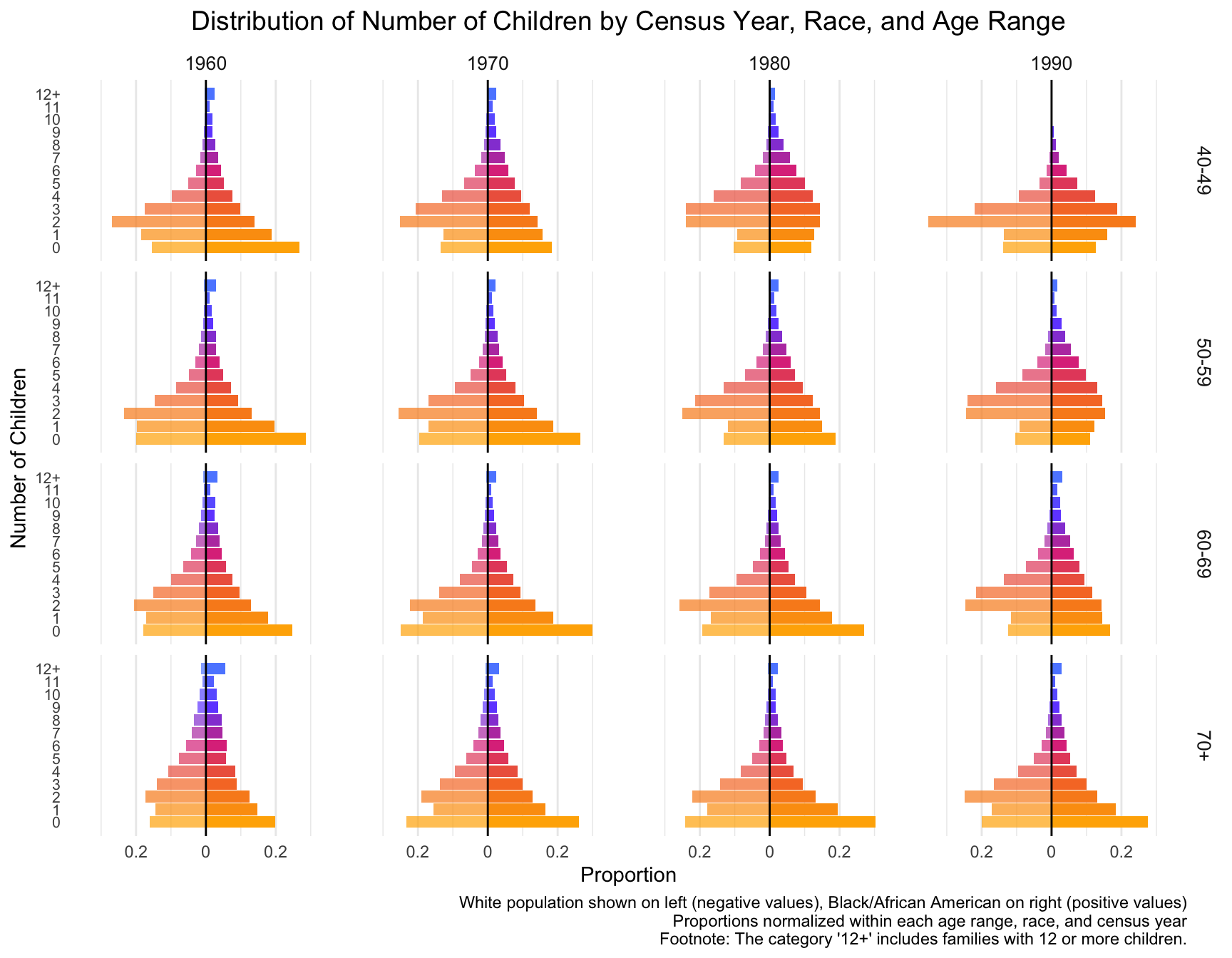
First we visualize the general trends in the frequency of the number of children for African American and European American mothers across the Census years by age group.
# Calculate proportions within each group, ensuring proper normalization
df_proportions <- df %>%
  group_by(YEAR, RACE, AGE_RANGE, chborn_num) %>%
  summarise(count = n(), .groups = "drop") %>%
  group_by(YEAR, RACE, AGE_RANGE) %>%
  mutate(proportion = count / sum(count)) %>%
  ungroup()

# Reshape data for the mirror plot
df_mirror <- df_proportions %>%
  mutate(proportion = if_else(RACE == "White", -proportion, proportion))

# Create color palette
my_colors <- colorRampPalette(c("#FFB000", "#F77A2E", "#DE3A8A", "#7253FF", "#5E8BFF"))(13)

# Create the plot
ggplot(df_mirror, aes(x = chborn_num, y = proportion, fill = as.factor(chborn_num))) +
  geom_col(aes(alpha = RACE)) +
  geom_hline(yintercept = 0, color = "black", size = 0.5) +
  facet_grid(AGE_RANGE ~ YEAR, scales = "free_y") +
  coord_flip() +
  scale_y_continuous(
    labels = function(x) abs(x),
    limits = function(x) c(-max(abs(x)), max(abs(x)))
  ) +
  scale_x_continuous(breaks = 0:12, labels = c(0:11, "12+")) +
  scale_fill_manual(values = my_colors) +
  scale_alpha_manual(values = c("White" = 0.7, "Black/African American" = 1)) +
  labs(
    title = "Distribution of Number of Children by Census Year, Race, and Age Range",
    x = "Number of Children",
    y = "Proportion",
    fill = "Number of Children",
    caption = "White population shown on left (negative values), Black/African American on right (positive values)\nProportions normalized within each age range, race, and census year\nFootnote: The category '12+' includes families with 12 or more children."
  ) +
  theme_minimal() +
  theme(
    plot.title = element_text(size = 14, hjust = 0.5),
    axis.text.y = element_text(size = 8),
    strip.text = element_text(size = 10),
    legend.position = "none",
    panel.grid.major.y = element_blank(),
    panel.grid.minor.y = element_blank()
  )
| Version | Author | Date |
|---|---|---|
| 2851385 | Tina Lasisi | 2024-09-21 |
# Save the plot (optional)
# ggsave("children_distribution_mirror_plot.png", width = 20, height = 25, units = "in", dpi = 300)

# Print summary to check age ranges and normalization
print(df_proportions %>%
  group_by(YEAR, RACE, AGE_RANGE) %>%
  summarise(total_proportion = sum(proportion), .groups = "drop") %>%
  arrange(YEAR, RACE, AGE_RANGE))
# A tibble: 32 × 4
YEAR RACE AGE_RANGE total_proportion
<int> <fct> <chr> <dbl>
1 1960 White 40-49 1
2 1960 White 50-59 1
3 1960 White 60-69 1
4 1960 White 70+ 1
5 1960 Black/African American 40-49 1
6 1960 Black/African American 50-59 1
7 1960 Black/African American 60-69 1
8 1960 Black/African American 70+ 1
9 1970 White 40-49 1
10 1970 White 50-59 1
# ℹ 22 more rowsWith this visualization of the distribution of the data, we can see that there are differences between White and Black Americans.
We will now test for differences in 1) the mean and variance, and 2) zero-inflation.
[instructions for Manqing] Model Fit Across Census Years
Question 1) What is the best model for the distribution of the data in each of these subsets of data (by race, by census year, by age range combined)?
Step 1: Fit Models Across All Subsets
For each combination of race, census year, and age range, fit your candidate models:
- Poisson Model
- Negative Binomial (NB) Model
- Zero-Inflated Poisson (ZIP) Model
- Zero-Inflated Negative Binomial (ZINB) Model
This should be done for each subset of the data (race × census year × age range).
Understanding the Data:
- Data Type: Count data representing the number of children per woman.
- Characteristics:
- Potential overdispersion (variance greater than the mean).
- Possible zero-inflation (excess zeros) in some subsets.
- Different distributions across races, census years, and age ranges.
Candidate Models for Count Data:
- Poisson Distribution:
- Assumes mean equals variance.
- Not suitable if overdispersion is present.
- Negative Binomial Distribution:
- Handles overdispersion by introducing a dispersion parameter.
- Suitable when variance exceeds the mean.
- Zero-Inflated Models:
- Zero-Inflated Poisson (ZIP):
- Combines a Poisson distribution with a point mass at zero.
- Suitable if there’s an excess of zeros.
- Zero-Inflated Negative Binomial (ZINB):
- Combines a negative binomial distribution with a point mass at zero.
- Handles both overdispersion and excess zeros.
- Zero-Inflated Poisson (ZIP):
- Hurdle Models: (optional)
- Similar to zero-inflated models but model zeros and positive counts separately.
Recommended Approach:
1: Exploratory Data Analysis (EDA)
- Compute Mean and Variance:
- For each subset (race, census year, age range), calculate the mean and variance of the number of children.
- Check for overdispersion: If variance > mean, overdispersion is present.
- Check for Zero-Inflation:
- Calculate the proportion of zeros in each subset.
- If the proportion of zeros is significantly higher than expected under a standard Poisson or negative binomial model, consider zero-inflated models.
2: Model Selection
Scenario 1: Overdispersion Without Excess Zeros
- Model: Negative Binomial Distribution
- Justification: Handles overdispersion effectively.
Scenario 2: Overdispersion With Excess Zeros
- Model: Zero-Inflated Negative Binomial (ZINB) Distribution
- Justification: Accounts for both overdispersion and excess zeros.
Scenario 3: No Overdispersion, No Excess Zeros
- Model: Poisson Distribution
- Justification: Appropriate if mean equals variance and no excess zeros.
3: Fit Models to Each Subset
- For Each Subset:
- Fit a Poisson model.
- Fit a Negative Binomial model.
- If necessary, fit a Zero-Inflated Poisson (ZIP) and Zero-Inflated Negative Binomial (ZINB) model.
- Compare Models:
- Use goodness-of-fit measures such as Akaike Information Criterion (AIC) or Bayesian Information Criterion (BIC).
- Lower AIC/BIC indicates a better-fitting model.
- Perform likelihood ratio tests where appropriate.
Step 2: Model Comparison Using AIC or BIC
Once the models are fitted, compare them using goodness-of-fit criteria like AIC or BIC for each subset. The model with the lowest AIC/BIC is the best fit for that subset.
- Assess Model Fit:
- Check residuals for patterns.
- Use diagnostic plots.
- Check Dispersion Parameter:
- For negative binomial models, examine the estimated dispersion parameter.
- Vuong Test:
- Compare zero-inflated models to standard models to assess if zero-inflation significantly improves the fit.
# example code to start you off. edit and comment appropriately

# Load necessary libraries
library(MASS)   # For negative binomial
library(pscl)   # For zero-inflated models

# Suppose 'df' is your dataset

# Subset data for each race
df_black <- subset(df, RACE == "Black/African American")
df_white <- subset(df, RACE == "White")

# Example for Black women over 40 in 1990 census

# Calculate mean and variance
mean_black <- mean(df_black$chborn_num)
var_black <- var(df_black$chborn_num)

# Check for overdispersion
if (var_black > mean_black) {
  # Overdispersion present
}

# Check for zero-inflation
prop_zero <- sum(df_black$chborn_num == 0) / nrow(df_black)
# Compare prop_zero to expected under Poisson or NB

# Fit Negative Binomial Model
nb_model_black <- glm.nb(chborn_num ~ AGE_RANGE + YEAR, data = df_black)

# Fit Zero-Inflated Negative Binomial Model if necessary
zinb_model_black <- zeroinfl(chborn_num ~ AGE_RANGE + YEAR | 1, data = df_black, dist = "negbin")

# Compare models using AIC
AIC(nb_model_black, zinb_model_black)

# Repeat for White women and other subsets
Step 3: Record the Best Model for Each Subset
Create a table or data frame where you store the best model for each combination of race, census year, and age range based on AIC/BIC. For example:
| Race | Census Year | Age Range | Best Model |
|---|---|---|---|
| Black/African Am. | 1990 | 40-49 | Negative Binomial |
| White | 1990 | 40-49 | Zero-Inflated NB |
| White | 1980 | 50-59 | Poisson |
| … | … | … | … |
(but obviously do this as a dataframe so we can analyze it)
Step 4: Analyze the Effect of Race, Census Year, and Age Range
Once you’ve gathered the best model for each subset, you can analyze which factor (race, census year, or age range) is most influential in determining the best-fitting model.
Options for statistical analysis:
- Chi-Square Test of Independence: You can use a chi-square test to determine whether there is a significant association between race and the best-fitting model, or census year/age group and the best-fitting model. This test will help you see if certain races or age ranges are more likely to have a particular model as the best fit.
#example
#
## Create a contingency table
table_model_race <- table(best_model_data$Race, best_model_data$Best_Model)

# Perform chi-square test
chisq.test(table_model_race)
Logistic Regression: You could fit a logistic regression model where the response variable is the best-fitting model (binary or multinomial) and the predictor variables are race, census year, and age range. This will allow you to quantify the effect of each variable on the model choice.
Example in R (assuming binary outcome: Poisson vs. NB):
# Fit logistic regression model
model_logistic <- glm(Best_Model ~ Race + Census_Year + Age_Range, family = binomial(), data = best_model_data)

# Summary of results
summary(model_logistic)
Multinomial Logistic Regression (if more than two models): If you have multiple possible best-fitting models (Poisson, NB, ZIP, ZINB), you can use multinomial logistic regression to assess the impact of race, census year, and age range on model selection.
Example in R using the
nnetpackage:
library(nnet)

# Fit multinomial logistic regression
model_multinom <- multinom(Best_Model ~ Race + Census_Year + Age_Range, data = best_model_data)

# Summary of results
summary(model_multinom)
Step 5: Summarize the Results
- Significance of Each Variable: From the regression analysis (or chi-square tests), you can determine which variable (race, census year, or age range) has the most significant impact on the model choice.
- Effect Sizes: Logistic regression will provide coefficients that describe how much each variable influences the probability of choosing a particular model.
- Best Model by Race: You can summarize which model tends to fit best for each race across years and age groups. For example, you might find that the Negative Binomial model consistently fits the best for a specific race or age group, indicating more overdispersion in that subset.
Visualize the Results
Finally, visualize the distribution of the best-fitting models across races, census years, and age groups.
- Bar Plots: Show the proportion of each model for different races or age groups.
- Heatmap: Use a heatmap to visualize how the best model varies across race, census year, and age range.
Example of a simple bar plot in R:
library(ggplot2)

# Bar plot showing the distribution of best models across races
ggplot(best_model_data, aes(x = Race, fill = Best_Model)) +
  geom_bar(position = "dodge") +
  labs(title = "Best-Fitting Models by Race", x = "Race", y = "Count", fill = "Best Model")
Conclusion:
- Best Model Analysis: The best-fitting model can be assessed across different races, census years, and age ranges by comparing models using AIC/BIC.
- Significance Testing: Use chi-square or logistic regression to assess which variable most influences the model selection.
- Summarizing Across Years: After analyzing the data, you’ll be able to conclude which model fits each race best across different years, and whether race, census year, or age group is the dominant factor.
[Instructions for Manqing] Cohort Stability Analysis
For Question 2: Cohort Stability Analysis, the goal is to determine if there is a significant change in zero inflation, family size, or model fit for the same cohort across different census years, given race.
Step 1: Add a Birth-Year “Cohort” Variable
Using the existing table of model summaries, calculate the birth-year cohort based on the Census Year and Age Range. For example, if a woman is in the 40-49 age range in the 1990 Census, her birth cohort would be 1941-1950.
- Formula to Calculate Cohort: For each row in the
table, subtract the age range from the census year to get the cohort.
For example:
- Census Year: 1990
- Age Range: 40-49
- Cohort: 1990 - (40 to 49) → Cohort: 1941-1950
- Add a new column to the summary table called
Cohort.
Example Table:
| Race | Census Year | Age Range | Best Model | Cohort |
|---|---|---|---|---|
| Black/African Am. | 1990 | 40-49 | Negative Binomial | 1941-1950 |
| White | 1990 | 40-49 | Zero-Inflated NB | 1941-1950 |
| White | 1980 | 50-59 | Poisson | 1921-1930 |
| … | … | … | … | … |
Step 2: Compute Summary Statistics for Each Subset
For each combination of Race, Cohort, and Census Year, compute additional summary statistics for family size distributions: - Mean, Variance, Mode of the number of children. - Probability of having 0, 1, 2, …, 12+ children (empirical or from the best-fitting model).
These statistics will help quantify family size changes over time.
Example Summary Table:
| Race | Cohort | Census Year | Best Model | Mean | Variance | Mode | Prob(0) | Prob(1) | Prob(2) | … | Prob(12+) |
|---|---|---|---|---|---|---|---|---|---|---|---|
| Black/African Am. | 1941-1950 | 1990 | Negative Binomial | 2.5 | 1.2 | 2 | 0.20 | 0.30 | 0.25 | … | 0.01 |
| White | 1941-1950 | 1990 | Zero-Inflated NB | 2.1 | 1.0 | 2 | 0.35 | 0.28 | 0.20 | … | 0.01 |
| White | 1921-1930 | 1980 | Poisson | 3.0 | 1.5 | 3 | 0.15 | 0.25 | 0.30 | … | 0.05 |
| … | … | … | … | … | … | … | … | … | … | … | … |
Step 3: Test for Significant Changes Over Time Within Each Cohort
Once the cohort information and summary statistics are available, the goal is to determine if there is a significant change in any of the following across census years for the same cohort:
- Zero Inflation: Check if the proportion of women with zero children changes significantly over time for the same cohort.
- Family Size: Test if the mean or variance in the number of children changes for the same cohort over time.
- Model Fit: Analyze if the best-fitting model for the cohort changes over time.
a. Zero-Inflation Analysis
Use a logistic regression model to assess if the probability of having zero children changes significantly over time for the same cohort.
Example Code:
# Fit logistic regression to check if zero-inflation changes over time
zero_inflation_model <- glm(Zero_Children ~ Census_Year + Race + Cohort,
                            family = binomial(), data = cohort_data)

# Summary of the model
summary(zero_inflation_model)
b. Family Size Analysis
Use an ANOVA or linear regression to test if the mean or variance in family size changes over census years for the same cohort.
Example Code:
  # Fit linear model to check for changes in family size over time
  family_size_model <- lm(Number_of_Children ~ Census_Year + Race + Cohort, data = cohort_data)

  # ANOVA to check for significant differences
  anova(family_size_model)
c. Model Fit Analysis
If the best-fitting model changes for the same cohort over time, this suggests that the distribution of family sizes has shifted. Use multinomial logistic regression to test if the model fit differs across census years for the same cohort.
Example Code:
library(nnet)

# Fit multinomial logistic regression to test changes in best-fitting model
model_fit_analysis <- multinom(Best_Model ~ Census_Year + Race + Cohort, data = cohort_data)

# Summary of the model
summary(model_fit_analysis)
Step 4: Interpret the Results
For each cohort, you will assess whether: - Zero-inflation changes significantly over time (i.e., whether the probability of having no children decreases or increases across census years). - Family size (mean, variance, mode) changes significantly over time. - The best-fitting model changes over time, indicating a shift in family size distributions.
If significant changes are detected for a cohort (e.g., the same cohort switches from a zero-inflated model to a non-zero-inflated model, or family sizes decrease), this indicates a shift in the demographic pattern for that group.
Conclusion
This analysis will allow you to evaluate cohort stability by testing whether demographic patterns (e.g., zero-inflation, family size) are consistent over time for the same cohort or if there are notable shifts. If the patterns change significantly, you will be able to identify when and how the demographic trends for each cohort begin to deviate from their earlier distribution.
[Instructions for Manqing] Question 3: Analyzing and Visualizing Significant Fertility Shifts
For Question 3: Significant Fertility shifts, the goal is to summarize the information in the top 2 questions and create a comprehensive analysis and visualization that illustrates significant fertility shifts in cohorts, compares fertility patterns of 40-49 year-olds to 50-59 year-olds in the 1990 census so we can pick the set of fertility distributions we want to use to visualize the sibling distribution and do the math on the genetic surveillance.
Objective
Create a comprehensive analysis and visualization that:
- Illustrates significant fertility shifts in cohorts based on the stability analysis from Question 2.
- Compares fertility patterns of 40-49 year-olds to 50-59 year-olds in the 1990 census, highlighting any significant differences.
- Synthesizes the findings to discuss overall trends and their implications.
The steps below are suggestions: use critical thinking and your judgement to complete this task and answer the question
Step 1: Prepare the Data
1.1 Use Results from Stability Analysis (Question 2)
- Identify Cohorts with Significant Shifts:
- Review the results from your stability analysis in Question 2.
- List the cohorts where significant shifts in fertility distributions were observed for 40-49 year-olds.
- Note the nature of these shifts for each cohort, such as changes in mean number of children, variance, or zero inflation (proportion of women with zero children).
1.2 Extract Data for Age Groups in 1990 Census
- Filter Data for 1990 Census:
- Use your existing dataset to extract data specifically from the 1990 census year.
- Select Age Groups:
- Focus on women in the age ranges of 40-49 and 50-59.
- Ensure the data includes necessary variables:
- Number of children (
chborn_num) - Age range (
AGE_RANGE) - Race (
RACE) - Any other relevant variables used in previous analyses
- Number of children (
Step 2: Create Visualizations
Design visualizations that effectively communicate your findings.
2.1 Panel A: Fertility Distribution Shifts Across Cohorts
- Use Existing Fertility Distribution Plots:
- Leverage the fertility distribution plots you created in Question 1.
- Highlight Significant Cohorts:
- Emphasize the cohorts identified in Step 1.1 where significant
shifts occurred.
- This could be done by using distinct colors, markers, or annotations.
- Emphasize the cohorts identified in Step 1.1 where significant
shifts occurred.
- Annotate the Plots:
- Include text or labels that describe the nature of the significant
shifts for each highlighted cohort.
- For example, indicate if there was a decrease in mean number of children or an increase in childlessness.
- Include text or labels that describe the nature of the significant
shifts for each highlighted cohort.
2.2 Panel B: Comparison of 40-49 and 50-59 Age Groups in 1990
- Create Comparative Distribution Plots:
- Generate side-by-side or overlaid histograms or density plots for the 40-49 and 50-59 age groups within each racial group.
- Include Summary Statistics:
- On each plot or in accompanying tables, provide:
- Mean number of children
- Variance
- Proportion of women with zero children (zero inflation)
- On each plot or in accompanying tables, provide:
- Ensure Clarity in Visuals:
- Properly label axes, legends, and titles.
- Use consistent color schemes for easy comparison between groups.
Step 3: Perform Statistical Comparisons
Conduct statistical tests to determine if observed differences are significant.
3.1 T-Test for Difference in Means
- Compare Means Between Age Groups:
- For each racial group, perform a t-test to compare the mean number of children between the 40-49 and 50-59 age groups.
- Check Assumptions:
- Ensure that the data meets the assumptions of the t-test (normality, equal variances).
- If assumptions are violated, consider using a non-parametric test like the Mann-Whitney U test.
3.2 F-Test for Difference in Variances
- Assess Variance Differences:
- Perform an F-test or Levene’s test to compare the variances of the number of children between the two age groups within each racial group.
3.3 Chi-Square Test for Difference in Zero Inflation
- Analyze Zero Inflation:
- Create contingency tables showing the counts of women with zero children and those with one or more children for each age group.
- Perform a chi-square test to determine if the proportion of childlessness differs significantly between the age groups within each racial group.
Step 4: Summarize Findings
Write a clear and concise summary addressing the following points.
4.1 Significant Fertility Shifts Across Cohorts
- Identify Timing of Shifts:
- Specify when significant fertility shifts occurred for each racial group based on your analysis in Question 2.
- Describe Nature of Shifts:
- Detail the characteristics of the shifts, such as:
- Decrease in mean number of children
- Increase in childlessness (zero inflation)
- Changes in variance or distribution shape
- Detail the characteristics of the shifts, such as:
- Highlight Differences Between Racial Groups:
- Compare the timing and nature of shifts between African American and European American women.
- Discuss any patterns or discrepancies observed.
4.2 Comparison of 40-49 and 50-59 Age Groups in 1990
- Summarize Key Differences:
- Present the differences in fertility patterns between the two age groups for each racial group.
- Include comparisons of:
- Distribution shapes
- Mean number of children
- Variance
- Zero inflation
- Report Statistical Test Results:
- Provide the results of the t-tests, F-tests, and chi-square tests.
- Interpret the significance of these results in the context of your analysis.
- Discuss Implications:
- Consider what these differences suggest about fertility trends and behaviors.
- Reflect on whether the older age group represents completed fertility patterns.
4.3 Synthesis and Implications
- Integrate Findings:
- Connect the insights from the cohort analysis with the age group comparison.
- Discuss how the patterns observed in the 1990 census relate to the shifts identified across cohorts.
- Consider Contributing Factors:
- Explore potential social, economic, or policy factors that may have
contributed to the observed fertility shifts.
- For example, changes in access to education, employment opportunities, or family planning resources.
- Explore potential social, economic, or policy factors that may have
contributed to the observed fertility shifts.
- Reflect on Broader Implications:
- Discuss how these fertility trends might impact your broader research topic, such as genetic surveillance disparities.
- Consider the implications for future demographic research or policy development.
Additional Considerations
- Visual Clarity:
- Ensure all visualizations are easy to interpret.
- Use clear labels, legends, and annotations.
- Contextualize Statistical Significance:
- Explain not just whether results are statistically significant, but also what they mean in practical terms.
- Acknowledge Data Limitations:
- Discuss any limitations or biases in the data that could affect your
findings.
- For instance, sample size constraints or missing data.
- Discuss any limitations or biases in the data that could affect your
findings.
- Ethical Considerations:
- Approach discussions of race and fertility sensitively and responsibly.
- Avoid drawing causal conclusions without robust evidence.
Integration with Previous Work
- Leverage Previous Analyses:
- Use the visualizations and statistical summaries from Questions 1 and 2 as foundations for this analysis.
- Create a Cohesive Narrative:
- Ensure that your findings from all questions are connected and build upon each other.
- Tell a comprehensive story about fertility trends across cohorts and racial groups.
Final Deliverables
- Multi-Panel Visualization:
- Panel A: Fertility distribution shifts across cohorts with highlighted significant shifts.
- Panel B: Comparative distribution plots for 40-49 and 50-59 age groups in 1990, including summary statistics.
- Written Summary:
- A concise report that addresses the points outlined in Step 4.
- Include interpretations of statistical analyses and discuss broader implications.
- Statistical Analysis Documentation:
- Provide details of the statistical tests conducted, including test assumptions, results, and interpretations.
- Annotated Code (if applicable):
- While not the focus, include any new code used for this analysis with appropriate comments.
Distribution of Number of Siblings Across Census Years
Having analyzed the distribution of the number of children, we now turn our attention to the distribution of the number of siblings. We will explore the trends in the frequency of the number of siblings for African American and European American mothers across the Census years by age group.
Frequency of siblings is calculated as follows.
\[ \text{freq}_{n_{\text{sib}}} = \text{freq}_{\text{mother}} \cdot \text{chborn}_{\text{num}} \]
For example, suppose 10 mothers (generation 0) have 7 children, then there will be 70 children (generation 1) in total who each have 6 siblings.
We take our original data and calculate the frequency of siblings for each mother based on the number of children they have. We then aggregate this data to get the frequency of siblings for each generation along with details on the birthyears of the relevant children to visualize the distribution of the number of siblings across generations.
[Instructions for Manqing] Plot Across Census Years for Children
Objective
Create a mirror plot for the distribution of siblings across census years, races, and birth ranges, similar to the one created for the number of children.
Step 1: Calculate Sibling Frequencies
Start with your dataframe that includes the
birth_rangecolumn.Create a new column for the number of siblings:
df <- df %>%
mutate(n_siblings = chborn_num - 1)- Calculate the frequency of siblings:
df <- df %>%
mutate(sibling_freq = n_siblings * 1)  # Assuming each mother represents 1 in frequency
Step 2: Aggregate Sibling Data
- Group the data and calculate sibling frequencies:
df_siblings <- df %>%
 group_by(YEAR, RACE, birth_range, n_siblings) %>%
 summarise(
   sibling_count = sum(sibling_freq),
   .groups = "drop"
)- Calculate proportions within each group:
df_sibling_proportions <- df_siblings %>%
 group_by(YEAR, RACE, birth_range) %>%
 mutate(proportion = sibling_count / sum(sibling_count)) %>%
 ungroup()
Step 3: Check Normalization
Before creating the plot, verify that the proportions are correctly normalized:
normalization_check <- df_sibling_proportions %>%
  group_by(YEAR, RACE, birth_range) %>%
  summarise(total_proportion = sum(proportion), .groups = "drop") %>%
  arrange(YEAR, RACE, birth_range)

print(normalization_check)
Ensure that the total_proportion for each group is very
close to 1.0. If not, revisit your calculations in Step 2.
Step 4: Prepare Data for Mirror Plot
Reshape data for the mirror plot:
df_sibling_mirror <- df_sibling_proportions %>%
  mutate(proportion = if_else(RACE == "White", -proportion, proportion))
Step 5: Create the Mirror Plot
- Create the color palette:
my_colors <- colorRampPalette(c("#FFB000", "#F77A2E", "#DE3A8A", "#7253FF", "#5E8BFF"))(13)- Create the plot:
ggplot(df_sibling_mirror, aes(x = n_siblings, y = proportion, fill = as.factor(n_siblings))) +
 geom_col(aes(alpha = RACE)) +
 geom_hline(yintercept = 0, color = "black", size = 0.5) +
 facet_grid(birth_range ~ YEAR, scales = "free_y") +
 coord_flip() +
 scale_y_continuous(
   labels = function(x) abs(x),
   limits = function(x) c(-max(abs(x)), max(abs(x)))
 ) +
 scale_x_continuous(breaks = 0:12, labels = c(0:11, "12+")) +
 scale_fill_manual(values = my_colors) +
 scale_alpha_manual(values = c("White" = 0.7, "Black/African American" = 1)) +
 labs(
   title = "Distribution of Number of Siblings by Census Year, Race, and Birth Range",
   x = "Number of Siblings",
   y = "Proportion",
   fill = "Number of Siblings",
   caption = "White population shown on left (negative values), Black/African American on right (positive values)\nProportions normalized within each birth range, race, and census year\nFootnote: The category '12+' includes individuals with 12 or more siblings."
 ) +
 theme_minimal() +
 theme(
   plot.title = element_text(size = 14, hjust = 0.5),
   axis.text.y = element_text(size = 8),
   strip.text = element_text(size = 10),
   legend.position = "none",
   panel.grid.major.y = element_blank(),
   panel.grid.minor.y = element_blank()
 )
Step 6: Interpret the Plot
After creating the plot, examine it carefully:
- Look for patterns in sibling distribution across different census years and birth ranges.
- Compare the distributions between White and Black/African American populations.
- Note any significant changes or trends in the number of siblings over time.
- Consider how these sibling distributions might differ from the children distributions you analyzed earlier, and think about potential reasons for these differences.
[Instructions for Manqing] Model Fit Across Census Years
Objective
Repeat the model fitting process we performed for the children distribution, this time using the sibling distribution data.
Steps
Prepare the Sibling Data Use the sibling distribution data you calculated earlier (
df_sibling_proportions).Fit Models For each combination of RACE, YEAR, and birth_range, fit the following distributions:
- Poisson
- Negative Binomial
- Zero-Inflated Poisson
- Zero-Inflated Negative Binomial
Use the same R functions and packages as in the children distribution analysis.
Compare Model Fits Use AIC (Akaike Information Criterion) to compare the fits of different models for each group.
Identify Best-Fitting Models Determine which model fits best for each combination of RACE, YEAR, and birth_range.
Analyze Patterns
- Examine how the best-fitting model changes across years and birth ranges for each race.
- Compare these patterns to those observed in the children distribution analysis.
Visualize Results Create a summary plot showing the best-fitting models across years and birth ranges for each race, similar to the one created for the children distribution.
Interpret Findings
- Discuss any differences in the best-fitting models between the sibling and children distributions.
- Consider the implications of these differences for understanding family structures and fertility patterns.
[Instructions for Manqing] Cohort Stability Analysis Siblings
Objective
Analyze the stability of sibling distributions across cohorts, similar to the analysis performed for children.
Steps
Use the sibling distribution data (
df_sibling_proportions).For each combination of RACE and birth_range:
- Compare the sibling distributions across different census years.
- Use statistical tests (e.g., Kolmogorov-Smirnov test) to assess if distributions are significantly different.
Create a summary table showing:
- RACE
- birth_range
- Whether the distribution is stable across census years
- Any significant changes observed
Visualize stability:
- Create a heatmap or similar plot showing stability/changes across cohorts and races.
Interpret results:
- Identify which cohorts show stable sibling distributions.
- Compare stability patterns to those observed in the children distribution analysis.
- Discuss implications of stability or lack thereof for understanding family structure changes over time.
[Instructions for Manqing] Plot Across Census Years Siblings
Objective
Create a visualization showing how sibling distributions change across census years for different races and birth ranges.
Steps
Use the sibling distribution data (
df_sibling_proportions).Create a multi-panel plot:
- X-axis: Number of siblings (0 to 12+)
- Y-axis: Proportion
- Color: Census Year
- Facet by: RACE and birth_range
Use
ggplot2to create the plot:
ggplot(df_sibling_proportions, aes(x = n_siblings, y = proportion, color = factor(YEAR))) +
 geom_line() +
 facet_grid(RACE ~ birth_range) +
 labs(title = "Sibling Distribution Across Census Years",
      x = "Number of Siblings", y = "Proportion", color = "Census Year") +
 theme_minimal() +
theme(axis.text.x = element_text(angle = 45, hjust = 1))- Analyze the plot:
- Identify trends in sibling distribution changes over time.
- Compare patterns between races and across birth ranges.
- Note any significant shifts or stable periods.
- Compare with children distribution plot:
- Highlight similarities and differences in trends.
- Discuss what these comparisons reveal about changing family structures.
Remember to reference your findings from the children distribution analysis when discussing the results, highlighting any notable similarities or differences between the two analyses.
sessionInfo()