HBA2025_results
Paloma
2025-01-27
Last updated: 2025-03-08
Checks: 6 1
Knit directory: QUAIL-Mex/
This reproducible R Markdown analysis was created with workflowr (version 1.7.1). The Checks tab describes the reproducibility checks that were applied when the results were created. The Past versions tab lists the development history.
The R Markdown file has unstaged changes. To know which version of
the R Markdown file created these results, you’ll want to first commit
it to the Git repo. If you’re still working on the analysis, you can
ignore this warning. When you’re finished, you can run
wflow_publish to commit the R Markdown file and build the
HTML.
Great job! The global environment was empty. Objects defined in the global environment can affect the analysis in your R Markdown file in unknown ways. For reproduciblity it’s best to always run the code in an empty environment.
The command set.seed(20241009) was run prior to running
the code in the R Markdown file. Setting a seed ensures that any results
that rely on randomness, e.g. subsampling or permutations, are
reproducible.
Great job! Recording the operating system, R version, and package versions is critical for reproducibility.
Nice! There were no cached chunks for this analysis, so you can be confident that you successfully produced the results during this run.
Great job! Using relative paths to the files within your workflowr project makes it easier to run your code on other machines.
Great! You are using Git for version control. Tracking code development and connecting the code version to the results is critical for reproducibility.
The results in this page were generated with repository version 77cc174. See the Past versions tab to see a history of the changes made to the R Markdown and HTML files.
Note that you need to be careful to ensure that all relevant files for
the analysis have been committed to Git prior to generating the results
(you can use wflow_publish or
wflow_git_commit). workflowr only checks the R Markdown
file, but you know if there are other scripts or data files that it
depends on. Below is the status of the Git repository when the results
were generated:
Ignored files:
    Ignored:    .DS_Store
    Ignored:    .RData
    Ignored:    .Rhistory
    Ignored:    .Rproj.user/
    Ignored:    analysis/.DS_Store
    Ignored:    analysis/.RData
    Ignored:    analysis/.Rhistory
    Ignored:    analysis/Hrs_by_HWISE score.png
    Ignored:    code/.DS_Store
    Ignored:    data/.DS_Store

Unstaged changes:
    Modified:   analysis/HBA2025_Analyses.Rmd
Note that any generated files, e.g. HTML, png, CSS, etc., are not included in this status report because it is ok for generated content to have uncommitted changes.
These are the previous versions of the repository in which changes were
made to the R Markdown (analysis/HBA2025_Analyses.Rmd) and
HTML (docs/HBA2025_Analyses.html) files. If you’ve
configured a remote Git repository (see ?wflow_git_remote),
click on the hyperlinks in the table below to view the files as they
were in that past version.
| File | Version | Author | Date | Message |
|---|---|---|---|---|
| Rmd | 77cc174 | Paloma | 2025-03-08 | more plots |
| html | 77cc174 | Paloma | 2025-03-08 | more plots |
| Rmd | 7866aba | Paloma | 2025-03-07 | newplots |
| html | 7866aba | Paloma | 2025-03-07 | newplots |
| Rmd | 3704a5a | Paloma | 2025-03-04 | add more vars |
| html | 3704a5a | Paloma | 2025-03-04 | add more vars |
Introduction
Here you will find the code used to obtain results shown in the annual meeting of the HBA, 2025.
Abstract:
Coping with water insecurity: women’s strategies and emotional responses in Iztapalapa, Mexico City
Water insecurity in urban areas presents distinctive challenges, particularly in marginalized communities. While past studies have documented how households adapt to poor water services, many of these coping strategies come at a significant personal cost. Here we examine the coping strategies and emotional impacts of unreliable water services among 400 women in Iztapalapa, Mexico City. Data were collected through surveys over the Fall of 2022 and Spring of 2023. We assessed household water access, water management practices, and emotional responses to local water services.
Results indicate that during acute water shortages, women can spend extended periods (several hours, or sometimes days) waiting for water trucks. Additionally, 57% of respondents reported feeling frustrated or angry about their water situation, while around 20% experienced family conflicts over water use or community-level conflicts around water management, often involving water vendors or government services.
This study offers one of the first in-depth examinations of how water insecurity specifically affects women in Iztapalapa, a densely populated region of Mexico City with severe water access challenges. The findings highlight the urgent need for policy interventions that address water insecurity with a gender-sensitive approach, recognizing the disproportionate burden placed on women as primary water managers in their households.
# Ensure HW_TOTAL is numeric
data$HW_TOTAL <- as.numeric(data$HW_TOTAL)

# Categorize HW_TOTAL into four groups
data <- data %>%
  mutate(HW_TOTAL_category = case_when(
    HW_TOTAL >= 0 & HW_TOTAL <= 2  ~ "No-to-Marginal",
    HW_TOTAL >= 3 & HW_TOTAL <= 11 ~ "Low",
    HW_TOTAL >= 12 & HW_TOTAL <= 23 ~ "Moderate",
    HW_TOTAL >= 24 & HW_TOTAL <= 36 ~ "High",
    TRUE ~ NA_character_  # Assign NA if value is missing or out of range
  ))

# Convert to factor to maintain categorical order
data$HW_TOTAL_category <- factor(data$HW_TOTAL_category,
                                 levels = c("No-to-Marginal", "Low", "Moderate", "High"))

# HWISE scores
summary(data$HW_TOTAL)
Min. 1st Qu. Median Mean 3rd Qu. Max. NA's
0.000 3.000 8.000 8.419 12.000 27.000 11 # Check the new variable distribution
temp <- table(data$HW_TOTAL_category)
table(data$HW_TOTAL_category)
No-to-Marginal            Low       Moderate           High
76 205 104 6 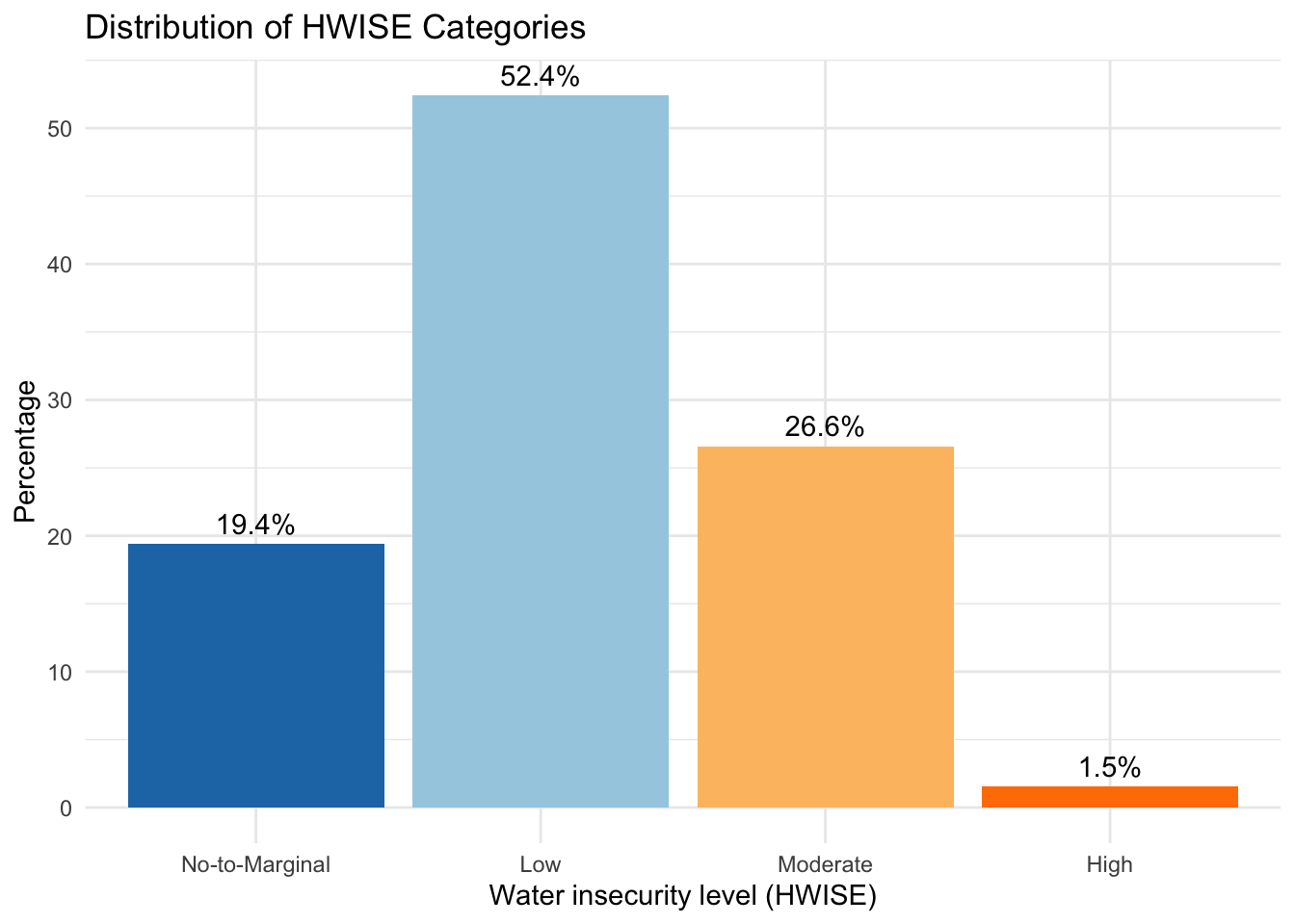
| Version | Author | Date |
|---|---|---|
| 7866aba | Paloma | 2025-03-07 |
| Version | Author | Date |
|---|---|---|
| 7866aba | Paloma | 2025-03-07 |
   Min. 1st Qu.  Median    Mean 3rd Qu.    Max.    NA's
  0.000   5.000   9.000   9.715  14.000  27.000       6
Min. 1st Qu. Median Mean 3rd Qu. Max. NA's
0.000 2.000 6.000 7.157 11.000 27.000 8
No-to-Marginal            Low       Moderate           High
            25            104             60              4
No-to-Marginal Low Moderate High
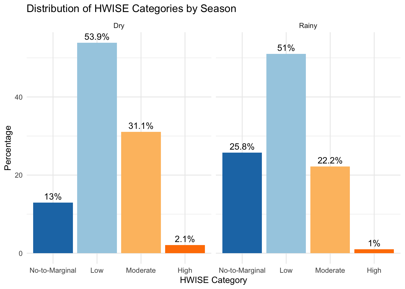
51 101 44 2 Rainy season to dry season
data <- read.csv(file.path(data_path, "Cleaned_Dataset_Screening_HWISE_PSS_V3.csv"),
         stringsAsFactors = FALSE,
         na.strings = c("", "N/A", "NA", "pending"))

# Define Rainy (Fall = 1) and Dry (Spring = 0) seasons
data <- data %>%
  mutate(Season_Type = case_when(
    SEASON == 1 ~ "Rainy",
    SEASON == 0 ~ "Dry"
  ))

# Convert Season_Type to a factor
data$Season_Type <- factor(data$Season_Type, levels = c("Rainy", "Dry"))

# Categorize HW_TOTAL into four groups
data <- data %>%
  filter(!is.na(HW_TOTAL)) %>%  # Remove missing values
  mutate(HW_TOTAL_category = case_when(
    HW_TOTAL >= 0 & HW_TOTAL <= 2  ~ "No-to-Marginal",
    HW_TOTAL >= 3 & HW_TOTAL <= 11 ~ "Low",
    HW_TOTAL >= 12 & HW_TOTAL <= 23 ~ "Moderate",
    HW_TOTAL >= 24 & HW_TOTAL <= 36 ~ "High"
  ))

# Convert to factor with correct ordering
data$HW_TOTAL_category <- factor(data$HW_TOTAL_category,
                                 levels = c("No-to-Marginal", "Low", "Moderate", "High"))

# Calculate the percentage for each category within each season
hw_season_counts <- data %>%
  filter(!is.na(HW_TOTAL_category)) %>%  # Ensure no NA categories
  group_by(Season_Type, HW_TOTAL_category) %>%
  summarise(Count = n(), .groups = 'drop') %>%
  group_by(Season_Type) %>%
  mutate(Percentage = (Count / sum(Count)) * 100)

# Reshape data to calculate the percentage difference (Dry - Rainy)
hw_diff <- hw_season_counts %>%
  select(Season_Type, HW_TOTAL_category, Percentage) %>%
  spread(Season_Type, Percentage) %>%  # Convert to wide format
  mutate(Difference = Dry - Rainy)  # Compute difference from Rainy to Dry

# Create the bar plot showing the percentage difference
ggplot(hw_diff, aes(x = HW_TOTAL_category, y = Difference, fill = Difference > 0)) +
  geom_bar(stat = "identity") +  # Use precomputed differences
  theme_minimal() +
  labs(title = "Seasonal change: Rainy compared to Dry Season",
       x = "Water insecurity level (HWISE)",
       y = "Percentage Difference (Rainy to Dry season)") +
  scale_fill_manual(values = c("#1f78b4", "#ff7f00"), labels = c("Decrease", "Increase")) +  # Assign colors
  theme(legend.position = "right") +  # Keep legend
  geom_text(aes(label = paste0(round(Difference, 1), "%")), vjust = -0.5)  # Add percentage labels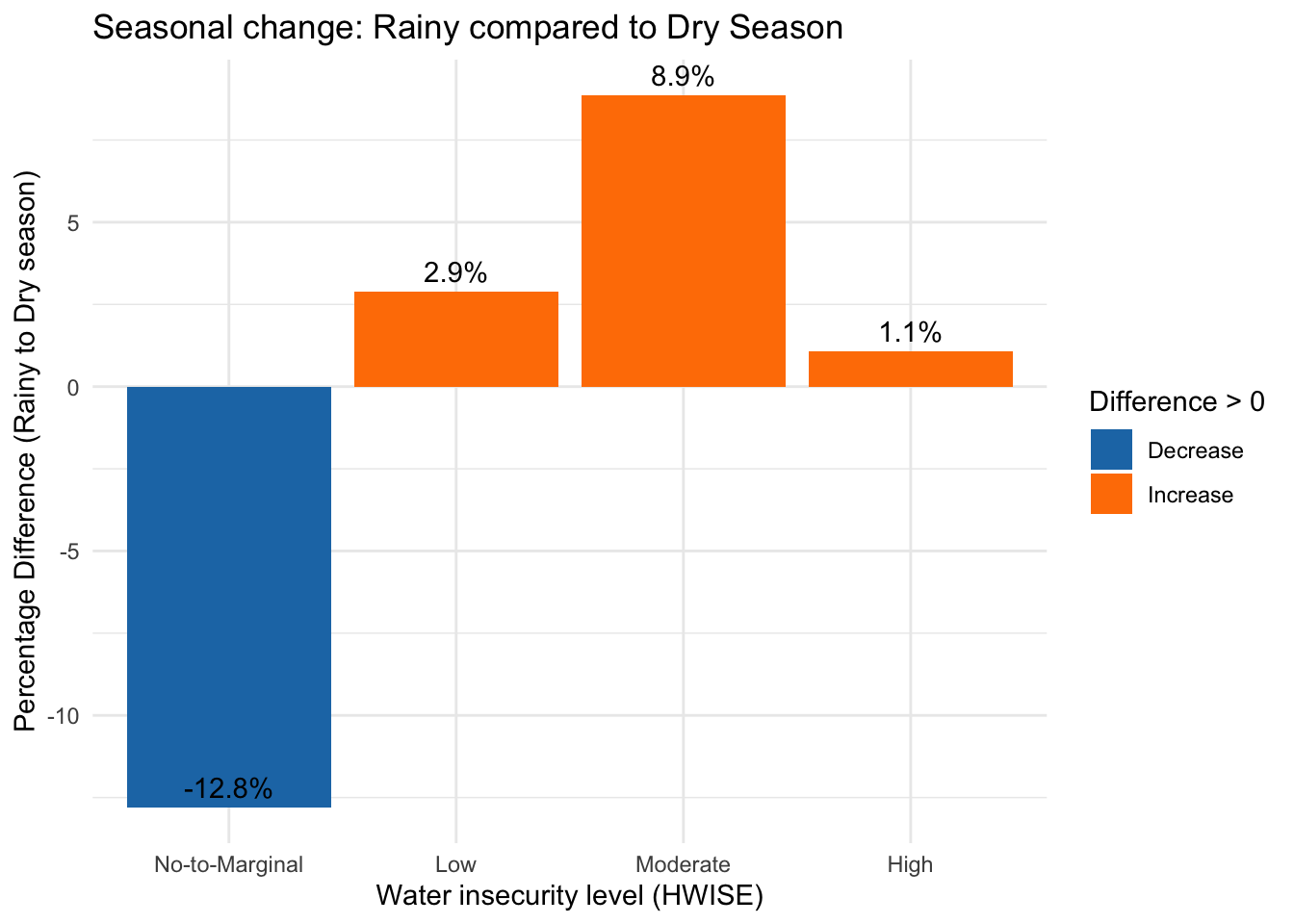
BOXPLOTS
data <- read.csv(file.path(data_path, "Cleaned_Dataset_Screening_HWISE_PSS_V3.csv"),
         stringsAsFactors = FALSE,
         na.strings = c("", "N/A", "NA", "pending"))

# Categorize HW_TOTAL into four groups
data <- data %>%
  filter(!is.na(HW_TOTAL)) %>%  # Remove missing values
  mutate(HW_TOTAL_category = case_when(
    HW_TOTAL >= 0 & HW_TOTAL <= 2  ~ "No-to-Marginal",
    HW_TOTAL >= 3 & HW_TOTAL <= 11 ~ "Low",
    HW_TOTAL >= 12 & HW_TOTAL <= 23 ~ "Moderate",
    HW_TOTAL >= 24 & HW_TOTAL <= 36 ~ "High"
  ))

# Convert to factor with proper order
data$HW_TOTAL_category <- factor(data$HW_TOTAL_category,
                                 levels = c("No-to-Marginal", "Low", "Moderate", "High"))

# Count the number of data points per Water insecurity level (HWISE)
 summary_stats <- data %>%
  group_by(HW_TOTAL_category) %>%
  summarise(Count = n(), SD = sd(HRS_WEEK, na.rm = TRUE), .groups = 'drop')

 hrs.w <- data$HRS_WEEK
 means <- aggregate(hrs.w ~ HW_TOTAL_category, data, mean)
means$hrs.w <- round(means$hrs.w, 2)

# Define color palette
color_palette <- c("#1f78b4", "#a6cee3", "#fdbf6f", "#ff7f00")

# Create box-and-whisker plot with individual data points
ggplot(data, aes(x = HW_TOTAL_category,
                 y = HRS_WEEK,
                 fill = HW_TOTAL_category)) +
    geom_jitter(aes(color = HW_TOTAL_category),
                size = 1, width = 0.25) +
  # Jitter adds individual data points
    geom_violin(alpha = 0.6, width = 1.4) + # violin
  geom_boxplot(outlier.shape = 1, alpha = 0.5,
               width = 0.08, color = "grey30") + # Boxplot
    geom_text(data = summary_stats,
              aes(x = HW_TOTAL_category,
                  y = max(data$HRS_WEEK,
                          na.rm = TRUE) + 10,
                  label = paste0("SD = ", round(SD, 1))),
              size = 4, fontface = "bold") +    # Add SD text annotations above the boxes
   geom_text(data = means,
             aes(label = hrs.w, y = hrs.w + 1, hjust=-1),
             size = 3, color = "darkred") + #adds average labels
  theme_minimal() +
  labs(title = "Hours water of supply by Water Insecurity group (HWISE)",
       x = "HWISE Group",
       y = "Hours of Water Supply per Week") +
  scale_fill_manual(values = color_palette) +  # Custom colors for boxes
  scale_color_manual(values = color_palette) +  # Custom colors for points +
   stat_summary(fun.y=mean, geom="point", shape=23,
                size=5, color="darkred", fill="darkred") +
  theme(legend.position = "none",
        axis.text = element_text(size = 10)) + # Remove legend for clarity
  scale_x_discrete(labels = paste0(summary_stats$HW_TOTAL_category,
                                 " (n=", summary_stats$Count, ")"))  # Add count to x-axis labels
Warning: The `fun.y` argument of `stat_summary()` is deprecated as of ggplot2 3.3.0.
ℹ Please use the `fun` argument instead.
This warning is displayed once every 8 hours.
Call `lifecycle::last_lifecycle_warnings()` to see where this warning was
generated.Warning: Removed 37 rows containing non-finite outside the scale range
(`stat_ydensity()`).Warning: Removed 37 rows containing non-finite outside the scale range
(`stat_boxplot()`).Warning: Removed 37 rows containing non-finite outside the scale range
(`stat_summary()`).Warning: `position_dodge()` requires non-overlapping x intervals.Warning: Removed 37 rows containing missing values or values outside the scale range
(`geom_point()`).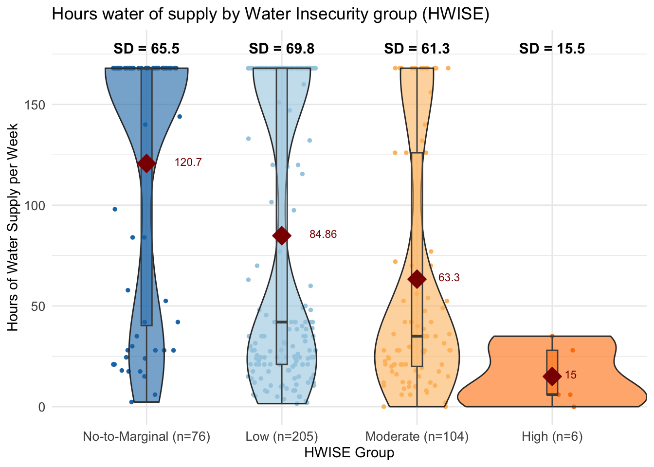
# Categorize HW_TOTAL into groups
data <- data %>%
  filter(!is.na(MX28_WQ_COMP)) %>%  # Remove missing values
  mutate(MX28_WQ_COMP_category = case_when(
    MX28_WQ_COMP == 0 ~ "Worse",
    MX28_WQ_COMP == 1 ~ "Same",
    MX28_WQ_COMP == 2 ~ "Better",
  ))

# Convert to factor with proper order
data$MX28_WQ_COMP_category <- factor(data$MX28_WQ_COMP_category,
                                 levels = c("Worse", "Same", "Better"))

# Count the number of data points per Water insecurity level (HWISE)
 summary_stats <- data %>%
  group_by(MX28_WQ_COMP_category) %>%
  summarise(Count = n(), SD = sd(HRS_WEEK, na.rm = TRUE), .groups = 'drop')

 hrs.w <- data$HRS_WEEK
 means <- aggregate(hrs.w ~ MX28_WQ_COMP_category, data, mean)
means$hrs.w <- round(means$hrs.w, 2)

color_palette <- c("#ff7f00", "#a6cee3",  "#1f78b4")

# Create box-and-whisker plot with individual data points
ggplot(data, aes(x = MX28_WQ_COMP_category,
                 y = HRS_WEEK,
                 fill = MX28_WQ_COMP_category)) +
    geom_jitter(aes(color = MX28_WQ_COMP_category),
                size = 1, width = 0.25) +
  # Jitter adds individual data points
    geom_violin(alpha = 0.6, width = 1) + # violin
  geom_boxplot(outlier.shape = 1, alpha = 0.5,
               width = 0.08, color = "grey30") + # Boxplot
      geom_text(data = means,
             aes(label = hrs.w, y = hrs.w + 1, hjust=-0.8),
             size = 3, color = "darkred") + #adds average labels
  theme_minimal() +
  labs(title = "Hours of water supply and comparison to other parts of the city",
       x = "Own water service is considered",
       y = "Hours of Water Supply per Week") +
  scale_fill_manual(values = color_palette) +  # Custom colors for boxes
  scale_color_manual(values = color_palette) +  # Custom colors for points +
   stat_summary(fun.y=mean, geom="point", shape=23,
                size=5, color="darkred", fill="darkred") +
  theme(legend.position = "none",
        axis.text = element_text(size = 10)) +
  scale_x_discrete(labels = paste0(summary_stats$MX28_WQ_COMP_category,
                                 " (n=", summary_stats$Count, ")"))
Warning: Removed 37 rows containing non-finite outside the scale range
(`stat_ydensity()`).Warning: Removed 37 rows containing non-finite outside the scale range
(`stat_boxplot()`).Warning: Removed 37 rows containing non-finite outside the scale range
(`stat_summary()`).Warning: Removed 37 rows containing missing values or values outside the scale range
(`geom_point()`).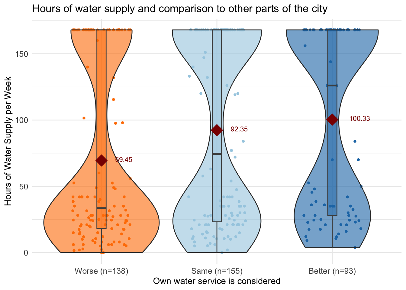
# Count the number of data points per Water insecurity level (HWISE)
 summary_stats <- data %>%
  group_by(MX28_WQ_COMP_category) %>%
  summarise(Count = n(), SD = sd(HW_TOTAL, na.rm = TRUE), .groups = 'drop')

 hrs.w <- data$HW_TOTAL
 means <- aggregate(hrs.w ~ MX28_WQ_COMP_category, data, mean)
means$hrs.w <- round(means$hrs.w, 2)


# Create box-and-whisker plot with individual data points
ggplot(data, aes(x = MX28_WQ_COMP_category,
                 y = HW_TOTAL,
                 fill = MX28_WQ_COMP_category)) +
    geom_jitter(aes(color = MX28_WQ_COMP_category),
               size = 1, width = 0.25) +
  # Jitter adds individual data points
    geom_violin(alpha = 0.4, width = 1) + # violin
  geom_boxplot(outlier.shape = 1, alpha = 0.3,
               width = 0.15, color = "grey30") + # Boxplot
    geom_text(data = means,
             aes(label = hrs.w, y = hrs.w + 0.8, hjust=-0.85),
             size = 3, color = "darkred") + #adds average labels
      geom_text(data = summary_stats,
              aes(x = MX28_WQ_COMP_category,
                  y = max(data$HW_TOTAL,
                          na.rm = TRUE) + 2,
                  label = paste0("SD = ", round(SD, 1))),
              size = 4, fontface = "bold") +    # Add SD text annotations above the boxes
  theme_minimal() +
  labs(title =  "Hours of water supply and comparison to other parts of the city",
       x = "Own water service is considered",
       y = "HWISE score") +
  scale_fill_manual(values = color_palette) +  # Custom colors for boxes
  scale_color_manual(values = color_palette) +  # Custom colors for points +
   stat_summary(fun.y=mean, geom="point", shape=23,
               size=5, color="darkred", fill="darkred") +
  theme(legend.position = "none",
        axis.text = element_text(size = 10)) +
  scale_x_discrete(labels = paste0(summary_stats$MX28_WQ_COMP_category,
" (n=", summary_stats$Count, ")")) 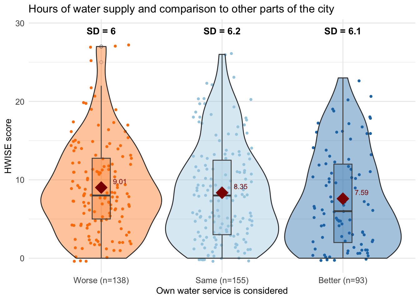
# Load the dataset
data <- read.csv(file.path(data_path, "Cleaned_Dataset_Screening_HWISE_PSS_V3.csv"),
         stringsAsFactors = FALSE,
         na.strings = c("", "N/A", "NA", "pending"))

# Keep only relevant columns (HW_ questions and HRS_WEEK)
data_long <- data %>%
  select(HW_TOTAL, HRS_WEEK) %>%
  pivot_longer(cols = HW_TOTAL, names_to = "HW_Question", values_to = "Response") %>%
  filter(!is.na(HRS_WEEK), !is.na(Response))  # Remove NAs

# Compute mean HRS_WEEK for each HW_Question & Response category
summary_stats <- data_long %>%
  group_by(HW_Question, Response) %>%
  summarise(Mean_HRS_WEEK = mean(HRS_WEEK, na.rm = TRUE), Count = n(), SD = sd(HRS_WEEK, na.rm = TRUE), .groups = 'drop')

# Generate boxplots with mean values
ggplot(data_long, aes(x = as.factor(Response), y = HRS_WEEK, fill = as.factor(Response))) +
  geom_jitter(aes(color = as.factor(Response)), size = 1.5, width = 0.2, alpha = 0.2) +
   geom_boxplot(outlier.shape = NA, width = 0.5, alpha = 0.4, color = "gray70") +  # Thinner boxes
  geom_point(data = summary_stats, aes(x = as.factor(Response), y = Mean_HRS_WEEK),
             color = "black", size = 1.5) +  # Add red dot for mean value
  geom_text(data = summary_stats, aes(x = as.factor(Response), y =  Mean_HRS_WEEK,
             label = round(Mean_HRS_WEEK, 0)), color = "black", hjust =  -0.35, size = 2.8) +  # Add numeric mean label
  theme_minimal() +
  labs(title = "Distribution of Hours water of supply by total HWISE score",
       subtitle = "Black dots show mean num. hours per week",
       x = "HWISE score",
       y = "Hours of Water Supply per Week") +
 # scale_fill_manual(values = color_palette) +  # Custom colors for boxes
 # scale_color_manual(values = color_palette) +  # Custom colors for points
  theme(legend.position = "none", axis.text.x = element_text(size = 5, angle = 45)) +
   scale_x_discrete(labels = paste0(summary_stats$Response,
" (n=", summary_stats$Count, ")")) 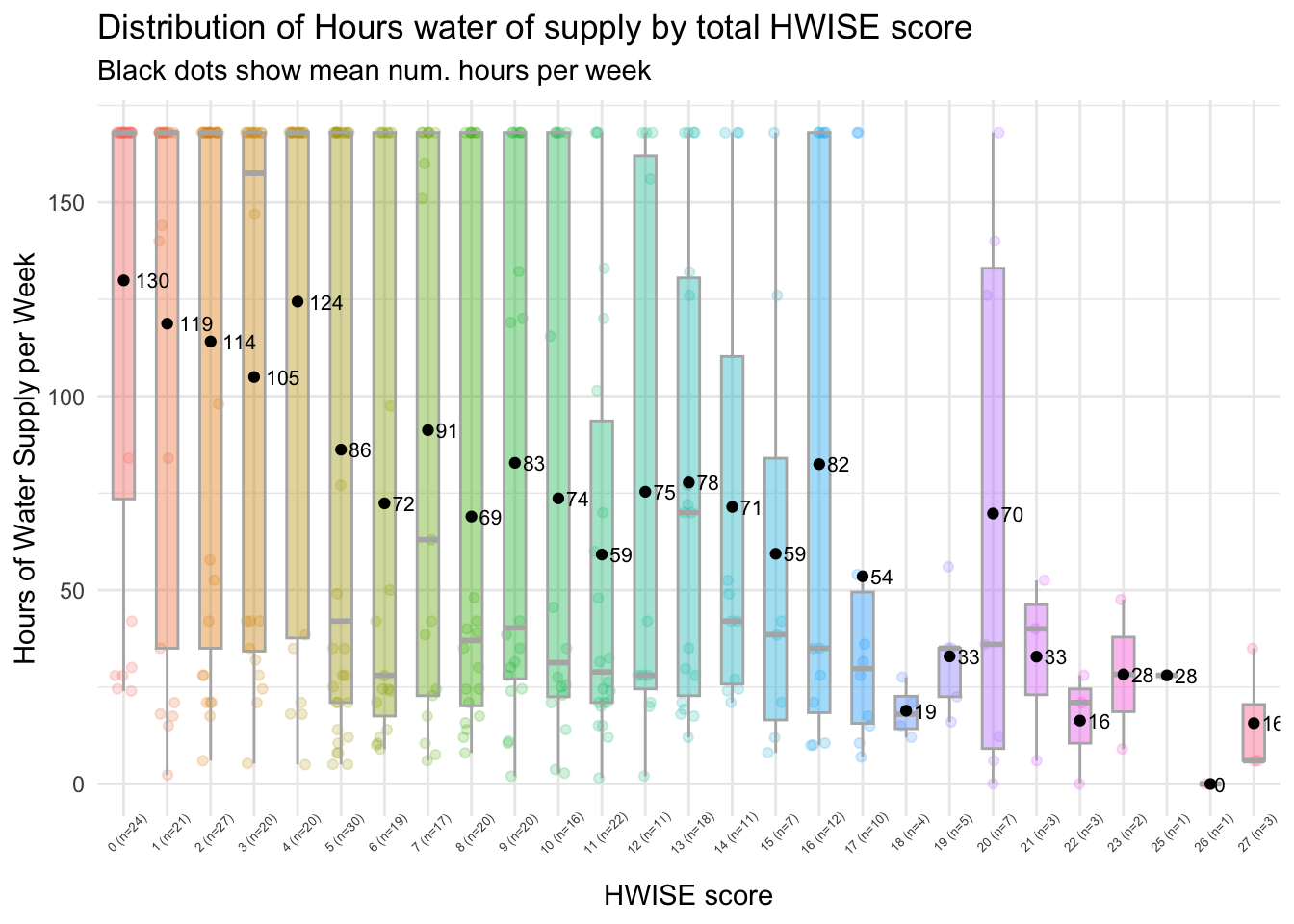
# Define color palette
#color_palette <- c("#1f78b4", "#a6cee3", "#fdbf6f", "#ff7f00")

# Generate boxplots
ggplot(data_long, aes(x = as.factor(Response), y = HRS_WEEK, fill = as.factor(Response))) +
  geom_boxplot(outlier.shape = NA, width = 0.5, alpha = 0.7) +  # Thinner boxes
  geom_jitter(aes(color = as.factor(Response)), size = 1.5, width = 0.2, alpha = 0.5) +
  theme_minimal() +
  labs(title = "Distribution of Hours water of supply by total HWISE score",
       x = "Score",
       y = "Hours of Water Supply per Week") +
#  scale_fill_manual(values = color_palette) +  # Custom colors for boxes
#  scale_color_manual(values = color_palette) +  # Custom colors for points
  theme(legend.position = "none")# +  # Remove legend for clarity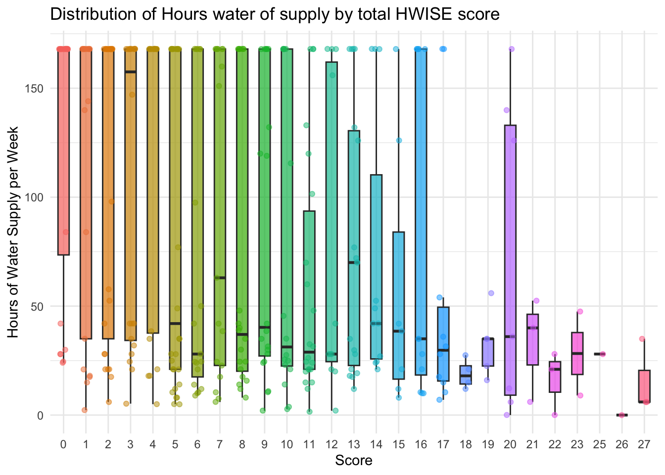
# Load the dataset
data <- read.csv(file.path(data_path, "Cleaned_Dataset_Screening_HWISE_PSS_V3.csv"),
         stringsAsFactors = FALSE,
         na.strings = c("", "N/A", "NA", "pending"))
data <- data %>%
  select(-HW_TOTAL)

# Select all columns that start with "HW_"
hw_vars <- grep("^HW_", names(data), value = TRUE)

# Keep only relevant columns (HW_ questions and HRS_WEEK)
data_long <- data %>%
  select(all_of(hw_vars), HRS_WEEK) %>%
  pivot_longer(cols = all_of(hw_vars), names_to = "HW_Question", values_to = "Response") %>%
  filter(!is.na(HRS_WEEK), !is.na(Response))  # Remove NAs

# Compute mean HRS_WEEK for each HW_Question & Response category
mean_values <- data_long %>%
  group_by(HW_Question, Response) %>%
  summarise(Mean_HRS_WEEK = mean(HRS_WEEK, na.rm = TRUE), .groups = 'drop')


# Generate boxplots with mean values
ggplot(data_long, aes(x = as.factor(Response), y = HRS_WEEK, fill = as.factor(Response))) +
  geom_boxplot(outlier.shape = NA,  alpha = 0.4, varwidth = TRUE) +  # Thinner boxes
  geom_jitter(aes(color = as.factor(Response)), size = 1.5, width = 0.2, alpha = 0.4) +
  geom_point(data = mean_values, aes(x = as.factor(Response), y = Mean_HRS_WEEK),
             color = "red", size = 2) +  # Add red dot for mean value
 # geom_text(data = mean_values, aes(x = as.factor(Response), y = Mean_HRS_WEEK,
            # label = round(Mean_HRS_WEEK, 1)), color = "red", vjust = -0.5, size = 3.5) +  # Add numeric mean label
  theme_minimal() +
  labs(title = "Distribution of Hours water of supply by HWISE Question",
       subtitle = "Red dots show mean num. hours per week",
       x = "Response",
       y = "Hours of Water Supply per Week") +
  theme(legend.position = "none") +  # Remove legend for clarity
  facet_wrap(~HW_Question, scales = "free_y")  # Create separate plots for each HW_ question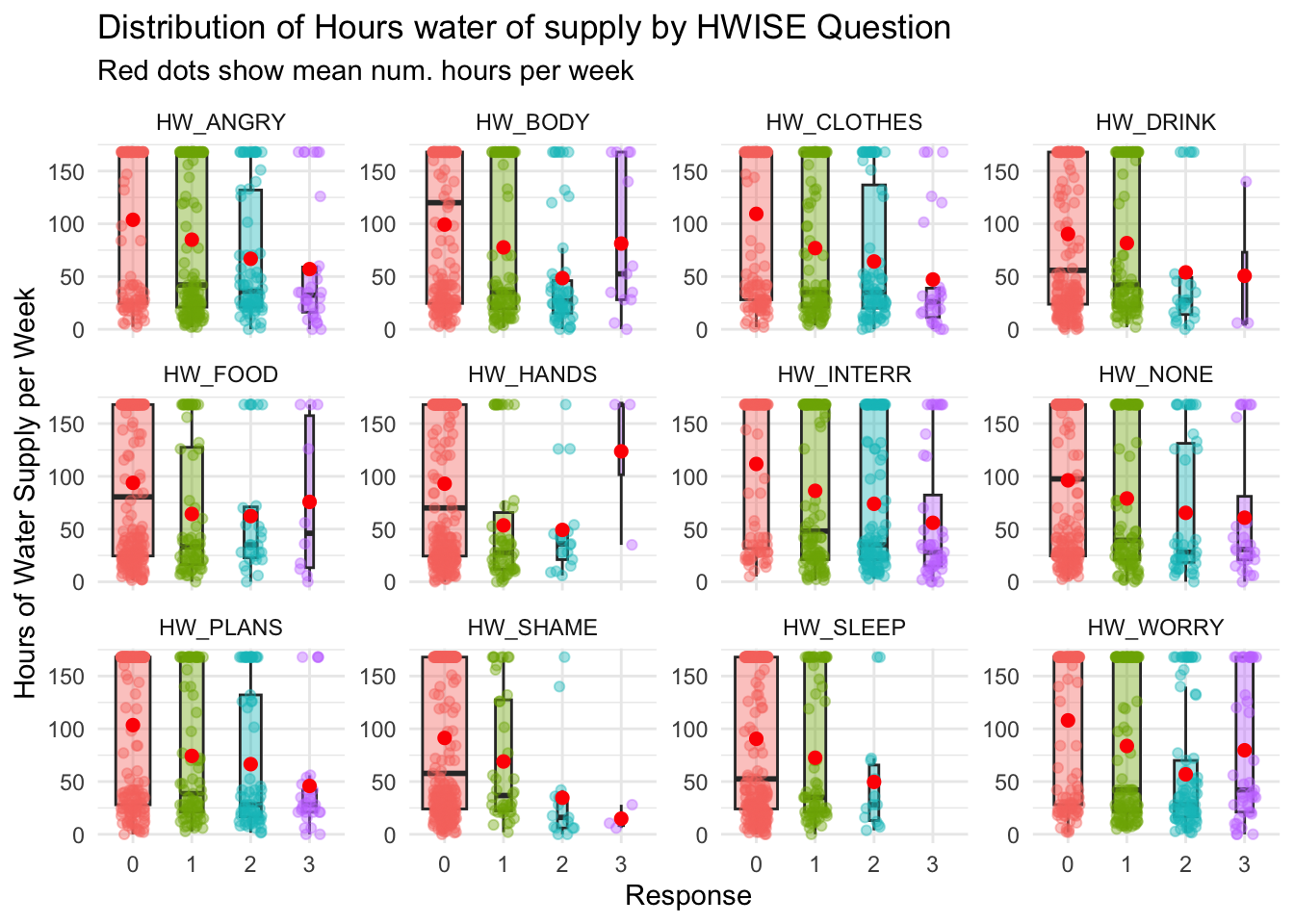
sessionInfo()R version 4.4.3 (2025-02-28)
Platform: aarch64-apple-darwin20
Running under: macOS Sequoia 15.3.1
Matrix products: default
BLAS: /Library/Frameworks/R.framework/Versions/4.4-arm64/Resources/lib/libRblas.0.dylib
LAPACK: /Library/Frameworks/R.framework/Versions/4.4-arm64/Resources/lib/libRlapack.dylib; LAPACK version 3.12.0
locale:
[1] en_US.UTF-8/en_US.UTF-8/en_US.UTF-8/C/en_US.UTF-8/en_US.UTF-8
time zone: America/Detroit
tzcode source: internal
attached base packages:
[1] stats graphics grDevices utils datasets methods base
other attached packages:
[1] knitr_1.49 reshape2_1.4.4 tidyr_1.3.1 ggplot2_3.5.1 dplyr_1.1.4
loaded via a namespace (and not attached):
[1] sass_0.4.9 utf8_1.2.4 generics_0.1.3 stringi_1.8.4
[5] digest_0.6.37 magrittr_2.0.3 evaluate_1.0.1 grid_4.4.3
[9] fastmap_1.2.0 rprojroot_2.0.4 workflowr_1.7.1 plyr_1.8.9
[13] jsonlite_1.8.9 whisker_0.4.1 promises_1.3.0 purrr_1.0.2
[17] fansi_1.0.6 scales_1.3.0 jquerylib_0.1.4 cli_3.6.3
[21] rlang_1.1.4 crayon_1.5.3 munsell_0.5.1 withr_3.0.2
[25] cachem_1.1.0 yaml_2.3.10 tools_4.4.3 colorspace_2.1-1
[29] httpuv_1.6.15 vctrs_0.6.5 R6_2.5.1 lifecycle_1.0.4
[33] git2r_0.35.0 stringr_1.5.1 fs_1.6.5 pkgconfig_2.0.3
[37] pillar_1.9.0 bslib_0.8.0 later_1.3.2 gtable_0.3.6
[41] glue_1.8.0 Rcpp_1.0.13-1 xfun_0.49 tibble_3.2.1
[45] tidyselect_1.2.1 rstudioapi_0.17.1 farver_2.1.2 htmltools_0.5.8.1
[49] rmarkdown_2.29 labeling_0.4.3 compiler_4.4.3