Main Meter - Simple linear regression
Maggie Douglas
03/23/26
Last updated: 2026-03-23
Checks: 6 1
Knit directory: dickinson_power/
This reproducible R Markdown analysis was created with workflowr (version 1.7.2). The Checks tab describes the reproducibility checks that were applied when the results were created. The Past versions tab lists the development history.
The R Markdown file has unstaged changes. To know which version of
the R Markdown file created these results, you’ll want to first commit
it to the Git repo. If you’re still working on the analysis, you can
ignore this warning. When you’re finished, you can run
wflow_publish to commit the R Markdown file and build the
HTML.
Great job! The global environment was empty. Objects defined in the global environment can affect the analysis in your R Markdown file in unknown ways. For reproduciblity it’s best to always run the code in an empty environment.
The command set.seed(20260107) was run prior to running
the code in the R Markdown file. Setting a seed ensures that any results
that rely on randomness, e.g. subsampling or permutations, are
reproducible.
Great job! Recording the operating system, R version, and package versions is critical for reproducibility.
Nice! There were no cached chunks for this analysis, so you can be confident that you successfully produced the results during this run.
Great job! Using relative paths to the files within your workflowr project makes it easier to run your code on other machines.
Great! You are using Git for version control. Tracking code development and connecting the code version to the results is critical for reproducibility.
The results in this page were generated with repository version 0e3911f. See the Past versions tab to see a history of the changes made to the R Markdown and HTML files.
Note that you need to be careful to ensure that all relevant files for
the analysis have been committed to Git prior to generating the results
(you can use wflow_publish or
wflow_git_commit). workflowr only checks the R Markdown
file, but you know if there are other scripts or data files that it
depends on. Below is the status of the Git repository when the results
were generated:
Ignored files:
    Ignored:    .DS_Store
    Ignored:    .Rhistory
    Ignored:    .Rproj.user/
    Ignored:    analysis/.DS_Store
    Ignored:    analysis_to-fix/.DS_Store
    Ignored:    data/.DS_Store
    Ignored:    data/FY25 Main Meter Data.xlsx
    Ignored:    data/building_list_FY25_updated.xlsx
    Ignored:    data/graph_data_life_exp.csv
    Ignored:    data/housing_counts.csv
    Ignored:    keys/.DS_Store
    Ignored:    output/annual_kwh.csv
    Ignored:    output/building_check.csv
    Ignored:    output/building_check.xlsx
    Ignored:    output/daily_kwh.csv
    Ignored:    output/kwh_academic_2026-03-16.csv
    Ignored:    output/kwh_academic_2026-03-17.csv
    Ignored:    output/kwh_academic_2026-03-18.csv
    Ignored:    output/kwh_academic_2026-03-22.csv
    Ignored:    output/kwh_academic_2026-03-23.csv
    Ignored:    output/kwh_annual.csv
    Ignored:    output/kwh_annual_2026-03-04.csv
    Ignored:    output/kwh_annual_2026-03-12.csv
    Ignored:    output/kwh_annual_2026-03-16.csv
    Ignored:    output/kwh_annual_2026-03-17.csv
    Ignored:    output/kwh_annual_2026-03-18.csv
    Ignored:    output/kwh_annual_2026-03-22.csv
    Ignored:    output/kwh_annual_2026-03-23.csv
    Ignored:    output/kwh_annual_20260225.csv
    Ignored:    output/kwh_annual_20260226.csv
    Ignored:    output/kwh_daily.csv
    Ignored:    output/kwh_daily_2026-03-04.csv
    Ignored:    output/kwh_daily_2026-03-12.csv
    Ignored:    output/kwh_daily_2026-03-16.csv
    Ignored:    output/kwh_daily_2026-03-17.csv
    Ignored:    output/kwh_daily_2026-03-18.csv
    Ignored:    output/kwh_daily_2026-03-22.csv
    Ignored:    output/kwh_daily_2026-03-23.csv
    Ignored:    output/kwh_daily_20260225.csv
    Ignored:    output/kwh_daily_20260226.csv
    Ignored:    output/kwh_main_annual.csv
    Ignored:    output/kwh_main_daily.csv

Unstaged changes:
    Modified:   analysis/main_meter_regression.Rmd
Note that any generated files, e.g. HTML, png, CSS, etc., are not included in this status report because it is ok for generated content to have uncommitted changes.
These are the previous versions of the repository in which changes were
made to the R Markdown (analysis/main_meter_regression.Rmd)
and HTML (docs/main_meter_regression.html) files. If you’ve
configured a remote Git repository (see ?wflow_git_remote),
click on the hyperlinks in the table below to view the files as they
were in that past version.
| File | Version | Author | Date | Message |
|---|---|---|---|---|
| Rmd | 0e3911f | maggiedouglas | 2026-03-23 | update data wrangling and add model tab and main meter regression example |
| html | 0e3911f | maggiedouglas | 2026-03-23 | update data wrangling and add model tab and main meter regression example |
| Rmd | 593611e | maggiedouglas | 2026-03-20 | developed main meter regression |
| html | 593611e | maggiedouglas | 2026-03-20 | developed main meter regression |
Guiding question
What is the relationship between electricity use and outdoor temperature for buildings on the main meter?
The below analysis provides an example of how to use linear regression to shed light on this question.
Prepare data
library(tidyverse)
library(segmented) # for segmented regression
library(tseries) # for time series, including autocorrelation

daily <- read.csv("./output/kwh_daily_2026-03-23.csv", strip.white = TRUE)

daily_main <- daily %>%
  filter(NAME == "Main Meter")

str(daily_main)
'data.frame': 365 obs. of 10 variables:
$ type : chr "Main Meter" "Main Meter" "Main Meter" "Main Meter" ...
$ meter : chr "Main Meter - Total" "Main Meter - Total" "Main Meter - Total" "Main Meter - Total" ...
$ NAME : chr "Main Meter" "Main Meter" "Main Meter" "Main Meter" ...
$ days_perc: num 100 100 100 100 100 100 100 100 100 100 ...
$ sqft : int 1119435 1119435 1119435 1119435 1119435 1119435 1119435 1119435 1119435 1119435 ...
$ occupants: num NA NA NA NA NA NA NA NA NA NA ...
$ period : chr "Summer Break" "Summer Break" "Summer Break" "Summer Break" ...
$ date : chr "2024-07-01" "2024-07-02" "2024-07-03" "2024-07-04" ...
$ kwh : num 33919 35412 38561 42526 45794 ...
$ ave_temp : int 69 73 78 81 84 86 84 84 86 87 ...Set expectations
Let’s start by looking at our data. For now we will do some quick-and-dirty graphs using ggplot.
The graph shows that the relationship is definitely not linear! Instead it appears V-shaped. Electricity use decreases from cold temperatures until around 60 degrees F, and then increases with temperature beyond that point. The increase in electricity use above 60 degrees F is more pronounced than the decrease with temperature at temperatures below 60 degrees F.
If we examine the relationship only at temperatures of 60 degrees F and above, it appears that the relationship is roughly linear.
# where is the break point?
ggplot(daily_main, aes(x = ave_temp, y = kwh)) +
  geom_point() +
  theme_bw() +
  geom_vline(xintercept = 60, col = "blue", linetype = "dashed")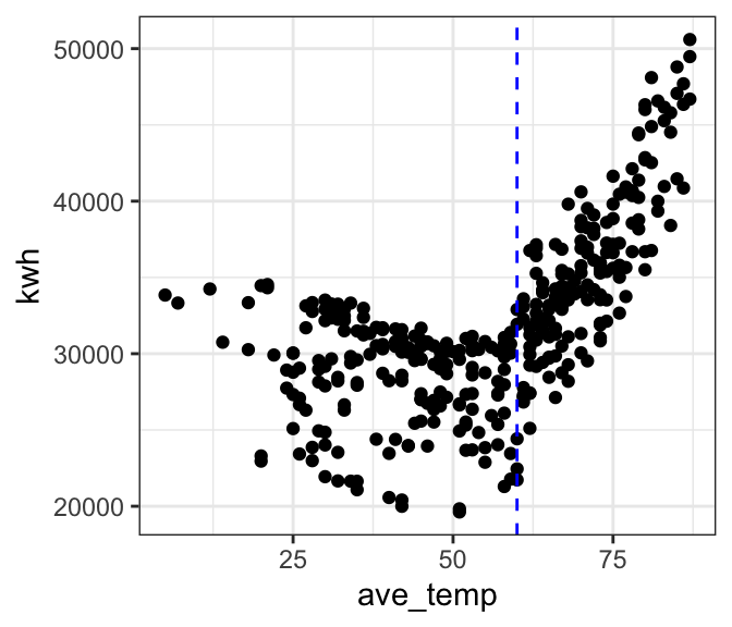
# let's look at only cooling temps
ggplot(filter(daily_main, ave_temp > 60),
       aes(x = ave_temp, y = kwh)) +
  geom_point() +
theme_bw() 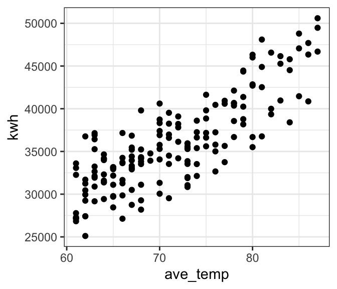
Bad model
We’ve already established that a linear model is probably not a good fit to our full dataset. As a cautionary tale, let’s see what happens if we go ahead and fit a linear model to the full data anyway. The outcomes will help us develop an intution for what to look for in our diagnostic plots to tell that a model is not a good fit.
Preview the model fit
# where is the break point?
ggplot(daily_main, aes(x = ave_temp, y = kwh)) +
  geom_point() +
  theme_bw() +
  geom_smooth(method = 'lm', formula = 'y ~ x', se = FALSE) # add a regression line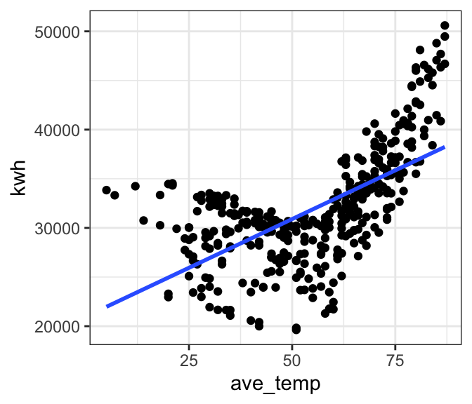
| Version | Author | Date |
|---|---|---|
| 0e3911f | maggiedouglas | 2026-03-23 |
Fit the model
mod_bad <- lm(formula = kwh ~ ave_temp,
              data = daily_main)
Check the fit
- The histogram and QQ-plot show that despite the poor fit, the residuals appear normally distributed
- The Residuals vs. Fitted values graph gives us the strongest clue that the linear model is NOT a good fit for our data. We see a strong V-shape in the residuals, showing that the residual error is consistently negative in the middle of electricity use (~30,000) and positive at the ends (<25,000 and >35,000). This patterns suggests a non-linear pattern, which fits our initial plot.
- The temporal autocorrelation plot similarly suggests that there may be some dependence in our data. The residuals for daily observations are correlated with each other at least out to ~ two weeks. (ACF values above the blue dotted line)
par(mfrow = c(1, 2)) # This code puts two plots in the same window
hist(mod_bad$residuals) # Histogram of residuals
plot(mod_bad, which = 2) # Quantile plot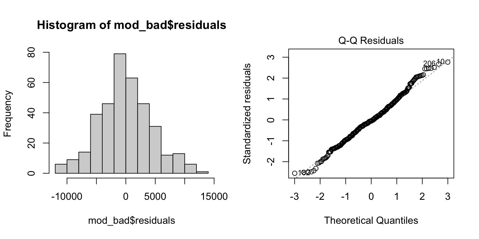
plot(mod_bad, which = 1) # Residuals vs. fits
acf(mod_bad$residuals) # Assess dependence between successive observations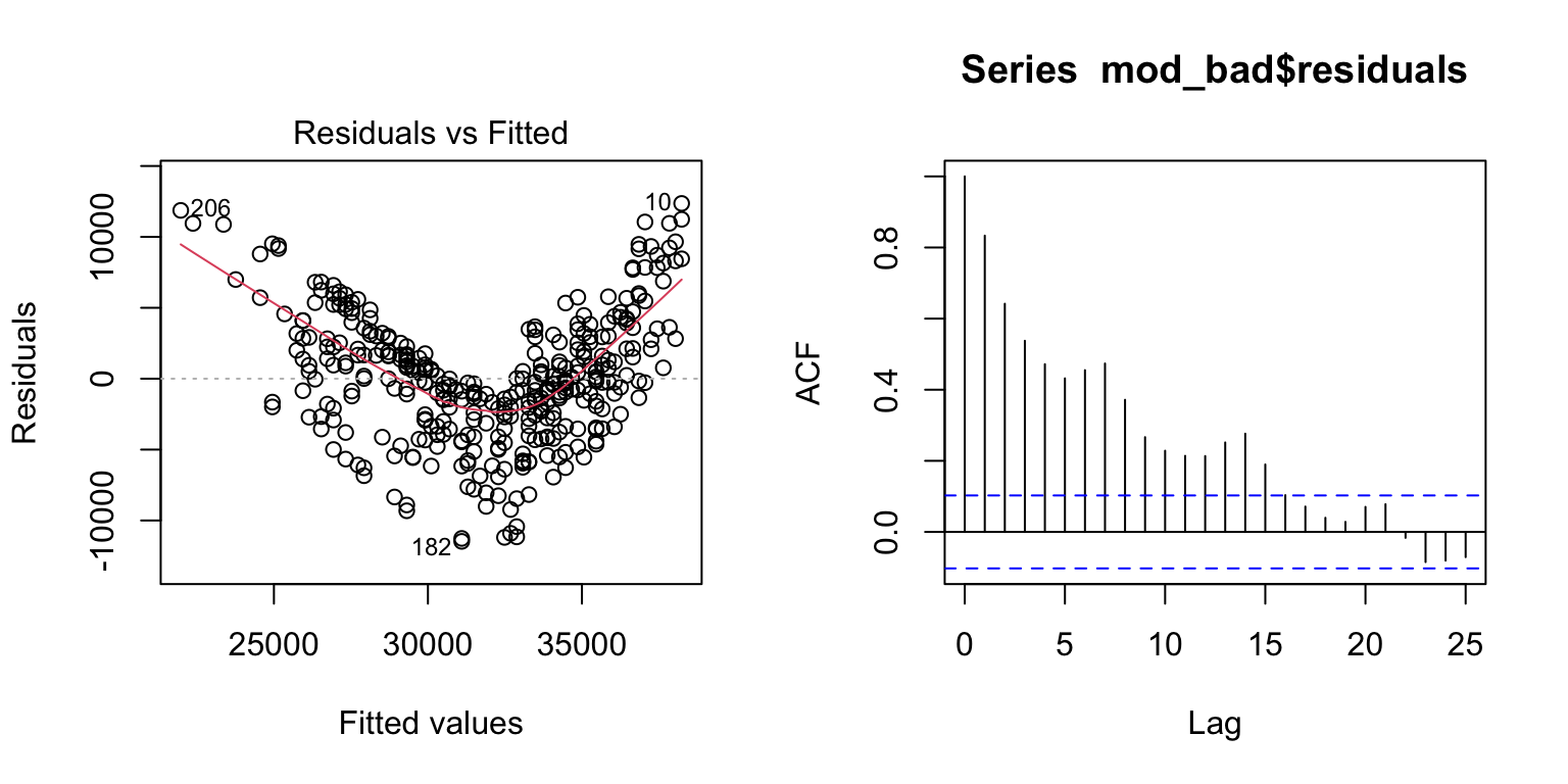
daily_main$resid <- mod_bad$residuals # store residuals in original dataset
daily_main$resid_sign <- ifelse(mod_bad$residuals < 0, "Negative","Positive")

# where is the break point?
ggplot(daily_main, aes(x = ave_temp, y = kwh)) +
  geom_point(aes(color = resid_sign)) +
  theme_bw() +
  geom_smooth(method = 'lm', formula = 'y ~ x', se = FALSE) + # add a regression line
  labs(color = "Residual")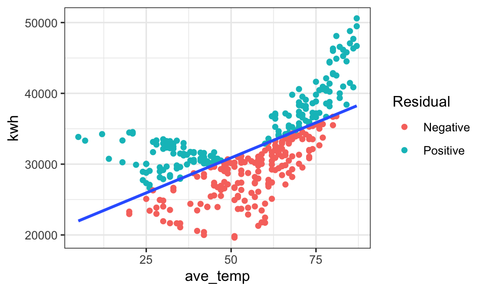
| Version | Author | Date |
|---|---|---|
| 0e3911f | maggiedouglas | 2026-03-23 |
Examine results
For the sake of example, let’s look at the fitted model for our ‘bad’ model. Notice that there is no obvious warning message or other clue that this model is bad! It shows a significant positive relationship that explains ~39% of the variation in electricity use. This illustrates the importance of looking at our data and thinking critically about what we’re doing when we write R code.
summary(mod_bad) # Examine model terms + outcomes
Call:
lm(formula = kwh ~ ave_temp, data = daily_main)

Residuals:
     Min       1Q   Median       3Q      Max
-11472.6  -2861.9   -244.4   2823.9  12360.0

Coefficients:
            Estimate Std. Error t value Pr(>|t|)
(Intercept)  20983.2      754.0   27.83   <2e-16 ***
ave_temp       198.3       13.0   15.26   <2e-16 ***
---
Signif. codes:  0 '***' 0.001 '**' 0.01 '*' 0.05 '.' 0.1 ' ' 1

Residual standard error: 4496 on 363 degrees of freedom
Multiple R-squared:  0.3908,    Adjusted R-squared:  0.3892
F-statistic: 232.9 on 1 and 363 DF,  p-value: < 2.2e-16
Better model
Okay, now let’s try and fit a more reasonable model. We will focus here on temperatures over 60 degrees, where the relationship appears linear.
# subset data > 60 degrees
daily_cool <- filter(daily_main, ave_temp > 60)

# fit the model for temps above 60
mod_cool <- lm(kwh ~ ave_temp, data = daily_cool)
Check the fit
- Similar to above, the residuals appear roughly normally distributed (histogram + QQ plot)
- The Residuals vs. Fitted graph now shows a more ‘cloud-like’ pattern. This is good news as it suggests our model likely meets the linearity and equality of variance assumptions.
- The temporal autocorrelation plot looks improved, but still suggests some dependency in our data. Lags 2 and 3 are over the blue dotted line, suggesting that electricity use is correlated with successive days in a way not currently captured in our model. Interestingly, it also appears there is a signal at 7 days, which could suggest a weekly pattern to electricity use that could be captured by adding a term for day-of-week to our model.
par(mfrow = c(1, 2)) # This code put two plots in the same window
hist(mod_cool$residuals) # Histogram of residuals
plot(mod_cool, which = 2) # Quantile plot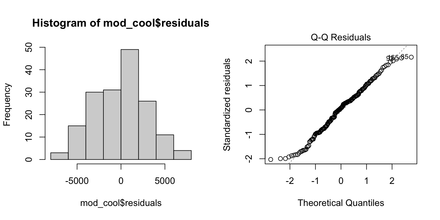
plot(mod_cool, which = 1) # Residuals vs. fits
acf(mod_cool$residuals)  # Assess dependence between successive observations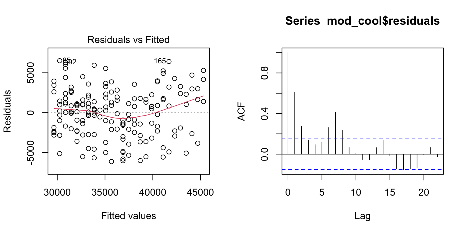
Examine results
For temperatures above 60 degrees F, electricity use on the main
meter increased linearly with outdoor temperature (Figure 1, P
< 0.0001). The relationship was relatively strong, with temperature
explaining about two thirds of the variation in electricity use
(R2 = 0.67). The fitted regression line was:
kWh = -7067 + 602*Temp(F), suggesting that electricity use
increased by 602 kWh for each degree increase in temperature over this
range.
summary(mod_cool) # Examine model terms + outcomes
Call:
lm(formula = kwh ~ ave_temp, data = daily_cool)

Residuals:
    Min      1Q  Median      3Q     Max
-6145.9 -2298.8   228.1  1940.4  6507.9

Coefficients:
            Estimate Std. Error t value Pr(>|t|)
(Intercept) -7067.09    2329.13  -3.034   0.0028 **
ave_temp      601.97      32.47  18.540   <2e-16 ***
---
Signif. codes:  0 '***' 0.001 '**' 0.01 '*' 0.05 '.' 0.1 ' ' 1

Residual standard error: 3036 on 167 degrees of freedom
Multiple R-squared:  0.673, Adjusted R-squared:  0.6711
F-statistic: 343.7 on 1 and 167 DF,  p-value: < 2.2e-16
ggplot(daily_cool, aes(x = ave_temp, y = kwh)) +
geom_point(alpha = 0.6) +
geom_smooth(method = 'lm', formula = 'y ~ x', se = TRUE) + # add regression line
theme_bw() +
labs(x = "Temperature (degrees F)", y = "Electricity use (kWh)",
title = "Figure 1")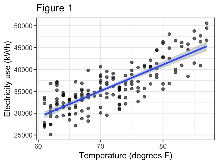
Segmented regression
If we want to fit a single model that works across the entire range
of temperatures, we can consider a segmented regression. This is a
technique that essentially allows us to fit two linear models to our
data, with a break point identified by the analysis. The function to do
this is included in the segmented package.
Fit the model
- First we fit the initial linear model as we did originally with
lm(). Notice I’m using the full data again. - Next we update the initial linear model with the
segmented()function. This fits a ‘broken line’ regression. The argumentseg.Zidentified the variable over which we want to break the regression. The argumentpsisets our initial guess for where the break point should be. The model will adjust this break point to find the one that best fits the data.
mod_full <- lm(kwh ~ ave_temp, data = daily_main)
mod_seg <- segmented(mod_full, seg.Z = ~ ave_temp, psi = 60)
Check the fit
- Fitted model objects returned by the
segmented()function work a bit differently than model objected created bylm(), so we will slightly adjust our approach to checking assumptions and drop the Q-Q plot. - The histogram of the residuals looks slightly left-skewed now. It is still probably sufficient to meet the normality assumption, given that linear regression is not too sensitive to this assumption.
- The Residuals vs. Fitted values plot does not show a strong pattern (‘cloud like’), suggesting that we are meeting the equal variance and linearity assumptions.
- The temporal autocorrelation plot suggests this model still has an issue with dependence among observations close in time, in fact moreso than the model fit to only warm temperatures.
par(mfrow = c(1, 2)) # This code put two plots in the same window
hist(mod_seg$residuals) # Histogram of residuals
plot(mod_seg$residuals) # Residuals vs. fits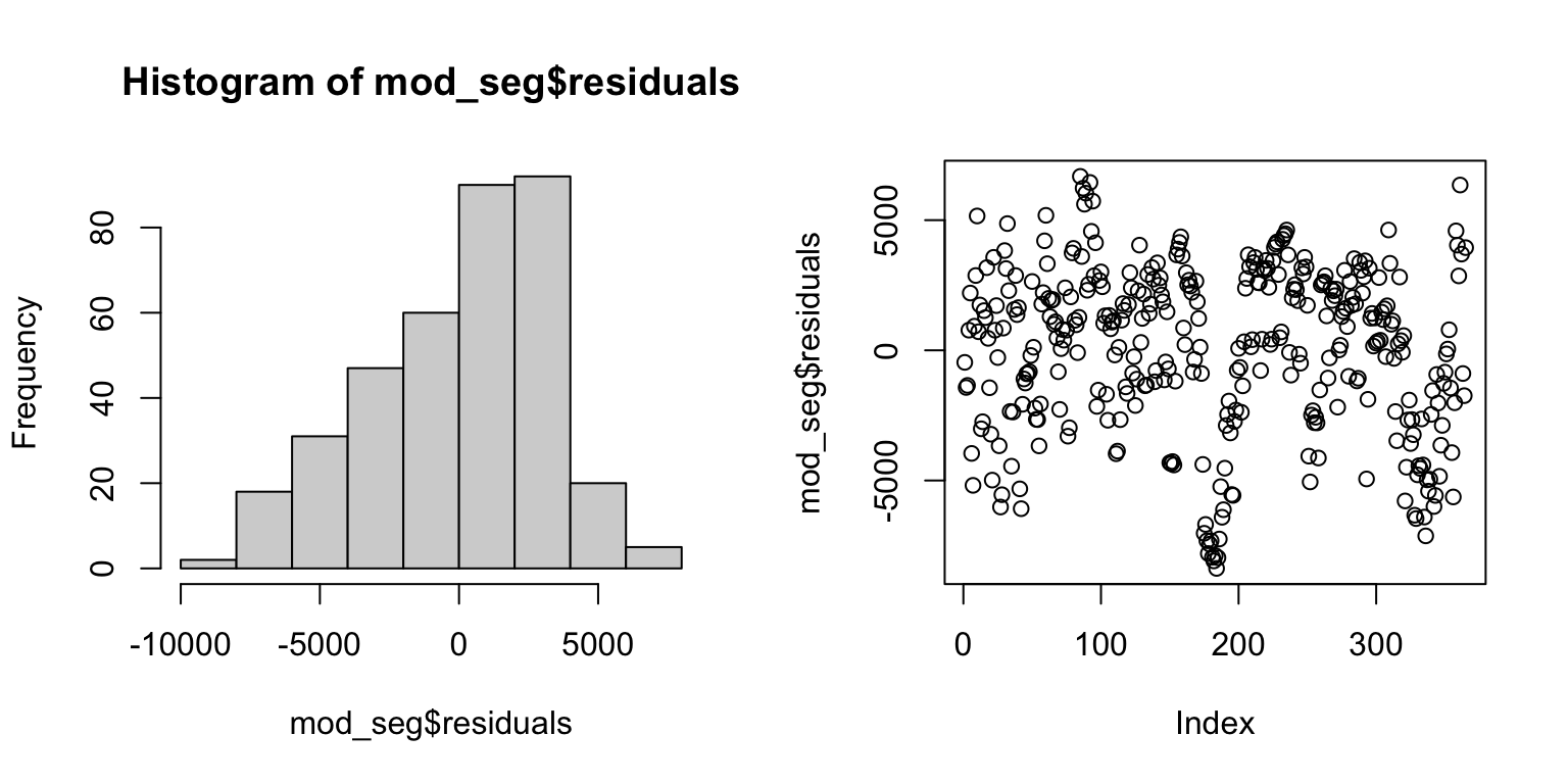
acf(mod_seg$residuals) # Assess dependence between successive observations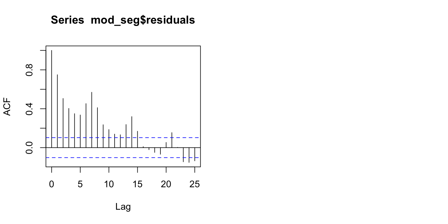
| Version | Author | Date |
|---|---|---|
| 0e3911f | maggiedouglas | 2026-03-23 |
Examine results
Output from summary()
- Run on a segmented regression model, this is similar to output from
lm(), but with a few additional pieces of information. - We no longer have an overall P-value, but the P-value for temperature is highly significant (P = 0.001), suggesting that there is a significant linear relationship between temperature and electricity use.
- The adjusted R2 = 0.68, suggests that two thirds of the variation in electricity use can be explained by temperature with the segmented model.
Additional information (using confint(),
intercept(), and slope() functions)
- The model estimates the break point at 57.3 degrees F (55.5 - 59.2) - this is where the slope changes from negative to positive.
- The equation below 57.3 degrees is:
kWh = 31451 - 73.3*Temp(F)- The negative slope reflects the negative relationship between temperature and electricity use at lower temperatures
- The equation above 57.3 degrees is:
kWh = -7994 + 614*Temp(F)- The positive slope reflects the positive relationship between temperature and electricity use at higher temperatures
- The larger magnitude of the slope reflects the stronger increase in electricity use in cooling vs. heating conditions
- Notice that this slope is not too different from the model fit on only the warm temperatures.
Figure 2 shows the relationship with the fitted segmented regression line.
- Because of how model objects from
segmentedinteract with plotting functions, we need to use a different approach to visualization, using theplot()function.
summary(mod_seg, var.diff = TRUE) # Examine model terms + outcomes
    ***Regression Model with Segmented Relationship(s)***

Call:
segmented.lm(obj = mod_full, seg.Z = ~ave_temp, psi = 60)

Estimated Break-Point(s):
                 Est. St.Err
psi1.ave_temp 57.382  0.947

Coefficients of the linear terms:
            Estimate Std. Error t value Pr(>|t|)
(Intercept) 31451.13     927.52  33.909  < 2e-16 ***
ave_temp      -73.28      22.72  -3.225  0.00137 **
U1.ave_temp   687.42      37.47  18.347       NA
---
Signif. codes:  0 '***' 0.001 '**' 0.01 '*' 0.05 '.' 0.1 ' ' 1

Residual standard error  1 : 3336 on 174 degrees of freedom
Residual standard error  2 : 3169 on 183 degrees of freedom
Multiple R-Squared: 0.6866,  Adjusted R-squared: 0.684

Boot restarting based on 6 samples. Last fit:
Convergence attained in 2 iterations (rel. change 2.6532e-15)
confint(mod_seg) # Get confidence interval for break point Est. CI(95%).low CI(95%).up
psi1.ave_temp 57.3816 55.5189 59.2443intercept(mod_seg) # Extract the intercept for each equation$ave_temp
Est.
intercept1 31451.0
intercept2 -7994.2slope(mod_seg) # Extract the slopes for each equation$ave_temp
Est. St.Err. t value CI(95%).l CI(95%).u
slope1 -73.275 22.021 -3.3276 -116.58 -29.97
slope2 614.140 30.399 20.2030 554.36 673.93# plot original data with fit
plot(mod_seg, col = 'black', res = TRUE, conf.level = .95, shade = T,
res.col = adjustcolor("steelblue", alpha.f = 0.7), # set color of data + transparency
xlab = "Temperature (deg F)", ylab = "Electricity use (kWh)") # label axes
title("Figure 2", adj = 0) # how to set the title in base R plotting function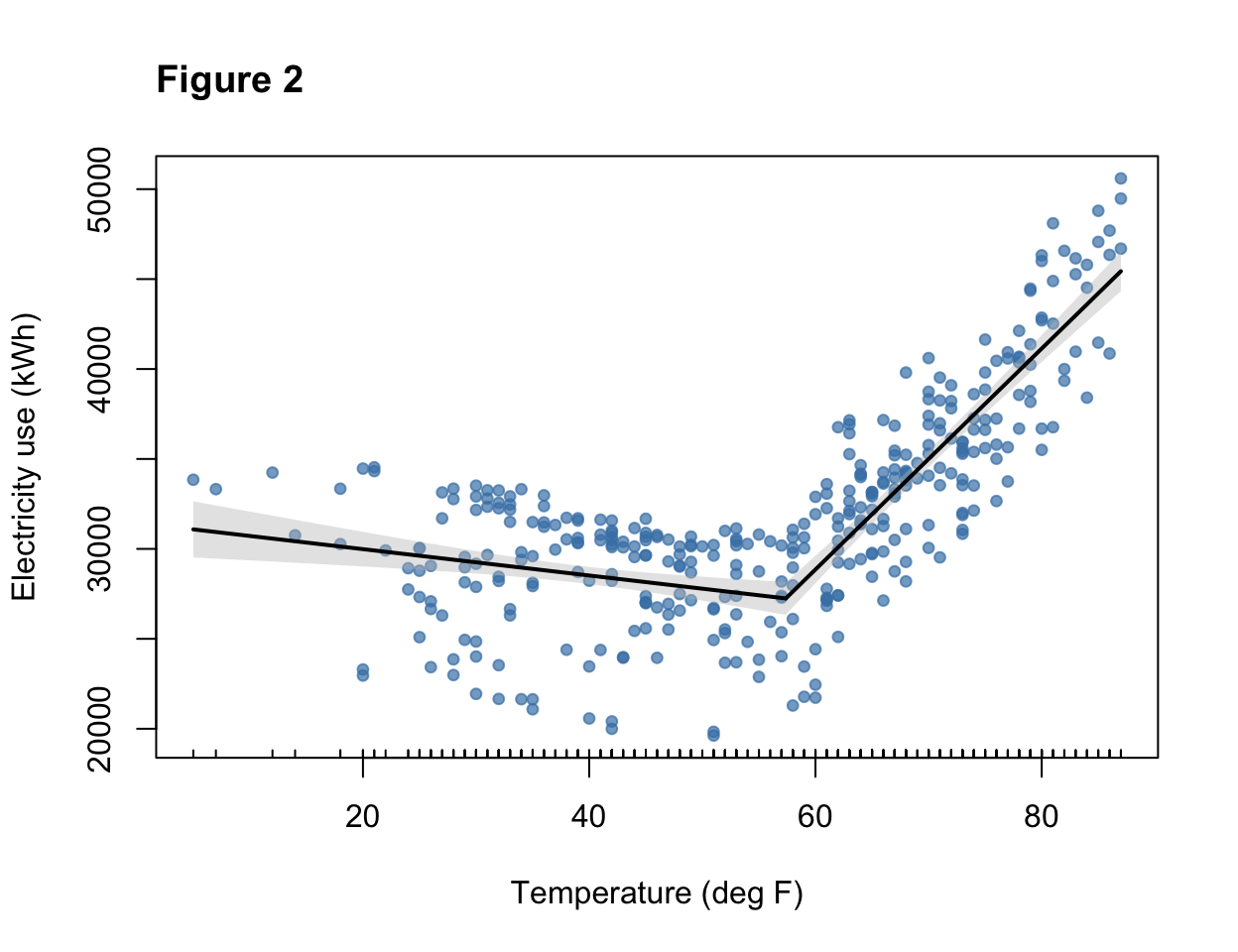
# main = "Figure 2", adj = 0) Revisit expectations
The model fit on temperatures > 60 degrees F and the segmented regression both appeared to fit the data fairly well. Both models were highly significant and explained about two thirds of the variation in electricity use, suggesting that these models have value to understand electricity use patterns. For those two models, the fit to assumptions of normality and equal variance appeared to be reasonably met. A straight line also appeared to capture the pattern in the data reasonably well. One issue we will want to revisit is that it does appear that the independence assumption may be violated, because the temporal autocorrelation plot shows correlation between observations near each other in time. Overall, the segmented model appears to provide a reasonable start for our model of the main meter, but can probably be improved by integrating additional explanatory variables.
sessionInfo()R version 4.5.2 (2025-10-31)
Platform: x86_64-apple-darwin20
Running under: macOS Ventura 13.7.8
Matrix products: default
BLAS: /Library/Frameworks/R.framework/Versions/4.5-x86_64/Resources/lib/libRblas.0.dylib
LAPACK: /Library/Frameworks/R.framework/Versions/4.5-x86_64/Resources/lib/libRlapack.dylib; LAPACK version 3.12.1
locale:
[1] en_US.UTF-8/en_US.UTF-8/en_US.UTF-8/C/en_US.UTF-8/en_US.UTF-8
time zone: America/New_York
tzcode source: internal
attached base packages:
[1] stats graphics grDevices utils datasets methods base
other attached packages:
[1] tseries_0.10-60 segmented_2.2-1 nlme_3.1-168 MASS_7.3-65
[5] lubridate_1.9.5 forcats_1.0.1 stringr_1.6.0 dplyr_1.2.0
[9] purrr_1.2.1 readr_2.2.0 tidyr_1.3.2 tibble_3.3.1
[13] ggplot2_4.0.2 tidyverse_2.0.0
loaded via a namespace (and not attached):
[1] gtable_0.3.6 xfun_0.56 bslib_0.10.0 lattice_0.22-7
[5] tzdb_0.5.0 quadprog_1.5-8 vctrs_0.7.1 tools_4.5.2
[9] generics_0.1.4 curl_7.0.0 xts_0.14.2 pkgconfig_2.0.3
[13] Matrix_1.7-4 RColorBrewer_1.1-3 S7_0.2.1 lifecycle_1.0.5
[17] compiler_4.5.2 farver_2.1.2 git2r_0.36.2 httpuv_1.6.16
[21] htmltools_0.5.9 sass_0.4.10 yaml_2.3.12 later_1.4.8
[25] pillar_1.11.1 jquerylib_0.1.4 whisker_0.4.1 cachem_1.1.0
[29] tidyselect_1.2.1 digest_0.6.39 stringi_1.8.7 labeling_0.4.3
[33] splines_4.5.2 rprojroot_2.1.1 fastmap_1.2.0 grid_4.5.2
[37] cli_3.6.5 magrittr_2.0.4 withr_3.0.2 scales_1.4.0
[41] promises_1.5.0 timechange_0.4.0 TTR_0.24.4 rmarkdown_2.30
[45] quantmod_0.4.28 otel_0.2.0 workflowr_1.7.2 zoo_1.8-15
[49] hms_1.1.4 evaluate_1.0.5 knitr_1.51 mgcv_1.9-3
[53] rlang_1.1.7 Rcpp_1.1.1 glue_1.8.0 rstudioapi_0.18.0
[57] jsonlite_2.0.0 R6_2.6.1 fs_1.6.7