Chapter 5 - Exploratory Data Analysis (EDA)
Vebash Naidoo
16/10/2020
Last updated: 2020-11-10
Checks: 7 0
Knit directory: r4ds_book/
This reproducible R Markdown analysis was created with workflowr (version 1.6.2). The Checks tab describes the reproducibility checks that were applied when the results were created. The Past versions tab lists the development history.
Great! Since the R Markdown file has been committed to the Git repository, you know the exact version of the code that produced these results.
Great job! The global environment was empty. Objects defined in the global environment can affect the analysis in your R Markdown file in unknown ways. For reproduciblity it’s best to always run the code in an empty environment.
The command set.seed(20200814) was run prior to running the code in the R Markdown file. Setting a seed ensures that any results that rely on randomness, e.g. subsampling or permutations, are reproducible.
Great job! Recording the operating system, R version, and package versions is critical for reproducibility.
Nice! There were no cached chunks for this analysis, so you can be confident that you successfully produced the results during this run.
Great job! Using relative paths to the files within your workflowr project makes it easier to run your code on other machines.
Great! You are using Git for version control. Tracking code development and connecting the code version to the results is critical for reproducibility.
The results in this page were generated with repository version cf689c8. See the Past versions tab to see a history of the changes made to the R Markdown and HTML files.
Note that you need to be careful to ensure that all relevant files for the analysis have been committed to Git prior to generating the results (you can use wflow_publish or wflow_git_commit). workflowr only checks the R Markdown file, but you know if there are other scripts or data files that it depends on. Below is the status of the Git repository when the results were generated:
Ignored files:
    Ignored:    .Rproj.user/

Untracked files:
    Untracked:  analysis/images/
    Untracked:  code_snipp.txt
Note that any generated files, e.g. HTML, png, CSS, etc., are not included in this status report because it is ok for generated content to have uncommitted changes.
These are the previous versions of the repository in which changes were made to the R Markdown (analysis/ch5_eda.Rmd) and HTML (docs/ch5_eda.html) files. If you’ve configured a remote Git repository (see ?wflow_git_remote), click on the hyperlinks in the table below to view the files as they were in that past version.
| File | Version | Author | Date | Message |
|---|---|---|---|---|
| html | 4879249 | sciencificity | 2020-11-09 | Build site. |
| html | e423967 | sciencificity | 2020-11-08 | Build site. |
| html | 0d223fb | sciencificity | 2020-11-08 | Build site. |
| html | ecd1d8e | sciencificity | 2020-11-07 | Build site. |
| html | 274005c | sciencificity | 2020-11-06 | Build site. |
| html | 60e7ce2 | sciencificity | 2020-11-02 | Build site. |
| html | db5a796 | sciencificity | 2020-11-01 | Build site. |
| html | d8813e9 | sciencificity | 2020-11-01 | Build site. |
| html | bf15f3b | sciencificity | 2020-11-01 | Build site. |
| html | 0aef1b0 | sciencificity | 2020-10-31 | Build site. |
| html | bdc0881 | sciencificity | 2020-10-26 | Build site. |
| html | 8224544 | sciencificity | 2020-10-26 | Build site. |
| html | 2f8dcc0 | sciencificity | 2020-10-25 | Build site. |
| html | 61e2324 | sciencificity | 2020-10-25 | Build site. |
| html | 570c0bb | sciencificity | 2020-10-22 | Build site. |
| html | cfbefe6 | sciencificity | 2020-10-21 | Build site. |
| html | 4497db4 | sciencificity | 2020-10-18 | Build site. |
| html | 1a3bebe | sciencificity | 2020-10-18 | Build site. |
| Rmd | 03b054a | sciencificity | 2020-10-18 | added Chapter 7 |
| html | ce8c214 | sciencificity | 2020-10-16 | Build site. |
| Rmd | 50bf4b7 | sciencificity | 2020-10-16 | added new chapters |
options(scipen=10000)
library(tidyverse)
library(flair)
library(nycflights13)
library(palmerpenguins)
library(gt)
library(skimr)
library(emo)
library(tidyquant)
library(lubridate)
library(magrittr)
theme_set(theme_tq())
Patterns
Variation: Best way to understand the pattern in a variable is to visualise the distribution of the variables values.
Categorical: Bar chart
Continuous: Histogram
In both:
- tall bars == common values of the variable
- short bars == less common values of the variable
- no bars == absense of that value in your data
Investigate Categories
ggplot(data = penguins) +
  geom_bar(aes(x = species))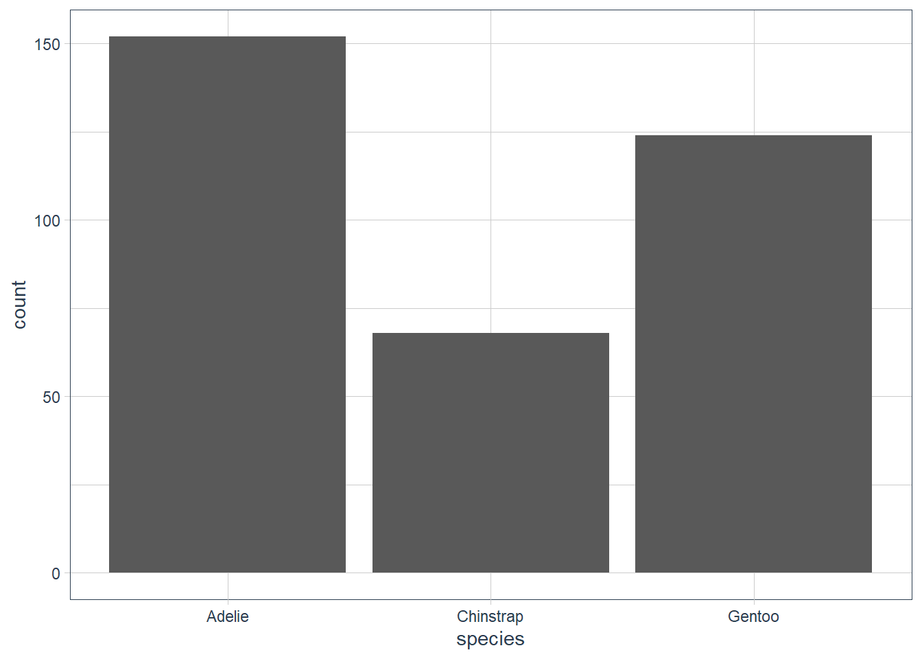
ggplot(data = penguins) +
  geom_bar(aes(x = sex))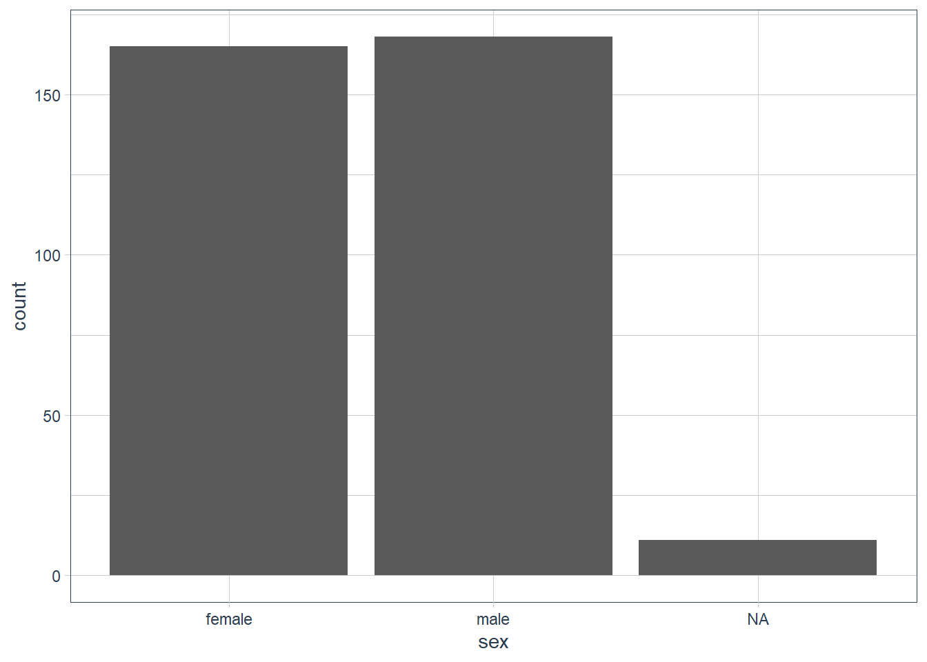
ggplot(data = penguins) +
  geom_bar(aes(x = island))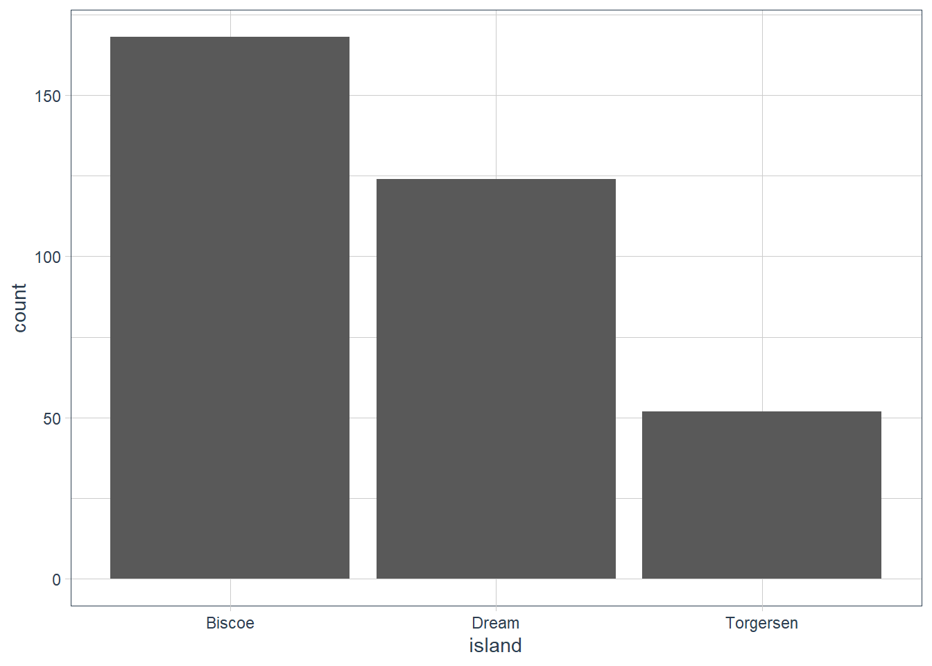
Investigate Continuous Data
ggplot(data = penguins) +
  geom_histogram(aes(x = bill_length_mm),
                 binwidth = 0.6)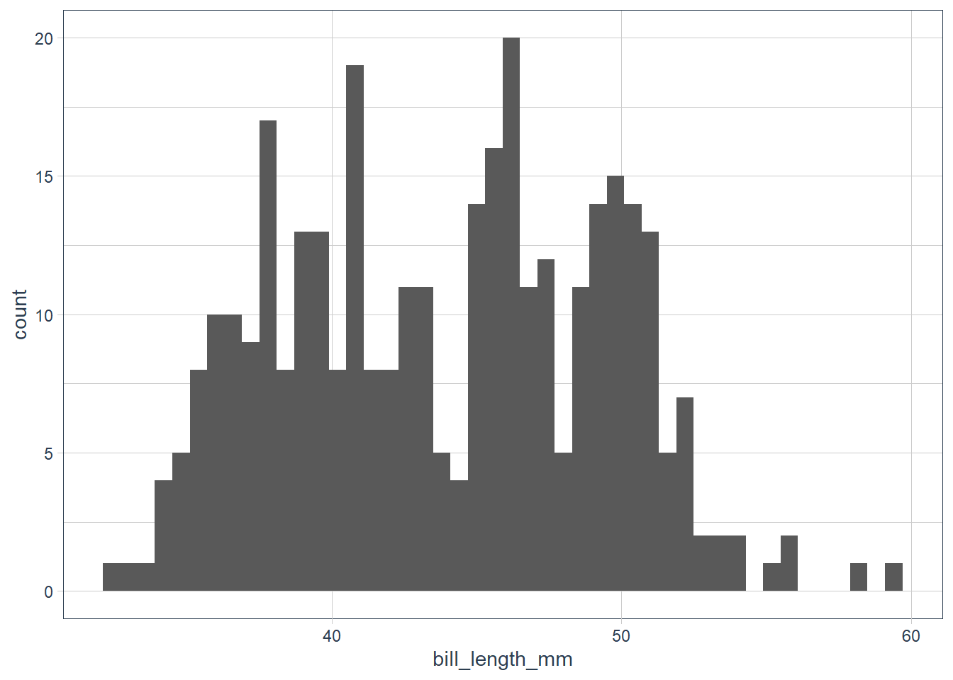
penguins %>%
  count(cut_width(bill_length_mm, 0.6))
# A tibble: 42 x 2
   `cut_width(bill_length_mm, 0.6)`     n
   <fct>                            <int>
 1 [32.1,32.7]                          1
 2 (32.7,33.3]                          1
 3 (33.3,33.9]                          1
 4 (33.9,34.5]                          3
 5 (34.5,35.1]                          5
 6 (35.1,35.7]                          6
 7 (35.7,36.3]                         13
 8 (36.3,36.9]                          9
 9 (36.9,37.5]                          8
10 (37.5,38.1]                         15
# ... with 32 more rows
The data looks bimodal - i.e. there are 2 bumps in the distribution. If we recall we have 3 species, so let’s fill in the bars based on the species.
ggplot(data = penguins) +
  geom_histogram(aes(x = bill_length_mm, fill = species),
                 alpha = 0.5,
                 binwidth = 0.6) +
  scale_fill_tq()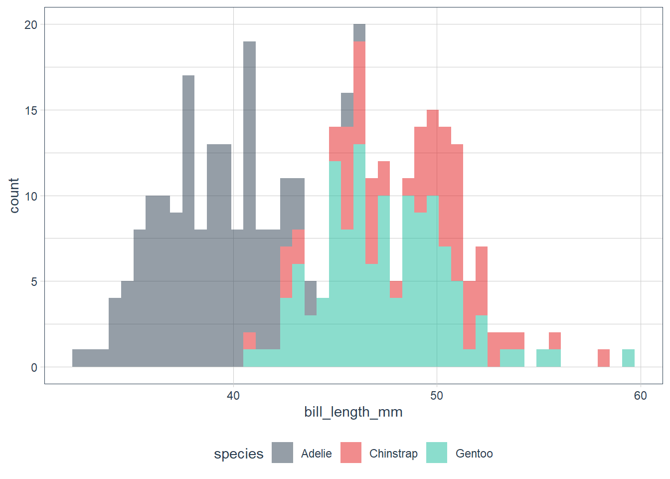
penguins %>%
  group_by(species) %>%
  count(cut_width(bill_length_mm, 0.6))
# A tibble: 71 x 3
# Groups:   species [3]
   species `cut_width(bill_length_mm, 0.6)`     n
   <fct>   <fct>                            <int>
 1 Adelie  [32.1,32.7]                          1
 2 Adelie  (32.7,33.3]                          1
 3 Adelie  (33.3,33.9]                          1
 4 Adelie  (33.9,34.5]                          3
 5 Adelie  (34.5,35.1]                          5
 6 Adelie  (35.1,35.7]                          6
 7 Adelie  (35.7,36.3]                         13
 8 Adelie  (36.3,36.9]                          9
 9 Adelie  (36.9,37.5]                          8
10 Adelie  (37.5,38.1]                         15
# ... with 61 more rows
When we have overlapping histograms, the suggestion is to use geom_freqpoly() which uses lines instead of bars.
ggplot(data = penguins) +
  geom_freqpoly(aes(x = bill_length_mm, colour = species),
                binwidth = 0.6) +
  scale_fill_tq()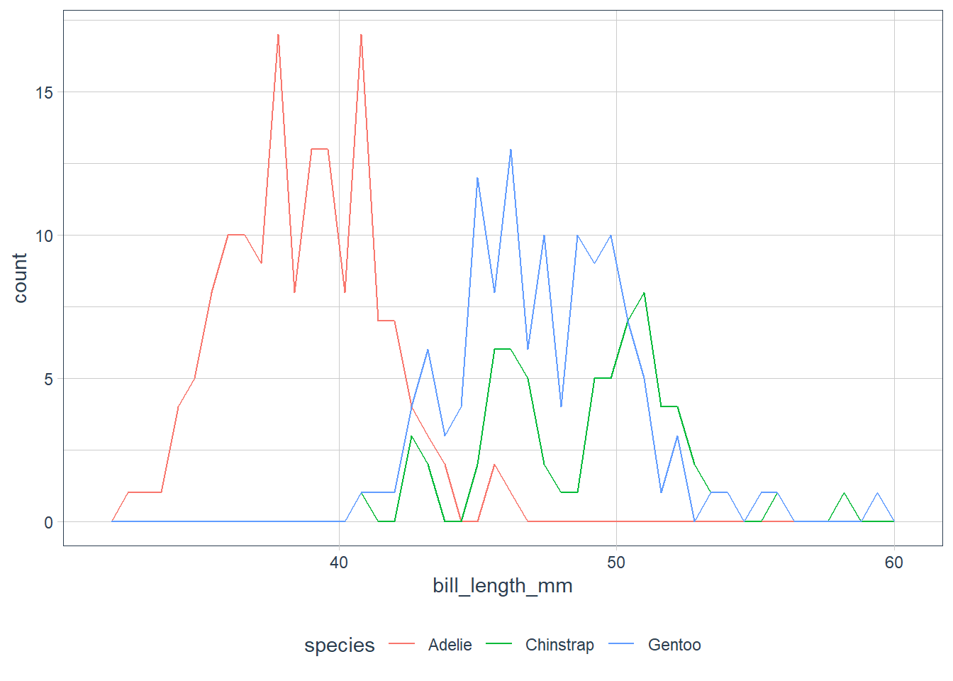
Looking at the plots ask some questions of your data:
Which values are the most common? Why?
Which values are rare? Why? Does that match your expectations?
Can you see any unusual patterns? What might explain them?
Clusters of similar values suggest that subgroups exist in your data. To understand the subgroups, ask:
How are the observations within each cluster similar to each other?
How are the observations in separate clusters different from each other?
How can you explain or describe the clusters?
Why might the appearance of clusters be misleading?
Investigate Unusual Values
Outliers are observations that don’t seem to gel nicely with the rest of the data.
Here the long y-axis indicates some outliers.
ggplot(data = diamonds) +
  # y is a var in the dataset! it measures one of the
  # dimensions of the diamond
  geom_histogram(aes(x = y),
                 binwidth = 0.5)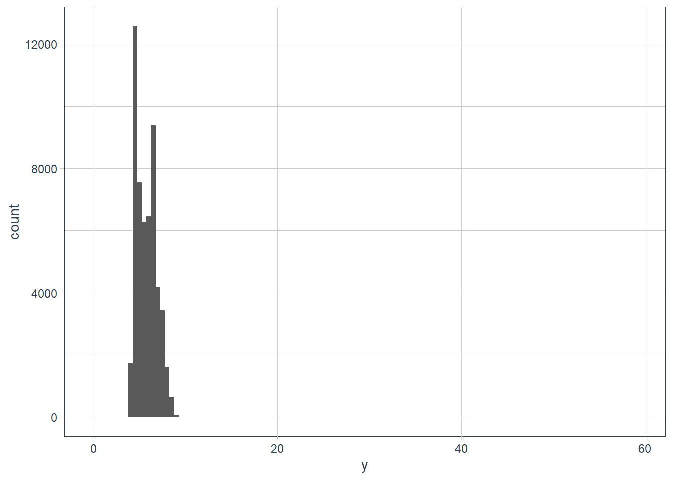
To zoom in lets use coord_cartesian() with the ylim variable.
The coord_cartesian() also has an xlim to zoom into the x-axis.
ggplot(data = diamonds) +
  geom_histogram(mapping = aes(x = y), binwidth = 0.5) +
  # limit the y-axis to btw 0-50! Note to self: DON'T CONFUSE with the x-axis
  # which is named `y`!!
  coord_cartesian(ylim = c(0,50)) +
  labs(x = "The variable y in the diamonds dataset")
# zoom into the unusual values
(unusual <- diamonds %>%
    filter(y < 3 | y > 20) %>%
    arrange(y)) %>%
  print(width = Inf) # print the whole dataset so we can see all cols
# A tibble: 9 x 10
carat cut color clarity depth table price x y z
<dbl> <ord> <ord> <ord> <dbl> <dbl> <int> <dbl> <dbl> <dbl>
1 1 Very Good H VS2 63.3 53 5139 0 0 0
2 1.14 Fair G VS1 57.5 67 6381 0 0 0
3 1.56 Ideal G VS2 62.2 54 12800 0 0 0
4 1.2 Premium D VVS1 62.1 59 15686 0 0 0
5 2.25 Premium H SI2 62.8 59 18034 0 0 0
6 0.71 Good F SI2 64.1 60 2130 0 0 0
7 0.71 Good F SI2 64.1 60 2130 0 0 0
8 0.51 Ideal E VS1 61.8 55 2075 5.15 31.8 5.12
9 2 Premium H SI2 58.9 57 12210 8.09 58.9 8.06The y feature in the diamonds dataset measures a dimension (width, height, depth) in millimeters. A dimension of 0 mm is incorrect, and a dimension of ~32mm or ~59mm is also incorrect. Those diamonds will cost an 💪 and a 🦵!
In practice it is best to do analysis with and without your outliers.
- No difference with or without, probably safe to remove them
- Big difference with vs without, need to investigate why they are there before any action.
- In both cases, disclose the action taken in your analysis.
Exercises
Explore the distribution of each of the
x,y, andzvariables indiamonds. What do you learn? Think about a diamond and how you might decide which dimension is the length, width, and depth.ggplot(data = diamonds) + geom_histogram(aes(x=x), binwidth = 0.5)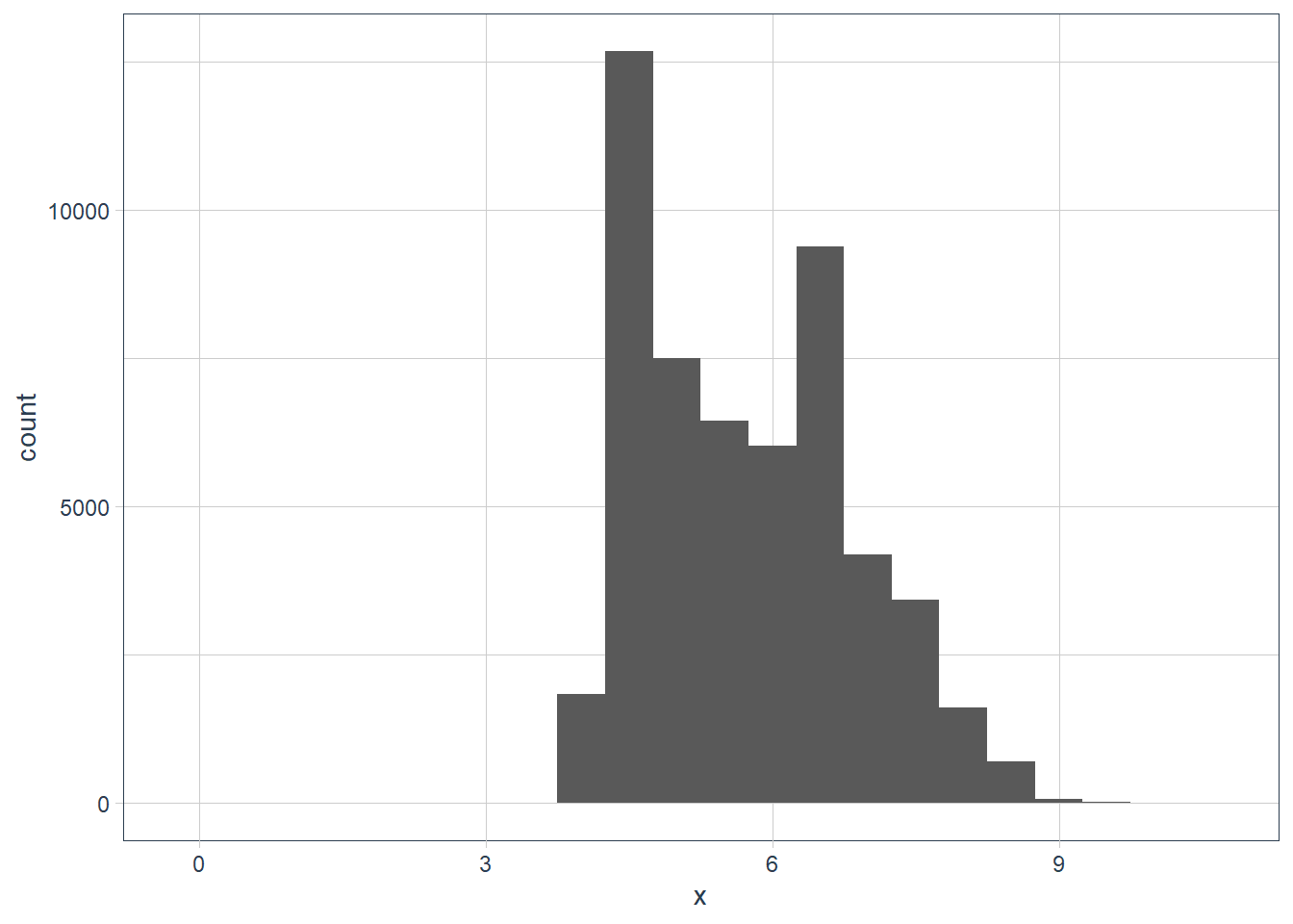
filter(diamonds, x == max(x)) %>%
  print(width = Inf)
# A tibble: 1 x 10 carat cut color clarity depth table price x y z <dbl> <ord> <ord> <ord> <dbl> <dbl> <int> <dbl> <dbl> <dbl> 1 5.01 Fair J I1 65.5 59 18018 10.7 10.5 6.98filter(diamonds, x == min(x)) %>% print(width = Inf)# A tibble: 8 x 10 carat cut color clarity depth table price x y z <dbl> <ord> <ord> <ord> <dbl> <dbl> <int> <dbl> <dbl> <dbl> 1 1.07 Ideal F SI2 61.6 56 4954 0 6.62 0 2 1 Very Good H VS2 63.3 53 5139 0 0 0 3 1.14 Fair G VS1 57.5 67 6381 0 0 0 4 1.56 Ideal G VS2 62.2 54 12800 0 0 0 5 1.2 Premium D VVS1 62.1 59 15686 0 0 0 6 2.25 Premium H SI2 62.8 59 18034 0 0 0 7 0.71 Good F SI2 64.1 60 2130 0 0 0 8 0.71 Good F SI2 64.1 60 2130 0 0 0diamonds %>% filter(x != 0) %>% filter(x == min(x)) %>% print(width = Inf)# A tibble: 2 x 10 carat cut color clarity depth table price x y z <dbl> <ord> <ord> <ord> <dbl> <dbl> <int> <dbl> <dbl> <dbl> 1 0.2 Premium F VS2 62.6 59 367 3.73 3.71 2.33 2 0.2 Premium D VS2 62.3 60 367 3.73 3.68 2.31ggplot(data = diamonds) + geom_histogram(aes(x = x), binwidth = 0.5) + coord_cartesian(xlim = c(0, 1), ylim = c(0, 10))
ggplot(data = diamonds) +
  geom_histogram(aes(x = y),
                 binwidth = 0.5)
filter(diamonds, y == max(y)) %>%
  print(width = Inf)
# A tibble: 1 x 10 carat cut color clarity depth table price x y z <dbl> <ord> <ord> <ord> <dbl> <dbl> <int> <dbl> <dbl> <dbl> 1 2 Premium H SI2 58.9 57 12210 8.09 58.9 8.06filter(diamonds, y == min(y)) %>% print(width = Inf)# A tibble: 7 x 10 carat cut color clarity depth table price x y z <dbl> <ord> <ord> <ord> <dbl> <dbl> <int> <dbl> <dbl> <dbl> 1 1 Very Good H VS2 63.3 53 5139 0 0 0 2 1.14 Fair G VS1 57.5 67 6381 0 0 0 3 1.56 Ideal G VS2 62.2 54 12800 0 0 0 4 1.2 Premium D VVS1 62.1 59 15686 0 0 0 5 2.25 Premium H SI2 62.8 59 18034 0 0 0 6 0.71 Good F SI2 64.1 60 2130 0 0 0 7 0.71 Good F SI2 64.1 60 2130 0 0 0diamonds %>% filter(y != 0) %>% filter(y == min(y)) %>% print(width = Inf)# A tibble: 1 x 10 carat cut color clarity depth table price x y z <dbl> <ord> <ord> <ord> <dbl> <dbl> <int> <dbl> <dbl> <dbl> 1 0.2 Premium D VS2 62.3 60 367 3.73 3.68 2.31diamonds %>% filter(y < 10) %>% filter(y == max(y)) %>% print(width = Inf)# A tibble: 2 x 10 carat cut color clarity depth table price x y z <dbl> <ord> <ord> <ord> <dbl> <dbl> <int> <dbl> <dbl> <dbl> 1 4.01 Premium J I1 62.5 62 15223 10.0 9.94 6.24 2 4 Very Good I I1 63.3 58 15984 10.0 9.94 6.31ggplot(data = diamonds) + geom_histogram(aes(x = z), binwidth = 0.5)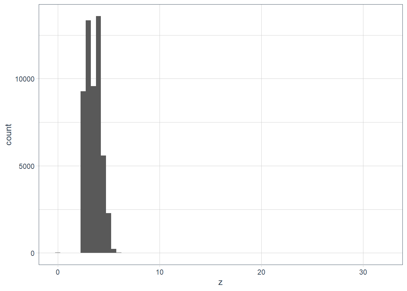
filter(diamonds, z == max(z)) %>%
  print(width = Inf)
# A tibble: 1 x 10 carat cut color clarity depth table price x y z <dbl> <ord> <ord> <ord> <dbl> <dbl> <int> <dbl> <dbl> <dbl> 1 0.51 Very Good E VS1 61.8 54.7 1970 5.12 5.15 31.8filter(diamonds, z == min(z)) %>% print(width = Inf)# A tibble: 20 x 10 carat cut color clarity depth table price x y z <dbl> <ord> <ord> <ord> <dbl> <dbl> <int> <dbl> <dbl> <dbl> 1 1 Premium G SI2 59.1 59 3142 6.55 6.48 0 2 1.01 Premium H I1 58.1 59 3167 6.66 6.6 0 3 1.1 Premium G SI2 63 59 3696 6.5 6.47 0 4 1.01 Premium F SI2 59.2 58 3837 6.5 6.47 0 5 1.5 Good G I1 64 61 4731 7.15 7.04 0 6 1.07 Ideal F SI2 61.6 56 4954 0 6.62 0 7 1 Very Good H VS2 63.3 53 5139 0 0 0 8 1.15 Ideal G VS2 59.2 56 5564 6.88 6.83 0 9 1.14 Fair G VS1 57.5 67 6381 0 0 0 10 2.18 Premium H SI2 59.4 61 12631 8.49 8.45 0 11 1.56 Ideal G VS2 62.2 54 12800 0 0 0 12 2.25 Premium I SI1 61.3 58 15397 8.52 8.42 0 13 1.2 Premium D VVS1 62.1 59 15686 0 0 0 14 2.2 Premium H SI1 61.2 59 17265 8.42 8.37 0 15 2.25 Premium H SI2 62.8 59 18034 0 0 0 16 2.02 Premium H VS2 62.7 53 18207 8.02 7.95 0 17 2.8 Good G SI2 63.8 58 18788 8.9 8.85 0 18 0.71 Good F SI2 64.1 60 2130 0 0 0 19 0.71 Good F SI2 64.1 60 2130 0 0 0 20 1.12 Premium G I1 60.4 59 2383 6.71 6.67 0unusual_z <- diamonds %>% filter(z < 2 | z > 10) ggplot(data = unusual_z) + geom_histogram(aes(x = z), binwidth = 0.5) + coord_cartesian(xlim = c(0, 35), ylim = c(0, 25))
diamonds %>%
  select(x, y, z) %>%
  filter(x != 0,
         y != 0,
         z != 0) %>%
  skim()
Data summary Name Piped data Number of rows 53920 Number of columns 3 _______________________ Column type frequency: numeric 3 ________________________ Group variables None Variable type: numeric
skim_variable n_missing complete_rate mean sd p0 p25 p50 p75 p100 hist x 0 1 5.73 1.12 3.73 4.71 5.70 6.54 10.74 ▇▇▅▁▁ y 0 1 5.73 1.14 3.68 4.72 5.71 6.54 58.90 ▇▁▁▁▁ z 0 1 3.54 0.70 1.07 2.91 3.53 4.04 31.80 ▇▁▁▁▁ So it turns out a diamond has a table, width and depth.
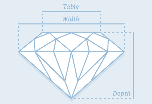
Credit: https://www.diamonds.pro/
x and y could be depth or width - there’s not much difference between the 2 values. The z is likely to be the
tablesince it is smaller.But looking at the
?diamondshelp page x = length, y = width and z = depth, and there is actually a table variable that is a relative measure 🤷, so there goes my “theory” 🤦.Explore the distribution of
price. Do you discover anything unusual or surprising? (Hint: Carefully think about thebinwidthand make sure you try a wide range of values.)ggplot(data = diamonds) + geom_histogram(aes(x = price), bins = 20)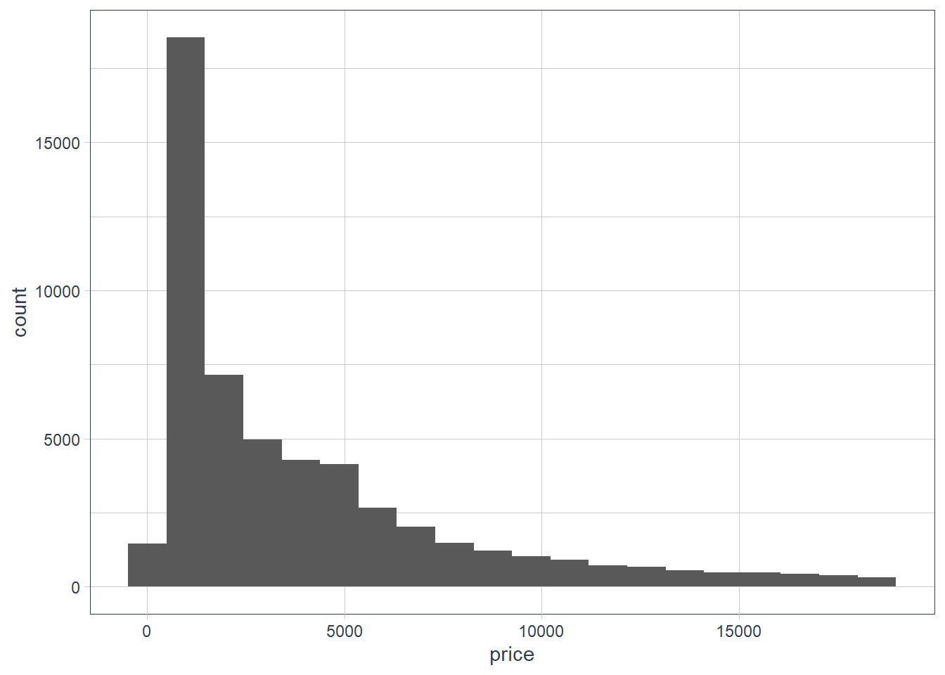
ggplot(data = diamonds) +
  geom_histogram(aes(x = price), binwidth = 1000)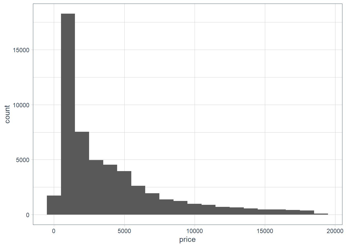
ggplot(data = diamonds) +
  geom_histogram(aes(x = price), binwidth = 200)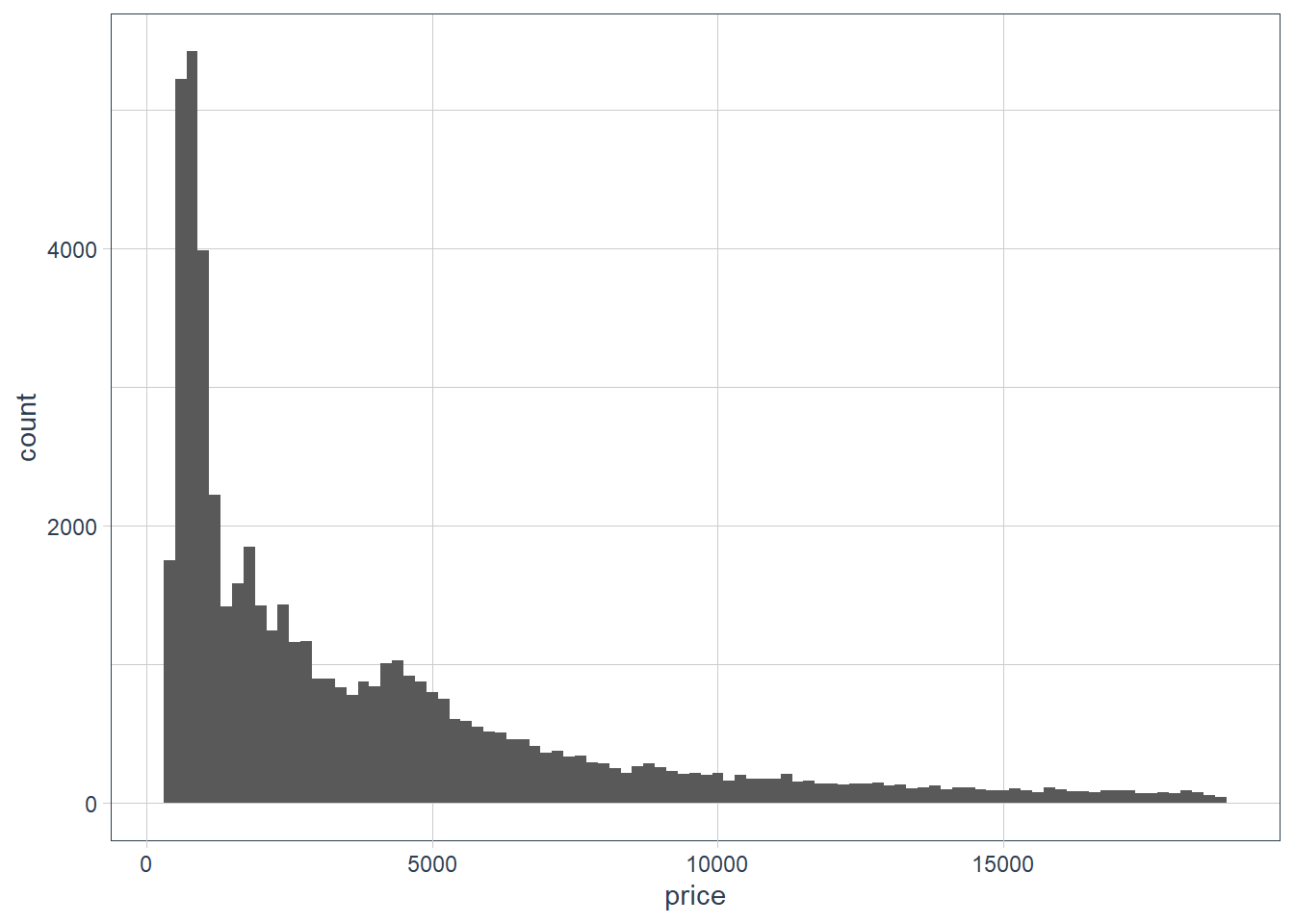
ggplot(data = diamonds) +
  geom_histogram(aes(x = price), binwidth = 500)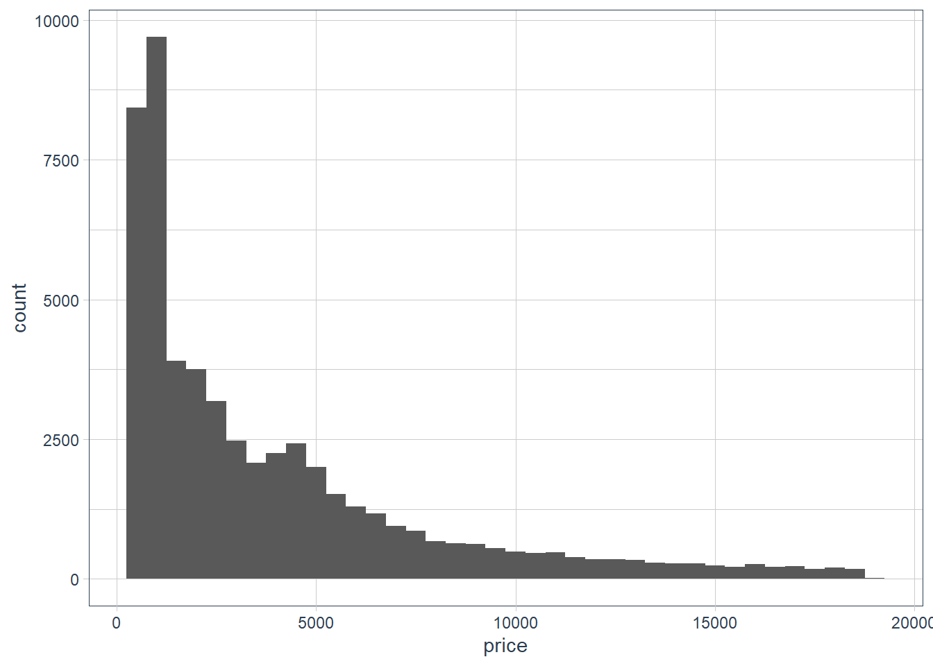
diamonds %>%
  select(price) %>%
  skim()
Data summary Name Piped data Number of rows 53940 Number of columns 1 _______________________ Column type frequency: numeric 1 ________________________ Group variables None Variable type: numeric
skim_variable n_missing complete_rate mean sd p0 p25 p50 p75 p100 hist price 0 1 3932.8 3989.44 326 950 2401 5324.25 18823 ▇▂▁▁▁ diamonds %>% filter(price == 326 | price == 18823) %>% gt()carat cut color clarity depth table price x y z 0.23 Ideal E SI2 61.5 55 326 3.95 3.98 2.43 0.21 Premium E SI1 59.8 61 326 3.89 3.84 2.31 2.29 Premium I VS2 60.8 60 18823 8.50 8.47 5.16 diamonds %>% arrange(-carat) %>% head(10) %>% gt()carat cut color clarity depth table price x y z 5.01 Fair J I1 65.5 59 18018 10.74 10.54 6.98 4.50 Fair J I1 65.8 58 18531 10.23 10.16 6.72 4.13 Fair H I1 64.8 61 17329 10.00 9.85 6.43 4.01 Premium I I1 61.0 61 15223 10.14 10.10 6.17 4.01 Premium J I1 62.5 62 15223 10.02 9.94 6.24 4.00 Very Good I I1 63.3 58 15984 10.01 9.94 6.31 3.67 Premium I I1 62.4 56 16193 9.86 9.81 6.13 3.65 Fair H I1 67.1 53 11668 9.53 9.48 6.38 3.51 Premium J VS2 62.5 59 18701 9.66 9.63 6.03 3.50 Ideal H I1 62.8 57 12587 9.65 9.59 6.03 The prices range from $326 to $18823. The carat of the high priced $18823 diamond is 2.29. There are other diamonds where the carat is bigger, and the cut is also Premium yet the price is lower. So it seems diamond pricing considers many factors, and could also be determined on who is doing the selling.
How many diamonds are 0.99 carat? How many are 1 carat? What do you think is the cause of the difference?
diamonds %>%
  filter(
         carat == 1 |
         carat == 0.99
        ) %>%
  count(carat, sort = TRUE)
# A tibble: 2 x 2 carat n <dbl> <int> 1 1 1558 2 0.99 23sample_test <- diamonds %>% filter(carat == 1 | carat == 0.99) %>% group_by(carat) %>% arrange(carat, price) sample_test %>% sample_n(20) %>% gt()cut color clarity depth table price x y z 0.99 Good F SI2 63.3 54 4052 6.36 6.43 4.05 Premium F VS2 62.6 55 5893 6.50 6.35 4.02 Very Good F SI2 61.2 56 4852 6.40 6.45 3.93 Fair I SI1 60.7 66 3337 6.42 6.34 3.87 Very Good D SI1 62.6 57 5671 6.34 6.37 3.98 Ideal F SI1 62.8 57 5728 6.30 6.38 3.98 Ideal H SI1 61.1 56 5287 6.44 6.47 3.94 Ideal F VS1 61.0 55 5947 6.46 6.52 3.96 Very Good F SI1 62.5 58 5112 6.36 6.38 3.98 Very Good G SI1 62.8 56 4863 6.34 6.36 3.99 Ideal F SI1 62.1 58 6038 6.33 6.40 3.95 Fair I SI2 68.1 56 2811 6.21 6.06 4.18 Fair H VS2 71.6 57 3593 5.94 5.80 4.20 Very Good J SI1 60.3 57 4002 6.44 6.49 3.90 Very Good F VS2 61.8 57 6094 6.37 6.39 3.94 Ideal I SI1 61.8 57 4763 6.40 6.42 3.96 Very Good E SI2 61.8 59 4780 6.30 6.33 3.90 Premium F SI2 60.6 61 4075 6.45 6.38 3.89 Very Good D SI2 62.5 57 4993 6.30 6.34 3.95 Fair J I1 73.6 60 1789 6.01 5.80 4.35 1 Very Good H SI1 62.1 58 5247 6.44 6.45 4.00 Very Good D SI1 60.1 60 4697 6.47 6.55 3.91 Premium H SI1 62.7 60 4469 6.30 6.24 3.93 Ideal E SI1 61.9 56 5458 6.37 6.45 3.97 Premium E VS2 63.0 58 7168 6.25 6.22 3.93 Good H VS1 61.8 61 5219 6.40 6.31 3.93 Very Good D IF 63.3 59 16073 6.37 6.33 4.02 Good D SI2 64.0 54 3304 6.29 6.24 4.01 Premium H VS2 61.5 61 5000 6.45 6.40 3.95 Fair F SI1 64.8 59 5292 6.29 6.24 4.06 Ideal E SI2 62.0 57 4623 6.37 6.41 3.96 Premium D SI1 61.5 60 5488 6.38 6.34 3.91 Premium G VS1 60.6 59 6115 6.48 6.42 3.91 Very Good I SI1 58.5 61 4649 6.51 6.55 3.82 Premium D SI2 61.6 58 4626 6.45 6.37 3.95 Premium H VS2 62.6 59 5320 6.37 6.31 3.97 Premium H SI2 62.8 60 3080 6.46 6.34 4.02 Ideal D SI1 63.0 56 4592 6.33 6.28 3.97 Premium F SI1 59.7 60 4939 6.51 6.48 3.88 Ideal G VS2 58.9 60 6235 6.53 6.58 3.86 sample_test %>% select(cut, price) %>% skim()Data summary Name Piped data Number of rows 1581 Number of columns 3 _______________________ Column type frequency: factor 1 numeric 1 ________________________ Group variables carat Variable type: factor
skim_variable carat n_missing complete_rate ordered n_unique top_counts cut 0.99 0 1 TRUE 5 Ver: 8, Fai: 7, Ide: 5, Pre: 2 cut 1.00 0 1 TRUE 5 Pre: 462, Ver: 389, Goo: 333, Ide: 208 Variable type: numeric
skim_variable carat n_missing complete_rate mean sd p0 p25 p50 p75 p100 hist price 0.99 0 1 4406.17 1318.99 1789 3465 4780 5479 6094 ▂▅▅▇▇ price 1.00 0 1 5241.59 1603.94 1681 4155 4864 6073 16469 ▇▇▁▁▁ The one carat diamonds are gigher in price and hugely so in the upper range.
Compare and contrast
coord_cartesian()vsxlim()orylim()when zooming in on a histogram. What happens if you leavebinwidthunset? What happens if you try and zoom so only half a bar shows?ggplot(data = diamonds) + geom_histogram(mapping = aes(x = y), binwidth = 0.5) + # limit the y-axis to btw 0-50! # Note to self: DON'T CONFUSE with the x-axis # which is named `y`!! coord_cartesian(ylim = c(0,50)) + labs(x = "The variable y in the diamonds dataset")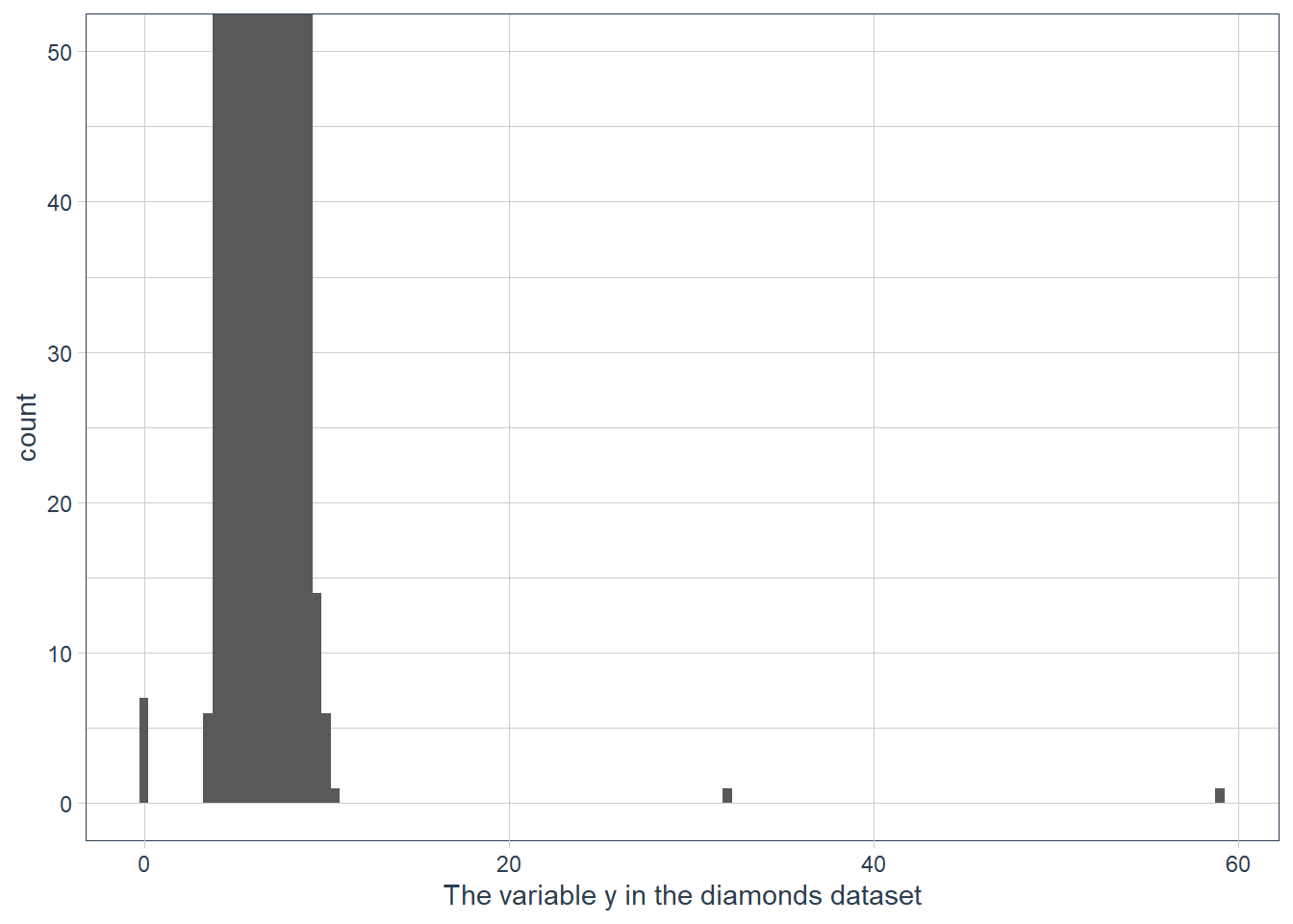
ggplot(data = diamonds) +
  geom_histogram(mapping = aes(x = y), binwidth = 0.5) +
  ylim(c(0,50)) +
  labs(x = "The variable y in the diamonds dataset")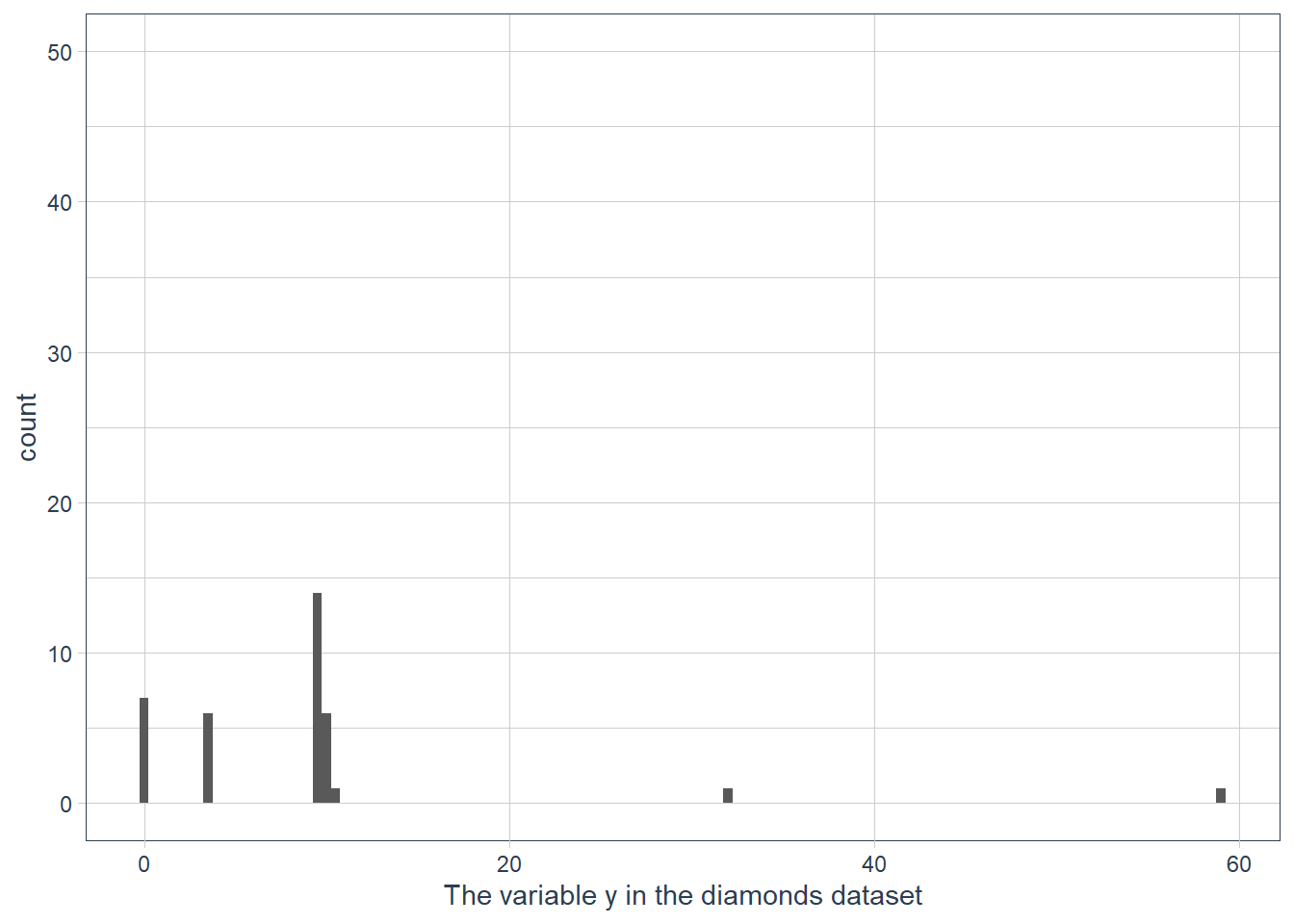
ggplot(data = diamonds) +
  geom_histogram(mapping = aes(x = y)) +
  ylim(c(0,50)) +
  labs(x = "The variable y in the diamonds dataset")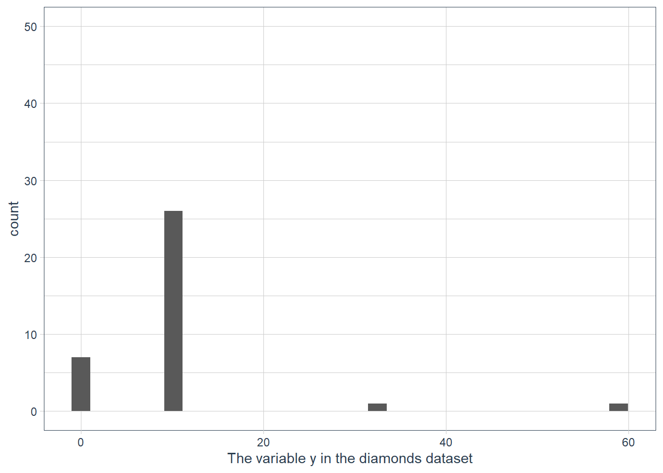
Documentation reads: “This is a shortcut for supplying the limits argument to the individual scales. Note that, by default, any values outside the limits will be replaced with NA.” So
ylim()andxlim()replace values outside the limit with NULL values resulting in the histogram being quite different to what we have when we usecoord_cartesian().If we don’t supply a binwidth ggplot defaults the number of bins to display to 30, and hence implicitly picks a binwidth for us.
Leveraging Missing Values
When you have weird values for variables, e.g. the ~59 mm for y, you may be tempted to drop these values and carry on. Often though a dataset is not nice and neat with all it’s weird values in a few observations! Usually the weird values are spread over multiple observations!
diamonds %>%
  mutate(row_num = row_number()) %>%
  filter(x==0 | y==0 | z==0) %>%
gt()| carat | cut | color | clarity | depth | table | price | x | y | z | row_num |
|---|---|---|---|---|---|---|---|---|---|---|
| 1.00 | Premium | G | SI2 | 59.1 | 59 | 3142 | 6.55 | 6.48 | 0 | 2208 |
| 1.01 | Premium | H | I1 | 58.1 | 59 | 3167 | 6.66 | 6.60 | 0 | 2315 |
| 1.10 | Premium | G | SI2 | 63.0 | 59 | 3696 | 6.50 | 6.47 | 0 | 4792 |
| 1.01 | Premium | F | SI2 | 59.2 | 58 | 3837 | 6.50 | 6.47 | 0 | 5472 |
| 1.50 | Good | G | I1 | 64.0 | 61 | 4731 | 7.15 | 7.04 | 0 | 10168 |
| 1.07 | Ideal | F | SI2 | 61.6 | 56 | 4954 | 0.00 | 6.62 | 0 | 11183 |
| 1.00 | Very Good | H | VS2 | 63.3 | 53 | 5139 | 0.00 | 0.00 | 0 | 11964 |
| 1.15 | Ideal | G | VS2 | 59.2 | 56 | 5564 | 6.88 | 6.83 | 0 | 13602 |
| 1.14 | Fair | G | VS1 | 57.5 | 67 | 6381 | 0.00 | 0.00 | 0 | 15952 |
| 2.18 | Premium | H | SI2 | 59.4 | 61 | 12631 | 8.49 | 8.45 | 0 | 24395 |
| 1.56 | Ideal | G | VS2 | 62.2 | 54 | 12800 | 0.00 | 0.00 | 0 | 24521 |
| 2.25 | Premium | I | SI1 | 61.3 | 58 | 15397 | 8.52 | 8.42 | 0 | 26124 |
| 1.20 | Premium | D | VVS1 | 62.1 | 59 | 15686 | 0.00 | 0.00 | 0 | 26244 |
| 2.20 | Premium | H | SI1 | 61.2 | 59 | 17265 | 8.42 | 8.37 | 0 | 27113 |
| 2.25 | Premium | H | SI2 | 62.8 | 59 | 18034 | 0.00 | 0.00 | 0 | 27430 |
| 2.02 | Premium | H | VS2 | 62.7 | 53 | 18207 | 8.02 | 7.95 | 0 | 27504 |
| 2.80 | Good | G | SI2 | 63.8 | 58 | 18788 | 8.90 | 8.85 | 0 | 27740 |
| 0.71 | Good | F | SI2 | 64.1 | 60 | 2130 | 0.00 | 0.00 | 0 | 49557 |
| 0.71 | Good | F | SI2 | 64.1 | 60 | 2130 | 0.00 | 0.00 | 0 | 49558 |
| 1.12 | Premium | G | I1 | 60.4 | 59 | 2383 | 6.71 | 6.67 | 0 | 51507 |
Throwing away all observations where a variable has weird values can result in a serious shrinking of your dataset.
The authors suggest that instead of throwing away the observations with weird values, rather replace them with missing values. This may sound strange since many of us have probably heard that missing values shouldn’t be used in data science! It’s usually a problem to be fixed!
But in EDA it may provide insight to either force weird values to be NA, or to investigate how missing values differ from non-missing values.
Exercises
What happens to missing values in a histogram? What happens to missing values in a bar chart? Why is there a difference?
Missing values in bar charts are plotted as a category. Missing values in a histogram are dropped.
I guess that it is easy to create one category for missing and lump all the missing variable observations into that count.
For a continuous variable where data is binned however how do you show that on a graph? The limits are continuous values e.g. from 0 - 100, -100 - 100 etc. Where should the count of NAs go on the x-axis, and y-axis given that the range that NA could represent is any number in the range of the continuous values we have for a variable.
What does
na.rm = TRUEdo inmean()andsum()?The NAs are removed and then the mean() or sum() is computed on the remaining non-NA values.
c(1,2,NA,3,4,NA,5) %>%
  mean(na.rm=TRUE)
[1] 3# (1+2+3+4+5) / 5 = 15 / 5 = 3 c(1,2,NA,3,4,NA,5) %>% sum(na.rm=TRUE)[1] 15# (1+2+3+4+5)
Covariation
Covariance is how two or more variables change together in some way. Visualisation is good for noticing these relationships.
Categorical and Continuous
Density Freq Polygons
We previously used a geom_freqpoly() for this, which doesn’t provide much use if groups are unbalanced. If one group is much smaller than the others it’s hard to see differences.
We can display density on the y-axis instead of a count. ..density.. is a count that is standardised so that the area under each curve is 1.
ggplot(penguins, aes(x = body_mass_g)) +
  geom_freqpoly(aes(colour = species), binwidth = 200)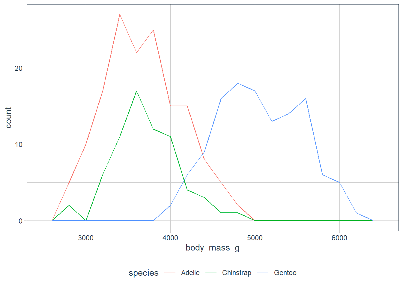
ggplot(penguins, aes(x = body_mass_g, y = ..density..)) +
  geom_freqpoly(aes(colour = species), binwidth = 200)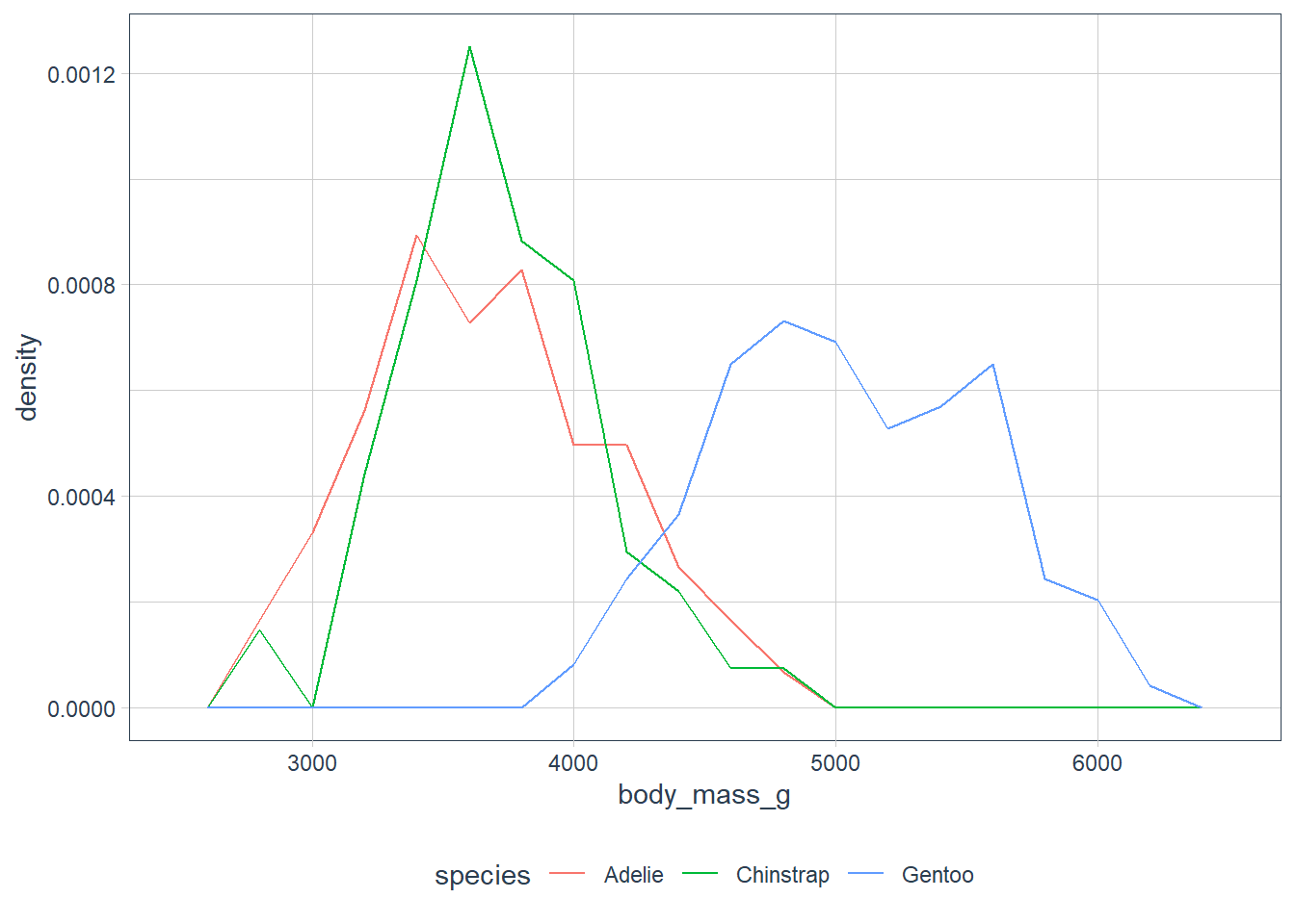
ggplot(penguins, aes(x = bill_length_mm)) +
  geom_freqpoly(aes(colour = species), binwidth = 5)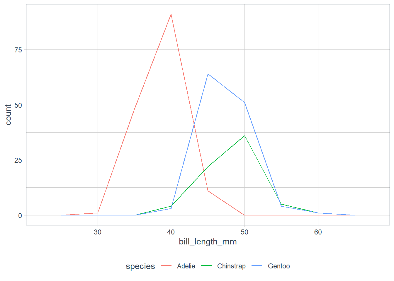
ggplot(penguins, aes(x = bill_length_mm, y = ..density..)) +
  geom_freqpoly(aes(colour = species), binwidth = 5)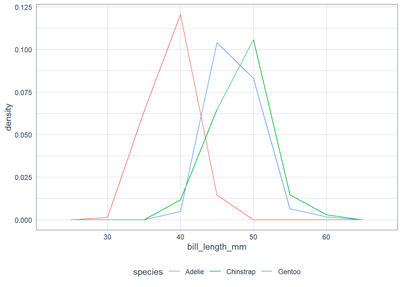
ggplot(penguins, aes(x = bill_depth_mm)) +
  geom_freqpoly(aes(colour = species), binwidth = 5)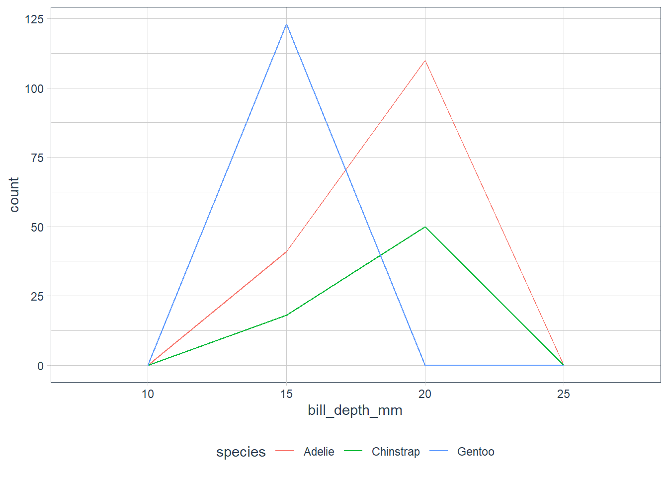
ggplot(penguins, aes(x = bill_depth_mm, y = ..density..)) +
  geom_freqpoly(aes(colour = species), binwidth = 5)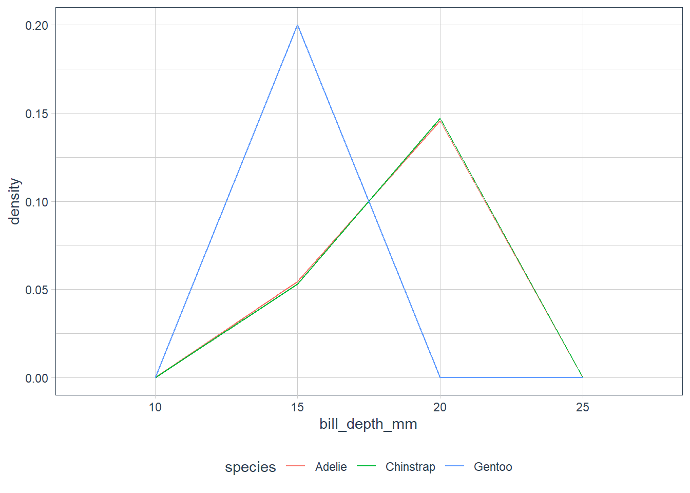
ggplot(penguins, aes(x = flipper_length_mm)) +
  geom_freqpoly(aes(colour = species), binwidth = 5)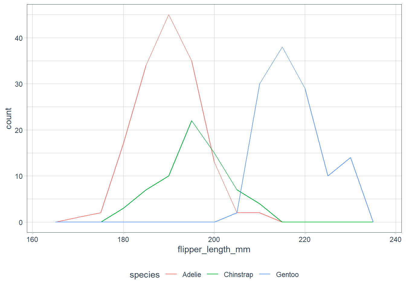
ggplot(penguins, aes(x = flipper_length_mm, y = ..density..)) +
  geom_freqpoly(aes(colour = species), binwidth = 5)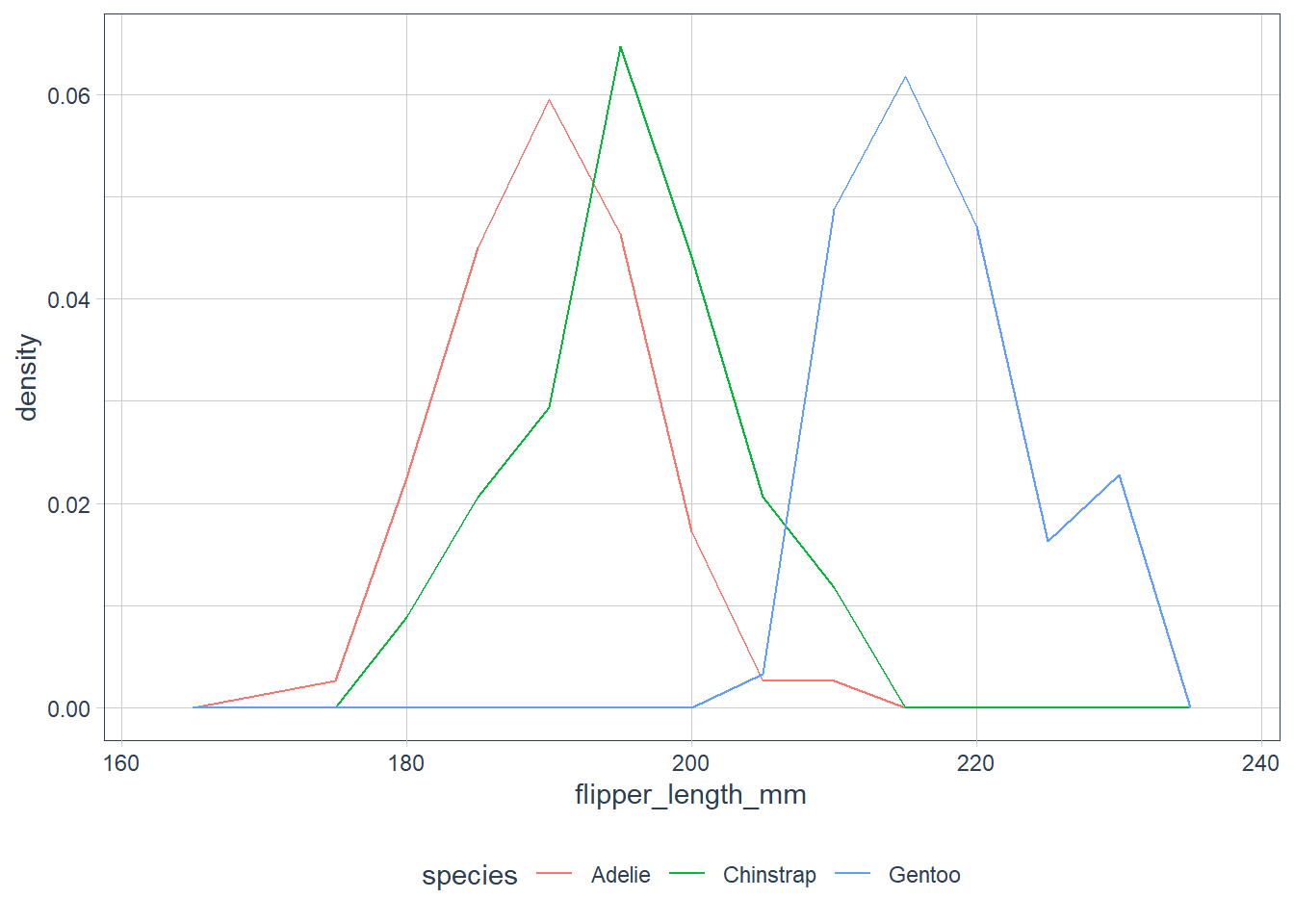
Boxplots
Verbatim from the book:
A box that stretches from the 25th percentile of the distribution to the 75th percentile, a distance known as the interquartile range (IQR). In the middle of the box is a line that displays the median, i.e. 50th percentile, of the distribution. These three lines give you a sense of the spread of the distribution and whether or not the distribution is symmetric about the median or skewed to one side.
Visual points that display observations that fall more than 1.5 times the IQR from either edge of the box. These outlying points are unusual so are plotted individually.
A line (or whisker) that extends from each end of the box and goes to the
farthest non-outlier point in the distribution.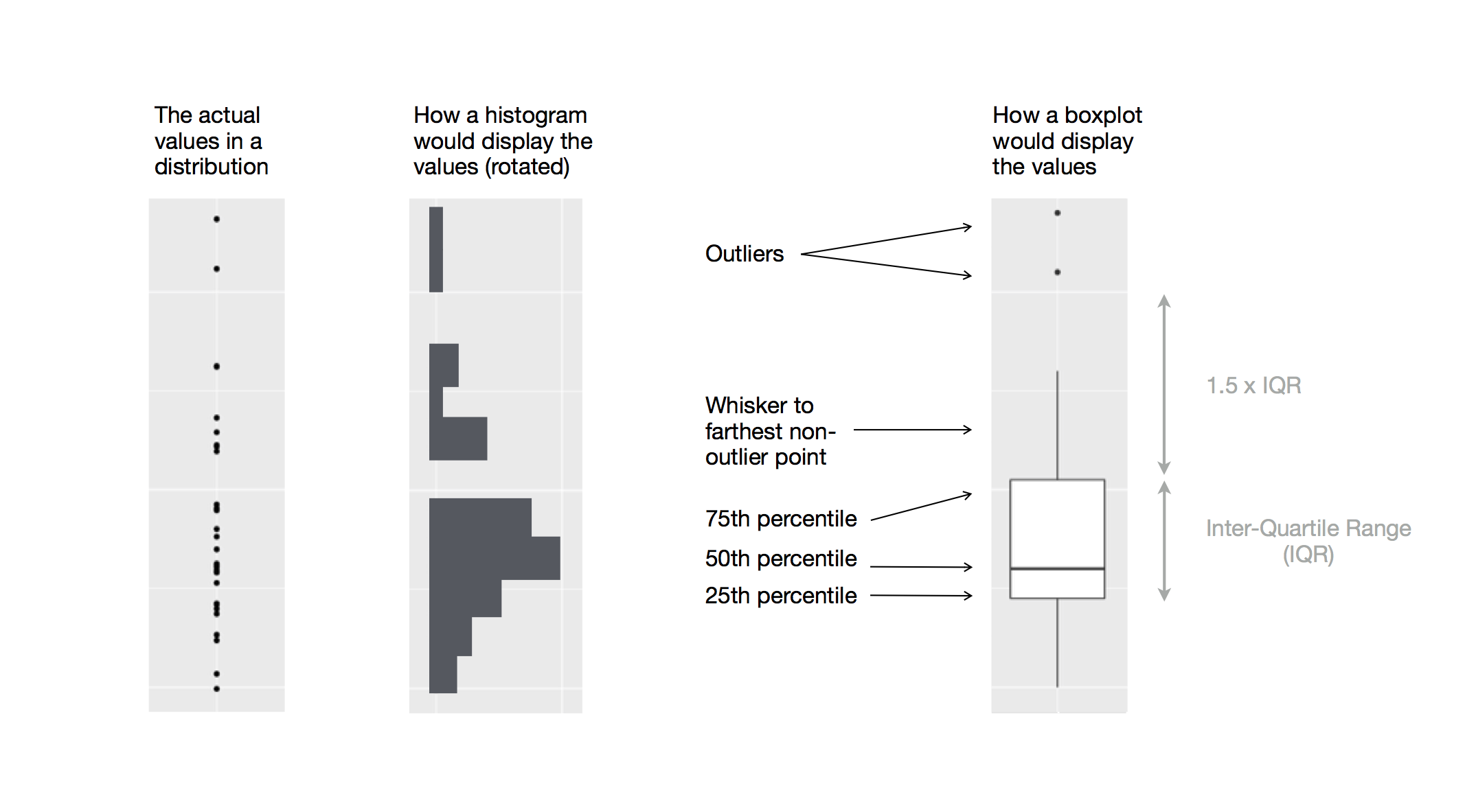
Credit: R for Data Science
ggplot(penguins, aes(x = species, y = body_mass_g)) +
  geom_boxplot()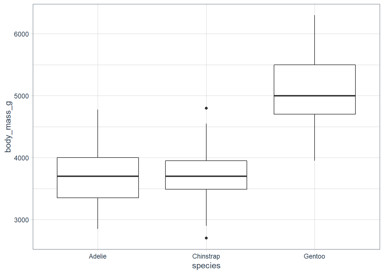
ggplot(penguins, aes(x = body_mass_g, y = species)) +
  geom_boxplot()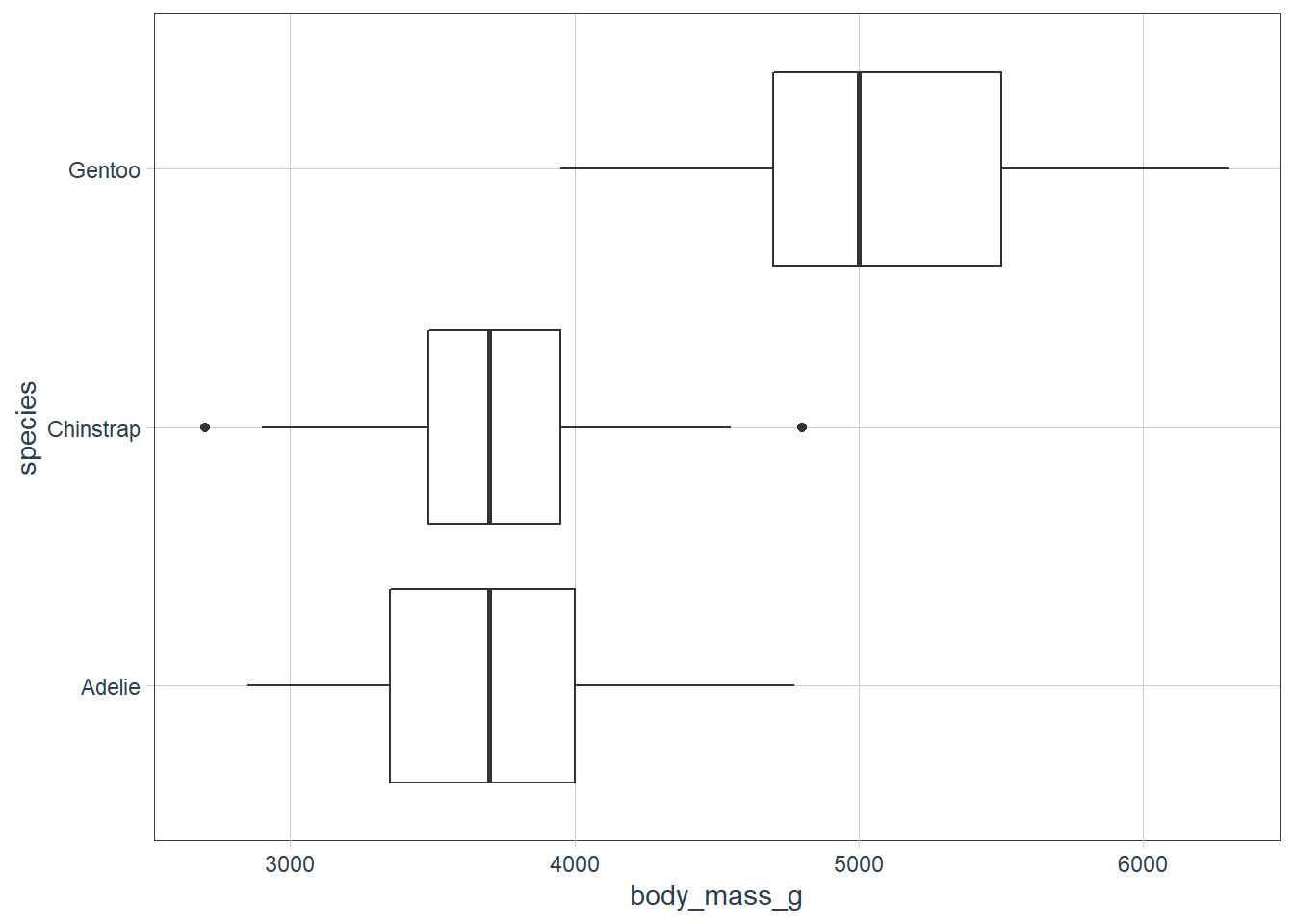
ggplot(penguins, aes(x = bill_length_mm, y = species)) +
  geom_boxplot()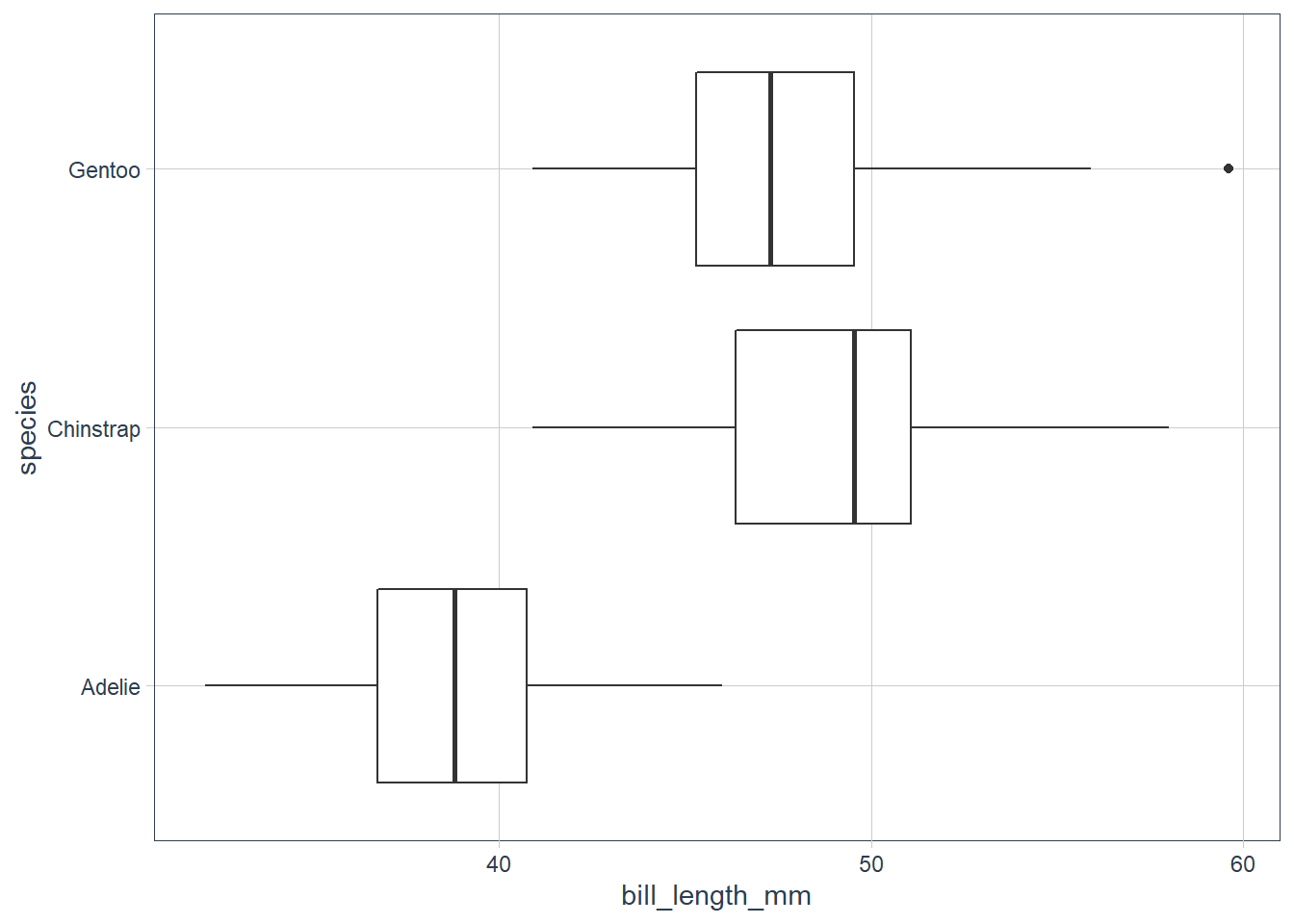
ggplot(penguins, aes(x = flipper_length_mm,
                     y = species)) +
  geom_boxplot()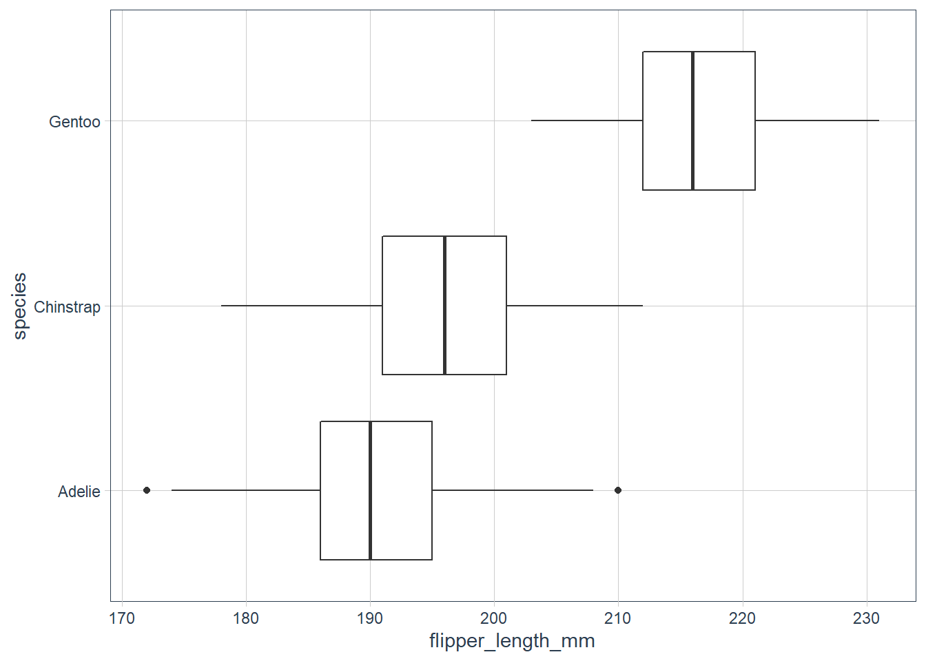
# the reorder does not seem to be working for me
ggplot(penguins, aes(y = bill_depth_mm,
                     x = reorder(species,
                                 bill_depth_mm,
                                 FUN = median))) +
  geom_boxplot()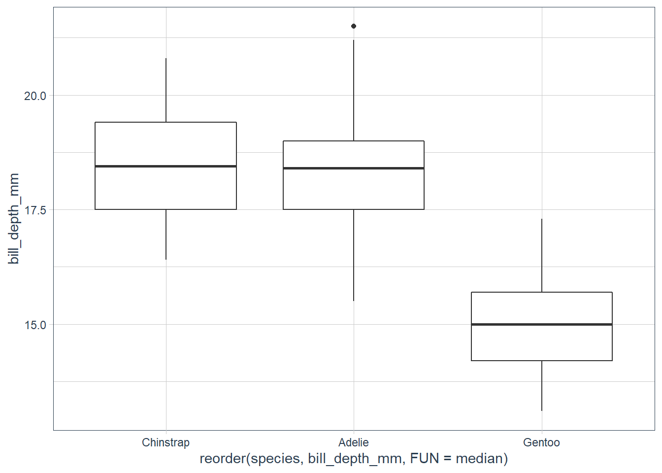
Exercises
Use what you’ve learned to improve the visualisation of the departure times of cancelled vs. non-cancelled flights.
nycflights13::flights %>%
  mutate(cancelled = is.na(dep_time),
         sched_hour = sched_dep_time %/% 100,
         sched_min = sched_dep_time %/% 100,
         sched_dep_time = sched_hour + sched_min / 60) %>%
  ggplot(aes(x = sched_dep_time, y = cancelled)) +
  geom_boxplot()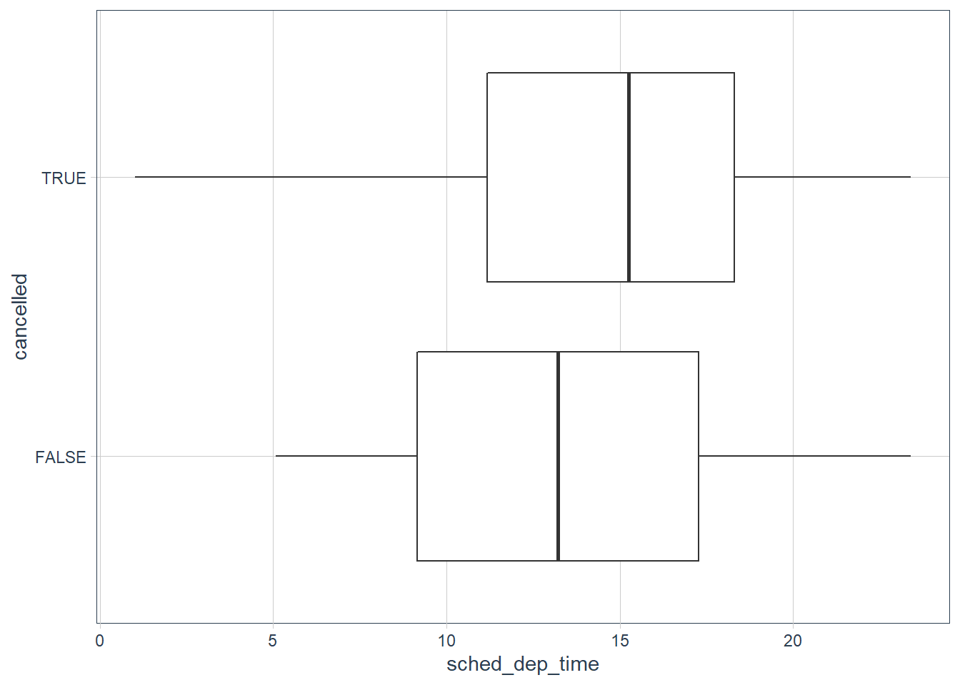
What variable in the diamonds dataset is most important for predicting the price of a diamond? How is that variable correlated with cut? Why does the combination of those two relationships lead to lower quality diamonds being more expensive?
ggplot(diamonds, aes(x = carat, y = price)) +
  geom_point()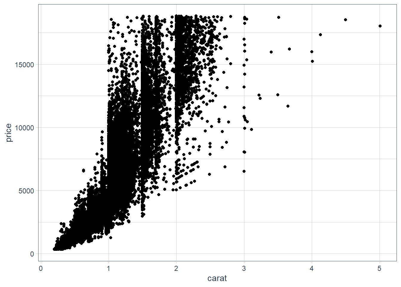
ggplot(diamonds, aes(x = reorder(cut, price,
                                 median), y = price)) +
  geom_boxplot()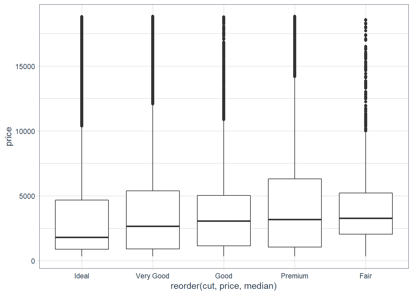
ggplot(diamonds, aes(x = reorder(color, price,
                                 median), y = price)) +
  geom_boxplot()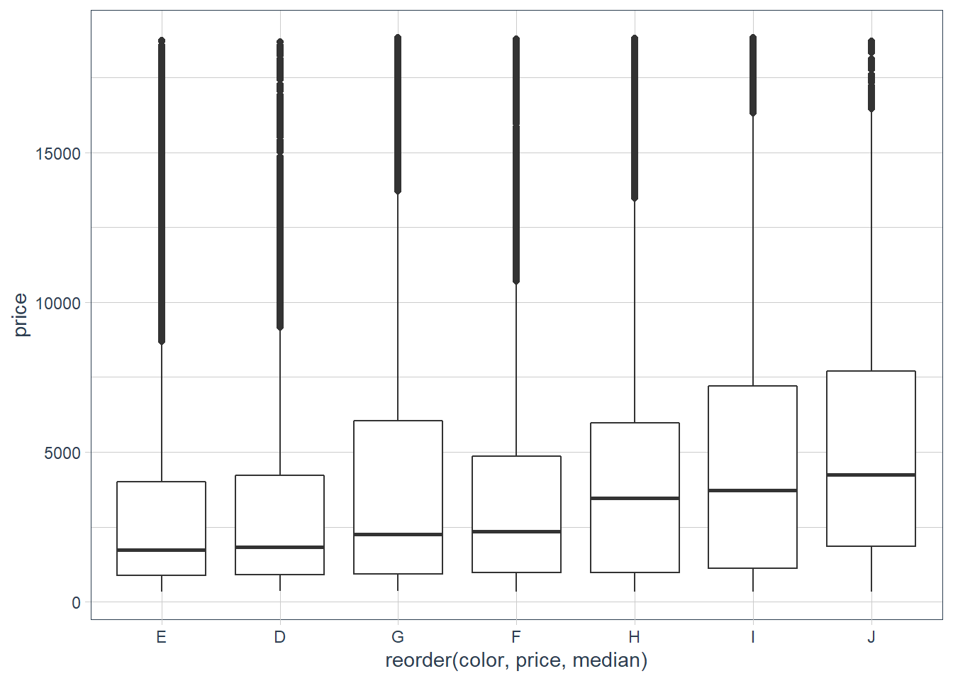
ggplot(diamonds, aes(x = reorder(clarity,
                                 price, median),
                     y = price)) +
  geom_boxplot()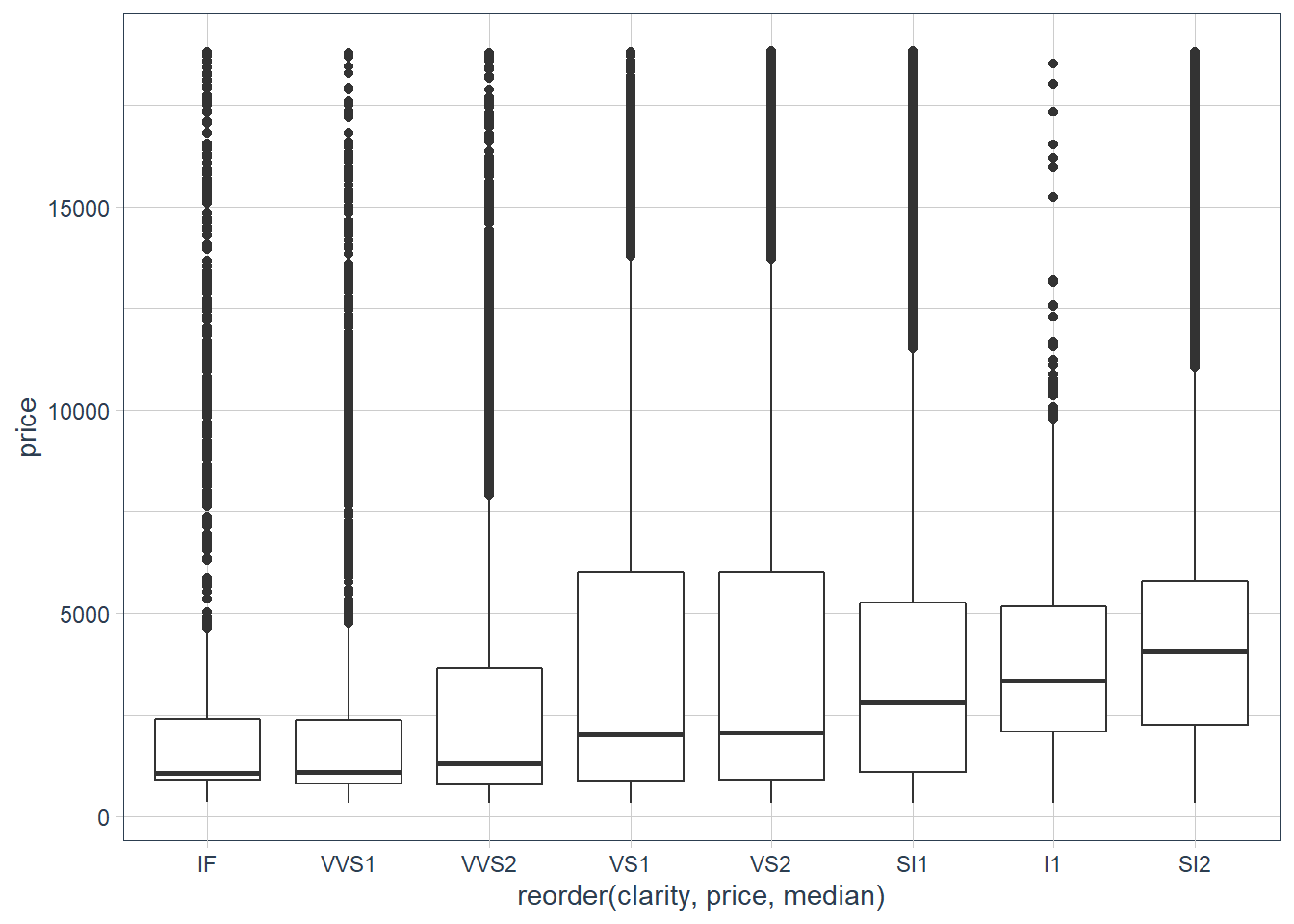
ggplot(diamonds, aes(x = reorder(cut, carat,
                                 median),
                     y = carat)) +
  geom_boxplot()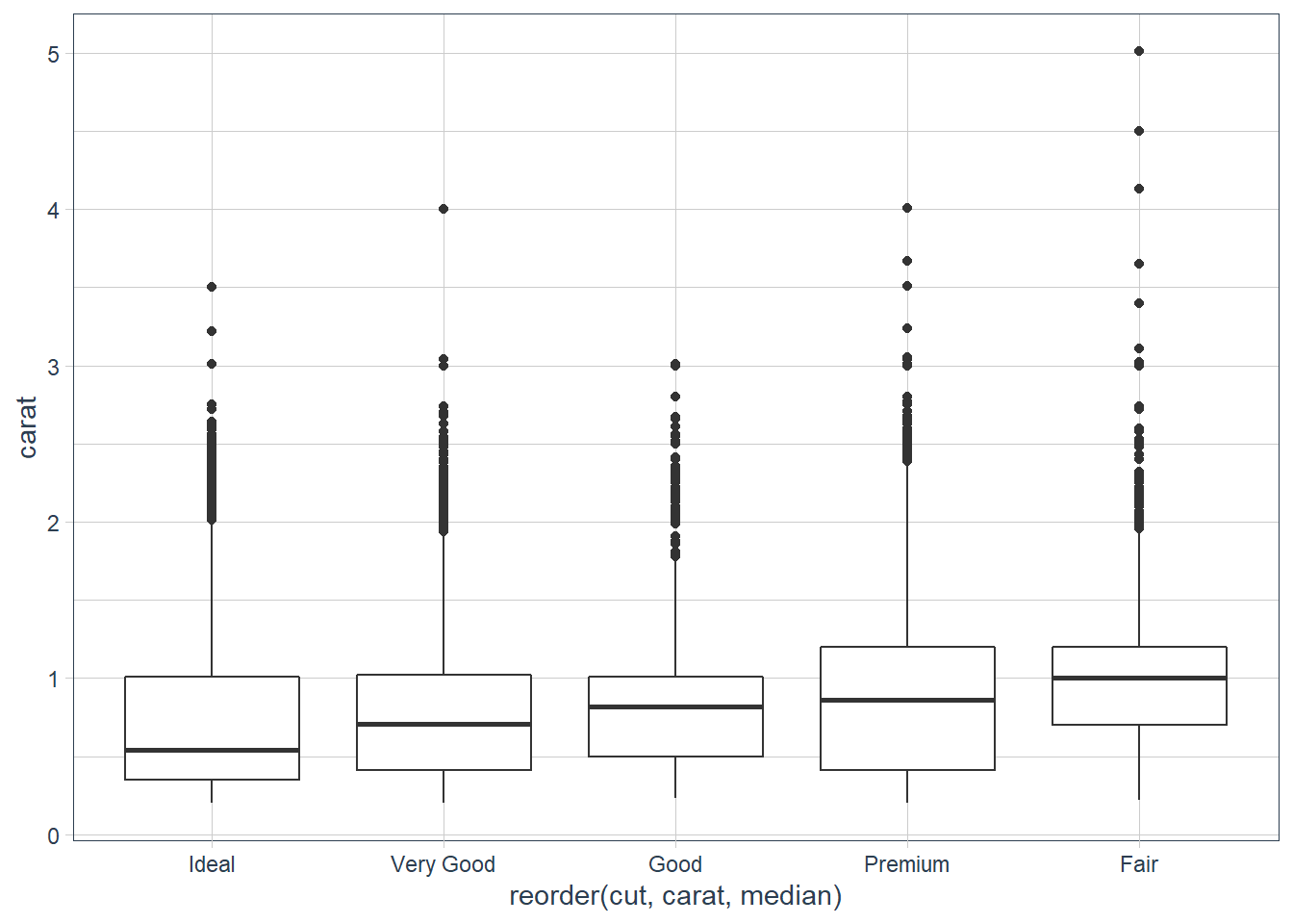
ggplot(diamonds, aes(x = reorder(color, carat,
                                 median), y = carat)) +
  geom_boxplot()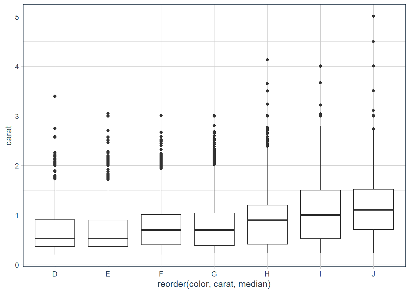
ggplot(diamonds, aes(x = reorder(clarity, carat,
                                 median), y = carat)) +
  geom_boxplot()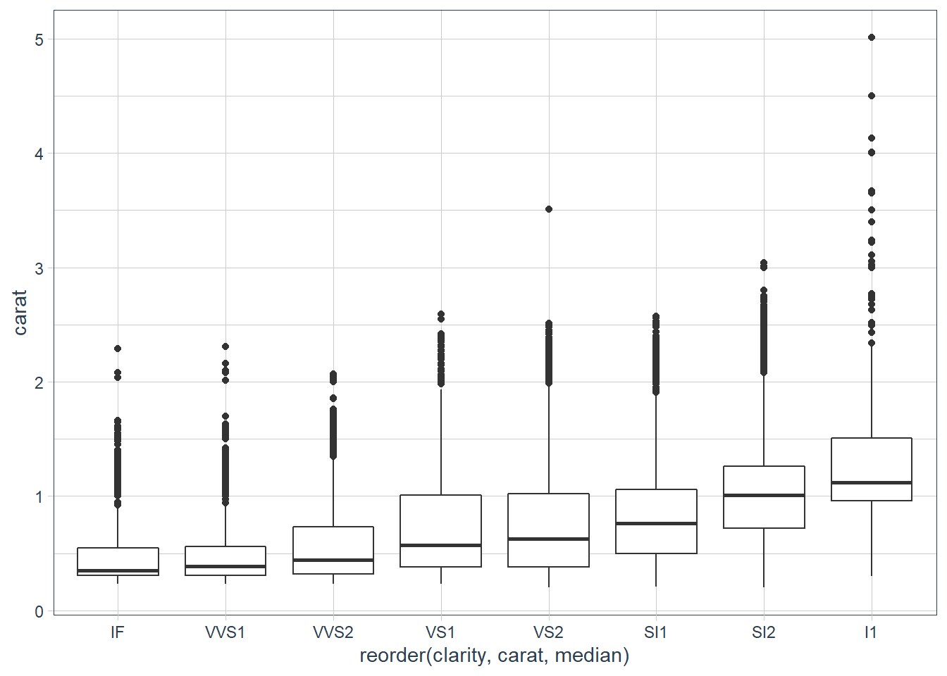
cor(diamonds$price, diamonds$carat)[1] 0.9215913They say that there are 4 characteristics of diamonds that come into play when considering the quality - Carat Weight, Cut, Colour and Clarity. It looks like carat, is most correlated with the price, and there are quite a few low quality for the Cut of the diamonds that have a big carat weight.
Install the ggstance package, and create a horizontal boxplot. How does this compare to using
coord_flip()?There is no longer a need to use the ggstance 📦 as this functionality is provided in ggplot2 since version 3.3.0.
One problem with boxplots is that they were developed in an era of much smaller datasets and tend to display a prohibitively large number of “outlying values”. One approach to remedy this problem is the letter value plot. Install the lvplot package, and try using
geom_lv()to display the distribution of price vs cut. What do you learn? How do you interpret the plots?library(lvplot) ggplot(diamonds, aes(reorder(cut, price, median), price)) + geom_boxplot() + labs(x = "Cut", y = "Price")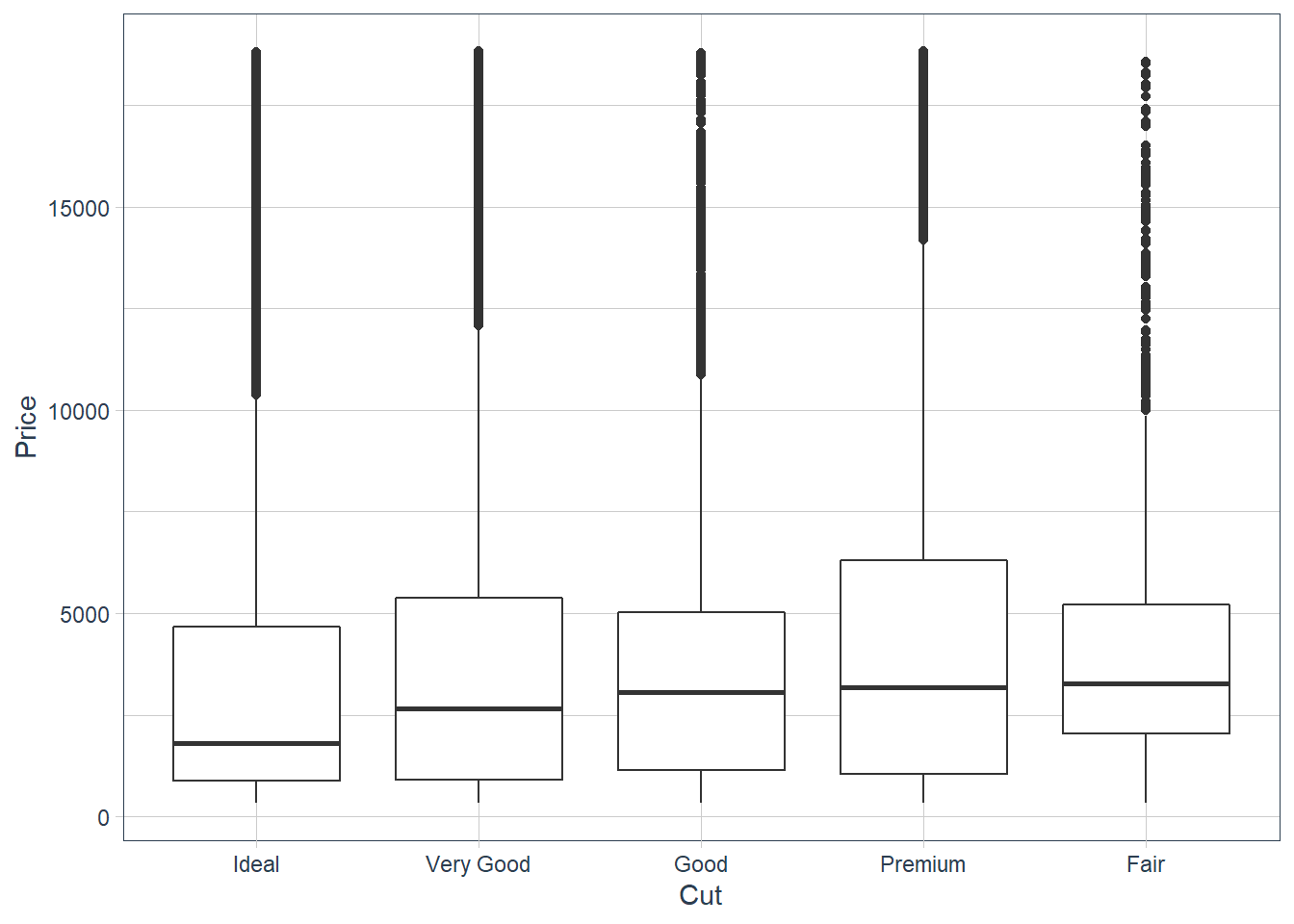
ggplot(diamonds, aes(reorder(cut, price,
                             median), price)) +
  geom_lv(outlier.colour = "darkgreen") +
  labs(x = "Cut", y = "Price")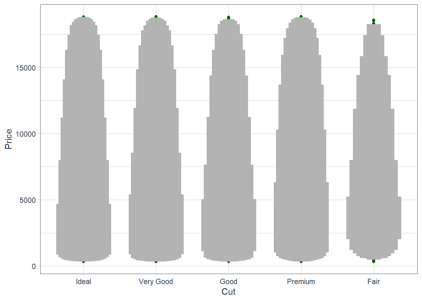
ggplot(diamonds, aes(reorder(cut, price,
                             median), price)) +
  geom_lv(aes(fill = ..LV..), outlier.colour = "darkgreen",
          k = 6) +
  labs(x = "Cut", y = "Price") +
  scale_fill_lv()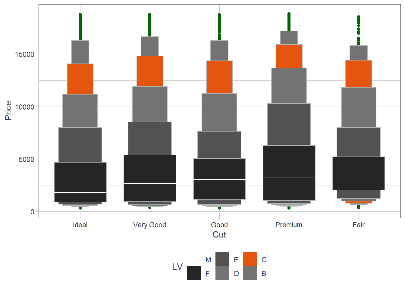
The plots are an extension of the boxplots and allows you to see the distribution better especially for large datasets. More information on the plot can be found here.
Compare and contrast
geom_violin()with a facettedgeom_histogram(), or a colouredgeom_freqpoly(). What are the pros and cons of each method?ggplot(penguins, aes(x = species, body_mass_g)) + geom_violin(aes(colour = species))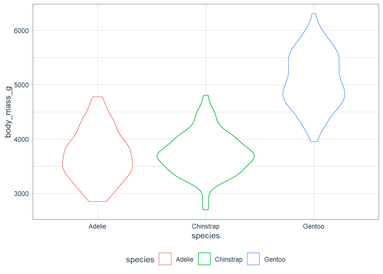
ggplot(penguins, aes(x = body_mass_g)) +
  geom_histogram() +
  facet_wrap(~ species,
             ncol = 1,
             scales = "free_y")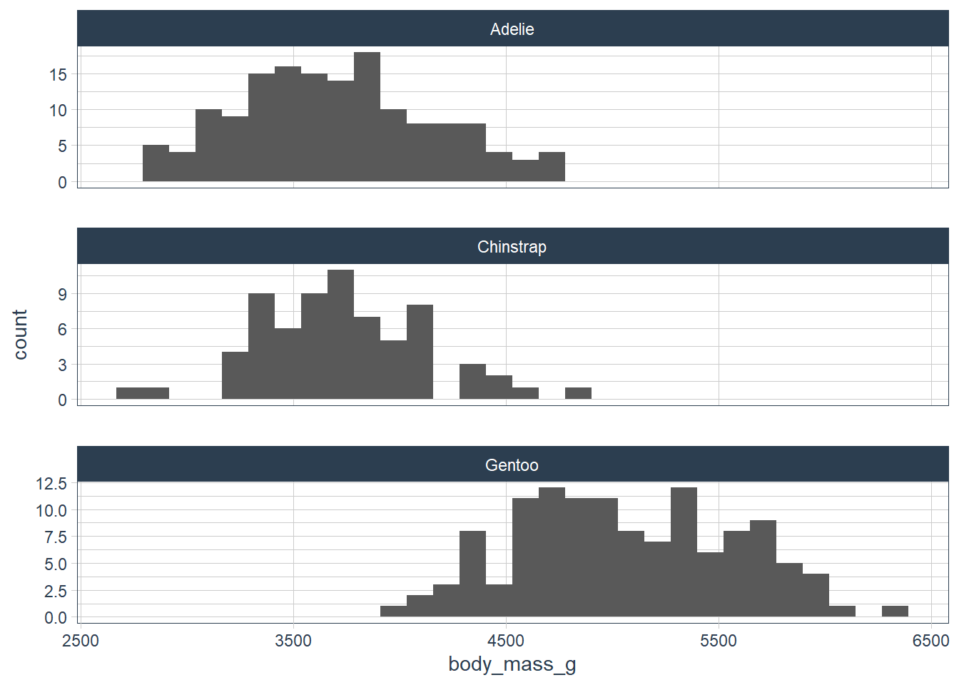
ggplot(penguins, aes(x = body_mass_g, y = ..density..)) +
  geom_freqpoly(aes(colour = species), binwidth = 200)
They’re all pretty similar, but I think the geom_freqpoly() and geom_violin() use density and hence is harder to interpret.
If you have a small dataset, it’s sometimes useful to use
geom_jitter()to see the relationship between a continuous and categorical variable. The ggbeeswarm package provides a number of methods similar togeom_jitter(). List them and briefly describe what each one does.library(ggbeeswarm) ggplot(penguins, aes(x = species, body_mass_g)) + geom_quasirandom()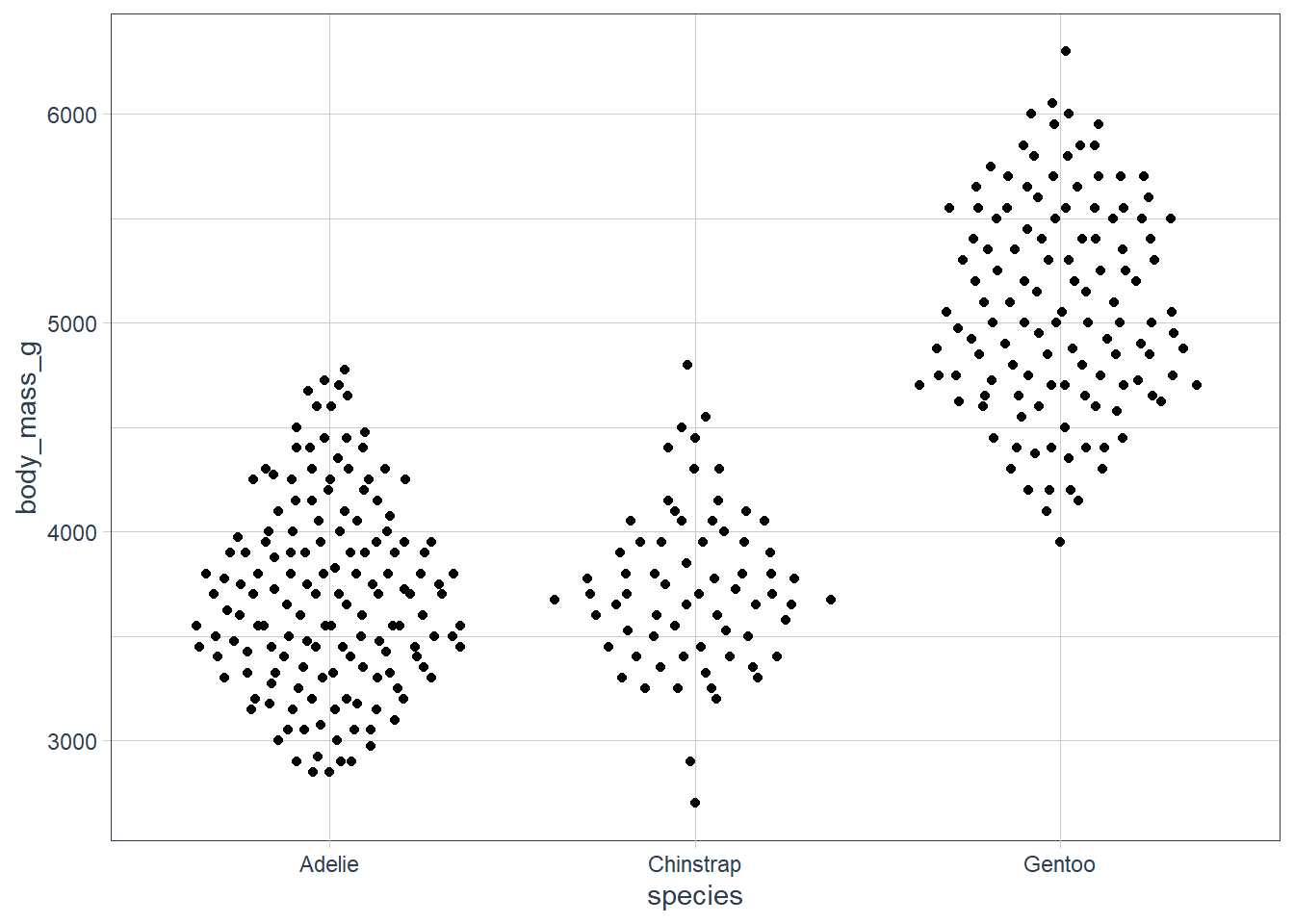
ggplot(penguins, aes(x = species, body_mass_g)) +
    geom_beeswarm()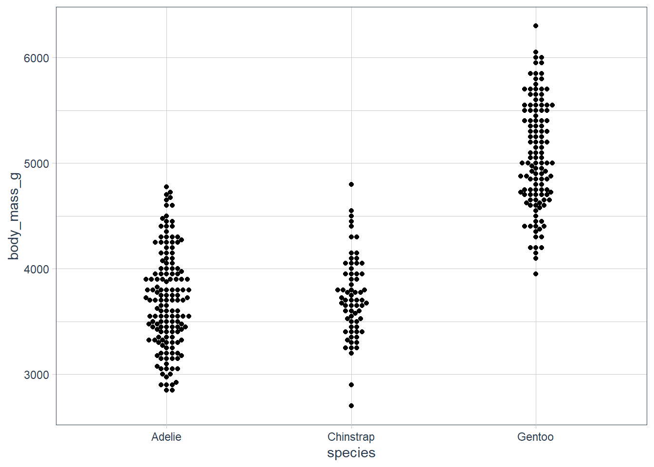
ggplot(penguins, aes(x = species, bill_depth_mm)) +
    geom_beeswarm()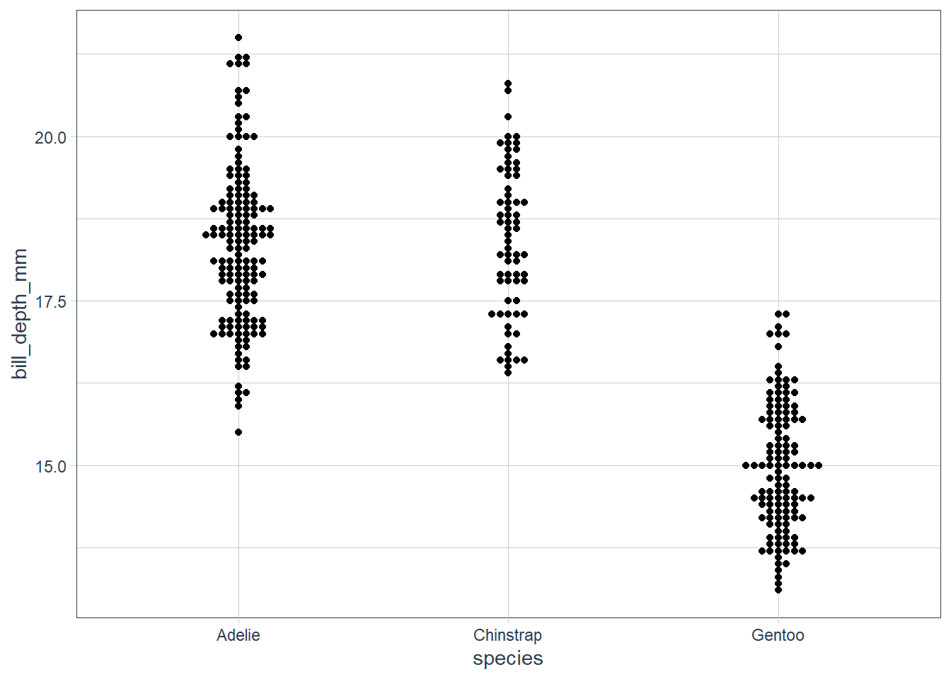
ggplot(diamonds, aes(x = reorder(cut, price,
                                median), y = price)) +
      geom_quasirandom()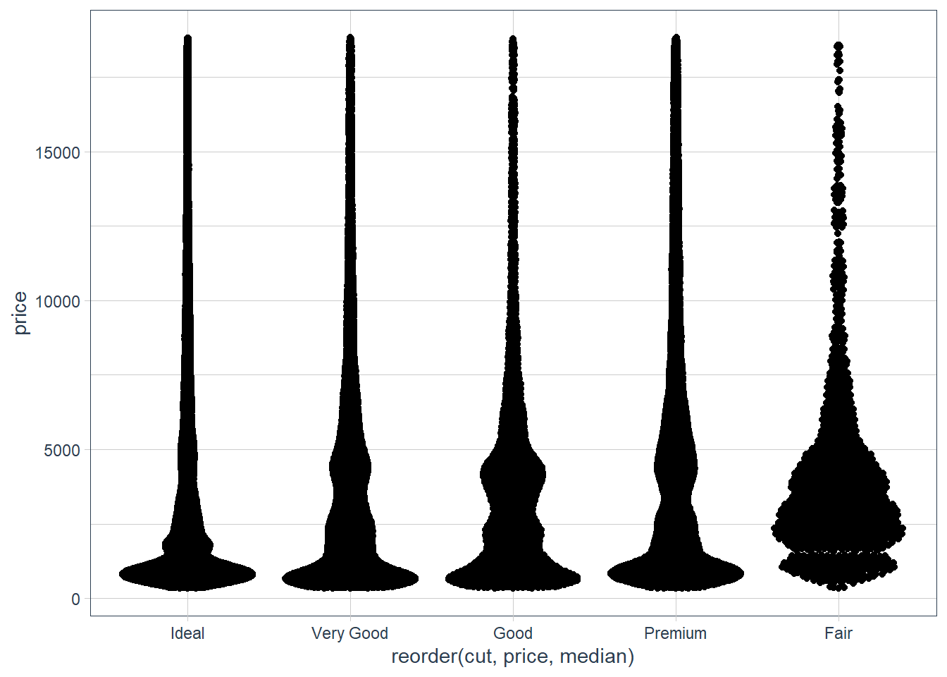
The
ggbeeswarm📦 produces column scatter plots and has 2 functions, onegeom_quasirandom()reduces the overplotting and also helps visualise the density at each point.The other is
geom_beeswarm()and does a point-size offset.
Two Categorical Variables
For two catgories we need to count the number of observations in each combination of the 2 categories.
We can use geom_count() for this, and the size of each dot tells you how many observations fell in that category.
ggplot(penguins) +
  geom_count(aes(x = species, y = island))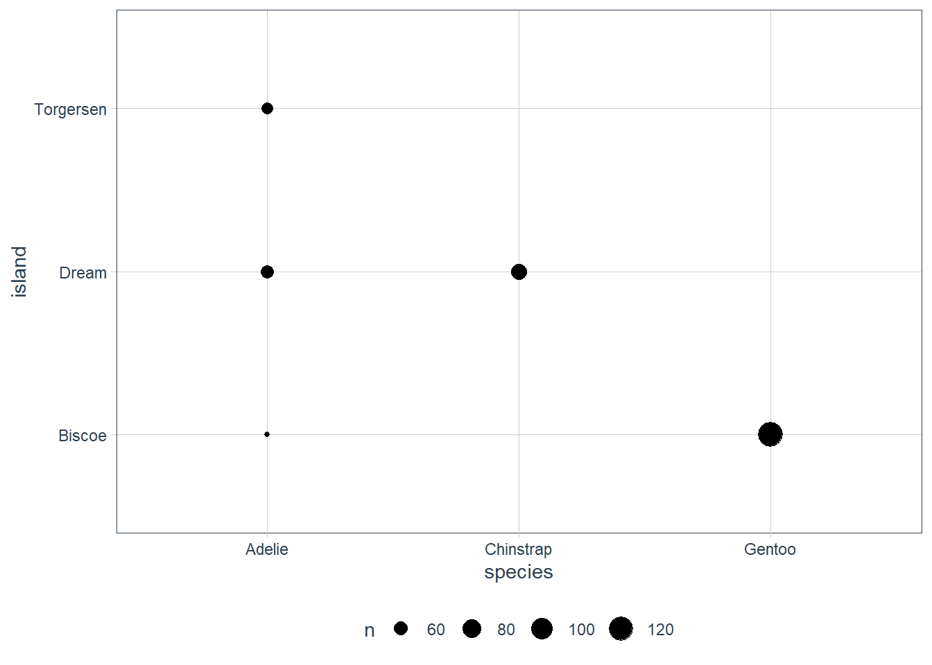
penguins %>%
  count(species, island, sort = TRUE)
# A tibble: 5 x 3
  species   island        n
  <fct>     <fct>     <int>
1 Gentoo    Biscoe      124
2 Chinstrap Dream        68
3 Adelie    Dream        56
4 Adelie    Torgersen    52
5 Adelie    Biscoe       44
ggplot(penguins) +
  geom_count(aes(x = species, y = sex))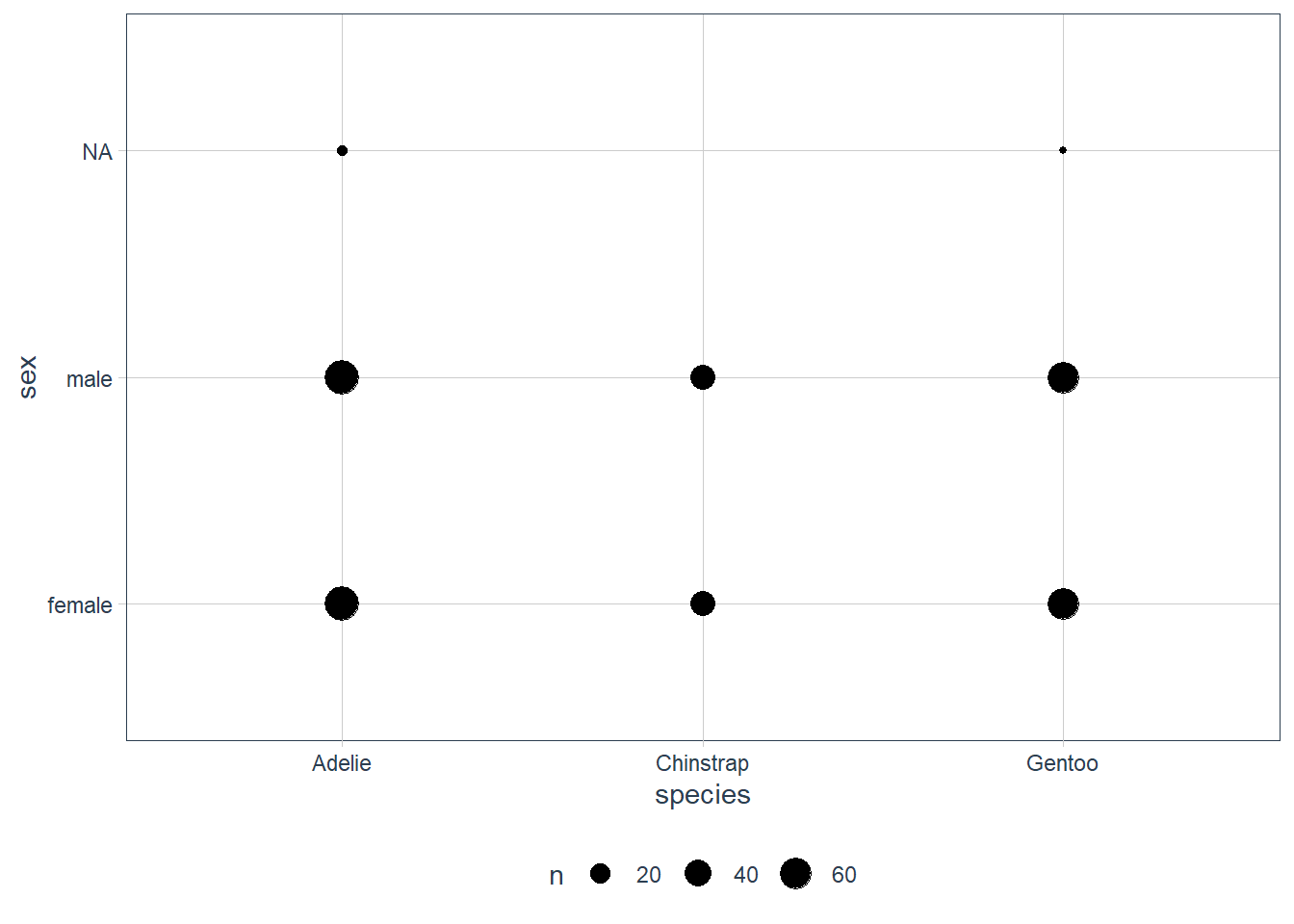
penguins %>%
  count(species, sex, sort = TRUE)
# A tibble: 8 x 3
  species   sex        n
  <fct>     <fct>  <int>
1 Adelie    female    73
2 Adelie    male      73
3 Gentoo    male      61
4 Gentoo    female    58
5 Chinstrap female    34
6 Chinstrap male      34
7 Adelie    <NA>       6
8 Gentoo    <NA>       5
We can see that the largest number of observations were of the Gentoo species, on the island Biscoe.
The male / female splits look roughly equal and is confirmed using a count().
Another way is to use the geom_tile() function but here you must first compute the count, and then use the count as a fill.
penguins %>%
  count(species, island) %>%
  ggplot(aes(x = species, y = island)) +
  geom_tile(aes(fill = n ))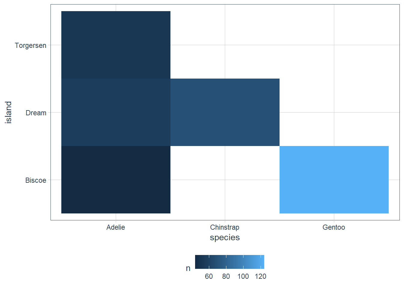
penguins %>%
  count(species, island, sort = TRUE)
# A tibble: 5 x 3
  species   island        n
  <fct>     <fct>     <int>
1 Gentoo    Biscoe      124
2 Chinstrap Dream        68
3 Adelie    Dream        56
4 Adelie    Torgersen    52
5 Adelie    Biscoe       44
penguins %>%
  count(species, sex) %>%
  ggplot(aes(x = species, y = sex)) +
  geom_tile(aes(fill = n ))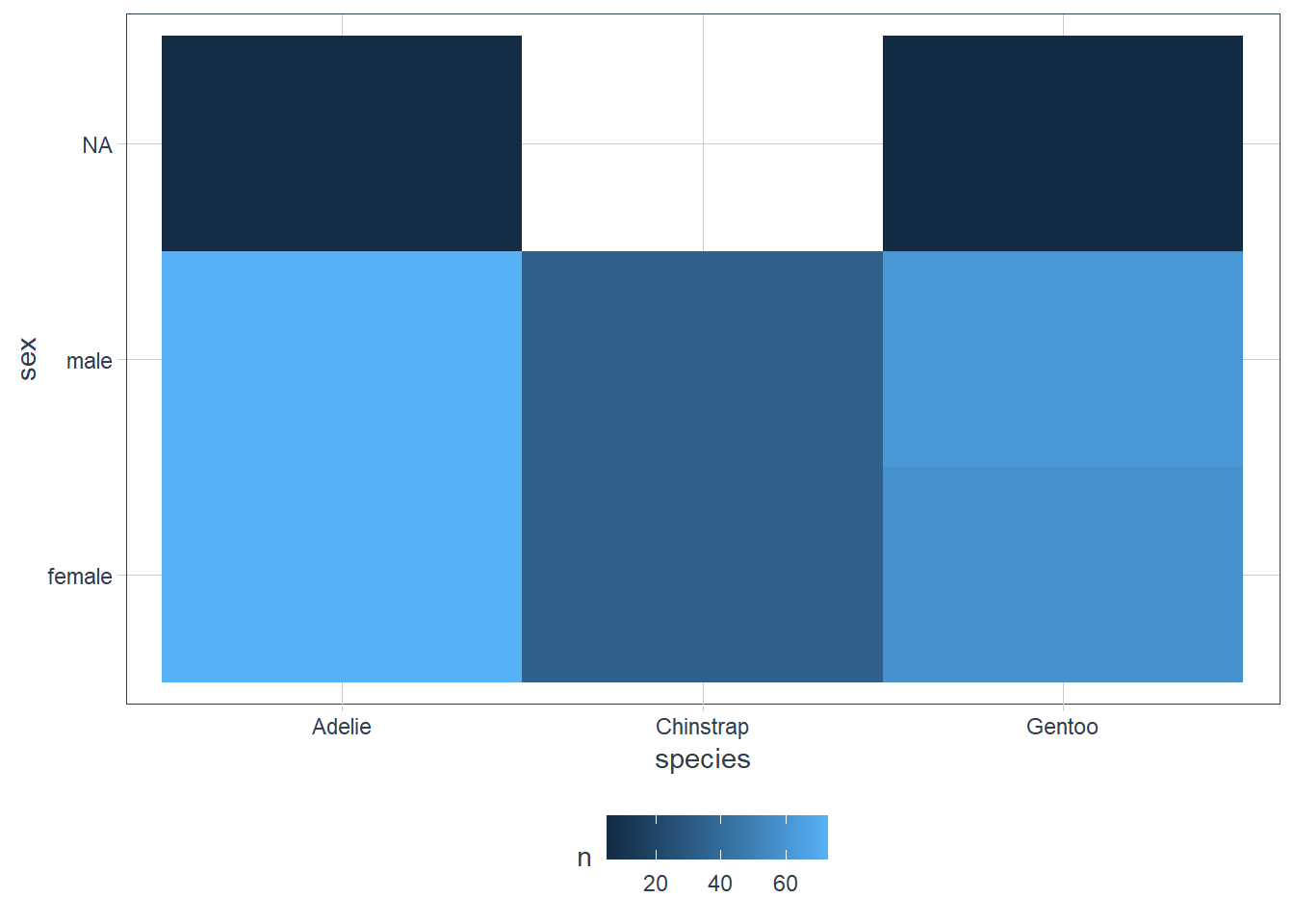
penguins %>%
  count(species, sex, sort = TRUE)
# A tibble: 8 x 3
  species   sex        n
  <fct>     <fct>  <int>
1 Adelie    female    73
2 Adelie    male      73
3 Gentoo    male      61
4 Gentoo    female    58
5 Chinstrap female    34
6 Chinstrap male      34
7 Adelie    <NA>       6
8 Gentoo    <NA>       5
We see that the colouring for the tiled graph of species and sex show again that the data is quite balanced in terms of males vs females for each species. The NA values also only appear for Adelie and Gentoo.
Exercises
How could you rescale the count dataset above to more clearly show the distribution of cut within colour, or colour within cut?
Original:
diamonds %>%
  count(color, cut) %>%
  ggplot(mapping = aes(x = color, y = cut)) +
    geom_tile(mapping = aes(fill = n))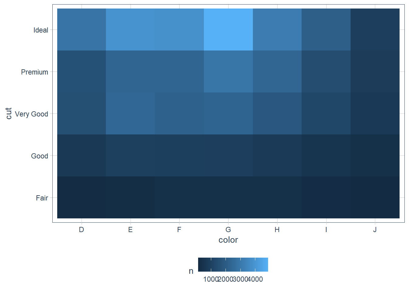
diamonds %>%
  add_count(color, cut) %>%
  group_by(color) %>%
  mutate(perc = n / sum(n) * 100) %>%
  ggplot(mapping = aes(x = color, y = cut)) +
    geom_tile(mapping = aes(fill = perc)) +
  scale_fill_gradient(low = "#999999",
                      high = "gold") +
  guides(fill = guide_colourbar(barwidth = 10,
                                barheight = 0.5))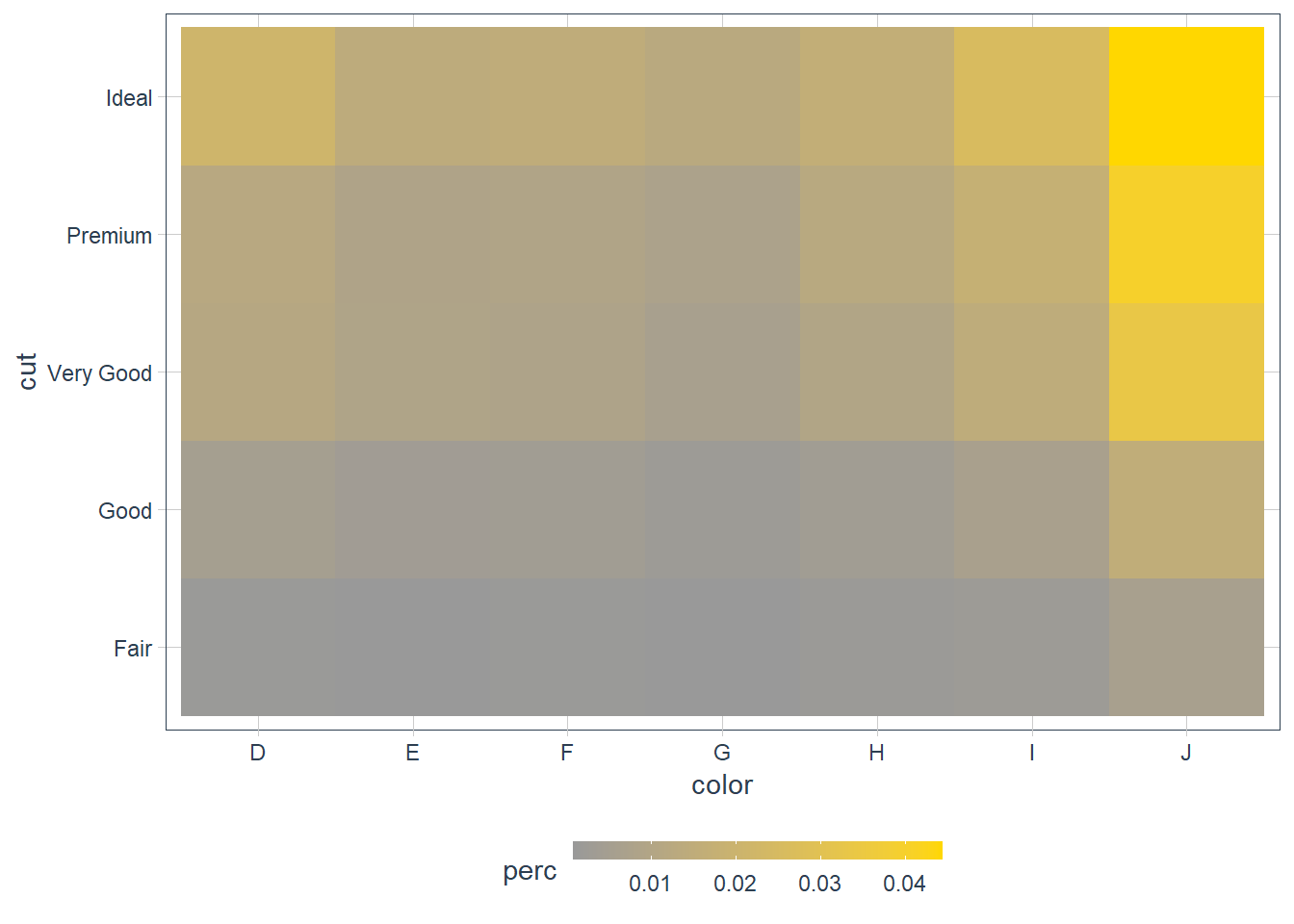
diamonds %>% add_count(cut, color) %>% group_by(cut) %>% mutate(perc = n / sum(n) * 100) %>% ggplot(mapping = aes(x = cut, y = color)) + geom_tile(mapping = aes(fill = perc)) + scale_fill_gradient(low = "#F4EDCA", high = "#293352") + guides(fill = guide_colourbar(barwidth = 10, barheight = 0.5))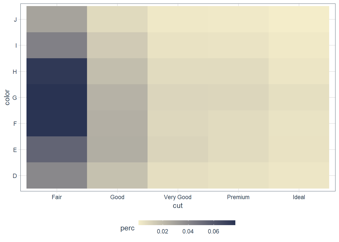 Maybe use a percentage within each color.
Use
geom_tile()together with dplyr to explore how average flight delays vary by destination and month of year. What makes the plot difficult to read? How could you improve it?flights %>% group_by(dest, month) %>% mutate(avg_delay = mean(arr_delay, na.rm = TRUE)) %>% ggplot(aes(x = month, y = dest)) + geom_tile(mapping = aes(fill = avg_delay)) + scale_fill_gradient(low = "#F4EDCA", high = "#293352") + guides(fill = guide_colourbar(barwidth = 10, barheight = 0.5))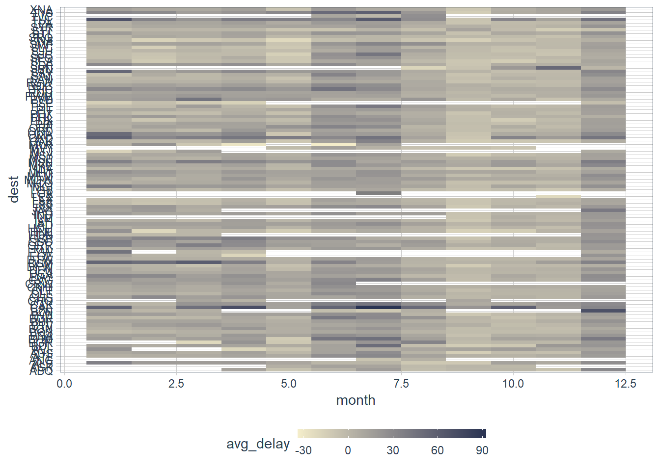
flights %>% mutate(dest = fct_lump(dest, 10)) %>% group_by(dest, month) %>% mutate(avg_delay = mean(arr_delay, na.rm = TRUE)) %>% ggplot(aes(x = month, y = dest)) + geom_tile(mapping = aes(fill = avg_delay)) + scale_fill_gradient(low = "#F4EDCA", high = "#293352") + guides(fill = guide_colourbar(barwidth = 10, barheight = 0.5))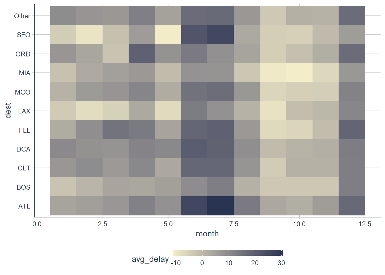 The missing values for some months is an issue. There are many destinations. It will be better to sort it by the highest number of flights and highest average delay, and then maybe also lump the lower ones into a single category with something like
 fct_lump()which we will learn about later. For now just seefct_lump(var, n = 8)as lumping together factors that are less frequent. Here we keep the most frequent or top 8 of the variablevar. In the example above we kept the 10 most frequent destinations, and lumped the rest intoOther.Why is it slightly better to use
aes(x = color, y = cut)rather thanaes(x = cut, y = color)in the example above?diamonds %>% count(color, cut) %>% ggplot(mapping = aes(x = color, y = cut)) + geom_tile(mapping = aes(fill = n)) + scale_fill_gradient(low = "#F4EDCA", high = "#293352") + guides(fill = guide_colourbar(barwidth = 10, barheight = 0.5))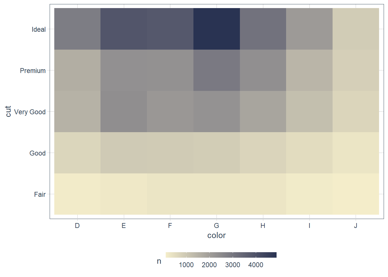
diamonds %>%
  count(cut, color) %>%
  ggplot(mapping = aes(x = cut, y = color)) +
    geom_tile(mapping = aes(fill = n)) +
    scale_fill_gradient(low = "#F4EDCA",
                            high = "#293352") +
    guides(fill = guide_colourbar(barwidth = 10,
                                      barheight = 0.5))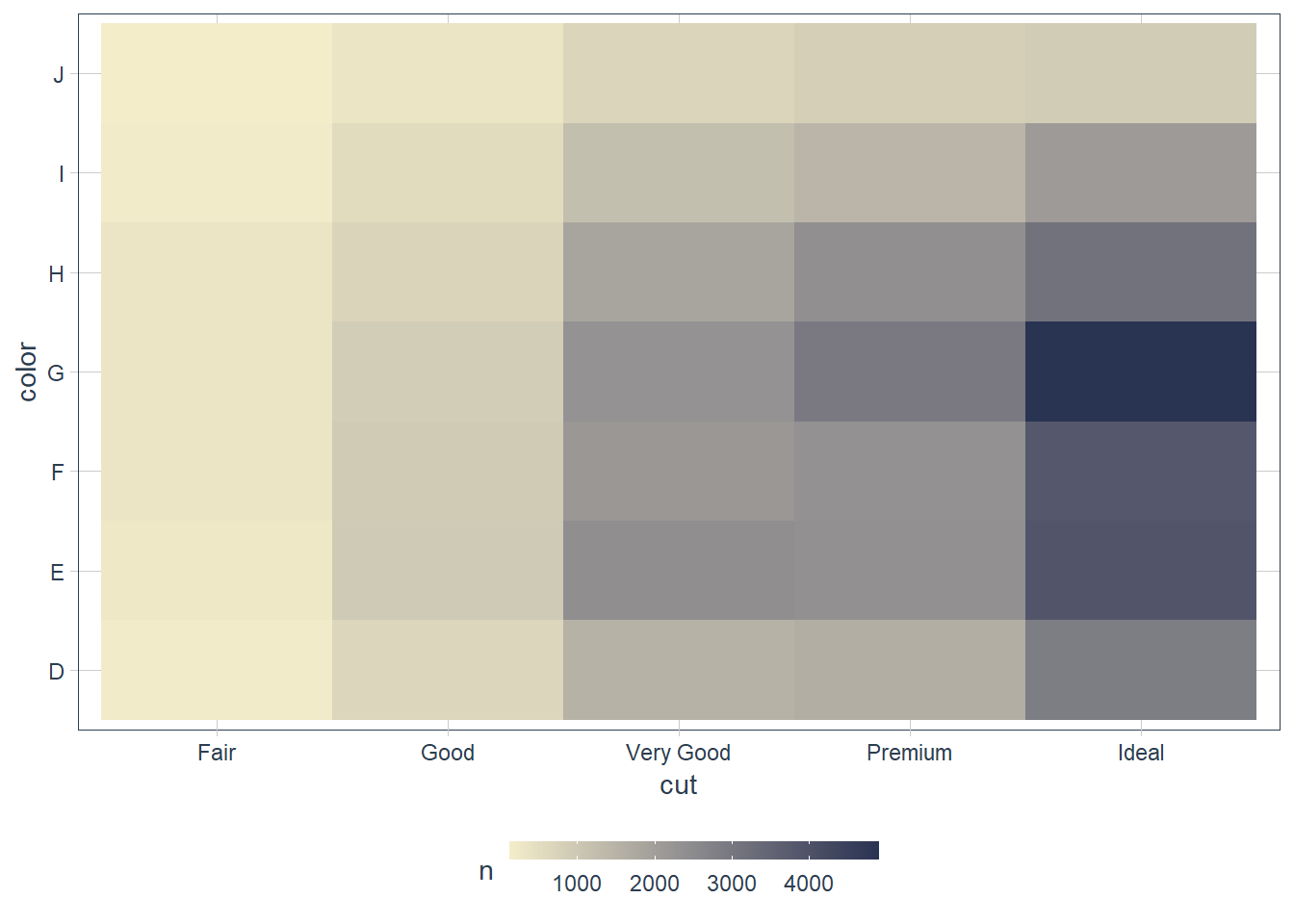
For me it is easier to read. I can say in the color
Dthere is approximately 200 observations of the cutFair, ~ 500 observations of the cutGoodetc. I.e. there is more variation in the cut within each color than the other way around if that makes sense.If I read the color in each cut, there’s not much variation, e.g. for the
Faircut ~200 lie in every color.
Two Continuous Variables
One way we have already seen is the geom_point(). When you have lots of data you can use an alpha value to prevent the overplotting, and see you data more clearly.
ggplot(penguins) +
  geom_point(aes(x = bill_length_mm,
                 y = bill_depth_mm))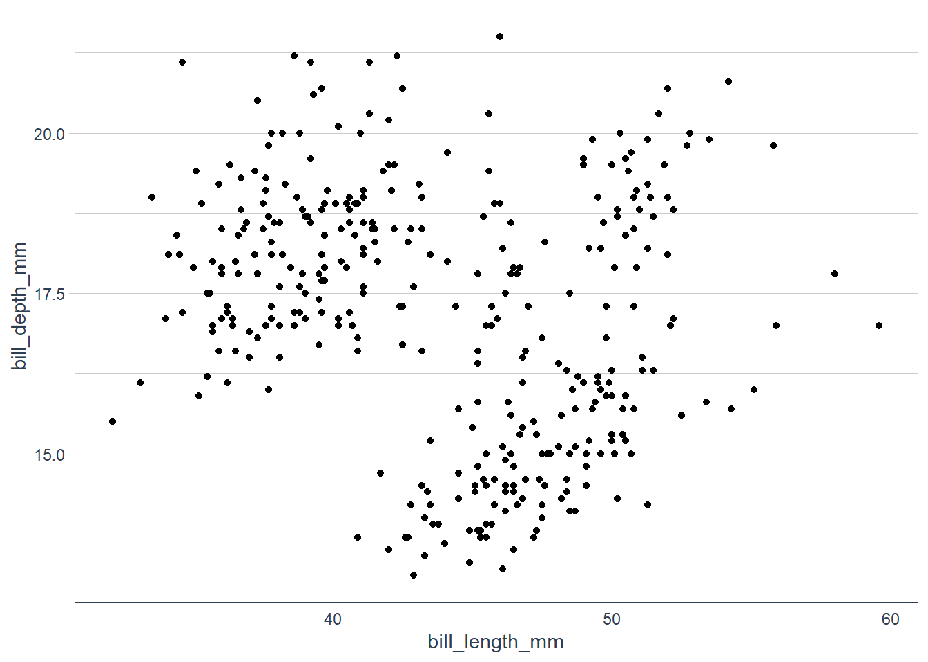
ggplot(penguins) +
  geom_point(aes(x = bill_length_mm,
                 y = bill_depth_mm,
                 colour = species))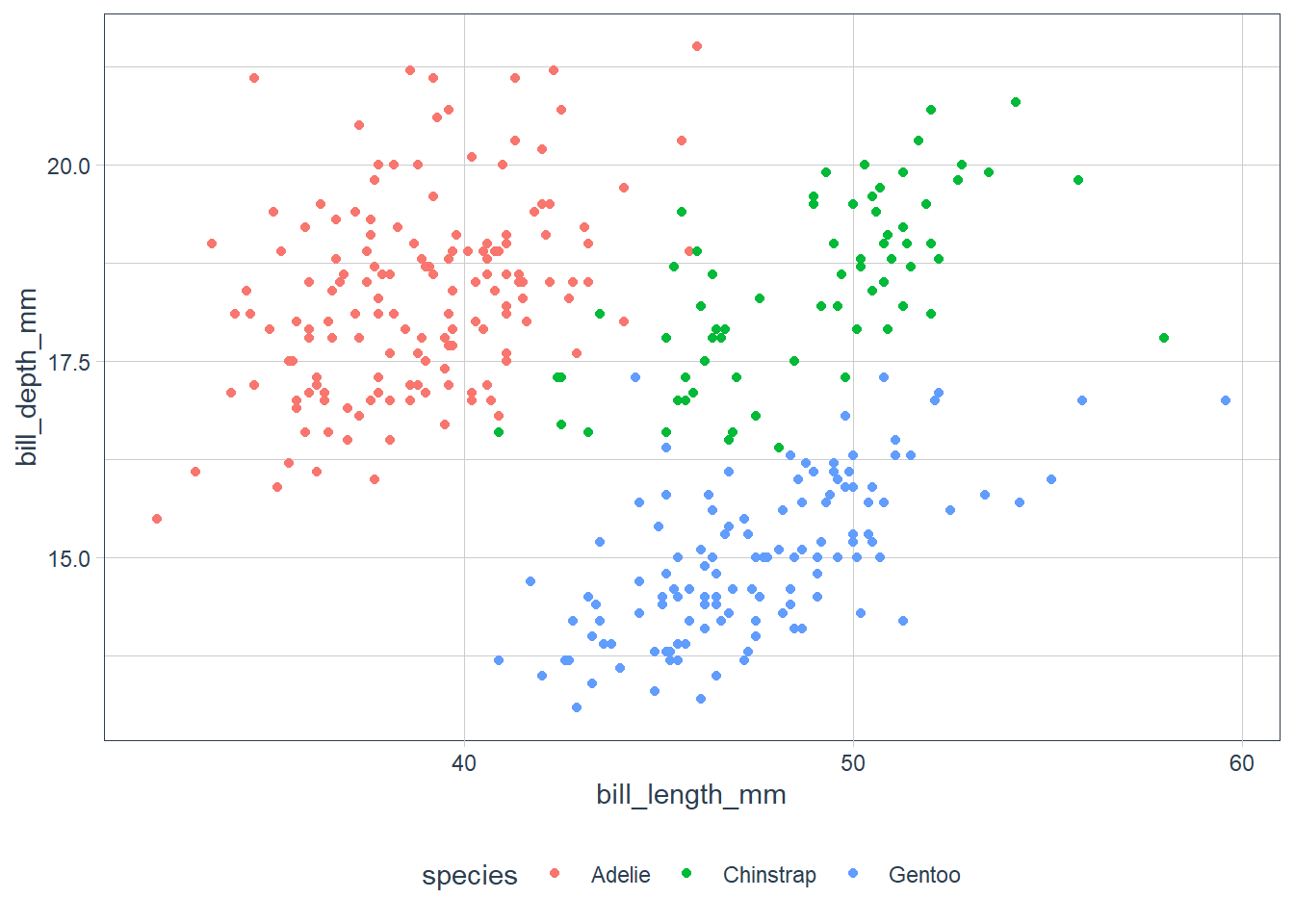
It seems there is an upward trend but it is hard to make it out.
ggplot(penguins) +
  geom_point(aes(x = bill_length_mm,
                 y = bill_depth_mm,
                 colour = species))
Ah that’s much better, when the data is segmented by species we can see a trend.
With large datasets you can also bin your data and use geom_bin2d() and geom_hex().
Or alternately you can bin one variable to act as though it is categorical e.g. using cut_width(), then we can use one of the visualisations suitable for a categorical and continuous combination.
Exercises
Instead of summarising the conditional distribution with a boxplot, you could use a frequency polygon. What do you need to consider when using
cut_width()vscut_number()? How does that impact a visualisation of the 2d distribution ofcaratandprice?smaller <- diamonds %>% filter(carat < 3) ggplot(data = smaller, mapping = aes(colour = cut_width(carat, 0.4), x = price)) + geom_freqpoly()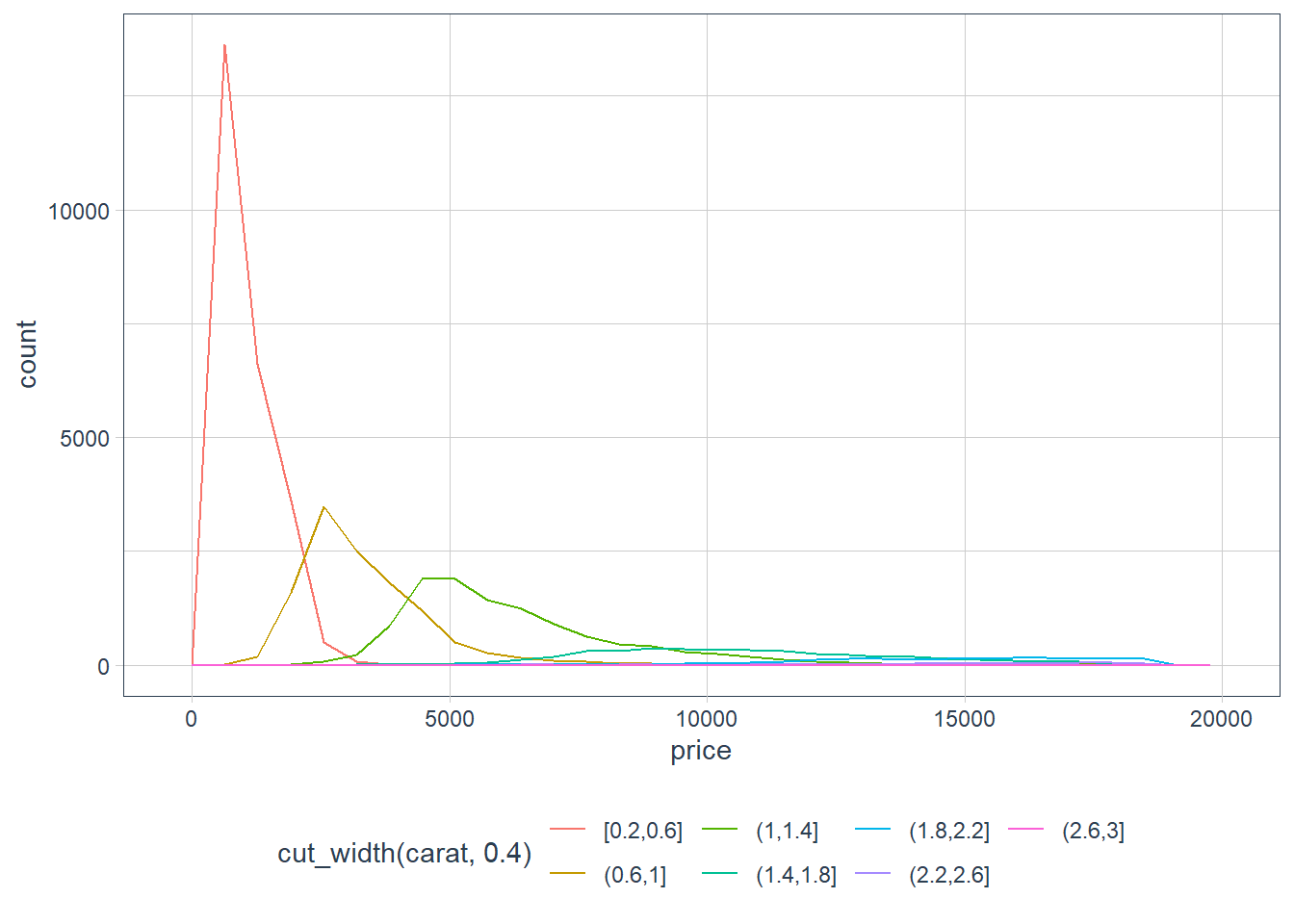
ggplot(data = smaller, mapping = aes(colour =
                                       cut_number(carat,
                                               6),
                                     x = price)) +
  geom_freqpoly()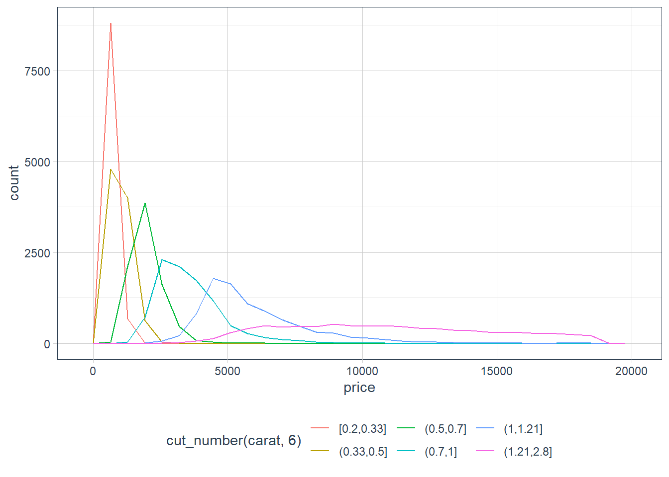
ggplot(data = diamonds, mapping = aes(colour =
                                       cut_width(carat,
                                               0.8),
                                     x = price)) +
  geom_freqpoly()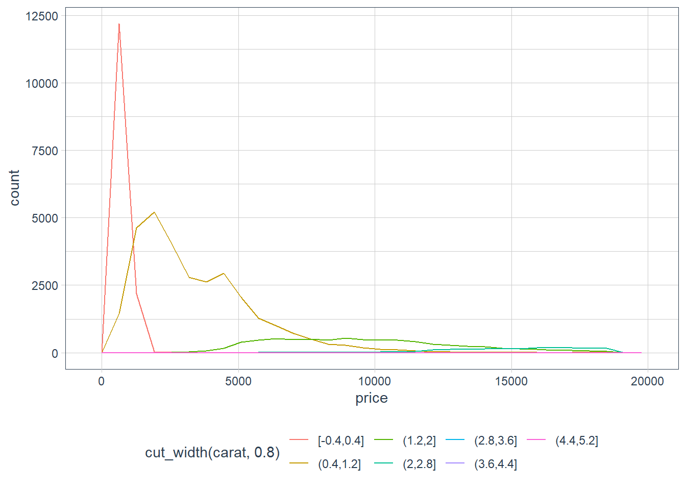
ggplot(data = diamonds, mapping = aes(colour =
                                       cut_number(carat,
                                               6),
                                     x = price)) +
  geom_freqpoly()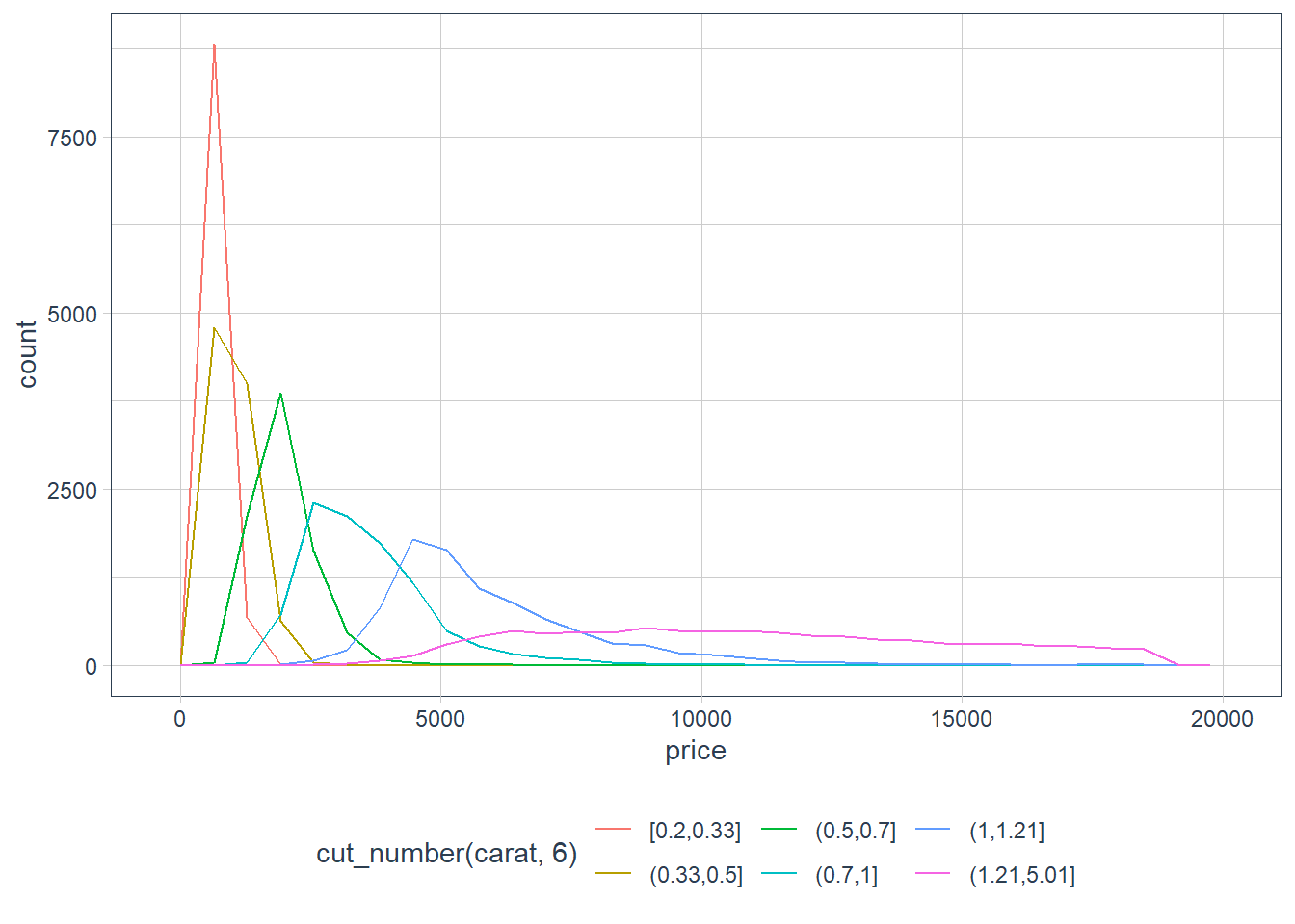
cut_width()we say what we’d like the binwidth of the variable to be, and the number of bins will be calculated.cut_number()we say what we’d like as a bin number, and the binwidth of each bin is calculated.Visualise the distribution of carat, partitioned by price.
ggplot(diamonds,
       aes(x = carat, y = price)) +
  geom_boxplot(aes(group = cut_number(price, 10)))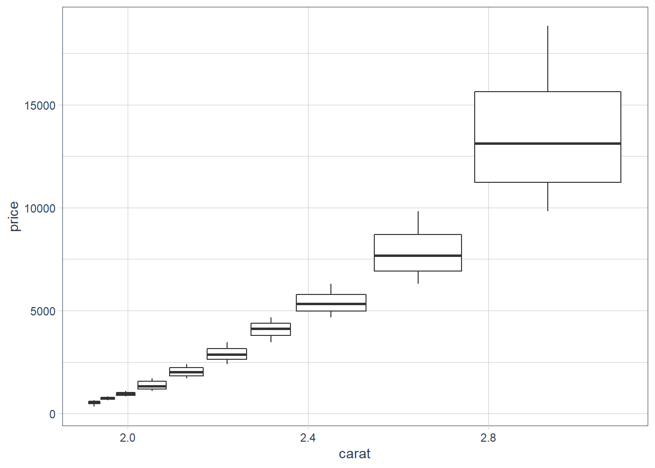
How does the price distribution of very large diamonds compare to small diamonds? Is it as you expect, or does it surprise you?
Heavier diamonds cost more than lighter diamonds. This does not surprise me, but as you see diamonds in the range 3-5 all get a big price tag, so there is more to the pricing mechanism than just carat weight and I would guess this is where the 4C’s come in. Heavier diamonds attract a big price tag.
Combine two of the techniques you’ve learned to visualise the combined distribution of cut, carat, and price.
ggplot(diamonds, aes(carat, price)) +
  geom_boxplot(aes(group = cut_number(price, 10))) +
  facet_wrap(~ cut, scales = "free_y")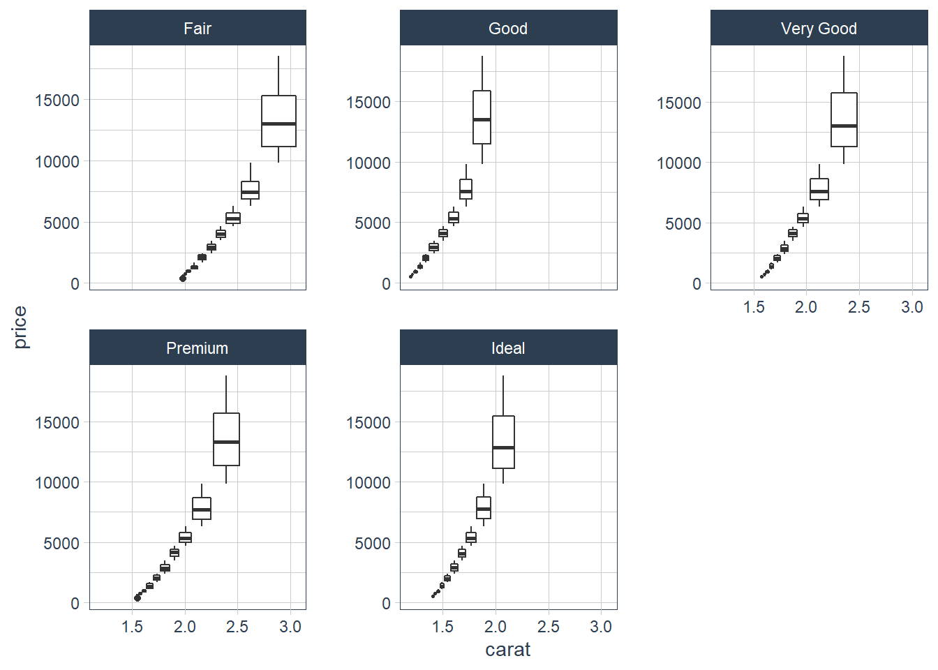
Two dimensional plots reveal outliers that are not visible in one dimensional plots. For example, some points in the plot below have an unusual combination of
xandyvalues, which makes the points outliers even though theirxandyvalues appear normal when examined separately.ggplot(data = diamonds) + geom_point(mapping = aes(x = x, y = y))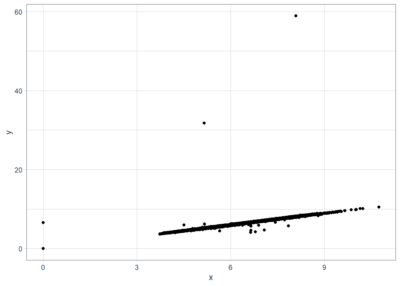
ggplot(data = diamonds) + geom_point(mapping = aes(x = x, y = y)) + coord_cartesian(xlim = c(4, 11), ylim = c(4, 11))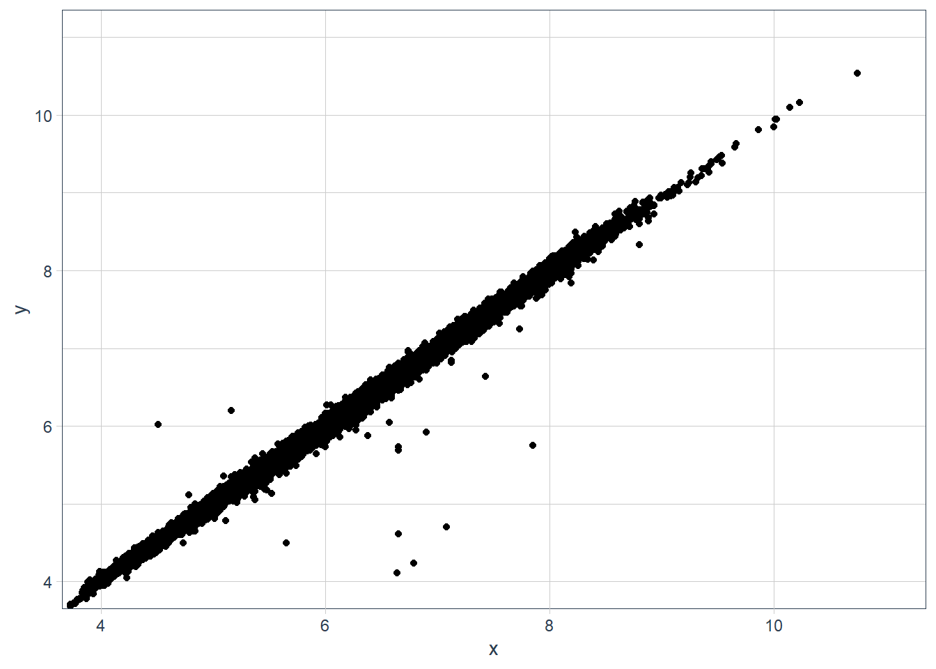
ggplot(data = diamonds) +
  geom_boxplot(mapping = aes(x = x, y = y, group=cut_number(y, 10))) +
  coord_cartesian(xlim = c(4, 11), ylim = c(4, 11))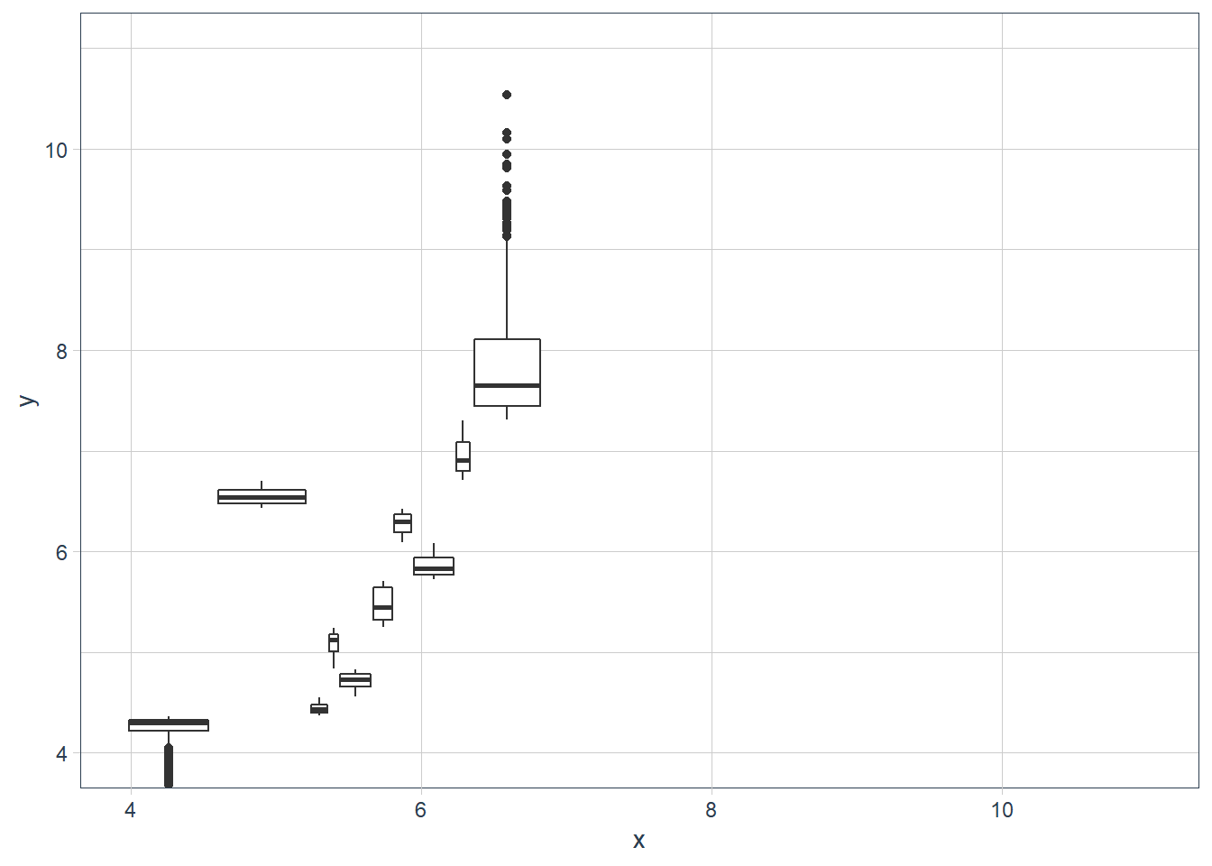
Why is a scatterplot a better display than a binned plot for this case?
In a binned plot the points are gathered together in a bin and you may not notice that it is an outlier.
Patterns
If you spot a pattern, some Qs:
Could this pattern be due to coincidence (i.e. random chance)?
How can you describe the relationship implied by the pattern?
How strong is the relationship implied by the pattern?
What other variables might affect the relationship?
Does the relationship change if you look at individual subgroups of the data?
# old faithful eruption lengths vs wait time
ggplot(faithful) +
  geom_point(mapping = aes(x = eruptions, y = waiting))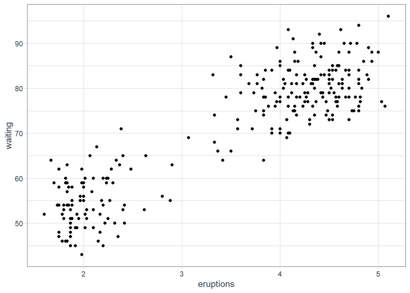
sessionInfo()R version 3.6.3 (2020-02-29)
Platform: x86_64-w64-mingw32/x64 (64-bit)
Running under: Windows 10 x64 (build 18363)
Matrix products: default
locale:
[1] LC_COLLATE=English_South Africa.1252 LC_CTYPE=English_South Africa.1252
[3] LC_MONETARY=English_South Africa.1252 LC_NUMERIC=C
[5] LC_TIME=English_South Africa.1252
attached base packages:
[1] stats graphics grDevices utils datasets methods base
other attached packages:
[1] ggbeeswarm_0.6.0 lvplot_0.2.0
[3] magrittr_1.5 tidyquant_1.0.0
[5] quantmod_0.4.17 TTR_0.23-6
[7] PerformanceAnalytics_2.0.4 xts_0.12-0
[9] zoo_1.8-7 lubridate_1.7.9
[11] emo_0.0.0.9000 skimr_2.1.1
[13] gt_0.2.2 palmerpenguins_0.1.0
[15] nycflights13_1.0.1 flair_0.0.2
[17] forcats_0.5.0 stringr_1.4.0
[19] dplyr_1.0.2 purrr_0.3.4
[21] readr_1.4.0 tidyr_1.1.2
[23] tibble_3.0.3 ggplot2_3.3.2
[25] tidyverse_1.3.0 workflowr_1.6.2
loaded via a namespace (and not attached):
[1] fs_1.5.0 RColorBrewer_1.1-2 httr_1.4.2 rprojroot_1.3-2
[5] repr_1.1.0 tools_3.6.3 backports_1.1.6 utf8_1.1.4
[9] R6_2.4.1 vipor_0.4.5 DBI_1.1.0 colorspace_1.4-1
[13] withr_2.2.0 tidyselect_1.1.0 curl_4.3 compiler_3.6.3
[17] git2r_0.26.1 cli_2.1.0 rvest_0.3.6 xml2_1.3.2
[21] labeling_0.3 sass_0.2.0 scales_1.1.0 checkmate_2.0.0
[25] quadprog_1.5-8 digest_0.6.27 rmarkdown_2.4 base64enc_0.1-3
[29] pkgconfig_2.0.3 htmltools_0.5.0 dbplyr_2.0.0 highr_0.8
[33] rlang_0.4.8 readxl_1.3.1 rstudioapi_0.11 generics_0.0.2
[37] farver_2.0.3 jsonlite_1.7.1 Rcpp_1.0.4.6 Quandl_2.10.0
[41] munsell_0.5.0 fansi_0.4.1 lifecycle_0.2.0 stringi_1.5.3
[45] whisker_0.4 yaml_2.2.1 grid_3.6.3 promises_1.1.0
[49] crayon_1.3.4 lattice_0.20-38 haven_2.3.1 hms_0.5.3
[53] knitr_1.28 ps_1.3.2 pillar_1.4.6 reprex_0.3.0
[57] glue_1.4.2 evaluate_0.14 modelr_0.1.8 vctrs_0.3.2
[61] httpuv_1.5.2 cellranger_1.1.0 gtable_0.3.0 assertthat_0.2.1
[65] xfun_0.13 broom_0.7.2 later_1.0.0 beeswarm_0.2.3
[69] ellipsis_0.3.1