Module 2: Data Pre-Proccessing
Stefano Cacciatore
September 16, 2024
Last updated: 2024-09-16
Checks: 7 0
Knit directory: Tutorials/
This reproducible R Markdown analysis was created with workflowr (version 1.7.1). The Checks tab describes the reproducibility checks that were applied when the results were created. The Past versions tab lists the development history.
Great! Since the R Markdown file has been committed to the Git repository, you know the exact version of the code that produced these results.
Great job! The global environment was empty. Objects defined in the global environment can affect the analysis in your R Markdown file in unknown ways. For reproduciblity it’s best to always run the code in an empty environment.
The command set.seed(20240905) was run prior to running
the code in the R Markdown file. Setting a seed ensures that any results
that rely on randomness, e.g. subsampling or permutations, are
reproducible.
Great job! Recording the operating system, R version, and package versions is critical for reproducibility.
Nice! There were no cached chunks for this analysis, so you can be confident that you successfully produced the results during this run.
Great job! Using relative paths to the files within your workflowr project makes it easier to run your code on other machines.
Great! You are using Git for version control. Tracking code development and connecting the code version to the results is critical for reproducibility.
The results in this page were generated with repository version 9a91f51. See the Past versions tab to see a history of the changes made to the R Markdown and HTML files.
Note that you need to be careful to ensure that all relevant files for
the analysis have been committed to Git prior to generating the results
(you can use wflow_publish or
wflow_git_commit). workflowr only checks the R Markdown
file, but you know if there are other scripts or data files that it
depends on. Below is the status of the Git repository when the results
were generated:
Ignored files:
    Ignored:    .DS_Store
    Ignored:    data/.DS_Store

Untracked files:
    Untracked:  data/COADREAD.clin.merged.picked.txt
    Untracked:  data/COADREAD.rnaseqv2__illuminahiseq_rnaseqv2__unc_edu__Level_3__RSEM_genes_normalized__data.data.txt
    Untracked:  data/Rstudio.png
    Untracked:  data/tumor_size_patient_survival.csv
    Untracked:  output/data.csv
    Untracked:  test.R

Unstaged changes:
    Modified:   analysis/.DS_Store
    Deleted:    analysis/Module_1_Basics.Rmd
    Deleted:    analysis/Module_2_Visualisation.Rmd
    Deleted:    analysis/Module_5_Unsupervised_Learning.Rmd
    Deleted:    analysis/supervised_learning_final.Rmd
Note that any generated files, e.g. HTML, png, CSS, etc., are not included in this status report because it is ok for generated content to have uncommitted changes.
These are the previous versions of the repository in which changes were
made to the R Markdown (analysis/Statistics.Rmd) and HTML
(docs/Statistics.html) files. If you’ve configured a remote
Git repository (see ?wflow_git_remote), click on the
hyperlinks in the table below to view the files as they were in that
past version.
| File | Version | Author | Date | Message |
|---|---|---|---|---|
| html | 1a34734 | tkcaccia | 2024-09-16 | Build site. |
| html | 5033c12 | tkcaccia | 2024-09-16 | Build site. |
| Rmd | e9cf751 | tkcaccia | 2024-09-16 | Start my new project |
Univariate Analysis
What is univariate analysis ?
The idea of univariate analysis is to first understand the variables individually. It is typically the first step in understanding a data set. A variable in UA is a condition or subset that your data falls into. You can think of it as a “category” such as “age”, “weight” or “length”. However, UA does not look at > than 1 variable at a time (this would be a bivariate analysis)
Learning Objectives:
Summarising Data
Frequency Tables
Univariate Hypothesis Testing
Visualising Univariate Data
Correlation
Simple Regression analysis
# Installation of packages (usually needed)
# install.packages("ggplot2")
# install.packages("dplyr")
# install.packages("ggpubr")
# install.packages("corrplot")

# Loading of packages
library(ggplot2)
library(dplyr)
Attaching package: 'dplyr'The following objects are masked from 'package:stats':
filter, lagThe following objects are masked from 'package:base':
intersect, setdiff, setequal, unionlibrary(ggpubr)
library(corrplot)corrplot 0.92 loadedlibrary(stats)1. Summarising Data
# Using the data set stored in Rstudio called "cars"

# We need to create an array of our single variable for UA:
x <- cars$speed
Looking at the CENTRAL TENDENCY of the data:
mean(x)[1] 15.4median(x)[1] 15mode(x)[1] "numeric"Looking at the DISPERSION of the data:
min(x)[1] 4max(x)[1] 25# Range of the data:
range(x)[1] 4 25# Inter-quantile range:
IQR(x)[1] 7# Variance -->
var(x)[1] 27.95918# Standard Deviation:
sd(x)[1] 5.287644TIP: you can use the function
summary to produce result summaries of the results of
various model fitting functions.
summary(x) Min. 1st Qu. Median Mean 3rd Qu. Max.
4.0 12.0 15.0 15.4 19.0 25.0 2. Frequency Tables:
The frequency of an observation tells you the number of times the observation occurs in the data.
A frequency table is a collection of these observations and their frequencies.
A frequency table can be shown either graphically (bar chart/histogram) or as a frequency distribution table.
These tables can show qualitative (categorical) or quantitative (numeric) variables.
Example Data
We will use a data frame with a categorical variable and a numerical variable to demonstrate each type of table.
# Create example data
set.seed(123)  # For reproducibility
data <- data.frame(
  category = sample(c("A", "B", "C", "D"), 100, replace = TRUE),
  value = rnorm(100, mean = 50, sd = 10)
)
head(data)
category value
1 C 52.53319
2 C 49.71453
3 C 49.57130
4 B 63.68602
5 C 47.74229
6 B 65.16471# Frequency table for the categorical variable
freq_table <- table(data$category)
freq_table
 A  B  C  D
28 26 29 17
# Qualitative Variables:
freq_table_numeric <- table(data$value)
freq_table_numeric
26.9083112435919 29.4675277845948 33.3205806341186 33.8211729171084
               1                1                1                1
33.9846382642541 34.2785584085451 34.5124719576978 34.8533234621825
               1                1                1                1
 35.382444150041 35.3935992907518  35.561068390282 37.1296952396482
               1                1                1                1
37.7928228774546 39.2820877352442 39.7357909969322 39.7587120939509
               1                1                1                1
39.8142461689291 40.3814336586987 40.4838143273498  40.525253858152
               1                1                1                1
41.5029565396642 42.1509553054292  42.895934363007 42.9079923741761
               1                1                1                1
43.1199138353264 43.4805009830454 43.5929399169462 43.7209392396063
               1                1                1                1
43.9974041285287 44.2465303739161  44.690934778297  44.976765468907
               1                1                1                1
45.0896883394346 45.0944255629933 45.7750316766038 46.1977347971224
               1                1                1                1
46.2933996820759 46.5245740060227 46.6679261633058 46.7406841446877
               1                1                1                1
47.1522699294899 47.3780251059753 47.4390780780175 47.5330812153763
               1                1                1                1
47.6429964089952 47.7422901434073 47.7951343818125 48.6110863756096
               1                1                1                1
 49.286919138764 49.4443803447546 49.5497227519108 49.5712954270868
               1                1                1                1
 49.714532446513 50.0576418589989 50.4123292199294  50.530042267305
               1                1                1                1
50.7796084956371 51.0567619414894 51.1764659710013 51.2385424384461
               1                1                1                1
51.8130347974915 52.1594156874397 52.3538657228486 52.3873173511144
               1                1                1                1
52.5331851399475 52.5688370915653 53.0115336216671 53.0352864140426
               1                1                1                1
 53.317819639157 53.7963948275988 53.8528040112633  54.351814908338
               1                1                1                1
54.4820977862943 54.5150405307921 55.1940720394346 55.4839695950807
               1                1                1                1
55.8461374963607 56.0796432222503 56.4437654851883 56.8791677297583
               1                1                1                1
57.0178433537471 57.3994751087733 59.1899660906077 59.2226746787974
               1                1                1                1
59.9350385596212 60.0573852446226  60.255713696967 60.9683901314935
               1                1                1                1
61.3133721341418 61.4880761845109 63.6065244853001 63.6860228401446
               1                1                1                1
64.4455085842335 65.1647060442954 65.3261062618519 68.4386200523221
               1                1                1                1
69.0910356921748 70.5008468562714 71.0010894052567 71.8733299301658
               1                1                1                1
Note: the frequency table is CASE-SENSITIVE so the frequencies of the variables corresponds to how many times that specific number of string appears.
Grouped Tables:
Grouped tables aggregate the data into groups or bins.
# 1st Step: Create BINS for the numerical data
bins <- cut(x, breaks = 5)
freq_table_numeric <- table(bins)
freq_table_numeric
bins
 (3.98,8.2]  (8.2,12.4] (12.4,16.6] (16.6,20.8]   (20.8,25]
5 10 13 15 7 # Group data into bins and create a grouped table:
grouped_table <- table(cut(x, breaks = 5))
grouped_table
(3.98,8.2] (8.2,12.4] (12.4,16.6] (16.6,20.8] (20.8,25]
5 10 13 15 7 Percentage (Proportion) Tables
Percentage tables show the proportion of each unique value or group in the data.
# Percentage table for the categorical variable
percentage_table <- prop.table(table(x)) * 100
percentage_table
x
4 7 8 9 10 11 12 13 14 15 16 17 18 19 20 22 23 24 25
4 4 2 2 6 4 8 8 8 6 4 6 8 6 10 2 2 8 2 # Percentage table for the grouped numerical data
percentage_table_numeric <- prop.table(table(cut(x, breaks = 5))) * 100
percentage_table_numeric
 (3.98,8.2]  (8.2,12.4] (12.4,16.6] (16.6,20.8]   (20.8,25]
         10          20          26          30          14
Cumulative Proportion Tables
Cumulative proportion tables show the cumulative proportion of each unique value or group.
# Cumulative proportion table for the categorical variable
cumulative_prop <- cumsum(prop.table(table(data$category)))
cumulative_prop <- cumulative_prop * 100
cumulative_prop
A B C D
28 54 83 100 # Cumulative proportion table for the grouped numerical data
cumulative_prop_numeric <- cumsum(prop.table(table(cut(x, breaks = 5))))
cumulative_prop_numeric <- cumulative_prop_numeric * 100
cumulative_prop_numeric (3.98,8.2] (8.2,12.4] (12.4,16.6] (16.6,20.8] (20.8,25]
10 30 56 86 100 Question 1:
Using the cars datset:
Calculate the mean, median, and standard deviation of variable “speed”.
Interpret what these statistics tell you about the speed data.
Compute the range and interquartile range (IQR) of speed.
What do these measures reveal about the dispersion of the speed data?
Use the summary function to get a summary of x.
Describe the central tendency and dispersion metrics provided by the summary output.
Question 2:
Using the below:
xy <- data.frame(
  category = sample(c("A", "B", "C", "D"), 100, replace = TRUE)
)
head(xy)
category
1 B
2 B
3 A
4 B
5 A
6 ACreate a frequency table for the category variable.
What is the frequency of each category?
Using the below:
data <- data.frame(
  value = rnorm(100, mean = 50, sd = 10)
)
Create a frequency table for the value variable.
How many observations fall into each unique value?
Using the below:
x <- data$value
bins <- cut(x, breaks = 5)
Create a grouped frequency table for the value variable using 5 bins.
What are the frequencies for each bin?
Using the below:
x <- data$value
bins <- cut(x, breaks = 5)
Create a percentage (proportion) table for the grouped value data.
What percentage of the observations fall into each bin?
Answers:
# Question 1:
# a. Calculate the mean, median, and standard deviation of variable "speed"
mean_speed <- mean(x)
median_speed <- median(x)
sd_speed <- sd(x)

# c. Compute the range and interquartile range (IQR) of speed
range_speed <- range(x)
iqr_speed <- IQR(x)

# e. Use the summary function to get a summary of x
summary_speed <- summary(x)

# Question 2:
# a. Create a frequency table for the category variable
freq_table_category <- table(xy$category)

# c. Create a frequency table for the value variable
freq_table_value <- table(data$value)

# e. Create a grouped frequency table for the value variable using 5 bins
grouped_table <- table(bins)

# g. Create a percentage (proportion) table for the grouped value data
percentage_table <- prop.table(grouped_table) * 100
3. Univariate Hypothesis Testing:
Often, the data you are dealing with is a subset (sample) of the complete data (population). Thus, the common question here is:
- Can the findings of the sample be extrapolated to the population? i.e., Is the sample representative of the population, or has the population changed?
Such questions are answered using specific hypothesis tests designed to deal with such univariate data-based problems.
Example Dataframe:
set.seed(42)  # For reproducibility

# Generate numerical data
sample_data_large <- rnorm(50, mean = 100, sd = 15)  # Sample size > 30
sample_data_small <- rnorm(20, mean = 100, sd = 15)  # Sample size < 30

# Known population parameters
population_mean <- 100
population_sd <- 15

# Generate categorical data
category_data <- sample(c("A", "B", "C"), 100, replace = TRUE)
ordinal_data <- sample(c("Low", "Medium", "High"), 100, replace = TRUE)- Z Test: Used for numerical (quantitative) data where the sample size is greater than 30 and the population’s standard deviation is known.
# Z Test: Test if sample mean is significantly different from population mean
library(stats)

# Perform Z Test
z_score <- (mean(sample_data_large) - population_mean) / (population_sd / sqrt(length(sample_data_large)))
z_score
[1] -0.2522376p_value_z <- 2 * pnorm(-abs(z_score)) # Two-tailed test
p_value_z[1] 0.8008574Interpretation: If the p-value is less than the significance level (commonly 0.05), the sample mean is significantly different from the population mean.
- One-Sample t-Test: Used for numerical (quantitative) data where the sample size is less than 30 or the population’s standard deviation is unknown.
# One-Sample t-Test: Test if sample mean is significantly different from population mean
t_test_result <- t.test(sample_data_small, mu = population_mean)
t_test_result
    One Sample t-test

data:  sample_data_small
t = 1.2497, df = 19, p-value = 0.2266
alternative hypothesis: true mean is not equal to 100
95 percent confidence interval:
  97.17831 111.18375
sample estimates:
mean of x
  104.181
Interpretation: The t-test result provides a p-value and confidence interval for the sample mean. A p-value less than 0.05 indicates a significant difference from the population mean.
- Chi-Square Test: Used with ordinal categorical data
# Chi-Square Test: Test the distribution of categorical data
observed_counts <- table(category_data)
expected_counts <- rep(length(category_data) / length(observed_counts), length(observed_counts))

chi_square_result <- chisq.test(observed_counts, p = expected_counts / sum(expected_counts))
chi_square_result
    Chi-squared test for given probabilities

data:  observed_counts
X-squared = 2.18, df = 2, p-value = 0.3362
Interpretation: The Chi-Square test assesses whether the observed frequencies differ from the expected frequencies. A p-value less than 0.05 suggests a significant difference.
- Kolmogorov-Smirnov Test: Used with nominal categorical data
# Kolmogorov-Smirnov Test: Compare sample distribution to a normal distribution
ks_test_result <- ks.test(sample_data_large, "pnorm", mean = population_mean, sd = population_sd)
ks_test_result
    Exact one-sample Kolmogorov-Smirnov test

data:  sample_data_large
D = 0.077011, p-value = 0.906
alternative hypothesis: two-sided
Interpretation: The KS test assesses whether the sample follows the specified distribution. A p-value less than 0.05 indicates a significant deviation from the normal distribution.
4. Visualising Univariate Data:
Visualizing univariate data helps us understand the distribution and patterns within a single variable. Below, we’ll cover visualization techniques for both categorical and numeric data.
Example Data:
set.seed(42)  # For reproducibility

# Numeric data
numeric_data <- rnorm(100, mean = 50, sd = 10)

# Categorical data
categorical_data <- sample(c("Category A", "Category B", "Category C"), 100, replace = TRUE)
Data Pre-Proccessing
library(dplyr)
library(ggplot2)
data("airquality")
data("mtcars")
Step 1: Data Collection
Firstly, in order to conduct your analysis you need to have your data.
The source of data depends on your research question and project requirements.
You need to ensure that the data you obtain is of high-quality and of relevance to your problem.
Step 2: Data Cleaning
a. Isolate and deal with missing values:
There are multiple methods for dealing with missing data.
If the missing values are random within your data set and don’t seem to follow a pattern (i.e., there seem to be certain columns with high missingness when compared with others), one could replace these missing values with the mean or median of the column.
In most cases, rows with high missingness could introduce bias. Therefore, it would be more accurate to remove these samples to avoid biasing your analysis.
# For the below we will be using the dataset: "airquality" as this data has missing values to remove.

# Check for missing values
missing_values <- sapply(airquality, function(x) sum(is.na(x)))

# Print the count of missing values in each column
print(missing_values)
Ozone Solar.R Wind Temp Month Day
37 7 0 0 0 0 # Create a copy of the dataset for cleaning
airquality_clean <- airquality
# Calculate the median for each column (ignoring NA values)
medians <- sapply(airquality_clean, function(x) median(x, na.rm = TRUE))
# Replace NA values with the corresponding column medians
for (col in names(airquality_clean)) {
airquality_clean[is.na(airquality_clean[[col]]), col] <- medians[col]
}# Alternatively, remove rows with any missing values (if applicable)
airquality_clean_2 <- na.omit(airquality)
# Now we check for cleaned data missing values:
missing_values <- sapply(airquality_clean, function(x) sum(is.na(x)))
missing_values_2 <- sapply(airquality_clean_2, function(x) sum(is.na(x)))
cat("The number of missing values from 1st dataset:", sum(missing_values),
"and from the 2nd dataset:", sum(missing_values_2), "\n")The number of missing values from 1st dataset: 0 and from the 2nd dataset: 0 b. Look for outliers and inconsistencies within your data
Outliers in a dataset are values that deviate from the rest of your data and if included could skew your analysis and decrease the accuracy of your analysis.
One can identify outliers using z-score normalisation to
calculate how many SD’s your value is from the mean (i.e., evaluates how
unsual a data point is).
# Calculate z-scores for each feature
z_scores <- scale(airquality_clean_2)

# Identify outliers using a z-score threshold (e.g., 3 standard deviations)
outlier_threshold <- 2
outliers <- apply(z_scores, 2, function(x) sum(abs(x) > outlier_threshold))

# Print the number of outliers in each column
print(outliers)
Ozone Solar.R Wind Temp Month Day
6 0 5 3 0 0 Once you have identified outliers you can either remove them or use a cut-off threshold to only exclude values above/below a certain score.
# Remove outliers based on the threshold
# Keep rows where all feature z-scores are within the threshold
airquality_no_outliers <- airquality_clean_2[apply(z_scores, 1, function(x) all(abs(x) <= outlier_threshold)), ]

# Recalculate z-scores for the dataset without outliers
z_scores_no_outliers <- scale(airquality_no_outliers)

# Identify remaining outliers
outliers_no_outliers <- apply(z_scores_no_outliers, 2, function(x) sum(abs(x) > outlier_threshold))

# Print the number of outliers in each column after removal
print(outliers_no_outliers)
Ozone Solar.R Wind Temp Month Day
5 0 2 3 0 0 Step 3: Data Transformation
Variables might have different units (cm/m/km) and therefore would have different scales and distributions. This introduces unnecessary dificulties for your algorithm.
MIN-MAX NORMALISATION
Applying min-max normalization will define the values within a fixed range, commonly [0, 1].
Typically used when you want to ensure all features are within the same range for certain machine learning algorithms (like neural networks) which are sensitive to the magnitude of the input value.
data("mtcars")

# Min-max normalize the mpg variable
mtcars$mpg_mm <- scale(mtcars$mpg,
                       center = min(mtcars$mpg),
                       scale = max(mtcars$mpg) - min(mtcars$mpg))

# Now we can check what minimum and maximum of the normalized mpg variable is:
cat("The minimum of the normalized mpg variable is:", min(mtcars$mpg_mm),
    "and the maximum is:", max(mtcars$mpg_mm), "\n")
The minimum of the normalized mpg variable is: 0 and the maximum is: 1 Large scale variables (generally) lead to large coefficients and
could result in unstable and incorrect models. Therefore our data needs
to be standardized and re-scaled in these
scenarios.
Z-SCORE NORMALISATION
Standardizes the data such that the mean of the values becomes 0 and the standard deviation becomes 1.
There is no fixed range after standardization and the values are rescaled relative to their SD
data("mtcars")

# Standardize the 'mpg' feature manually
mpg_standardized <- (mtcars$mpg - mean(mtcars$mpg)) / sd(mtcars$mpg)

# Alternatively, use the scale function to standardize multiple columns
data_standardized <- as.data.frame(scale(mtcars))
Standardized ‘mpg’ values:
   Min. 1st Qu.  Median    Mean 3rd Qu.    Max.
-1.6079 -0.7741 -0.1478  0.0000  0.4495  2.2913
Step 4: Data Reduction
Data reduction is a crucial step when working with high-dimensional data sets. Reducing the number of variables (features) or the size of your dataset helps reduce the risk of having an overfitting model in downstream analyses. These methods can improve the accuracy and performance of your model. By decreasing the size of your dataset one can also decrease the comutational burden.
Types of Data Reduction Techniques:
Principal Component Analysis (PCA): PCA is a commonly used technique for dimensionality reduction. It transforms the data into a new coordinate system where the greatest variance lies on the first principal components.
Feature Selection: This involves selecting a subset of relevant features based on certain criteria such as correlation or variance.
Sampling: Instead of using the entire dataset, you can sample a representative portion of the data for training.
Aggregation: Aggregating data points into groups (e.g., by averaging or summing) to reduce the number of instances while retaining key characteristics.
PCA:
# Standardize the dataset (scale to mean 0 and standard deviation 1)
mtcars_scaled <- as.data.frame(scale(mtcars))

# Perform PCA to reduce the dataset to two principal components
pca_result <- prcomp(mtcars_scaled, center = TRUE, scale. = TRUE)

# Get summary of PCA to show variance explained by each component
summary(pca_result)
Importance of components:
PC1 PC2 PC3 PC4 PC5 PC6 PC7
Standard deviation 2.5707 1.6280 0.79196 0.51923 0.47271 0.46000 0.3678
Proportion of Variance 0.6008 0.2409 0.05702 0.02451 0.02031 0.01924 0.0123
Cumulative Proportion 0.6008 0.8417 0.89873 0.92324 0.94356 0.96279 0.9751
PC8 PC9 PC10 PC11
Standard deviation 0.35057 0.2776 0.22811 0.1485
Proportion of Variance 0.01117 0.0070 0.00473 0.0020
Cumulative Proportion 0.98626 0.9933 0.99800 1.0000# Create a biplot to visualize PCA (first two principal components)**** make better
biplot(pca_result, scale = 0)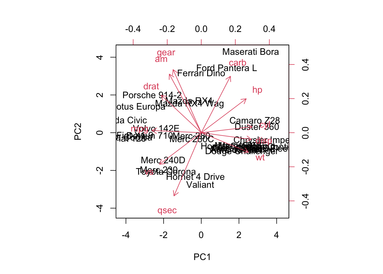
| Version | Author | Date |
|---|---|---|
| 5033c12 | tkcaccia | 2024-09-16 |
Feature Selection:
mtcars prior to feature selection:
str(mtcars)'data.frame': 32 obs. of 11 variables:
$ mpg : num 21 21 22.8 21.4 18.7 18.1 14.3 24.4 22.8 19.2 ...
$ cyl : num 6 6 4 6 8 6 8 4 4 6 ...
$ disp: num 160 160 108 258 360 ...
$ hp : num 110 110 93 110 175 105 245 62 95 123 ...
$ drat: num 3.9 3.9 3.85 3.08 3.15 2.76 3.21 3.69 3.92 3.92 ...
$ wt : num 2.62 2.88 2.32 3.21 3.44 ...
$ qsec: num 16.5 17 18.6 19.4 17 ...
$ vs : num 0 0 1 1 0 1 0 1 1 1 ...
$ am : num 1 1 1 0 0 0 0 0 0 0 ...
$ gear: num 4 4 4 3 3 3 3 4 4 4 ...
$ carb: num 4 4 1 1 2 1 4 2 2 4 ...# Step 1: Calculate the variance for each feature (column)
feature_variances <- apply(mtcars, 2, var)
# Step 2: Set a threshold for filtering low variance features (e.g., use the 25th percentile of the variance)
threshold <- quantile(feature_variances, 0.25)
# Step 3: Retain only the features with variance above the threshold
filtered_data <- mtcars[, feature_variances > threshold]mtcars after feature selection:
str(filtered_data)'data.frame': 32 obs. of 8 variables:
$ mpg : num 21 21 22.8 21.4 18.7 18.1 14.3 24.4 22.8 19.2 ...
$ cyl : num 6 6 4 6 8 6 8 4 4 6 ...
$ disp: num 160 160 108 258 360 ...
$ hp : num 110 110 93 110 175 105 245 62 95 123 ...
$ wt : num 2.62 2.88 2.32 3.21 3.44 ...
$ qsec: num 16.5 17 18.6 19.4 17 ...
$ gear: num 4 4 4 3 3 3 3 4 4 4 ...
$ carb: num 4 4 1 1 2 1 4 2 2 4 ...Hypothesis Testing:
1. T-Test:
A T-test is used to determine if there is a significant difference between the means of two groups. It is typically used when comparing the means of two groups to see if they are statistically different from each other.
When to use?
When comparing the means of two independent groups (Independent T-test).
When comparing the means of two related groups or paired samples (Paired T-test).
# Example Data
method_A <- c(85, 88, 90, 92, 87)
method_B <- c(78, 82, 80, 85, 79)

# Perform T-test
t_test_result <- t.test(method_A, method_B)

# Print results
print(t_test_result)
    Welch Two Sample t-test

data:  method_A and method_B
t = 4.3879, df = 7.9943, p-value = 0.002328
alternative hypothesis: true difference in means is not equal to 0
95 percent confidence interval:
  3.605389 11.594611
sample estimates:
mean of x mean of y
     88.4      80.8
Interpretation: p-value < 0.05 = there is a
significant difference between the paired samples.
2. ANOVA:
ANOVA is used to determine if there are any statistically significant differences between the means of three or more independent groups.
When to use?
- When comparing means among three or more groups.
# Example Data
scores <- data.frame(
  score = c(85, 88, 90, 92, 87, 78, 82, 80, 85, 79, 95, 97, 92, 91, 96),
  method = factor(rep(c("A", "B", "C"), each = 5))
)

# Perform ANOVA
anova_result <- aov(score ~ method, data = scores)

# Print summary of results
summary(anova_result)
Df Sum Sq Mean Sq F value Pr(>F)
method 2 451.6 225.80 31.22 1.76e-05 ***
Residuals 12 86.8 7.23
---
Signif. codes: 0 '***' 0.001 '**' 0.01 '*' 0.05 '.' 0.1 ' ' 1Interpretation: p-value < 0.05 = there is a
significant difference between the group means.
- Post-hoc tests (e.g., Tukey’s HSD) can be used to determine which specific groups differ.
3. Shapiro-Wilk Test for Normality:
The Shapiro-Wilk test assesses whether a sample comes from a normally distributed population. It is particularly useful for checking the normality assumption in parametric tests like the T-test and ANOVA.
When to use?
When you need to check if your data is normally distributed before performing parametric tests.
To validate the assumptions of normality for statistical tests that assume data is normally distributed.
# Example Data
sample_data <- c(5.2, 6.1, 5.8, 7.2, 6.5, 5.9, 6.8, 6.0, 6.7, 5.7)

# Perform Shapiro-Wilk test
shapiro_test_result <- shapiro.test(sample_data)

# Print results
print(shapiro_test_result)
    Shapiro-Wilk normality test

data:  sample_data
W = 0.97508, p-value = 0.9335
Interpretation: The Shapiro-Wilk test returns a p-value that indicates whether the sample deviates from a normal distribution.
p-value > 0.05: Fail to reject the null hypothesis; data is not significantly different from a normal distribution.
p-value ≤ 0.05: Reject the null hypothesis; data significantly deviates from a normal distribution.
4. Chi-Squared Test:
The Chi-squared test is used to determine if there is a significant association between two categorical variables.
When to use?
- When testing the independence of two categorical variables in a contingency table.
# Example Data
study_method <- matrix(c(20, 15, 30, 25), nrow = 2, byrow = TRUE)
rownames(study_method) <- c("Passed", "Failed")
colnames(study_method) <- c("Method A", "Method B")

# Perform Chi-squared test
chi_sq_result <- chisq.test(study_method)

# Print results
print(chi_sq_result)
    Pearson's Chi-squared test with Yates' continuity correction

data:  study_method
X-squared = 0.00058442, df = 1, p-value = 0.9807
Interpretation: p-value < 0.05 there is a
significant association between the study method and the passing
rate.
5. Wilcoxon Signed-Rank Test:
The Wilcoxon Signed-Rank Test is a non-parametric test used to compare two related samples or paired observations to determine if their population mean ranks differ.
When to use?
- When the data is paired and does not meet the assumptions required for a T-test (e.g., non-normality).
# Example Data
before <- c(5, 7, 8, 6, 9)
after <- c(6, 8, 7, 7, 10)

# Perform Wilcoxon Signed-Rank Test
wilcox_test_result <- wilcox.test(before, after, paired = TRUE)
Warning in wilcox.test.default(before, after, paired = TRUE): cannot compute
exact p-value with ties# Print results
print(wilcox_test_result)
    Wilcoxon signed rank test with continuity correction

data:  before and after
V = 3, p-value = 0.233
alternative hypothesis: true location shift is not equal to 0
Interpretation: p-value < 0.05 = there is a
significant difference between the paired samples.
Now your data is ready for downstream analyses!
sessionInfo()R version 4.3.3 (2024-02-29)
Platform: aarch64-apple-darwin20 (64-bit)
Running under: macOS Sonoma 14.5
Matrix products: default
BLAS: /Library/Frameworks/R.framework/Versions/4.3-arm64/Resources/lib/libRblas.0.dylib
LAPACK: /Library/Frameworks/R.framework/Versions/4.3-arm64/Resources/lib/libRlapack.dylib; LAPACK version 3.11.0
locale:
[1] en_US.UTF-8/en_US.UTF-8/en_US.UTF-8/C/en_US.UTF-8/en_US.UTF-8
time zone: America/Bogota
tzcode source: internal
attached base packages:
[1] stats graphics grDevices utils datasets methods base
other attached packages:
[1] corrplot_0.92 ggpubr_0.6.0 dplyr_1.1.4 ggplot2_3.5.1
[5] workflowr_1.7.1
loaded via a namespace (and not attached):
[1] tidyr_1.3.1 sass_0.4.9 utf8_1.2.4 generics_0.1.3
[5] rstatix_0.7.2 stringi_1.8.4 digest_0.6.36 magrittr_2.0.3
[9] evaluate_0.24.0 grid_4.3.3 fastmap_1.2.0 rprojroot_2.0.4
[13] jsonlite_1.8.8 processx_3.8.4 whisker_0.4.1 backports_1.5.0
[17] ps_1.7.7 promises_1.3.0 httr_1.4.7 purrr_1.0.2
[21] fansi_1.0.6 scales_1.3.0 jquerylib_0.1.4 abind_1.4-5
[25] cli_3.6.3 rlang_1.1.4 munsell_0.5.1 withr_3.0.1
[29] cachem_1.1.0 yaml_2.3.10 tools_4.3.3 ggsignif_0.6.4
[33] colorspace_2.1-1 httpuv_1.6.15 broom_1.0.6 vctrs_0.6.5
[37] R6_2.5.1 lifecycle_1.0.4 git2r_0.33.0 stringr_1.5.1
[41] car_3.1-2 fs_1.6.4 pkgconfig_2.0.3 callr_3.7.6
[45] pillar_1.9.0 bslib_0.8.0 later_1.3.2 gtable_0.3.5
[49] glue_1.7.0 Rcpp_1.0.13 highr_0.11 xfun_0.46
[53] tibble_3.2.1 tidyselect_1.2.1 rstudioapi_0.16.0 knitr_1.48
[57] htmltools_0.5.8.1 carData_3.0-5 rmarkdown_2.27 compiler_4.3.3
[61] getPass_0.2-4