Results DESeq2 per species
Maeva Techer
2024-11-02
Last updated: 2024-11-02
Checks: 6 1
Knit directory:
locust-comparative-genomics/
This reproducible R Markdown analysis was created with workflowr (version 1.7.1). The Checks tab describes the reproducibility checks that were applied when the results were created. The Past versions tab lists the development history.
Great! Since the R Markdown file has been committed to the Git repository, you know the exact version of the code that produced these results.
Great job! The global environment was empty. Objects defined in the global environment can affect the analysis in your R Markdown file in unknown ways. For reproduciblity it’s best to always run the code in an empty environment.
The command set.seed(20221025) was run prior to running
the code in the R Markdown file. Setting a seed ensures that any results
that rely on randomness, e.g. subsampling or permutations, are
reproducible.
Great job! Recording the operating system, R version, and package versions is critical for reproducibility.
Nice! There were no cached chunks for this analysis, so you can be confident that you successfully produced the results during this run.
Using absolute paths to the files within your workflowr project makes it difficult for you and others to run your code on a different machine. Change the absolute path(s) below to the suggested relative path(s) to make your code more reproducible.
| absolute | relative |
|---|---|
| /Users/maevatecher/Library/Mobile Documents/comappleCloudDocs/Documents/GitHub/locust-comparative-genomics/data | data |
Great! You are using Git for version control. Tracking code development and connecting the code version to the results is critical for reproducibility.
The results in this page were generated with repository version f763b3c. See the Past versions tab to see a history of the changes made to the R Markdown and HTML files.
Note that you need to be careful to ensure that all relevant files for
the analysis have been committed to Git prior to generating the results
(you can use wflow_publish or
wflow_git_commit). workflowr only checks the R Markdown
file, but you know if there are other scripts or data files that it
depends on. Below is the status of the Git repository when the results
were generated:
Ignored files:
Ignored: .DS_Store
Ignored: .RData
Ignored: .Rhistory
Ignored: .Rproj.user/
Ignored: analysis/.DS_Store
Ignored: analysis/.Rhistory
Ignored: data/.DS_Store
Ignored: data/.Rhistory
Ignored: data/OLD/.DS_Store
Ignored: data/OLD/DEseq2_SCUBE_SCUBE_THORAX_STARnew_features/.DS_Store
Ignored: data/OLD/DEseq2_SGREG_SGREG_HEAD_STARnew_features/.DS_Store
Ignored: data/OLD/DEseq2_SGREG_SGREG_THORAX_STARnew_features/.DS_Store
Ignored: data/OLD/americana/.DS_Store
Ignored: data/OLD/americana/deg_counts/.DS_Store
Ignored: data/OLD/americana/deg_counts/STAR_newparams/.DS_Store
Ignored: data/OLD/cubense/deg_counts/STAR/cubense/featurecounts/
Ignored: data/OLD/cubense/deg_counts/STAR/gregaria/
Ignored: data/OLD/gregaria/.DS_Store
Ignored: data/OLD/gregaria/deg_counts/.DS_Store
Ignored: data/OLD/gregaria/deg_counts/STAR/.DS_Store
Ignored: data/OLD/gregaria/deg_counts/STAR/gregaria/.DS_Store
Ignored: data/OLD/gregaria/deg_counts/STAR_newparams/.DS_Store
Ignored: data/OLD/piceifrons/.DS_Store
Ignored: data/annotation/
Ignored: data/list/.DS_Store
Ignored: figures/
Ignored: tables/
Unstaged changes:
Modified: data/list/Thorax_americana_nooutliers.txt
Modified: data/list/Thorax_cancellata_nooutliers.txt
Modified: data/list/Thorax_cubense_nooutliers.txt
Modified: data/list/Thorax_gregaria_nooutliers.txt
Modified: data/list/Thorax_nitens_nooutliers.txt
Modified: data/list/Thorax_piceifrons.txt
Note that any generated files, e.g. HTML, png, CSS, etc., are not included in this status report because it is ok for generated content to have uncommitted changes.
These are the previous versions of the repository in which changes were
made to the R Markdown (analysis/3_deseq2-results.Rmd) and
HTML (docs/3_deseq2-results.html) files. If you’ve
configured a remote Git repository (see ?wflow_git_remote),
click on the hyperlinks in the table below to view the files as they
were in that past version.
| File | Version | Author | Date | Message |
|---|---|---|---|---|
| Rmd | f763b3c | Maeva TECHER | 2024-11-02 | workflowr::wflow_publish(c("../analysis/3_deseq2-results.Rmd")) |
| html | 66ffff7 | Maeva TECHER | 2024-11-02 | Build site. |
| Rmd | bb5a302 | Maeva TECHER | 2024-11-02 | workflowr::wflow_publish(c("../analysis/3_deseq2-results.Rmd")) |
| html | 01490a8 | Maeva TECHER | 2024-11-02 | Build site. |
| Rmd | 4322067 | Maeva TECHER | 2024-11-02 | workflowr::wflow_publish(c("../analysis/3_deseq2-results.Rmd", |
| html | 1aaa476 | Maeva TECHER | 2024-11-01 | push |
| Rmd | f01f1cf | Maeva TECHER | 2024-11-01 | Adding new files and docs |
| html | f01f1cf | Maeva TECHER | 2024-11-01 | Adding new files and docs |
Load the libraries
We start by loading all the required R packages.
#(install first from CRAN or Bioconductor)
library("DESeq2")
library("tximport")
library("txdbmaker")
library("knitr")
library("rmdformats")
library("tidyverse")
library("data.table")
library("DT") # for making interactive search table
library("plotly") # for interactive plots
library("ggthemes") # for theme_calc
library("reshape2")
library("ComplexHeatmap")
library("RColorBrewer")
library("circlize")
library("apeglm")
library("ggpubr")
library("ggplot2")
library("ggrepel")
library("EnhancedVolcano")
library("SARTools")
library("pheatmap")
library("clusterProfiler")
library("sva")
library("cowplot")
library("ashr")
library("vsn")
library("ggdist")
library("ggConvexHull")
library("kableExtra")
library("plotly")
# Path for all species
workDir <- "/Users/maevatecher/Library/Mobile Documents/com~apple~CloudDocs/Documents/GitHub/locust-comparative-genomics/data"
## PARAMETERS for running DEseq2
tresh_logfold <- 1 # Treshold for log2(foldchange) in final DE-files
tresh_padj <- 0.05 # Treshold for adjusted p-valued in final DE-files
alpha_DEseq2 <- 0.05 # threshold of statistical significance
pAdjustMethod_DEseq2 <- "BH" # p-value adjustment method: "BH" (default) or "BY"
featuresToRemove <- c(NULL) # names of the features to be removed, NULL if none or if using Idxstats
varInt <- "RearingCondition" # factor of interest
condRef <- "Isolated" # reference biological condition
batch <- NULL # blocking factor: NULL (default) or "batch" for example
fitType <- "parametric" # mean-variance relationship: "parametric" (default) or "local"
cooksCutoff <- TRUE # TRUE/FALSE to perform the outliers detection (default is TRUE)
independentFiltering <- TRUE # TRUE/FALSE to perform independent filtering (default is TRUE)
typeTrans <- "rlog" # transformation for PCA/clustering: "VST" or "rlog"
locfunc <- "median"STRATEGY 1: One genome S. gregaria
DEGs in bulk Head tissues
piceifrons
cancellata
americana
cubense
nitens
STRATEGY 2: Own RefSeq genome
STAR + featurecounts + DEseq2 {.tabset .tabset-fade}
DEGs in bulk Head tissues
This follows the same code as for STRATEGY 1 except that we will change the RefSeq to the transcript species genome path.
gregaria
rawDir <- file.path(workDir, "03-gregaria-DESeq2")
# Path and name of targetfile containing conditions and file names
species <- "gregaria"
targetFile <- file.path(workDir, "list", paste0("Head", "_", species, ".txt"))
sampletable <- fread(targetFile)
rownames(sampletable) <- sampletable$SampleName
sampletable$RearingCondition <- as.factor(sampletable$RearingCondition)
sampletable$Tissue <- as.factor(sampletable$Tissue)
## Import count files
satoshi <- DESeqDataSetFromHTSeqCount(sampleTable = sampletable,
directory = rawDir,
design = ~ RearingCondition )
#satoshi
smallestGroupSize <- 3
keep <- rowSums(counts(satoshi) >= 5) >= smallestGroupSize
satoshi <- satoshi[keep,]
#nrow(satoshi)
satoshi$RearingCondition <- relevel(satoshi$RearingCondition, ref = "Isolated")
# Fit the statistical model
shigeru <- DESeq(satoshi)
#cbind(resultsNames(shigeru))
res_shigeru <- results(shigeru)
sum(res_shigeru$padj < tresh_padj, na.rm = TRUE)[1] 5697A total of 5,697 genes out of the pre-filtered 16,305 features were showing significant differences in expression levels. The summary below showed how many were upregulated and downregulated in crowded compared to isolated it is possible to scroll it.
brock <- results(shigeru, name = "RearingCondition_Crowded_vs_Isolated", alpha = alpha_DEseq2)
summary(brock)
out of 16305 with nonzero total read count
adjusted p-value < 0.05
LFC > 0 (up) : 2709, 17%
LFC < 0 (down) : 2988, 18%
outliers [1] : 99, 0.61%
low counts [2] : 0, 0%
(mean count < 1)
[1] see 'cooksCutoff' argument of ?results
[2] see 'independentFiltering' argument of ?results#mcols(brock)$description
#head(brock)
brock_df <- as.data.frame(brock)
datatable(brock_df, options = list(
pageLength = 10, # Set initial page length
scrollX = TRUE, # Enable horizontal scrolling
autoWidth = TRUE, # Adjust column width automatically
searchHighlight = TRUE # Highlight search matches
))Now we will make the different plots: PCA, MA and Volcano.
# Try with the data transformation
shigeru_vst <- vst(shigeru)
shigeru_rlog <- rlog(shigeru)
shigeru_ntd <- normTransform(shigeru)
itadori <- meanSdPlot(assay(shigeru_ntd))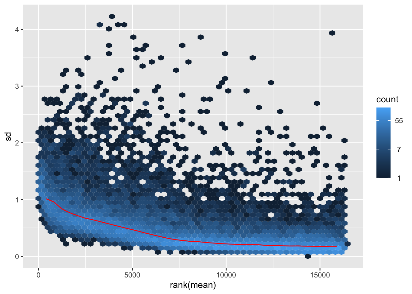
| Version | Author | Date |
|---|---|---|
| f01f1cf | Maeva TECHER | 2024-11-01 |
itadori2 <- itadori$gg + ggtitle("Transformation with ntd")
itadori2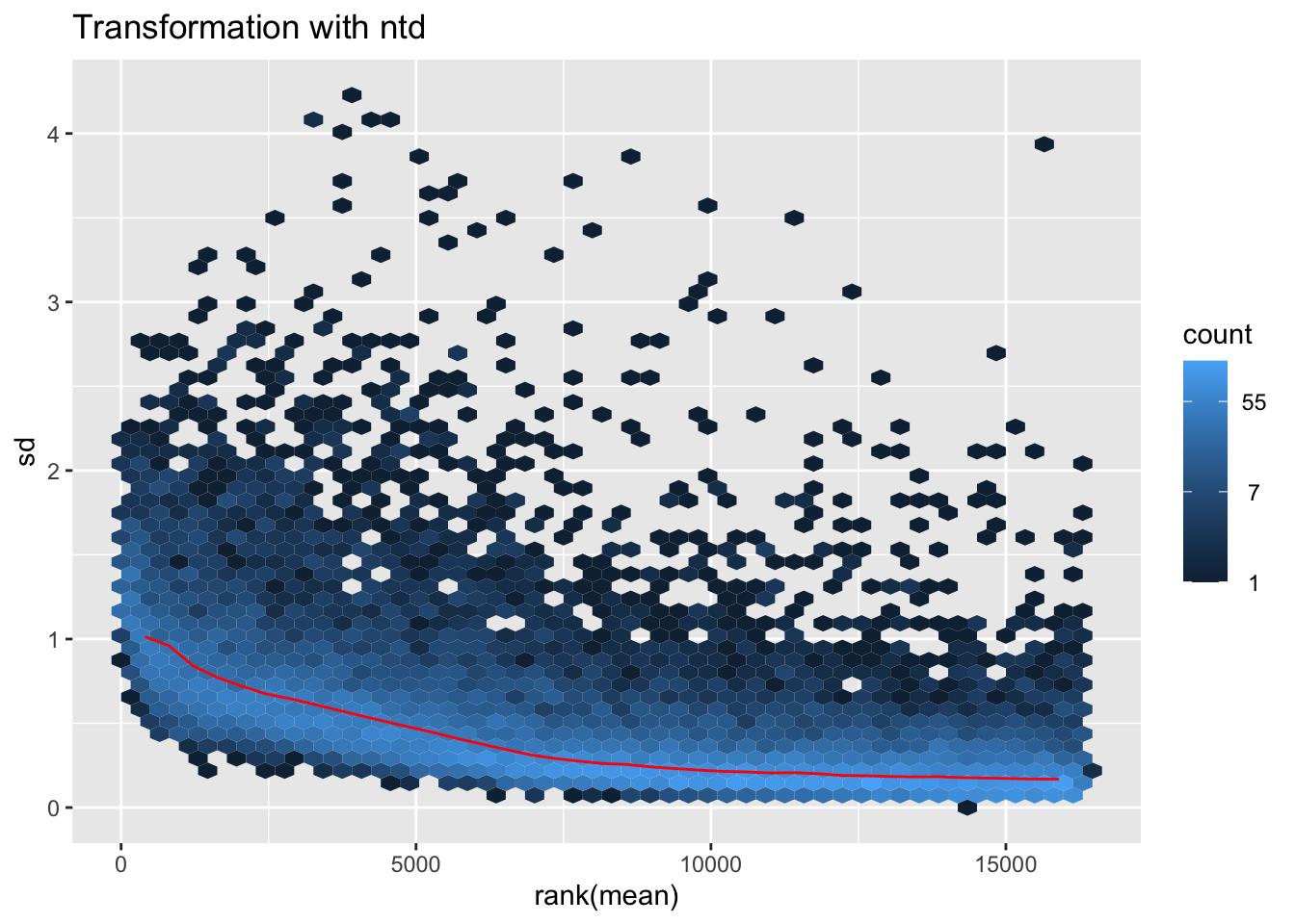
| Version | Author | Date |
|---|---|---|
| f01f1cf | Maeva TECHER | 2024-11-01 |
megumi <- meanSdPlot(assay(shigeru_vst))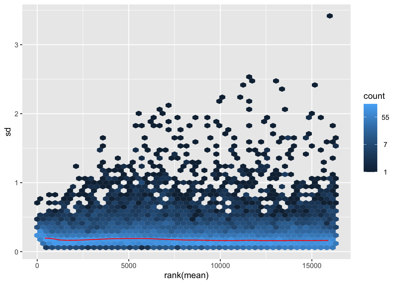
| Version | Author | Date |
|---|---|---|
| f01f1cf | Maeva TECHER | 2024-11-01 |
megumi2 <- megumi$gg + ggtitle("Transformation with vst")
megumi2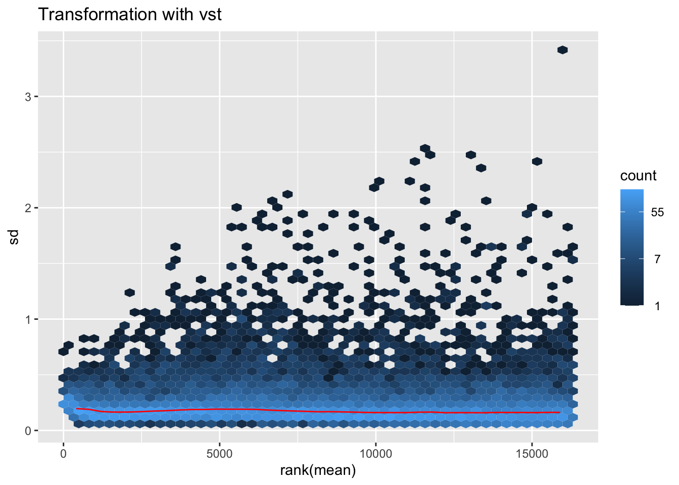
| Version | Author | Date |
|---|---|---|
| f01f1cf | Maeva TECHER | 2024-11-01 |
nobara <- meanSdPlot(assay(shigeru_rlog))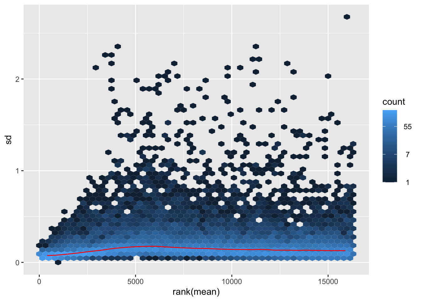
| Version | Author | Date |
|---|---|---|
| f01f1cf | Maeva TECHER | 2024-11-01 |
nobara2 <-nobara$gg + ggtitle("Transformation with rlog")
nobara2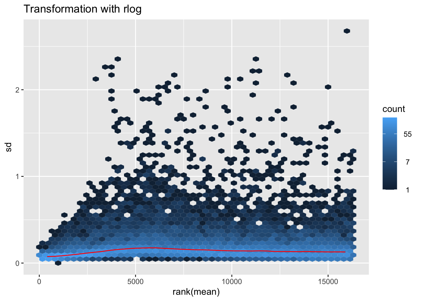
| Version | Author | Date |
|---|---|---|
| f01f1cf | Maeva TECHER | 2024-11-01 |
# Create the pca on the defined groups
pcaData1 <- plotPCA(object = shigeru_rlog, intgroup = c("RearingCondition"),returnData=TRUE)
percentVar <- round(100 * attr(pcaData1, "percentVar"))
pcaData1$RearingCondition<-factor(pcaData1$RearingCondition,levels=c("Crowded","Isolated"), labels=c("Crowded S. gregaria","Isolated S. gregaria"))
#levels(pcaData1$RearingCondition)
p1 <- ggplot(pcaData1, aes(PC1, PC2, color= RearingCondition)) +
geom_point(size=6) +
xlab(paste0("PC1: ", percentVar[1], "% variance")) +
ylab(paste0("PC2: ", percentVar[2], "% variance")) +
scale_color_manual(values = c("blue", "red")) +
#coord_fixed() +
theme_bw() +
theme(legend.title = element_blank()) +
theme(legend.text = element_text(face="bold", size=16)) +
theme(axis.text = element_text(size=14)) +
theme(axis.title = element_text(size=14))
p1 + geom_convexhull(aes(fill = RearingCondition, color = RearingCondition), alpha = 0.5) +
scale_fill_manual(values = c("blue", "red"))+
ggtitle("PCA on S. gregaria Head tissues", subtitle = "rlog transformation") 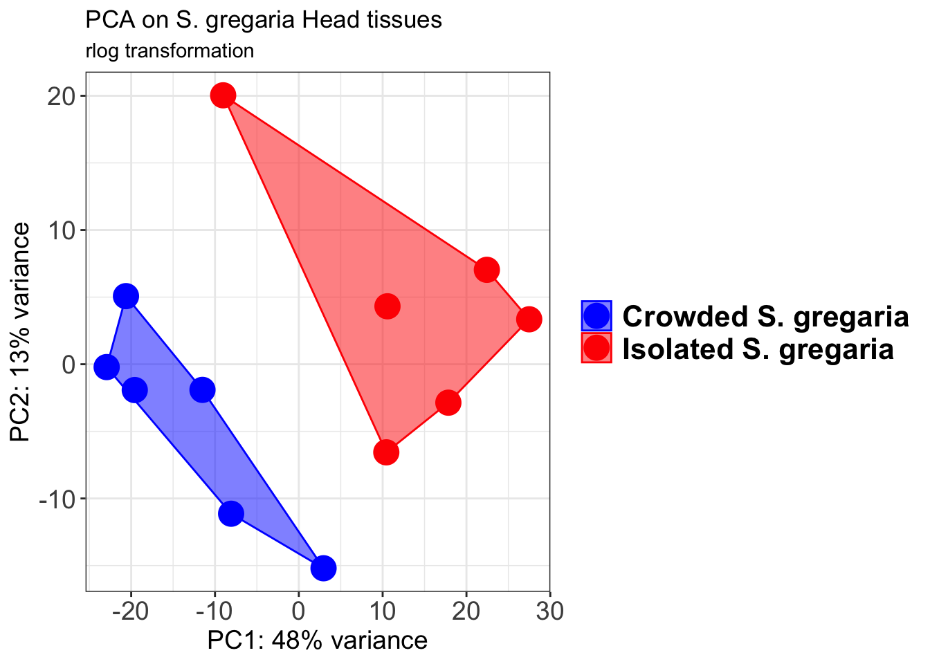
| Version | Author | Date |
|---|---|---|
| f01f1cf | Maeva TECHER | 2024-11-01 |
pcaData2 <- plotPCA(object = shigeru_vst, intgroup = c("RearingCondition"),returnData=TRUE)
percentVar <- round(100 * attr(pcaData2, "percentVar"))
pcaData2$RearingCondition<-factor(pcaData2$RearingCondition,levels=c("Crowded","Isolated"), labels=c("Crowded S. gregaria","Isolated S. gregaria"))
#levels(pcaData2$RearingCondition)
p2 <-ggplot(pcaData2, aes(PC1, PC2, color= RearingCondition)) +
geom_point(size=6) +
xlab(paste0("PC1: ", percentVar[1], "% variance")) +
ylab(paste0("PC2: ", percentVar[2], "% variance")) +
scale_color_manual(values = c("blue", "red")) +
#coord_fixed() +
theme_bw() +
theme(legend.title = element_blank()) +
theme(legend.text = element_text(face="bold", size=16)) +
theme(axis.text = element_text(size=14)) +
theme(axis.title = element_text(size=14))
p2 + geom_convexhull(aes(fill = RearingCondition, color = RearingCondition), alpha = 0.5) +
scale_fill_manual(values = c("blue", "red"))+
ggtitle("PCA on S. gregaria Head tissues", subtitle = "vst transformation") 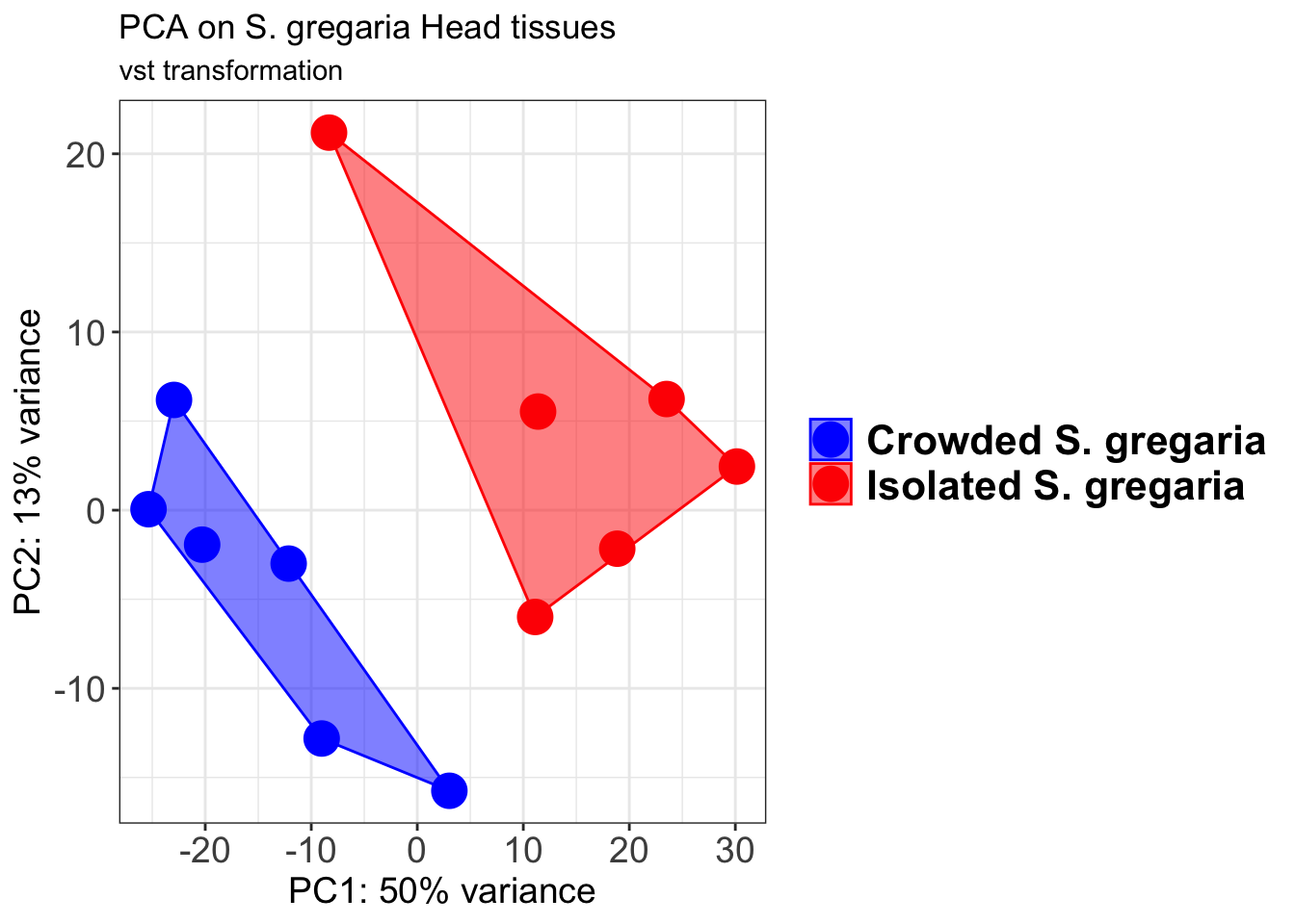
| Version | Author | Date |
|---|---|---|
| f01f1cf | Maeva TECHER | 2024-11-01 |
select <- order(rowMeans(counts(shigeru,normalized=TRUE)),
decreasing=TRUE)[1:12]
df <- as.data.frame(colData(shigeru)[,c("RearingCondition","Tissue")])
# Count matrix
pheatmap(assay(shigeru_ntd)[select,], cluster_rows=FALSE, show_rownames=FALSE,
cluster_cols=FALSE, annotation_col=df, main = "Count Matrix after norm transformation")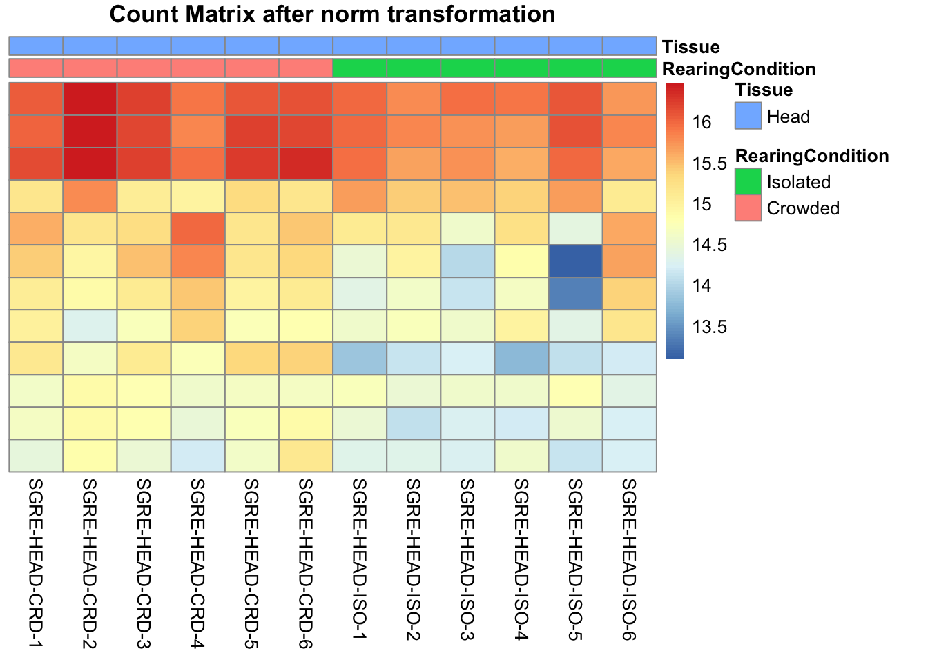
| Version | Author | Date |
|---|---|---|
| f01f1cf | Maeva TECHER | 2024-11-01 |
pheatmap(assay(shigeru_vst)[select,], cluster_rows=FALSE, show_rownames=FALSE,
cluster_cols=FALSE, annotation_col=df, main = "Count Matrix after vst transformation")
| Version | Author | Date |
|---|---|---|
| f01f1cf | Maeva TECHER | 2024-11-01 |
pheatmap(assay(shigeru_rlog)[select,], cluster_rows=FALSE, show_rownames=FALSE,
cluster_cols=FALSE, annotation_col=df, main = "Count Matrix after rlog transformation")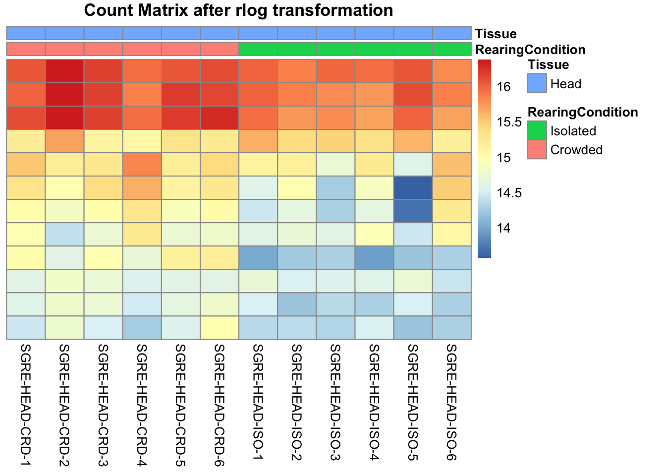
| Version | Author | Date |
|---|---|---|
| f01f1cf | Maeva TECHER | 2024-11-01 |
# calculate between-sample distance matrix
metadata <- sampletable[,c("RearingCondition", "Tissue")]
rownames(metadata) <- sampletable$SampleName
sampleDistMatrix.rlog <- as.matrix(dist(t(assay(shigeru_rlog))))
pheatmap(sampleDistMatrix.rlog, annotation_col=metadata, main = "Head tissue heatmap distance matrix, rlog transformation")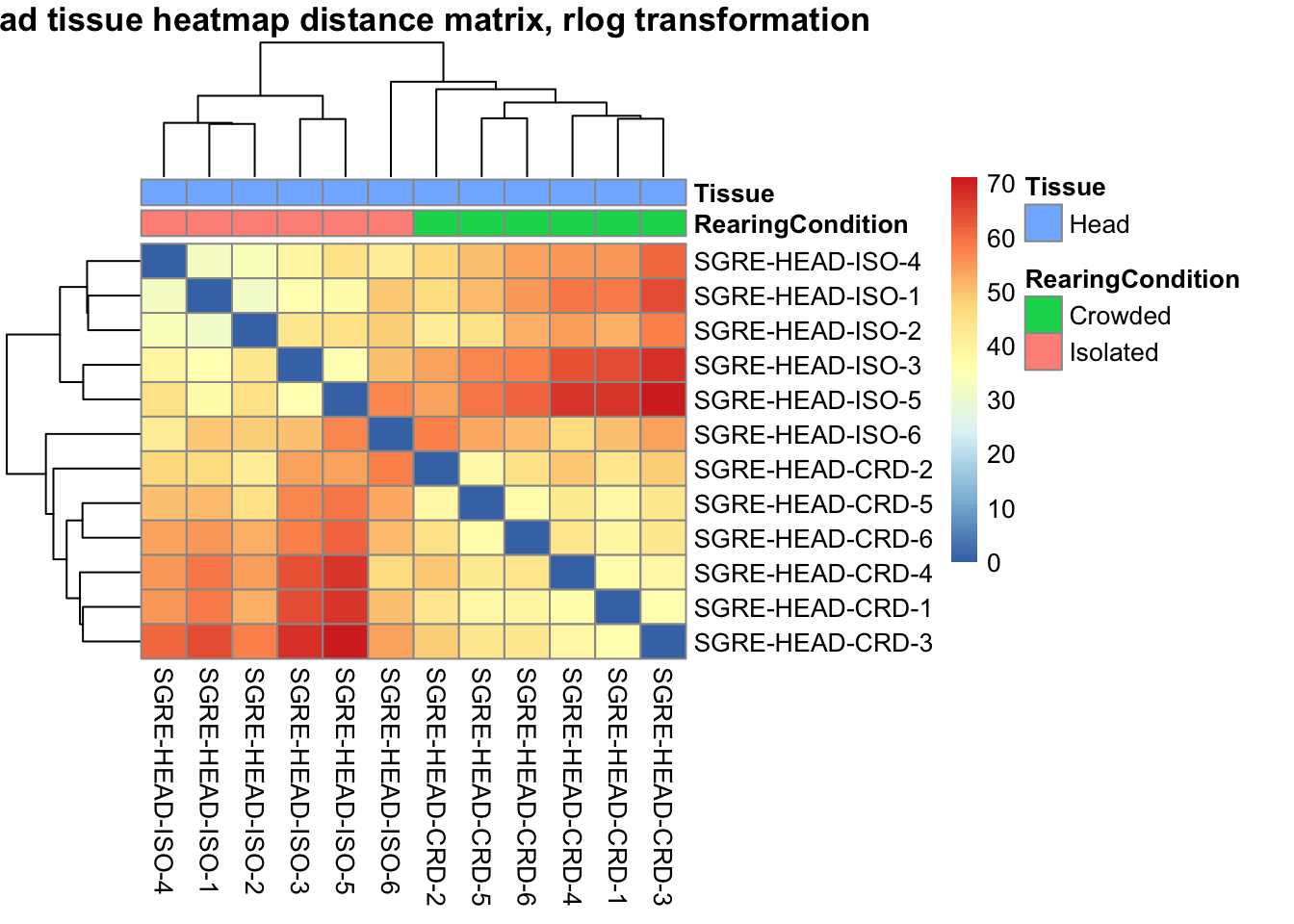
| Version | Author | Date |
|---|---|---|
| f01f1cf | Maeva TECHER | 2024-11-01 |
sampleDistMatrix.vst<- as.matrix(dist(t(assay(shigeru_vst))))
pheatmap(sampleDistMatrix.vst, annotation_col=metadata, main = "Head tissue heatmap distance matrix, rlog transformation")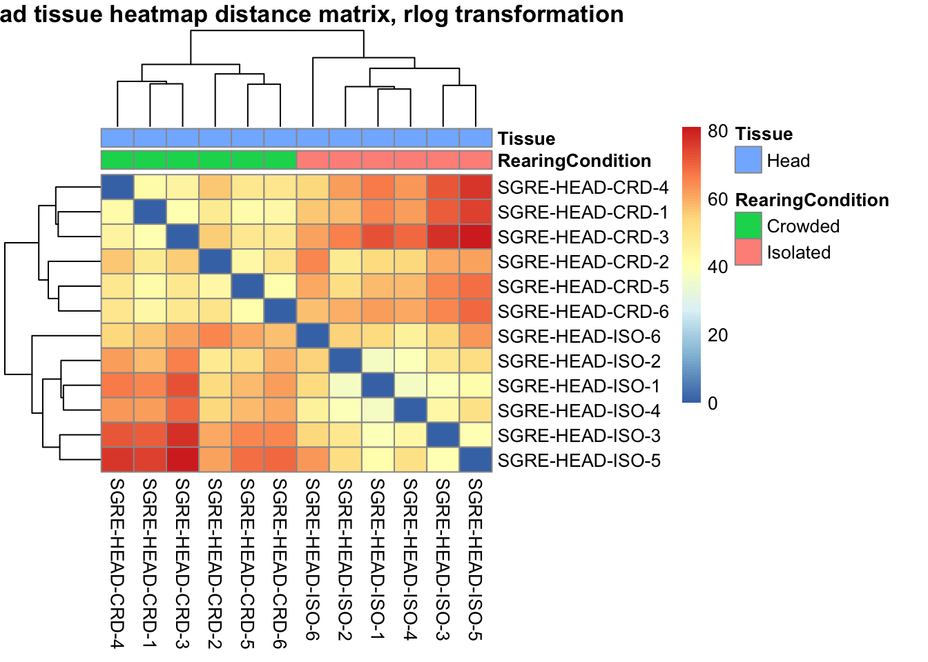
| Version | Author | Date |
|---|---|---|
| f01f1cf | Maeva TECHER | 2024-11-01 |
The following plots are interactive and we can hover or Zoom on the locus of interest.
# Ma plot parameters after shrinkage
de_shrink <- lfcShrink(dds = shigeru, coef="RearingCondition_Crowded_vs_Isolated", type="apeglm")
#head(de_shrink)
maplot <-ggmaplot(de_shrink, fdr = 0.05, fc = 1, size = 1, palette = c("#B31B21", "#1465AC", "darkgray"), genenames = as.vector(rownames(de_shrink$name)), top = 0,legend="top",label.select = NULL) +
coord_cartesian(xlim = c(0, 20)) +
scale_y_continuous(limits=c(-12, 12)) +
theme(axis.text.x = element_text(size=12),axis.text.y = element_text(size=12),axis.title.x = element_text(size=14),axis.title.y = element_text(size=14),axis.line = element_line(size = 1, colour="gray20"),axis.ticks = element_line(size = 1, colour="gray20")) +
guides(color = guide_legend(override.aes = list(size = c(3,3,3)))) +
theme(legend.position = c(0.70, 0.12),legend.text=element_text(size=14,face="bold"),legend.background = element_rect(fill="transparent")) +
theme(plot.title = element_text(size=18, colour="gray30", face="bold",hjust=0.06, vjust=-5)) +
labs(title="MA-plot for the shrunken log2 fold changes in the Head tissues")
interactive_maplot <- ggplotly(maplot)
interactive_maplot#Volcano plot
keyvals <-ifelse(
res_shigeru$log2FoldChange >= 1 & res_shigeru$padj <= 0.05, '#B31B21',
ifelse(res_shigeru$log2FoldChange <= -1 & res_shigeru$padj <= 0.05, '#1465AC', 'darkgray'))
keyvals[is.na(keyvals)] <-'lightgray'
names(keyvals)[keyvals == "#B31B21"] <-'Upregulated'
names(keyvals)[keyvals == "#1465AC"] <-'Downregulated'
names(keyvals)[keyvals == 'darkgray'] <-'NS'
res_shigeru$color <- keyvals
volcano_plot <- ggplot(res_shigeru, aes(x = log2FoldChange, y = -log10(padj),
color = color, # Use the color column with keyvals
text = rownames(res_shigeru))) +
geom_point(size = 3, alpha = 0.8) +
scale_color_identity() + # Directly use the color values from `keyvals`
guides(color = "none") + # Hide the color legend
labs(title = "Volcano Plot DEG Head S. gregaria", x = "log2 Fold Change", y = "-log10 Adjusted P-Value") +
theme_minimal()
# Convert to interactive plot with hover text for gene names
interactive_volcano <- ggplotly(volcano_plot, tooltip = "text") %>%
layout(hoverlabel = list(namelength = -1))
# Display the interactive plot
interactive_volcanopiceifrons
rawDir <- file.path(workDir, "03-piceifrons-DESeq2")
# Path and name of targetfile containing conditions and file names
species <- "piceifrons"
targetFile <- file.path(workDir, "list", paste0("Head", "_", species, "_nooutliers.txt"))
sampletable <- fread(targetFile)
rownames(sampletable) <- sampletable$SampleName
sampletable$RearingCondition <- as.factor(sampletable$RearingCondition)
sampletable$Tissue <- as.factor(sampletable$Tissue)
## Import count files
satoshi <- DESeqDataSetFromHTSeqCount(sampleTable = sampletable,
directory = rawDir,
design = ~ RearingCondition )
#satoshi
smallestGroupSize <- 3
keep <- rowSums(counts(satoshi) >= 5) >= smallestGroupSize
satoshi <- satoshi[keep,]
#nrow(satoshi)
satoshi$RearingCondition <- relevel(satoshi$RearingCondition, ref = "Isolated")
# Fit the statistical model
shigeru <- DESeq(satoshi)
#cbind(resultsNames(shigeru))
res_shigeru <- results(shigeru)
sum(res_shigeru$padj < tresh_padj, na.rm = TRUE)[1] 1053A total of 1,053 genes out of the pre-filtered 13,527 features were showing significant differences in expression levels. The summary below showed how many were upregulated and downregulated in crowded compared to isolated it is possible to scroll it.
brock <- results(shigeru, name = "RearingCondition_Crowded_vs_Isolated", alpha = alpha_DEseq2)
summary(brock)
out of 13527 with nonzero total read count
adjusted p-value < 0.05
LFC > 0 (up) : 538, 4%
LFC < 0 (down) : 518, 3.8%
outliers [1] : 43, 0.32%
low counts [2] : 525, 3.9%
(mean count < 5)
[1] see 'cooksCutoff' argument of ?results
[2] see 'independentFiltering' argument of ?results#mcols(brock)$description
#head(brock)
brock_df <- as.data.frame(brock)
datatable(brock_df, options = list(
pageLength = 10, # Set initial page length
scrollX = TRUE, # Enable horizontal scrolling
autoWidth = TRUE, # Adjust column width automatically
searchHighlight = TRUE # Highlight search matches
))Now we will make the different plots: PCA, MA and Volcano.
# Try with the data transformation
shigeru_vst <- vst(shigeru)
shigeru_rlog <- rlog(shigeru)
shigeru_ntd <- normTransform(shigeru)
itadori <- meanSdPlot(assay(shigeru_ntd))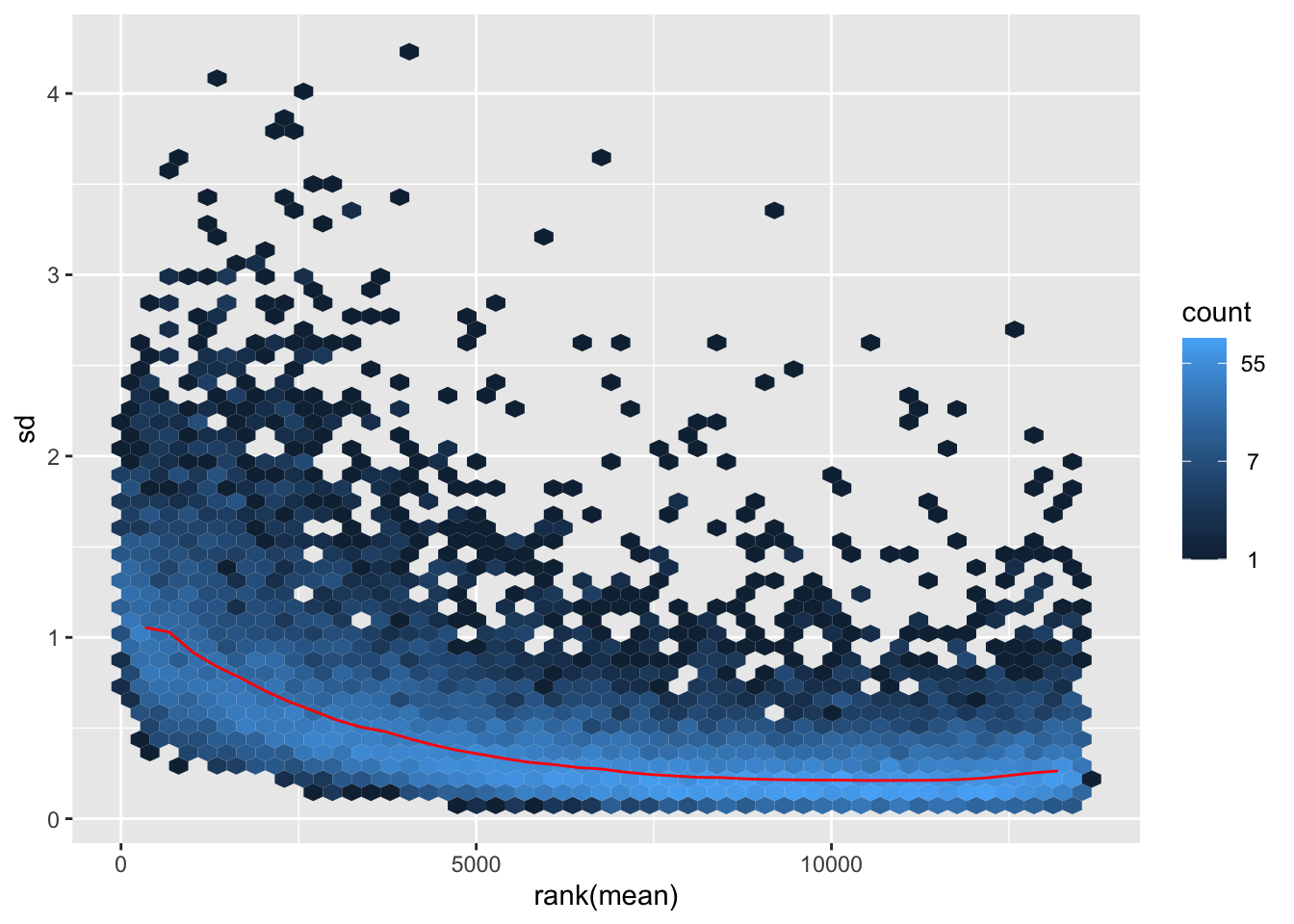
itadori2 <- itadori$gg + ggtitle("Transformation with ntd")
itadori2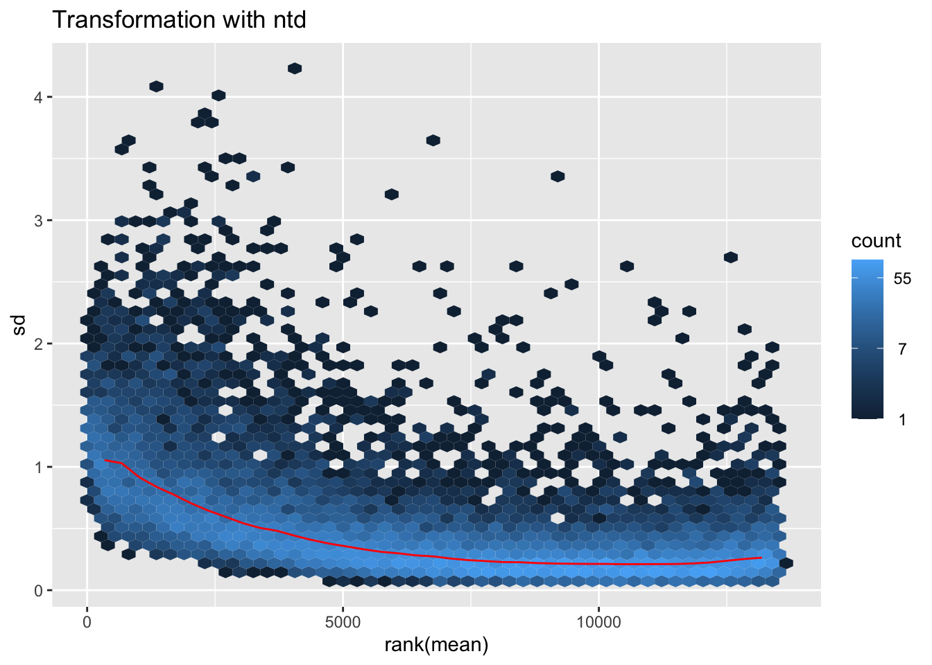
megumi <- meanSdPlot(assay(shigeru_vst))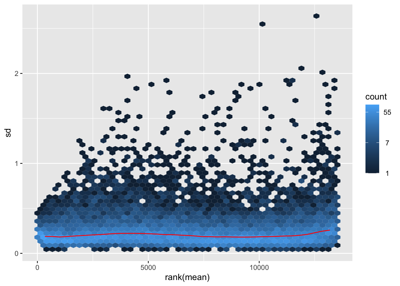
megumi2 <- megumi$gg + ggtitle("Transformation with vst")
megumi2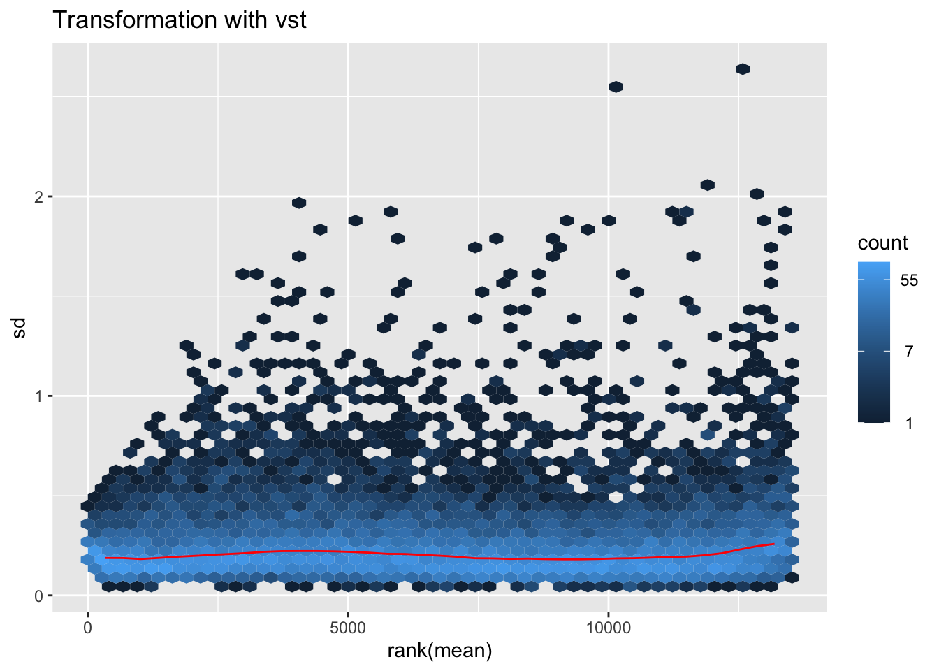
nobara <- meanSdPlot(assay(shigeru_rlog))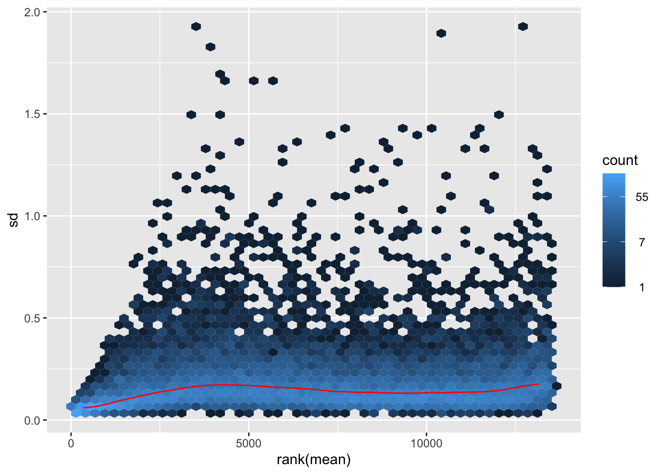
nobara2 <-nobara$gg + ggtitle("Transformation with rlog")
nobara2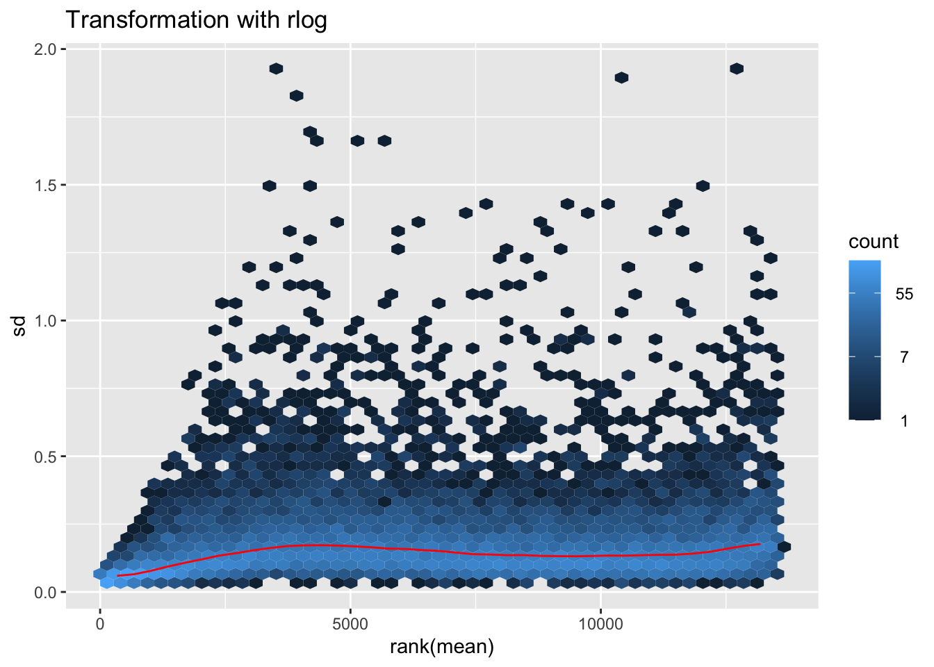
# Create the pca on the defined groups
pcaData1 <- plotPCA(object = shigeru_rlog, intgroup = c("RearingCondition"),returnData=TRUE)
percentVar <- round(100 * attr(pcaData1, "percentVar"))
pcaData1$RearingCondition<-factor(pcaData1$RearingCondition,levels=c("Crowded","Isolated"), labels=c("Crowded S. piceifrons","Isolated S. piceifrons"))
#levels(pcaData1$RearingCondition)
p1 <- ggplot(pcaData1, aes(PC1, PC2, color= RearingCondition)) +
geom_point(size=6) +
xlab(paste0("PC1: ", percentVar[1], "% variance")) +
ylab(paste0("PC2: ", percentVar[2], "% variance")) +
scale_color_manual(values = c("blue", "red")) +
#coord_fixed() +
theme_bw() +
theme(legend.title = element_blank()) +
theme(legend.text = element_text(face="bold", size=16)) +
theme(axis.text = element_text(size=14)) +
theme(axis.title = element_text(size=14))
p1 + geom_convexhull(aes(fill = RearingCondition, color = RearingCondition), alpha = 0.5) +
scale_fill_manual(values = c("blue", "red"))+
ggtitle("PCA on S. piceifrons Head tissues", subtitle = "rlog transformation") 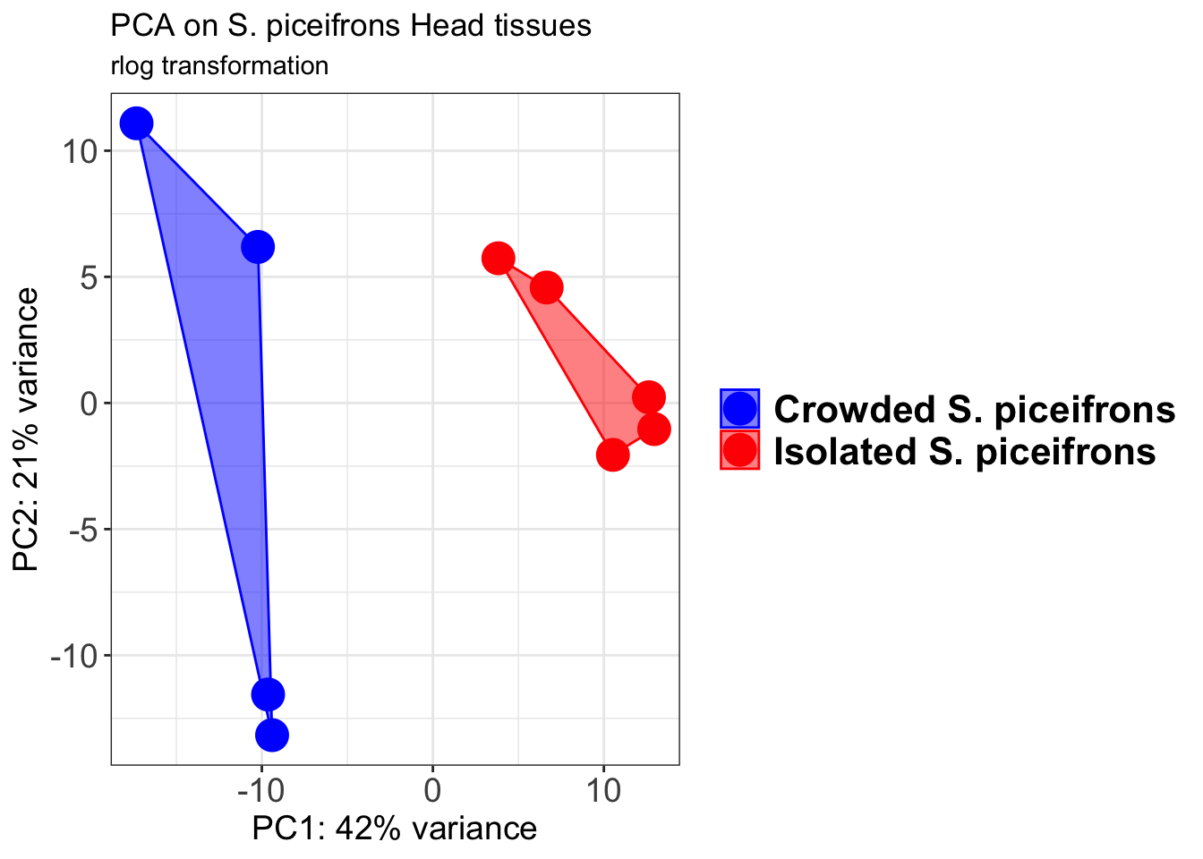
pcaData2 <- plotPCA(object = shigeru_vst, intgroup = c("RearingCondition"),returnData=TRUE)
percentVar <- round(100 * attr(pcaData2, "percentVar"))
pcaData2$RearingCondition<-factor(pcaData2$RearingCondition,levels=c("Crowded","Isolated"), labels=c("Crowded S. piceifrons","Isolated S. piceifrons"))
#levels(pcaData2$RearingCondition)
p2 <-ggplot(pcaData2, aes(PC1, PC2, color= RearingCondition)) +
geom_point(size=6) +
xlab(paste0("PC1: ", percentVar[1], "% variance")) +
ylab(paste0("PC2: ", percentVar[2], "% variance")) +
scale_color_manual(values = c("blue", "red")) +
#coord_fixed() +
theme_bw() +
theme(legend.title = element_blank()) +
theme(legend.text = element_text(face="bold", size=16)) +
theme(axis.text = element_text(size=14)) +
theme(axis.title = element_text(size=14))
p2 + geom_convexhull(aes(fill = RearingCondition, color = RearingCondition), alpha = 0.5) +
scale_fill_manual(values = c("blue", "red"))+
ggtitle("PCA on S. piceifrons Head tissues", subtitle = "vst transformation") 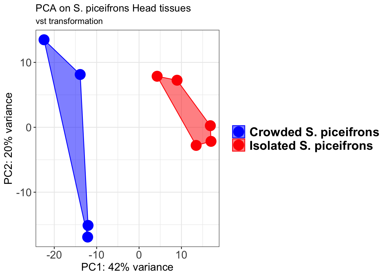
select <- order(rowMeans(counts(shigeru,normalized=TRUE)),
decreasing=TRUE)[1:12]
df <- as.data.frame(colData(shigeru)[,c("RearingCondition","Tissue")])
# Count matrix
pheatmap(assay(shigeru_ntd)[select,], cluster_rows=FALSE, show_rownames=FALSE,
cluster_cols=FALSE, annotation_col=df, main = "Count Matrix after norm transformation")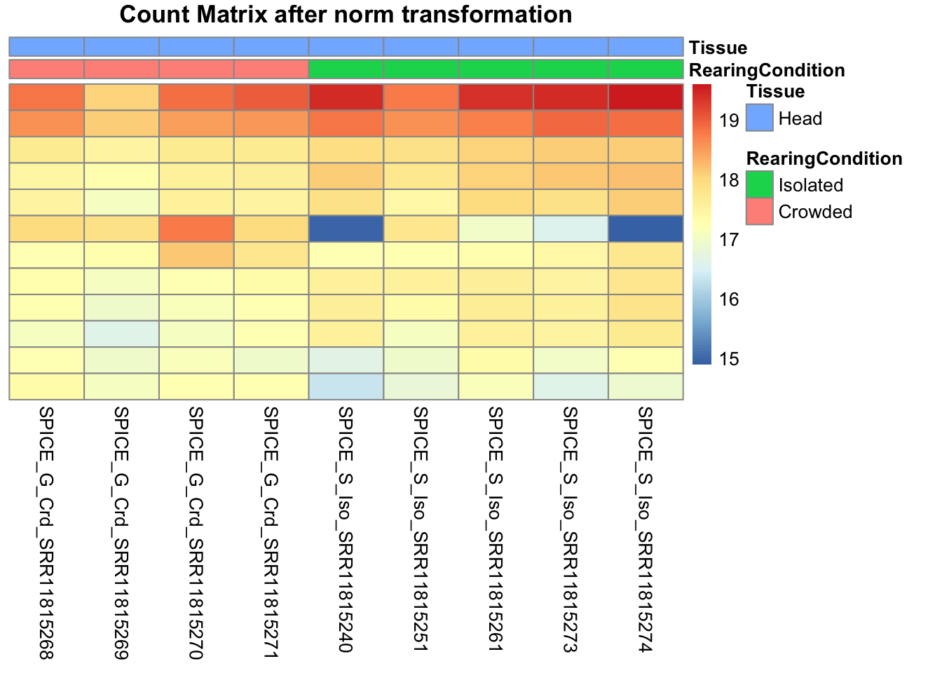
pheatmap(assay(shigeru_vst)[select,], cluster_rows=FALSE, show_rownames=FALSE,
cluster_cols=FALSE, annotation_col=df, main = "Count Matrix after vst transformation")
pheatmap(assay(shigeru_rlog)[select,], cluster_rows=FALSE, show_rownames=FALSE,
cluster_cols=FALSE, annotation_col=df, main = "Count Matrix after rlog transformation")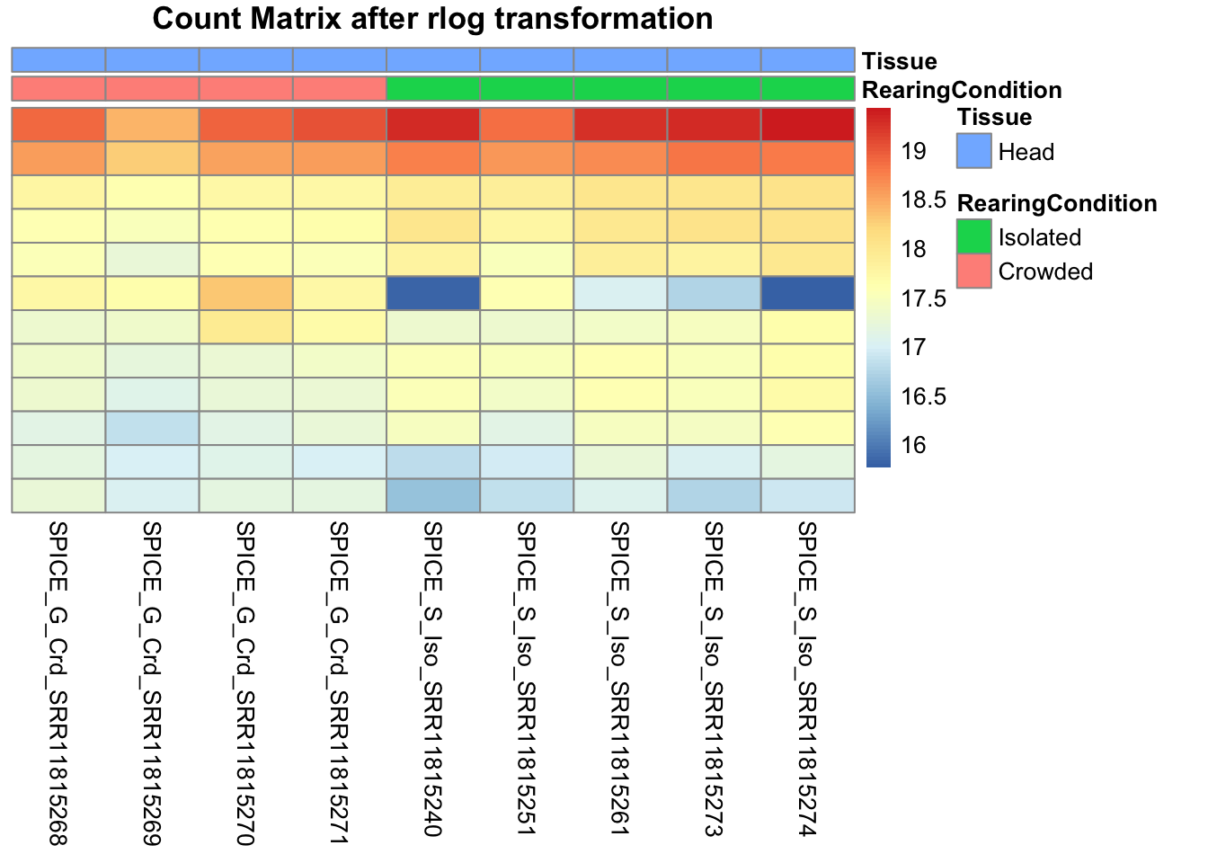
# calculate between-sample distance matrix
metadata <- sampletable[,c("RearingCondition", "Tissue")]
rownames(metadata) <- sampletable$SampleName
sampleDistMatrix.rlog <- as.matrix(dist(t(assay(shigeru_rlog))))
pheatmap(sampleDistMatrix.rlog, annotation_col=metadata, main = "Head tissue heatmap distance matrix, rlog transformation")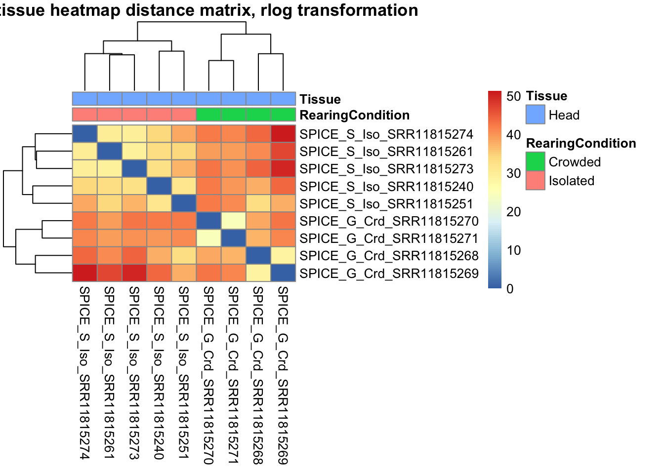
sampleDistMatrix.vst<- as.matrix(dist(t(assay(shigeru_vst))))
pheatmap(sampleDistMatrix.vst, annotation_col=metadata, main = "Head tissue heatmap distance matrix, rlog transformation")
The following plots are interactive and we can hover or Zoom on the locus of interest.
# Ma plot parameters after shrinkage
de_shrink <- lfcShrink(dds = shigeru, coef="RearingCondition_Crowded_vs_Isolated", type="apeglm")
#head(de_shrink)
maplot <-ggmaplot(de_shrink, fdr = 0.05, fc = 1, size = 1, palette = c("#B31B21", "#1465AC", "darkgray"), genenames = as.vector(rownames(de_shrink$name)), top = 0,legend="top",label.select = NULL) +
coord_cartesian(xlim = c(0, 20)) +
scale_y_continuous(limits=c(-12, 12)) +
theme(axis.text.x = element_text(size=12),axis.text.y = element_text(size=12),axis.title.x = element_text(size=14),axis.title.y = element_text(size=14),axis.line = element_line(size = 1, colour="gray20"),axis.ticks = element_line(size = 1, colour="gray20")) +
guides(color = guide_legend(override.aes = list(size = c(3,3,3)))) +
theme(legend.position = c(0.70, 0.12),legend.text=element_text(size=14,face="bold"),legend.background = element_rect(fill="transparent")) +
theme(plot.title = element_text(size=18, colour="gray30", face="bold",hjust=0.06, vjust=-5)) +
labs(title="MA-plot for the shrunken log2 fold changes in the Head tissues")
interactive_maplot <- ggplotly(maplot)
interactive_maplot#Volcano plot
keyvals <-ifelse(
res_shigeru$log2FoldChange >= 1 & res_shigeru$padj <= 0.05, '#B31B21',
ifelse(res_shigeru$log2FoldChange <= -1 & res_shigeru$padj <= 0.05, '#1465AC', 'darkgray'))
keyvals[is.na(keyvals)] <-'lightgray'
names(keyvals)[keyvals == "#B31B21"] <-'Upregulated'
names(keyvals)[keyvals == "#1465AC"] <-'Downregulated'
names(keyvals)[keyvals == 'darkgray'] <-'NS'
res_shigeru$color <- keyvals
volcano_plot <- ggplot(res_shigeru, aes(x = log2FoldChange, y = -log10(padj),
color = color, # Use the color column with keyvals
text = rownames(res_shigeru))) +
geom_point(size = 3, alpha = 0.8) +
scale_color_identity() + # Directly use the color values from `keyvals`
guides(color = "none") + # Hide the color legend
labs(title = "Volcano Plot DEG Head S. piceifrons", x = "log2 Fold Change", y = "-log10 Adjusted P-Value") +
theme_minimal()
# Convert to interactive plot with hover text for gene names
interactive_volcano <- ggplotly(volcano_plot, tooltip = "text") %>%
layout(hoverlabel = list(namelength = -1))
# Display the interactive plot
interactive_volcanocancellata
rawDir <- file.path(workDir, "03-cancellata-DESeq2")
# Path and name of targetfile containing conditions and file names
species <- "cancellata"
targetFile <- file.path(workDir, "list", paste0("Head", "_", species, "_nooutliers.txt"))
sampletable <- fread(targetFile)
rownames(sampletable) <- sampletable$SampleName
sampletable$RearingCondition <- as.factor(sampletable$RearingCondition)
sampletable$Tissue <- as.factor(sampletable$Tissue)
## Import count files
satoshi <- DESeqDataSetFromHTSeqCount(sampleTable = sampletable,
directory = rawDir,
design = ~ RearingCondition )
#satoshi
smallestGroupSize <- 3
keep <- rowSums(counts(satoshi) >= 5) >= smallestGroupSize
satoshi <- satoshi[keep,]
#nrow(satoshi)
satoshi$RearingCondition <- relevel(satoshi$RearingCondition, ref = "Isolated")
# Fit the statistical model
shigeru <- DESeq(satoshi)
#cbind(resultsNames(shigeru))
res_shigeru <- results(shigeru)
sum(res_shigeru$padj < tresh_padj, na.rm = TRUE)[1] 1628A total of 1,628 genes out of the pre-filtered 13,547 features were showing significant differences in expression levels. The summary below showed how many were upregulated and downregulated in crowded compared to isolated it is possible to scroll it.
brock <- results(shigeru, name = "RearingCondition_Crowded_vs_Isolated", alpha = alpha_DEseq2)
summary(brock)
out of 13547 with nonzero total read count
adjusted p-value < 0.05
LFC > 0 (up) : 751, 5.5%
LFC < 0 (down) : 877, 6.5%
outliers [1] : 26, 0.19%
low counts [2] : 263, 1.9%
(mean count < 4)
[1] see 'cooksCutoff' argument of ?results
[2] see 'independentFiltering' argument of ?results#mcols(brock)$description
#head(brock)
brock_df <- as.data.frame(brock)
datatable(brock_df, options = list(
pageLength = 10, # Set initial page length
scrollX = TRUE, # Enable horizontal scrolling
autoWidth = TRUE, # Adjust column width automatically
searchHighlight = TRUE # Highlight search matches
))Now we will make the different plots: PCA, MA and Volcano.
# Try with the data transformation
shigeru_vst <- vst(shigeru)
shigeru_rlog <- rlog(shigeru)
shigeru_ntd <- normTransform(shigeru)
itadori <- meanSdPlot(assay(shigeru_ntd))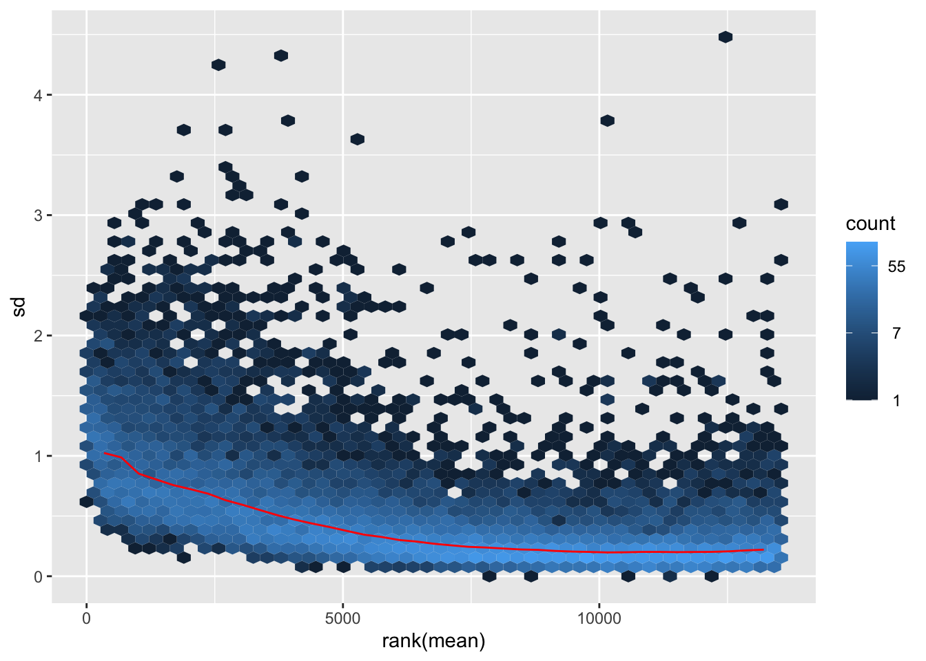
itadori2 <- itadori$gg + ggtitle("Transformation with ntd")
itadori2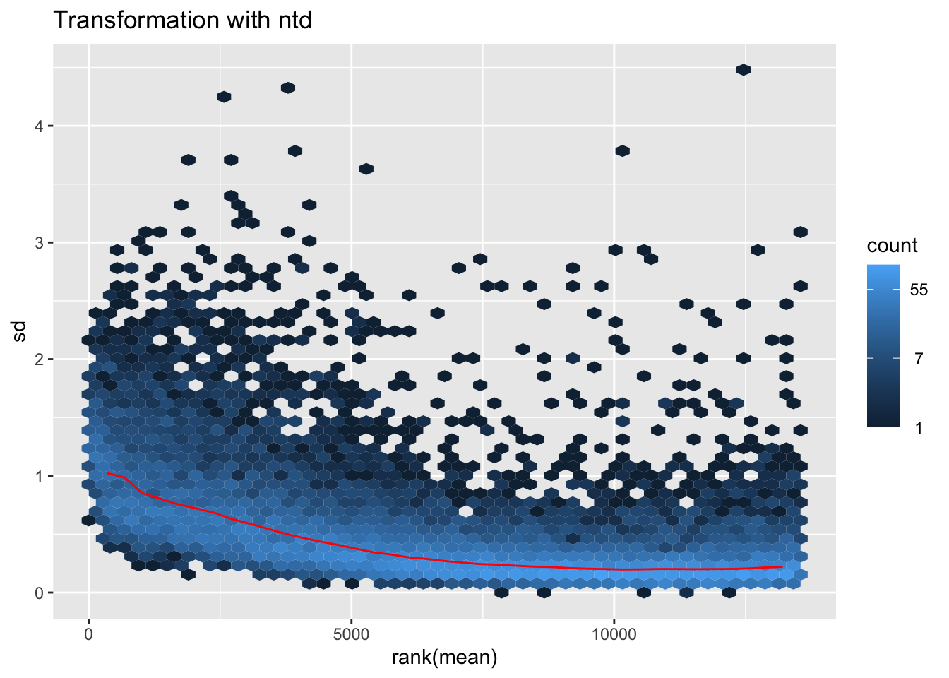
megumi <- meanSdPlot(assay(shigeru_vst))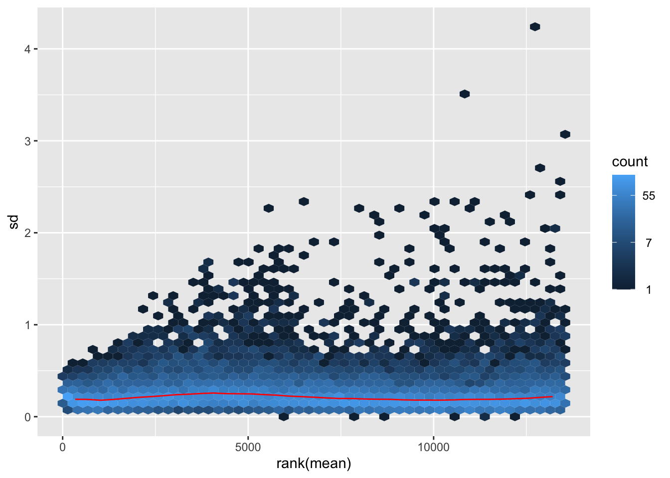
megumi2 <- megumi$gg + ggtitle("Transformation with vst")
megumi2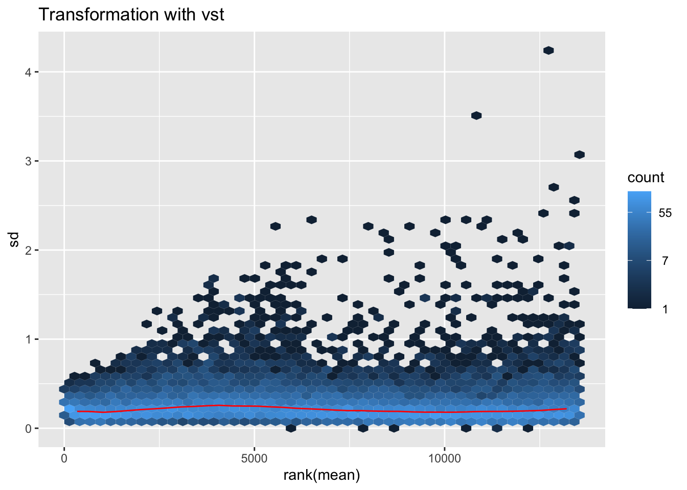
nobara <- meanSdPlot(assay(shigeru_rlog))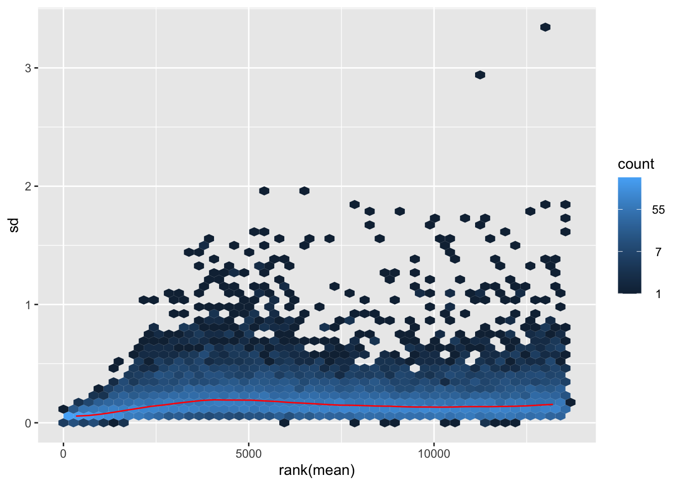
nobara2 <-nobara$gg + ggtitle("Transformation with rlog")
nobara2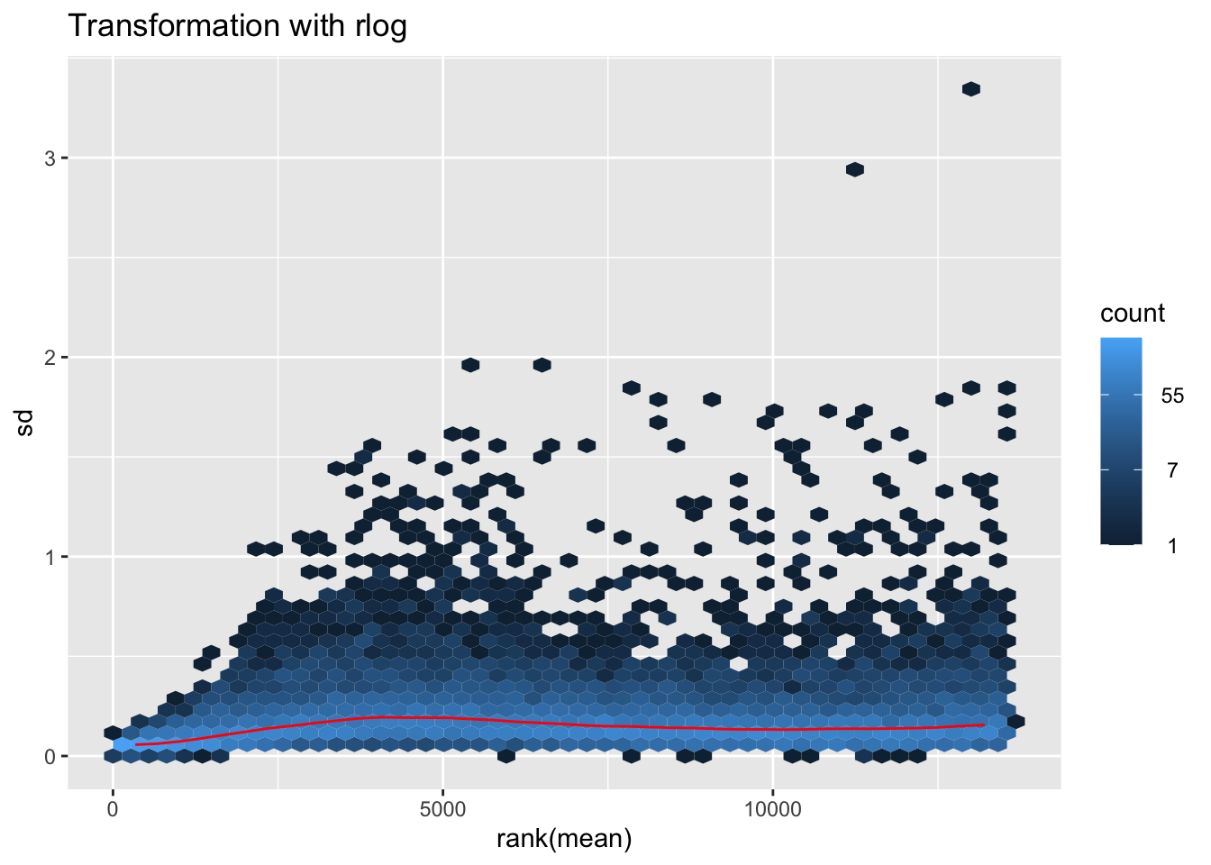
# Create the pca on the defined groups
pcaData1 <- plotPCA(object = shigeru_rlog, intgroup = c("RearingCondition"),returnData=TRUE)
percentVar <- round(100 * attr(pcaData1, "percentVar"))
pcaData1$RearingCondition<-factor(pcaData1$RearingCondition,levels=c("Crowded","Isolated"), labels=c("Crowded S. cancellata","Isolated S. cancellata"))
#levels(pcaData1$RearingCondition)
p1 <- ggplot(pcaData1, aes(PC1, PC2, color= RearingCondition)) +
geom_point(size=6) +
xlab(paste0("PC1: ", percentVar[1], "% variance")) +
ylab(paste0("PC2: ", percentVar[2], "% variance")) +
scale_color_manual(values = c("blue", "red")) +
#coord_fixed() +
theme_bw() +
theme(legend.title = element_blank()) +
theme(legend.text = element_text(face="bold", size=16)) +
theme(axis.text = element_text(size=14)) +
theme(axis.title = element_text(size=14))
p1 + geom_convexhull(aes(fill = RearingCondition, color = RearingCondition), alpha = 0.5) +
scale_fill_manual(values = c("blue", "red"))+
ggtitle("PCA on S. cancellata Head tissues", subtitle = "rlog transformation") 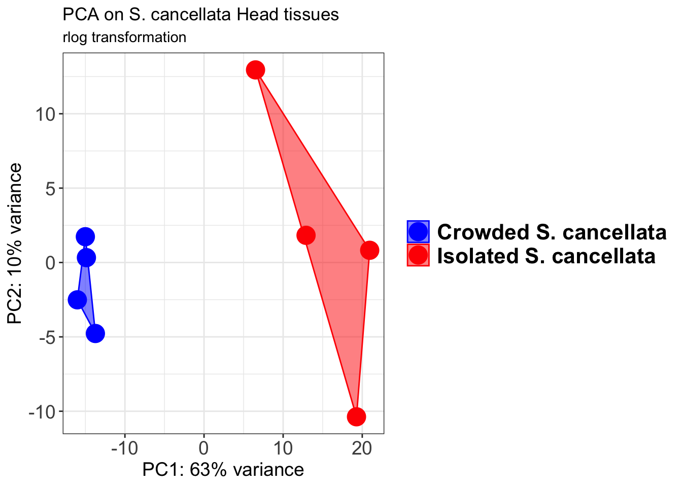
pcaData2 <- plotPCA(object = shigeru_vst, intgroup = c("RearingCondition"),returnData=TRUE)
percentVar <- round(100 * attr(pcaData2, "percentVar"))
pcaData2$RearingCondition<-factor(pcaData2$RearingCondition,levels=c("Crowded","Isolated"), labels=c("Crowded S. cancellata","Isolated S. cancellata"))
#levels(pcaData2$RearingCondition)
p2 <-ggplot(pcaData2, aes(PC1, PC2, color= RearingCondition)) +
geom_point(size=6) +
xlab(paste0("PC1: ", percentVar[1], "% variance")) +
ylab(paste0("PC2: ", percentVar[2], "% variance")) +
scale_color_manual(values = c("blue", "red")) +
#coord_fixed() +
theme_bw() +
theme(legend.title = element_blank()) +
theme(legend.text = element_text(face="bold", size=16)) +
theme(axis.text = element_text(size=14)) +
theme(axis.title = element_text(size=14))
p2 + geom_convexhull(aes(fill = RearingCondition, color = RearingCondition), alpha = 0.5) +
scale_fill_manual(values = c("blue", "red"))+
ggtitle("PCA on S. cancellata Head tissues", subtitle = "vst transformation") 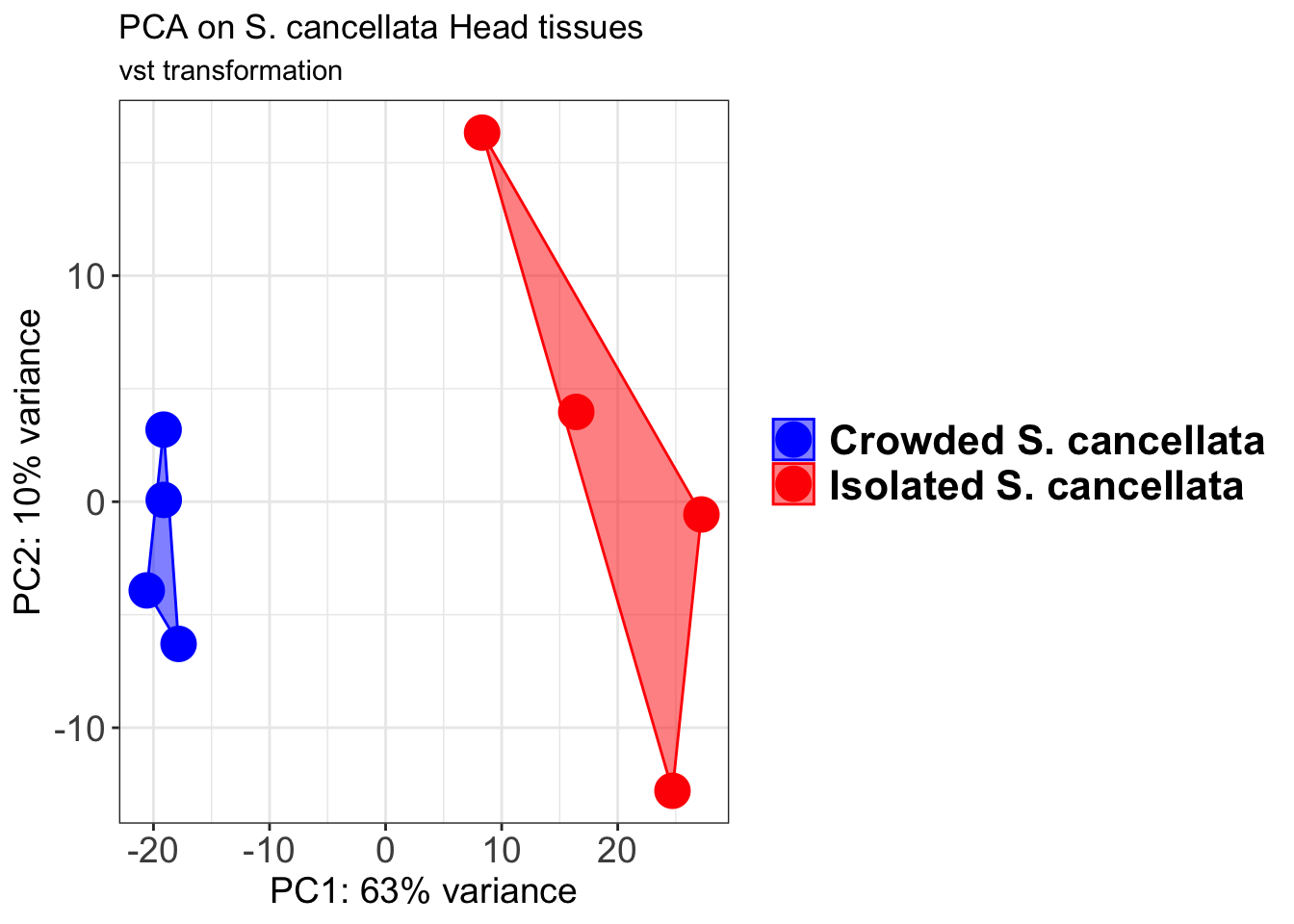
select <- order(rowMeans(counts(shigeru,normalized=TRUE)),
decreasing=TRUE)[1:12]
df <- as.data.frame(colData(shigeru)[,c("RearingCondition","Tissue")])
# Count matrix
pheatmap(assay(shigeru_ntd)[select,], cluster_rows=FALSE, show_rownames=FALSE,
cluster_cols=FALSE, annotation_col=df, main = "Count Matrix after norm transformation")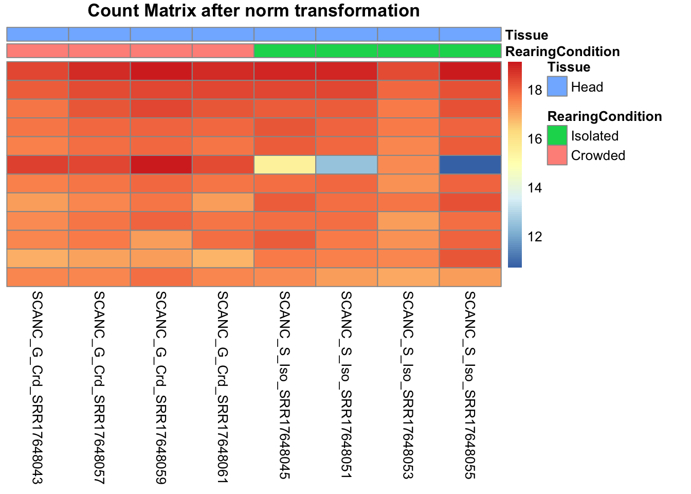
pheatmap(assay(shigeru_vst)[select,], cluster_rows=FALSE, show_rownames=FALSE,
cluster_cols=FALSE, annotation_col=df, main = "Count Matrix after vst transformation")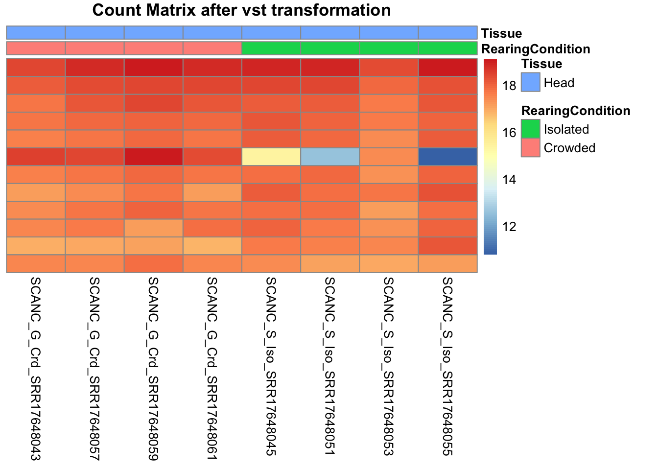
pheatmap(assay(shigeru_rlog)[select,], cluster_rows=FALSE, show_rownames=FALSE,
cluster_cols=FALSE, annotation_col=df, main = "Count Matrix after rlog transformation")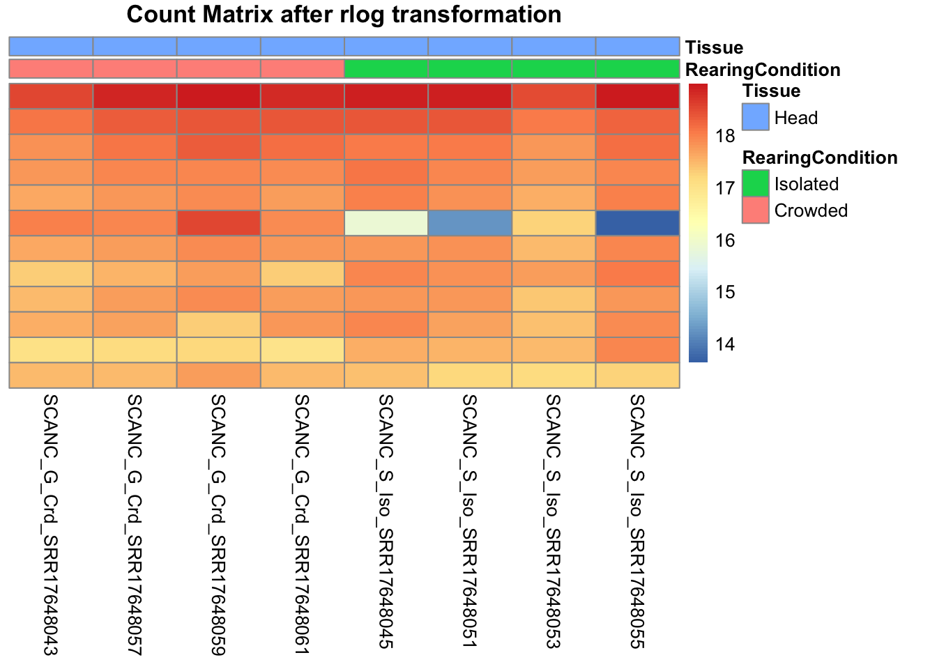
# calculate between-sample distance matrix
metadata <- sampletable[,c("RearingCondition", "Tissue")]
rownames(metadata) <- sampletable$SampleName
sampleDistMatrix.rlog <- as.matrix(dist(t(assay(shigeru_rlog))))
pheatmap(sampleDistMatrix.rlog, annotation_col=metadata, main = "Head tissue heatmap distance matrix, rlog transformation")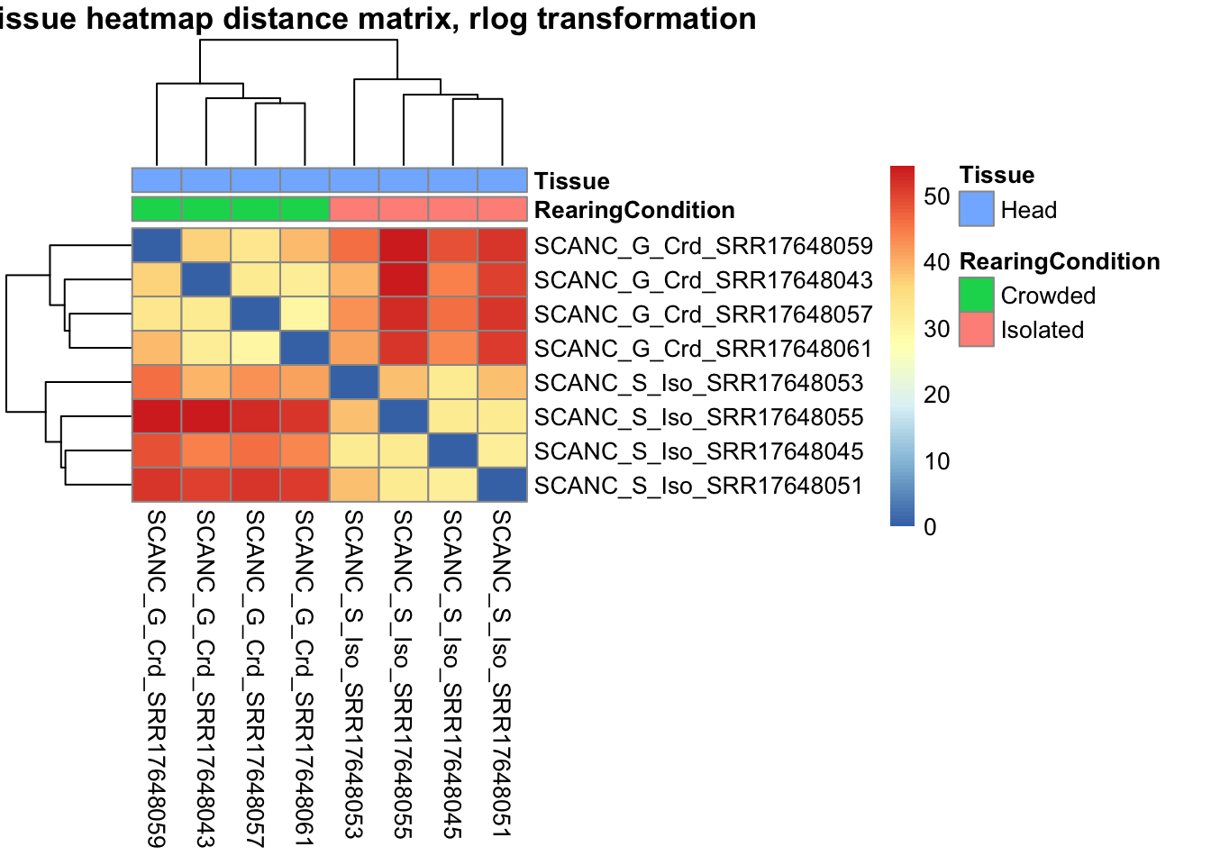
sampleDistMatrix.vst<- as.matrix(dist(t(assay(shigeru_vst))))
pheatmap(sampleDistMatrix.vst, annotation_col=metadata, main = "Head tissue heatmap distance matrix, rlog transformation")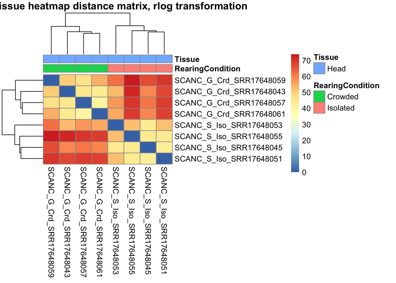
The following plots are interactive and we can hover or Zoom on the locus of interest.
# Ma plot parameters after shrinkage
de_shrink <- lfcShrink(dds = shigeru, coef="RearingCondition_Crowded_vs_Isolated", type="apeglm")
#head(de_shrink)
maplot <-ggmaplot(de_shrink, fdr = 0.05, fc = 1, size = 1, palette = c("#B31B21", "#1465AC", "darkgray"), genenames = as.vector(rownames(de_shrink$name)), top = 0,legend="top",label.select = NULL) +
coord_cartesian(xlim = c(0, 20)) +
scale_y_continuous(limits=c(-12, 12)) +
theme(axis.text.x = element_text(size=12),axis.text.y = element_text(size=12),axis.title.x = element_text(size=14),axis.title.y = element_text(size=14),axis.line = element_line(size = 1, colour="gray20"),axis.ticks = element_line(size = 1, colour="gray20")) +
guides(color = guide_legend(override.aes = list(size = c(3,3,3)))) +
theme(legend.position = c(0.70, 0.12),legend.text=element_text(size=14,face="bold"),legend.background = element_rect(fill="transparent")) +
theme(plot.title = element_text(size=18, colour="gray30", face="bold",hjust=0.06, vjust=-5)) +
labs(title="MA-plot for the shrunken log2 fold changes in the Head tissues")
interactive_maplot <- ggplotly(maplot)
interactive_maplot#Volcano plot
keyvals <-ifelse(
res_shigeru$log2FoldChange >= 1 & res_shigeru$padj <= 0.05, '#B31B21',
ifelse(res_shigeru$log2FoldChange <= -1 & res_shigeru$padj <= 0.05, '#1465AC', 'darkgray'))
keyvals[is.na(keyvals)] <-'lightgray'
names(keyvals)[keyvals == "#B31B21"] <-'Upregulated'
names(keyvals)[keyvals == "#1465AC"] <-'Downregulated'
names(keyvals)[keyvals == 'darkgray'] <-'NS'
res_shigeru$color <- keyvals
volcano_plot <- ggplot(res_shigeru, aes(x = log2FoldChange, y = -log10(padj),
color = color, # Use the color column with keyvals
text = rownames(res_shigeru))) +
geom_point(size = 3, alpha = 0.8) +
scale_color_identity() + # Directly use the color values from `keyvals`
guides(color = "none") + # Hide the color legend
labs(title = "Volcano Plot DEG Head S. cancellata", x = "log2 Fold Change", y = "-log10 Adjusted P-Value") +
theme_minimal()
# Convert to interactive plot with hover text for gene names
interactive_volcano <- ggplotly(volcano_plot, tooltip = "text") %>%
layout(hoverlabel = list(namelength = -1))
# Display the interactive plot
interactive_volcanoamericana
rawDir <- file.path(workDir, "03-americana-DESeq2")
# Path and name of targetfile containing conditions and file names
species <- "americana"
targetFile <- file.path(workDir, "list", paste0("Head", "_", species, "_nooutliers.txt"))
sampletable <- fread(targetFile)
rownames(sampletable) <- sampletable$SampleName
sampletable$RearingCondition <- as.factor(sampletable$RearingCondition)
sampletable$Tissue <- as.factor(sampletable$Tissue)
## Import count files
satoshi <- DESeqDataSetFromHTSeqCount(sampleTable = sampletable,
directory = rawDir,
design = ~ RearingCondition )
#satoshi
smallestGroupSize <- 3
keep <- rowSums(counts(satoshi) >= 5) >= smallestGroupSize
satoshi <- satoshi[keep,]
#nrow(satoshi)
satoshi$RearingCondition <- relevel(satoshi$RearingCondition, ref = "Isolated")
# Fit the statistical model
shigeru <- DESeq(satoshi)
#cbind(resultsNames(shigeru))
res_shigeru <- results(shigeru)
sum(res_shigeru$padj < tresh_padj, na.rm = TRUE)[1] 1413A total of 1,413 genes out of the pre-filtered 13,764 features were showing significant differences in expression levels. The summary below showed how many were upregulated and downregulated in crowded compared to isolated it is possible to scroll it.
brock <- results(shigeru, name = "RearingCondition_Crowded_vs_Isolated", alpha = alpha_DEseq2)
summary(brock)
out of 13764 with nonzero total read count
adjusted p-value < 0.05
LFC > 0 (up) : 802, 5.8%
LFC < 0 (down) : 619, 4.5%
outliers [1] : 57, 0.41%
low counts [2] : 534, 3.9%
(mean count < 5)
[1] see 'cooksCutoff' argument of ?results
[2] see 'independentFiltering' argument of ?results#mcols(brock)$description
#head(brock)
brock_df <- as.data.frame(brock)
datatable(brock_df, options = list(
pageLength = 10, # Set initial page length
scrollX = TRUE, # Enable horizontal scrolling
autoWidth = TRUE, # Adjust column width automatically
searchHighlight = TRUE # Highlight search matches
))Now we will make the different plots: PCA, MA and Volcano.
# Try with the data transformation
shigeru_vst <- vst(shigeru)
shigeru_rlog <- rlog(shigeru)
shigeru_ntd <- normTransform(shigeru)
itadori <- meanSdPlot(assay(shigeru_ntd))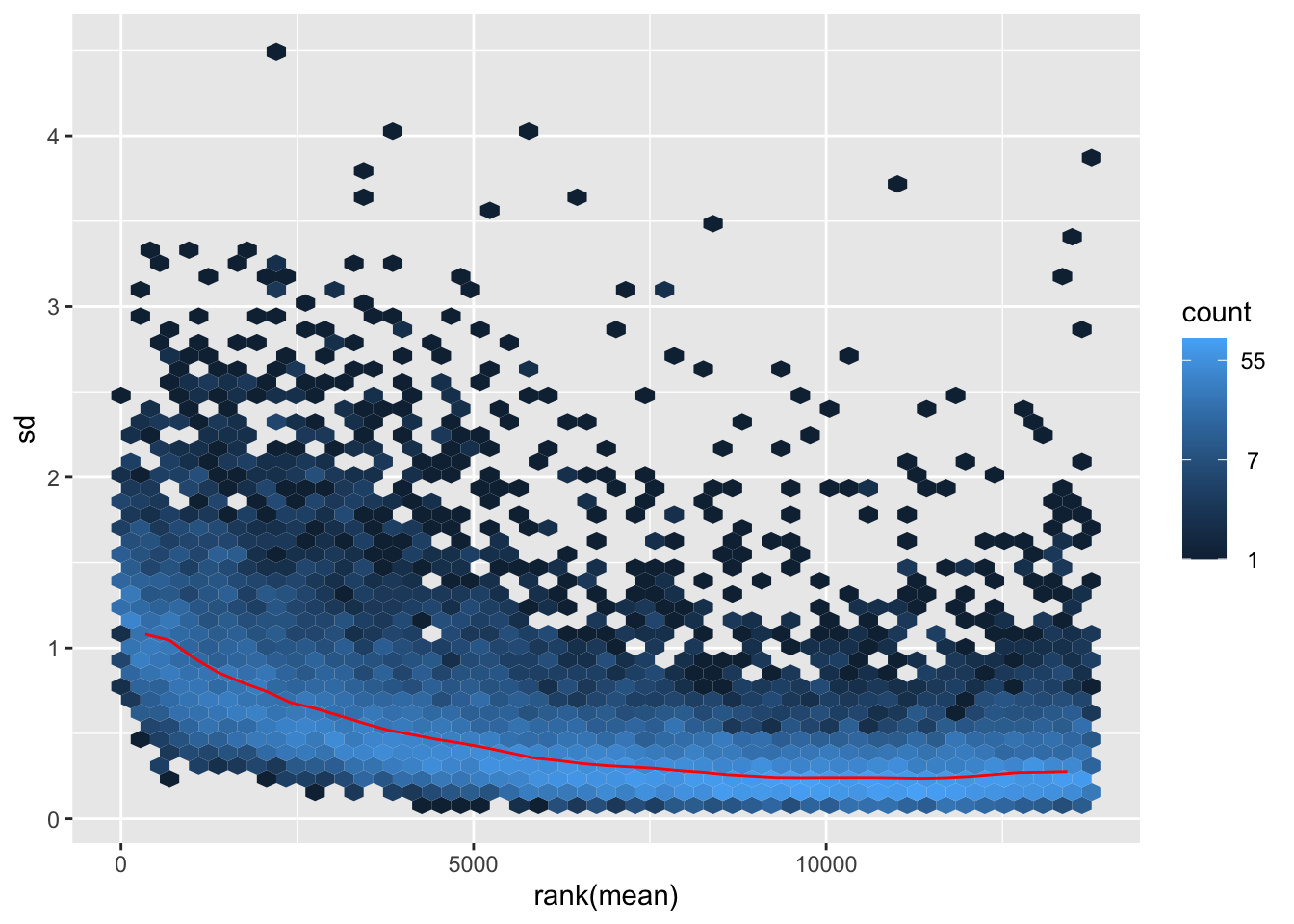
itadori2 <- itadori$gg + ggtitle("Transformation with ntd")
itadori2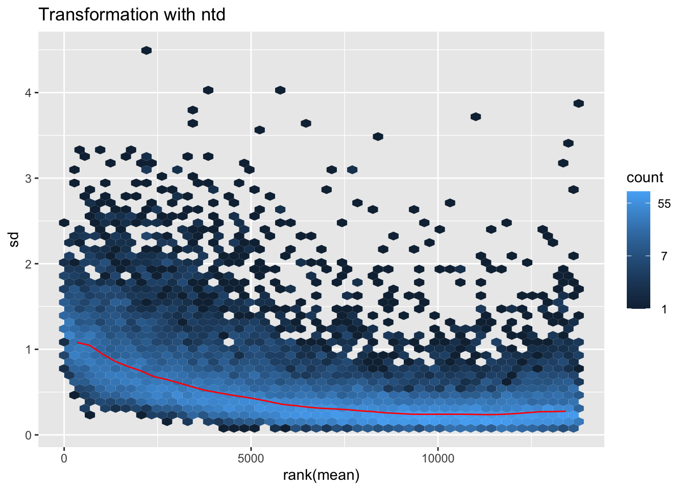
megumi <- meanSdPlot(assay(shigeru_vst))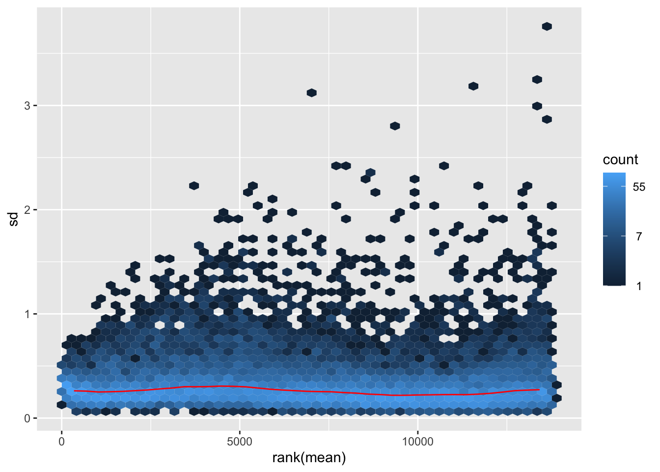
megumi2 <- megumi$gg + ggtitle("Transformation with vst")
megumi2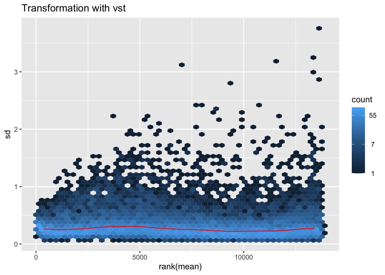
nobara <- meanSdPlot(assay(shigeru_rlog))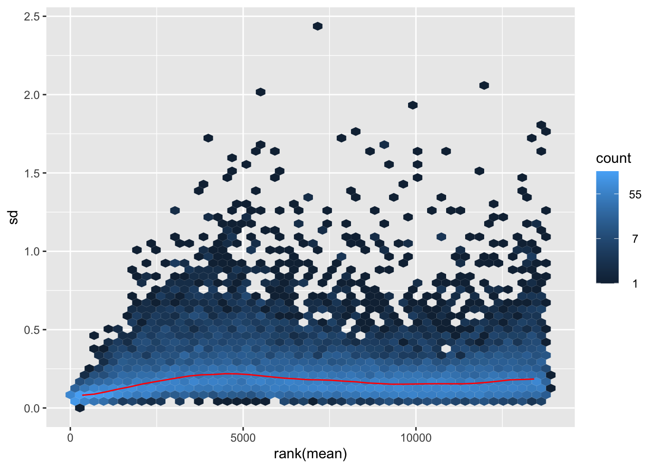
nobara2 <-nobara$gg + ggtitle("Transformation with rlog")
nobara2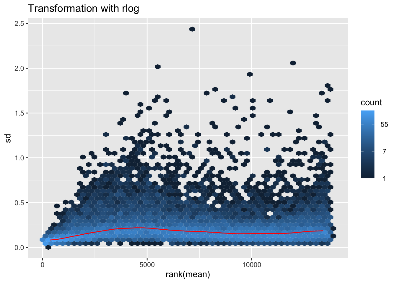
# Create the pca on the defined groups
pcaData1 <- plotPCA(object = shigeru_rlog, intgroup = c("RearingCondition"),returnData=TRUE)
percentVar <- round(100 * attr(pcaData1, "percentVar"))
pcaData1$RearingCondition<-factor(pcaData1$RearingCondition,levels=c("Crowded","Isolated"), labels=c("Crowded S. americana","Isolated S. americana"))
#levels(pcaData1$RearingCondition)
p1 <- ggplot(pcaData1, aes(PC1, PC2, color= RearingCondition)) +
geom_point(size=6) +
xlab(paste0("PC1: ", percentVar[1], "% variance")) +
ylab(paste0("PC2: ", percentVar[2], "% variance")) +
scale_color_manual(values = c("blue", "red")) +
#coord_fixed() +
theme_bw() +
theme(legend.title = element_blank()) +
theme(legend.text = element_text(face="bold", size=16)) +
theme(axis.text = element_text(size=14)) +
theme(axis.title = element_text(size=14))
p1 + geom_convexhull(aes(fill = RearingCondition, color = RearingCondition), alpha = 0.5) +
scale_fill_manual(values = c("blue", "red"))+
ggtitle("PCA on S. americana Head tissues", subtitle = "rlog transformation") 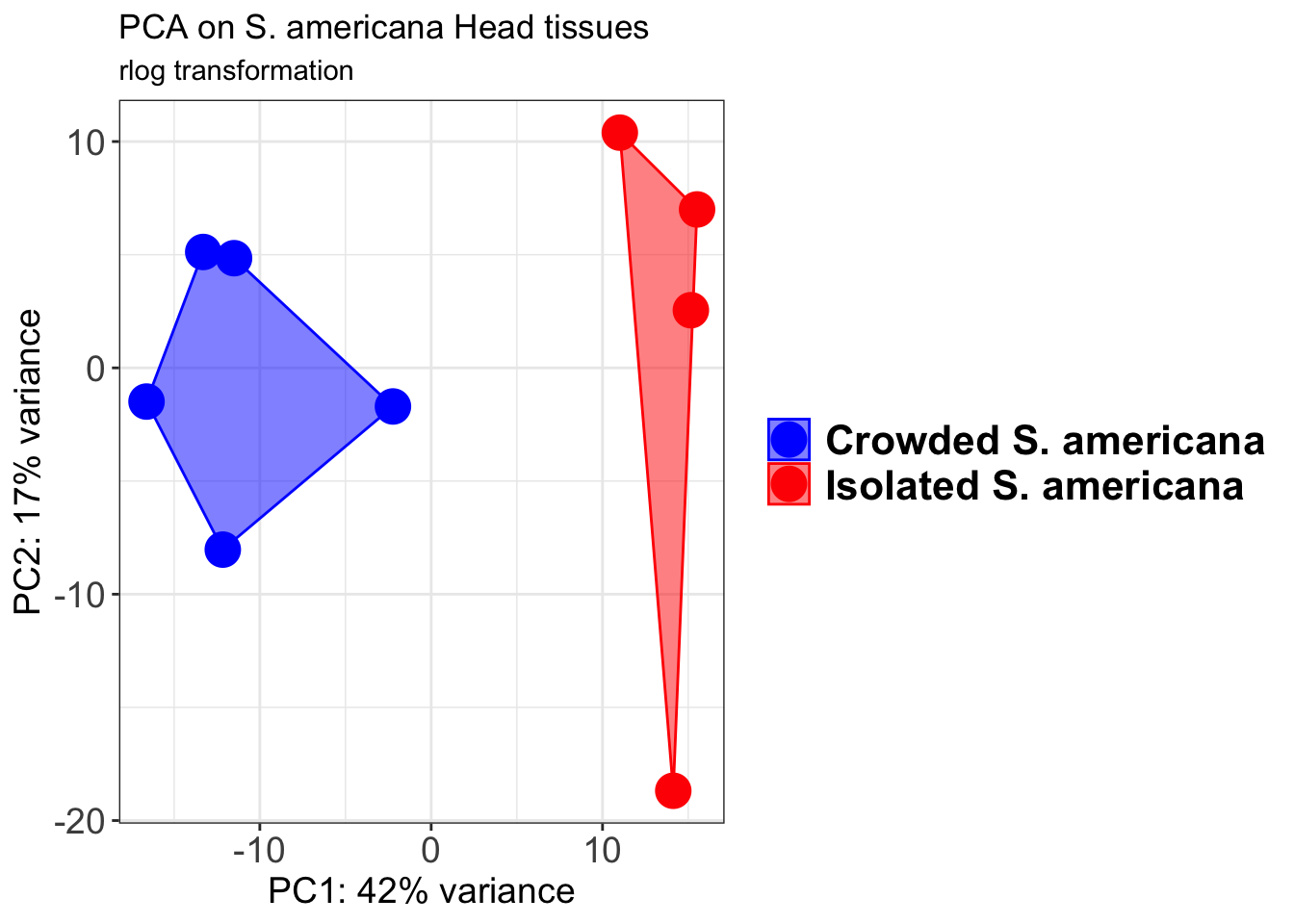
pcaData2 <- plotPCA(object = shigeru_vst, intgroup = c("RearingCondition"),returnData=TRUE)
percentVar <- round(100 * attr(pcaData2, "percentVar"))
pcaData2$RearingCondition<-factor(pcaData2$RearingCondition,levels=c("Crowded","Isolated"), labels=c("Crowded S. americana","Isolated S. americana"))
#levels(pcaData2$RearingCondition)
p2 <-ggplot(pcaData2, aes(PC1, PC2, color= RearingCondition)) +
geom_point(size=6) +
xlab(paste0("PC1: ", percentVar[1], "% variance")) +
ylab(paste0("PC2: ", percentVar[2], "% variance")) +
scale_color_manual(values = c("blue", "red")) +
#coord_fixed() +
theme_bw() +
theme(legend.title = element_blank()) +
theme(legend.text = element_text(face="bold", size=16)) +
theme(axis.text = element_text(size=14)) +
theme(axis.title = element_text(size=14))
p2 + geom_convexhull(aes(fill = RearingCondition, color = RearingCondition), alpha = 0.5) +
scale_fill_manual(values = c("blue", "red"))+
ggtitle("PCA on S. americana Head tissues", subtitle = "vst transformation") 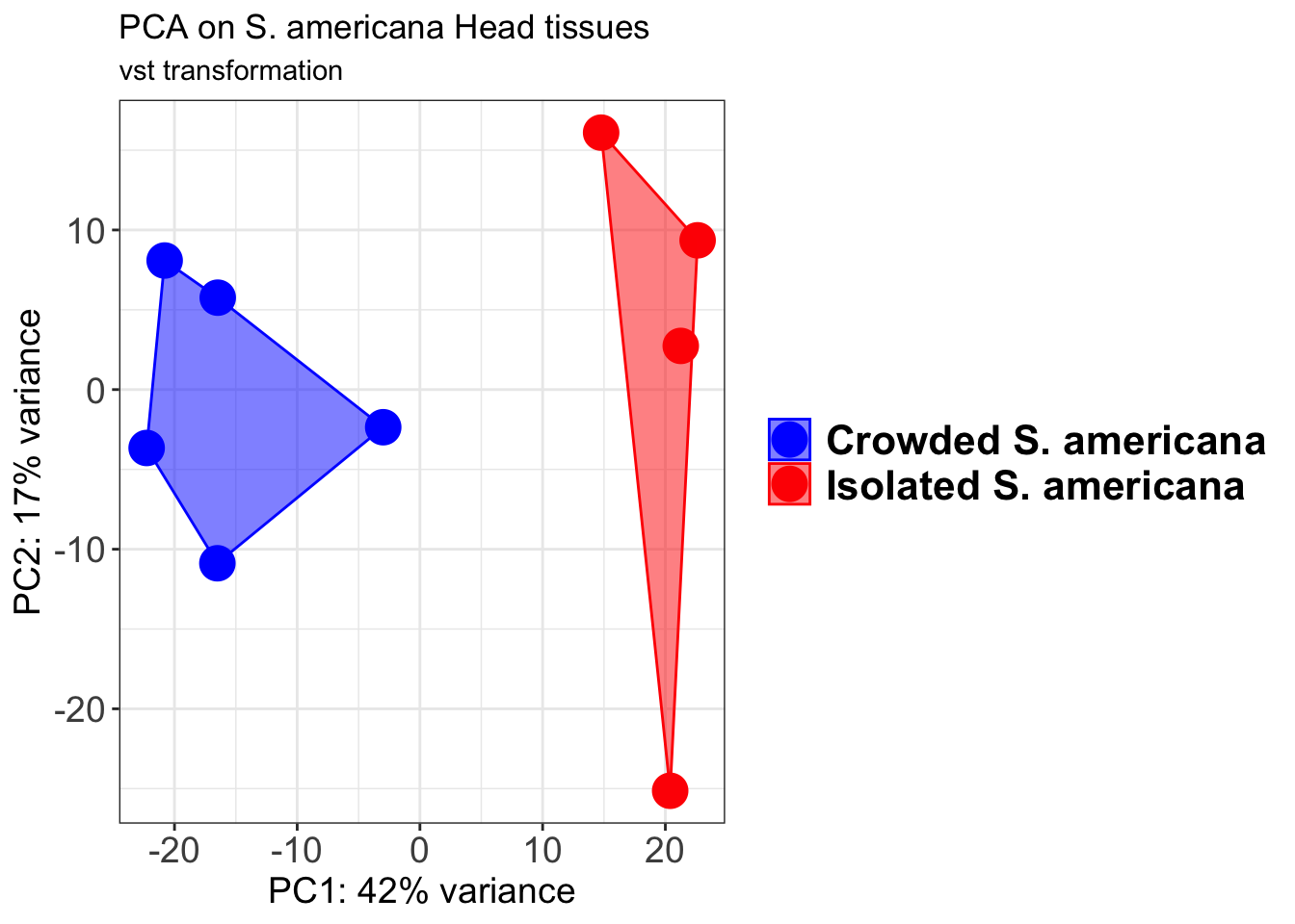
select <- order(rowMeans(counts(shigeru,normalized=TRUE)),
decreasing=TRUE)[1:12]
df <- as.data.frame(colData(shigeru)[,c("RearingCondition","Tissue")])
# Count matrix
pheatmap(assay(shigeru_ntd)[select,], cluster_rows=FALSE, show_rownames=FALSE,
cluster_cols=FALSE, annotation_col=df, main = "Count Matrix after norm transformation")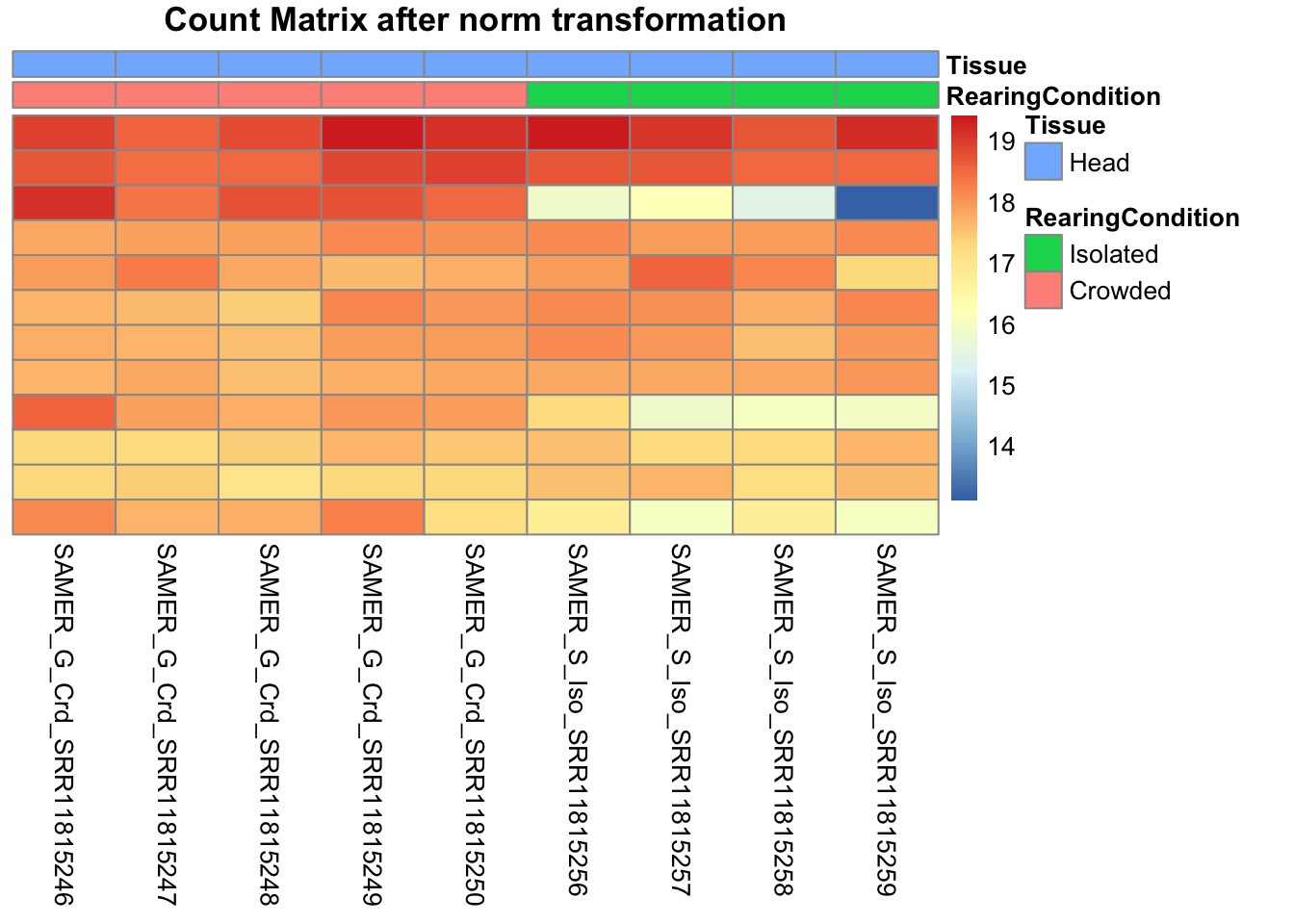
pheatmap(assay(shigeru_vst)[select,], cluster_rows=FALSE, show_rownames=FALSE,
cluster_cols=FALSE, annotation_col=df, main = "Count Matrix after vst transformation")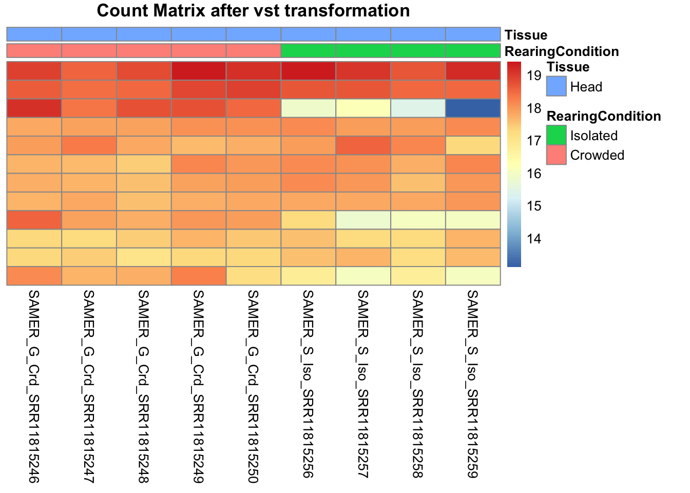
pheatmap(assay(shigeru_rlog)[select,], cluster_rows=FALSE, show_rownames=FALSE,
cluster_cols=FALSE, annotation_col=df, main = "Count Matrix after rlog transformation")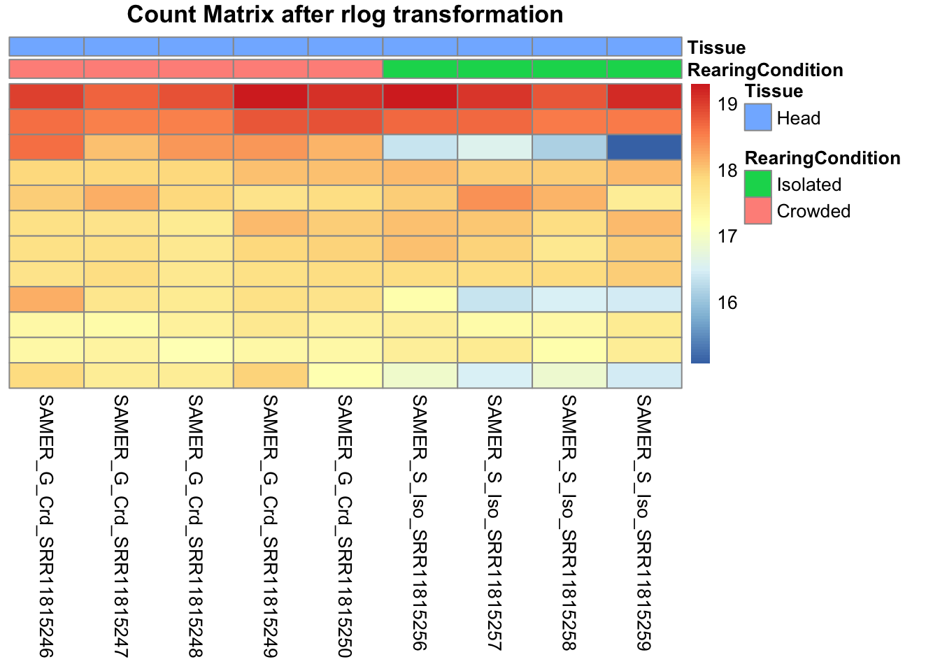
# calculate between-sample distance matrix
metadata <- sampletable[,c("RearingCondition", "Tissue")]
rownames(metadata) <- sampletable$SampleName
sampleDistMatrix.rlog <- as.matrix(dist(t(assay(shigeru_rlog))))
pheatmap(sampleDistMatrix.rlog, annotation_col=metadata, main = "Head tissue heatmap distance matrix, rlog transformation")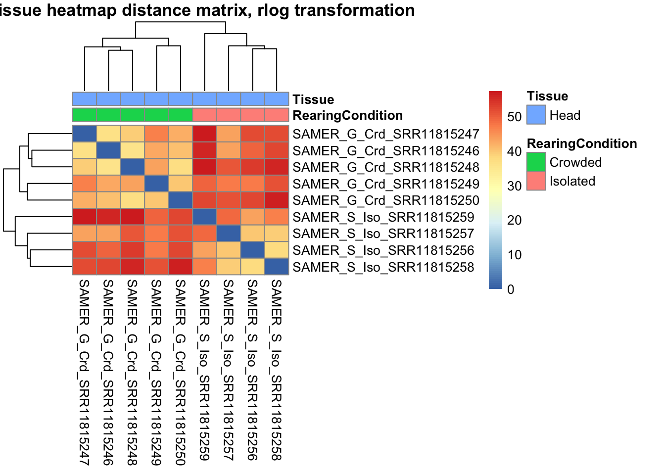
sampleDistMatrix.vst<- as.matrix(dist(t(assay(shigeru_vst))))
pheatmap(sampleDistMatrix.vst, annotation_col=metadata, main = "Head tissue heatmap distance matrix, rlog transformation")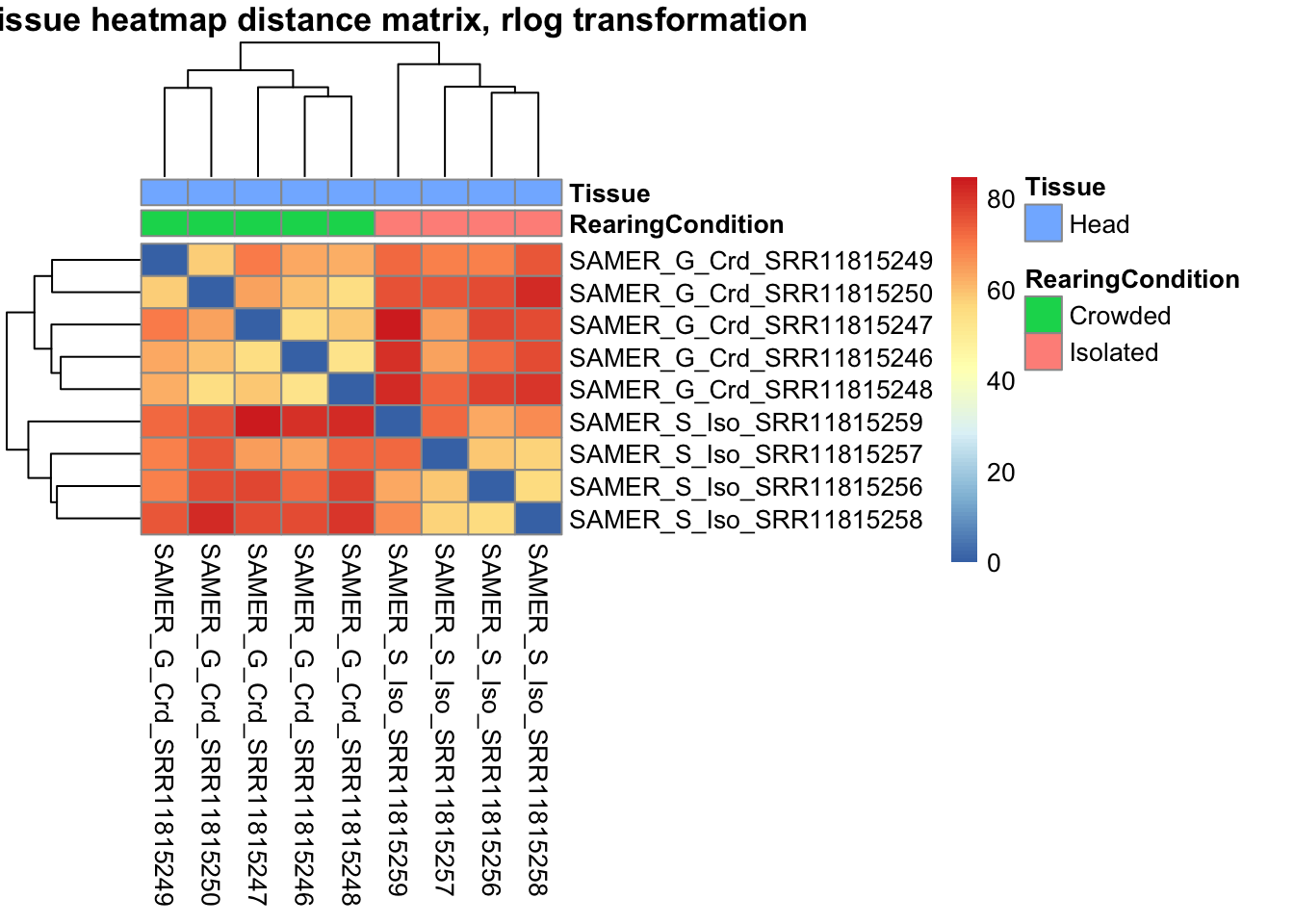
The following plots are interactive and we can hover or Zoom on the locus of interest.
# Ma plot parameters after shrinkage
de_shrink <- lfcShrink(dds = shigeru, coef="RearingCondition_Crowded_vs_Isolated", type="apeglm")
#head(de_shrink)
maplot <-ggmaplot(de_shrink, fdr = 0.05, fc = 1, size = 1, palette = c("#B31B21", "#1465AC", "darkgray"), genenames = as.vector(rownames(de_shrink$name)), top = 0,legend="top",label.select = NULL) +
coord_cartesian(xlim = c(0, 20)) +
scale_y_continuous(limits=c(-12, 12)) +
theme(axis.text.x = element_text(size=12),axis.text.y = element_text(size=12),axis.title.x = element_text(size=14),axis.title.y = element_text(size=14),axis.line = element_line(size = 1, colour="gray20"),axis.ticks = element_line(size = 1, colour="gray20")) +
guides(color = guide_legend(override.aes = list(size = c(3,3,3)))) +
theme(legend.position = c(0.70, 0.12),legend.text=element_text(size=14,face="bold"),legend.background = element_rect(fill="transparent")) +
theme(plot.title = element_text(size=18, colour="gray30", face="bold",hjust=0.06, vjust=-5)) +
labs(title="MA-plot for the shrunken log2 fold changes in the Head tissues")
interactive_maplot <- ggplotly(maplot)
interactive_maplot#Volcano plot
keyvals <-ifelse(
res_shigeru$log2FoldChange >= 1 & res_shigeru$padj <= 0.05, '#B31B21',
ifelse(res_shigeru$log2FoldChange <= -1 & res_shigeru$padj <= 0.05, '#1465AC', 'darkgray'))
keyvals[is.na(keyvals)] <-'lightgray'
names(keyvals)[keyvals == "#B31B21"] <-'Upregulated'
names(keyvals)[keyvals == "#1465AC"] <-'Downregulated'
names(keyvals)[keyvals == 'darkgray'] <-'NS'
res_shigeru$color <- keyvals
volcano_plot <- ggplot(res_shigeru, aes(x = log2FoldChange, y = -log10(padj),
color = color, # Use the color column with keyvals
text = rownames(res_shigeru))) +
geom_point(size = 3, alpha = 0.8) +
scale_color_identity() + # Directly use the color values from `keyvals`
guides(color = "none") + # Hide the color legend
labs(title = "Volcano Plot DEG Head S. americana", x = "log2 Fold Change", y = "-log10 Adjusted P-Value") +
theme_minimal()
# Convert to interactive plot with hover text for gene names
interactive_volcano <- ggplotly(volcano_plot, tooltip = "text") %>%
layout(hoverlabel = list(namelength = -1))
# Display the interactive plot
interactive_volcanocubense
rawDir <- file.path(workDir, "03-cubense-DESeq2")
# Path and name of targetfile containing conditions and file names
species <- "cubense"
targetFile <- file.path(workDir, "list", paste0("Head", "_", species, "_nooutliers.txt"))
sampletable <- fread(targetFile)
rownames(sampletable) <- sampletable$SampleName
sampletable$RearingCondition <- as.factor(sampletable$RearingCondition)
sampletable$Tissue <- as.factor(sampletable$Tissue)
## Import count files
satoshi <- DESeqDataSetFromHTSeqCount(sampleTable = sampletable,
directory = rawDir,
design = ~ RearingCondition )
#satoshi
smallestGroupSize <- 3
keep <- rowSums(counts(satoshi) >= 5) >= smallestGroupSize
satoshi <- satoshi[keep,]
#nrow(satoshi)
satoshi$RearingCondition <- relevel(satoshi$RearingCondition, ref = "Isolated")
# Fit the statistical model
shigeru <- DESeq(satoshi)
#cbind(resultsNames(shigeru))
res_shigeru <- results(shigeru)
sum(res_shigeru$padj < tresh_padj, na.rm = TRUE)[1] 105A total of 105 genes out of the pre-filtered 14,328 features were showing significant differences in expression levels. The summary below showed how many were upregulated and downregulated in crowded compared to isolated it is possible to scroll it.
brock <- results(shigeru, name = "RearingCondition_Crowded_vs_Isolated", alpha = alpha_DEseq2)
summary(brock)
out of 14328 with nonzero total read count
adjusted p-value < 0.05
LFC > 0 (up) : 49, 0.34%
LFC < 0 (down) : 56, 0.39%
outliers [1] : 173, 1.2%
low counts [2] : 0, 0%
(mean count < 2)
[1] see 'cooksCutoff' argument of ?results
[2] see 'independentFiltering' argument of ?results#mcols(brock)$description
#head(brock)
brock_df <- as.data.frame(brock)
datatable(brock_df, options = list(
pageLength = 10, # Set initial page length
scrollX = TRUE, # Enable horizontal scrolling
autoWidth = TRUE, # Adjust column width automatically
searchHighlight = TRUE # Highlight search matches
))Now we will make the different plots: PCA, MA and Volcano.
# Try with the data transformation
shigeru_vst <- vst(shigeru)
shigeru_rlog <- rlog(shigeru)
shigeru_ntd <- normTransform(shigeru)
itadori <- meanSdPlot(assay(shigeru_ntd))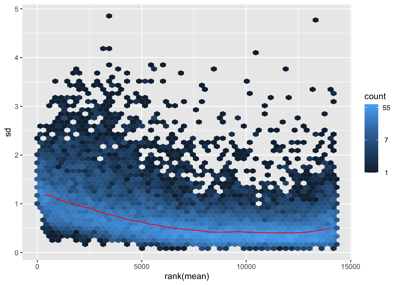
itadori2 <- itadori$gg + ggtitle("Transformation with ntd")
itadori2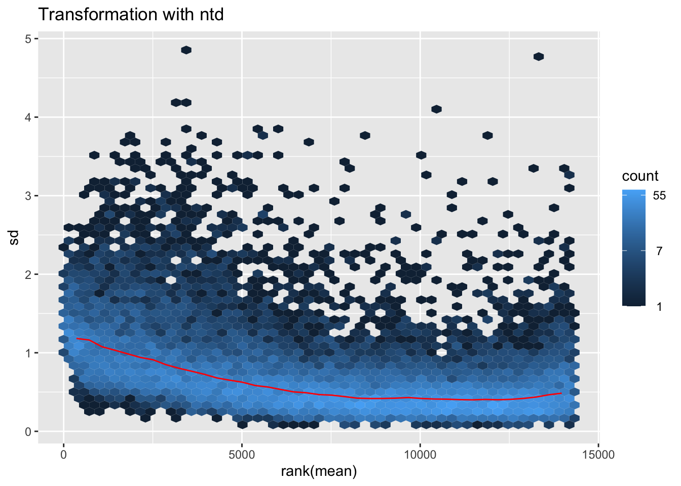
megumi <- meanSdPlot(assay(shigeru_vst))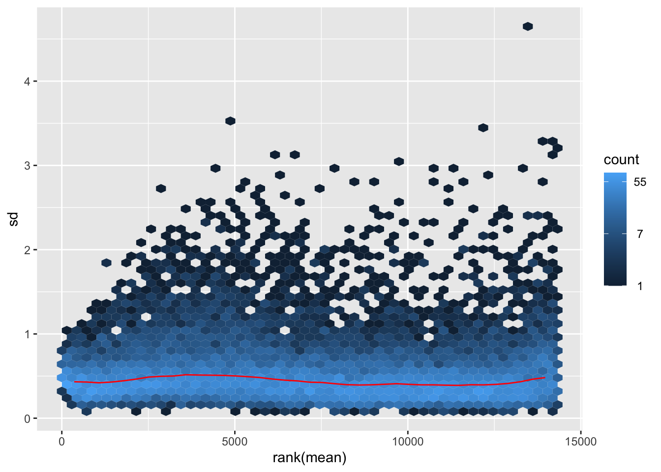
megumi2 <- megumi$gg + ggtitle("Transformation with vst")
megumi2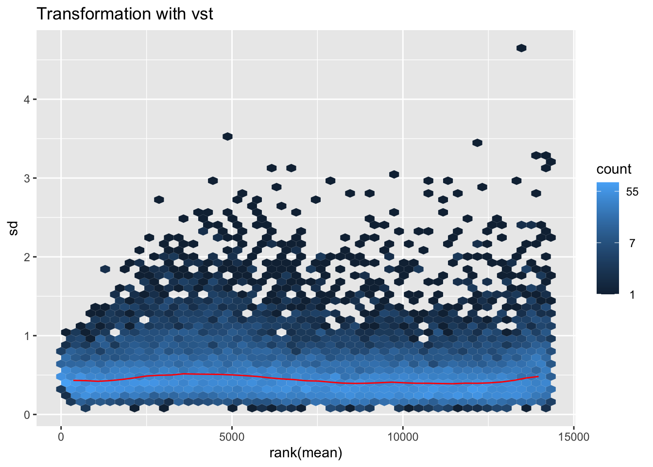
nobara <- meanSdPlot(assay(shigeru_rlog))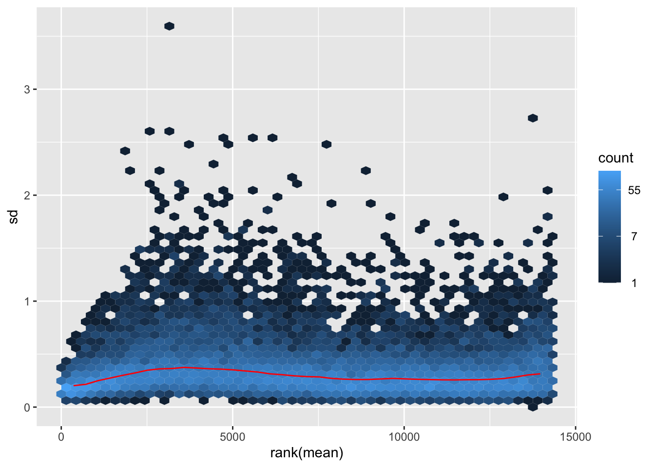
nobara2 <-nobara$gg + ggtitle("Transformation with rlog")
nobara2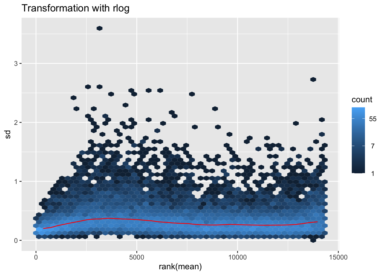
# Create the pca on the defined groups
pcaData1 <- plotPCA(object = shigeru_rlog, intgroup = c("RearingCondition"),returnData=TRUE)
percentVar <- round(100 * attr(pcaData1, "percentVar"))
pcaData1$RearingCondition<-factor(pcaData1$RearingCondition,levels=c("Crowded","Isolated"), labels=c("Crowded S. cubense","Isolated S. cubense"))
#levels(pcaData1$RearingCondition)
p1 <- ggplot(pcaData1, aes(PC1, PC2, color= RearingCondition)) +
geom_point(size=6) +
xlab(paste0("PC1: ", percentVar[1], "% variance")) +
ylab(paste0("PC2: ", percentVar[2], "% variance")) +
scale_color_manual(values = c("blue", "red")) +
#coord_fixed() +
theme_bw() +
theme(legend.title = element_blank()) +
theme(legend.text = element_text(face="bold", size=16)) +
theme(axis.text = element_text(size=14)) +
theme(axis.title = element_text(size=14))
p1 + geom_convexhull(aes(fill = RearingCondition, color = RearingCondition), alpha = 0.5) +
scale_fill_manual(values = c("blue", "red"))+
ggtitle("PCA on S. cubense Head tissues", subtitle = "rlog transformation") 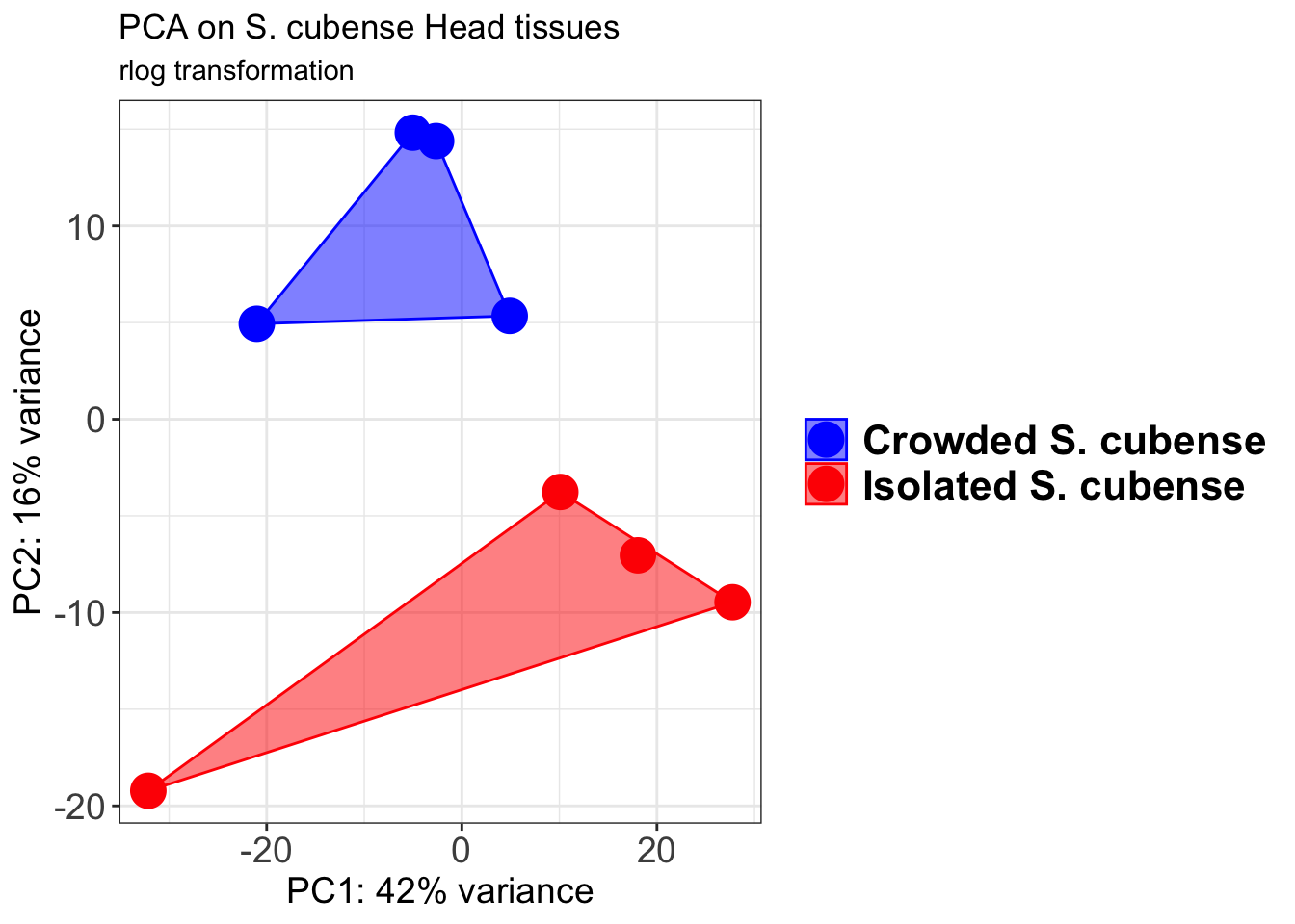
pcaData2 <- plotPCA(object = shigeru_vst, intgroup = c("RearingCondition"),returnData=TRUE)
percentVar <- round(100 * attr(pcaData2, "percentVar"))
pcaData2$RearingCondition<-factor(pcaData2$RearingCondition,levels=c("Crowded","Isolated"), labels=c("Crowded S. cubense","Isolated S. cubense"))
#levels(pcaData2$RearingCondition)
p2 <-ggplot(pcaData2, aes(PC1, PC2, color= RearingCondition)) +
geom_point(size=6) +
xlab(paste0("PC1: ", percentVar[1], "% variance")) +
ylab(paste0("PC2: ", percentVar[2], "% variance")) +
scale_color_manual(values = c("blue", "red")) +
#coord_fixed() +
theme_bw() +
theme(legend.title = element_blank()) +
theme(legend.text = element_text(face="bold", size=16)) +
theme(axis.text = element_text(size=14)) +
theme(axis.title = element_text(size=14))
p2 + geom_convexhull(aes(fill = RearingCondition, color = RearingCondition), alpha = 0.5) +
scale_fill_manual(values = c("blue", "red"))+
ggtitle("PCA on S. cubense Head tissues", subtitle = "vst transformation") 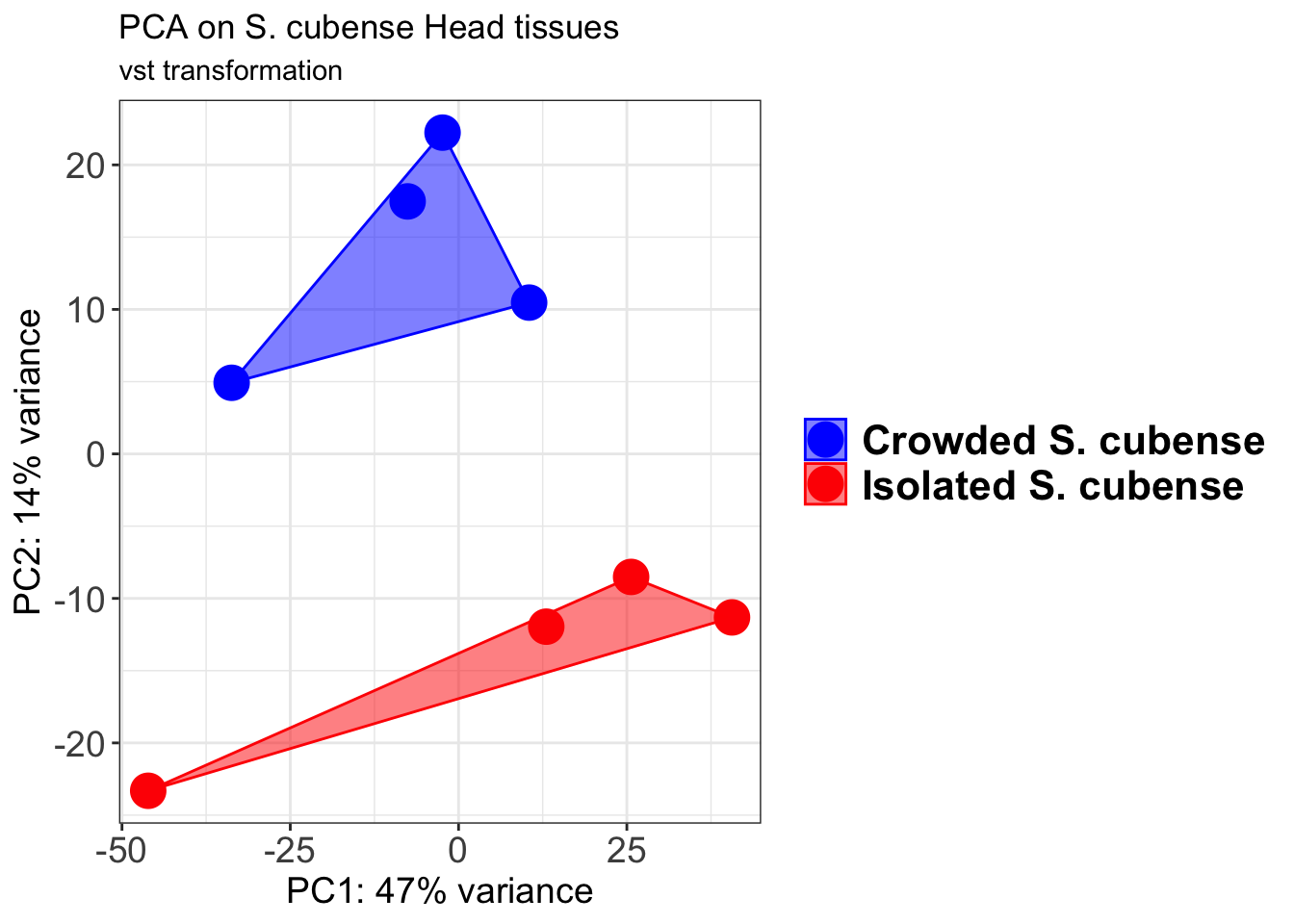
select <- order(rowMeans(counts(shigeru,normalized=TRUE)),
decreasing=TRUE)[1:12]
df <- as.data.frame(colData(shigeru)[,c("RearingCondition","Tissue")])
# Count matrix
pheatmap(assay(shigeru_ntd)[select,], cluster_rows=FALSE, show_rownames=FALSE,
cluster_cols=FALSE, annotation_col=df, main = "Count Matrix after norm transformation")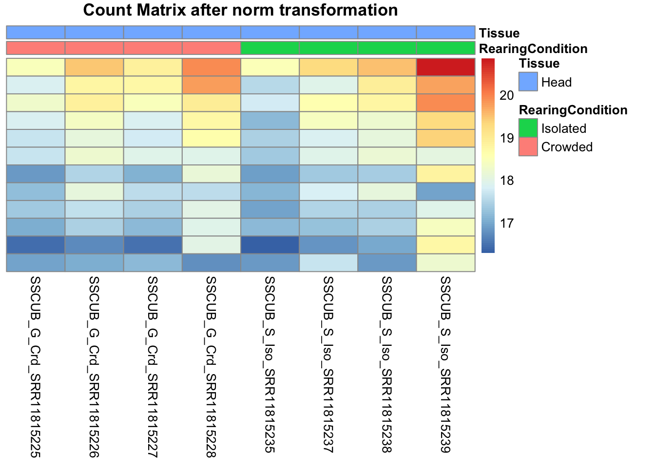
pheatmap(assay(shigeru_vst)[select,], cluster_rows=FALSE, show_rownames=FALSE,
cluster_cols=FALSE, annotation_col=df, main = "Count Matrix after vst transformation")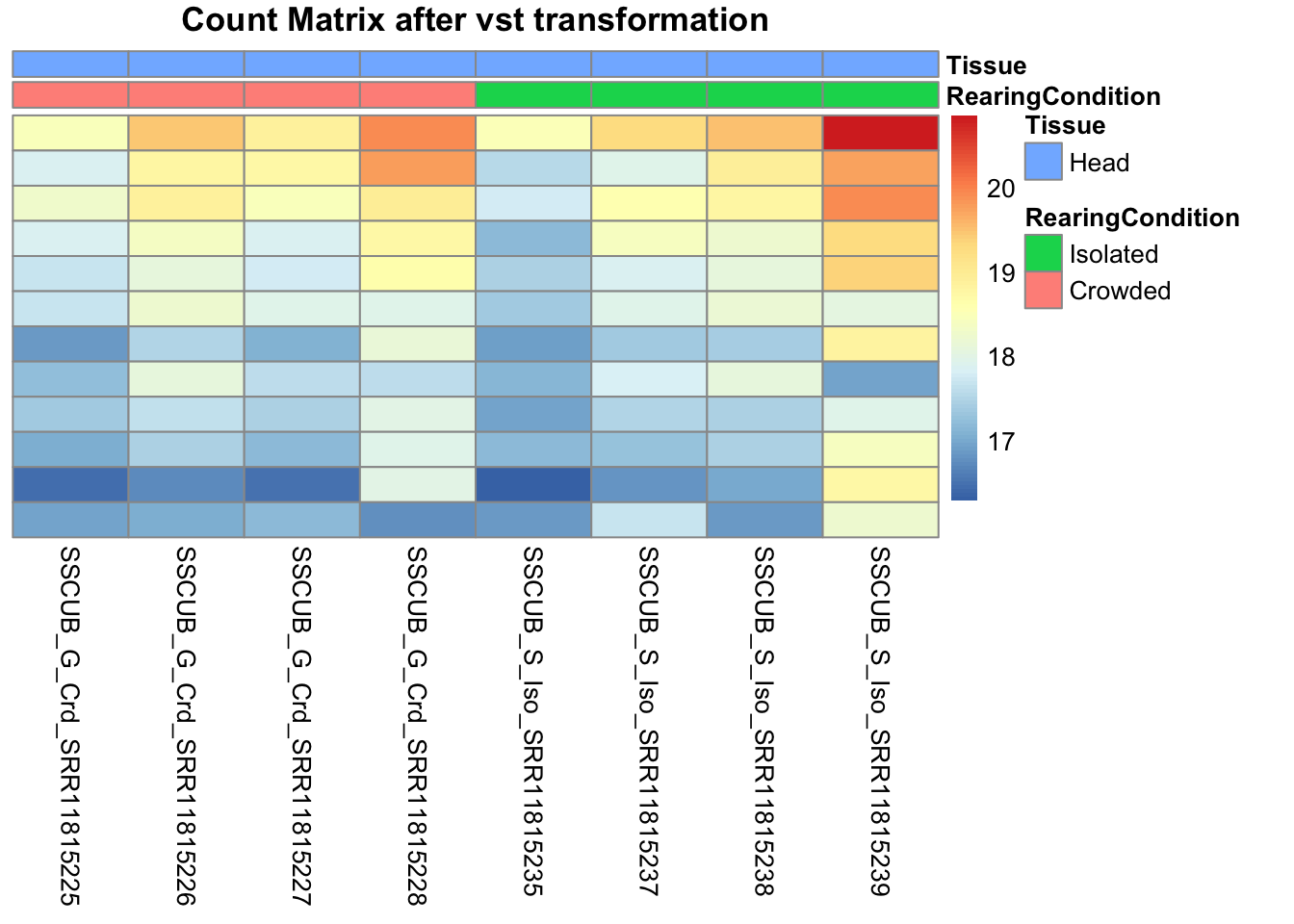
pheatmap(assay(shigeru_rlog)[select,], cluster_rows=FALSE, show_rownames=FALSE,
cluster_cols=FALSE, annotation_col=df, main = "Count Matrix after rlog transformation")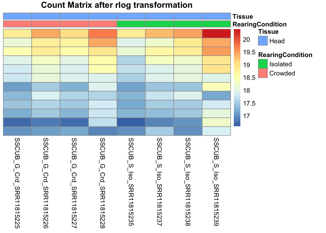
# calculate between-sample distance matrix
metadata <- sampletable[,c("RearingCondition", "Tissue")]
rownames(metadata) <- sampletable$SampleName
sampleDistMatrix.rlog <- as.matrix(dist(t(assay(shigeru_rlog))))
pheatmap(sampleDistMatrix.rlog, annotation_col=metadata, main = "Head tissue heatmap distance matrix, rlog transformation")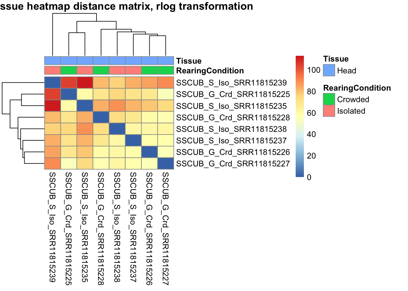
sampleDistMatrix.vst<- as.matrix(dist(t(assay(shigeru_vst))))
pheatmap(sampleDistMatrix.vst, annotation_col=metadata, main = "Head tissue heatmap distance matrix, rlog transformation")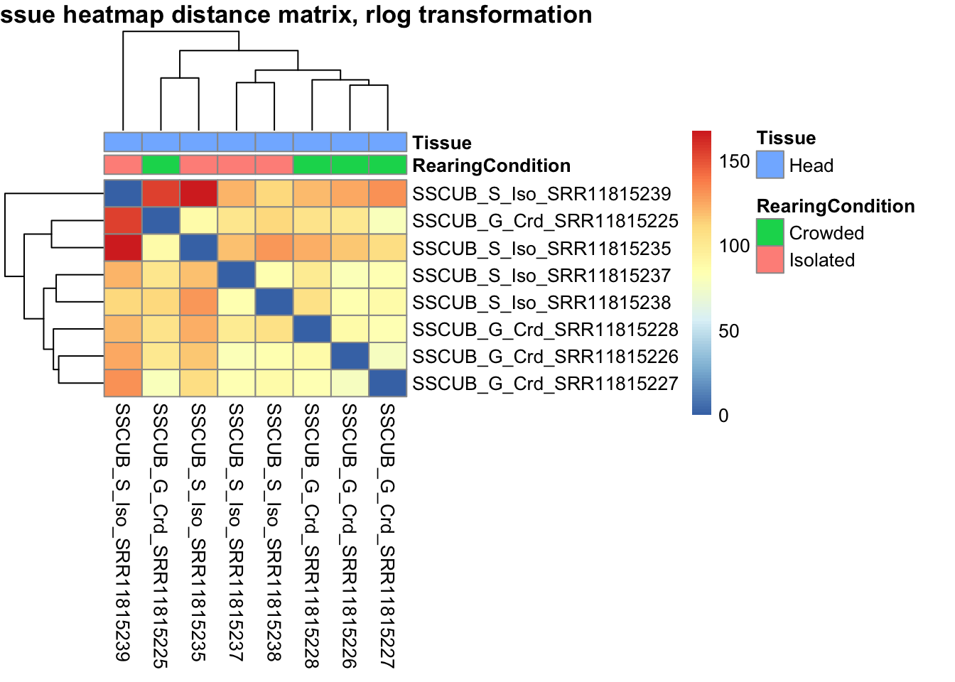
The following plots are interactive and we can hover or Zoom on the locus of interest.
# Ma plot parameters after shrinkage
de_shrink <- lfcShrink(dds = shigeru, coef="RearingCondition_Crowded_vs_Isolated", type="apeglm")
#head(de_shrink)
maplot <-ggmaplot(de_shrink, fdr = 0.05, fc = 1, size = 1, palette = c("#B31B21", "#1465AC", "darkgray"), genenames = as.vector(rownames(de_shrink$name)), top = 0,legend="top",label.select = NULL) +
coord_cartesian(xlim = c(0, 20)) +
scale_y_continuous(limits=c(-12, 12)) +
theme(axis.text.x = element_text(size=12),axis.text.y = element_text(size=12),axis.title.x = element_text(size=14),axis.title.y = element_text(size=14),axis.line = element_line(size = 1, colour="gray20"),axis.ticks = element_line(size = 1, colour="gray20")) +
guides(color = guide_legend(override.aes = list(size = c(3,3,3)))) +
theme(legend.position = c(0.70, 0.12),legend.text=element_text(size=14,face="bold"),legend.background = element_rect(fill="transparent")) +
theme(plot.title = element_text(size=18, colour="gray30", face="bold",hjust=0.06, vjust=-5)) +
labs(title="MA-plot for the shrunken log2 fold changes in the Head tissues")
interactive_maplot <- ggplotly(maplot)
interactive_maplot#Volcano plot
keyvals <-ifelse(
res_shigeru$log2FoldChange >= 1 & res_shigeru$padj <= 0.05, '#B31B21',
ifelse(res_shigeru$log2FoldChange <= -1 & res_shigeru$padj <= 0.05, '#1465AC', 'darkgray'))
keyvals[is.na(keyvals)] <-'lightgray'
names(keyvals)[keyvals == "#B31B21"] <-'Upregulated'
names(keyvals)[keyvals == "#1465AC"] <-'Downregulated'
names(keyvals)[keyvals == 'darkgray'] <-'NS'
res_shigeru$color <- keyvals
volcano_plot <- ggplot(res_shigeru, aes(x = log2FoldChange, y = -log10(padj),
color = color, # Use the color column with keyvals
text = rownames(res_shigeru))) +
geom_point(size = 3, alpha = 0.8) +
scale_color_identity() + # Directly use the color values from `keyvals`
guides(color = "none") + # Hide the color legend
labs(title = "Volcano Plot DEG Head S. cubense", x = "log2 Fold Change", y = "-log10 Adjusted P-Value") +
theme_minimal()
# Convert to interactive plot with hover text for gene names
interactive_volcano <- ggplotly(volcano_plot, tooltip = "text") %>%
layout(hoverlabel = list(namelength = -1))
# Display the interactive plot
interactive_volcanonitens
rawDir <- file.path(workDir, "03-nitens-DESeq2")
# Path and name of targetfile containing conditions and file names
species <- "nitens"
targetFile <- file.path(workDir, "list", paste0("Head", "_", species, "_nooutliers.txt"))
sampletable <- fread(targetFile)
rownames(sampletable) <- sampletable$SampleName
sampletable$RearingCondition <- as.factor(sampletable$RearingCondition)
sampletable$Tissue <- as.factor(sampletable$Tissue)
## Import count files
satoshi <- DESeqDataSetFromHTSeqCount(sampleTable = sampletable,
directory = rawDir,
design = ~ RearingCondition )
#satoshi
smallestGroupSize <- 3
keep <- rowSums(counts(satoshi) >= 5) >= smallestGroupSize
satoshi <- satoshi[keep,]
#nrow(satoshi)
satoshi$RearingCondition <- relevel(satoshi$RearingCondition, ref = "Isolated")
# Fit the statistical model
shigeru <- DESeq(satoshi)
#cbind(resultsNames(shigeru))
res_shigeru <- results(shigeru)
sum(res_shigeru$padj < tresh_padj, na.rm = TRUE)[1] 540A total of 540 genes out of the pre-filtered 13,510 features were showing significant differences in expression levels. The summary below showed how many were upregulated and downregulated in crowded compared to isolated it is possible to scroll it.
brock <- results(shigeru, name = "RearingCondition_Crowded_vs_Isolated", alpha = alpha_DEseq2)
summary(brock)
out of 13510 with nonzero total read count
adjusted p-value < 0.05
LFC > 0 (up) : 233, 1.7%
LFC < 0 (down) : 314, 2.3%
outliers [1] : 124, 0.92%
low counts [2] : 524, 3.9%
(mean count < 5)
[1] see 'cooksCutoff' argument of ?results
[2] see 'independentFiltering' argument of ?results#mcols(brock)$description
#head(brock)
brock_df <- as.data.frame(brock)
datatable(brock_df, options = list(
pageLength = 10, # Set initial page length
scrollX = TRUE, # Enable horizontal scrolling
autoWidth = TRUE, # Adjust column width automatically
searchHighlight = TRUE # Highlight search matches
))Now we will make the different plots: PCA, MA and Volcano.
# Try with the data transformation
shigeru_vst <- vst(shigeru)
shigeru_rlog <- rlog(shigeru)
shigeru_ntd <- normTransform(shigeru)
itadori <- meanSdPlot(assay(shigeru_ntd))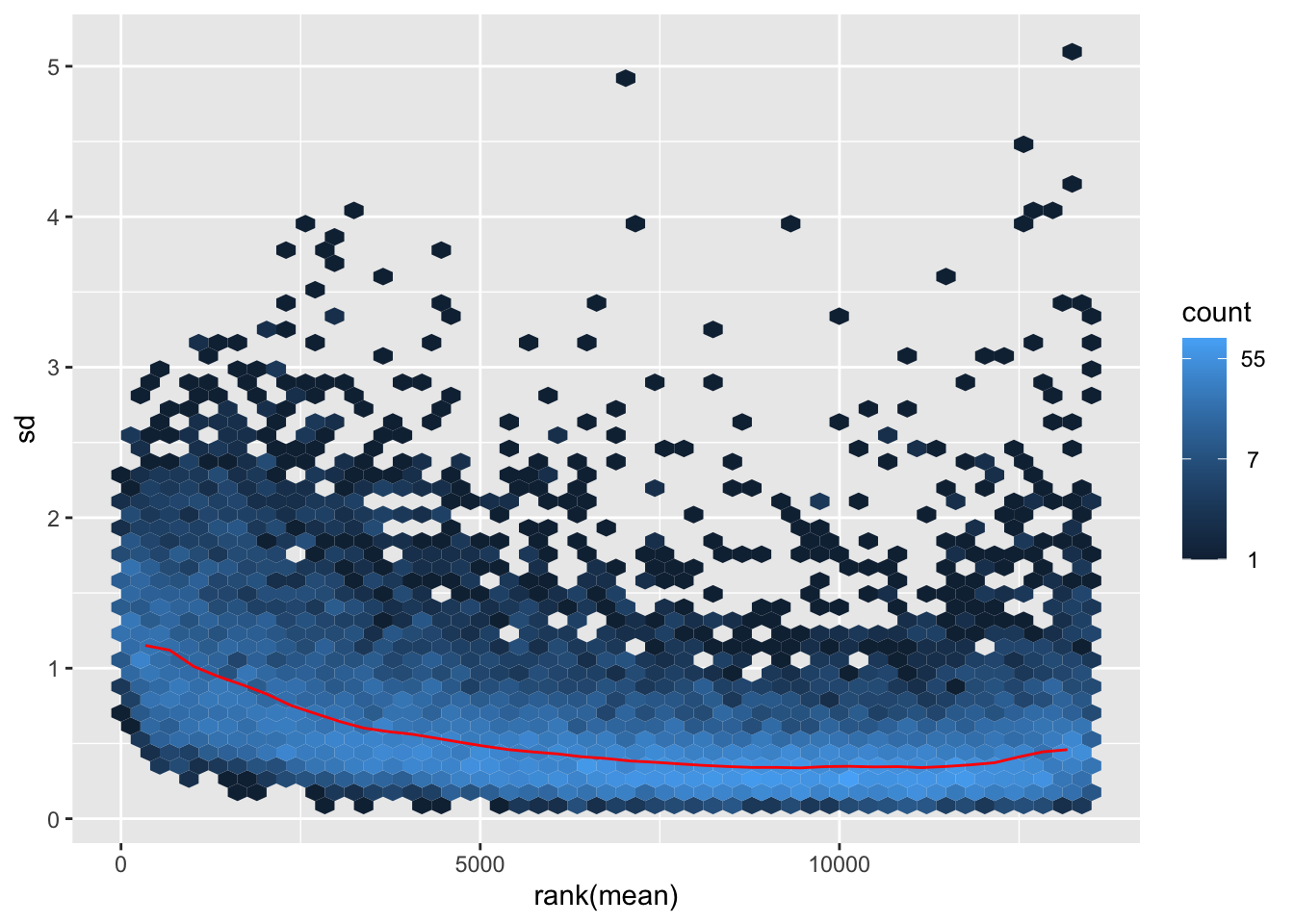
itadori2 <- itadori$gg + ggtitle("Transformation with ntd")
itadori2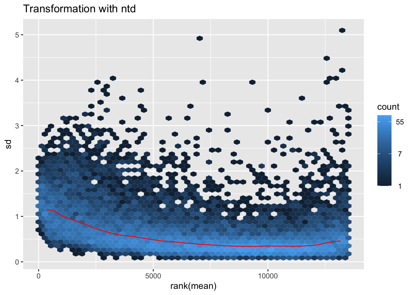
megumi <- meanSdPlot(assay(shigeru_vst))
megumi2 <- megumi$gg + ggtitle("Transformation with vst")
megumi2
nobara <- meanSdPlot(assay(shigeru_rlog))
nobara2 <-nobara$gg + ggtitle("Transformation with rlog")
nobara2
# Create the pca on the defined groups
pcaData1 <- plotPCA(object = shigeru_rlog, intgroup = c("RearingCondition"),returnData=TRUE)
percentVar <- round(100 * attr(pcaData1, "percentVar"))
pcaData1$RearingCondition<-factor(pcaData1$RearingCondition,levels=c("Crowded","Isolated"), labels=c("Crowded S. nitens","Isolated S. nitens"))
#levels(pcaData1$RearingCondition)
p1 <- ggplot(pcaData1, aes(PC1, PC2, color= RearingCondition)) +
geom_point(size=6) +
xlab(paste0("PC1: ", percentVar[1], "% variance")) +
ylab(paste0("PC2: ", percentVar[2], "% variance")) +
scale_color_manual(values = c("blue", "red")) +
#coord_fixed() +
theme_bw() +
theme(legend.title = element_blank()) +
theme(legend.text = element_text(face="bold", size=16)) +
theme(axis.text = element_text(size=14)) +
theme(axis.title = element_text(size=14))
p1 + geom_convexhull(aes(fill = RearingCondition, color = RearingCondition), alpha = 0.5) +
scale_fill_manual(values = c("blue", "red"))+
ggtitle("PCA on S. nitens Head tissues", subtitle = "rlog transformation") 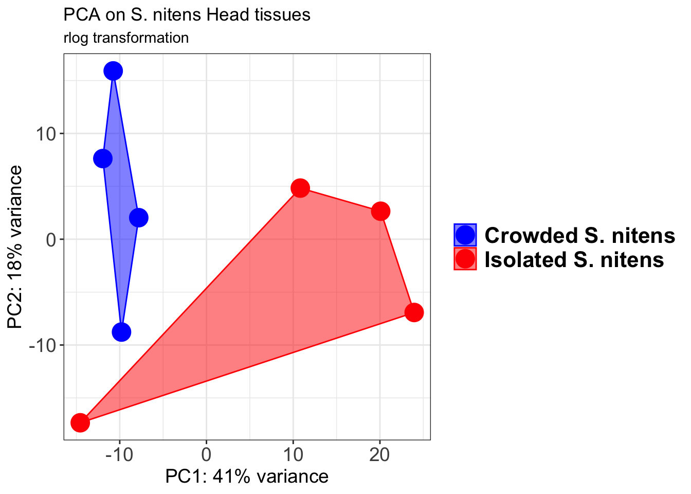
pcaData2 <- plotPCA(object = shigeru_vst, intgroup = c("RearingCondition"),returnData=TRUE)
percentVar <- round(100 * attr(pcaData2, "percentVar"))
pcaData2$RearingCondition<-factor(pcaData2$RearingCondition,levels=c("Crowded","Isolated"), labels=c("Crowded S. nitens","Isolated S. nitens"))
#levels(pcaData2$RearingCondition)
p2 <-ggplot(pcaData2, aes(PC1, PC2, color= RearingCondition)) +
geom_point(size=6) +
xlab(paste0("PC1: ", percentVar[1], "% variance")) +
ylab(paste0("PC2: ", percentVar[2], "% variance")) +
scale_color_manual(values = c("blue", "red")) +
#coord_fixed() +
theme_bw() +
theme(legend.title = element_blank()) +
theme(legend.text = element_text(face="bold", size=16)) +
theme(axis.text = element_text(size=14)) +
theme(axis.title = element_text(size=14))
p2 + geom_convexhull(aes(fill = RearingCondition, color = RearingCondition), alpha = 0.5) +
scale_fill_manual(values = c("blue", "red"))+
ggtitle("PCA on S. nitens Head tissues", subtitle = "vst transformation") 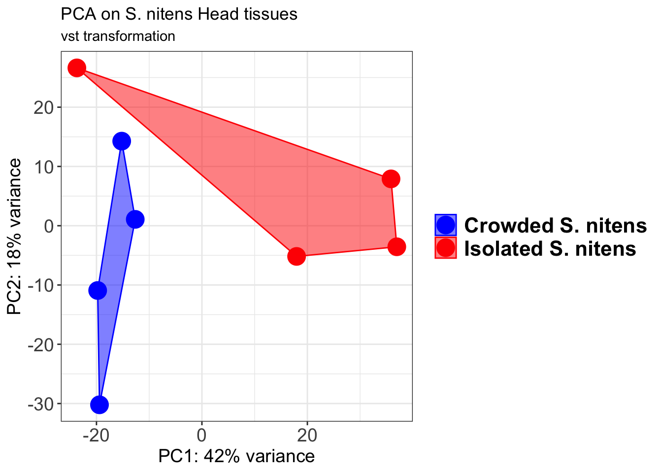
select <- order(rowMeans(counts(shigeru,normalized=TRUE)),
decreasing=TRUE)[1:12]
df <- as.data.frame(colData(shigeru)[,c("RearingCondition","Tissue")])
# Count matrix
pheatmap(assay(shigeru_ntd)[select,], cluster_rows=FALSE, show_rownames=FALSE,
cluster_cols=FALSE, annotation_col=df, main = "Count Matrix after norm transformation")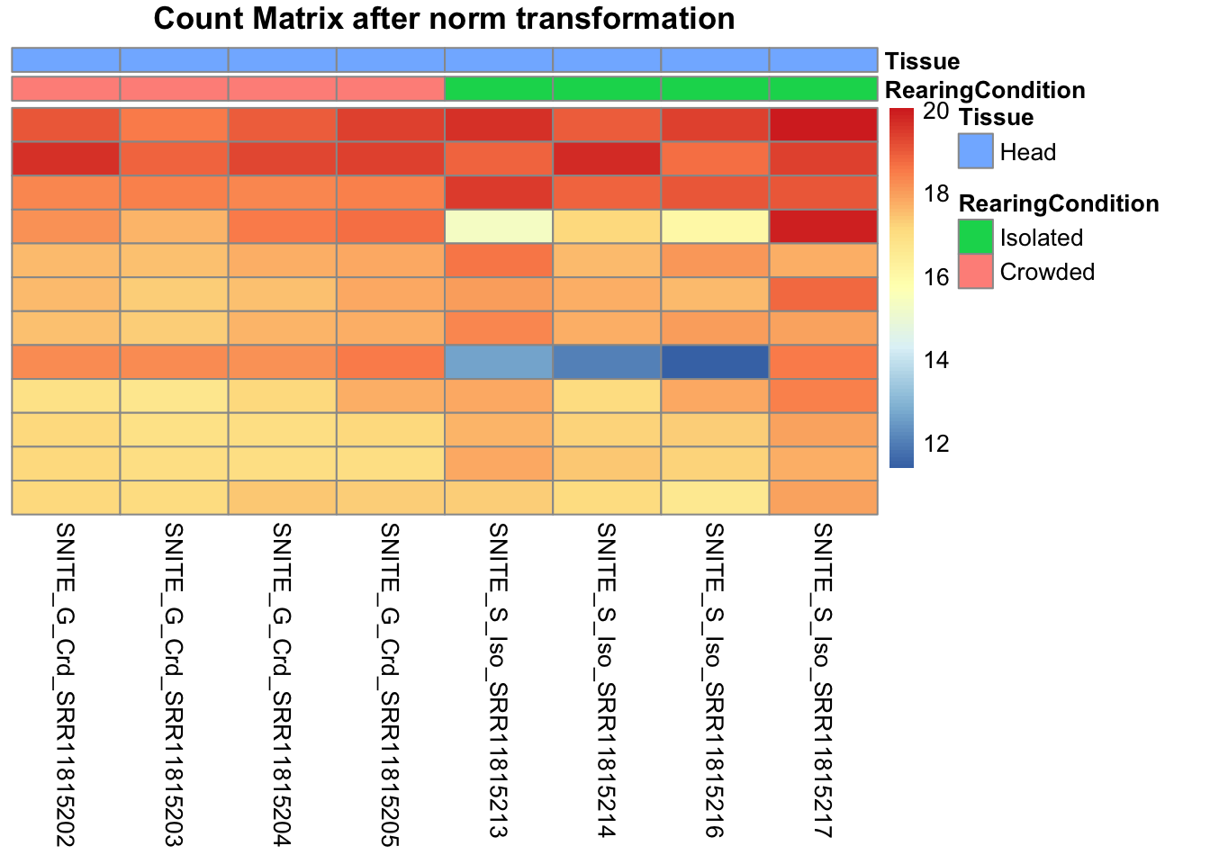
pheatmap(assay(shigeru_vst)[select,], cluster_rows=FALSE, show_rownames=FALSE,
cluster_cols=FALSE, annotation_col=df, main = "Count Matrix after vst transformation")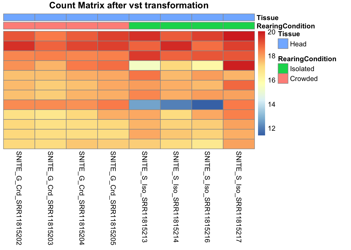
pheatmap(assay(shigeru_rlog)[select,], cluster_rows=FALSE, show_rownames=FALSE,
cluster_cols=FALSE, annotation_col=df, main = "Count Matrix after rlog transformation")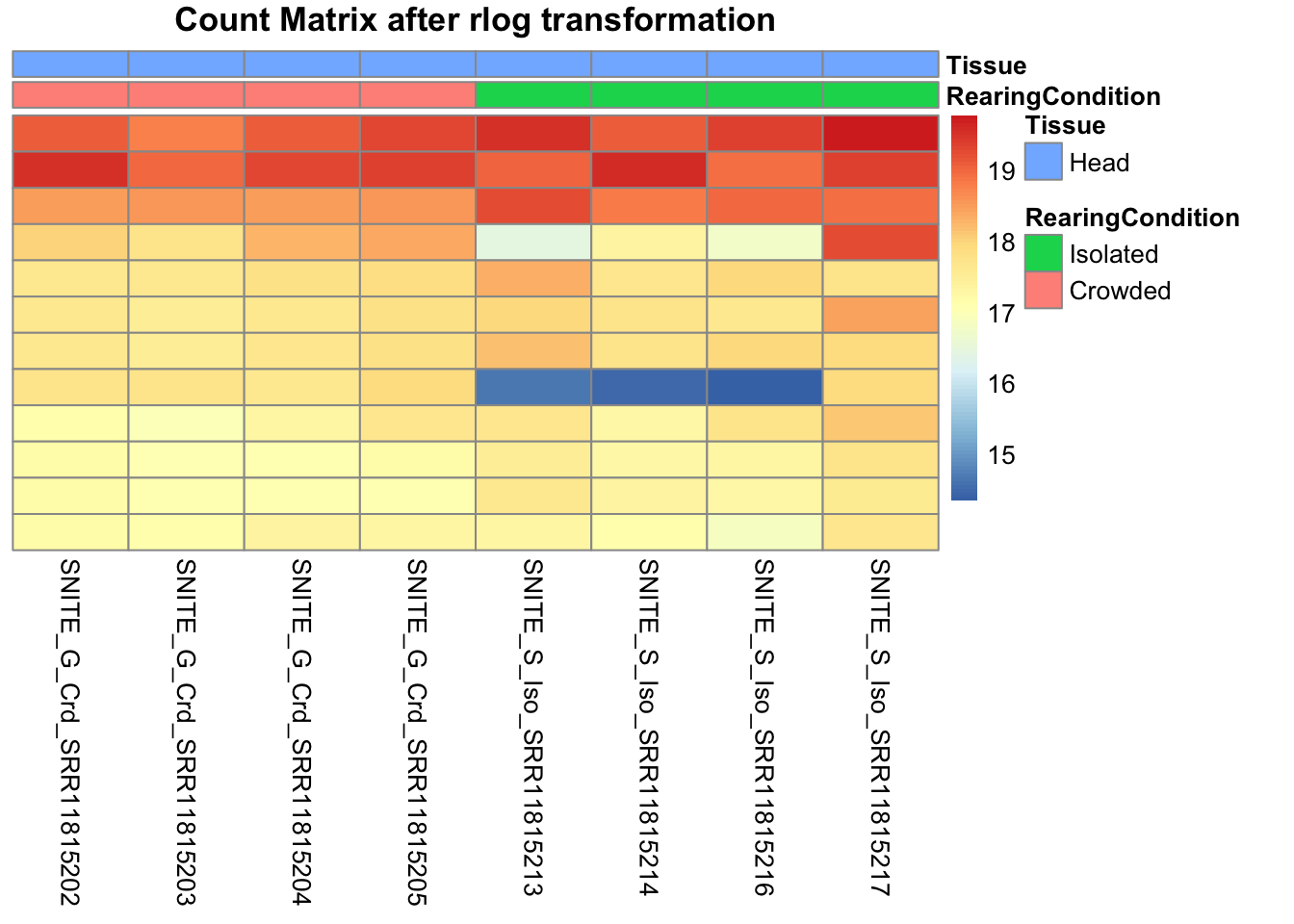
# calculate between-sample distance matrix
metadata <- sampletable[,c("RearingCondition", "Tissue")]
rownames(metadata) <- sampletable$SampleName
sampleDistMatrix.rlog <- as.matrix(dist(t(assay(shigeru_rlog))))
pheatmap(sampleDistMatrix.rlog, annotation_col=metadata, main = "Head tissue heatmap distance matrix, rlog transformation")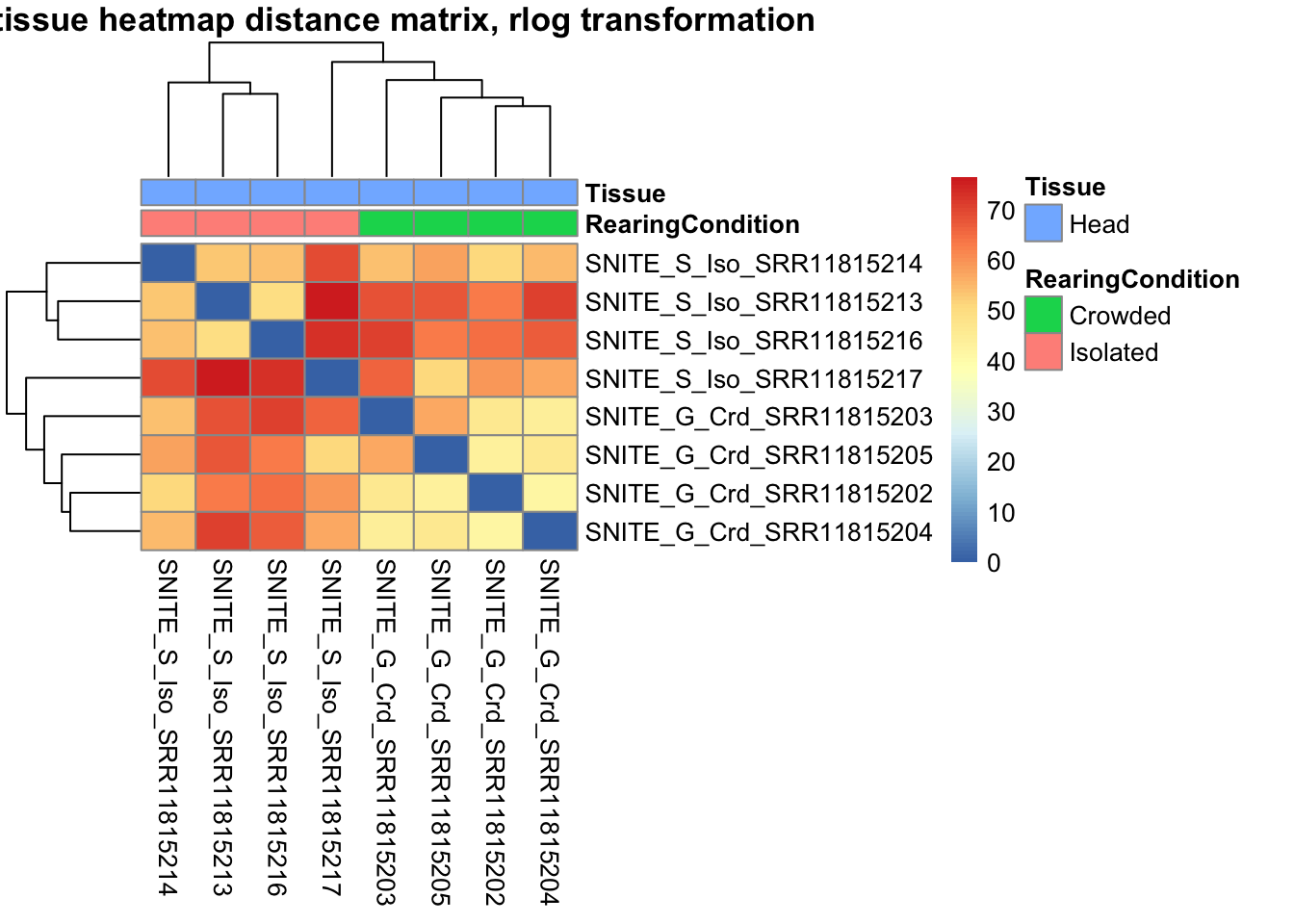
sampleDistMatrix.vst<- as.matrix(dist(t(assay(shigeru_vst))))
pheatmap(sampleDistMatrix.vst, annotation_col=metadata, main = "Head tissue heatmap distance matrix, rlog transformation")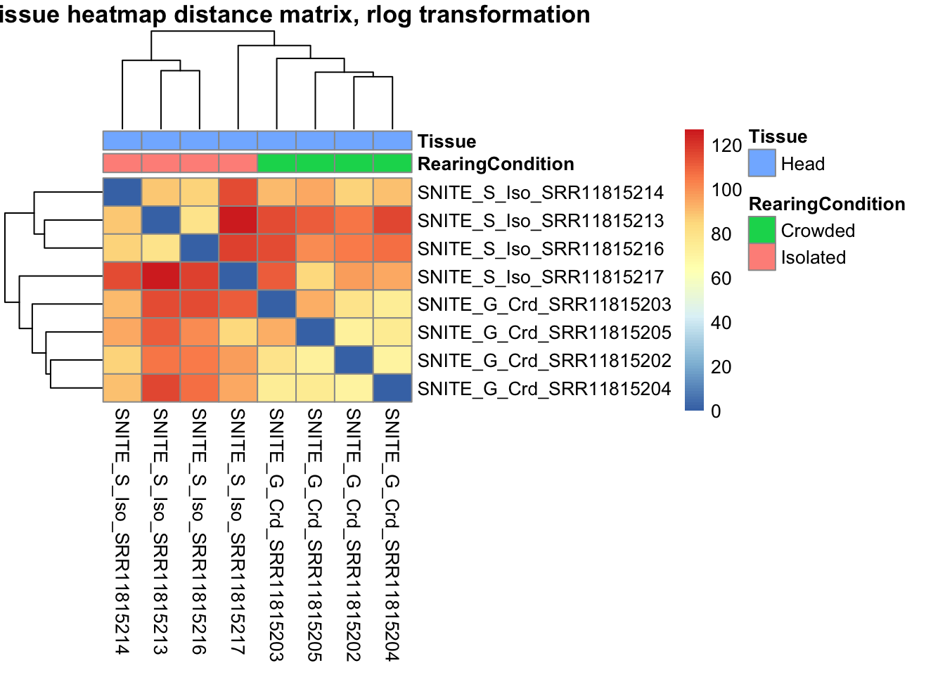
The following plots are interactive and we can hover or Zoom on the locus of interest.
# Ma plot parameters after shrinkage
de_shrink <- lfcShrink(dds = shigeru, coef="RearingCondition_Crowded_vs_Isolated", type="apeglm")
#head(de_shrink)
maplot <-ggmaplot(de_shrink, fdr = 0.05, fc = 1, size = 1, palette = c("#B31B21", "#1465AC", "darkgray"), genenames = as.vector(rownames(de_shrink$name)), top = 0,legend="top",label.select = NULL) +
coord_cartesian(xlim = c(0, 20)) +
scale_y_continuous(limits=c(-12, 12)) +
theme(axis.text.x = element_text(size=12),axis.text.y = element_text(size=12),axis.title.x = element_text(size=14),axis.title.y = element_text(size=14),axis.line = element_line(size = 1, colour="gray20"),axis.ticks = element_line(size = 1, colour="gray20")) +
guides(color = guide_legend(override.aes = list(size = c(3,3,3)))) +
theme(legend.position = c(0.70, 0.12),legend.text=element_text(size=14,face="bold"),legend.background = element_rect(fill="transparent")) +
theme(plot.title = element_text(size=18, colour="gray30", face="bold",hjust=0.06, vjust=-5)) +
labs(title="MA-plot for the shrunken log2 fold changes in the Head tissues")
interactive_maplot <- ggplotly(maplot)
interactive_maplot#Volcano plot
keyvals <-ifelse(
res_shigeru$log2FoldChange >= 1 & res_shigeru$padj <= 0.05, '#B31B21',
ifelse(res_shigeru$log2FoldChange <= -1 & res_shigeru$padj <= 0.05, '#1465AC', 'darkgray'))
keyvals[is.na(keyvals)] <-'lightgray'
names(keyvals)[keyvals == "#B31B21"] <-'Upregulated'
names(keyvals)[keyvals == "#1465AC"] <-'Downregulated'
names(keyvals)[keyvals == 'darkgray'] <-'NS'
res_shigeru$color <- keyvals
volcano_plot <- ggplot(res_shigeru, aes(x = log2FoldChange, y = -log10(padj),
color = color, # Use the color column with keyvals
text = rownames(res_shigeru))) +
geom_point(size = 3, alpha = 0.8) +
scale_color_identity() + # Directly use the color values from `keyvals`
guides(color = "none") + # Hide the color legend
labs(title = "Volcano Plot DEG Head S. nitens", x = "log2 Fold Change", y = "-log10 Adjusted P-Value") +
theme_minimal()
# Convert to interactive plot with hover text for gene names
interactive_volcano <- ggplotly(volcano_plot, tooltip = "text") %>%
layout(hoverlabel = list(namelength = -1))
# Display the interactive plot
interactive_volcanoDEGs in bulk Thorax tissues
gregaria
rawDir <- file.path(workDir, "03-gregaria-DESeq2")
# Path and name of targetfile containing conditions and file names
species <- "gregaria"
targetFile <- file.path(workDir, "list", paste0("Thorax", "_", species, "_nooutliers.txt"))
sampletable <- fread(targetFile)
rownames(sampletable) <- sampletable$SampleName
sampletable$RearingCondition <- as.factor(sampletable$RearingCondition)
sampletable$Tissue <- as.factor(sampletable$Tissue)
## Import count files
satoshi <- DESeqDataSetFromHTSeqCount(sampleTable = sampletable,
directory = rawDir,
design = ~ RearingCondition )
#satoshi
smallestGroupSize <- 3
keep <- rowSums(counts(satoshi) >= 5) >= smallestGroupSize
satoshi <- satoshi[keep,]
#nrow(satoshi)
satoshi$RearingCondition <- relevel(satoshi$RearingCondition, ref = "Isolated")
# Fit the statistical model
shigeru <- DESeq(satoshi)
#cbind(resultsNames(shigeru))
res_shigeru <- results(shigeru)
sum(res_shigeru$padj < tresh_padj, na.rm = TRUE)[1] 5442A total of 5,442 genes out of the pre-filtered 16,613 features were showing significant differences in expression levels. The summary below showed how many were upregulated and downregulated in crowded compared to isolated it is possible to scroll it.
brock <- results(shigeru, name = "RearingCondition_Crowded_vs_Isolated", alpha = alpha_DEseq2)
summary(brock)
out of 16613 with nonzero total read count
adjusted p-value < 0.05
LFC > 0 (up) : 2751, 17%
LFC < 0 (down) : 2691, 16%
outliers [1] : 112, 0.67%
low counts [2] : 0, 0%
(mean count < 2)
[1] see 'cooksCutoff' argument of ?results
[2] see 'independentFiltering' argument of ?results#mcols(brock)$description
#head(brock)
brock_df <- as.data.frame(brock)
datatable(brock_df, options = list(
pageLength = 10, # Set initial page length
scrollX = TRUE, # Enable horizontal scrolling
autoWidth = TRUE, # Adjust column width automatically
searchHighlight = TRUE # Highlight search matches
))Now we will make the different plots: PCA, MA and Volcano.
# Try with the data transformation
shigeru_vst <- vst(shigeru)
shigeru_rlog <- rlog(shigeru)
shigeru_ntd <- normTransform(shigeru)
itadori <- meanSdPlot(assay(shigeru_ntd))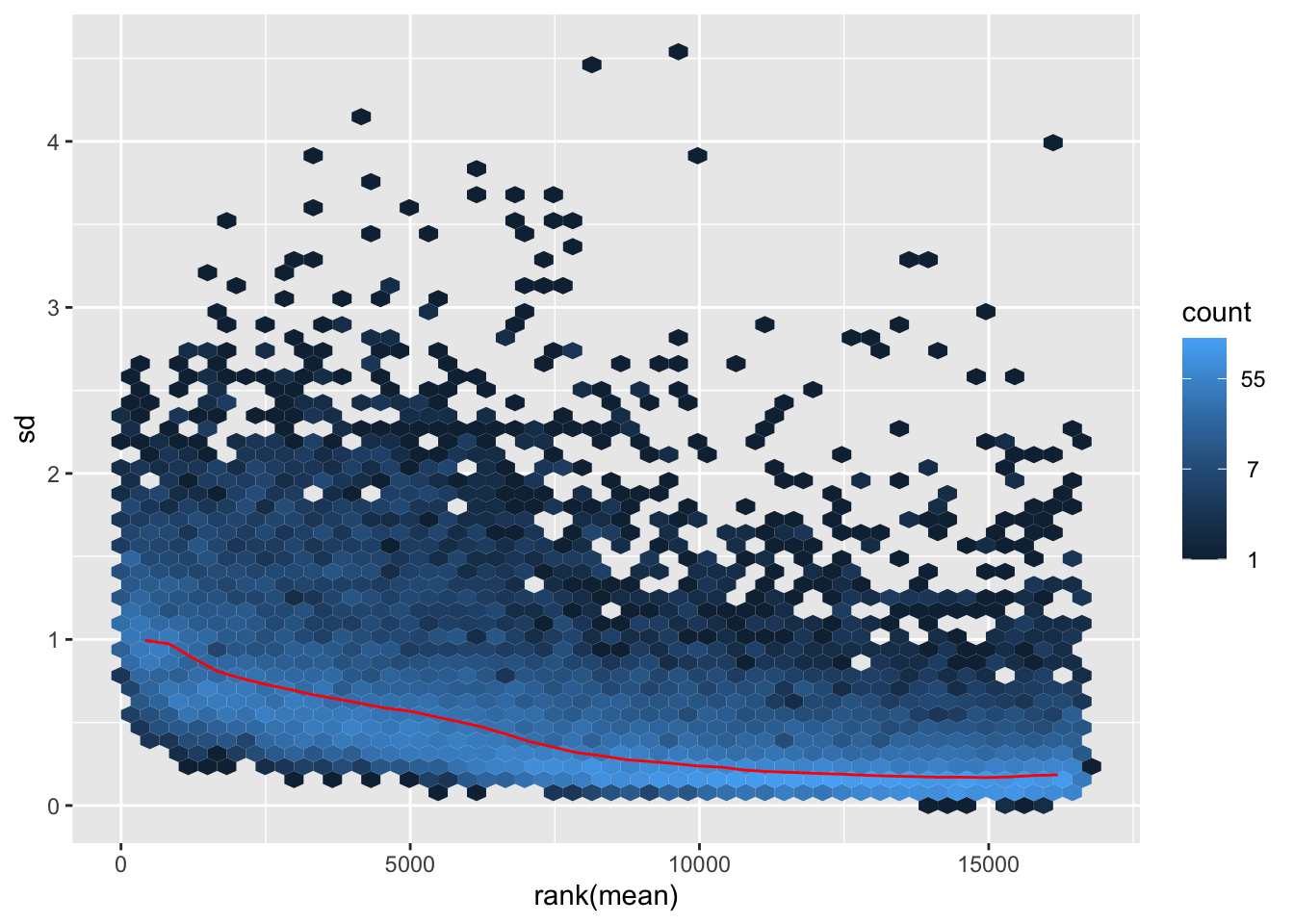
itadori2 <- itadori$gg + ggtitle("Transformation with ntd")
itadori2
megumi <- meanSdPlot(assay(shigeru_vst))
megumi2 <- megumi$gg + ggtitle("Transformation with vst")
megumi2
nobara <- meanSdPlot(assay(shigeru_rlog))
nobara2 <-nobara$gg + ggtitle("Transformation with rlog")
nobara2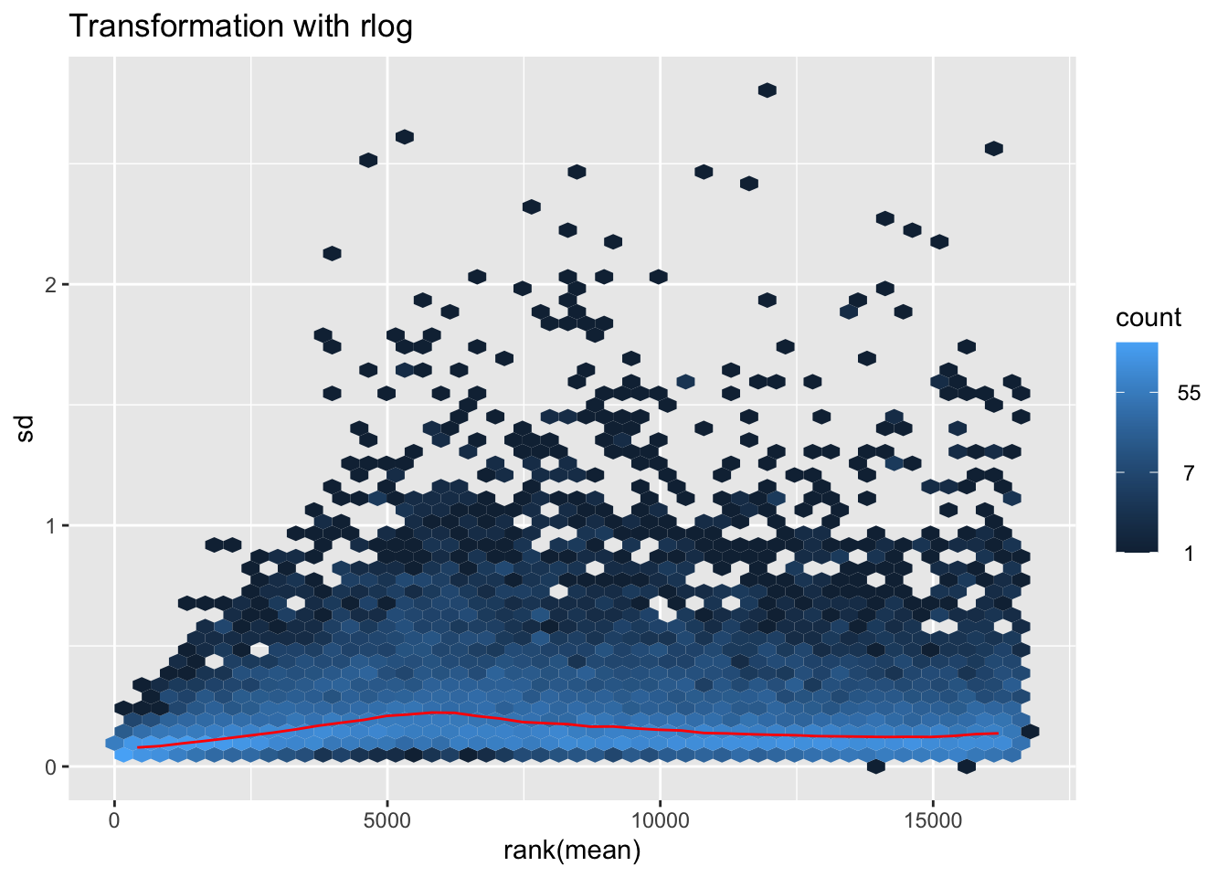
# Create the pca on the defined groups
pcaData1 <- plotPCA(object = shigeru_rlog, intgroup = c("RearingCondition"),returnData=TRUE)
percentVar <- round(100 * attr(pcaData1, "percentVar"))
pcaData1$RearingCondition<-factor(pcaData1$RearingCondition,levels=c("Crowded","Isolated"), labels=c("Crowded S. gregaria","Isolated S. gregaria"))
#levels(pcaData1$RearingCondition)
p1 <- ggplot(pcaData1, aes(PC1, PC2, color= RearingCondition)) +
geom_point(size=6) +
xlab(paste0("PC1: ", percentVar[1], "% variance")) +
ylab(paste0("PC2: ", percentVar[2], "% variance")) +
scale_color_manual(values = c("blue", "red")) +
#coord_fixed() +
theme_bw() +
theme(legend.title = element_blank()) +
theme(legend.text = element_text(face="bold", size=16)) +
theme(axis.text = element_text(size=14)) +
theme(axis.title = element_text(size=14))
p1 + geom_convexhull(aes(fill = RearingCondition, color = RearingCondition), alpha = 0.5) +
scale_fill_manual(values = c("blue", "red"))+
ggtitle("PCA on S. gregaria Thorax tissues", subtitle = "rlog transformation") 
pcaData2 <- plotPCA(object = shigeru_vst, intgroup = c("RearingCondition"),returnData=TRUE)
percentVar <- round(100 * attr(pcaData2, "percentVar"))
pcaData2$RearingCondition<-factor(pcaData2$RearingCondition,levels=c("Crowded","Isolated"), labels=c("Crowded S. gregaria","Isolated S. gregaria"))
#levels(pcaData2$RearingCondition)
p2 <-ggplot(pcaData2, aes(PC1, PC2, color= RearingCondition)) +
geom_point(size=6) +
xlab(paste0("PC1: ", percentVar[1], "% variance")) +
ylab(paste0("PC2: ", percentVar[2], "% variance")) +
scale_color_manual(values = c("blue", "red")) +
#coord_fixed() +
theme_bw() +
theme(legend.title = element_blank()) +
theme(legend.text = element_text(face="bold", size=16)) +
theme(axis.text = element_text(size=14)) +
theme(axis.title = element_text(size=14))
p2 + geom_convexhull(aes(fill = RearingCondition, color = RearingCondition), alpha = 0.5) +
scale_fill_manual(values = c("blue", "red"))+
ggtitle("PCA on S. gregaria Thorax tissues", subtitle = "vst transformation") 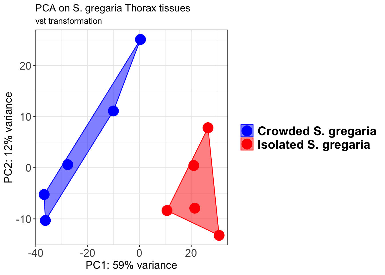
select <- order(rowMeans(counts(shigeru,normalized=TRUE)),
decreasing=TRUE)[1:12]
df <- as.data.frame(colData(shigeru)[,c("RearingCondition","Tissue")])
# Count matrix
pheatmap(assay(shigeru_ntd)[select,], cluster_rows=FALSE, show_rownames=FALSE,
cluster_cols=FALSE, annotation_col=df, main = "Count Matrix after norm transformation")
pheatmap(assay(shigeru_vst)[select,], cluster_rows=FALSE, show_rownames=FALSE,
cluster_cols=FALSE, annotation_col=df, main = "Count Matrix after vst transformation")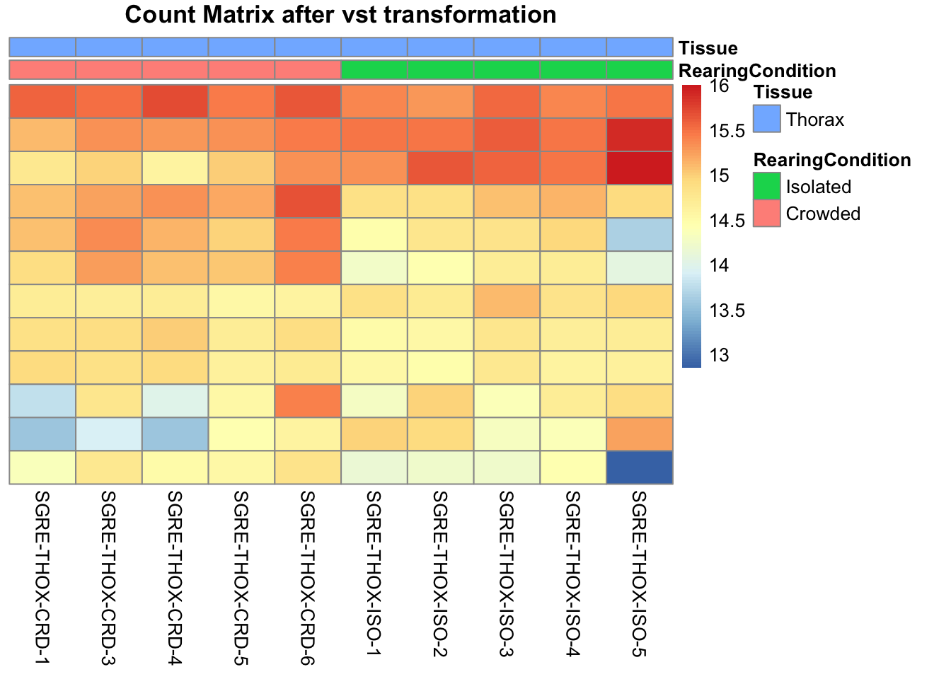
pheatmap(assay(shigeru_rlog)[select,], cluster_rows=FALSE, show_rownames=FALSE,
cluster_cols=FALSE, annotation_col=df, main = "Count Matrix after rlog transformation")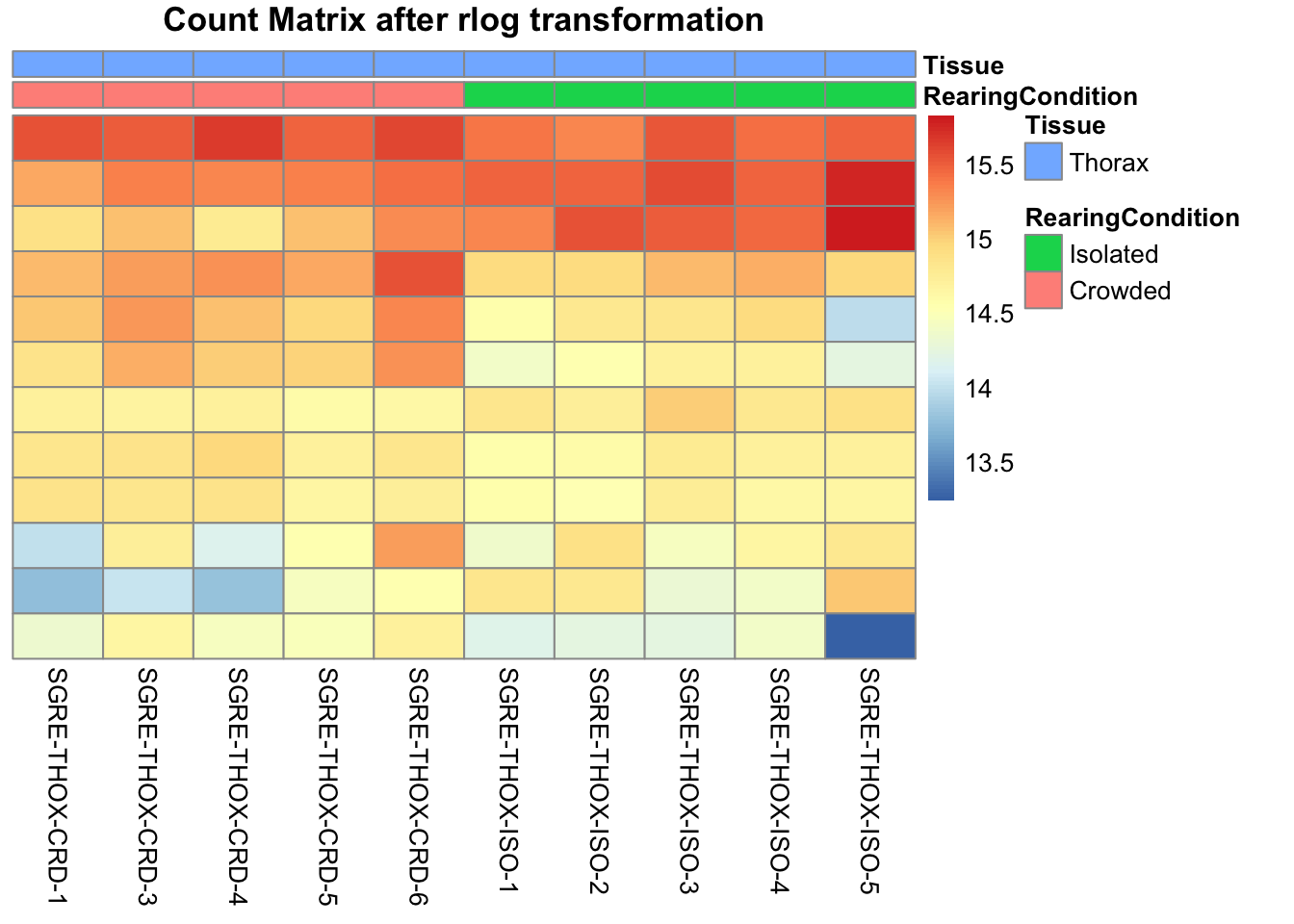
# calculate between-sample distance matrix
metadata <- sampletable[,c("RearingCondition", "Tissue")]
rownames(metadata) <- sampletable$SampleName
sampleDistMatrix.rlog <- as.matrix(dist(t(assay(shigeru_rlog))))
pheatmap(sampleDistMatrix.rlog, annotation_col=metadata, main = "Thorax tissue heatmap distance matrix, rlog transformation")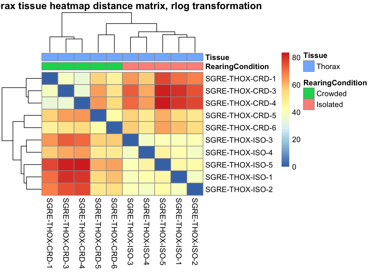
sampleDistMatrix.vst<- as.matrix(dist(t(assay(shigeru_vst))))
pheatmap(sampleDistMatrix.vst, annotation_col=metadata, main = "Thorax tissue heatmap distance matrix, rlog transformation")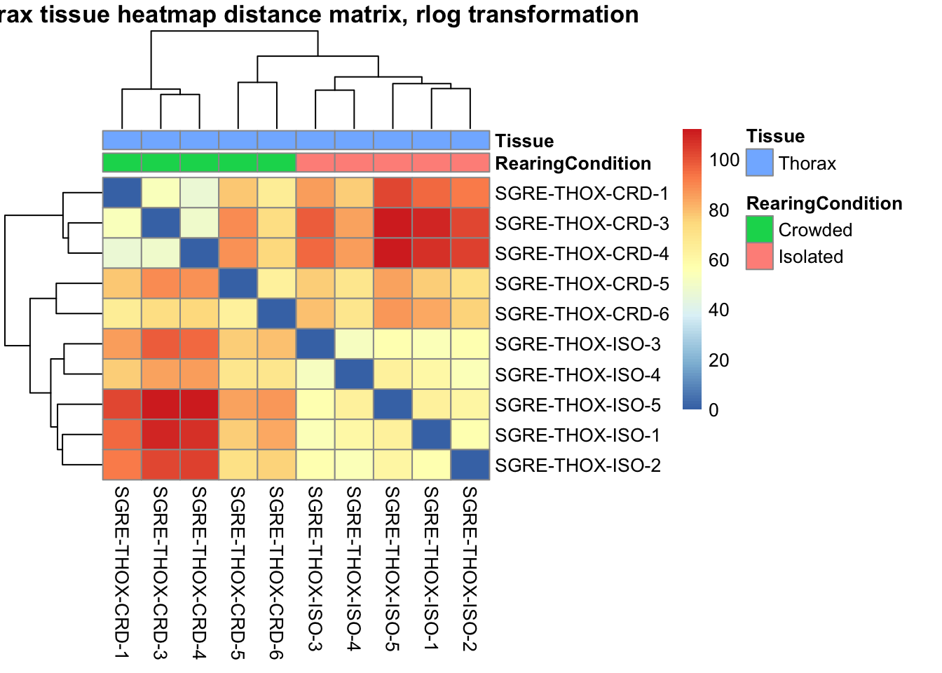
The following plots are interactive and we can hover or Zoom on the locus of interest.
# Ma plot parameters after shrinkage
de_shrink <- lfcShrink(dds = shigeru, coef="RearingCondition_Crowded_vs_Isolated", type="apeglm")
#head(de_shrink)
maplot <-ggmaplot(de_shrink, fdr = 0.05, fc = 1, size = 1, palette = c("#B31B21", "#1465AC", "darkgray"), genenames = as.vector(rownames(de_shrink$name)), top = 0,legend="top",label.select = NULL) +
coord_cartesian(xlim = c(0, 20)) +
scale_y_continuous(limits=c(-12, 12)) +
theme(axis.text.x = element_text(size=12),axis.text.y = element_text(size=12),axis.title.x = element_text(size=14),axis.title.y = element_text(size=14),axis.line = element_line(size = 1, colour="gray20"),axis.ticks = element_line(size = 1, colour="gray20")) +
guides(color = guide_legend(override.aes = list(size = c(3,3,3)))) +
theme(legend.position = c(0.70, 0.12),legend.text=element_text(size=14,face="bold"),legend.background = element_rect(fill="transparent")) +
theme(plot.title = element_text(size=18, colour="gray30", face="bold",hjust=0.06, vjust=-5)) +
labs(title="MA-plot for the shrunken log2 fold changes in the Thorax tissues")
interactive_maplot <- ggplotly(maplot)
interactive_maplot#Volcano plot
keyvals <-ifelse(
res_shigeru$log2FoldChange >= 1 & res_shigeru$padj <= 0.05, '#B31B21',
ifelse(res_shigeru$log2FoldChange <= -1 & res_shigeru$padj <= 0.05, '#1465AC', 'darkgray'))
keyvals[is.na(keyvals)] <-'lightgray'
names(keyvals)[keyvals == "#B31B21"] <-'Upregulated'
names(keyvals)[keyvals == "#1465AC"] <-'Downregulated'
names(keyvals)[keyvals == 'darkgray'] <-'NS'
res_shigeru$color <- keyvals
volcano_plot <- ggplot(res_shigeru, aes(x = log2FoldChange, y = -log10(padj),
color = color, # Use the color column with keyvals
text = rownames(res_shigeru))) +
geom_point(size = 3, alpha = 0.8) +
scale_color_identity() + # Directly use the color values from `keyvals`
guides(color = "none") + # Hide the color legend
labs(title = "Volcano Plot DEG Thorax S. gregaria", x = "log2 Fold Change", y = "-log10 Adjusted P-Value") +
theme_minimal()
# Convert to interactive plot with hover text for gene names
interactive_volcano <- ggplotly(volcano_plot, tooltip = "text") %>%
layout(hoverlabel = list(namelength = -1))
# Display the interactive plot
interactive_volcanopiceifrons
rawDir <- file.path(workDir, "03-piceifrons-DESeq2")
# Path and name of targetfile containing conditions and file names
species <- "piceifrons"
targetFile <- file.path(workDir, "list", paste0("Thorax", "_", species, ".txt"))
sampletable <- fread(targetFile)
rownames(sampletable) <- sampletable$SampleName
sampletable$RearingCondition <- as.factor(sampletable$RearingCondition)
sampletable$Tissue <- as.factor(sampletable$Tissue)
## Import count files
satoshi <- DESeqDataSetFromHTSeqCount(sampleTable = sampletable,
directory = rawDir,
design = ~ RearingCondition )
#satoshi
smallestGroupSize <- 3
keep <- rowSums(counts(satoshi) >= 5) >= smallestGroupSize
satoshi <- satoshi[keep,]
#nrow(satoshi)
satoshi$RearingCondition <- relevel(satoshi$RearingCondition, ref = "Isolated")
# Fit the statistical model
shigeru <- DESeq(satoshi)
#cbind(resultsNames(shigeru))
res_shigeru <- results(shigeru)
sum(res_shigeru$padj < tresh_padj, na.rm = TRUE)[1] 3002A total of 3,002 genes out of the pre-filtered 13,527 features were showing significant differences in expression levels. The summary below showed how many were upregulated and downregulated in crowded compared to isolated it is possible to scroll it.
brock <- results(shigeru, name = "RearingCondition_Crowded_vs_Isolated", alpha = alpha_DEseq2)
summary(brock)
out of 13253 with nonzero total read count
adjusted p-value < 0.05
LFC > 0 (up) : 1641, 12%
LFC < 0 (down) : 1361, 10%
outliers [1] : 36, 0.27%
low counts [2] : 0, 0%
(mean count < 2)
[1] see 'cooksCutoff' argument of ?results
[2] see 'independentFiltering' argument of ?results#mcols(brock)$description
#head(brock)
brock_df <- as.data.frame(brock)
datatable(brock_df, options = list(
pageLength = 10, # Set initial page length
scrollX = TRUE, # Enable horizontal scrolling
autoWidth = TRUE, # Adjust column width automatically
searchHighlight = TRUE # Highlight search matches
))Now we will make the different plots: PCA, MA and Volcano.
# Try with the data transformation
shigeru_vst <- vst(shigeru)
shigeru_rlog <- rlog(shigeru)
shigeru_ntd <- normTransform(shigeru)
itadori <- meanSdPlot(assay(shigeru_ntd))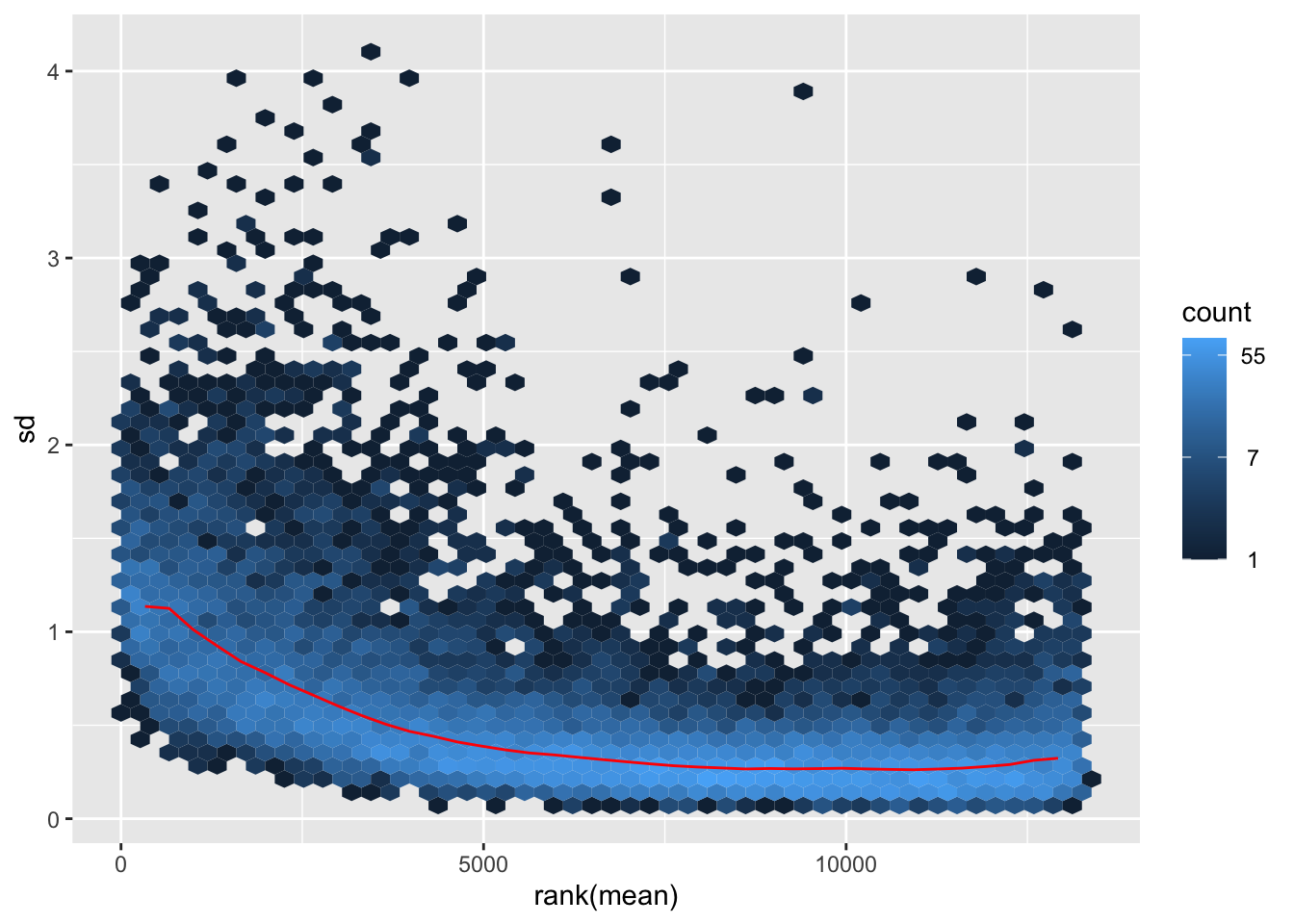
itadori2 <- itadori$gg + ggtitle("Transformation with ntd")
itadori2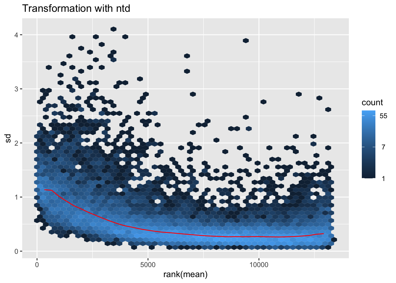
megumi <- meanSdPlot(assay(shigeru_vst))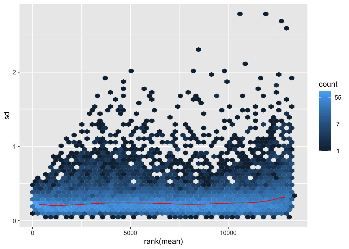
megumi2 <- megumi$gg + ggtitle("Transformation with vst")
megumi2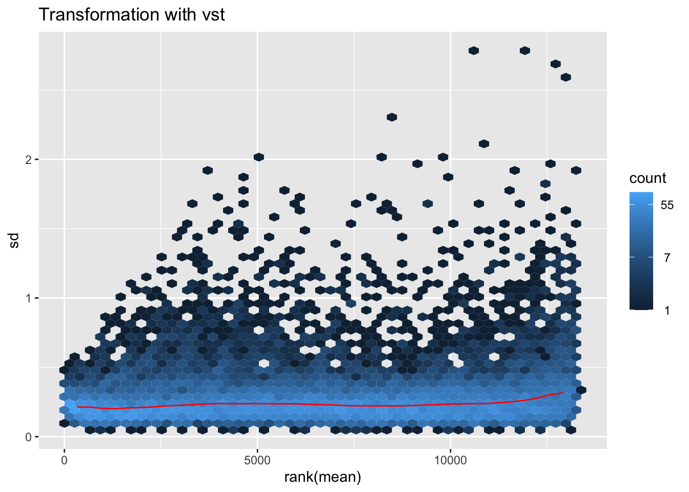
nobara <- meanSdPlot(assay(shigeru_rlog))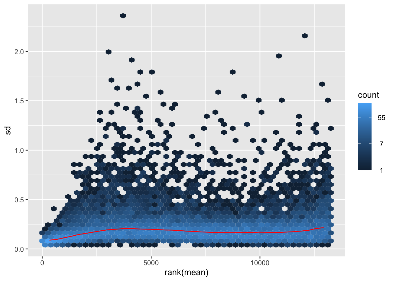
nobara2 <-nobara$gg + ggtitle("Transformation with rlog")
nobara2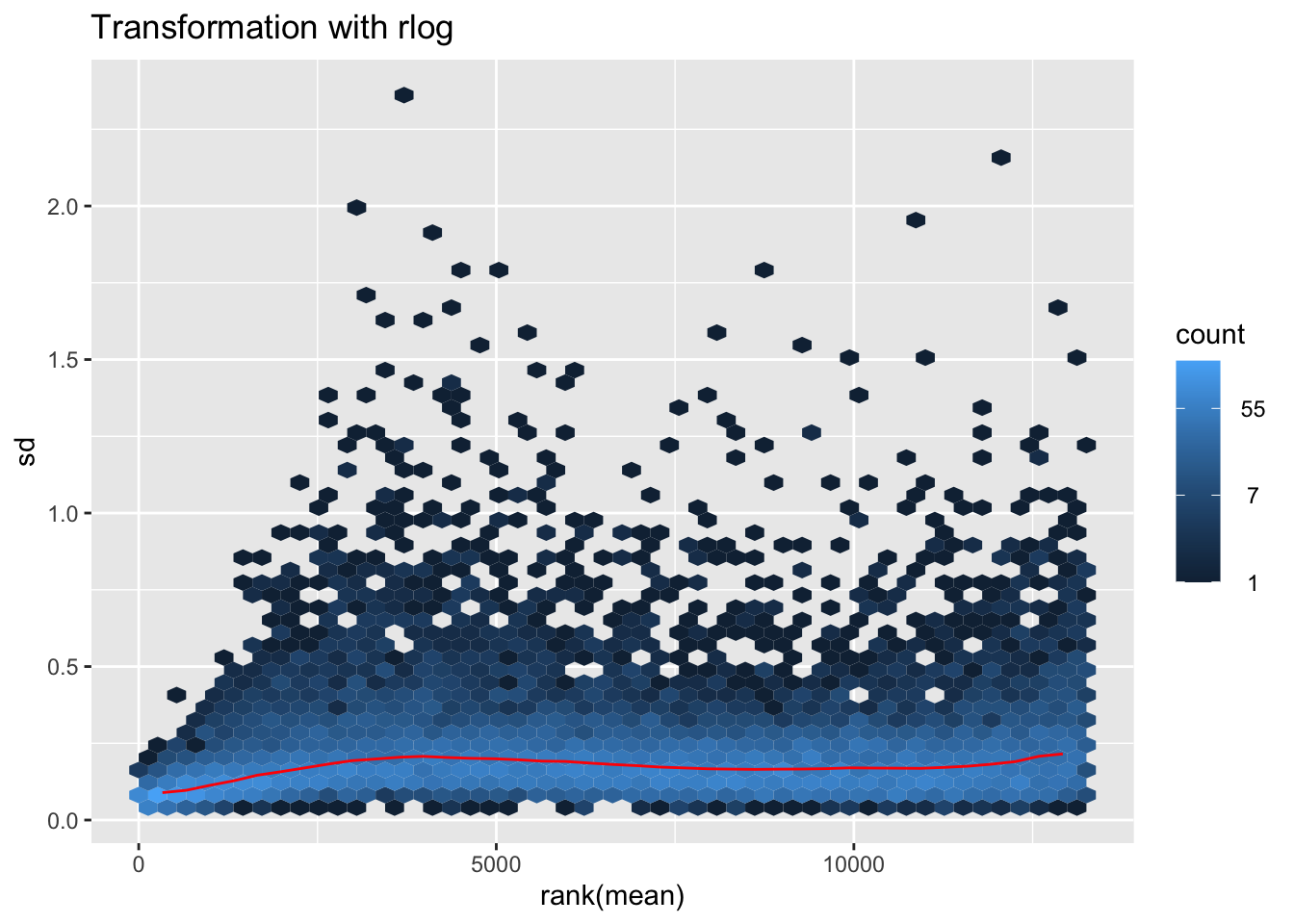
# Create the pca on the defined groups
pcaData1 <- plotPCA(object = shigeru_rlog, intgroup = c("RearingCondition"),returnData=TRUE)
percentVar <- round(100 * attr(pcaData1, "percentVar"))
pcaData1$RearingCondition<-factor(pcaData1$RearingCondition,levels=c("Crowded","Isolated"), labels=c("Crowded S. piceifrons","Isolated S. piceifrons"))
#levels(pcaData1$RearingCondition)
p1 <- ggplot(pcaData1, aes(PC1, PC2, color= RearingCondition)) +
geom_point(size=6) +
xlab(paste0("PC1: ", percentVar[1], "% variance")) +
ylab(paste0("PC2: ", percentVar[2], "% variance")) +
scale_color_manual(values = c("blue", "red")) +
#coord_fixed() +
theme_bw() +
theme(legend.title = element_blank()) +
theme(legend.text = element_text(face="bold", size=16)) +
theme(axis.text = element_text(size=14)) +
theme(axis.title = element_text(size=14))
p1 + geom_convexhull(aes(fill = RearingCondition, color = RearingCondition), alpha = 0.5) +
scale_fill_manual(values = c("blue", "red"))+
ggtitle("PCA on S. piceifrons Thorax tissues", subtitle = "rlog transformation") 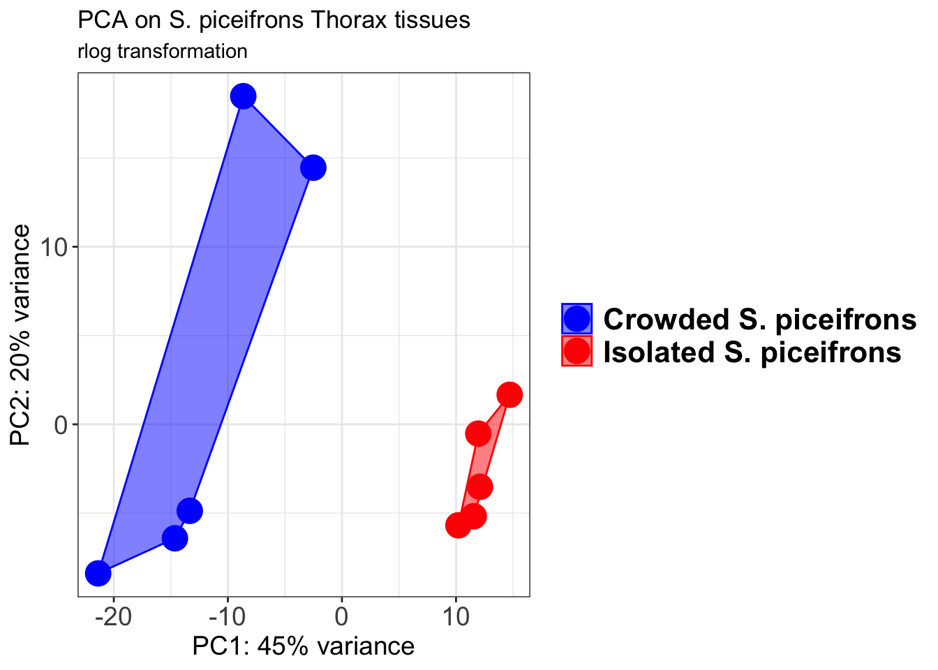
pcaData2 <- plotPCA(object = shigeru_vst, intgroup = c("RearingCondition"),returnData=TRUE)
percentVar <- round(100 * attr(pcaData2, "percentVar"))
pcaData2$RearingCondition<-factor(pcaData2$RearingCondition,levels=c("Crowded","Isolated"), labels=c("Crowded S. piceifrons","Isolated S. piceifrons"))
#levels(pcaData2$RearingCondition)
p2 <-ggplot(pcaData2, aes(PC1, PC2, color= RearingCondition)) +
geom_point(size=6) +
xlab(paste0("PC1: ", percentVar[1], "% variance")) +
ylab(paste0("PC2: ", percentVar[2], "% variance")) +
scale_color_manual(values = c("blue", "red")) +
#coord_fixed() +
theme_bw() +
theme(legend.title = element_blank()) +
theme(legend.text = element_text(face="bold", size=16)) +
theme(axis.text = element_text(size=14)) +
theme(axis.title = element_text(size=14))
p2 + geom_convexhull(aes(fill = RearingCondition, color = RearingCondition), alpha = 0.5) +
scale_fill_manual(values = c("blue", "red"))+
ggtitle("PCA on S. piceifrons Thorax tissues", subtitle = "vst transformation") 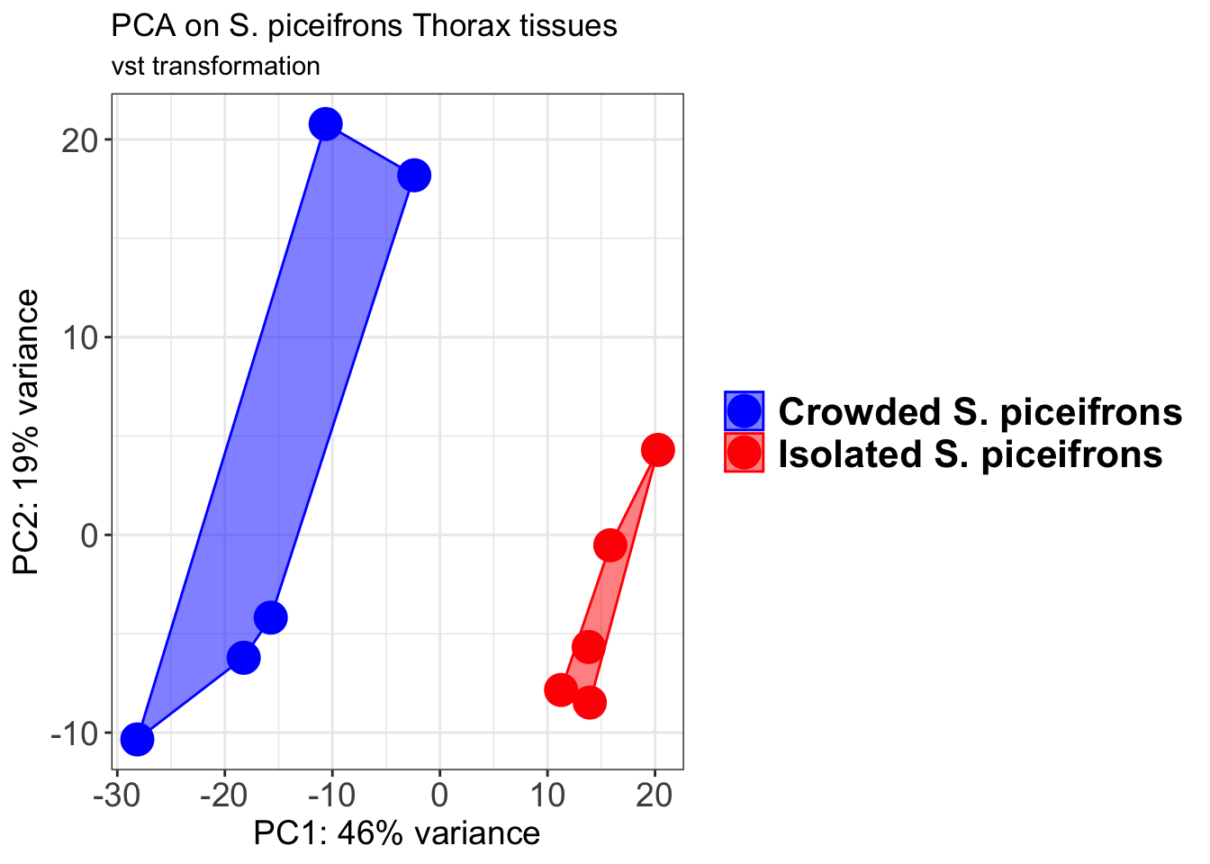
select <- order(rowMeans(counts(shigeru,normalized=TRUE)),
decreasing=TRUE)[1:12]
df <- as.data.frame(colData(shigeru)[,c("RearingCondition","Tissue")])
# Count matrix
pheatmap(assay(shigeru_ntd)[select,], cluster_rows=FALSE, show_rownames=FALSE,
cluster_cols=FALSE, annotation_col=df, main = "Count Matrix after norm transformation")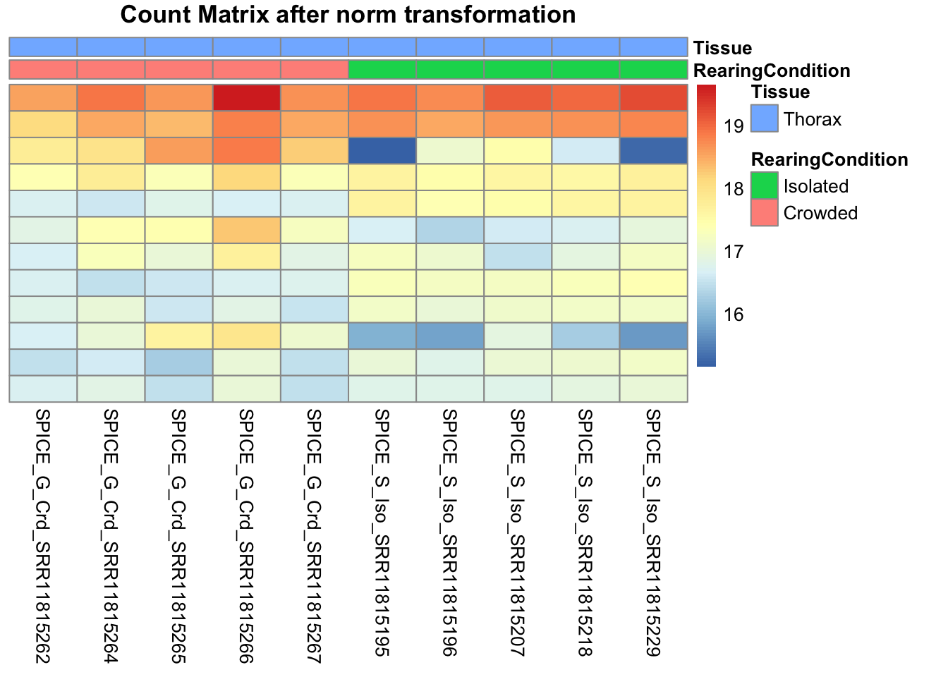
pheatmap(assay(shigeru_vst)[select,], cluster_rows=FALSE, show_rownames=FALSE,
cluster_cols=FALSE, annotation_col=df, main = "Count Matrix after vst transformation")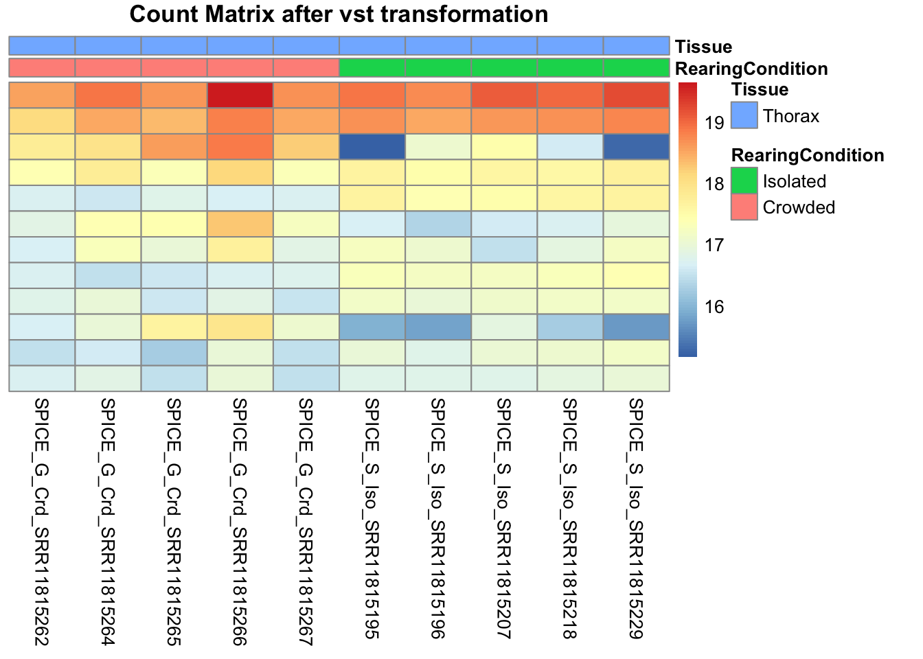
pheatmap(assay(shigeru_rlog)[select,], cluster_rows=FALSE, show_rownames=FALSE,
cluster_cols=FALSE, annotation_col=df, main = "Count Matrix after rlog transformation")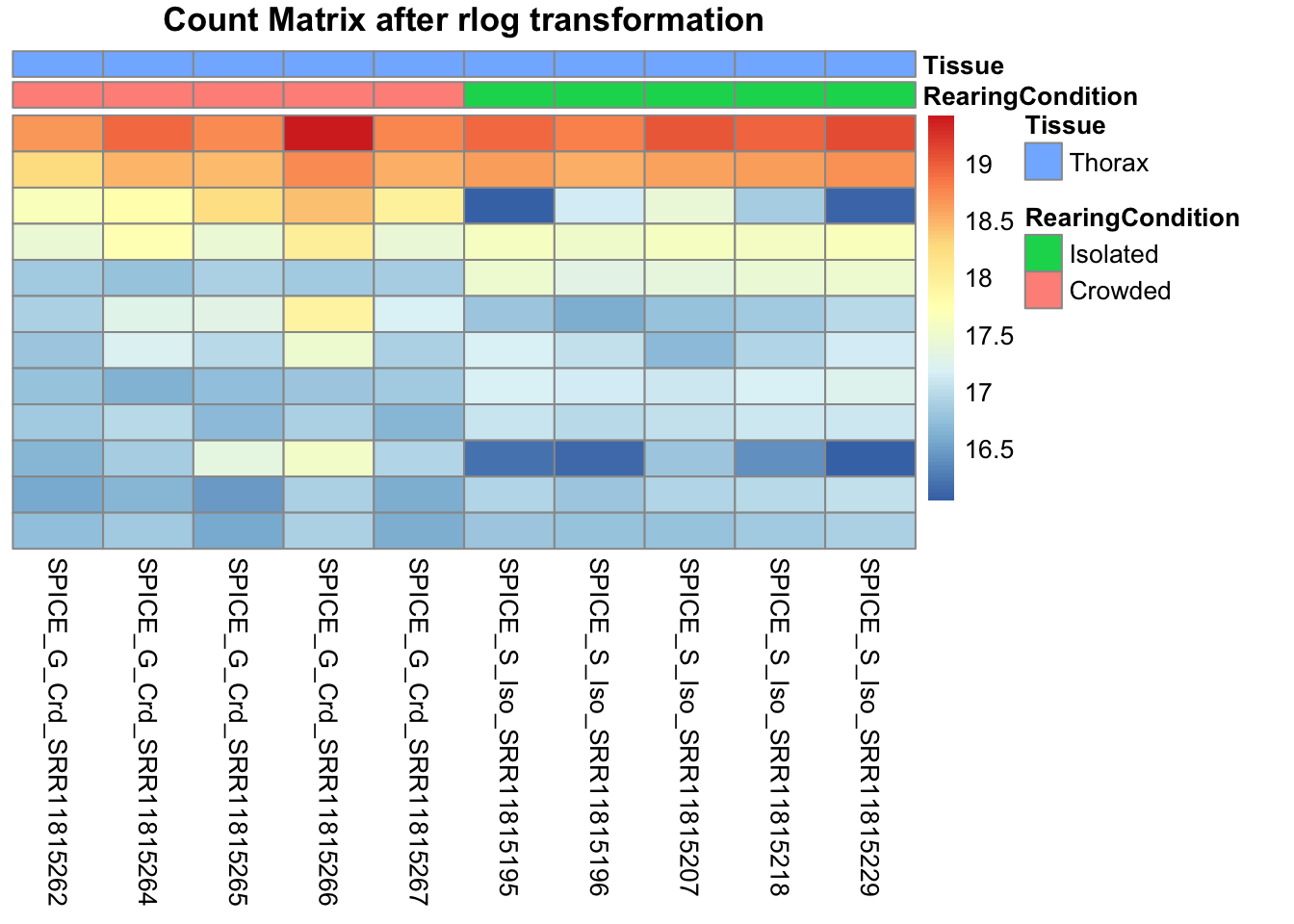
# calculate between-sample distance matrix
metadata <- sampletable[,c("RearingCondition", "Tissue")]
rownames(metadata) <- sampletable$SampleName
sampleDistMatrix.rlog <- as.matrix(dist(t(assay(shigeru_rlog))))
pheatmap(sampleDistMatrix.rlog, annotation_col=metadata, main = "Thorax tissue heatmap distance matrix, rlog transformation")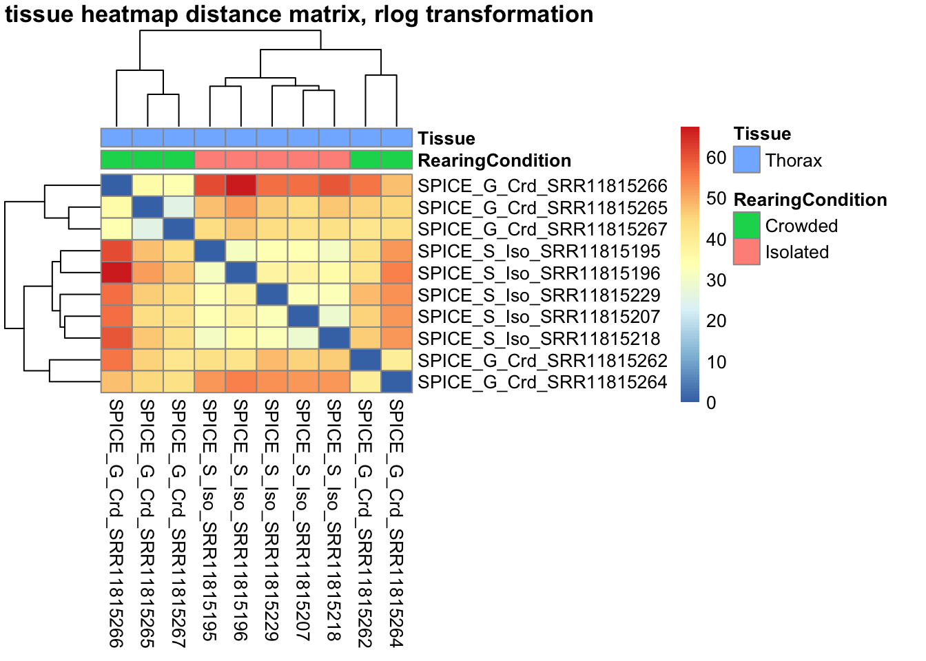
sampleDistMatrix.vst<- as.matrix(dist(t(assay(shigeru_vst))))
pheatmap(sampleDistMatrix.vst, annotation_col=metadata, main = "Thorax tissue heatmap distance matrix, rlog transformation")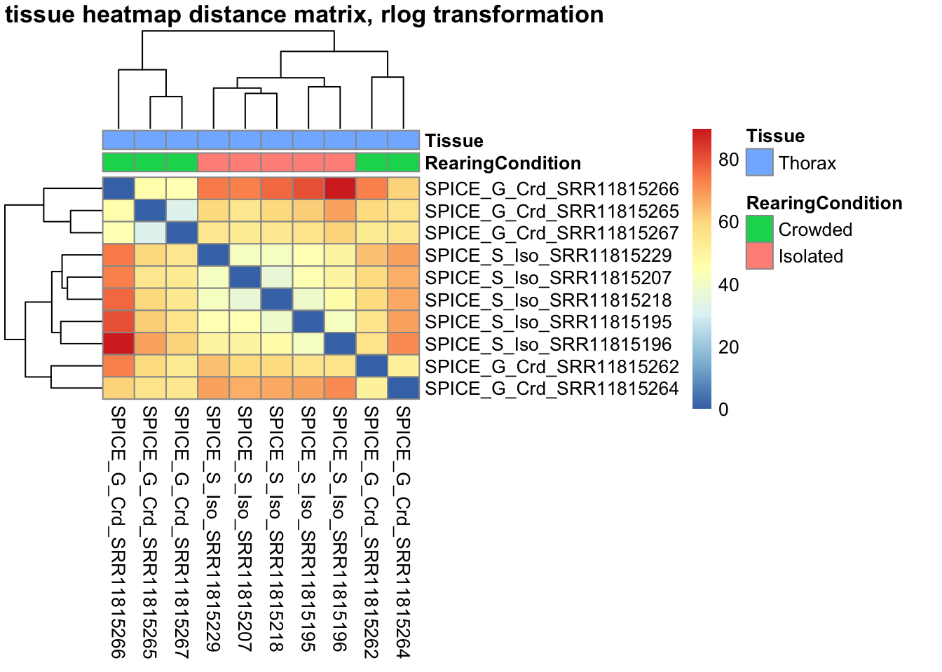
The following plots are interactive and we can hover or Zoom on the locus of interest.
# Ma plot parameters after shrinkage
de_shrink <- lfcShrink(dds = shigeru, coef="RearingCondition_Crowded_vs_Isolated", type="apeglm")
#head(de_shrink)
maplot <-ggmaplot(de_shrink, fdr = 0.05, fc = 1, size = 1, palette = c("#B31B21", "#1465AC", "darkgray"), genenames = as.vector(rownames(de_shrink$name)), top = 0,legend="top",label.select = NULL) +
coord_cartesian(xlim = c(0, 20)) +
scale_y_continuous(limits=c(-12, 12)) +
theme(axis.text.x = element_text(size=12),axis.text.y = element_text(size=12),axis.title.x = element_text(size=14),axis.title.y = element_text(size=14),axis.line = element_line(size = 1, colour="gray20"),axis.ticks = element_line(size = 1, colour="gray20")) +
guides(color = guide_legend(override.aes = list(size = c(3,3,3)))) +
theme(legend.position = c(0.70, 0.12),legend.text=element_text(size=14,face="bold"),legend.background = element_rect(fill="transparent")) +
theme(plot.title = element_text(size=18, colour="gray30", face="bold",hjust=0.06, vjust=-5)) +
labs(title="MA-plot for the shrunken log2 fold changes in the Thorax tissues")
interactive_maplot <- ggplotly(maplot)
interactive_maplot#Volcano plot
keyvals <-ifelse(
res_shigeru$log2FoldChange >= 1 & res_shigeru$padj <= 0.05, '#B31B21',
ifelse(res_shigeru$log2FoldChange <= -1 & res_shigeru$padj <= 0.05, '#1465AC', 'darkgray'))
keyvals[is.na(keyvals)] <-'lightgray'
names(keyvals)[keyvals == "#B31B21"] <-'Upregulated'
names(keyvals)[keyvals == "#1465AC"] <-'Downregulated'
names(keyvals)[keyvals == 'darkgray'] <-'NS'
res_shigeru$color <- keyvals
volcano_plot <- ggplot(res_shigeru, aes(x = log2FoldChange, y = -log10(padj),
color = color, # Use the color column with keyvals
text = rownames(res_shigeru))) +
geom_point(size = 3, alpha = 0.8) +
scale_color_identity() + # Directly use the color values from `keyvals`
guides(color = "none") + # Hide the color legend
labs(title = "Volcano Plot DEG Thorax S. piceifrons", x = "log2 Fold Change", y = "-log10 Adjusted P-Value") +
theme_minimal()
# Convert to interactive plot with hover text for gene names
interactive_volcano <- ggplotly(volcano_plot, tooltip = "text") %>%
layout(hoverlabel = list(namelength = -1))
# Display the interactive plot
interactive_volcanocancellata
rawDir <- file.path(workDir, "03-cancellata-DESeq2")
# Path and name of targetfile containing conditions and file names
species <- "cancellata"
targetFile <- file.path(workDir, "list", paste0("Thorax", "_", species, "_nooutliers.txt"))
sampletable <- fread(targetFile)
rownames(sampletable) <- sampletable$SampleName
sampletable$RearingCondition <- as.factor(sampletable$RearingCondition)
sampletable$Tissue <- as.factor(sampletable$Tissue)
## Import count files
satoshi <- DESeqDataSetFromHTSeqCount(sampleTable = sampletable,
directory = rawDir,
design = ~ RearingCondition )
#satoshi
smallestGroupSize <- 3
keep <- rowSums(counts(satoshi) >= 5) >= smallestGroupSize
satoshi <- satoshi[keep,]
#nrow(satoshi)
satoshi$RearingCondition <- relevel(satoshi$RearingCondition, ref = "Isolated")
# Fit the statistical model
shigeru <- DESeq(satoshi)
#cbind(resultsNames(shigeru))
res_shigeru <- results(shigeru)
sum(res_shigeru$padj < tresh_padj, na.rm = TRUE)[1] 1475A total of 1,475 genes out of the pre-filtered 13,557 features were showing significant differences in expression levels. The summary below showed how many were upregulated and downregulated in crowded compared to isolated it is possible to scroll it.
brock <- results(shigeru, name = "RearingCondition_Crowded_vs_Isolated", alpha = alpha_DEseq2)
summary(brock)
out of 13557 with nonzero total read count
adjusted p-value < 0.05
LFC > 0 (up) : 734, 5.4%
LFC < 0 (down) : 738, 5.4%
outliers [1] : 37, 0.27%
low counts [2] : 526, 3.9%
(mean count < 6)
[1] see 'cooksCutoff' argument of ?results
[2] see 'independentFiltering' argument of ?results#mcols(brock)$description
#head(brock)
brock_df <- as.data.frame(brock)
datatable(brock_df, options = list(
pageLength = 10, # Set initial page length
scrollX = TRUE, # Enable horizontal scrolling
autoWidth = TRUE, # Adjust column width automatically
searchHighlight = TRUE # Highlight search matches
))Now we will make the different plots: PCA, MA and Volcano.
# Try with the data transformation
shigeru_vst <- vst(shigeru)
shigeru_rlog <- rlog(shigeru)
shigeru_ntd <- normTransform(shigeru)
itadori <- meanSdPlot(assay(shigeru_ntd))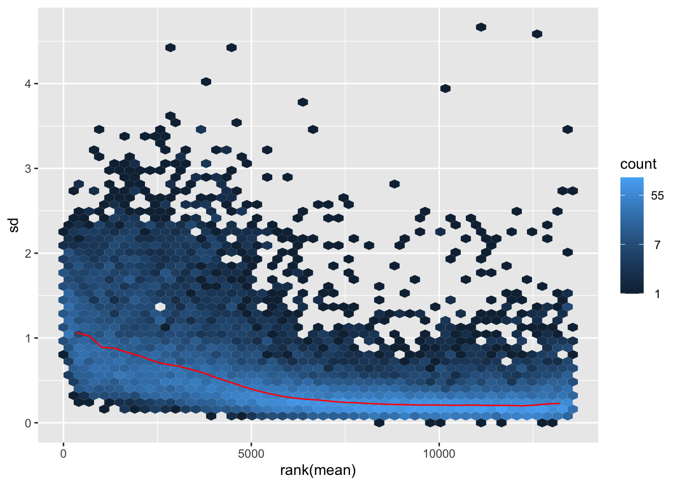
itadori2 <- itadori$gg + ggtitle("Transformation with ntd")
itadori2
megumi <- meanSdPlot(assay(shigeru_vst))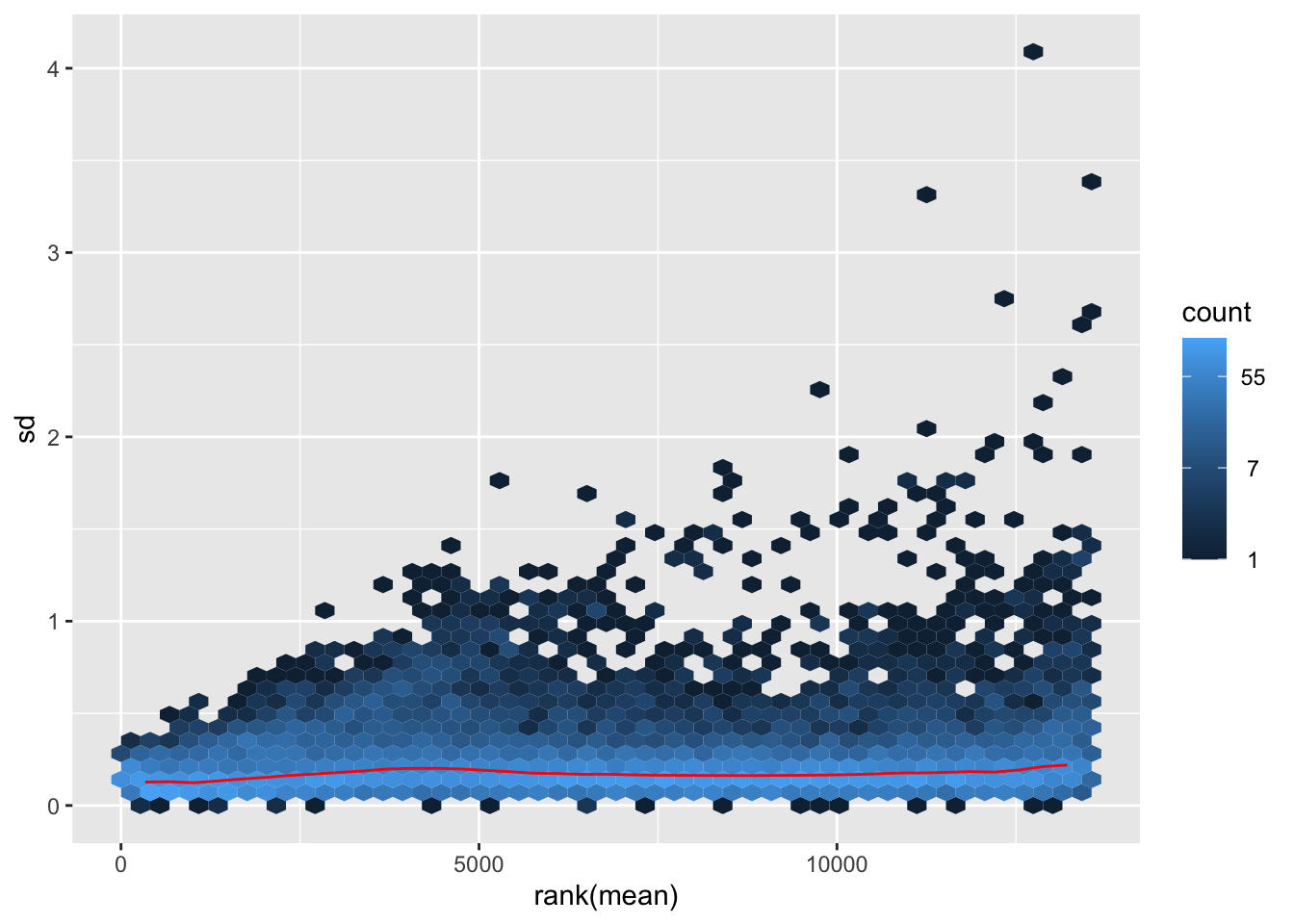
megumi2 <- megumi$gg + ggtitle("Transformation with vst")
megumi2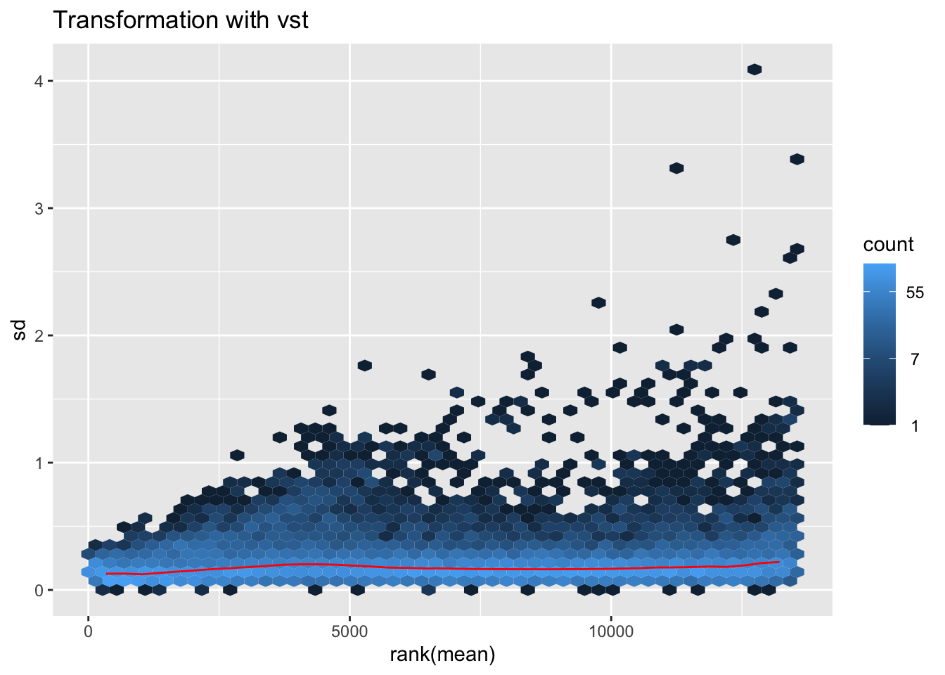
nobara <- meanSdPlot(assay(shigeru_rlog))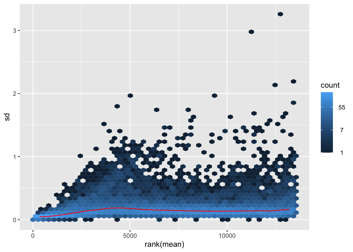
nobara2 <-nobara$gg + ggtitle("Transformation with rlog")
nobara2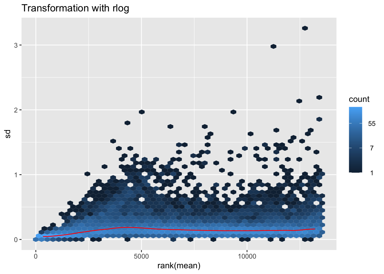
# Create the pca on the defined groups
pcaData1 <- plotPCA(object = shigeru_rlog, intgroup = c("RearingCondition"),returnData=TRUE)
percentVar <- round(100 * attr(pcaData1, "percentVar"))
pcaData1$RearingCondition<-factor(pcaData1$RearingCondition,levels=c("Crowded","Isolated"), labels=c("Crowded S. cancellata","Isolated S. cancellata"))
#levels(pcaData1$RearingCondition)
p1 <- ggplot(pcaData1, aes(PC1, PC2, color= RearingCondition)) +
geom_point(size=6) +
xlab(paste0("PC1: ", percentVar[1], "% variance")) +
ylab(paste0("PC2: ", percentVar[2], "% variance")) +
scale_color_manual(values = c("blue", "red")) +
#coord_fixed() +
theme_bw() +
theme(legend.title = element_blank()) +
theme(legend.text = element_text(face="bold", size=16)) +
theme(axis.text = element_text(size=14)) +
theme(axis.title = element_text(size=14))
p1 + geom_convexhull(aes(fill = RearingCondition, color = RearingCondition), alpha = 0.5) +
scale_fill_manual(values = c("blue", "red"))+
ggtitle("PCA on S. cancellata Thorax tissues", subtitle = "rlog transformation") 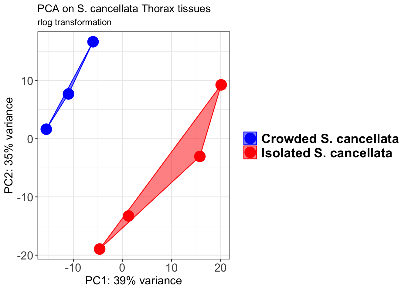
pcaData2 <- plotPCA(object = shigeru_vst, intgroup = c("RearingCondition"),returnData=TRUE)
percentVar <- round(100 * attr(pcaData2, "percentVar"))
pcaData2$RearingCondition<-factor(pcaData2$RearingCondition,levels=c("Crowded","Isolated"), labels=c("Crowded S. cancellata","Isolated S. cancellata"))
#levels(pcaData2$RearingCondition)
p2 <-ggplot(pcaData2, aes(PC1, PC2, color= RearingCondition)) +
geom_point(size=6) +
xlab(paste0("PC1: ", percentVar[1], "% variance")) +
ylab(paste0("PC2: ", percentVar[2], "% variance")) +
scale_color_manual(values = c("blue", "red")) +
#coord_fixed() +
theme_bw() +
theme(legend.title = element_blank()) +
theme(legend.text = element_text(face="bold", size=16)) +
theme(axis.text = element_text(size=14)) +
theme(axis.title = element_text(size=14))
p2 + geom_convexhull(aes(fill = RearingCondition, color = RearingCondition), alpha = 0.5) +
scale_fill_manual(values = c("blue", "red"))+
ggtitle("PCA on S. cancellata Thorax tissues", subtitle = "vst transformation") 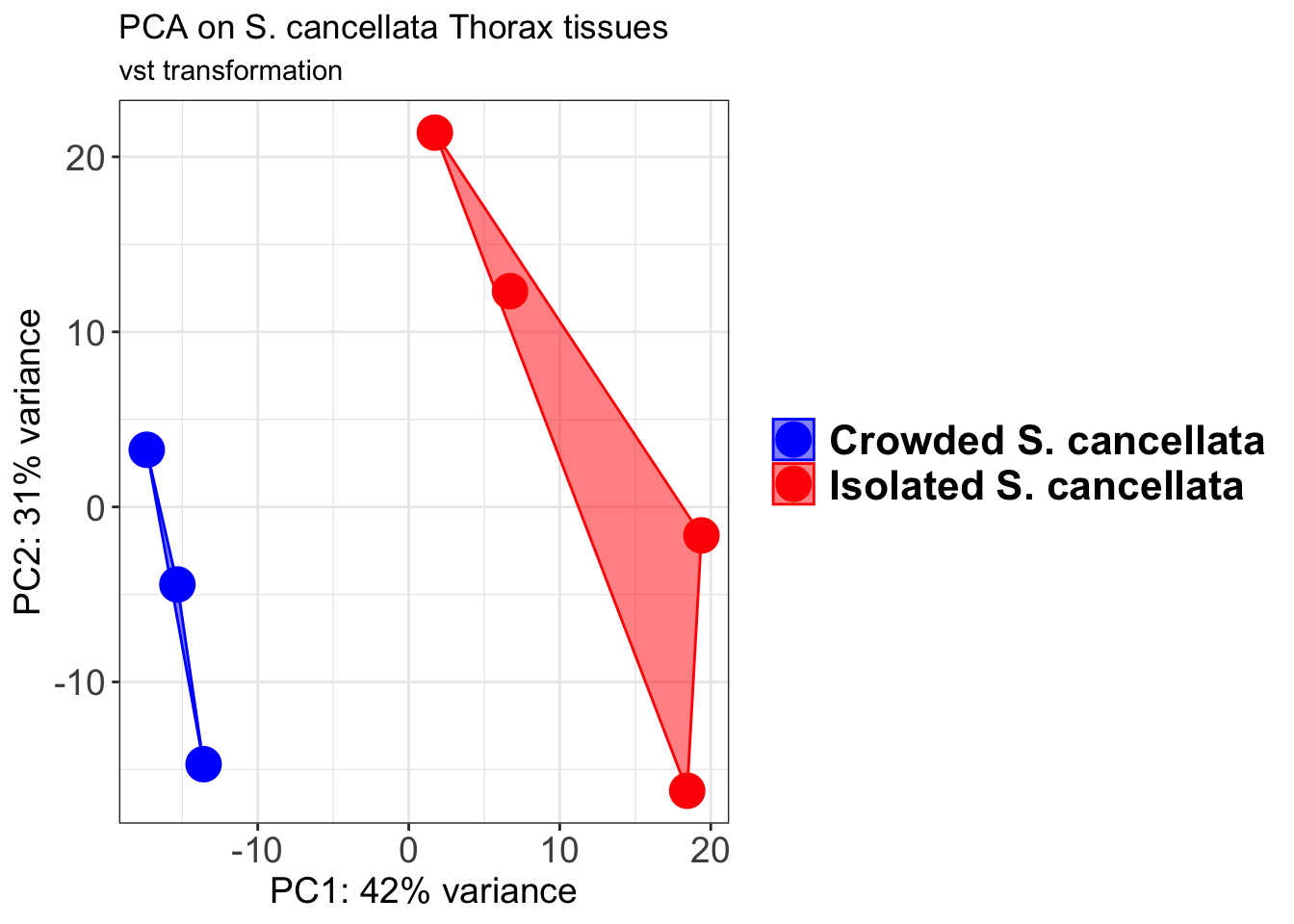
select <- order(rowMeans(counts(shigeru,normalized=TRUE)),
decreasing=TRUE)[1:12]
df <- as.data.frame(colData(shigeru)[,c("RearingCondition","Tissue")])
# Count matrix
pheatmap(assay(shigeru_ntd)[select,], cluster_rows=FALSE, show_rownames=FALSE,
cluster_cols=FALSE, annotation_col=df, main = "Count Matrix after norm transformation")
pheatmap(assay(shigeru_vst)[select,], cluster_rows=FALSE, show_rownames=FALSE,
cluster_cols=FALSE, annotation_col=df, main = "Count Matrix after vst transformation")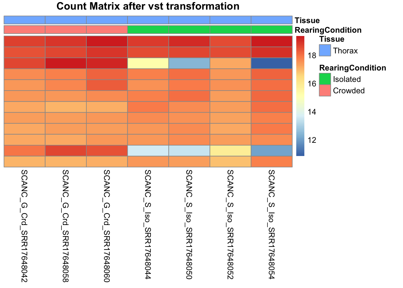
pheatmap(assay(shigeru_rlog)[select,], cluster_rows=FALSE, show_rownames=FALSE,
cluster_cols=FALSE, annotation_col=df, main = "Count Matrix after rlog transformation")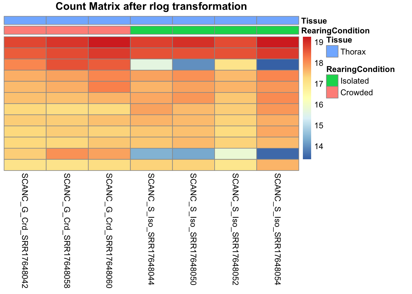
# calculate between-sample distance matrix
metadata <- sampletable[,c("RearingCondition", "Tissue")]
rownames(metadata) <- sampletable$SampleName
sampleDistMatrix.rlog <- as.matrix(dist(t(assay(shigeru_rlog))))
pheatmap(sampleDistMatrix.rlog, annotation_col=metadata, main = "Thorax tissue heatmap distance matrix, rlog transformation")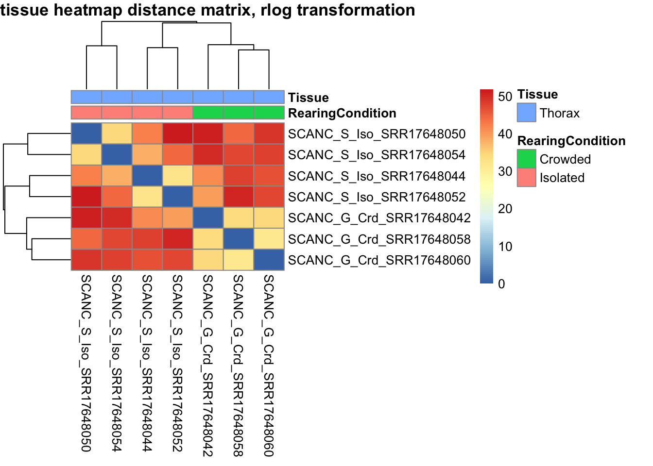
sampleDistMatrix.vst<- as.matrix(dist(t(assay(shigeru_vst))))
pheatmap(sampleDistMatrix.vst, annotation_col=metadata, main = "Thorax tissue heatmap distance matrix, rlog transformation")
The following plots are interactive and we can hover or Zoom on the locus of interest.
# Ma plot parameters after shrinkage
de_shrink <- lfcShrink(dds = shigeru, coef="RearingCondition_Crowded_vs_Isolated", type="apeglm")
#head(de_shrink)
maplot <-ggmaplot(de_shrink, fdr = 0.05, fc = 1, size = 1, palette = c("#B31B21", "#1465AC", "darkgray"), genenames = as.vector(rownames(de_shrink$name)), top = 0,legend="top",label.select = NULL) +
coord_cartesian(xlim = c(0, 20)) +
scale_y_continuous(limits=c(-12, 12)) +
theme(axis.text.x = element_text(size=12),axis.text.y = element_text(size=12),axis.title.x = element_text(size=14),axis.title.y = element_text(size=14),axis.line = element_line(size = 1, colour="gray20"),axis.ticks = element_line(size = 1, colour="gray20")) +
guides(color = guide_legend(override.aes = list(size = c(3,3,3)))) +
theme(legend.position = c(0.70, 0.12),legend.text=element_text(size=14,face="bold"),legend.background = element_rect(fill="transparent")) +
theme(plot.title = element_text(size=18, colour="gray30", face="bold",hjust=0.06, vjust=-5)) +
labs(title="MA-plot for the shrunken log2 fold changes in the Thorax tissues")
interactive_maplot <- ggplotly(maplot)
interactive_maplot#Volcano plot
keyvals <-ifelse(
res_shigeru$log2FoldChange >= 1 & res_shigeru$padj <= 0.05, '#B31B21',
ifelse(res_shigeru$log2FoldChange <= -1 & res_shigeru$padj <= 0.05, '#1465AC', 'darkgray'))
keyvals[is.na(keyvals)] <-'lightgray'
names(keyvals)[keyvals == "#B31B21"] <-'Upregulated'
names(keyvals)[keyvals == "#1465AC"] <-'Downregulated'
names(keyvals)[keyvals == 'darkgray'] <-'NS'
res_shigeru$color <- keyvals
volcano_plot <- ggplot(res_shigeru, aes(x = log2FoldChange, y = -log10(padj),
color = color, # Use the color column with keyvals
text = rownames(res_shigeru))) +
geom_point(size = 3, alpha = 0.8) +
scale_color_identity() + # Directly use the color values from `keyvals`
guides(color = "none") + # Hide the color legend
labs(title = "Volcano Plot DEG Thorax S. cancellata", x = "log2 Fold Change", y = "-log10 Adjusted P-Value") +
theme_minimal()
# Convert to interactive plot with hover text for gene names
interactive_volcano <- ggplotly(volcano_plot, tooltip = "text") %>%
layout(hoverlabel = list(namelength = -1))
# Display the interactive plot
interactive_volcanoamericana
rawDir <- file.path(workDir, "03-americana-DESeq2")
# Path and name of targetfile containing conditions and file names
species <- "americana"
targetFile <- file.path(workDir, "list", paste0("Thorax", "_", species, "_nooutliers.txt"))
sampletable <- fread(targetFile)
rownames(sampletable) <- sampletable$SampleName
sampletable$RearingCondition <- as.factor(sampletable$RearingCondition)
sampletable$Tissue <- as.factor(sampletable$Tissue)
## Import count files
satoshi <- DESeqDataSetFromHTSeqCount(sampleTable = sampletable,
directory = rawDir,
design = ~ RearingCondition )
#satoshi
smallestGroupSize <- 3
keep <- rowSums(counts(satoshi) >= 5) >= smallestGroupSize
satoshi <- satoshi[keep,]
#nrow(satoshi)
satoshi$RearingCondition <- relevel(satoshi$RearingCondition, ref = "Isolated")
# Fit the statistical model
shigeru <- DESeq(satoshi)
#cbind(resultsNames(shigeru))
res_shigeru <- results(shigeru)
sum(res_shigeru$padj < tresh_padj, na.rm = TRUE)[1] 1264A total of 1,264 genes out of the pre-filtered 13,764 features were showing significant differences in expression levels. The summary below showed how many were upregulated and downregulated in crowded compared to isolated it is possible to scroll it.
brock <- results(shigeru, name = "RearingCondition_Crowded_vs_Isolated", alpha = alpha_DEseq2)
summary(brock)
out of 13520 with nonzero total read count
adjusted p-value < 0.05
LFC > 0 (up) : 460, 3.4%
LFC < 0 (down) : 798, 5.9%
outliers [1] : 48, 0.36%
low counts [2] : 0, 0%
(mean count < 2)
[1] see 'cooksCutoff' argument of ?results
[2] see 'independentFiltering' argument of ?results#mcols(brock)$description
#head(brock)
brock_df <- as.data.frame(brock)
datatable(brock_df, options = list(
pageLength = 10, # Set initial page length
scrollX = TRUE, # Enable horizontal scrolling
autoWidth = TRUE, # Adjust column width automatically
searchHighlight = TRUE # Highlight search matches
))Now we will make the different plots: PCA, MA and Volcano.
# Try with the data transformation
shigeru_vst <- vst(shigeru)
shigeru_rlog <- rlog(shigeru)
shigeru_ntd <- normTransform(shigeru)
itadori <- meanSdPlot(assay(shigeru_ntd))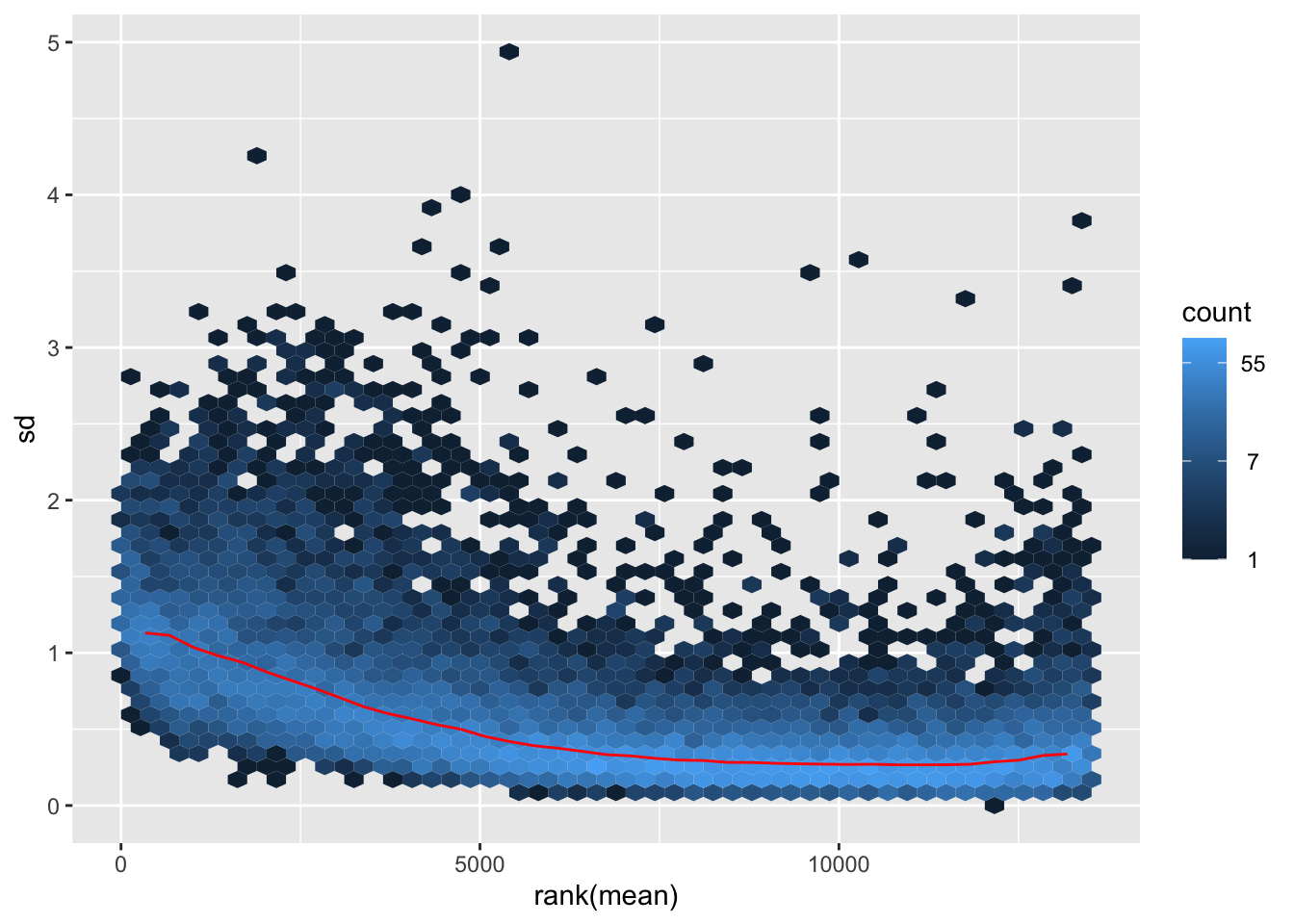
itadori2 <- itadori$gg + ggtitle("Transformation with ntd")
itadori2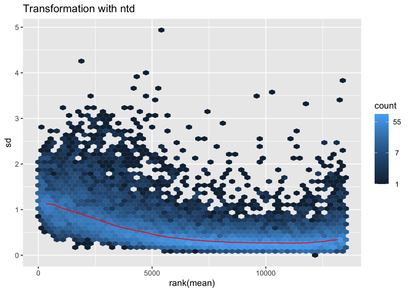
megumi <- meanSdPlot(assay(shigeru_vst))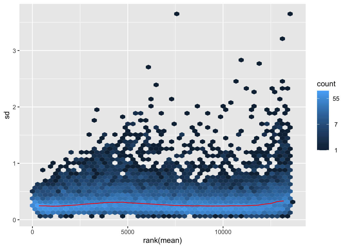
megumi2 <- megumi$gg + ggtitle("Transformation with vst")
megumi2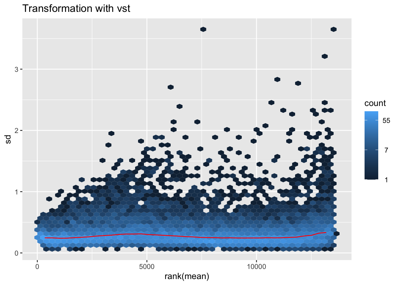
nobara <- meanSdPlot(assay(shigeru_rlog))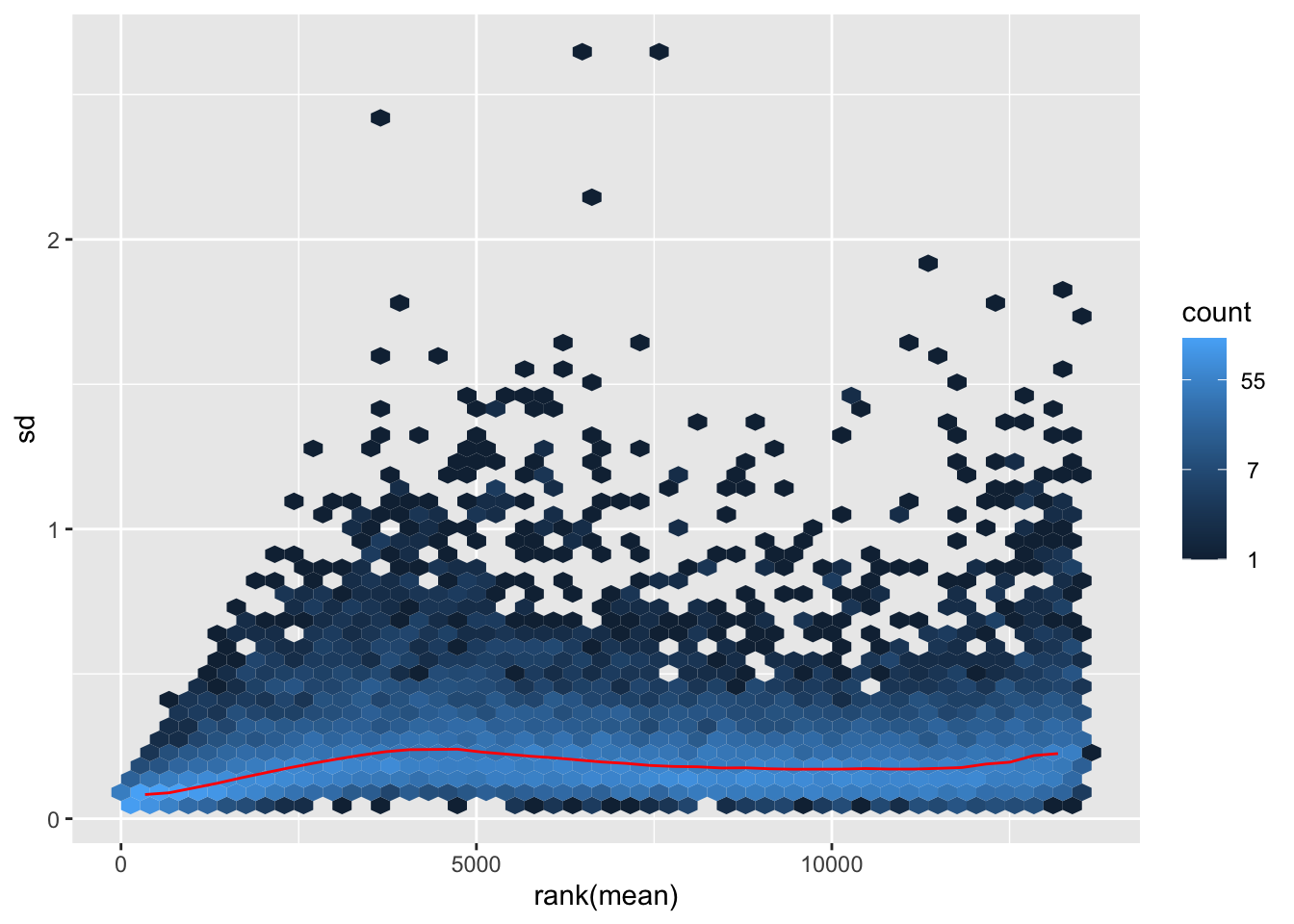
nobara2 <-nobara$gg + ggtitle("Transformation with rlog")
nobara2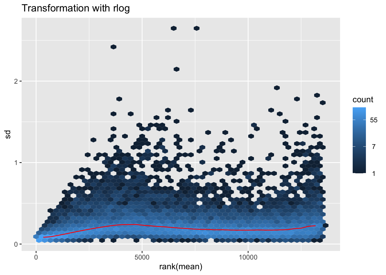
# Create the pca on the defined groups
pcaData1 <- plotPCA(object = shigeru_rlog, intgroup = c("RearingCondition"),returnData=TRUE)
percentVar <- round(100 * attr(pcaData1, "percentVar"))
pcaData1$RearingCondition<-factor(pcaData1$RearingCondition,levels=c("Crowded","Isolated"), labels=c("Crowded S. americana","Isolated S. americana"))
#levels(pcaData1$RearingCondition)
p1 <- ggplot(pcaData1, aes(PC1, PC2, color= RearingCondition)) +
geom_point(size=6) +
xlab(paste0("PC1: ", percentVar[1], "% variance")) +
ylab(paste0("PC2: ", percentVar[2], "% variance")) +
scale_color_manual(values = c("blue", "red")) +
#coord_fixed() +
theme_bw() +
theme(legend.title = element_blank()) +
theme(legend.text = element_text(face="bold", size=16)) +
theme(axis.text = element_text(size=14)) +
theme(axis.title = element_text(size=14))
p1 + geom_convexhull(aes(fill = RearingCondition, color = RearingCondition), alpha = 0.5) +
scale_fill_manual(values = c("blue", "red"))+
ggtitle("PCA on S. americana Thorax tissues", subtitle = "rlog transformation") 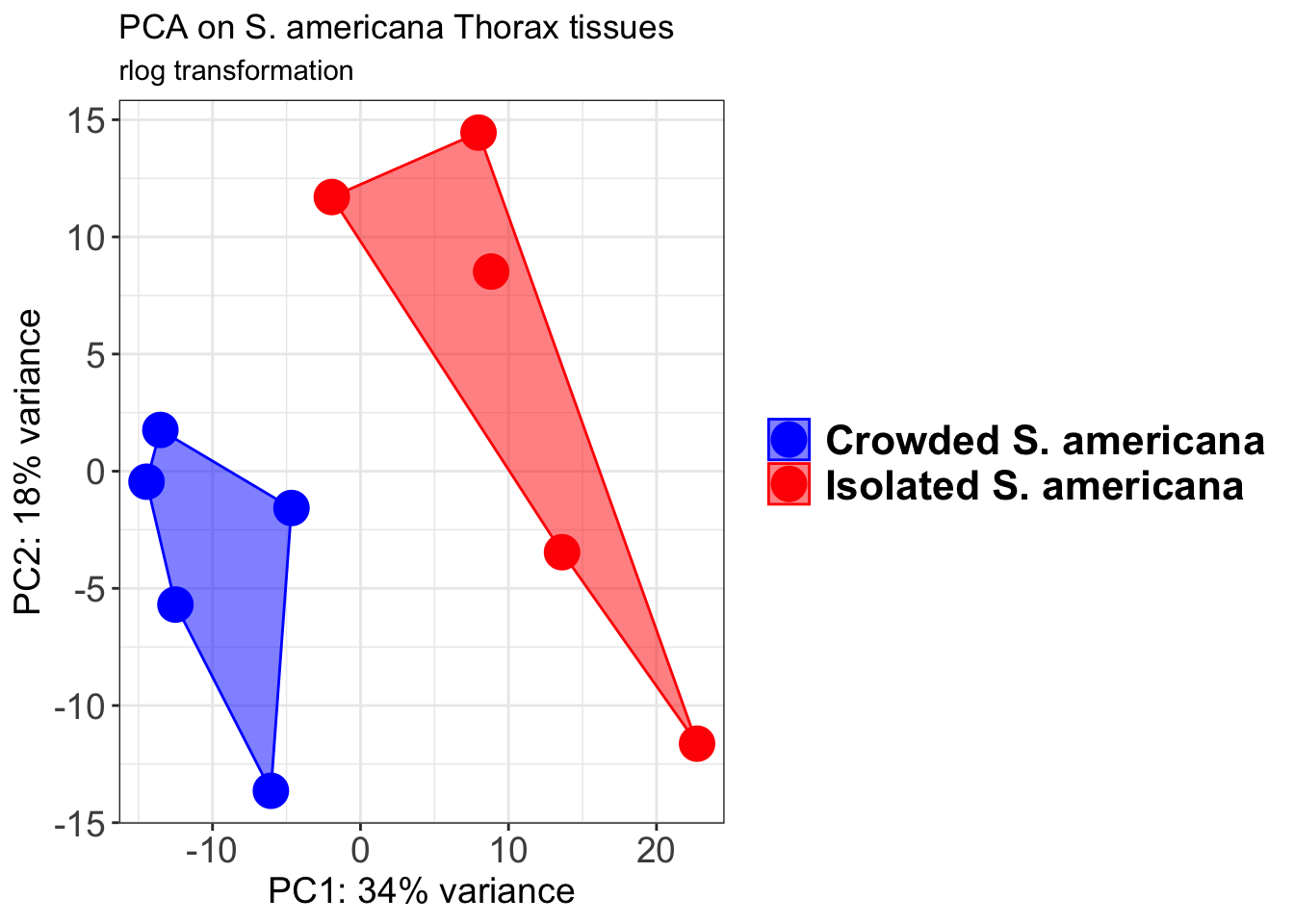
pcaData2 <- plotPCA(object = shigeru_vst, intgroup = c("RearingCondition"),returnData=TRUE)
percentVar <- round(100 * attr(pcaData2, "percentVar"))
pcaData2$RearingCondition<-factor(pcaData2$RearingCondition,levels=c("Crowded","Isolated"), labels=c("Crowded S. americana","Isolated S. americana"))
#levels(pcaData2$RearingCondition)
p2 <-ggplot(pcaData2, aes(PC1, PC2, color= RearingCondition)) +
geom_point(size=6) +
xlab(paste0("PC1: ", percentVar[1], "% variance")) +
ylab(paste0("PC2: ", percentVar[2], "% variance")) +
scale_color_manual(values = c("blue", "red")) +
#coord_fixed() +
theme_bw() +
theme(legend.title = element_blank()) +
theme(legend.text = element_text(face="bold", size=16)) +
theme(axis.text = element_text(size=14)) +
theme(axis.title = element_text(size=14))
p2 + geom_convexhull(aes(fill = RearingCondition, color = RearingCondition), alpha = 0.5) +
scale_fill_manual(values = c("blue", "red"))+
ggtitle("PCA on S. americana Thorax tissues", subtitle = "vst transformation") 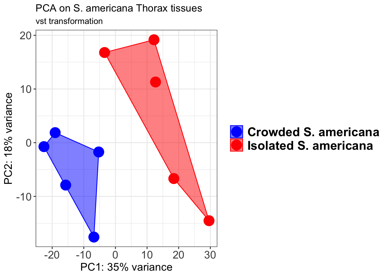
select <- order(rowMeans(counts(shigeru,normalized=TRUE)),
decreasing=TRUE)[1:12]
df <- as.data.frame(colData(shigeru)[,c("RearingCondition","Tissue")])
# Count matrix
pheatmap(assay(shigeru_ntd)[select,], cluster_rows=FALSE, show_rownames=FALSE,
cluster_cols=FALSE, annotation_col=df, main = "Count Matrix after norm transformation")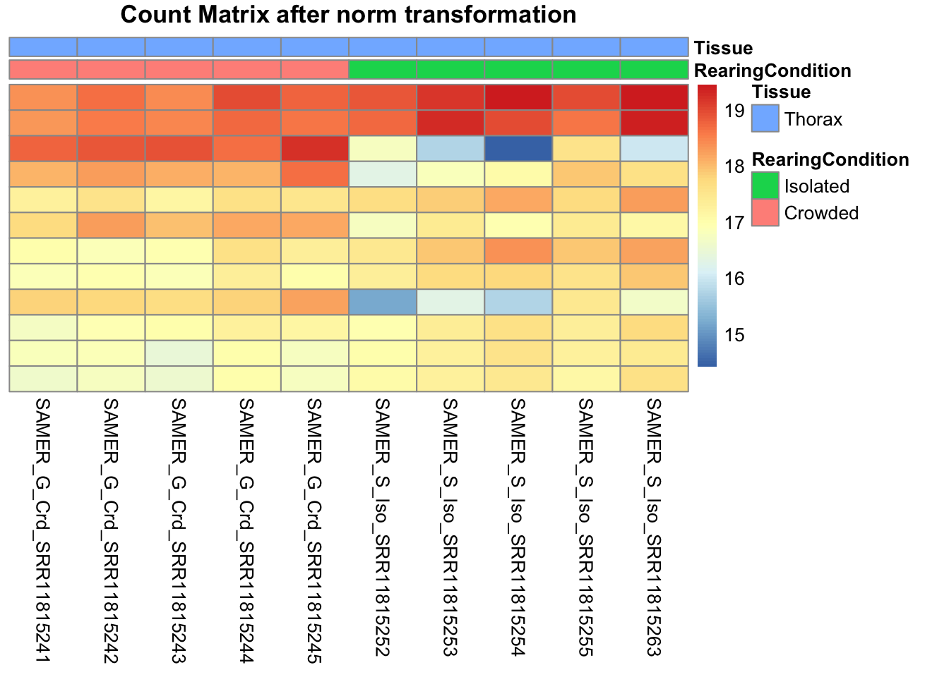
pheatmap(assay(shigeru_vst)[select,], cluster_rows=FALSE, show_rownames=FALSE,
cluster_cols=FALSE, annotation_col=df, main = "Count Matrix after vst transformation")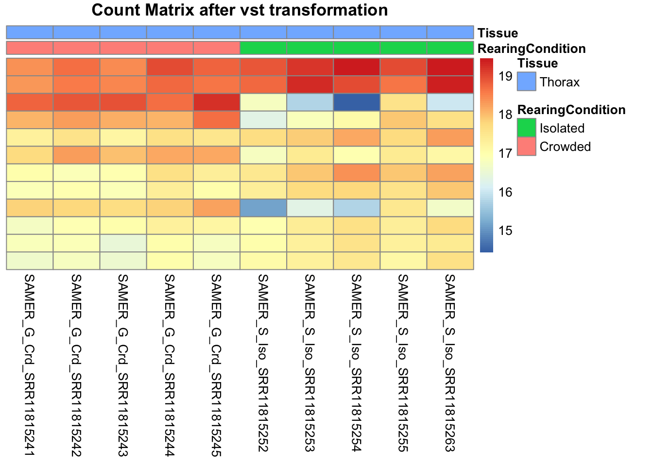
pheatmap(assay(shigeru_rlog)[select,], cluster_rows=FALSE, show_rownames=FALSE,
cluster_cols=FALSE, annotation_col=df, main = "Count Matrix after rlog transformation")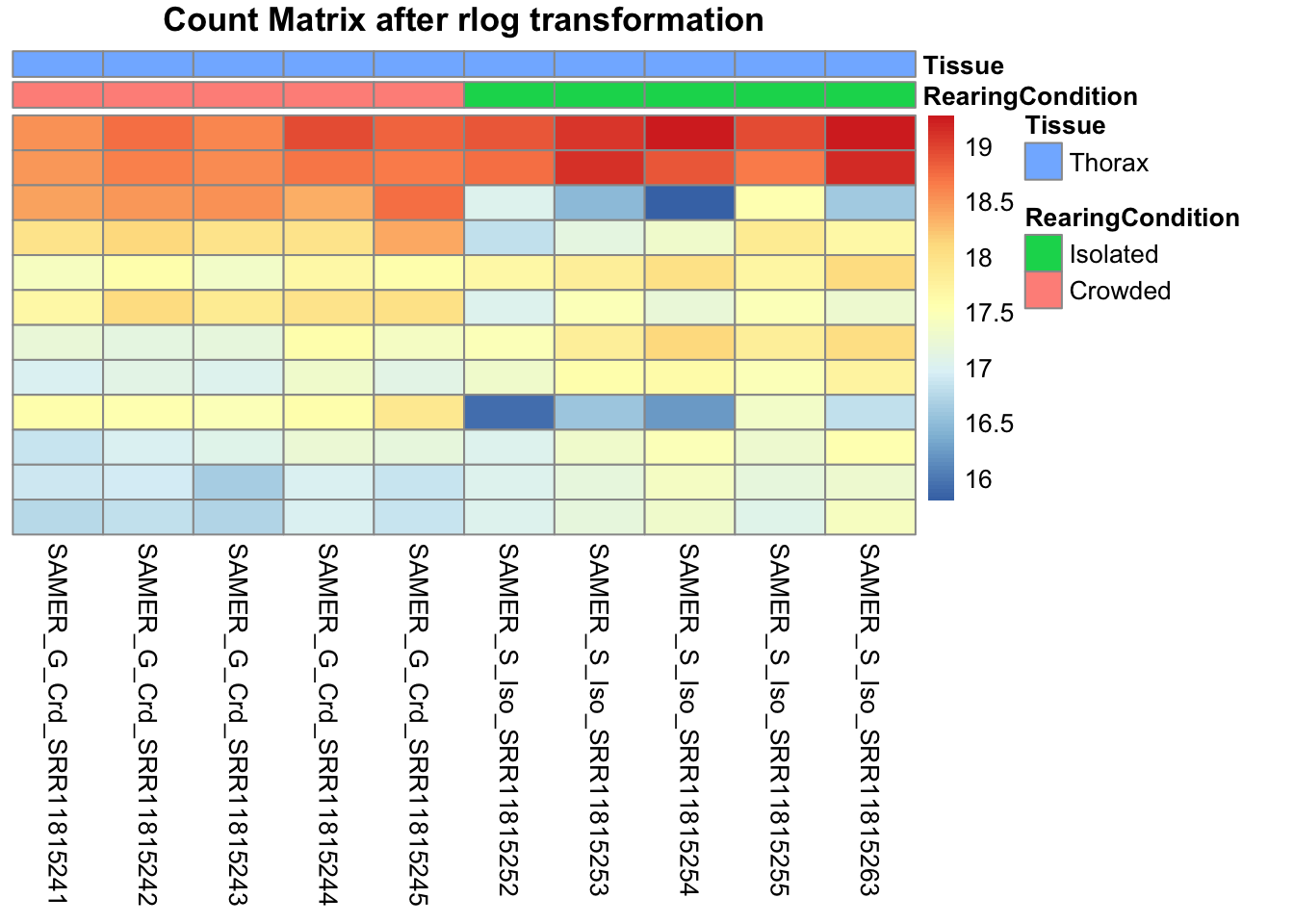
# calculate between-sample distance matrix
metadata <- sampletable[,c("RearingCondition", "Tissue")]
rownames(metadata) <- sampletable$SampleName
sampleDistMatrix.rlog <- as.matrix(dist(t(assay(shigeru_rlog))))
pheatmap(sampleDistMatrix.rlog, annotation_col=metadata, main = "Thorax tissue heatmap distance matrix, rlog transformation")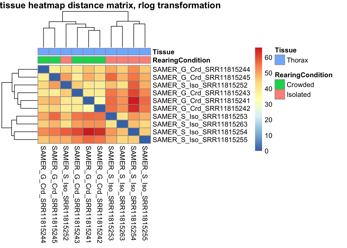
sampleDistMatrix.vst<- as.matrix(dist(t(assay(shigeru_vst))))
pheatmap(sampleDistMatrix.vst, annotation_col=metadata, main = "Thorax tissue heatmap distance matrix, rlog transformation")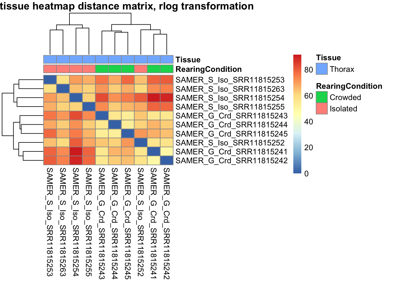
The following plots are interactive and we can hover or Zoom on the locus of interest.
# Ma plot parameters after shrinkage
de_shrink <- lfcShrink(dds = shigeru, coef="RearingCondition_Crowded_vs_Isolated", type="apeglm")
#head(de_shrink)
maplot <-ggmaplot(de_shrink, fdr = 0.05, fc = 1, size = 1, palette = c("#B31B21", "#1465AC", "darkgray"), genenames = as.vector(rownames(de_shrink$name)), top = 0,legend="top",label.select = NULL) +
coord_cartesian(xlim = c(0, 20)) +
scale_y_continuous(limits=c(-12, 12)) +
theme(axis.text.x = element_text(size=12),axis.text.y = element_text(size=12),axis.title.x = element_text(size=14),axis.title.y = element_text(size=14),axis.line = element_line(size = 1, colour="gray20"),axis.ticks = element_line(size = 1, colour="gray20")) +
guides(color = guide_legend(override.aes = list(size = c(3,3,3)))) +
theme(legend.position = c(0.70, 0.12),legend.text=element_text(size=14,face="bold"),legend.background = element_rect(fill="transparent")) +
theme(plot.title = element_text(size=18, colour="gray30", face="bold",hjust=0.06, vjust=-5)) +
labs(title="MA-plot for the shrunken log2 fold changes in the Thorax tissues")
interactive_maplot <- ggplotly(maplot)
interactive_maplot#Volcano plot
keyvals <-ifelse(
res_shigeru$log2FoldChange >= 1 & res_shigeru$padj <= 0.05, '#B31B21',
ifelse(res_shigeru$log2FoldChange <= -1 & res_shigeru$padj <= 0.05, '#1465AC', 'darkgray'))
keyvals[is.na(keyvals)] <-'lightgray'
names(keyvals)[keyvals == "#B31B21"] <-'Upregulated'
names(keyvals)[keyvals == "#1465AC"] <-'Downregulated'
names(keyvals)[keyvals == 'darkgray'] <-'NS'
res_shigeru$color <- keyvals
volcano_plot <- ggplot(res_shigeru, aes(x = log2FoldChange, y = -log10(padj),
color = color, # Use the color column with keyvals
text = rownames(res_shigeru))) +
geom_point(size = 3, alpha = 0.8) +
scale_color_identity() + # Directly use the color values from `keyvals`
guides(color = "none") + # Hide the color legend
labs(title = "Volcano Plot DEG Thorax S. americana", x = "log2 Fold Change", y = "-log10 Adjusted P-Value") +
theme_minimal()
# Convert to interactive plot with hover text for gene names
interactive_volcano <- ggplotly(volcano_plot, tooltip = "text") %>%
layout(hoverlabel = list(namelength = -1))
# Display the interactive plot
interactive_volcanocubense
rawDir <- file.path(workDir, "03-cubense-DESeq2")
# Path and name of targetfile containing conditions and file names
species <- "cubense"
targetFile <- file.path(workDir, "list", paste0("Thorax", "_", species, "_nooutliers.txt"))
sampletable <- fread(targetFile)
rownames(sampletable) <- sampletable$SampleName
sampletable$RearingCondition <- as.factor(sampletable$RearingCondition)
sampletable$Tissue <- as.factor(sampletable$Tissue)
## Import count files
satoshi <- DESeqDataSetFromHTSeqCount(sampleTable = sampletable,
directory = rawDir,
design = ~ RearingCondition )
#satoshi
smallestGroupSize <- 3
keep <- rowSums(counts(satoshi) >= 5) >= smallestGroupSize
satoshi <- satoshi[keep,]
#nrow(satoshi)
satoshi$RearingCondition <- relevel(satoshi$RearingCondition, ref = "Isolated")
# Fit the statistical model
shigeru <- DESeq(satoshi)
#cbind(resultsNames(shigeru))
res_shigeru <- results(shigeru)
sum(res_shigeru$padj < tresh_padj, na.rm = TRUE)[1] 368A total of 368 genes out of the pre-filtered 14,328 features were showing significant differences in expression levels. The summary below showed how many were upregulated and downregulated in crowded compared to isolated it is possible to scroll it.
brock <- results(shigeru, name = "RearingCondition_Crowded_vs_Isolated", alpha = alpha_DEseq2)
summary(brock)
out of 13909 with nonzero total read count
adjusted p-value < 0.05
LFC > 0 (up) : 127, 0.91%
LFC < 0 (down) : 251, 1.8%
outliers [1] : 137, 0.98%
low counts [2] : 1079, 7.8%
(mean count < 7)
[1] see 'cooksCutoff' argument of ?results
[2] see 'independentFiltering' argument of ?results#mcols(brock)$description
#head(brock)
brock_df <- as.data.frame(brock)
datatable(brock_df, options = list(
pageLength = 10, # Set initial page length
scrollX = TRUE, # Enable horizontal scrolling
autoWidth = TRUE, # Adjust column width automatically
searchHighlight = TRUE # Highlight search matches
))Now we will make the different plots: PCA, MA and Volcano.
# Try with the data transformation
shigeru_vst <- vst(shigeru)
shigeru_rlog <- rlog(shigeru)
shigeru_ntd <- normTransform(shigeru)
itadori <- meanSdPlot(assay(shigeru_ntd))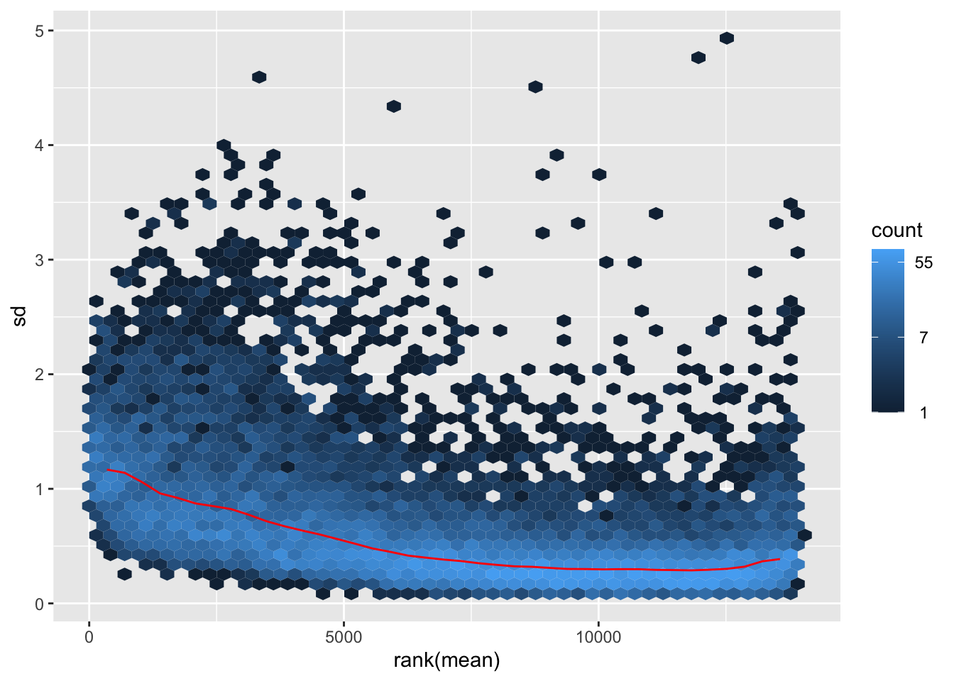
itadori2 <- itadori$gg + ggtitle("Transformation with ntd")
itadori2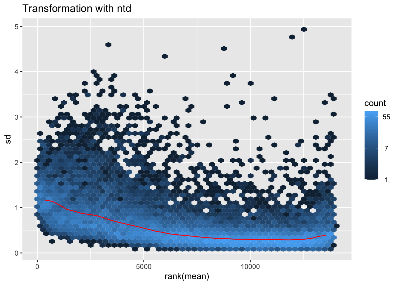
megumi <- meanSdPlot(assay(shigeru_vst))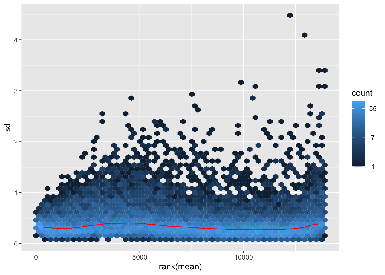
megumi2 <- megumi$gg + ggtitle("Transformation with vst")
megumi2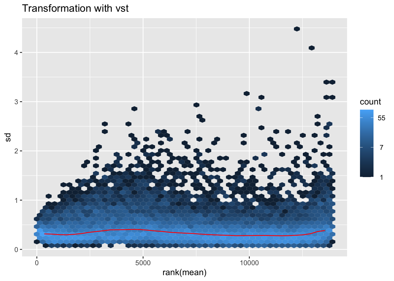
nobara <- meanSdPlot(assay(shigeru_rlog))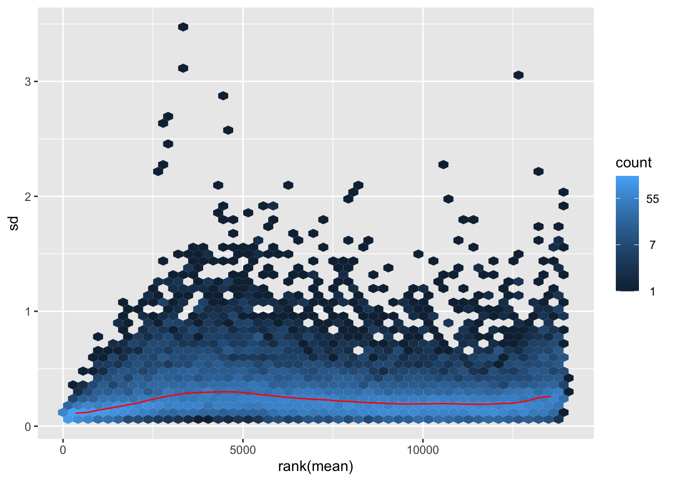
nobara2 <-nobara$gg + ggtitle("Transformation with rlog")
nobara2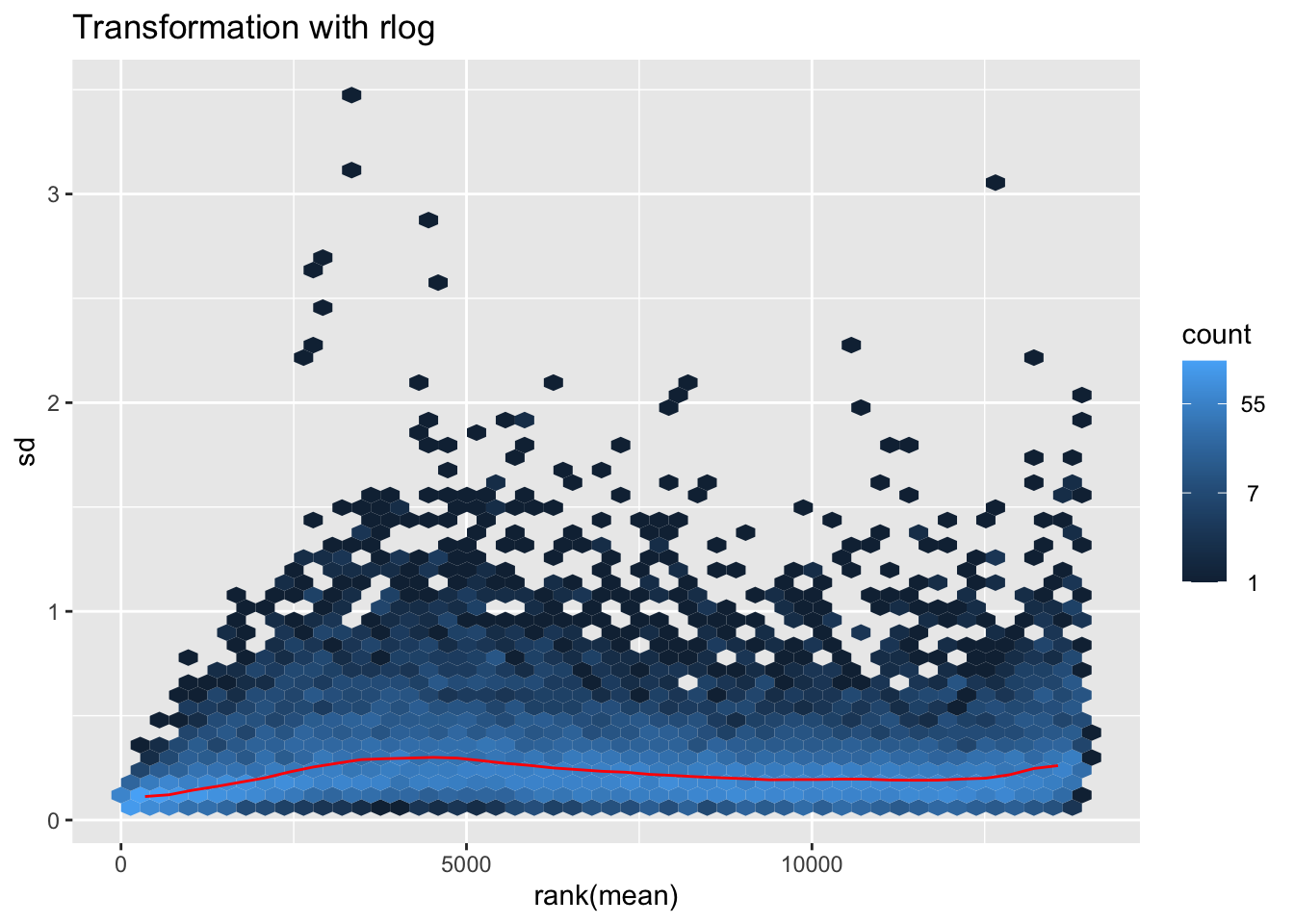
# Create the pca on the defined groups
pcaData1 <- plotPCA(object = shigeru_rlog, intgroup = c("RearingCondition"),returnData=TRUE)
percentVar <- round(100 * attr(pcaData1, "percentVar"))
pcaData1$RearingCondition<-factor(pcaData1$RearingCondition,levels=c("Crowded","Isolated"), labels=c("Crowded S. cubense","Isolated S. cubense"))
#levels(pcaData1$RearingCondition)
p1 <- ggplot(pcaData1, aes(PC1, PC2, color= RearingCondition)) +
geom_point(size=6) +
xlab(paste0("PC1: ", percentVar[1], "% variance")) +
ylab(paste0("PC2: ", percentVar[2], "% variance")) +
scale_color_manual(values = c("blue", "red")) +
#coord_fixed() +
theme_bw() +
theme(legend.title = element_blank()) +
theme(legend.text = element_text(face="bold", size=16)) +
theme(axis.text = element_text(size=14)) +
theme(axis.title = element_text(size=14))
p1 + geom_convexhull(aes(fill = RearingCondition, color = RearingCondition), alpha = 0.5) +
scale_fill_manual(values = c("blue", "red"))+
ggtitle("PCA on S. cubense Thorax tissues", subtitle = "rlog transformation") 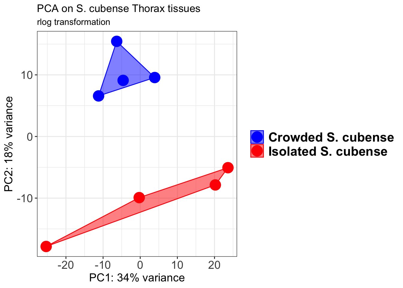
pcaData2 <- plotPCA(object = shigeru_vst, intgroup = c("RearingCondition"),returnData=TRUE)
percentVar <- round(100 * attr(pcaData2, "percentVar"))
pcaData2$RearingCondition<-factor(pcaData2$RearingCondition,levels=c("Crowded","Isolated"), labels=c("Crowded S. cubense","Isolated S. cubense"))
#levels(pcaData2$RearingCondition)
p2 <-ggplot(pcaData2, aes(PC1, PC2, color= RearingCondition)) +
geom_point(size=6) +
xlab(paste0("PC1: ", percentVar[1], "% variance")) +
ylab(paste0("PC2: ", percentVar[2], "% variance")) +
scale_color_manual(values = c("blue", "red")) +
#coord_fixed() +
theme_bw() +
theme(legend.title = element_blank()) +
theme(legend.text = element_text(face="bold", size=16)) +
theme(axis.text = element_text(size=14)) +
theme(axis.title = element_text(size=14))
p2 + geom_convexhull(aes(fill = RearingCondition, color = RearingCondition), alpha = 0.5) +
scale_fill_manual(values = c("blue", "red"))+
ggtitle("PCA on S. cubense Thorax tissues", subtitle = "vst transformation") 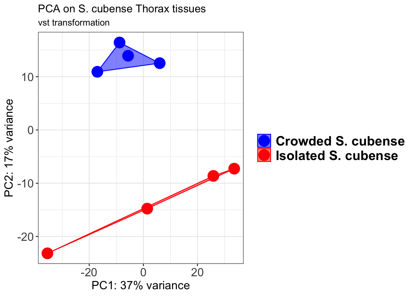
select <- order(rowMeans(counts(shigeru,normalized=TRUE)),
decreasing=TRUE)[1:12]
df <- as.data.frame(colData(shigeru)[,c("RearingCondition","Tissue")])
# Count matrix
pheatmap(assay(shigeru_ntd)[select,], cluster_rows=FALSE, show_rownames=FALSE,
cluster_cols=FALSE, annotation_col=df, main = "Count Matrix after norm transformation")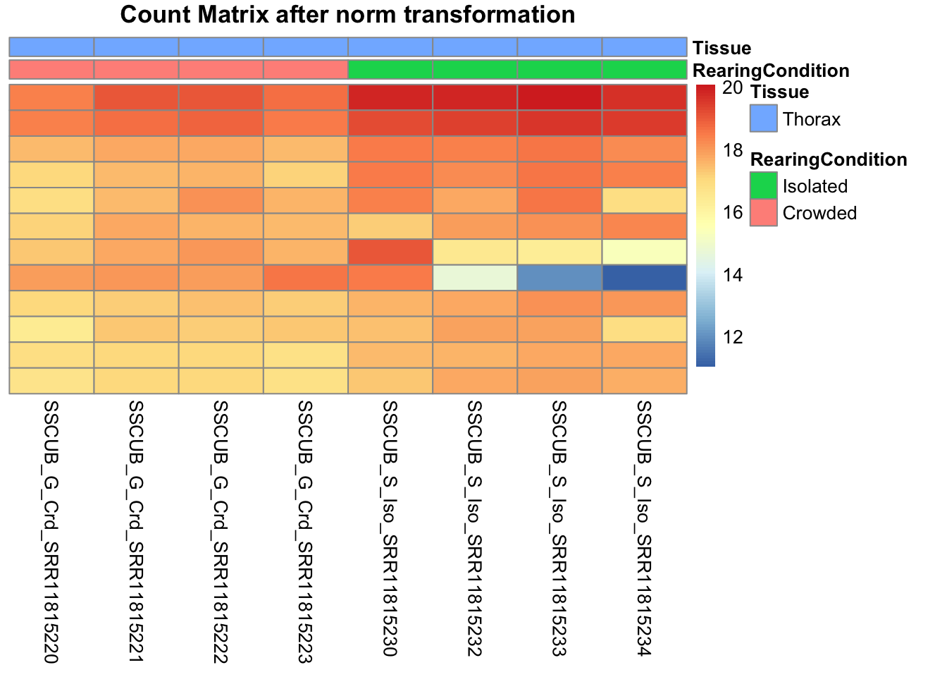
pheatmap(assay(shigeru_vst)[select,], cluster_rows=FALSE, show_rownames=FALSE,
cluster_cols=FALSE, annotation_col=df, main = "Count Matrix after vst transformation")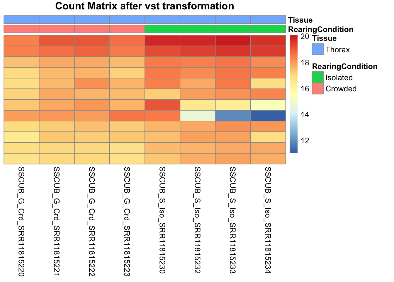
pheatmap(assay(shigeru_rlog)[select,], cluster_rows=FALSE, show_rownames=FALSE,
cluster_cols=FALSE, annotation_col=df, main = "Count Matrix after rlog transformation")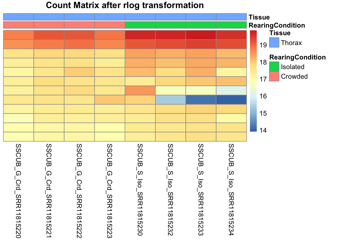
# calculate between-sample distance matrix
metadata <- sampletable[,c("RearingCondition", "Tissue")]
rownames(metadata) <- sampletable$SampleName
sampleDistMatrix.rlog <- as.matrix(dist(t(assay(shigeru_rlog))))
pheatmap(sampleDistMatrix.rlog, annotation_col=metadata, main = "Thorax tissue heatmap distance matrix, rlog transformation")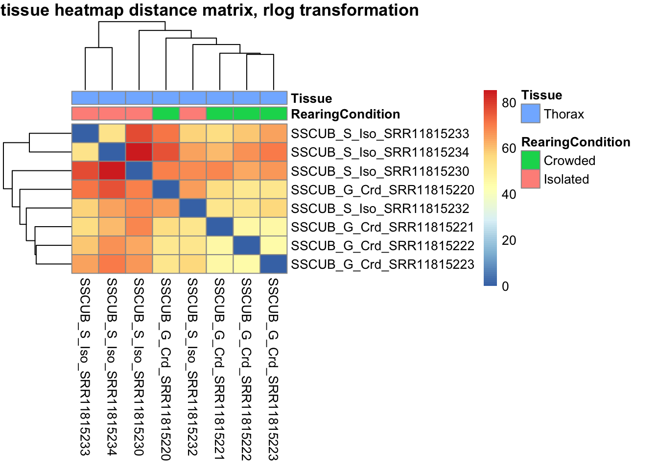
sampleDistMatrix.vst<- as.matrix(dist(t(assay(shigeru_vst))))
pheatmap(sampleDistMatrix.vst, annotation_col=metadata, main = "Thorax tissue heatmap distance matrix, rlog transformation")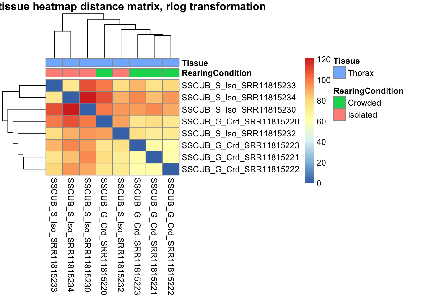
The following plots are interactive and we can hover or Zoom on the locus of interest.
# Ma plot parameters after shrinkage
de_shrink <- lfcShrink(dds = shigeru, coef="RearingCondition_Crowded_vs_Isolated", type="apeglm")
#head(de_shrink)
maplot <-ggmaplot(de_shrink, fdr = 0.05, fc = 1, size = 1, palette = c("#B31B21", "#1465AC", "darkgray"), genenames = as.vector(rownames(de_shrink$name)), top = 0,legend="top",label.select = NULL) +
coord_cartesian(xlim = c(0, 20)) +
scale_y_continuous(limits=c(-12, 12)) +
theme(axis.text.x = element_text(size=12),axis.text.y = element_text(size=12),axis.title.x = element_text(size=14),axis.title.y = element_text(size=14),axis.line = element_line(size = 1, colour="gray20"),axis.ticks = element_line(size = 1, colour="gray20")) +
guides(color = guide_legend(override.aes = list(size = c(3,3,3)))) +
theme(legend.position = c(0.70, 0.12),legend.text=element_text(size=14,face="bold"),legend.background = element_rect(fill="transparent")) +
theme(plot.title = element_text(size=18, colour="gray30", face="bold",hjust=0.06, vjust=-5)) +
labs(title="MA-plot for the shrunken log2 fold changes in the Thorax tissues")
interactive_maplot <- ggplotly(maplot)
interactive_maplot#Volcano plot
keyvals <-ifelse(
res_shigeru$log2FoldChange >= 1 & res_shigeru$padj <= 0.05, '#B31B21',
ifelse(res_shigeru$log2FoldChange <= -1 & res_shigeru$padj <= 0.05, '#1465AC', 'darkgray'))
keyvals[is.na(keyvals)] <-'lightgray'
names(keyvals)[keyvals == "#B31B21"] <-'Upregulated'
names(keyvals)[keyvals == "#1465AC"] <-'Downregulated'
names(keyvals)[keyvals == 'darkgray'] <-'NS'
res_shigeru$color <- keyvals
volcano_plot <- ggplot(res_shigeru, aes(x = log2FoldChange, y = -log10(padj),
color = color, # Use the color column with keyvals
text = rownames(res_shigeru))) +
geom_point(size = 3, alpha = 0.8) +
scale_color_identity() + # Directly use the color values from `keyvals`
guides(color = "none") + # Hide the color legend
labs(title = "Volcano Plot DEG Thorax S. cubense", x = "log2 Fold Change", y = "-log10 Adjusted P-Value") +
theme_minimal()
# Convert to interactive plot with hover text for gene names
interactive_volcano <- ggplotly(volcano_plot, tooltip = "text") %>%
layout(hoverlabel = list(namelength = -1))
# Display the interactive plot
interactive_volcanonitens
rawDir <- file.path(workDir, "03-nitens-DESeq2")
# Path and name of targetfile containing conditions and file names
species <- "nitens"
targetFile <- file.path(workDir, "list", paste0("Thorax", "_", species, "_nooutliers.txt"))
sampletable <- fread(targetFile)
rownames(sampletable) <- sampletable$SampleName
sampletable$RearingCondition <- as.factor(sampletable$RearingCondition)
sampletable$Tissue <- as.factor(sampletable$Tissue)
## Import count files
satoshi <- DESeqDataSetFromHTSeqCount(sampleTable = sampletable,
directory = rawDir,
design = ~ RearingCondition )
#satoshi
smallestGroupSize <- 3
keep <- rowSums(counts(satoshi) >= 5) >= smallestGroupSize
satoshi <- satoshi[keep,]
#nrow(satoshi)
satoshi$RearingCondition <- relevel(satoshi$RearingCondition, ref = "Isolated")
# Fit the statistical model
shigeru <- DESeq(satoshi)
#cbind(resultsNames(shigeru))
res_shigeru <- results(shigeru)
sum(res_shigeru$padj < tresh_padj, na.rm = TRUE)[1] 0A total of 0 genes out of the pre-filtered 13,510 features were showing significant differences in expression levels. The summary below showed how many were upregulated and downregulated in crowded compared to isolated it is possible to scroll it.
brock <- results(shigeru, name = "RearingCondition_Crowded_vs_Isolated", alpha = alpha_DEseq2)
summary(brock)
out of 13168 with nonzero total read count
adjusted p-value < 0.05
LFC > 0 (up) : 0, 0%
LFC < 0 (down) : 0, 0%
outliers [1] : 132, 1%
low counts [2] : 0, 0%
(mean count < 2)
[1] see 'cooksCutoff' argument of ?results
[2] see 'independentFiltering' argument of ?results#mcols(brock)$description
#head(brock)
#brock_df <- as.data.frame(brock)
#datatable(brock_df, options = list(
# pageLength = 10, # Set initial page length
# scrollX = TRUE, # Enable horizontal scrolling
# autoWidth = TRUE, # Adjust column width automatically
# searchHighlight = TRUE # Highlight search matches
#))Now we will make the different plots: PCA, MA and Volcano.
# Try with the data transformation
shigeru_vst <- vst(shigeru)
shigeru_rlog <- rlog(shigeru)
shigeru_ntd <- normTransform(shigeru)
itadori <- meanSdPlot(assay(shigeru_ntd))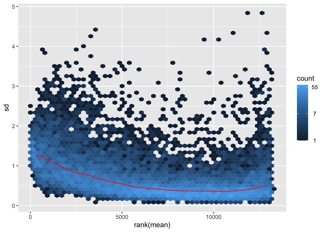
itadori2 <- itadori$gg + ggtitle("Transformation with ntd")
itadori2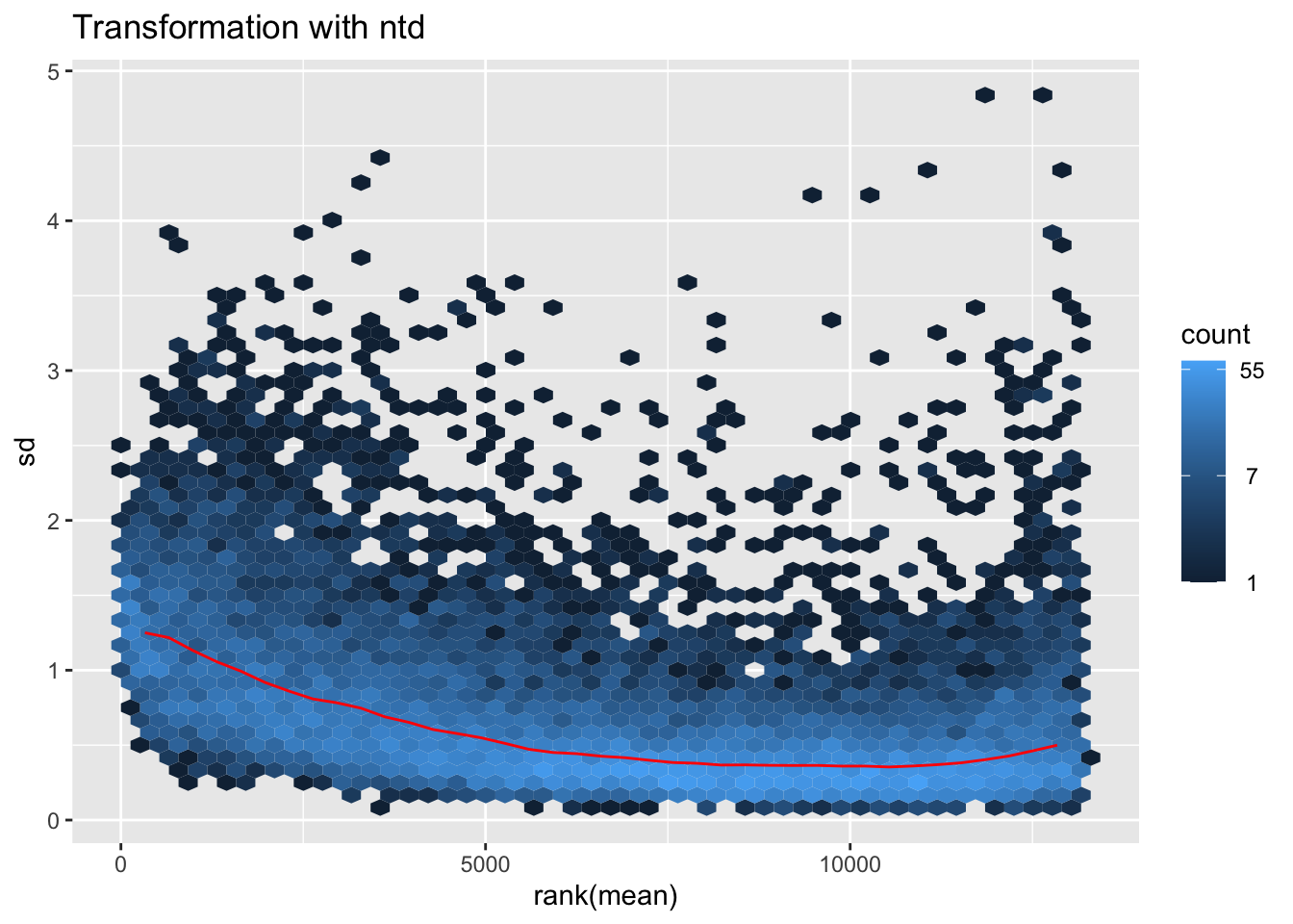
megumi <- meanSdPlot(assay(shigeru_vst))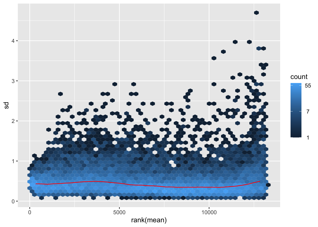
megumi2 <- megumi$gg + ggtitle("Transformation with vst")
megumi2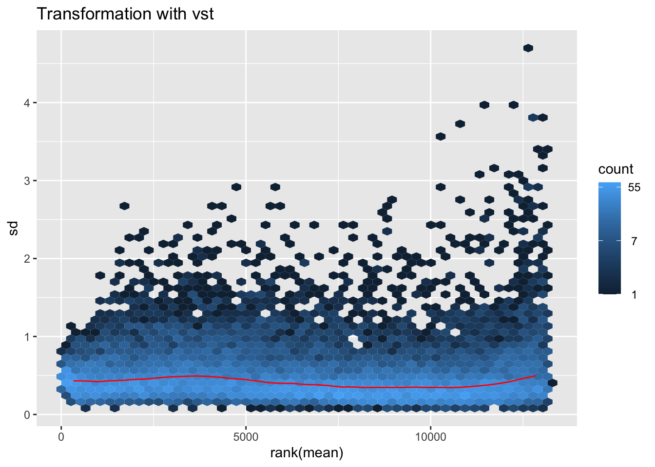
nobara <- meanSdPlot(assay(shigeru_rlog))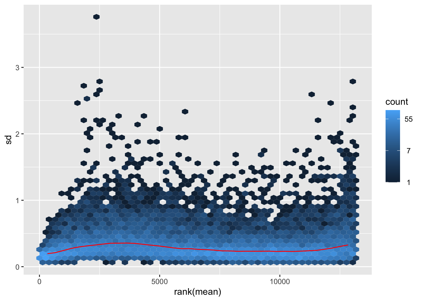
nobara2 <-nobara$gg + ggtitle("Transformation with rlog")
nobara2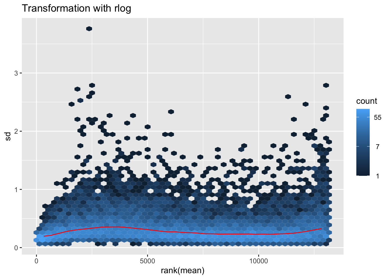
# Create the pca on the defined groups
pcaData1 <- plotPCA(object = shigeru_rlog, intgroup = c("RearingCondition"),returnData=TRUE)
percentVar <- round(100 * attr(pcaData1, "percentVar"))
pcaData1$RearingCondition<-factor(pcaData1$RearingCondition,levels=c("Crowded","Isolated"), labels=c("Crowded S. nitens","Isolated S. nitens"))
#levels(pcaData1$RearingCondition)
p1 <- ggplot(pcaData1, aes(PC1, PC2, color= RearingCondition)) +
geom_point(size=6) +
xlab(paste0("PC1: ", percentVar[1], "% variance")) +
ylab(paste0("PC2: ", percentVar[2], "% variance")) +
scale_color_manual(values = c("blue", "red")) +
#coord_fixed() +
theme_bw() +
theme(legend.title = element_blank()) +
theme(legend.text = element_text(face="bold", size=16)) +
theme(axis.text = element_text(size=14)) +
theme(axis.title = element_text(size=14))
p1 + geom_convexhull(aes(fill = RearingCondition, color = RearingCondition), alpha = 0.5) +
scale_fill_manual(values = c("blue", "red"))+
ggtitle("PCA on S. nitens Thorax tissues", subtitle = "rlog transformation") 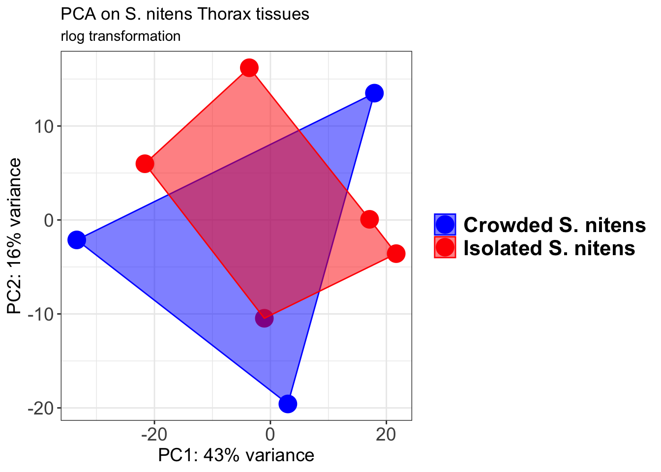
pcaData2 <- plotPCA(object = shigeru_vst, intgroup = c("RearingCondition"),returnData=TRUE)
percentVar <- round(100 * attr(pcaData2, "percentVar"))
pcaData2$RearingCondition<-factor(pcaData2$RearingCondition,levels=c("Crowded","Isolated"), labels=c("Crowded S. nitens","Isolated S. nitens"))
#levels(pcaData2$RearingCondition)
p2 <-ggplot(pcaData2, aes(PC1, PC2, color= RearingCondition)) +
geom_point(size=6) +
xlab(paste0("PC1: ", percentVar[1], "% variance")) +
ylab(paste0("PC2: ", percentVar[2], "% variance")) +
scale_color_manual(values = c("blue", "red")) +
#coord_fixed() +
theme_bw() +
theme(legend.title = element_blank()) +
theme(legend.text = element_text(face="bold", size=16)) +
theme(axis.text = element_text(size=14)) +
theme(axis.title = element_text(size=14))
p2 + geom_convexhull(aes(fill = RearingCondition, color = RearingCondition), alpha = 0.5) +
scale_fill_manual(values = c("blue", "red"))+
ggtitle("PCA on S. nitens Thorax tissues", subtitle = "vst transformation") 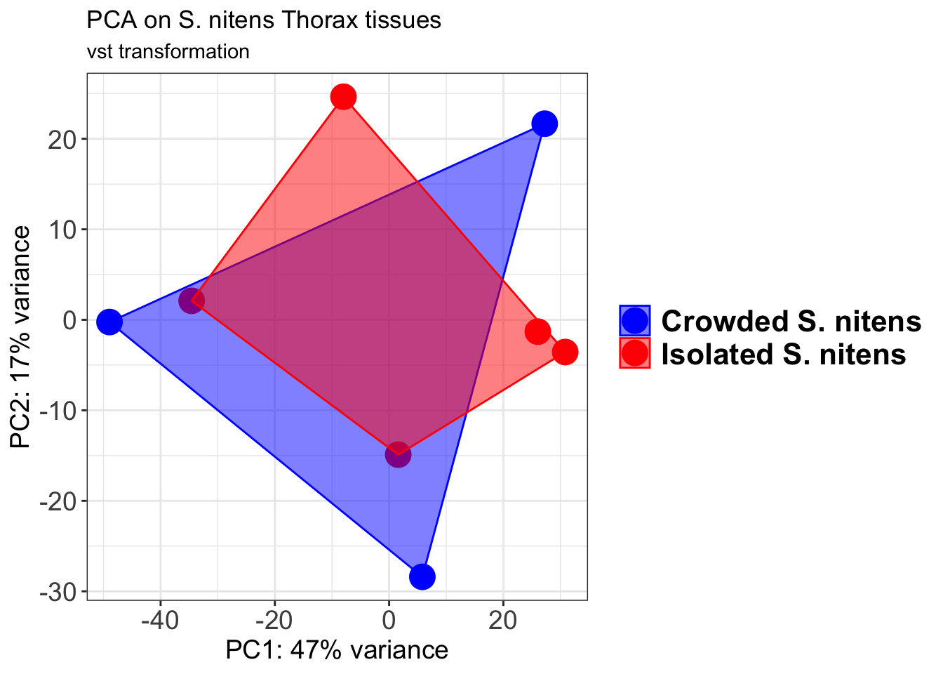
select <- order(rowMeans(counts(shigeru,normalized=TRUE)),
decreasing=TRUE)[1:12]
df <- as.data.frame(colData(shigeru)[,c("RearingCondition","Tissue")])
# Count matrix
pheatmap(assay(shigeru_ntd)[select,], cluster_rows=FALSE, show_rownames=FALSE,
cluster_cols=FALSE, annotation_col=df, main = "Count Matrix after norm transformation")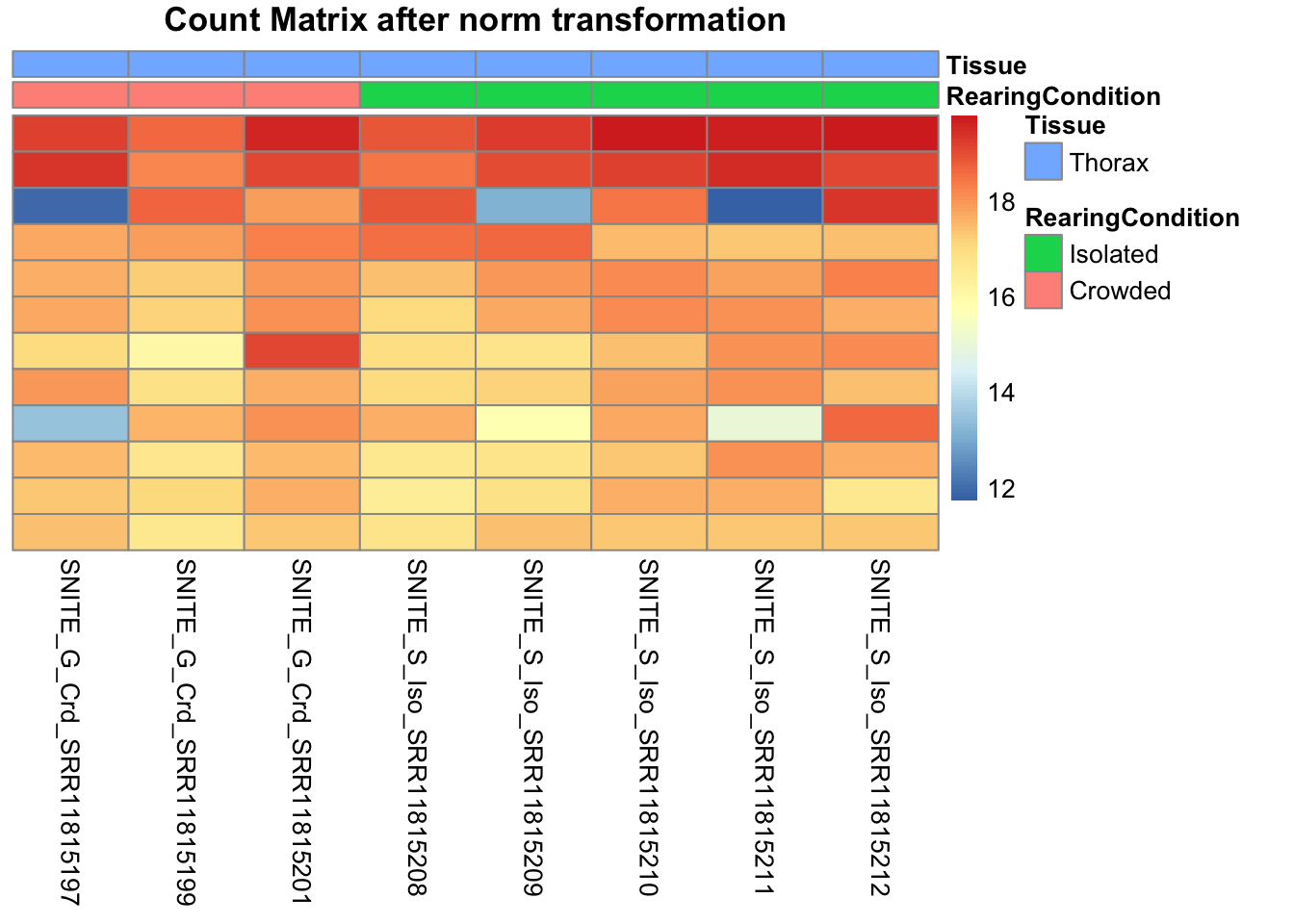
pheatmap(assay(shigeru_vst)[select,], cluster_rows=FALSE, show_rownames=FALSE,
cluster_cols=FALSE, annotation_col=df, main = "Count Matrix after vst transformation")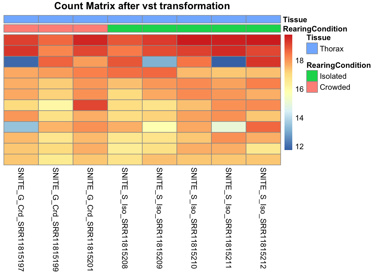
pheatmap(assay(shigeru_rlog)[select,], cluster_rows=FALSE, show_rownames=FALSE,
cluster_cols=FALSE, annotation_col=df, main = "Count Matrix after rlog transformation")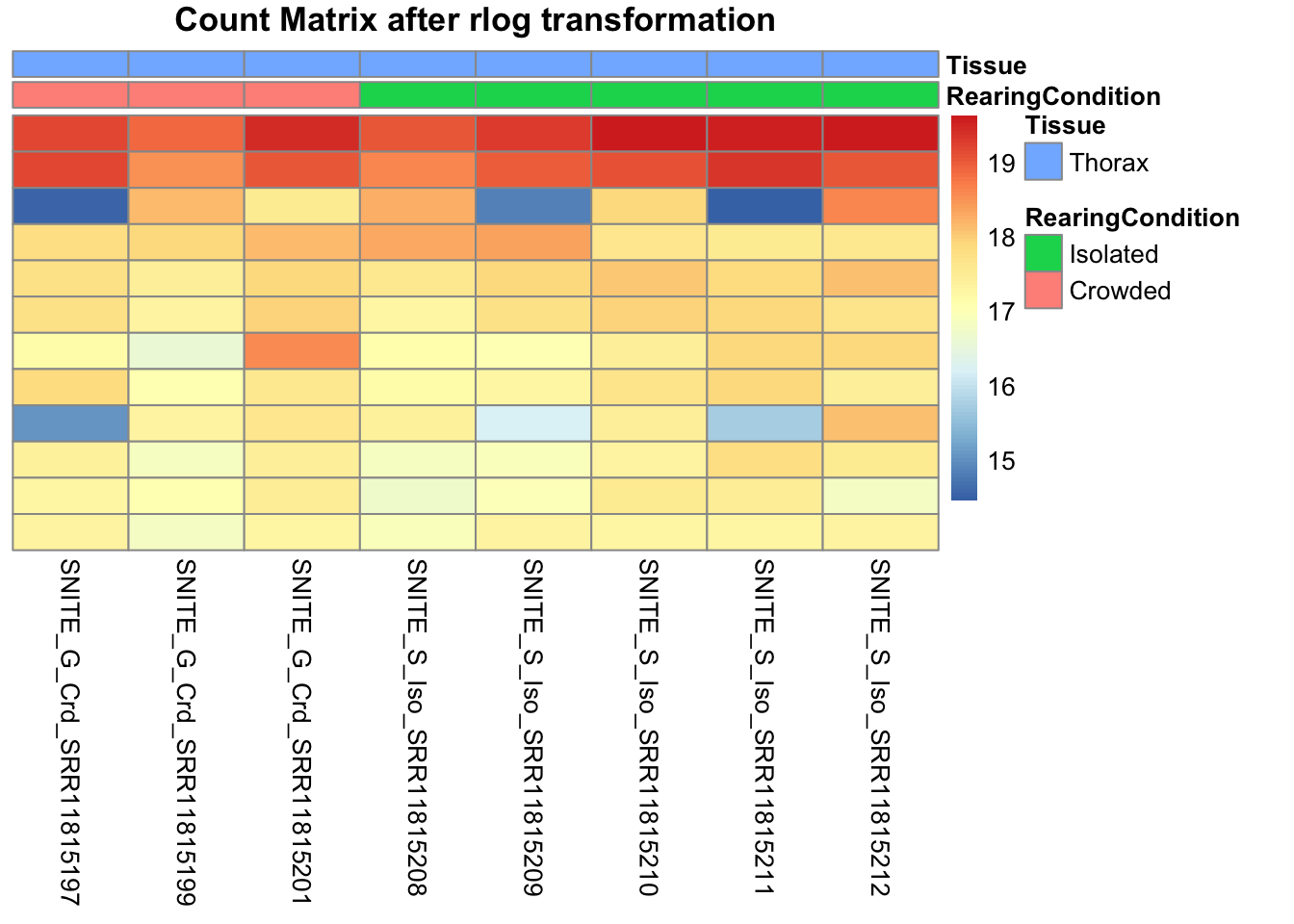
# calculate between-sample distance matrix
metadata <- sampletable[,c("RearingCondition", "Tissue")]
rownames(metadata) <- sampletable$SampleName
sampleDistMatrix.rlog <- as.matrix(dist(t(assay(shigeru_rlog))))
pheatmap(sampleDistMatrix.rlog, annotation_col=metadata, main = "Thorax tissue heatmap distance matrix, rlog transformation")
sampleDistMatrix.vst<- as.matrix(dist(t(assay(shigeru_vst))))
pheatmap(sampleDistMatrix.vst, annotation_col=metadata, main = "Thorax tissue heatmap distance matrix, rlog transformation")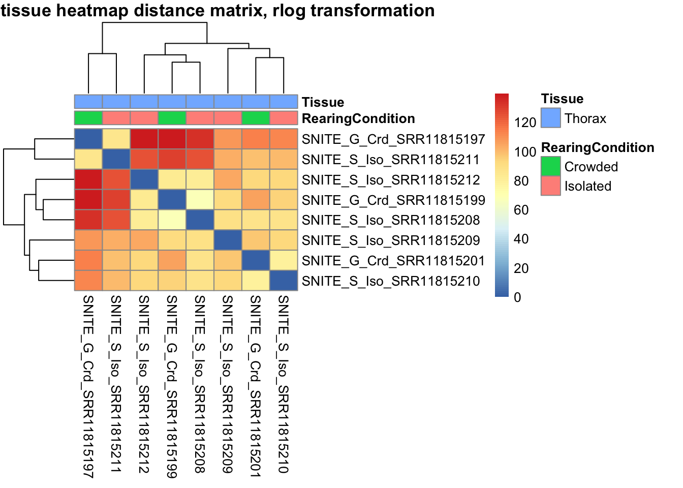
sessionInfo()R version 4.4.1 (2024-06-14)
Platform: aarch64-apple-darwin20
Running under: macOS Sonoma 14.7
Matrix products: default
BLAS: /Library/Frameworks/R.framework/Versions/4.4-arm64/Resources/lib/libRblas.0.dylib
LAPACK: /Library/Frameworks/R.framework/Versions/4.4-arm64/Resources/lib/libRlapack.dylib; LAPACK version 3.12.0
locale:
[1] en_US.UTF-8/en_US.UTF-8/en_US.UTF-8/C/en_US.UTF-8/en_US.UTF-8
time zone: Asia/Tokyo
tzcode source: internal
attached base packages:
[1] grid stats4 stats graphics grDevices utils datasets
[8] methods base
other attached packages:
[1] ggConvexHull_0.1.0 ggdist_3.3.2
[3] vsn_3.72.0 cowplot_1.1.3
[5] sva_3.52.0 BiocParallel_1.38.0
[7] genefilter_1.86.0 mgcv_1.9-1
[9] nlme_3.1-166 clusterProfiler_4.12.6
[11] pheatmap_1.0.12 SARTools_1.8.1
[13] kableExtra_1.4.0 edgeR_4.2.2
[15] limma_3.60.6 ashr_2.2-63
[17] EnhancedVolcano_1.22.0 ggrepel_0.9.6
[19] ggpubr_0.6.0 apeglm_1.26.1
[21] circlize_0.4.16 RColorBrewer_1.1-3
[23] ComplexHeatmap_2.20.0 reshape2_1.4.4
[25] ggthemes_5.1.0 plotly_4.10.4
[27] DT_0.33 data.table_1.16.2
[29] lubridate_1.9.3 forcats_1.0.0
[31] stringr_1.5.1 dplyr_1.1.4
[33] purrr_1.0.2 readr_2.1.5
[35] tidyr_1.3.1 tibble_3.2.1
[37] ggplot2_3.5.1 tidyverse_2.0.0
[39] rmdformats_1.0.4 knitr_1.48
[41] txdbmaker_1.0.1 GenomicFeatures_1.56.0
[43] AnnotationDbi_1.66.0 tximport_1.32.0
[45] DESeq2_1.44.0 SummarizedExperiment_1.34.0
[47] Biobase_2.64.0 MatrixGenerics_1.16.0
[49] matrixStats_1.4.1 GenomicRanges_1.56.2
[51] GenomeInfoDb_1.40.1 IRanges_2.38.1
[53] S4Vectors_0.42.1 BiocGenerics_0.50.0
loaded via a namespace (and not attached):
[1] fs_1.6.5 bitops_1.0-9 enrichplot_1.24.4
[4] httr_1.4.7 doParallel_1.0.17 numDeriv_2016.8-1.1
[7] tools_4.4.1 backports_1.5.0 utf8_1.2.4
[10] R6_2.5.1 lazyeval_0.2.2 GetoptLong_1.0.5
[13] withr_3.0.2 prettyunits_1.2.0 GGally_2.2.1
[16] gridExtra_2.3 preprocessCore_1.66.0 cli_3.6.3
[19] scatterpie_0.2.4 labeling_0.4.3 sass_0.4.9
[22] SQUAREM_2021.1 mvtnorm_1.3-1 mixsqp_0.3-54
[25] Rsamtools_2.20.0 systemfonts_1.1.0 yulab.utils_0.1.7
[28] gson_0.1.0 DOSE_3.30.5 svglite_2.1.3
[31] R.utils_2.12.3 invgamma_1.1 bbmle_1.0.25.1
[34] rstudioapi_0.17.1 RSQLite_2.3.7 gridGraphics_0.5-1
[37] generics_0.1.3 shape_1.4.6.1 BiocIO_1.14.0
[40] crosstalk_1.2.1 distributional_0.5.0 car_3.1-3
[43] GO.db_3.19.1 Matrix_1.7-1 fansi_1.0.6
[46] abind_1.4-8 R.methodsS3_1.8.2 lifecycle_1.0.4
[49] whisker_0.4.1 yaml_2.3.10 carData_3.0-5
[52] qvalue_2.36.0 SparseArray_1.4.8 BiocFileCache_2.12.0
[55] blob_1.2.4 promises_1.3.0 crayon_1.5.3
[58] bdsmatrix_1.3-7 lattice_0.22-6 annotate_1.82.0
[61] KEGGREST_1.44.1 pillar_1.9.0 fgsea_1.30.0
[64] rjson_0.2.23 codetools_0.2-20 fastmatch_1.1-4
[67] glue_1.8.0 ggfun_0.1.7 treeio_1.28.0
[70] vctrs_0.6.5 png_0.1-8 gtable_0.3.6
[73] emdbook_1.3.13 cachem_1.1.0 xfun_0.49
[76] S4Arrays_1.4.1 tidygraph_1.3.1 coda_0.19-4.1
[79] survival_3.7-0 iterators_1.0.14 statmod_1.5.0
[82] ggtree_3.12.0 bit64_4.5.2 progress_1.2.3
[85] filelock_1.0.3 rprojroot_2.0.4 bslib_0.8.0
[88] affyio_1.74.0 irlba_2.3.5.1 colorspace_2.1-1
[91] DBI_1.2.3 tidyselect_1.2.1 bit_4.5.0
[94] compiler_4.4.1 curl_5.2.3 git2r_0.35.0
[97] httr2_1.0.5 xml2_1.3.6 ggdendro_0.2.0
[100] DelayedArray_0.30.1 shadowtext_0.1.4 bookdown_0.41
[103] rtracklayer_1.64.0 scales_1.3.0 hexbin_1.28.4
[106] affy_1.82.0 rappdirs_0.3.3 digest_0.6.37
[109] rmarkdown_2.28 XVector_0.44.0 htmltools_0.5.8.1
[112] pkgconfig_2.0.3 highr_0.11 dbplyr_2.5.0
[115] fastmap_1.2.0 rlang_1.1.4 GlobalOptions_0.1.2
[118] htmlwidgets_1.6.4 UCSC.utils_1.0.0 farver_2.1.2
[121] jquerylib_0.1.4 jsonlite_1.8.9 GOSemSim_2.30.2
[124] R.oo_1.26.0 RCurl_1.98-1.16 magrittr_2.0.3
[127] ggplotify_0.1.2 Formula_1.2-5 GenomeInfoDbData_1.2.12
[130] patchwork_1.3.0 munsell_0.5.1 Rcpp_1.0.13
[133] ape_5.8 viridis_0.6.5 stringi_1.8.4
[136] ggraph_2.2.1 zlibbioc_1.50.0 MASS_7.3-61
[139] plyr_1.8.9 ggstats_0.7.0 parallel_4.4.1
[142] graphlayouts_1.2.0 Biostrings_2.72.1 splines_4.4.1
[145] hms_1.1.3 locfit_1.5-9.10 igraph_2.1.1
[148] ggsignif_0.6.4 biomaRt_2.60.1 XML_3.99-0.17
[151] evaluate_1.0.1 BiocManager_1.30.25 tweenr_2.0.3
[154] tzdb_0.4.0 foreach_1.5.2 httpuv_1.6.15
[157] polyclip_1.10-7 clue_0.3-65 ggforce_0.4.2
[160] broom_1.0.7 xtable_1.8-4 restfulr_0.0.15
[163] tidytree_0.4.6 rstatix_0.7.2 later_1.3.2
[166] viridisLite_0.4.2 truncnorm_1.0-9 aplot_0.2.3
[169] memoise_2.0.1 GenomicAlignments_1.40.0 cluster_2.1.6
[172] workflowr_1.7.1 timechange_0.3.0